In this documentation, you are about to learn the customizations of the Blog Coral Skin Slider widget. Or, the Coral Skin of the Blog Slider widget.
Inserting The Blog Slider widget
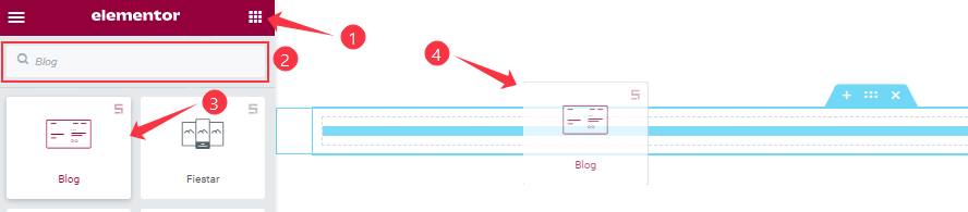
You can add this Prime Slider addon to WordPress by opening the page you want to use it on in Elementor and then dragging and dropping the Blog widget into that page. Please note that you need both Elementor and Prime Slider installed before you can use this widget.
Work With The Content Tab
Layout Section Customizations
Step-1
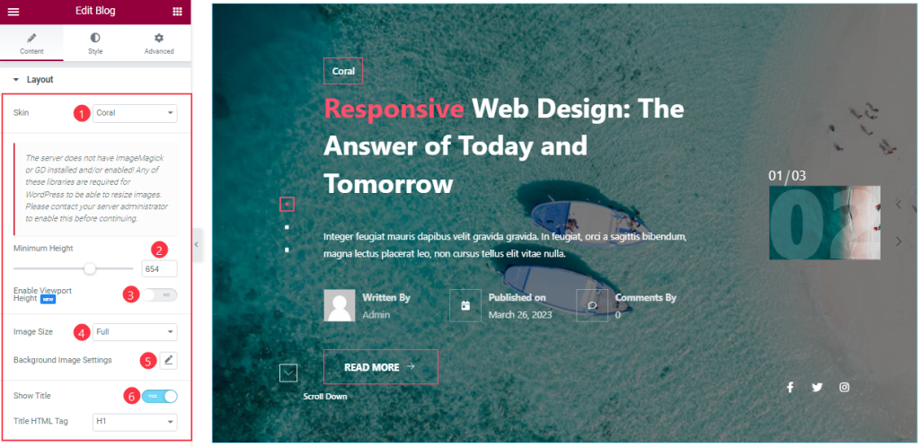
Go to the Content tab > Layout
Come to the Layout section, you can change the Blog Skin Type (Default, Coral, Zinest, and Folio). Here we select the Coral Skin to show the widget function. Here you can set the Minimum Height to adjust the net height of all slides and also the On/Off Viewport Height. The viewport height of the slider is the height of the element containing the slider. The viewport height will depend on the slider that you’re using. If you have the default slider, the viewport height is calculated by adding the slider height and the slider bottom padding.
Here you also set the Slider Image size and customize the Background Image settings as your working demand.
Step-2
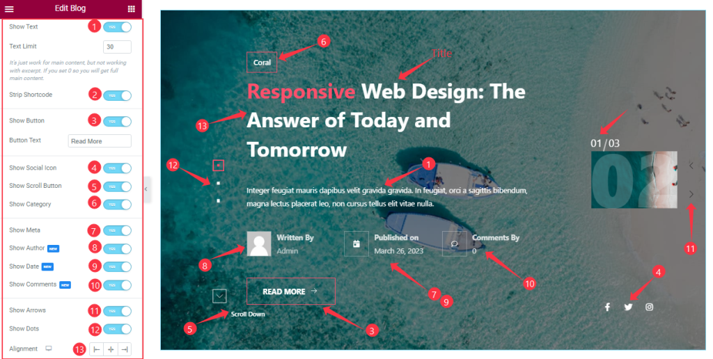
Here you will get the Show Title, Show Text, Strip Shortcode, Show Button, Show Social Icon, Show Scroll Button, Show Category, Show Meta, Show Author, Show Date, Show Comments, Show Arrows, and Show Dots switchers which you can turn on/off to show/hide these elements from the slider. you also edit the Text Limit, Button Text, and Alignment as you wish. If you enable the ‘strip shortcode‘ option, then shortcode content will be removed from your slider content.
Query Section Customizations
Go to the Content tab > Query.
This section works for setting the source location of data that you need to display by references like Posts, Pages, Authors, Categories, Tags, and Formats. The references can be different in accordance with the source location.
Step-1
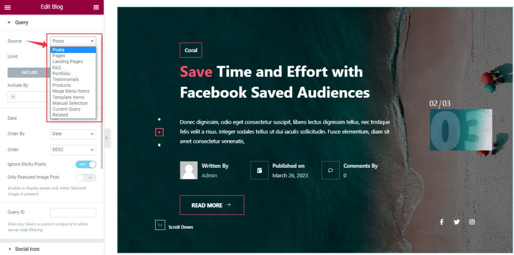
Go to Query > Source
Here you can easily select the Source that you create to see on your slide.
Step-2
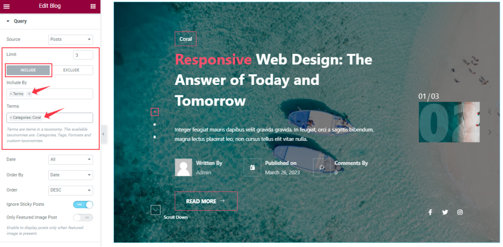
Here you can set your post limit as you need. Also, you can show only specific posts with the Include filter.
Step-3
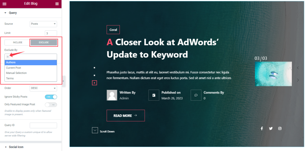
With the Exclude filter, you can hide the selected posts from the display.
Step-4
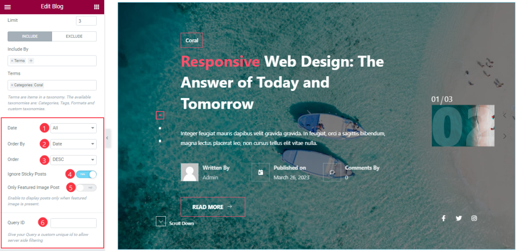
Order By and Order controls are here to arrange the data you want to display through Random, Title, Date, or Menu order wise and also with ascending or descending order.
Here you can also see more two switcher options (Ignore Sticky Posts, Only Featured Image Posts), and anybody can easily On/Off them. If you are on the two switcher buttons then The Sticky posts will be Ignored and The Only Featured Image posts will appear on your slide. Here you also set the Query ID that gives your Query a custom unique ID to allow server-side filtering.
Customizations Of The Social Icon Section
Step-1
Go to the Content tab > Social Icon
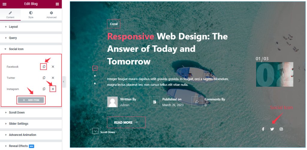
In this section, you can easily add a slider item by clicking Add Item button. Otherwise, you can easily increase your Item by clicking the Duplicate Sign symbol and you can also decrease/remove your item by clicking the cross sign as shown in the screenshot above.
Step-2
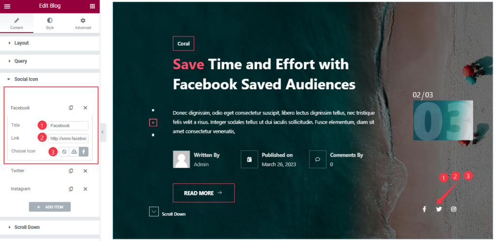
Let’s click the 1st Social Icon item. Then you are able to change The Title name, and you can set a link under The Icon. Also, you can change the Social Icon as you wish, as shown in the screenshot. In the same process, you can customize the other items like the first one.
Customization of the Scroll Down Section
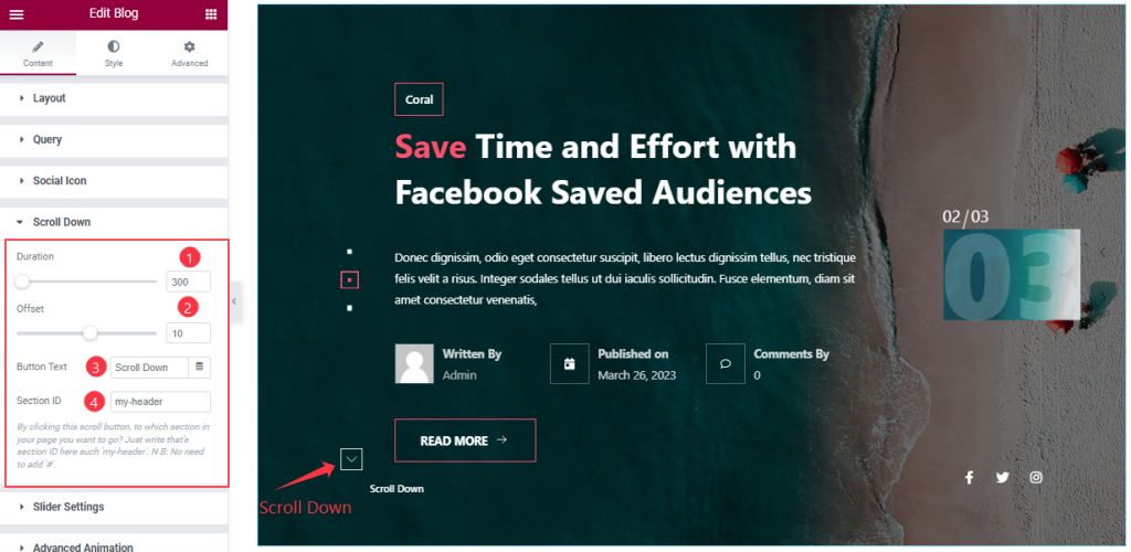
Go to the Content tab > Scroll Down
Come to the Scroll Down Section, you can set the value of Duration, and Offset, and change the Button Text like the screenshot. Here you can add a section ID. By clicking this scroll button, you can go to any section you want to go to.
Slider Settings Section Customization
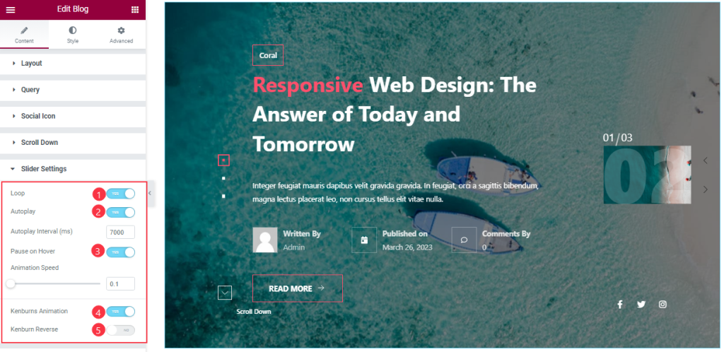
Go to the Content tab > Slider Settings
Here you will be able to see some Switchers that are Auto Play, Pause on Hover, Loop, Kenburns Animation, and Kenburns Animation Reverse. You can easily enable or disable those switcher buttons to apply specific effects. Also, you can customize the Autoplay Interval and Animation Speed for the slider.
Autoplay switcher: Enable the switcher to make the slider slide Automatically with a customizable Autoplay Speed control.
Pause on Hover: If turned on, when you Hover your mouse cursor on the slider then your slider will Hold, otherwise, your slider will Autoplay.
Loop: You can easily enable or disable the switcher button. When you activate the Loop switcher button your slider will loop at a certain time interval. You can also set up the loop animation speed here.
Kenburns Animation: Kenburns Animation is the most attractive Animation effect for the widget. if you enable the switcher button then your post Image will appear like a zoom-in/zoom-out animation that makes your post image Awesome.
Advanced Animation Section Customizations
Step-1
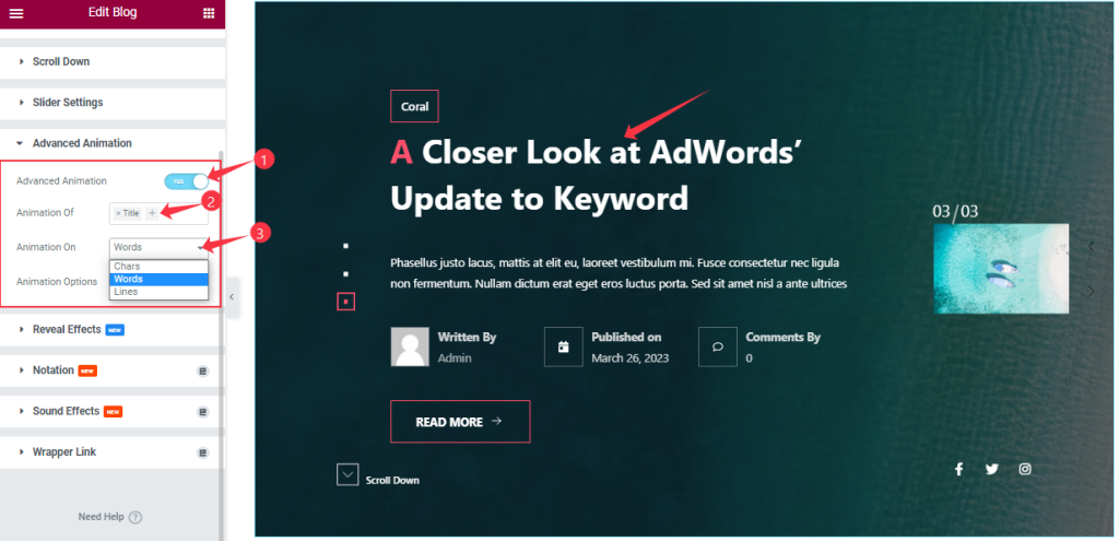
Go to the Content tab > Advanced Animation
Come to the Advanced Animation section, you can easily on/off the switcher button to show/hide the Animation Effect. If you are on the Switcher button then you can add the Animation of Title, Sub Title, and Excerpt. Also, you can select the Animation for Words, Chars, and Lines like the screenshot.
Step-2
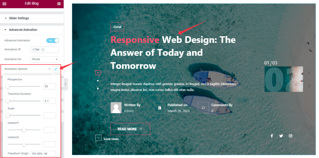
Here you can customize the Animation Options as your working demand That we have shown in the screenshot.
Work With The Style Tab
Style The Sliders Section
Step-1
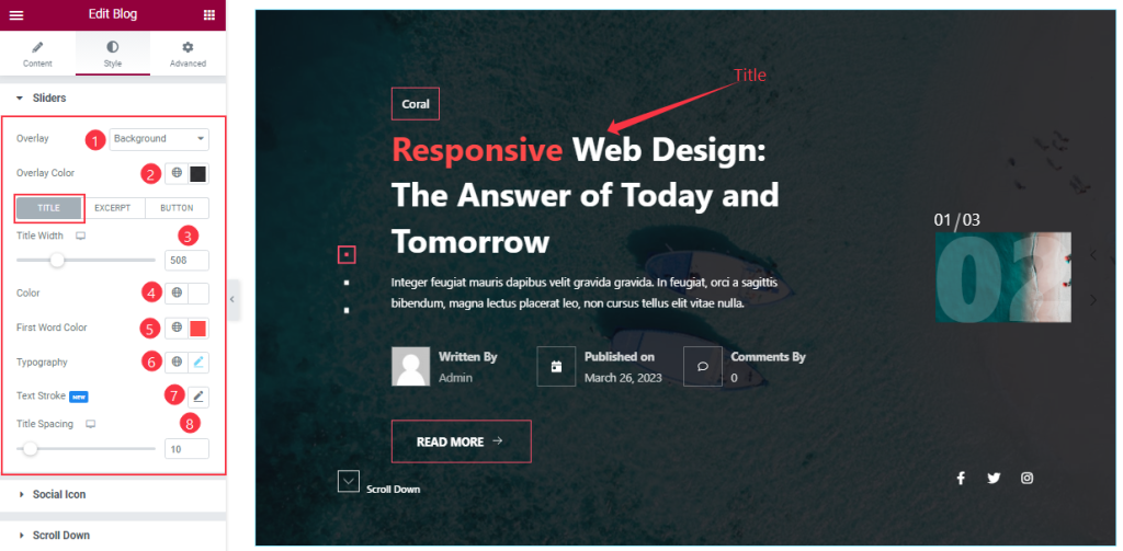
Go to the Style Tab > Sliders
Come to the Sliders section, you can change the Overlay Type, and Overlay Color as you wish like the screenshot. In Title mode, you also change the Title Color, First-word Color, and Separator Color. If you want then add the Text Stroke, Typography, and adjust the Title Width, and Title Spacing from here.
Step-2
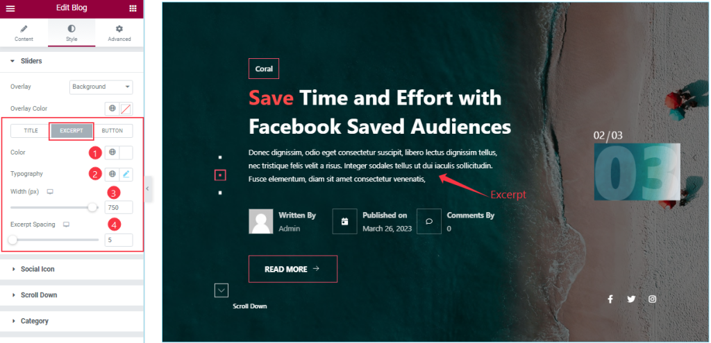
By clicking the Excerpt tab, you can change the Excerpt Color, and Typography, and set the Excerpt Width, and Spacing according to your slider.
Step-3
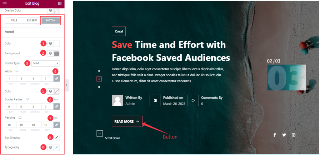
After clicking the Button tab, In Normal mode, you are able to change the Button Text Color, Background Color, and Border Type and set the Box Shadow And Typography as you wish. You also set the value of Border Radius and Padding as your working demand.
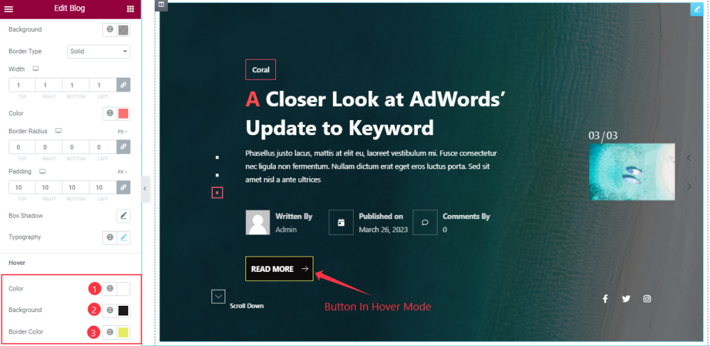
In Hover Mode, you can change the Button Text Color, Background Color, and Border Color as you need as we have shown you in the screenshot.
Social Icon Section Customizations
Step-1
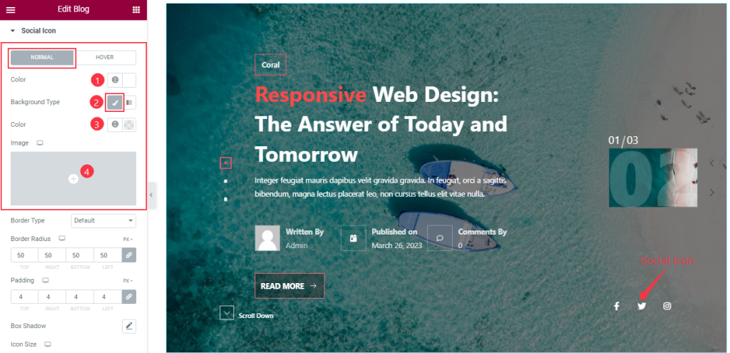
Go to the Style Tab > Social Icon
Come to the Social Icon Section, in Normal mode, you can change the Icon Color, Icon Background Type, and Background Color and also set an image as Icon Background that we have marked in the screenshot.
Step-2
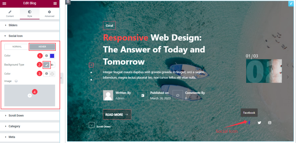
In Hover mode, you will get similar customization options as normal mode and easily customize those options.
Step-3
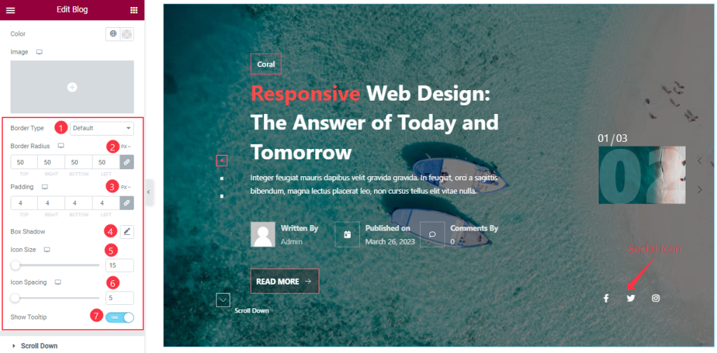
Here you also change the Border Type, Border Radius, and Padding as you wish and add the Box Shadow effect on your Social Icon section. you can easily on/off the Show Tooltip switcher button to show the Icon Tooltip and Adjust the Icon Size And Icon Spacing as your working demand.
Customization of the Scroll Down Section
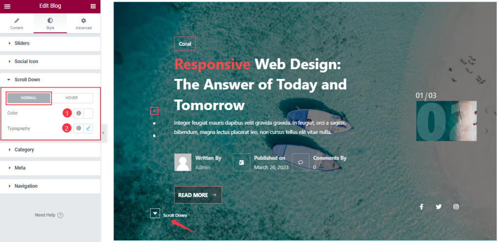
Go to the Content tab > Scroll Down
Come to the Scroll Down Section, In Normal Mode, you can change the Scroll Down Color, and set the Typography as your working demand.
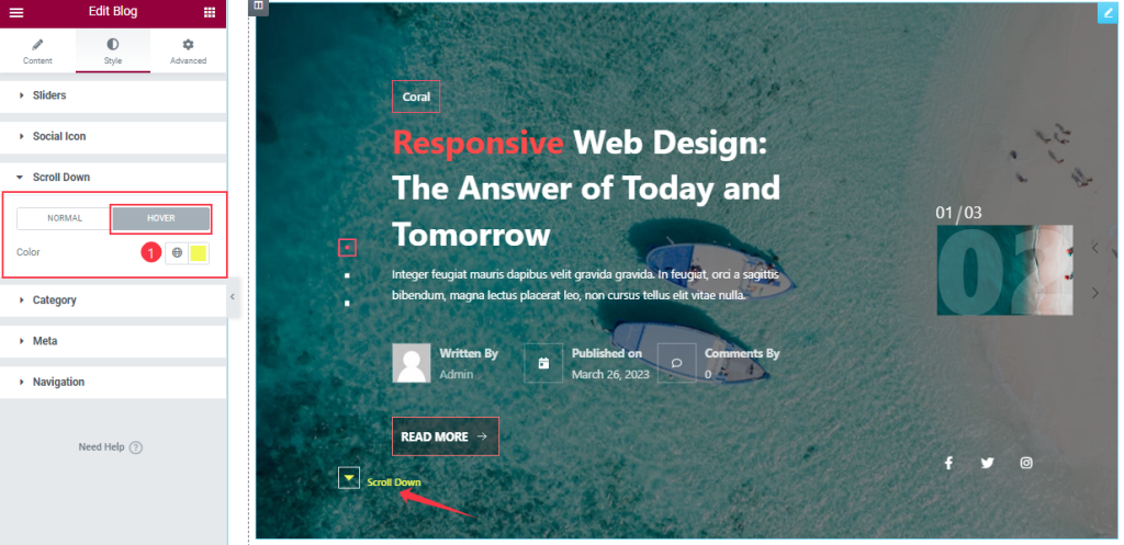
In Hover mode, you can customize the Scroll Down Color as you wish like in the screenshot.
Style The Category Section
Step-1
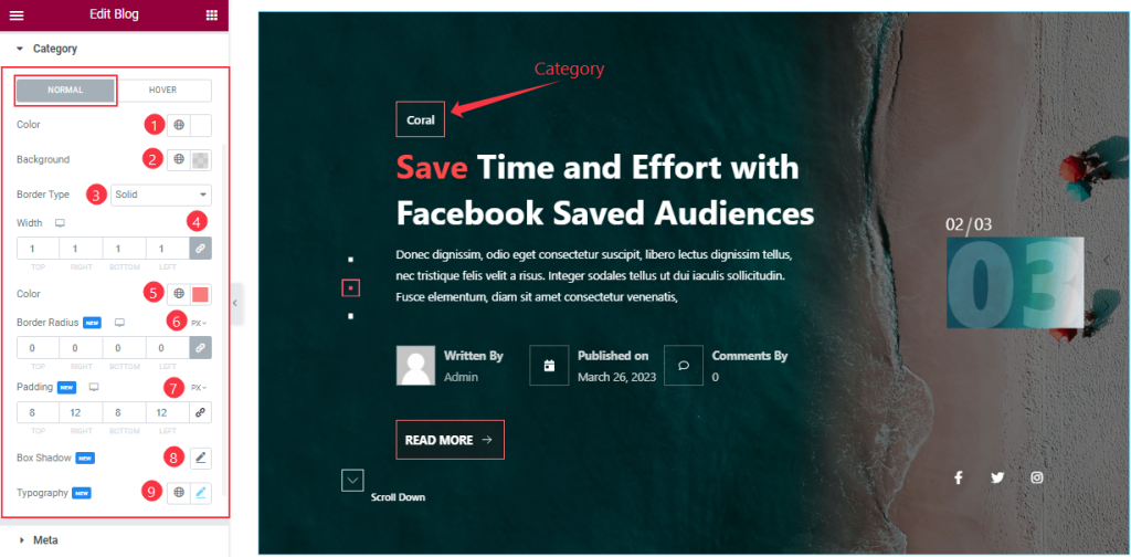
Go to the Style Tab > Category
In Normal mode, you can change the Category Color, and Background Color as your working demand, and the other customization options are the same as before.
Step-2
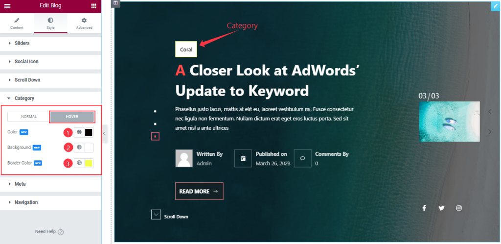
In Hover Mode, you can change the Category Color, Background Color, and Border Color like in the above screenshot.
Meta Section Customizations
Step-1
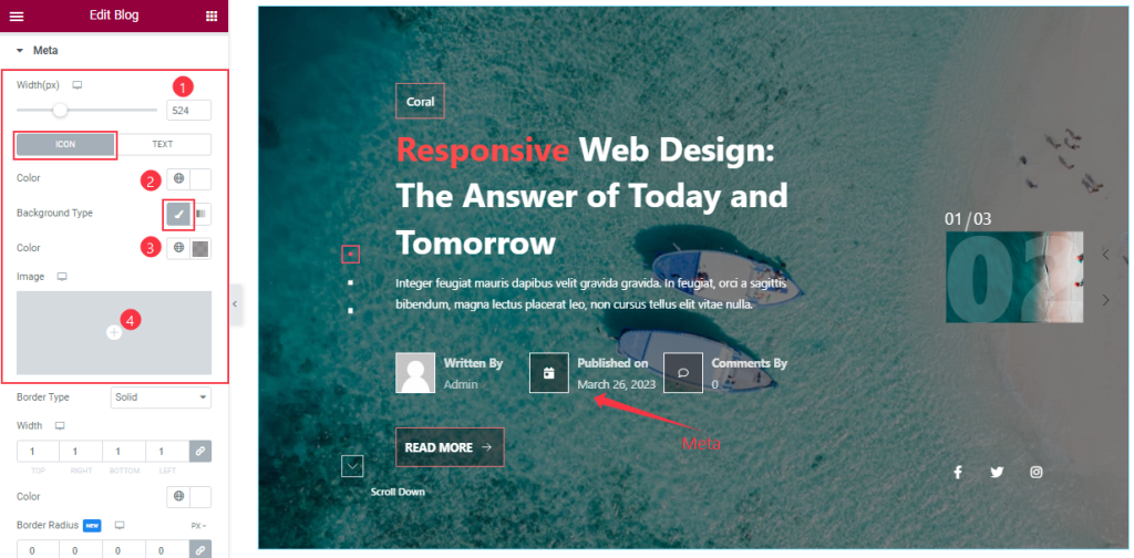
Go to the Style Tab > Meta
In this section, in Icon mode, you can change the Meta Icon Color, Icon Background Type, and Background Color and also set an image as Icon Background and adjust the Meta Width that we have marked in the screenshot.
Step-2
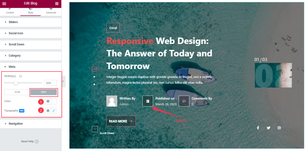
In Text Mode, you can change the Meta Text Color and Typography as you wish.
Step-3
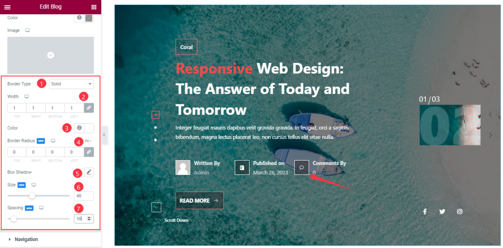
Here you will get a similar set of controls to modify the appearance of this section like before screenshots. so please try it yourself.
Work with the Navigation Section
Step-1
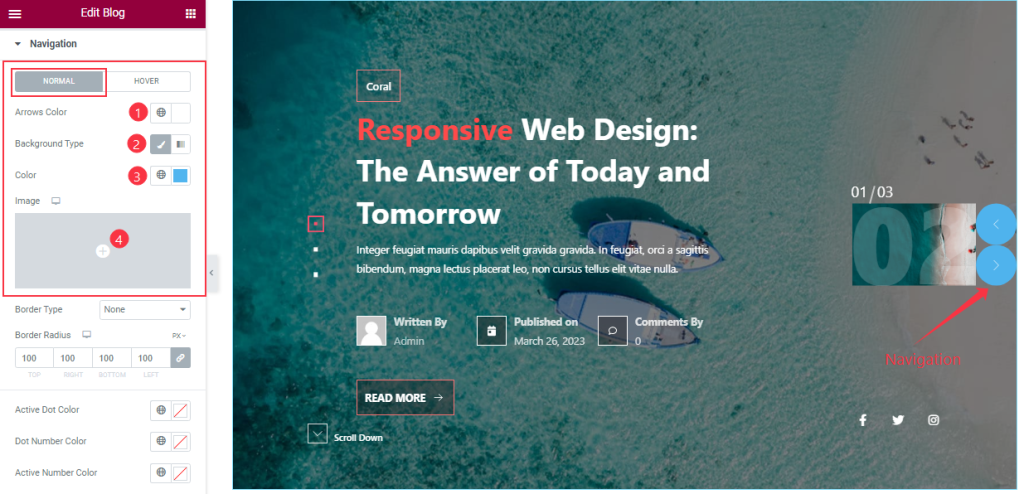
Go to the Style Tab > Navigation
In Normal Mode, you will get a similar set of controls to modify the appearance of this section like the Meta section. so please follow the before screenshots.
Step-2
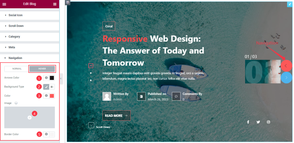
In Hover Mode, you also get the same options to customize the Navigation section like Normal mode. so please follow the above screenshot.
Step-3
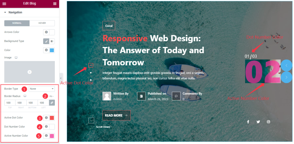
In this section, In normal mode, you can change the Active Dot Color, Dot Number Color, and Active Number Color as you wish as we marked in the screenshot. Here you also set the Border Type, and Border Radius as your demand.
All done! You have successfully customized the Blog Coral Skin Slider widget on your website.
Video Assist
You can watch this quick video to learn more about the Blog Coral Skin Slider widget. Please visit the demo page for examples.
Thanks for staying with us.