

In this documentation, we will discuss the customization of the Berlin Slider widget, brought to you by the Ultimate Post Kit addon for Elementor.
Inserting Widget
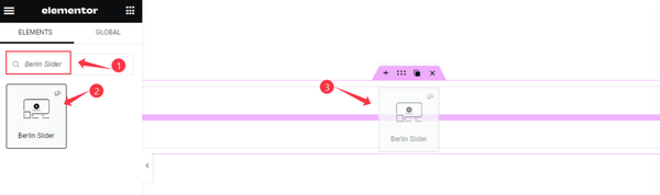
Open your page in Elementor Editor and search by the widget name. Then drag it and drop it on the page.
Default View of the Berlin Slider
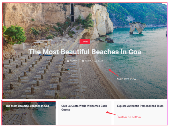
On the top is the full-width image with the post and below the post thumb bar which contains the heading of posts. It has an active item and other deactivated items whose images are not visible.
Let’s Work with Content Tab
Layout Customization
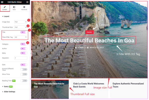
Go to Content > Layout
First, we have set the Image size Full for the main Slider, then the thumbnail size full for the post bar. We have enabled the Title switcher with the H3 tag and the Category.
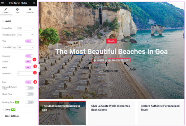
There is another switcher which we have enabled. This switcher will show the Author, Meta, Separator, and Date of the post. That’s all the work for the switcher. Let’s go to the next section.
Make Query of Posts
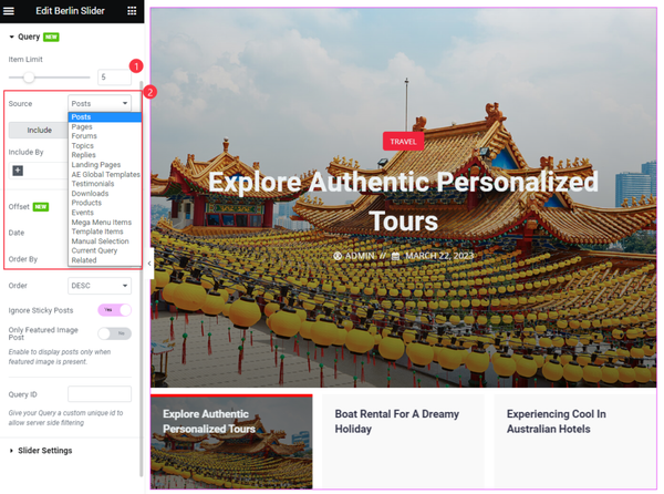
Go to Content > Query
You can select the source from here. Whether it can be the Posts, Pages, Current Query, or relevant option. We have selected the Posts here and Set Item Limit. Now it will show all types of posts.
Include by category
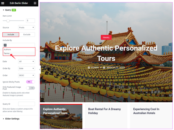
You can select specific categories by using the Include option and only show them inside the slider. Just click on the plus icon of the Include By box.
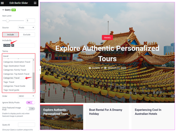
Then you will see and Terms box appear, here you can search by Category, Tags, Formats, or Custom Taxonomies.
The Exclude filter option hides selected posts.
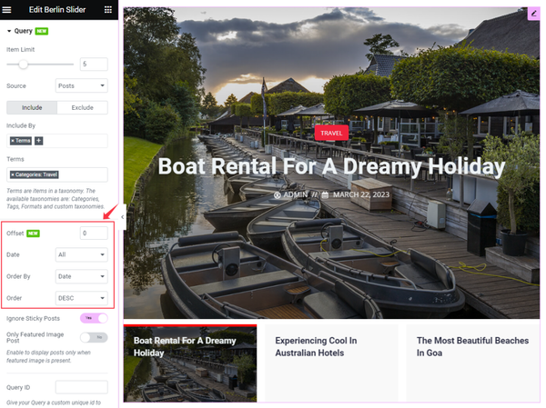
You can represent the items in your way. For this, you can set Offset. It will show first the item which you will select. Date, Order by, and Order options will represent the items in various ways.
Slider Settings Customization
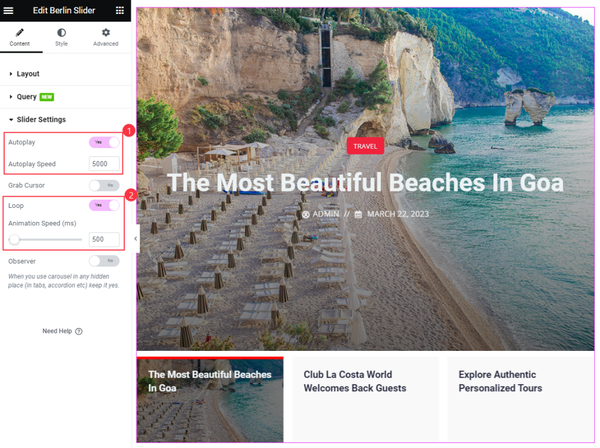
Go to Content > Slider Settings
To make the slider play automatically, enable the Autoplay Switcher and set Autoplay Speed. To make the slider repeat, enable the Loop switcher and Set Animation Speed.
Let’s Do Style Tab Customization
Image Customization
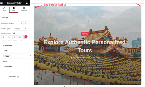
Go to Style > Image
Here, you can add the Background of the image and Set the Border. We have added only Border Radius and left the other options default.
Set Title Style
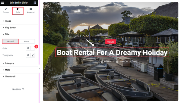
Go to Style > Title
In Normal mode, we have set only the Color and Default Typography. That’s the option for the Title.
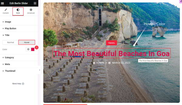
In hover mode, change the title Color.
Category Customization
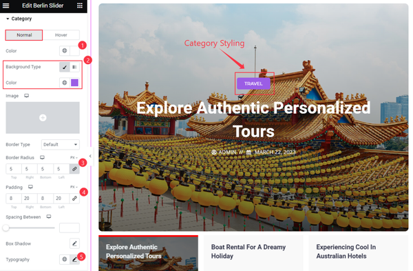
Go to Style > Category
We have made the category a little bit different, In the Normal mode, we have set Color, Background Color, Border Radius, Padding, and Typography.
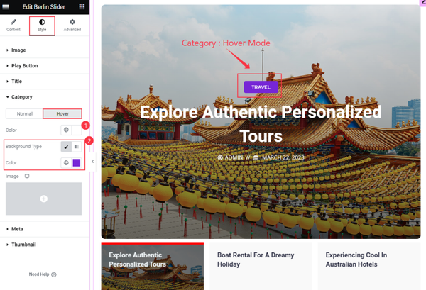
Here we have set the Color and Background Color. It will change the background color when you will hover over the Category.
Meta Customization
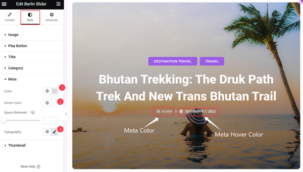
Go to Style > Meta
We have made the meta stylish. Here we have set Color, Hover Color, and Typography. Follow the screenshot above.
Thumbnail Customization
Go to Style > Thumbnail
Item Customization of the thumbnail
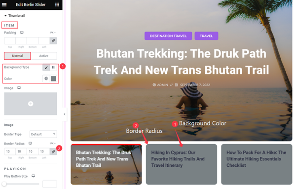
We have selected the item Background Color and Set the Border radius for the normal mode.
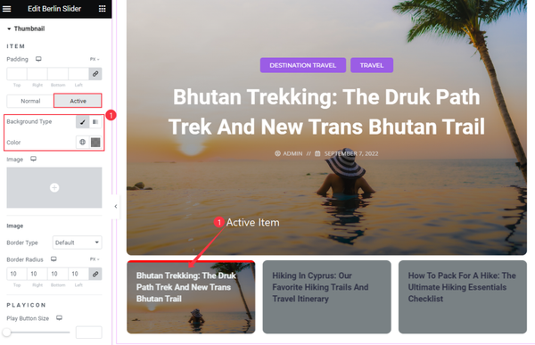
For the active item, we have made the Background Color Transparent.
Title customization of thumbnail
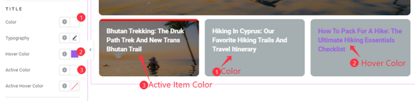
For the thumbnail, we have set the Color and Hover Color for the Items and set the Active Item Color.
Topbar Customization

For the thumbnail top bar here we have set the Active Color only.
That’s all the options for the Berlin Slider.
Video Assist
You can watch the Video tutorial to learn about the Berlin Slider widget. Please visit the demo page for examples.
Thanks for staying with us.