In this documentation, we will discuss the customization of the Flogia slider widget, brought to you by the Prime Slider addon for Elementor.
Inserting The Flogia Slider widget
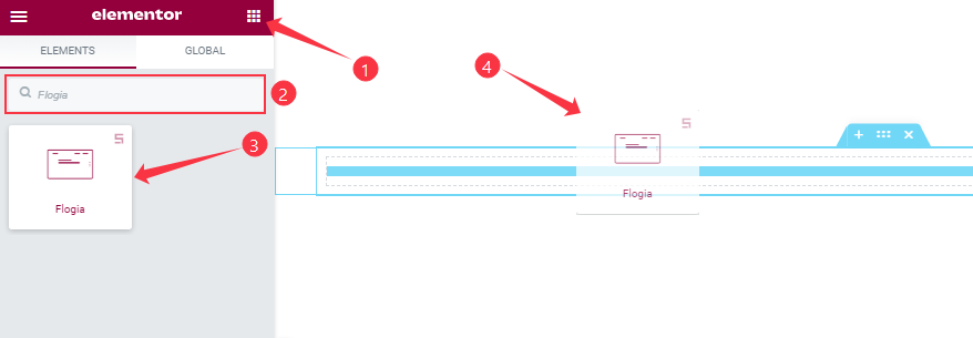
You can add this Prime Slider addon to WordPress by opening the page you want to use it on in Elementor and then dragging and dropping the Flogia Slider widget into that page. Please note that you need both Elementor and Prime Slider installed before you can use this widget.
Work With The Content Tab
Layout Section Customizations
Step-1
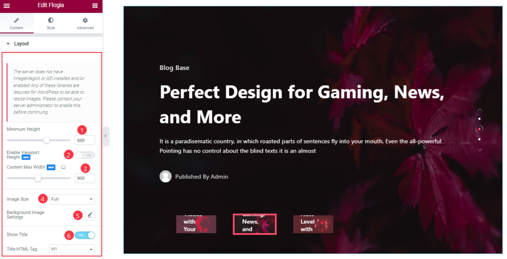
Go to the Content tab > Layout
Come to the Layout section, Here you can set the Minimum Height to adjust the net height of all slides and also the On/Off Viewport Height. The viewport height of the slider is the height of the element containing the slider.
The viewport height will depend on the slider that you’re using. If you have the default slider, the viewport height is calculated by adding the slider height and the slider bottom padding. Here you can also set the Content max Width to adjust for showing all slide’s content position.
Here you also set the Slider Image size and customize the Background Image settings as your working demand.
Step-2
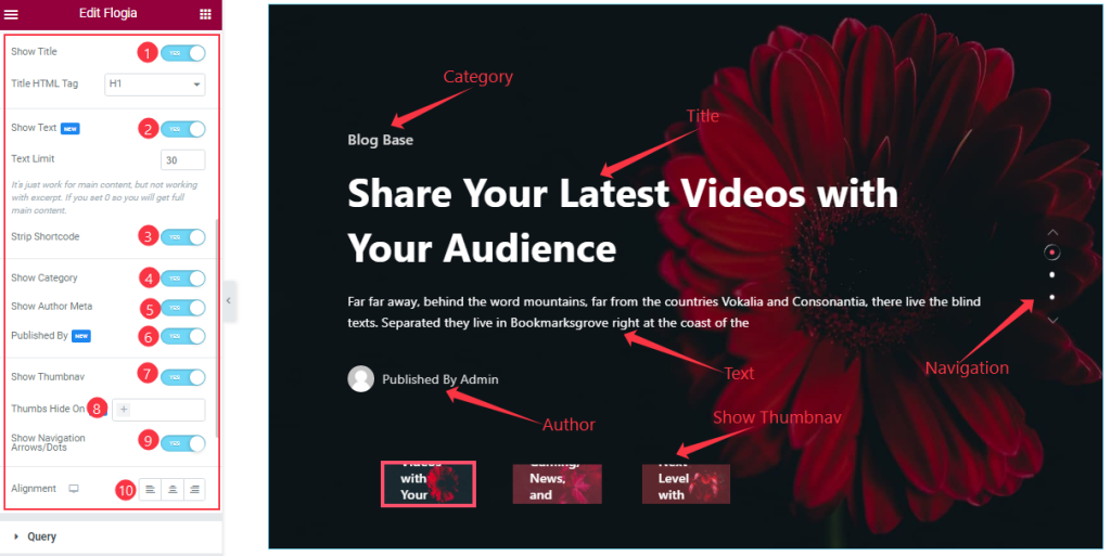
Here you will get the Show Title, Show Text, Strip Shortcode, Show Category, Show Author Meta, Published By, Show Navigation Arrows/Dots, and Show Thumbnav switchers which you can turn on/off to show/hide these elements from the slider. you also edit the Text Limit, and Button Text, and you can easily show/hide the Thumbnav on your Devices like Desktop, tablet, and Moble as your wish. If you enable the ‘strip shortcode‘ option, then shortcode content will be removed from your slider content. Here you can set Alignment for the best text position for your text content.
Query Section Customizations
Go to the Content tab > Query
This section works for setting the source location of data that you need to display by references like Posts, Pages, Authors, Categories, Tags, and Formats. The references can be different in accordance with the source location.
Step-1
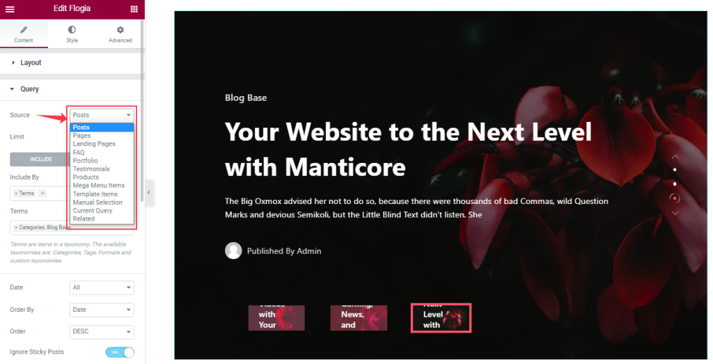
Go to Query > Source
Here you can easily select the Source that you create to see on your slide.
Step-2
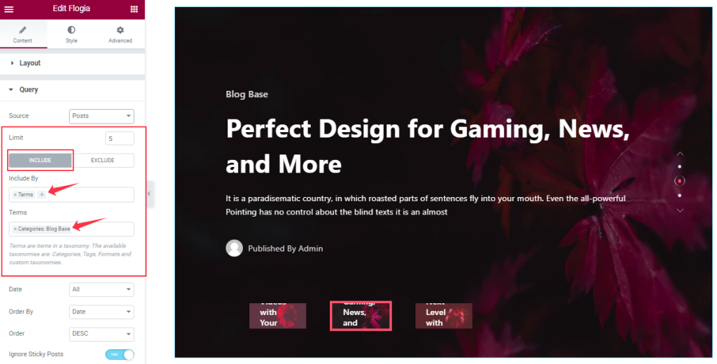
Here you can set your post limit as you need. Here Also, you can see your posts under certain Terms And Conditions by Include filter.
Step-3
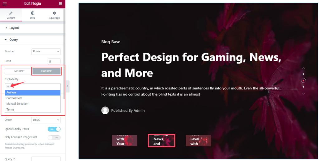
You can hide the selected posts by using the Exclude filter. Actually, this works the opposite of the Include filter.
Step-4
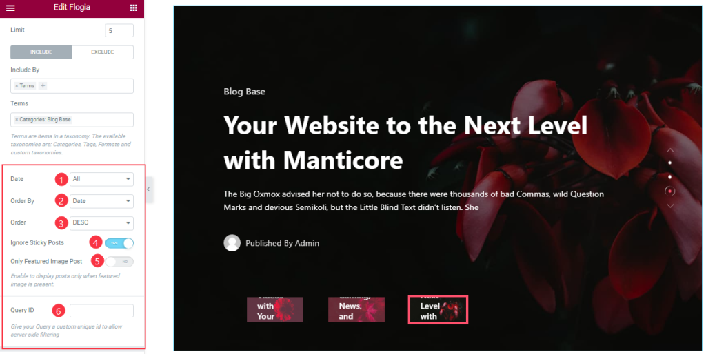
Order By and Order controls are here to arrange the data you want to display through Random, Title, Date, or Menu order wise and also with ascending or descending order.
Here you can also see more two switcher options (Ignore Sticky Posts, Only Featured Image Posts), and anybody can easily On/Off them. If you are on the two switcher buttons then The Sticky posts will be Ignored and The Only Featured Image posts will appear on your slide. Here you also set the Query ID that gives your Query a custom unique ID to allow server-side filtering.
Slider Settings Section Customization
Go to the Content tab > Slider Settings
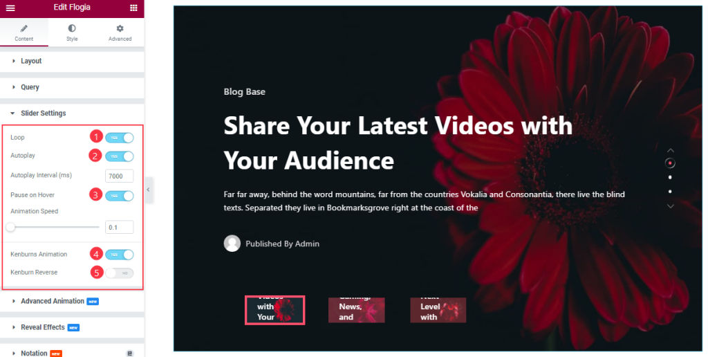
Here you will be able to see some Switchers that are Auto Play, Pause on Hover, Loop, Kenburns Animation, and Kenburns Animation Reverse. You can easily enable or disable those switcher buttons to apply specific effects. Also, you can customize the Autoplay Interval and Animation Speed for the slider.
Autoplay switcher: Enable the switcher to make the slider slide Automatically with a customizable Autoplay Speed control.
Pause on Hover: If turned on, when you Hover your mouse cursor on the slider then your slider will Hold, otherwise, your slider will Autoplay.
Loop: You can easily enable or disable the switcher button. When you activate the Loop switcher button your slider will loop at a certain time interval. You can also set up the loop animation speed here.
Kenburns Animation: Kenburns Animation is the most attractive Animation effect for the widget. if you enable the switcher button then your post Image will appear like a zoom-in/zoom-out animation that makes your post image Awesome.
Advanced Animation Section Customizations
Step-1
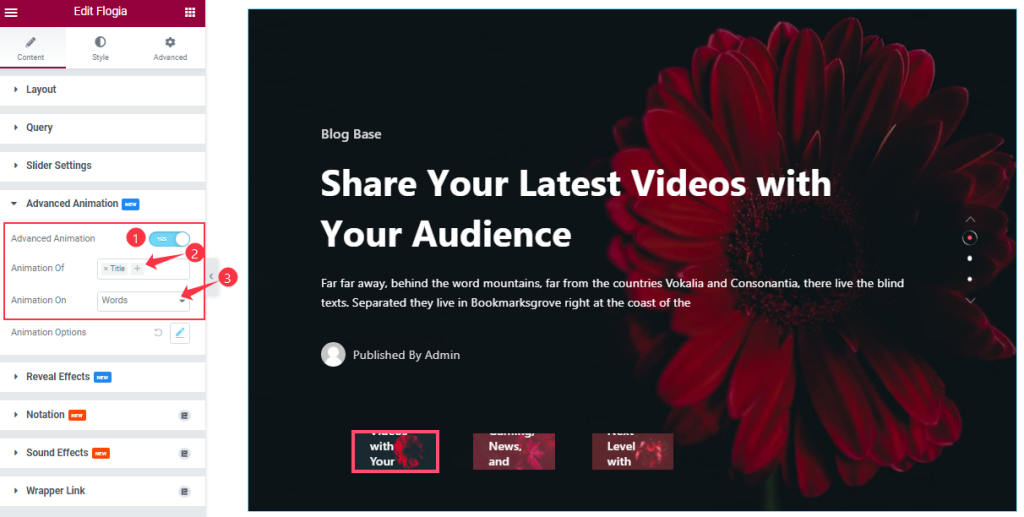
Go to the Content tab > Advanced Animation
Come to the Advanced Animation section, you can easily on/off the switcher button to show/hide the Animation Effect. If you are on the Switcher button then you can add the Animation of Title, Sub Title, and Excerpt. Also, you can select the Animation for Words, Chars, and Lines like the screenshot.
Step-2
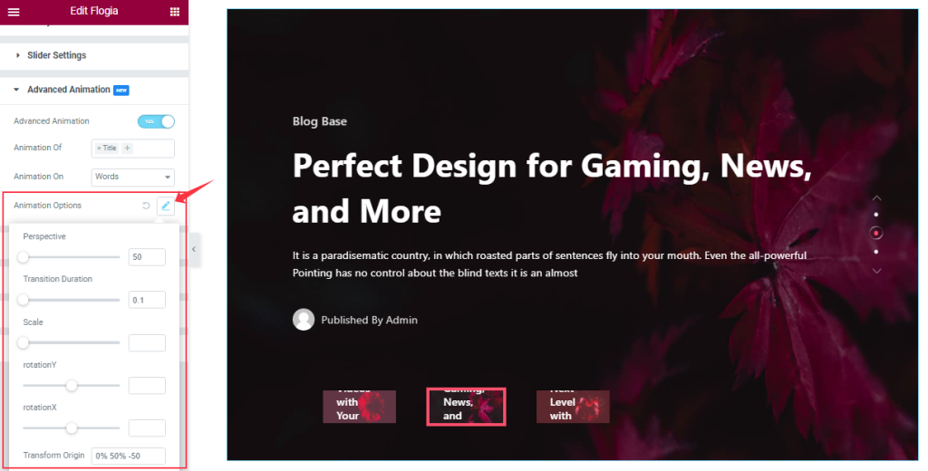
Here you can customize the Animation Options as your working demand That we have shown in the screenshot.
Work With The Style Tab
Style The Sliders Section
Step-1
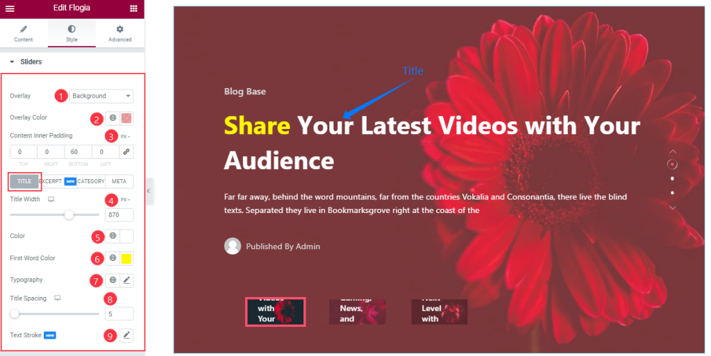
Go to the Style Tab > Sliders
Come to the Sliders section, you can change the Overlay Type, and Overlay Color as your wish like the screenshot. In Title mode, you also change the Title Color and First-word Color. If you want then you can add the Text Stroke, Typography, and adjust the Content’s Inner padding, Title Spacing, and Title Width from here.
Step-2
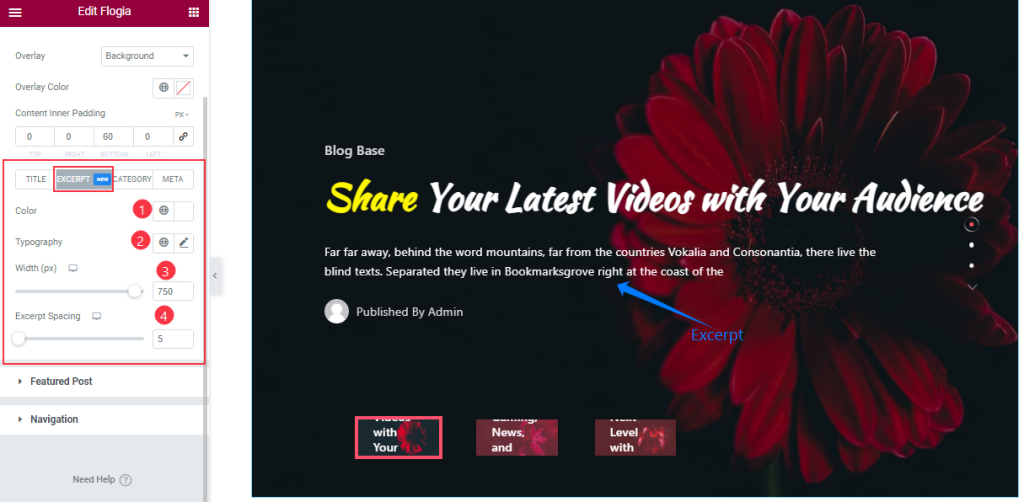
By clicking the Excerpt tab, you can change the Excerpt Color, and Typography, and set the Excerpt Width, and Spacing according to your slider.
Step-3
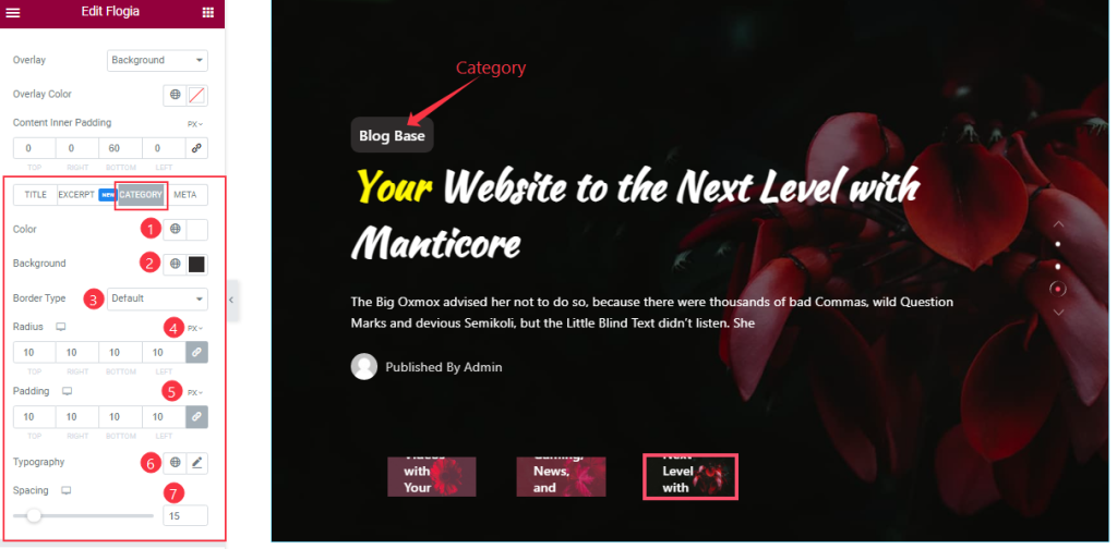
In the Category section, you can change the Category Color, Background Type, and Border Type like before and adjust the Border Radius, Padding, and Spacing as you wish. Here you will add the Typography to your working demand.
Step-4
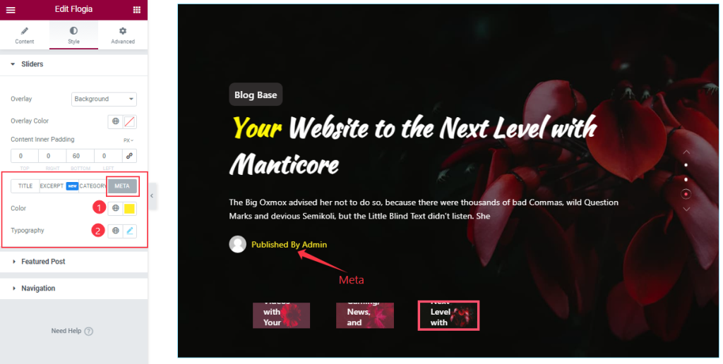
Here you can change the Meta Color and set the Typography like the screenshot.
Featured Post Section Customizations
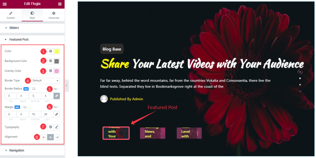
Go to the Style Tab > Featured Post
In This section, you can change the Featured Post Color, and Background Color, Overlay Color as your working demand, and the other customization options are the same as before.
Work with the Navigation Section
Step-1
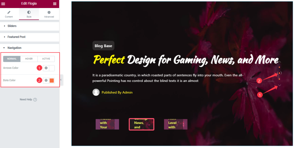
Go to the Style Tab > Navigation
In Normal Mode, you will get the option to change the Arrow’s Color, and Dot’s color like in the above screenshot.
Step-2
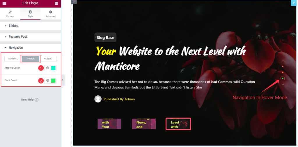
In Hover Mode, you also get the same options to customize the Navigation section like Normal mode. so please follow the above screenshot.
Step-3
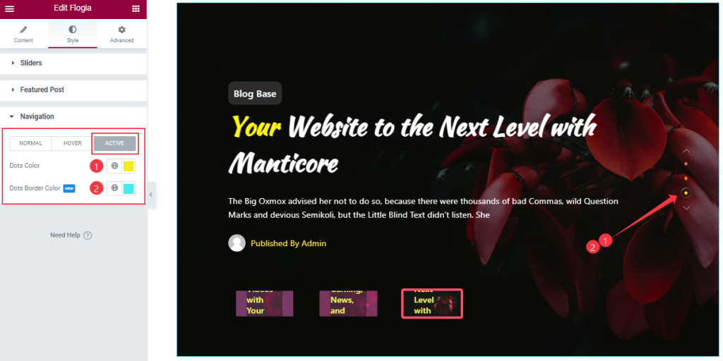
In Active Mode, you also change Dots Color, and Dots Border Color as your wish.
All done! You have successfully customized the Flogia Slider widget on your website.
Video Assist
You can watch this quick video to learn more about the Flogia Slider widget. Please visit the demo page for examples.
Thanks for staying with us.