

In this documentation, we will discuss the customization of the Member widget, brought to you by the Element Pack Lite addons.
Insert Member Widget
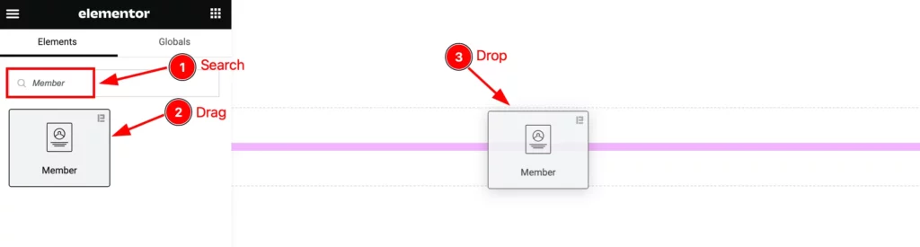
Open your page in the Elementor editor, search by the “Member” widget name, and then drag-drop it on the page.
The default view of the Member Widget
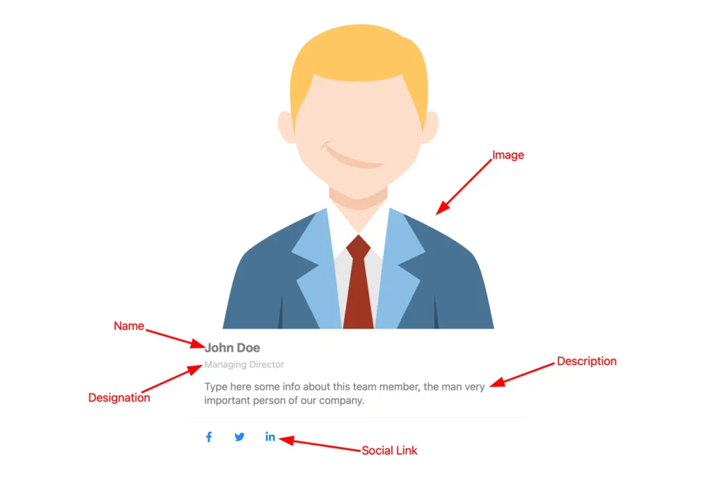
The Member widget displays the Image, Title, Role, Description, and Social Link.
Content Tab Customization
Layout section
Go to Content > Layout
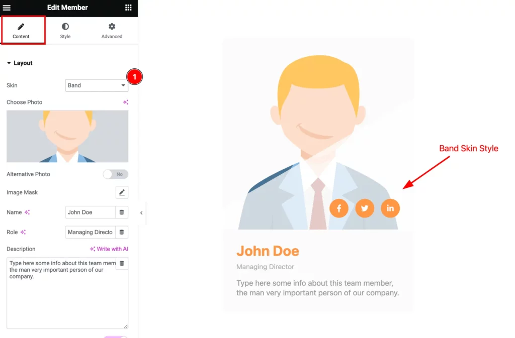
Find the Skin option and select any. Different skin appears in different visual styles.
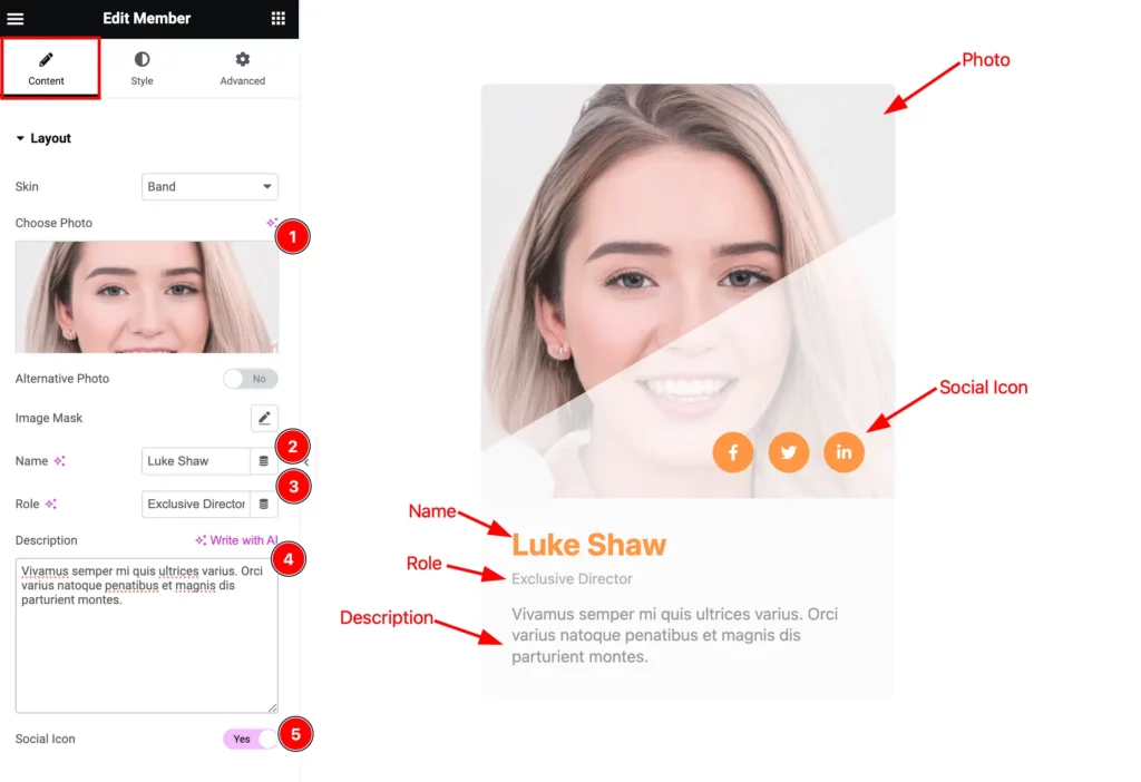
Then find the Choose Photo, Image Mask, Name, Role, Description, and Social Icon options.
Social Icon Section
Go to Content > Social Icon
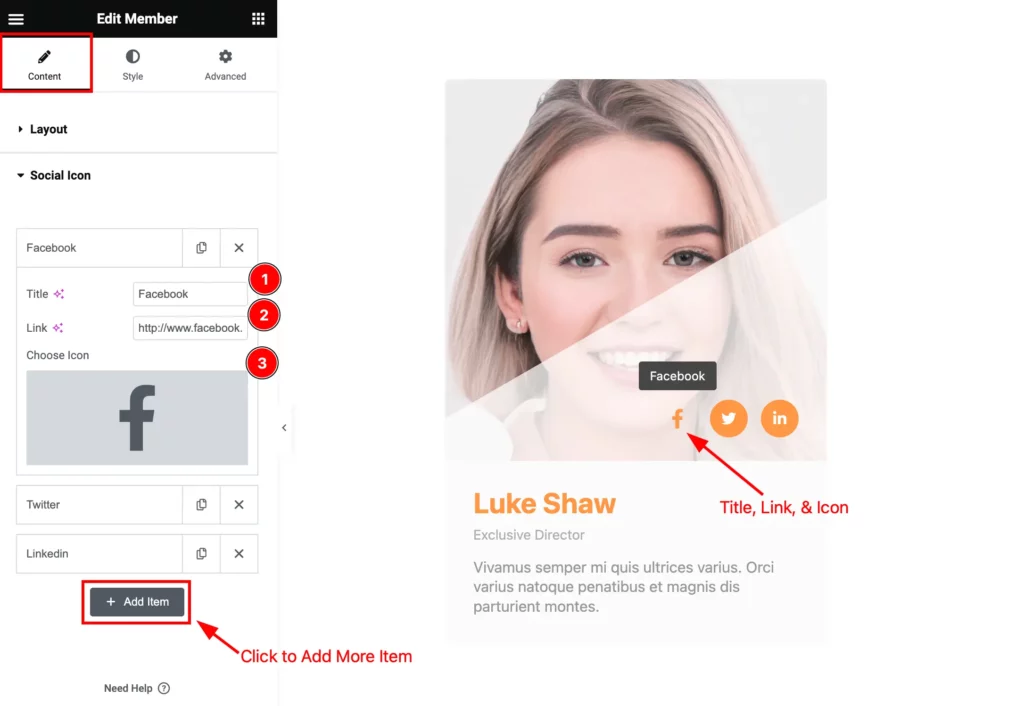
Find the Title, Link, and Choose Icon options. Click the ” + Add Item ” button to add more social icons.
Style Tab Customization
Member Section
Go to Style > Member
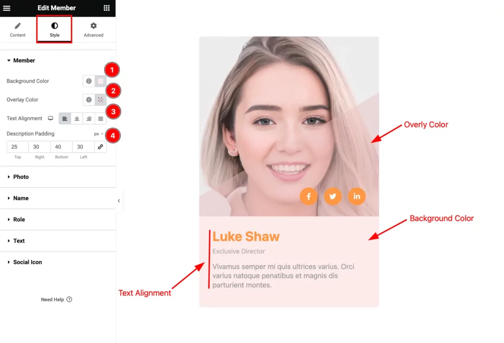
Find the Background Color, Overlay Color, Text alignment, and Description Padding options.
Photo Section
Go to Style > Photo
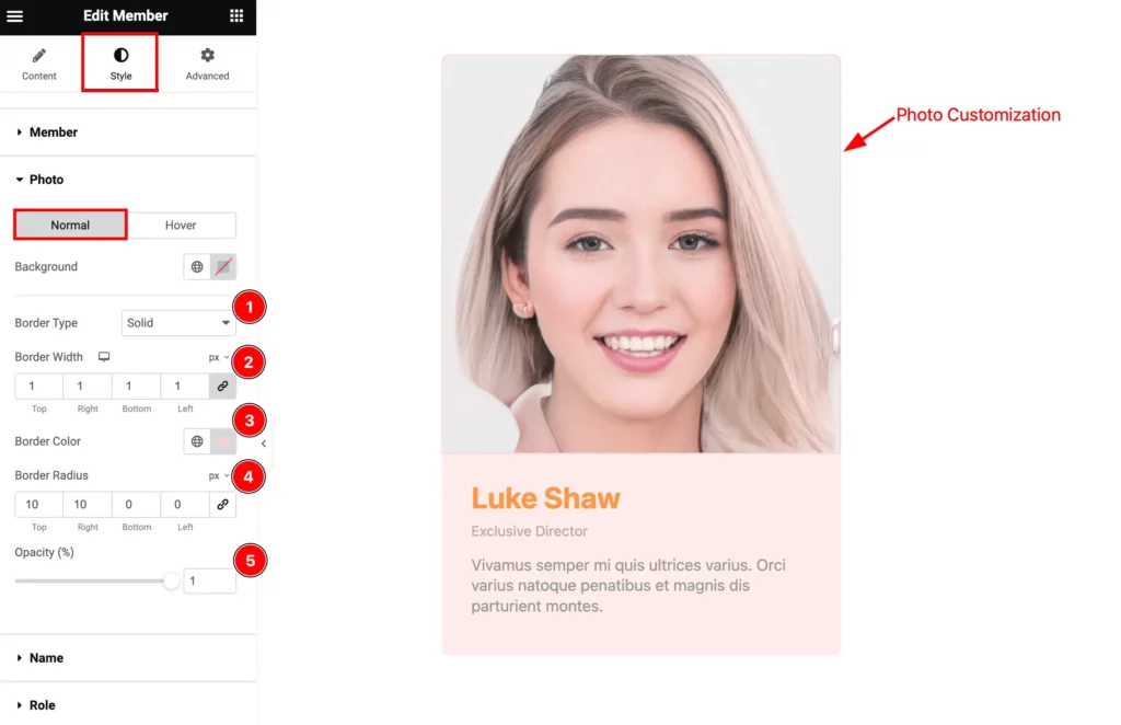
Find the Background, Border Type, Border Width, Border Color, Border Radius, and Opacity options.
Name Section
Go to Style > Name
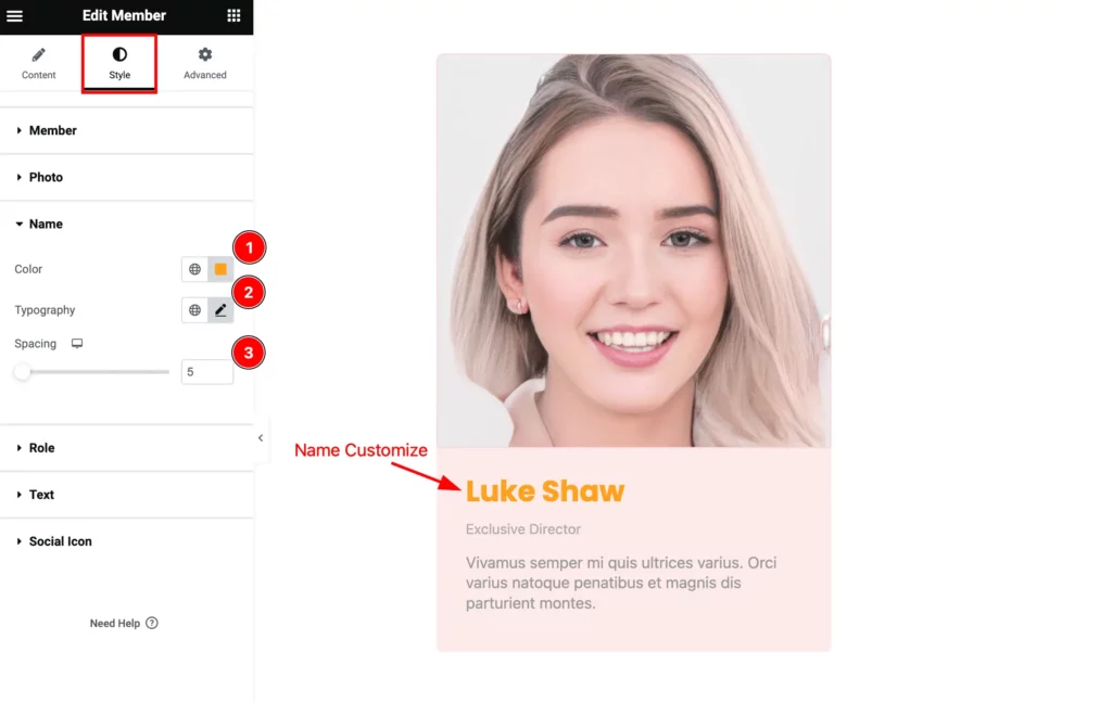
Find the Color, Typography, and Spacing options.
Role Section
Go to Style > Role
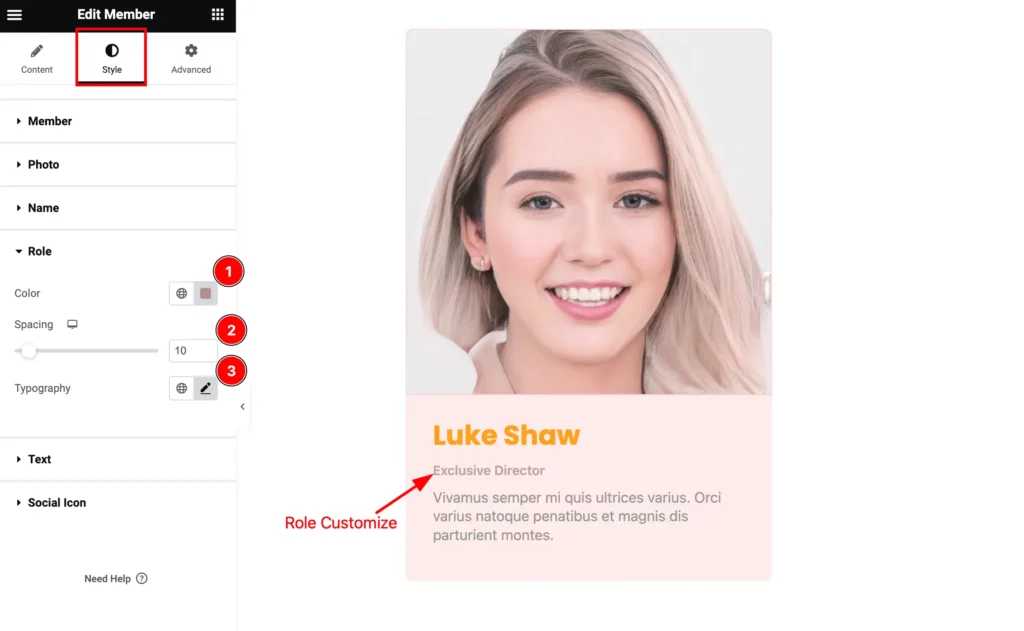
Find the Color, Spacing, and Typography options.
Text Section
Go to Style > Text
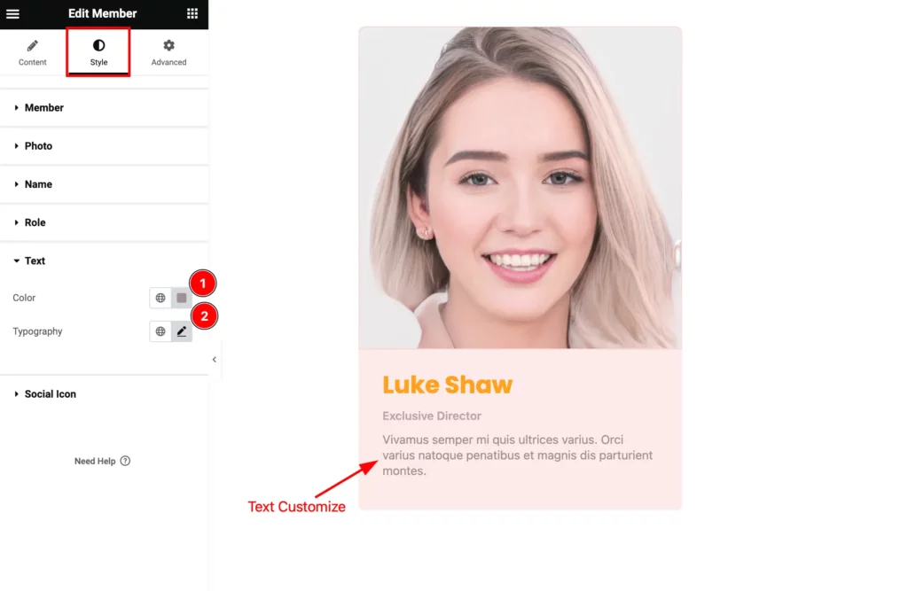
Find the Color and Typography options.
Social Icon Section
Go to Style > Social Icon
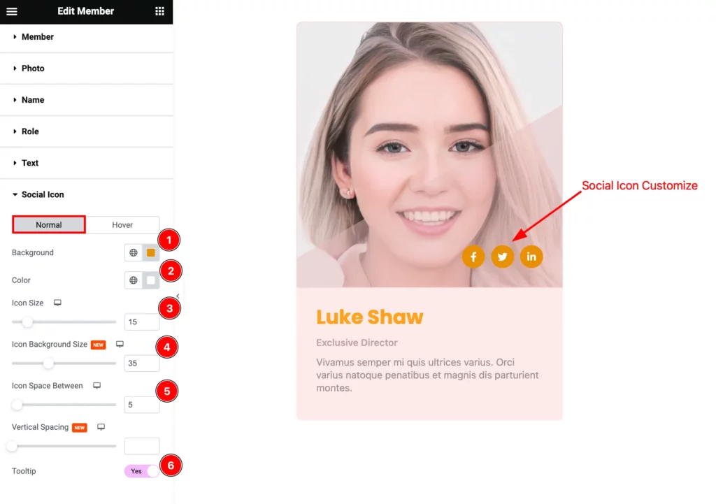
Find the Normal > Background, Color, Icon Size, Icon Background Size, Icon Space Between, Vertical Spacing, and Tooltip options.
Video Assist
You can watch the Member widget video tutorial above. Please visit the demo page for examples.
Thanks for staying with us.