In this documentation, we will show you how to customize the Webhook Form widget presented by the Element Pack Pro add-on.
Enable Webhook Form widget
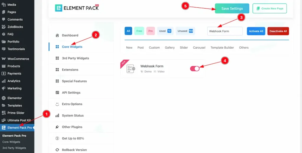
To use the Webhook widget from Element Pack Pro, first, you have to enable the widget.
- Go to WordPress dashboard > Element Pack Pro Plugin dashboard.
- Then, Click the Core Widgets Tab.
- Search the Webhook Form Widget Name.
- Enable the Webhook Form Widget.
- Hit the Save Settings Button.
Insert Webhook Form widget
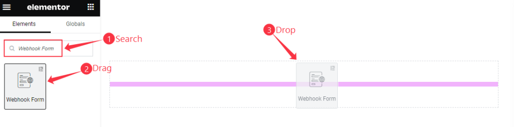
- Search by the Webhook Form widget name.
- The widget will appear, Check the Element Pack Pro logo on top right corner.
- Select the widget then Drag and Drop it on the editor page.
Content Tab Customization
Connection Settings
Go to Content > Connection Settings
When Connection Type- Webhook URL
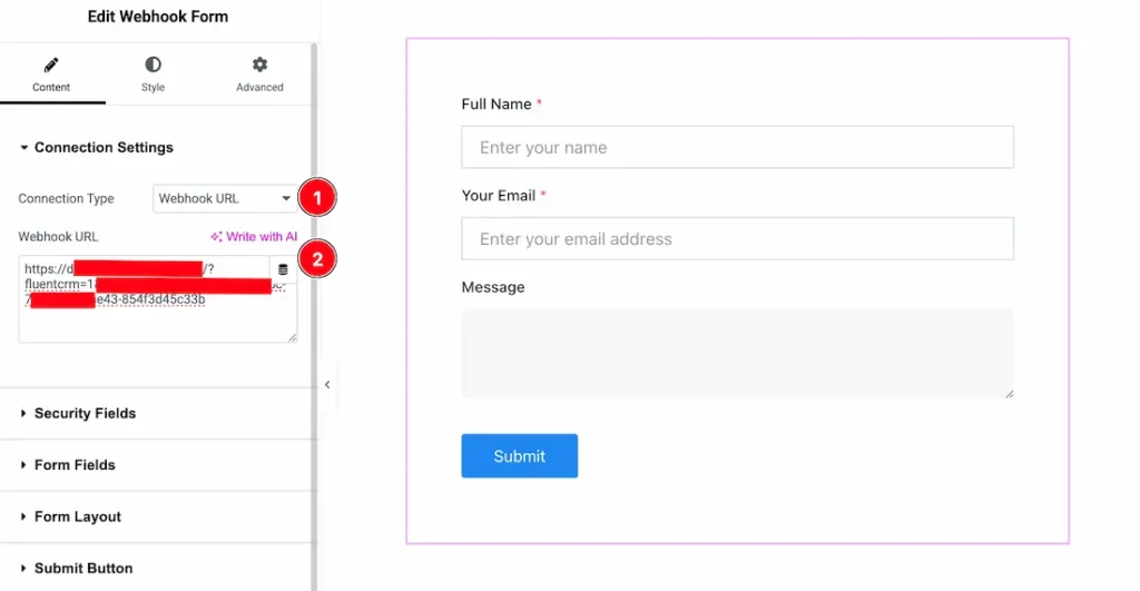
Go to the Connection Settings section, where you will find two connection types: Webhook URL and Google Sheets. Let’s explore the Webhook URL option.
- Connection Type: Select Webhook URL as the connection type.
- Webhook URL: After selecting Webhook URL, an input field will appear. Enter your webhook URL in the field and click the Update button to save the changes.
When Connection Type- Google Sheets
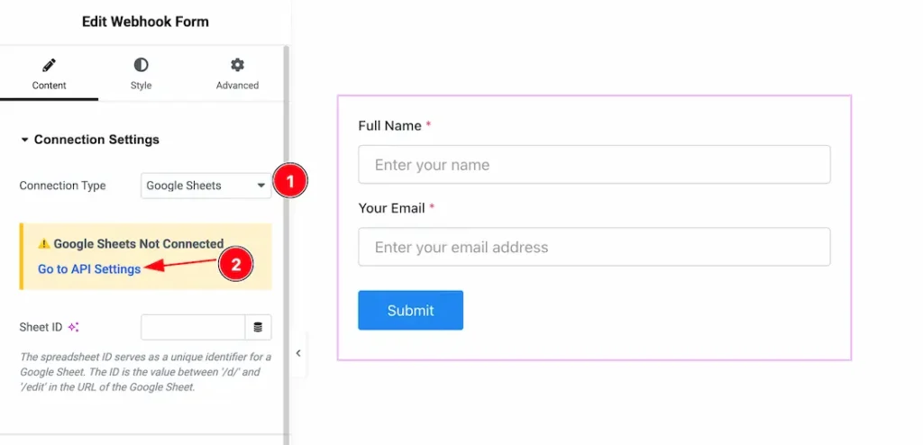
- Connection Type: Select Google Sheets as the connection type.
- After selecting Google Sheets, you will see a notification message (as shown in the screenshot). To access this feature, you need to set up the Google Sheets Client ID and Client Secret first.
Guide to Connect and Adding Google Sheets API Key and Client ID
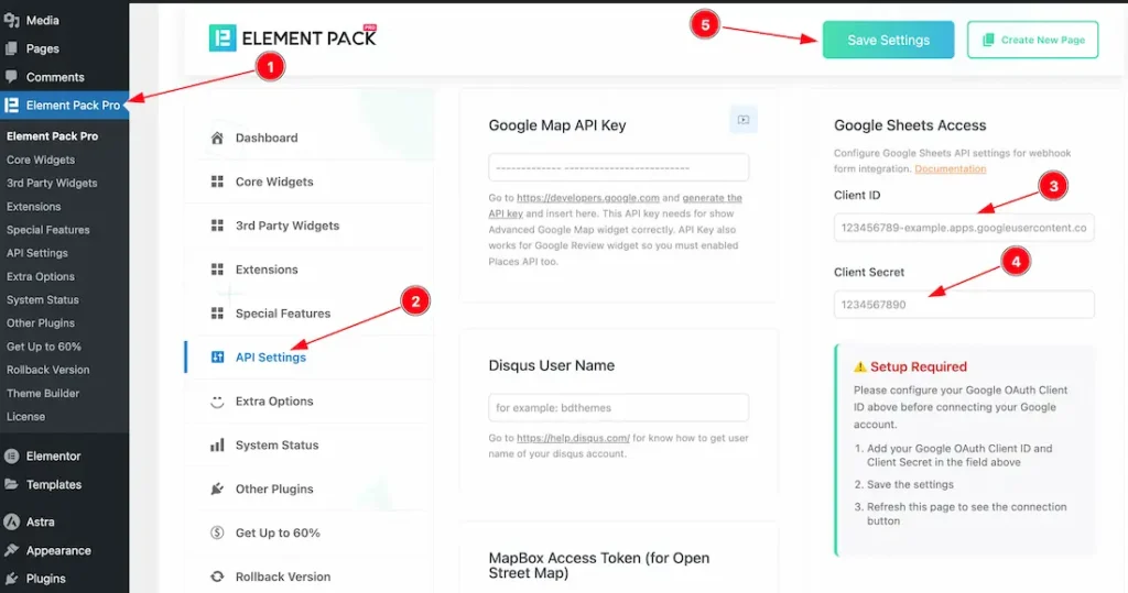
To set up the Google Sheets Client ID and Client Secret, follow these steps:
- Open the Element Pack Pro plugin dashboard.
- Go to the API Settings section.
- In the Google Sheets Access area, enter your Client ID in the Client ID field.
- Enter your Client Secret in the Client Secret field.
- Click the Connect to Google Sheets button to link your Google Sheet with the Webhook widget.
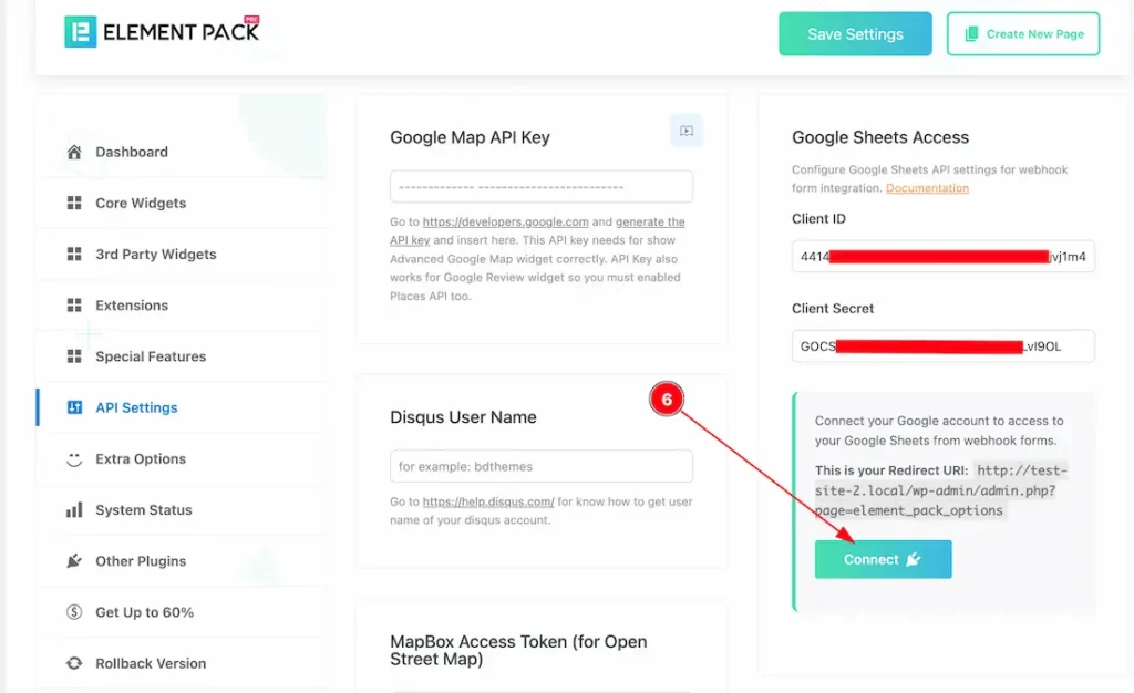
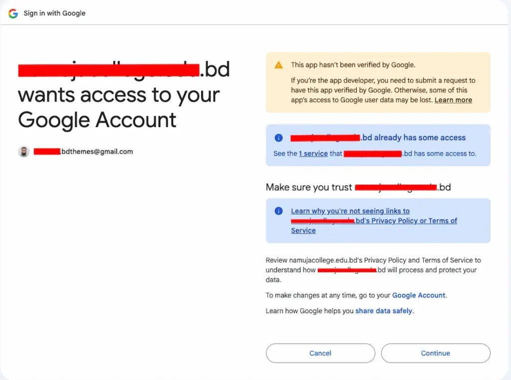
6. After entering all the required information, click the Connect button. You’ll then be redirected to your Google account to complete the Google Sheets setup.
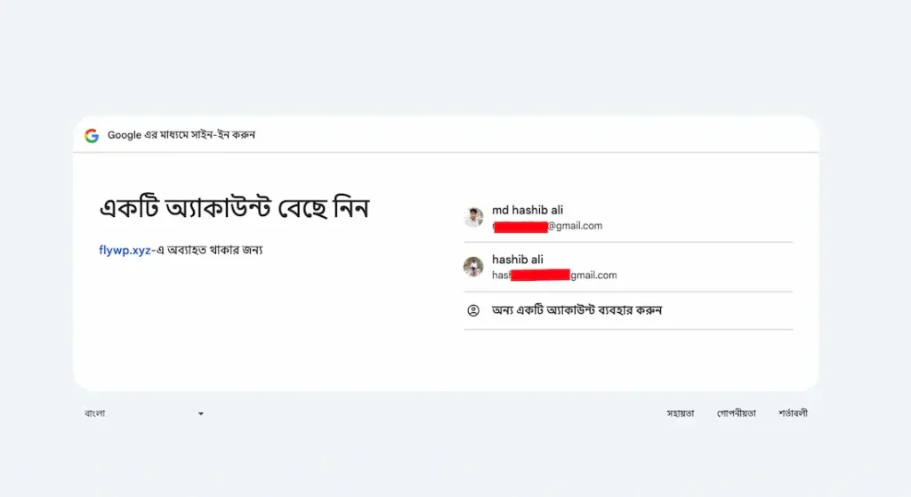
After clicking the Connect to Google Sheets button, you will be prompted to select the Gmail account that contains your Google Sheets. Simply choose your Gmail account to proceed.
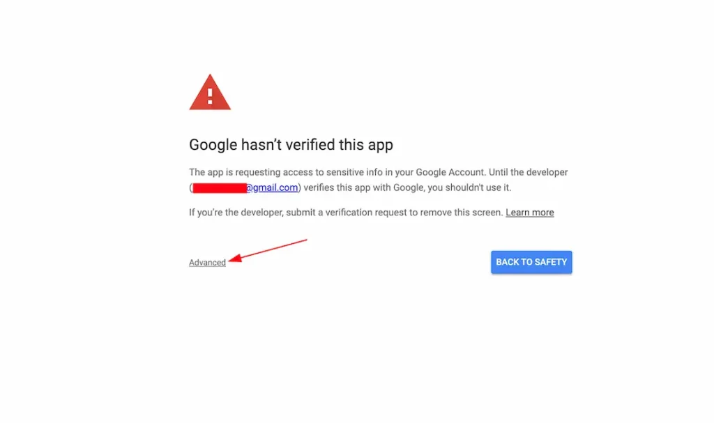
After choosing the gmail account, Just click on the Advanced button to proceed the next steps.
Note: If your apps is varified then you will not get the above and below attached screenshot wizard on your screen. You’ll be redirected directly to the next step.
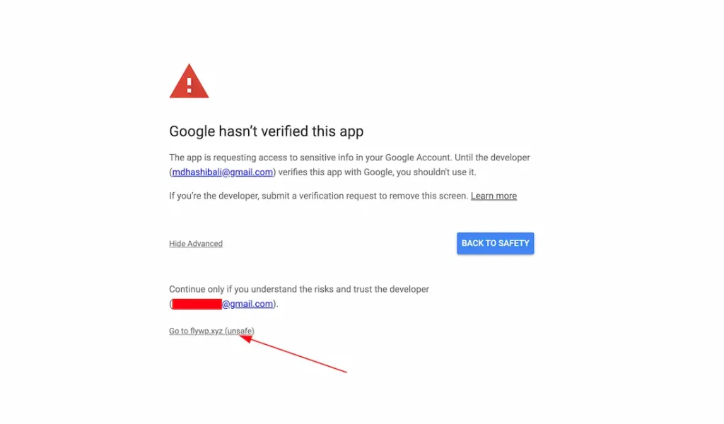
After that, just click on your connected site button.
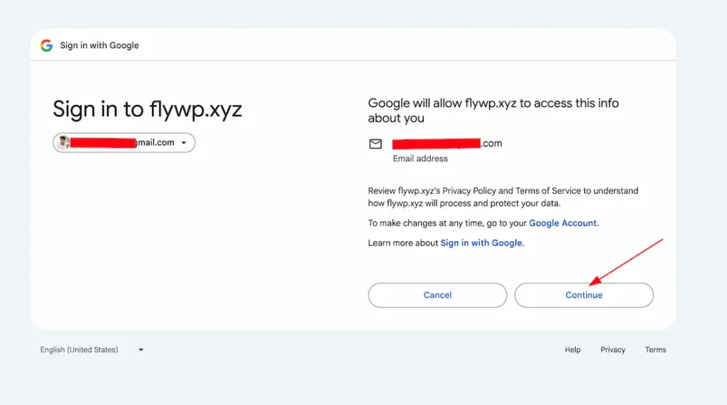
After that, click on the continue button go to the next step.
Simply click the Continue button to grant Google Sheets access to your Gmail account.
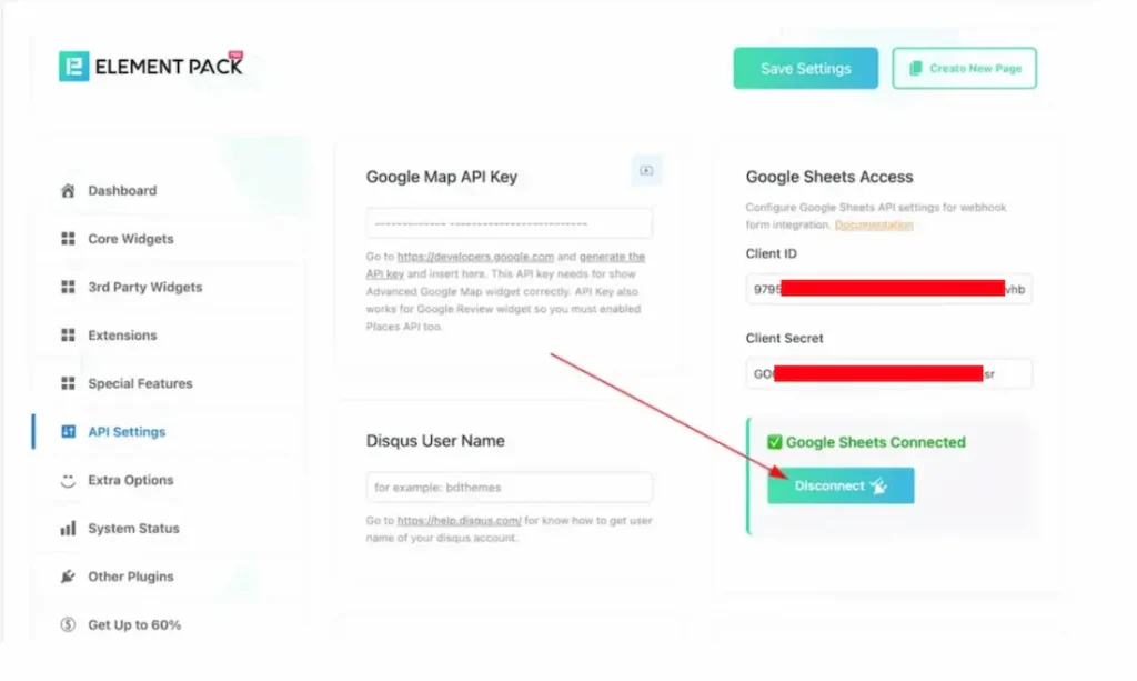
After connecting the sheet, the disconnect button will appear.
Set the Google Sheet ID in the Webhook Form Widget
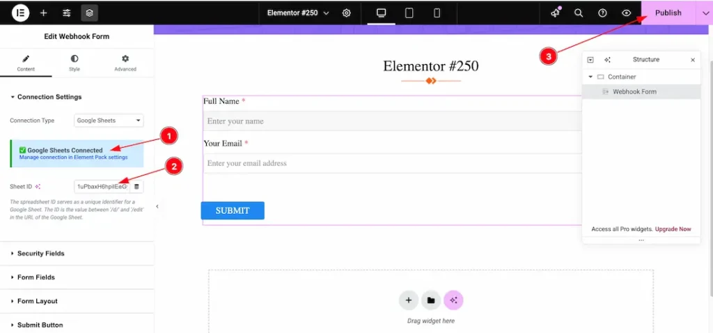
- After connecting Google Sheets with the Webhook widget, a notification message will appear (as shown in the screenshot).
- Set Google Sheet ID: Once connected, just set the Google Sheet ID, where you want to store your webhook email information.
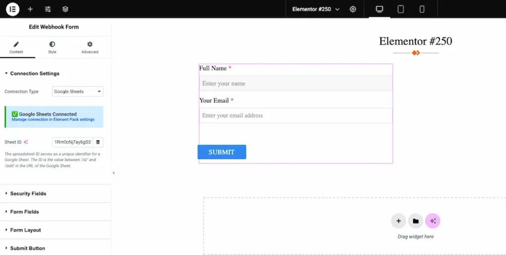
After selecting your Google Sheet, fill out the form and click the Submit button. A submission success message will then appear on your screen.
Collecting Form Data from Your Selected Google Sheet
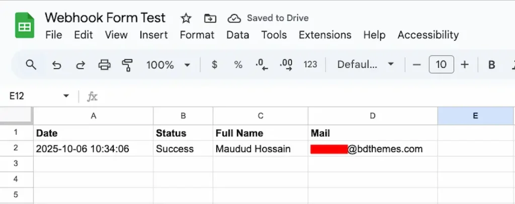
Just go to your Google sheets and open your selected google sheet to collect or view your form submitted data.
How to Create Google Sheet Client ID and Client Secret ID For Google Sheets access
In this documentation, we will guide you through the process of creating an Element Pack Pro Google Sheets Client ID and Client Secret ID for Google Sheets access. Just follow the documentation from here.
Security Fields Section
Go to Content > Security Fields
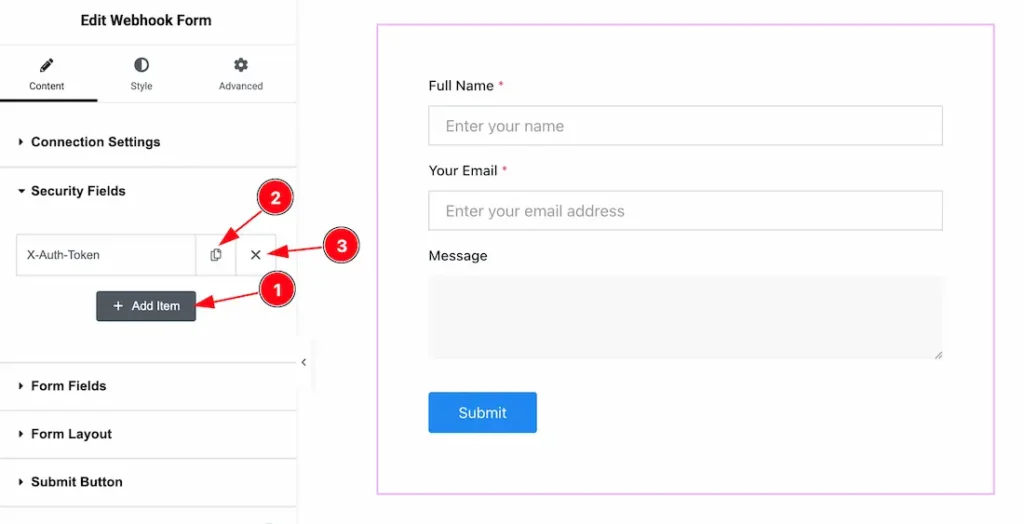
- Add Item: You can easily add the Security Item to click on the add item button.
- You can duplicate the item from here.
- You can remove the item to click on the cross icon.
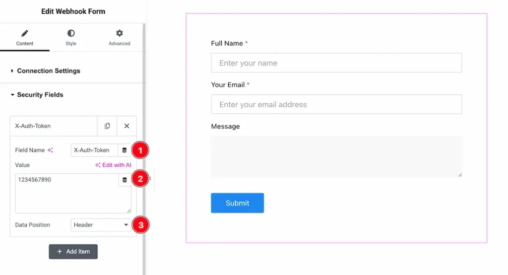
1. Field Name: This option lets you change the Security Field Name.
2. Value: The Value field is where you define the actual data (token, key, secret, etc.) that is required for secure communication between your form and the server. Without it, the webhook or API request may fail authentication. It allows you to manually set a fixed value that will always be sent with the form.
3. Data Position: You can set the Data Position as- Header and Body.
Form Fields Section
Go to Content > Form Fields
Content
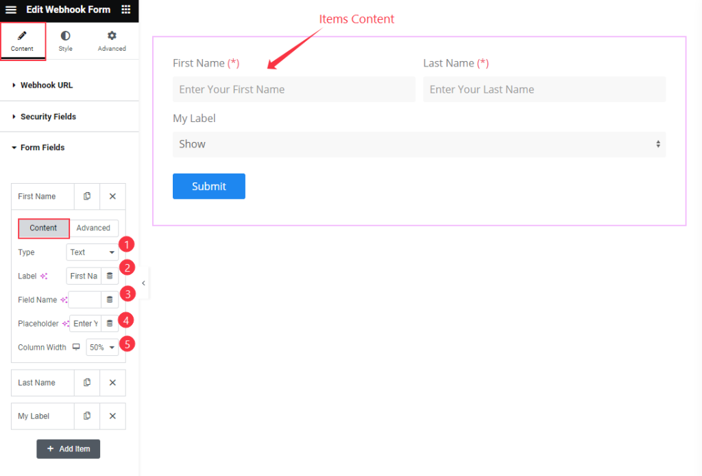
- Type: Set the type for the item. Select the Text.
- Label: Set the label for the fields.
- Field Name: Set the Fields Name.
- Placeholder: Set the placeholder for the items.
- Column Width: Set the width for the Column.
Advanced
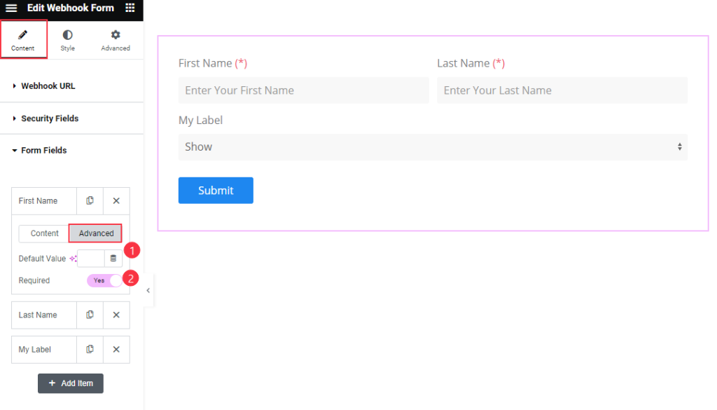
- Default Value: Select the default value for the fields items.
- Required: Enable the switcher to make it required.
Choose the Select Forms
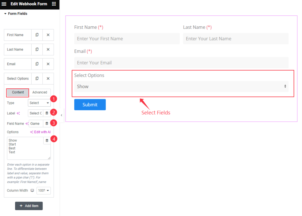
- Type: Choose the Select type for select options.
- Label: Set the label for it.
- Field Name: Set the fields name.
- Options: Set the options for the Select items. Use the Pipe ” | ” symbol for the item and value.
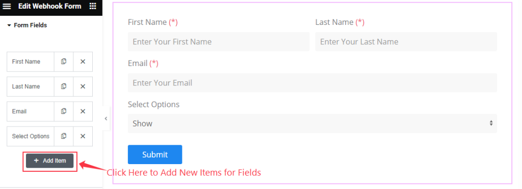
To add new Form Fields click on the “ + Add Item ” button.
Form Layout Section
Go to Content > Form Layout
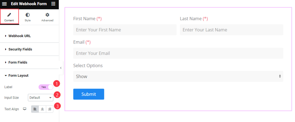
- Label: Enable the switcher to show the Label for forms layout.
- Input Size: Set the size for the input button.
- Text Align: Set the alignment for the Text Left, Center, Right.
Submit Button Section
Go to Content > Submit Button
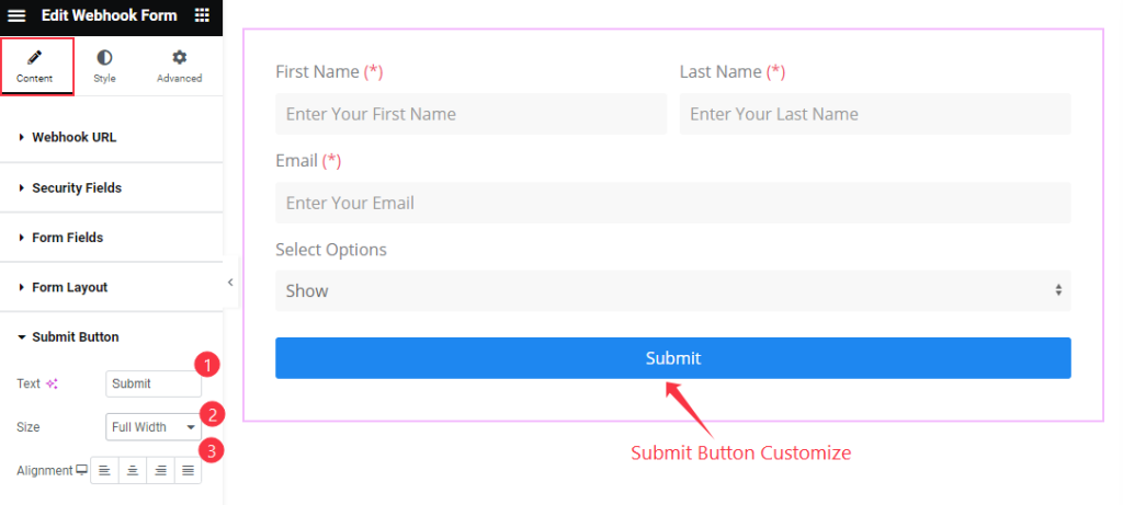
- Text: Set the text for the Submit Button.
- Size: Set the size for Button Small, Medium and Full width are available.
- Alignment: Choose the alignment for the button position left, centre, right, justified.
Style Tab Customization
Form Style Section
Go to Style > Form Style
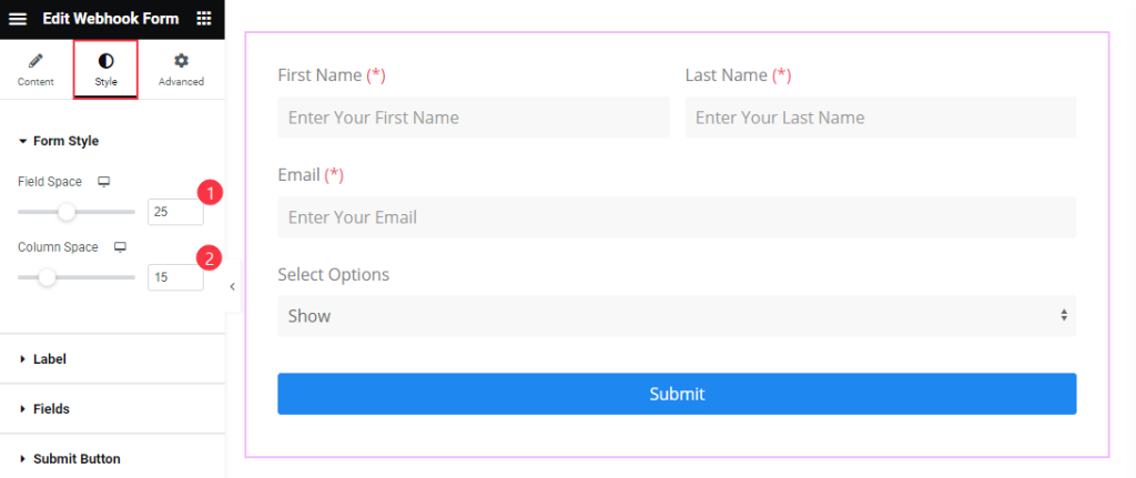
- Field Space: Set the space between the Fields.
- Column Space: Set the space between the Columns.
Label Section
Go to Style > Label
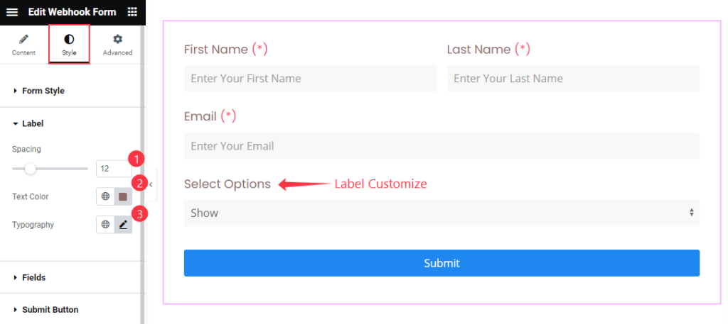
- Spacing: Set the spacing for the Label spacing.
- Text Color: Set the color for the Text.
- Typography: Set the typography for the Label.
Fields Section
Go to Style > Fields
Normal
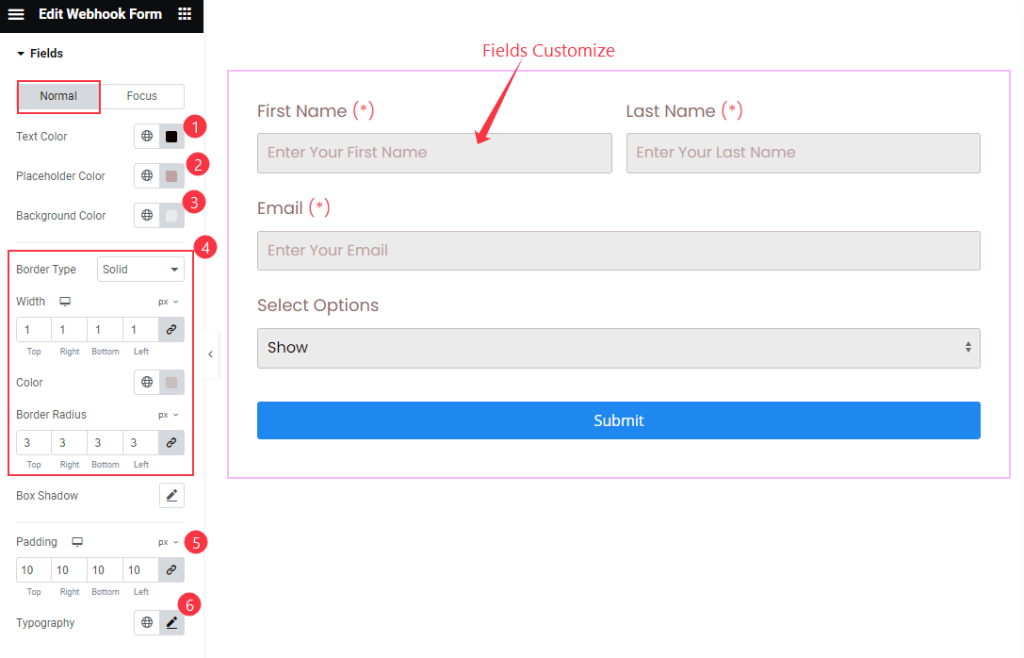
- Text Color: Set the Text Color for the Fields Items.
- Placeholder Color: Set the placeholder color.
- Background Color: Set the background color.
- Border
- Border Type: Set the border type for the fields.
- Width: Set the width for the Fiedls.
- Color: Choose the color for it.
- Border Radius: Make the border Radius.
- Padding: Set the padding for the background.
- Typography: Set the typography for the fields.
Focus
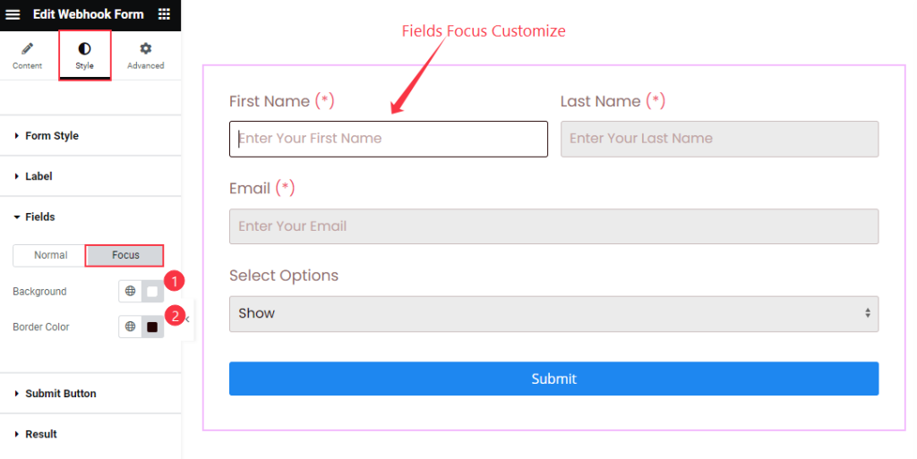
- Background: Set the background color for the text.
- Border Color: Set the border color for Focus Item.
Submit Button Section
Go to Style > Submit Button
Normal
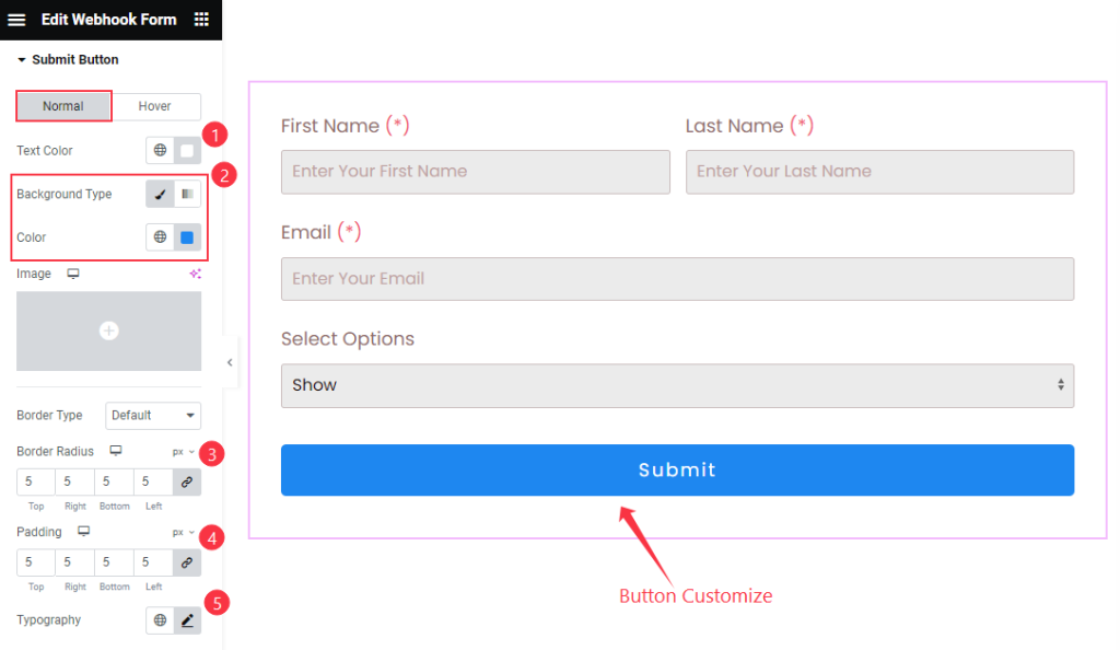
- Text Color: Choose the Text Color for the Submit Button.
- Background Type: Set the Background type color and choose the color.
- Border Type: Select the border type.
- Border Radius: Make the border Radius.
- Padding: Set the padding for the button.
- Typography: Select the typography for the button.
Hover
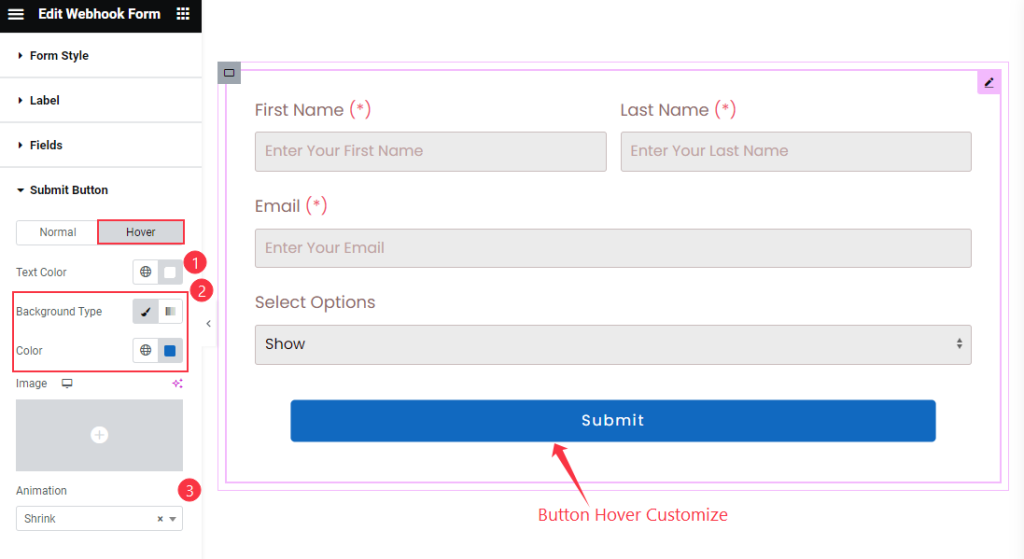
- Text Color: Choose the Text Color for the button.
- Background Type: Select the background type.
- Animation: Set the animation for the button.
Results Section
Go to Style > Results
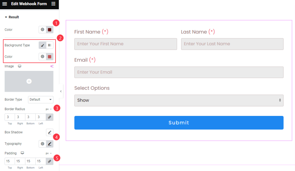
- Color: Choose the color for the Result
- Background Color: Select the background Color.
- Border Type: Choose the border type.
- Border Radius: Make the border Radius.
- Box Shadow: Set the shadow for the box.
- Typography: Choose the typography of the results.
- Padding: Set the padding.
Video Assist
The Webhook Form Video Tutorial helps you to learn more about the widget. Please visit the demo page for examples.
Thanks for being with us.