

Atlas Slider is one of the best sliders to show the post item differently. It has a slider option with a sidebar. So let’s get started with it.
Inserting Atlas Slider
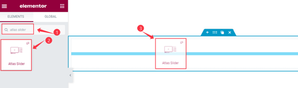
Inserting a widget is an easy task. Open the page in Elementor editor, search for the widget, and then drag the widget and drop it on the page.
Default view of the Atlas Slider
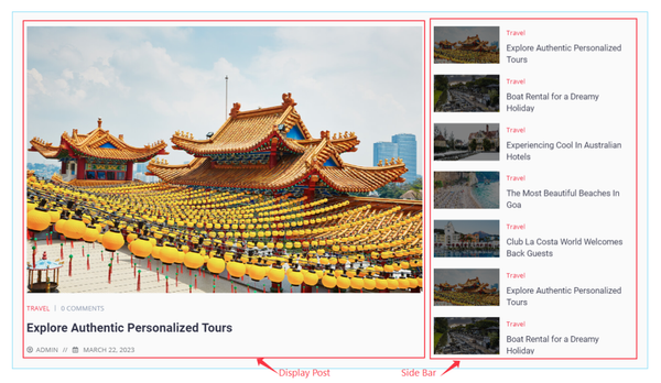
As you see in the screenshot above, this is the default view of the Atlas slider. Showing the Main post which slides, and the sidebar of the relevant category.
Explore the Content Tab of Atlas Slider
Layout Customization
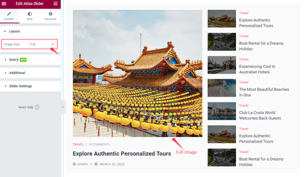
Go to Content > Layout
In the layout section has only one option, here you can select the Image Size option only.
Query Section Customization
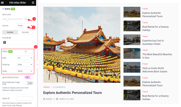
Go to Content > Query
In the Query section, You can set Item Limit and select Sources of the displayed items by the slider. Here you can select the Posts or other types that you want to show with the slider.
The Include filter lets you display only specific posts by their categories, tags, author, etc. Exclude filter is exactly the opposite.
Also, use sorting options such as Offset, Date, Order By, and Order.
Set Additional Settings
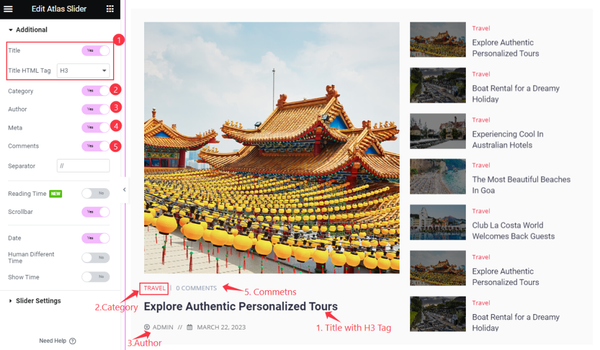
Go to Content > Additional
In the additional section, you will see several switchers enabled by default. We have enabled the Title with (H3) Heading Tag, Category, Author, and Comments for the posts.

Also selected Separator, enabled the Scrollbar on the right side, and Date. Other switchers are Reading Time, Human Different Time, and Show Time.
Set Slider Settings
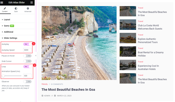
Go to Content > Slider Settings
Here, find the Autoplay, Autoplay Speed, Pause on Hover, Grab Cursor, Loop, Animation speed, and Observer options.
Customization with Style Tab
Play Button Customization
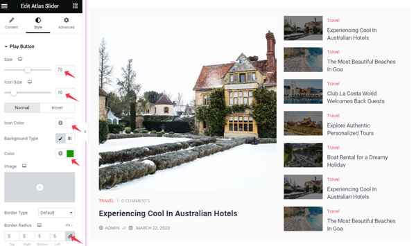
Go to Style > Play Button
Set Size, Icon Size, Icon Color, Background Color, Border, Border Radius, and Padding.
Note that, there are Hover options available for the colors.
Title Customization
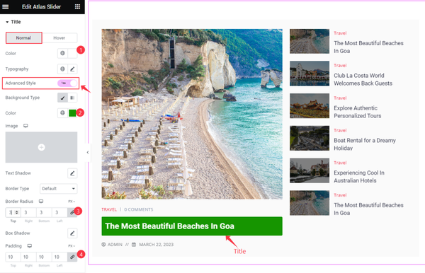
Go to Style > Title
Here, find the Color, Typography, and Advanced Style options.
Enabling the Advanced Style switcher shows more options to customize, such as the Background Type, Text Shadow, Border Type, Border Radius, Box Shadow, and Padding.
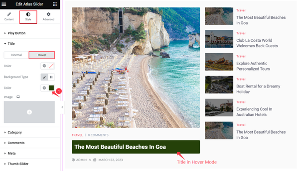
For hover, get Color and Background Color options.
Category Section Customization
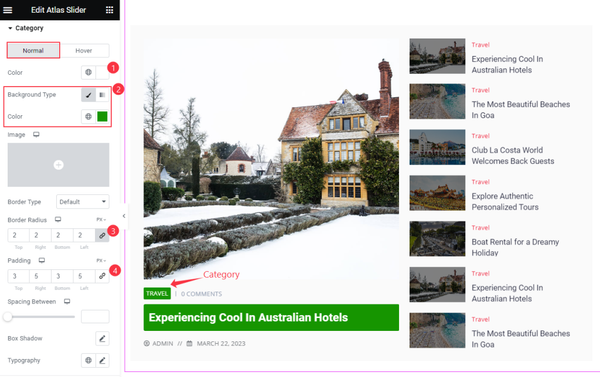
Go to Style > Category
To make the category stylish, you can set Color, Background Color, Border, Border Radius, and Padding for the category.
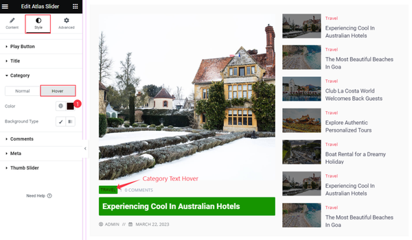
In the Hover mode, find Color and Background Color options.
Comment Section Customization
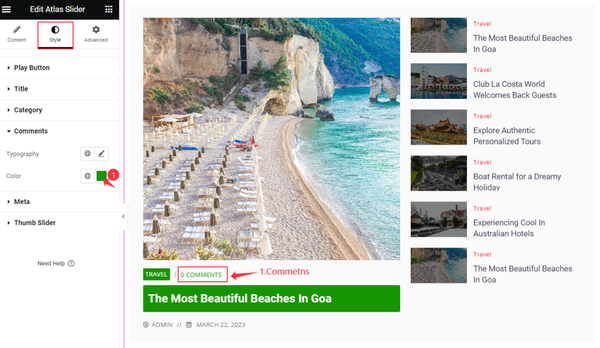
Go to Style > Comment
Set the Color and Typography for the comments text.
Meta Section Customization
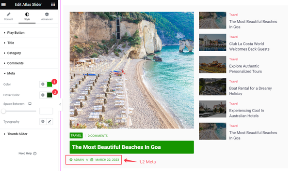
Go to Style > Meta
Set Color and Hover Color, Space Between, and Typography options.
Thumb Slider Customization
Go to Style > Thumb Slider
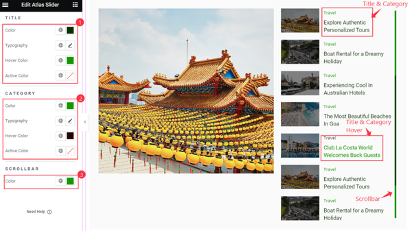
TITLE Style
Find Color, Typography, Hover Color, and Active Color options.
CATEGORY
Find similar options as the title above.
SCROLLBAR
Find Color option.
With all these options, you can effectively customize the Atlas slider widget.
Video Assist
For a better design concept, watch the video tutorial. Please visit the demo page for examples.
Thanks for being with us.