

In this documentation, we will discuss the customization of the Newsletter block, brought to you by Zoloblocks.
Enable the Newsletter Block
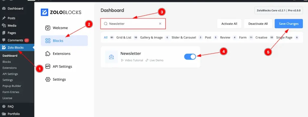
To use the Newsletter block from Zoloblocks, you must first enable the block.
- Go to WordPress Dashboard > Zoloblocks Plugin dashboard.
- Then Click the Blocks Tab.
- Search the Newsletter block Name.
- Enable the Newsletter block.
- Hit the Save Changes button.
Inserting The Block into the Editor
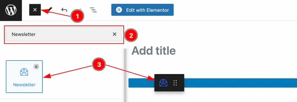
- Click the Toggle Block Inserter icon and a sidebar will appear on the left side, All the blocks will be visible here.
- Search the Newsletter Block Name inside the search Box. otherwise, select the Newsletter blocks ( with Zoloblocks logo T.R corner).
- Then Drag and Drop it on the page.
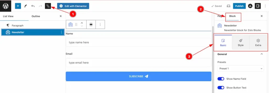
After Inserting the blocks, Follow this.
- Click on the Document Overviewer button and the Blocks list view will appear.
- After on the right side, Click on the Block.
- Here show all the control tabs( Basic, Style, Extra ) of a block.
Basic Tab Customization
The Basic tab controller displayed here offers the flexibility to adjust the layout of blocks according to your preferences.
General Section
Go to Basic > General
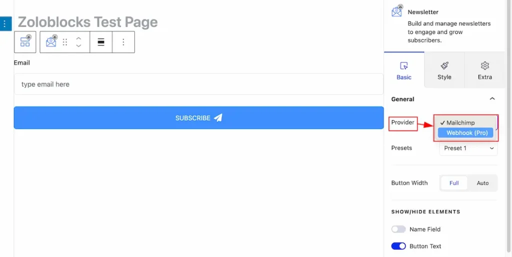
Provider: The Provider option allows you to choose between Mailchimp or Webhook for sending or receiving emails. Select the one that best fits your email handling needs.
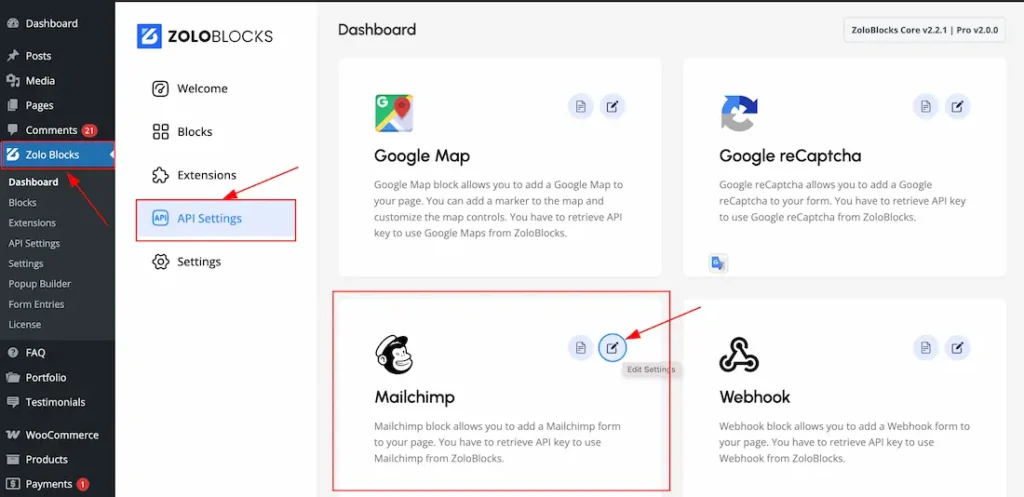
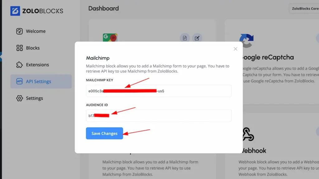
- Mailchimp: If you choose the Mailchimp for sending or receiving emails then you should need first to setup the Mailchimp Key & Audience ID. For that just go to your WP plugin dashboard > Zoloblocks plugin dashboard > API Settings > Set the Mailchimp Key & Audience ID. Please see the below screenshots-
For more details how to get the mailchimp key & audience ID then we request you to read the doc.
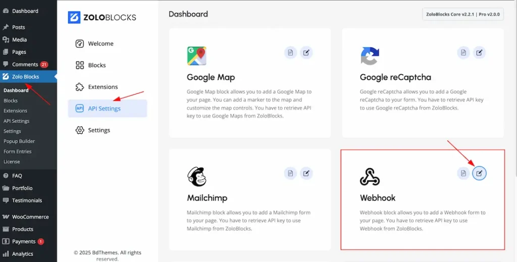
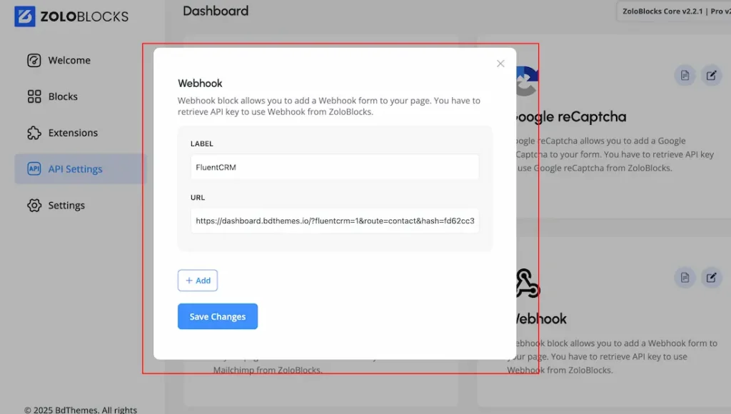
- Webhook: If you choose the Webhok for sending or receiving emails then you should need first to setup the Label & URL. For that just go to your WP plugin dashboard > Zoloblocks plugin dashboard > API Settings > Set the Label & URL. You can keep any text as Label but in the URL feild, you can keed any Webhook email platform supported URL. Please see the below screenshots-
Explore the Newsletter Presets & other features
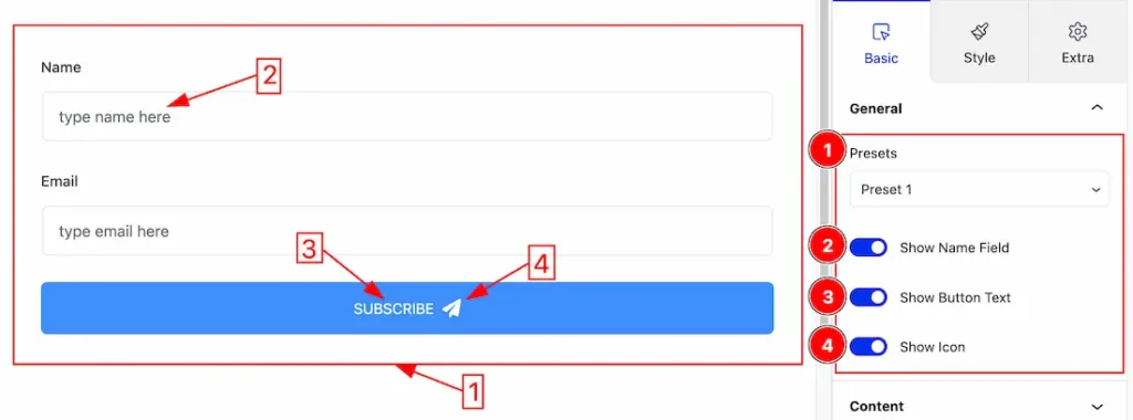
1. Presets: Actually, the Presets are pre-design Newsletter. Here we have 5 presets. You can choose any one of them. Here we set the Preset 1.
2. Show Name Field: Enable or Disable the Show Name Field switcher button to show or hide the Name Field on the Newsletter.
3. Show Button Text: Enable or Disable the Show Button Text switcher button to show or hide the Button Text on the Newsletter.
4. Show Icon: Enable or Disable the Show Icon switcher button to show or hide the Icon on the Newsletter button.
Content Section
Go to Basic > Content
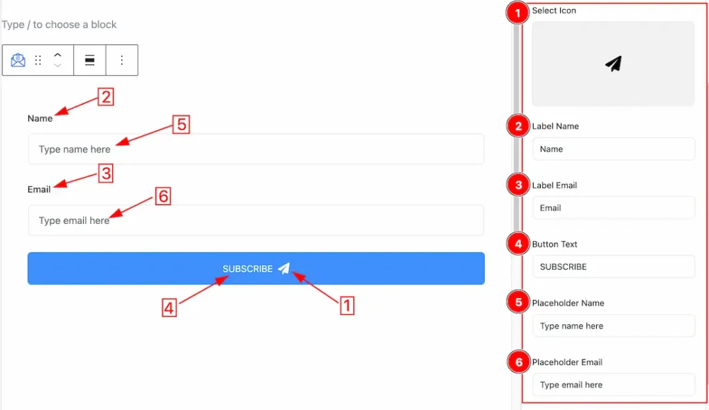
1. Select Icon: This option lets you change the Icon of the Newsletter Button.
2. Label Name: This option lets you change the Label Name of the Newsletter.
3. Label Email: This option lets you change the Label Email of the Newsletter.
4. Button Text: This option lets you change the Button Text.
5. Placeholder Name: This option lets you change the Placeholder Name.
6. Placeholder Email: This option lets you change the Placeholder Email.
Message Section
Go to Basic > Message
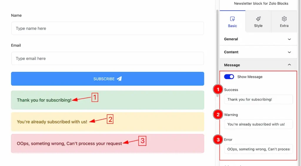
Show Message: Enable or Disable the Show Message switcher button to show or hide the message. If you enable the switcher button then the below message will appear.
- Success Message: This option lets you change the Success Message. just put down your success message inside the success field.
- Warning Message: This option lets you change the Warning Message. just put down your Warning message inside the Warning field.
- Error Message: This option lets you change the Error Message. just put down your Error message inside the Error field.
Work with The Style Tab
Label Section
Go to Style > Label
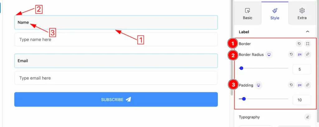
1. Border: you can set the Border Type to Default, None, Solid, Double, Dotted, Dashed, or Groove. We choose here the Border Type Solid.
2. Border Radius: Customizes the border corners for roundness.
3. Padding: Add spaces around an object to increase the inner area. Padding allows you to control the internal space within an element.
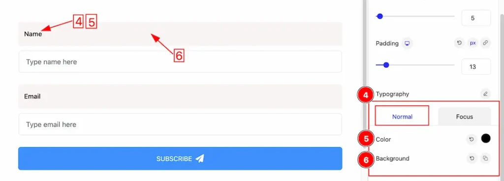
4. Typography: Change the font family, size, weight, style, transform, decoration, line height, letter spacing, and word spacing from here.
Come to the Typography section, you will get two subsections under the Typography. The two subsections are Normal and Focus.
Under the Normal subsection, you will get the below options.
5. Color: This option lets you change the Label’s Text color.
6. Background: you can change the color of the image background to classic or gradient. Here we choose the Background type Classic. If you want, you can also set an image as the Background.
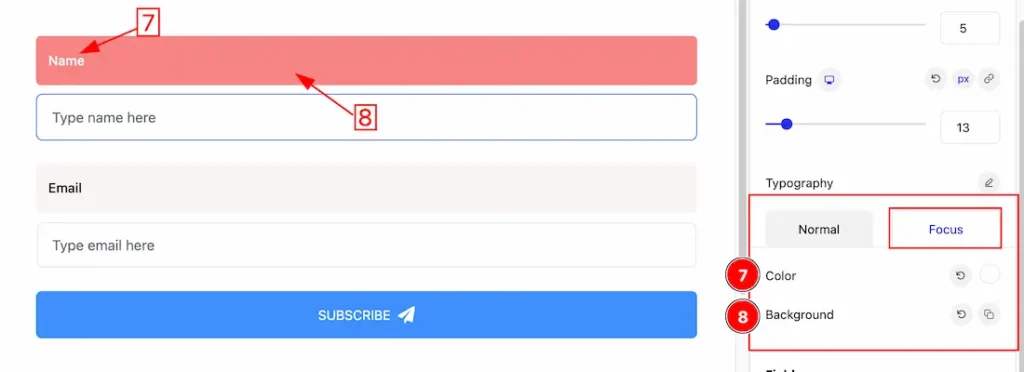
Under the Focus subsection, you will get similar customization options as in the normal subsection. Please try it yourself.
Field Section
Go to Style > Field
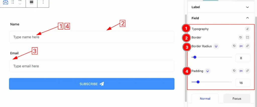
1. Typography: Change the font family, size, weight, style, transform, decoration, line height, letter spacing, and word spacing from here.
2. Border: you can set the Border Type to Default, None, Solid, Double, Dotted, Dashed, or Groove. We choose here the Border Type Solid.
3. Border Radius: Customizes the border corners for roundness.
4. Padding: Add spaces around an object to increase the inner area. Padding allows you to control the internal space within an element.
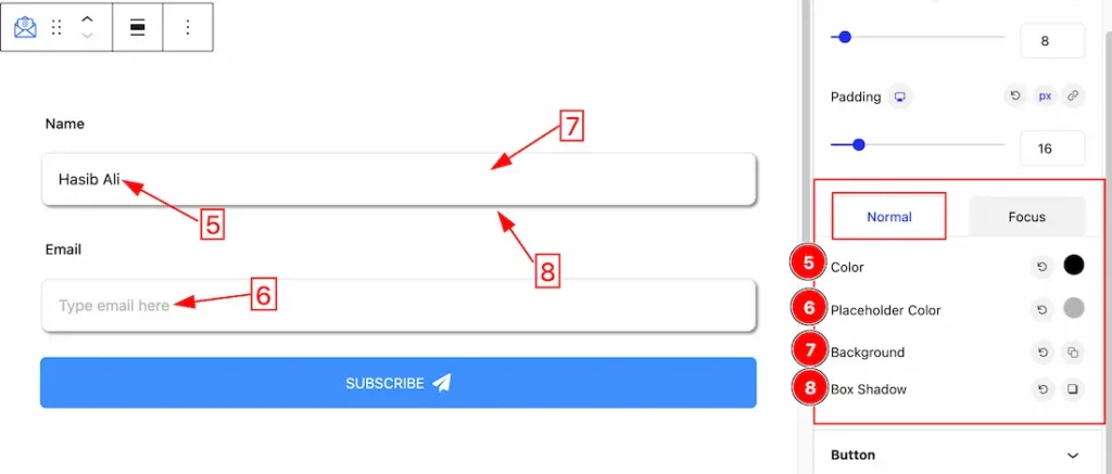
Come to the Field section, you will get two subsections under the Field section. The two subsections are Normal and Focus.
Under the Normal subsection, you will get the below options.
5. Color: This option lets you change the Field Text color.
6. Placeholder Color: This option lets you change the Placeholder Text color.
7. Background: you can change the color of the image background to classic or gradient. Here we choose the Background type Classic. If you want, you can also set an image as the Background.
8. Box Shadow: The Box Shadow property is used to create the shadow around the image. It takes Four values: Horizontal offset (X), Vertical offset (Y), blur, and Spread to customize the Box shadow.
- Box Shadow Color: This lets you change the Box Shadow color.
- Position: you can set the Box Shadow position Outer and Inner. Here we set the Box Shadow position Outer.
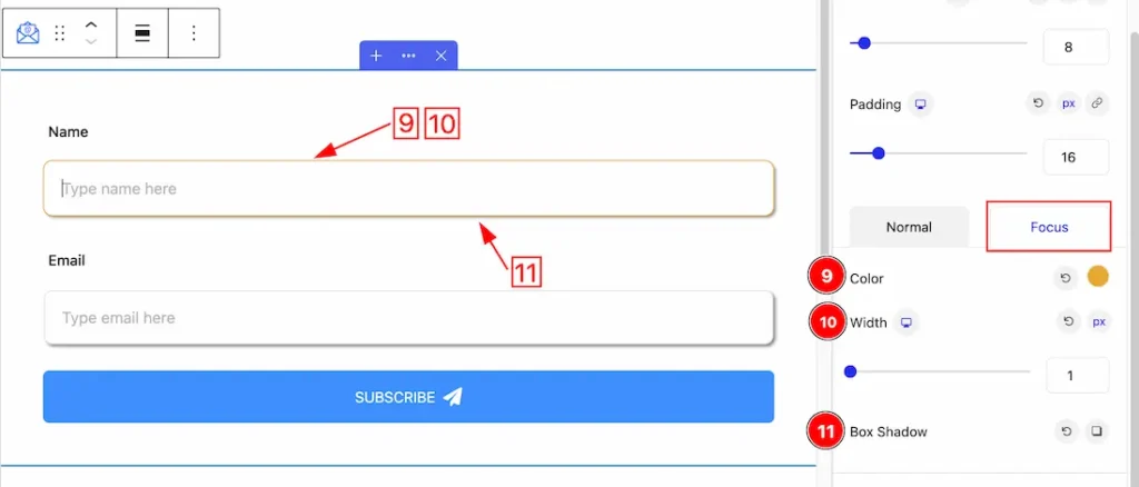
Under the Focus subsection, you will get the below options to customize the field section.
9. Color: This option lets you change the Field Focus color.
10. Width: This option lets you change the Field Focus width.
11. Box Shadow: The Box Shadow property is used to create the shadow around the image. It takes Four values: Horizontal offset (X), Vertical offset (Y), blur, and Spread to customize the Box shadow.
- Box Shadow Color: This lets you change the Box Shadow color.
- Position: you can set the Box Shadow position Outer and Inner. Here we set the Box Shadow position Outer.
Button Section
Go to Style > Button
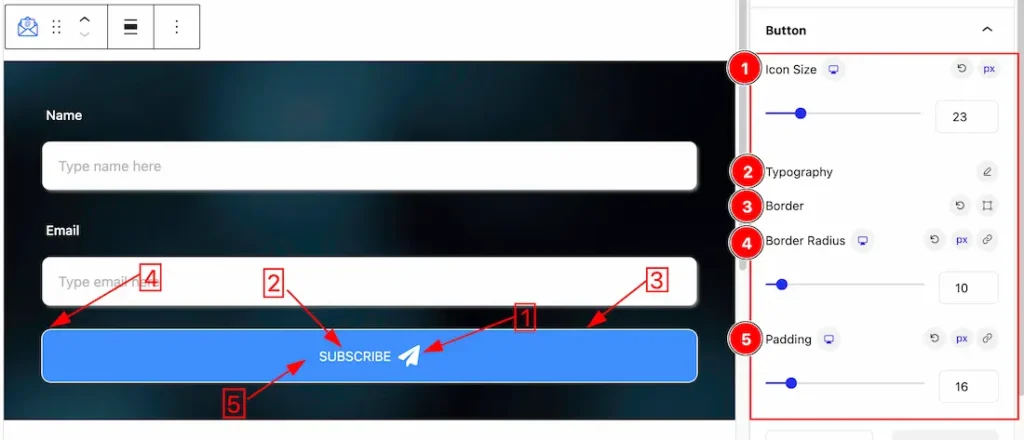
1. Icon Size: This options lets you change the Icon Size of the Button.
2. Typography: Change the font family, size, weight, style, transform, decoration, line height, letter spacing, and word spacing from here.
3. Border: you can set the Border Type to Default, None, Solid, Double, Dotted, Dashed, or Groove. We choose here the Border Type Solid.
4. Border Radius: Customizes the border corners for roundness.
5. Padding: Add spaces around an object to increase the inner area. Padding allows you to control the internal space within an element.
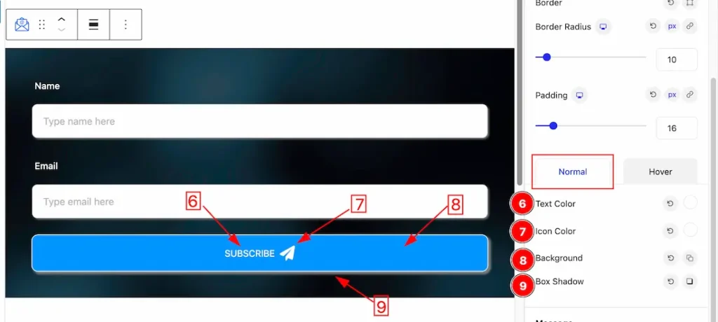
Come to the Button section, you will get two subsections under the Button section. The two subsections are Normal and Hover.
Under the Normal subsection, you will get the below options.
6. Text Color: This option lets you change the text color of the Button.
7. Icon Color: This option lets you change the Icon color of the Button.
8. Background: you can change the color of any object background to classic or gradient. Here we choose the Background type Classic. Here you also can set the Background color. If you want, you also can change an image to the Background.
9. Box Shadow: The Box Shadow property is used to create the shadow around the image. It takes Four values: Horizontal offset (X), Vertical offset (Y), blur, and Spread to customize the Box shadow.
- Box Shadow Color: This lets you change the Box Shadow color.
- Position: you can set the Box Shadow position Outer and Inner. Here we set the Box Shadow position Outer.
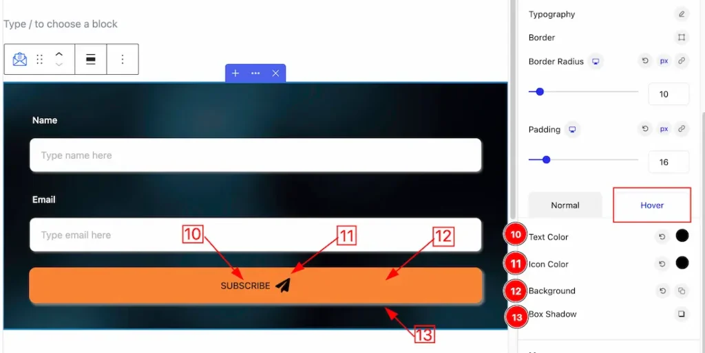
Under the Hover subsection, you will get similar customization options as in the normal subsection. Please try it yourself.
Message Section
Go to Style > Message
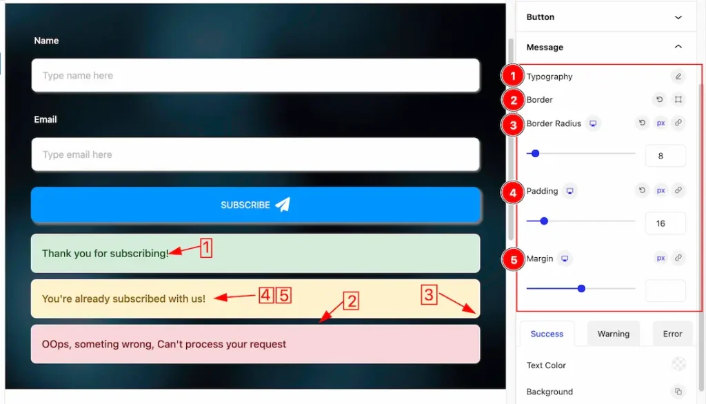
1. Typography: Change the font family, size, weight, style, transform, decoration, line height, letter spacing, and word spacing from here.
2. Border: you can set the Border Type to Default, None, Solid, Double, Dotted, Dashed, or Groove. We choose here the Border Type Solid.
3. Border Radius: Customizes the border corners for roundness.
4. Padding: Add spaces around an object to increase the inner area. Padding allows you to control the internal space within an element.
5. Margin: Adjusts the position of an object over the canvas.
Come to the Message section, you will get three subsections under the Message section. The three subsections are Success, Warning, and Error.
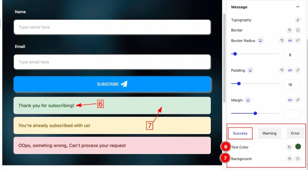
Under the Success subsection, you will get the below options.
6. Text Color: This option lets you change the Text color of the success message.
7. Background: This option lets you change the Background color of the success message.
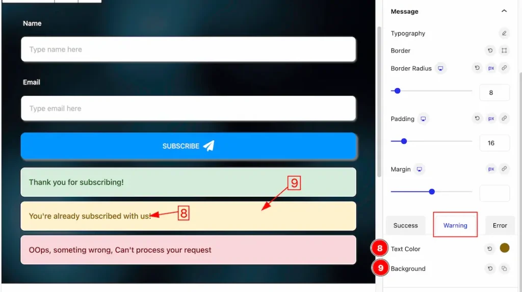
Under the Warning subsection, you will get the below options.
6. Text Color: This option lets you change the Text color of the Warning message.
7. Background: This option lets you change the Background color of the Warning message.
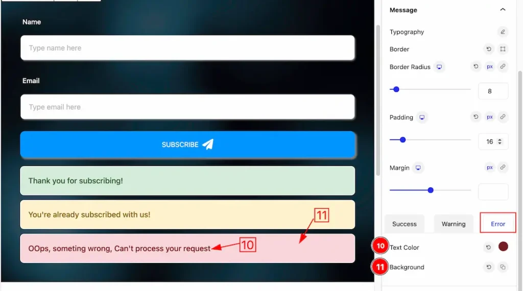
Under the Error subsection, you will get the below options.
6. Text Color: This option lets you change the Text color of the Error message.
7. Background: This option lets you change the Background color of the Error message.
Extra Tab Controls
The extra tabs provide the controls of any blocks. You can make different visual layouts by following these Controls.
Click to learn more>>.
Video Assist
You can watch the video above to learn about the Newsletter block. Please visit the demo page for examples.
Thanks for being with us.