

In this documentation, we will show you how to customize the Post Card widget presented by Element Pack Pro.
Inserting The Post Card Widget
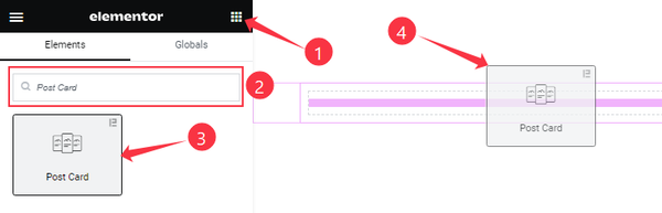
On the Elementor editor page, search by the Post Card widget name, then drag and drop it on the page.
Note: You need both Elementor and Element Pack Pro installed to use this widget.
Content Tab Customizations
Layout section
Go to Content > Layout
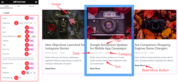
Come to the Layout section, Find the Image Size, Text Limit, Alignment, and Title HTML Tag options.
Also, Find the Title, Date, Human Different Time, Category, Tags, Show Text, Strip Shortcode, and Read More Button switchers.
Query section
Go to Content > Query
Step-1
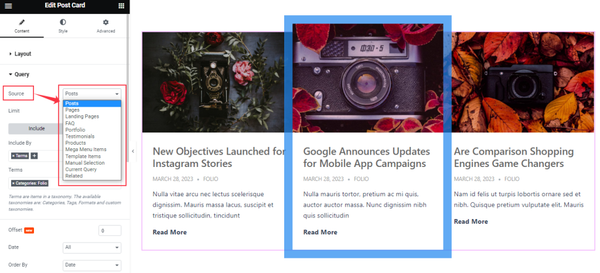
Find the Source (Posts, Pages, Landing Pages, FAQ, Portfolio, etc.) options.
Step-2
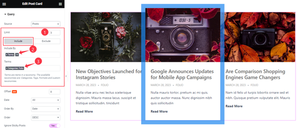
Here find the Item Limit and Also, find the Include > Include By and Terms filters. Include filter helps show only selected posts.
Step-3
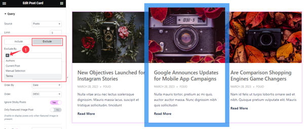
Exclude filter does exactly the opposite of the Include filter and helps hide selected posts.
Step-4
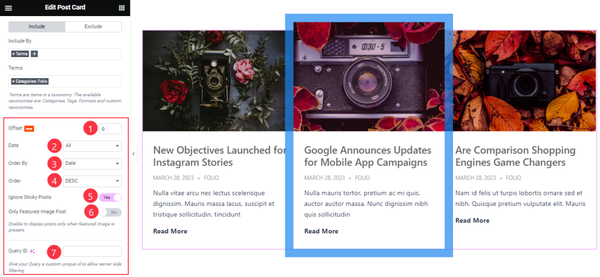
Then find the Offset, Date, OrderBy, Order, Ignore Sticky Posts, and Only Featured Image Post options.
The Query ID field is for applying custom queries on WordPress.
Read More section
Go to Content > Read More
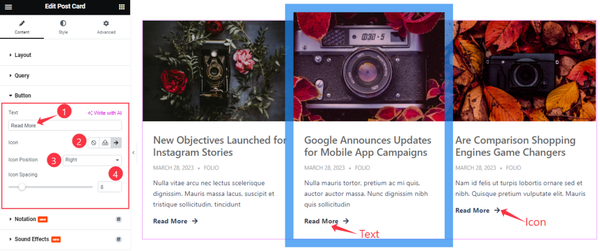
Here Find the Read More Text, Icon, Icon Position, and Spacing options.
Work with The Style Tab
Item section
Go to Style > Item
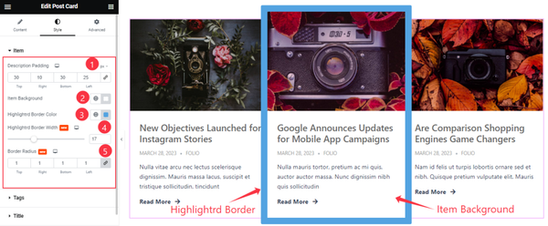
Come to the Item section, Find the Description Padding, Item Background, Highlighted Border Color, Highlighted Border Width, and Border Radius options.
Tags section
Go to Style > Tags
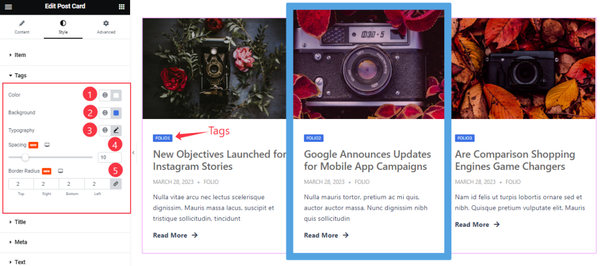
Find the Tags Color, Background Color, Typography, Spacing, and Border Radius options.
Title section
Go to Style > Title
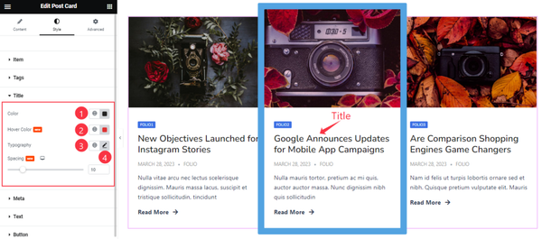
In the Title section, Find the Title Color, Hover Color, Typography, and Spacing options.
Meta section
Go to Style > Meta
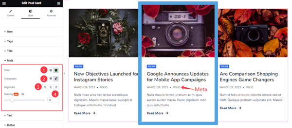
Here Find the Meta Color, Typography, Alignment, and Spacing options.
Text section
Go to Style > Text
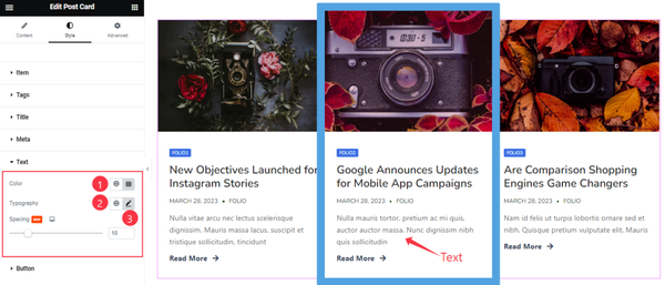
Find the Color, Typography, and Spacing options.
Read More Button section
Go to Style > Button
Step-1
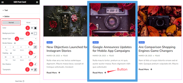
Come to the Button section, you will find two sub-section; Normal and Hover.
Here in the Normal Mode, find the Read More Button text Color, Background Color, Border Type, Border Radius, Box Shadow, Padding, and Typography options.
Step-2
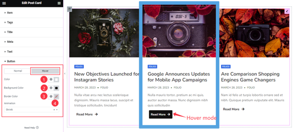
In the Hover Mode, find the Read More button text Color, Background Color, Border Color, and Animation options.
All done! You have successfully customized the Post Card widget on your website.
Video Assist
You can also watch the tutorial video about the Post Card widget. Please visit the demo page for examples.
Thanks for staying with us.