

In this documentation, we will show you how to customize the EDD Category Carousel Widget by Ultimate Store Kit.
Enable the EDD Category Carousel Widget
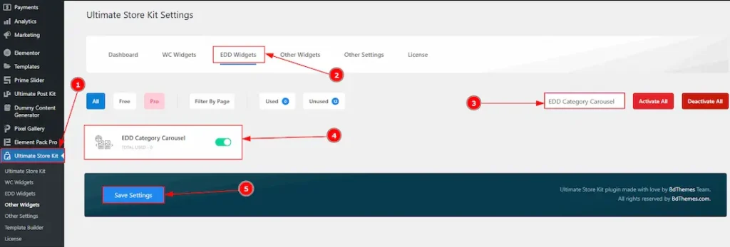
To use the EDD Category Carousel by Ultimate Store Kit, first, you have to enable the widget.
- Go to WordPress > Ultimate Store Kit Plugin dashboard.
- Then, Click the EDD Widgets Tab.
- Search the EDD Category Carousel Widget Name.
- Enable the EDD Category Carousel Widget.
- Hit the Save Settings Button.
Inserting The EDD Category Carousel widget
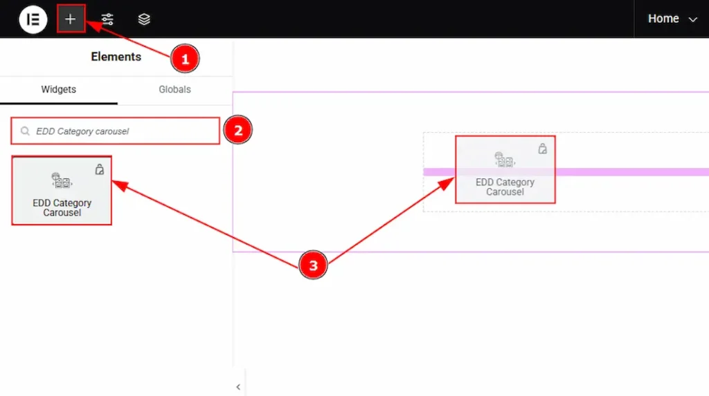
- Go to the Elementor Editor Page and Hit the “+” icon Button.
- Search the EDD Category Carousel widget.
- Drag the widget and drop it on the editor page
Configuring the Content Tab Of EDD Category Carousel
The Content Tab provides options to manage and structure the core settings of elements. It allows defining the content and functionality to align with design goals.
Layout Section
Go to Content > Layout
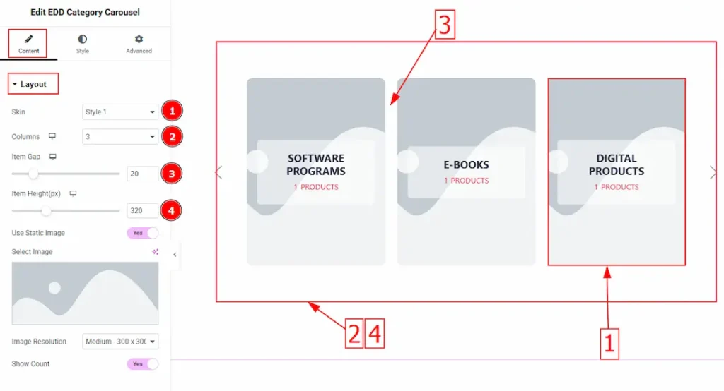
1. Skin: You can select the visual option from here. There are a total of 5 styles.
2. Columns: Set here how many columns you want to show for the layout section.
3. Item Gap: You can adjust the space between items with this option.
4. Item Height(px): You can adjust the height of the items with this option.
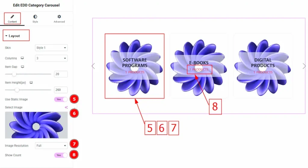
5. Use Static Image: Enable the switcher to add a background image for the items.
6. Select Image: This option allows you to change the background image.
7. Image Resolutions: You can select the image resolution here.
8. Show Count: Enable the switcher to show the product count.
Query Section
Go to Content > Query
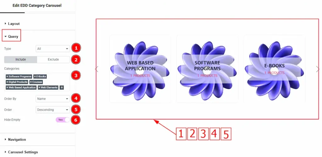
1. Type: Select the Type for the EDD Category Grid. You can select the type from All, Only Parent & Only Child options.
2. Include/Exclude Selection: Select the Include / Exclude filter to show/hide specific posts by Categories.
3. Categories: Select the terms for specifying. You will get to select from Category or Tags.
4. Order By: It controls the data you want to display through name, count & slug.
5. Order: This option controls the order by which data is arranged. There are two types of order. Ascending Order (Starts from the smallest or lowest value and goes to the largest or highest.) & Descending Order (Starts from the largest or highest value and goes to the smallest or lowest.)
6. Hide Empty: Enable the switcher you can hide the items that don’t have any products.
Navigation Section
Go to Content > Navigation
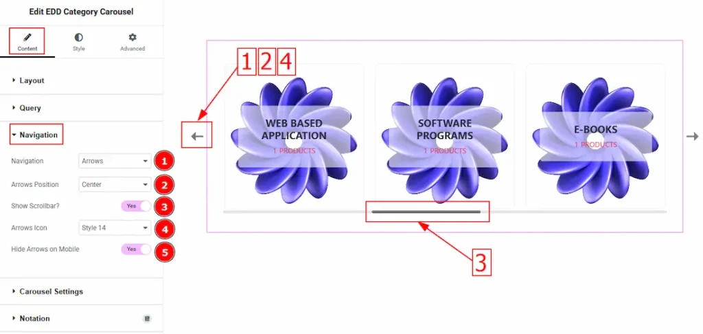
1. Navigation: This option allows you can set the Navigation Type- Arrows & Dots, Arrows & Fractions, Arrows, Dots, Progress and None.
2. Arrows Position: By this option, you can adjust the navigator position to Top Left, Top Center, Top Right, Center, Bottom Left, Bottom Center & Bottom Right.
3. Show Scrolbar: Enable or disable the Show Scrollbar switcher button to show/hide the Scrollbar on the carousel.
4. Arrows Icon: You can customize the appearance of navigation arrows using the selected style. (There are a total of 23 styles included.)
5. Hide Arrows on Mobile: By enabling this switcher button, the navigation Arrows will hide for Mobile devices.
Carousel Settings Section
Go to Content > Carousel Settings
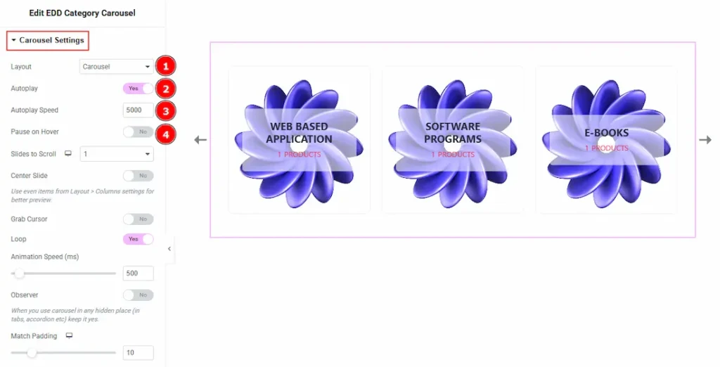
1. Layout: You can select the Layout type – Carousel & Coverflow. Here we selected the layout type – Carousel.
2. Autoplay: If you enable the Autoplay switcher button, your slider will slide into Autoplay mode.
3. Autoplay Speed: This option allows you to set the speed for automatically playing the carousel.
4. Pause on Hover: If you activate the pause on Hover button, when visitors hover the mouse cursor on the slider, then your slider will hold; otherwise, your slider will slide Autoplay.
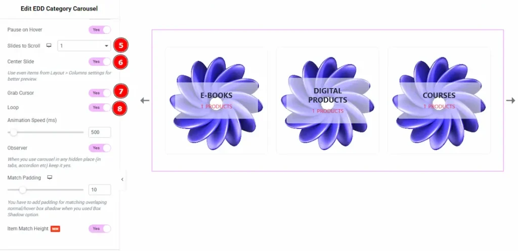
5. Slides to Scroll: It represents how many slides will slide at once.
6. Center Slide: If you enable the Switcher option, then your Active slider will show the center (depending on your widget style).
7. Grab Cursor: Your mouse pointer icon will be changed into a grab cursor. Visitors can slide your slider manually with your mouse cursor.
8. Loop: Enable the switch to loop the content.
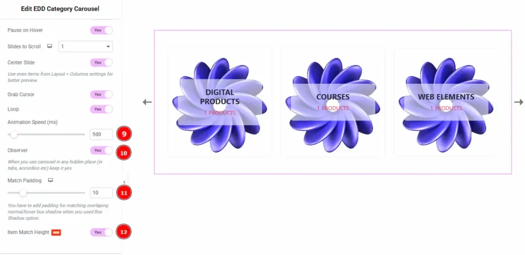
9. Animation Speed: Set the speed for animation. The speed count in (ms).
10. Observer: If you enable the option, then you will be able to use the slider/carousel in any hidden places (such as in tabs, Accordion, etc).
11. Match Padding: Controls the padding around carousel items to align with hover or box shadow effects.
12. Item Match Height: This feature is to control the items same height. Enable the switcher to match the same height of the carousel items.
Designing with the Style Tab
Item Section
Go to Style > Item
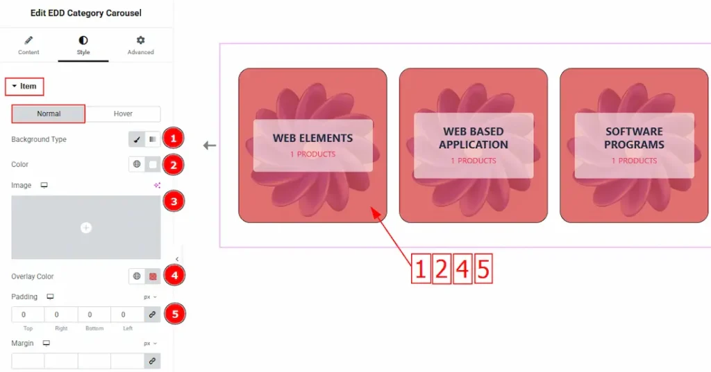
In this section, we have two tabs. One is Normal and the other is Hover. Let’s start with the Normal tab – 1. Background Type: You can change the background type here. There are two options for background type. These are Classic & Gradient.
In Classic, you can change the background color and also set an image as the background.
In the gradient option, you can also set background color along with locations and angle for each breakpoint to ensure the gradient adapts to different screen sizes. Also, you can change the gradient type (Radial & Linear) and positions.
2. Color: You can change the item background color with this option.
3. Image: You can change the item background image with this option.
4. Overlay Color: This option allows you to add a visual layer that appears over the items.
5. Padding: Add spaces around an object to increase the inner area. Padding allows you to control the internal space within an element.
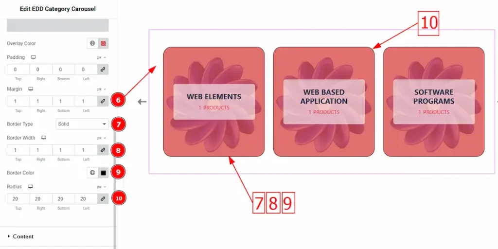
6. Margin: This option allows you to adjust the space & creating gaps around the items.
7. Border Type: This option allows you to add borders to your items. You can select various border types from this option. Such as Solid, Double, Dotted, Dashed, Groove.
8. Border Width: Set the thickness of the border by selecting the width.
9. Border Color: You can change the border color by this option.
10. Border Radius: The Border Radius controls the roundness of the border.
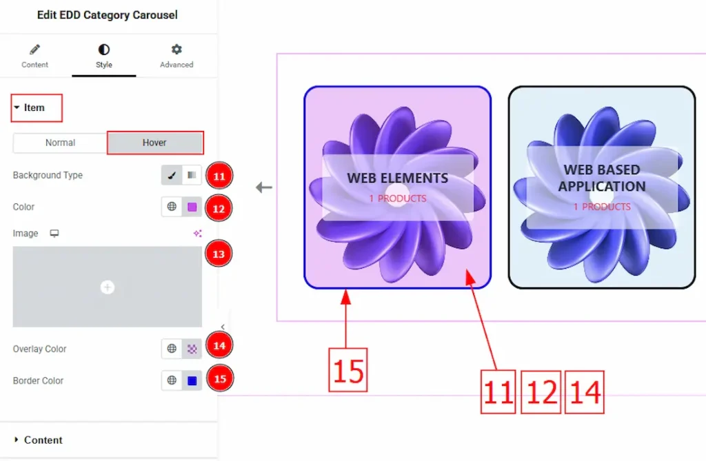
Now, let’s proceed to the Hover tab –
11. Background Type: You can change the background type (Classic or Gradient) by using this option.
12 Color: This option allows you to change the background hover color.
13. Image: This option allows you to change the background image.
14. Overlay Color: You can change the overlay hover color with this option.
15. Border Color: You can set hover color on your border by using this option.
Content Section
Go to Style > Content
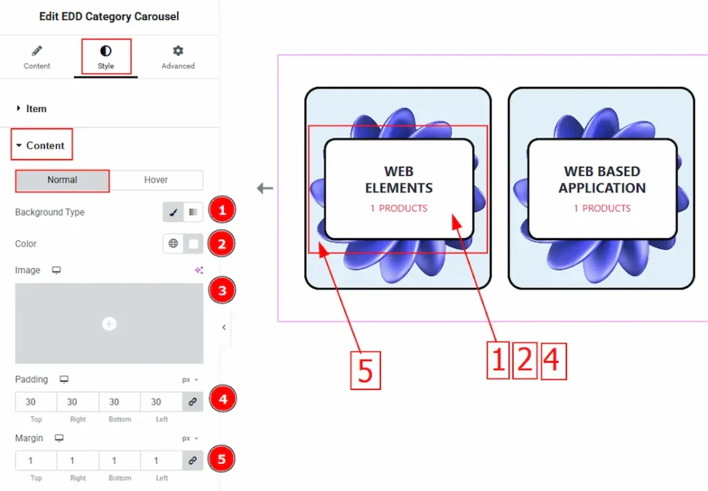
In this section, we have two tabs. One is Normal and the other is Hover. Let’s start with the Normal tab – 1. Background Type: You can change the category’s background type here. There are two options in background type. These are Classic & Gradient.
2. Color: You can change the category’s color with this option.
3. Image: You can change the category’s background image with this option.
4. Padding: Padding allows you to control the internal space around the content.
5. Margin: This option allows you to adjust the space & create gaps around the content field.
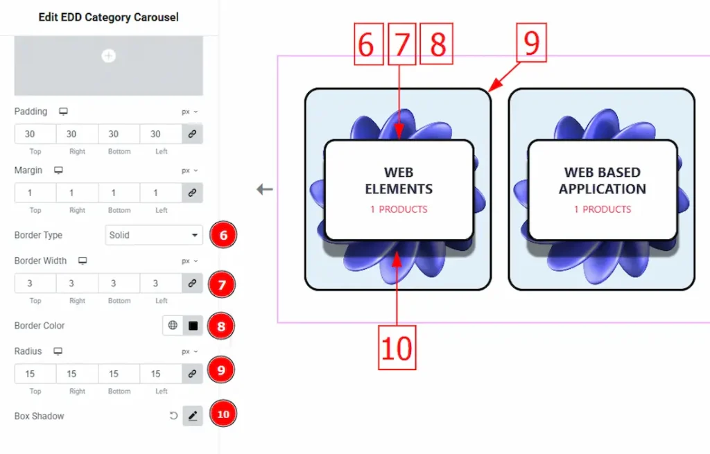
6. Border Type: This option allows you to add borders to your items. You can select various border types from this option. Such as Solid, Double, Dotted, Dashed, Groove.
7. Border Width: Set the thickness of the border by selecting the width.
8. Border Color: You can change the border color by this option.
9. Radius: The Border Radius controls the roundness of the border.
10. Box Shadow: You can add shadow and customize it by this option.
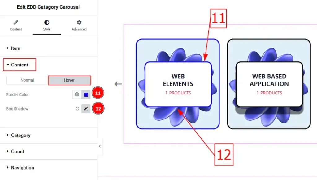
Now, let’s proceed to the Hover tab –
11. Border Color: You can set hover color on your border by using this option.
12. Box Shadow: You can add & change hover shadow and customize it with this option.
Category Section
Go to Style > Category
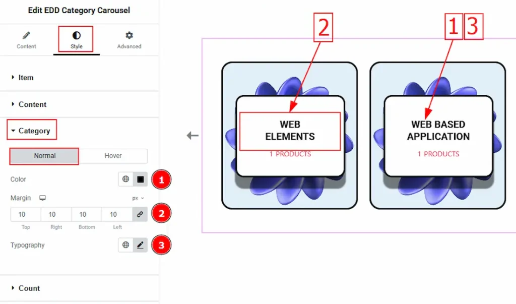
In this section, we have two tabs. One is Normal and the other is Hover. Let’s start with the Normal tab – 1. Color: You can change the category’s color with this option.
2. Margin: This option allows you to adjust the space & create gaps around the category text.
3. Typography: You can change the category text’s font family, size, weight, transform, style, decoration, line height, letter spacing, and word spacing from here.
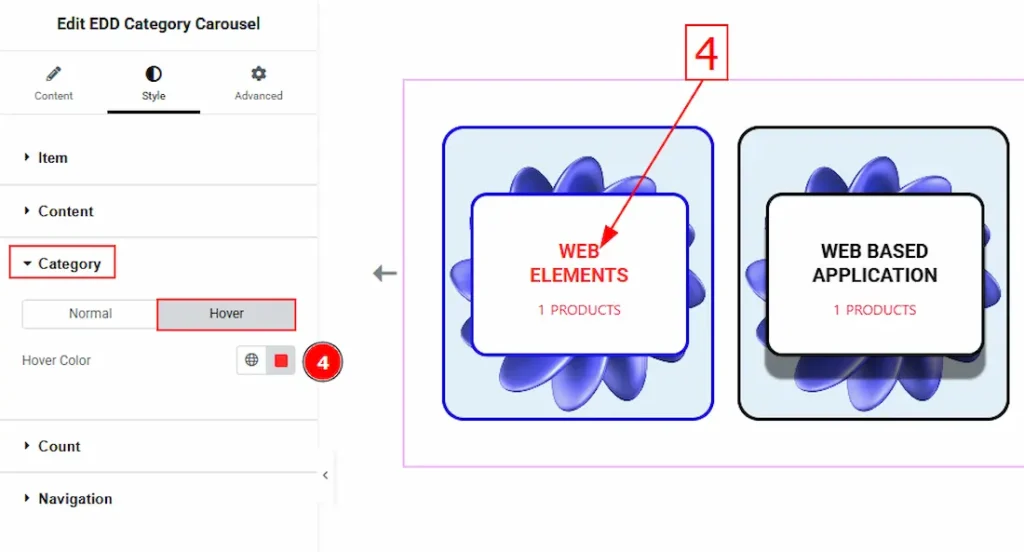
Now Let’s proceed to the Hover tab –
4. Hover Color: This option allows you to change the category text hover color.
Count Section
Go to Style > Count
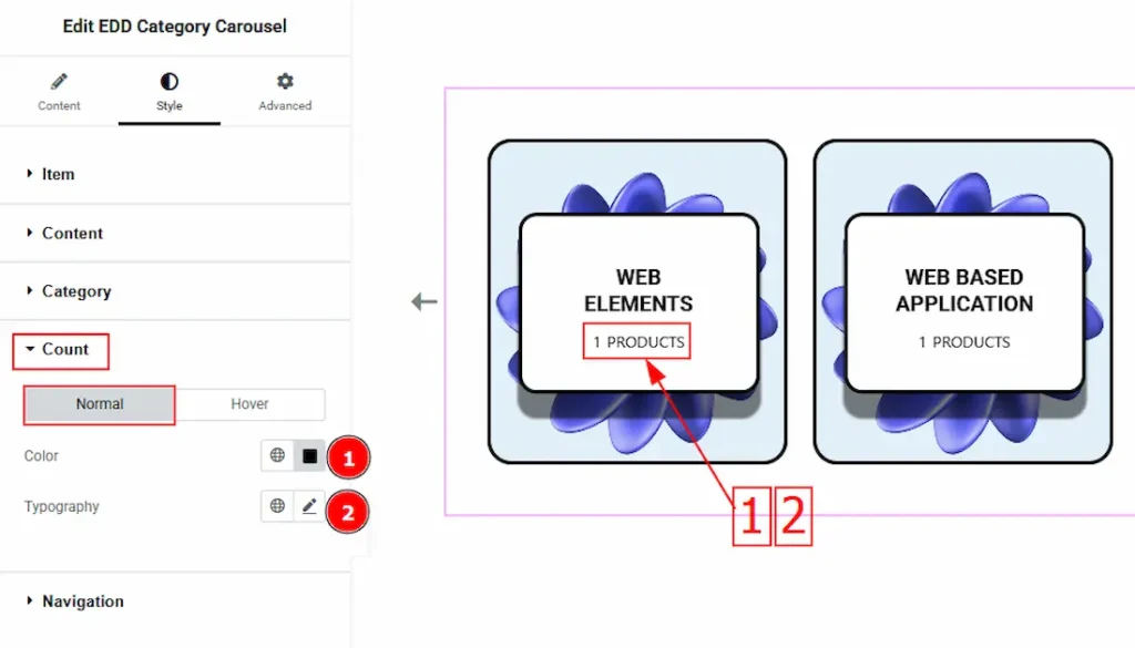
In this section, we have two tabs. One is Normal and the other is Hover. Let’s start with the Normal tab – 1. Color: This option allows you to change the count text color.
2. Typography: You can change the count text’s font family, size, weight, transform, style, decoration, line height, letter spacing, and word spacing from here.
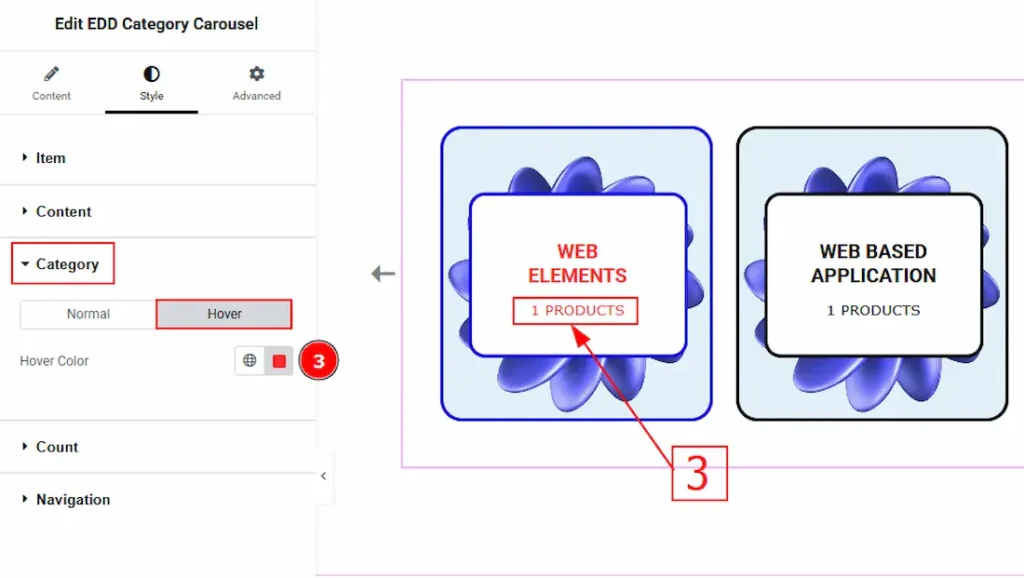
Now, let’s proceed to the Hover Tab –
3. Color: You can change the count text hover color with this option.
Navigation Section
Go to Style > Navigation
In this section, we will get three sub-sections. They are Arrows, Dots & Offset. Let’s go through the discussion step by step.
Arrows Sub-Section
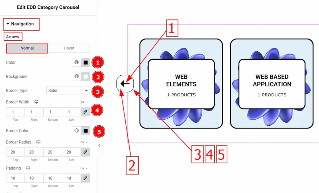
1. Color: This option allows you to change the arrow’s Normal color.
2. Background: You can change the arrow’s normal background color by using this option.
3. Border Type: This option allows you to add borders to the arrows. You can select various border types from this option. Such as Solid, Double, Dotted, Dashed, Groove.
4. Border Width: You can set the border thickness by this option.
5. Border Color: You can set a color on your arrow’s border by using this option.
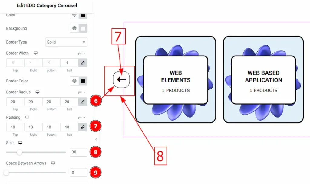
6. Border Radius: The Border Radius controls the roundness of the border.
7. Padding: Padding allows you to control the internal space around the arrow.
8. Size: You can adjust the arrow’s size by using this option.
9. Space Between Arrows: This option allows you to adjust the space between two arrows.
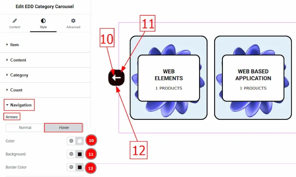
10. Color: This option allows you to change the arrow’s hover color.
11. Background: You can change the arrow’s background hover color by using this option.
12. Border Color: This option lets you set the Arrow hover border color.
Offset Subsection-
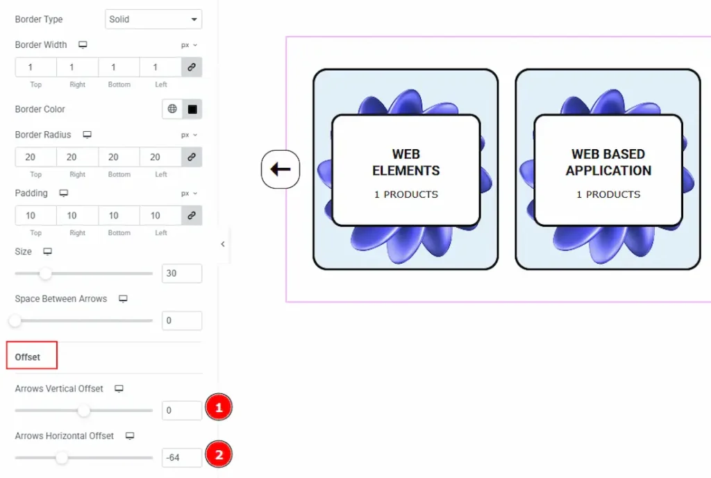
1. Arrows Vertical Offset: This option lets you set the arrows’ position vertically.
2. Arrows Horizontal Offset: This option lets you set the arrows’ position horizontally.
All done! You have successfully customized the EDD Category Carousel widget on your website.
Video Assist
The video will come soon. Please visit the demo page for examples.
Thanks for being with us.