

This documentation provides comprehensive insights into the My Account Page Widget developed by Ultimate Store Kit Pro.
Create Themes Builder Pages
To use the My Account Page first need to create a themes builder pages. Create Dashboard, Downloads, Orders, Account Details, Wishlist, and Logout page via themes builder and activate it.
Add New Templates
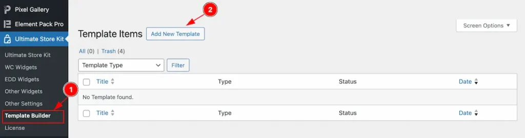
- Go to Ultimate Store Kit > Template Builder section from Dashboard.
- Find the ” Add New Template ” button to create a new templates. It will open a popup window and select the pages that want to create.
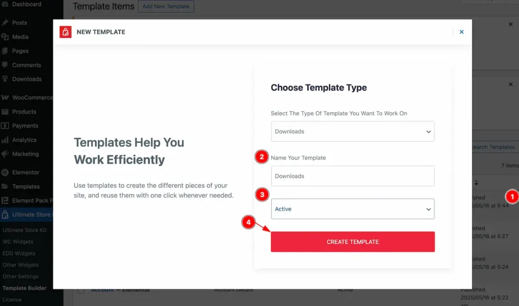
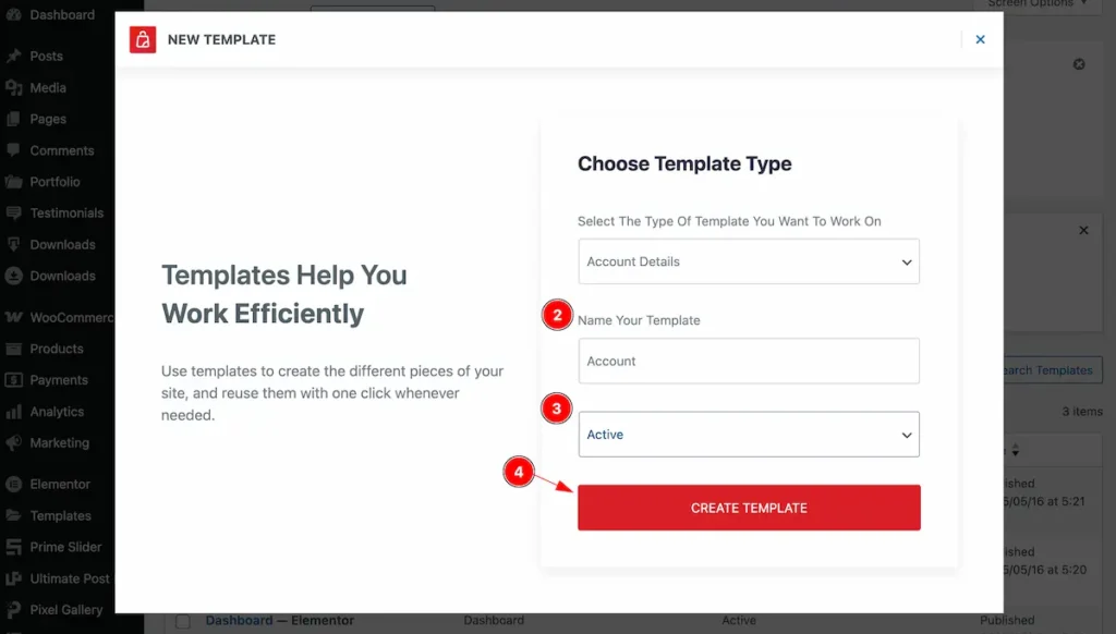
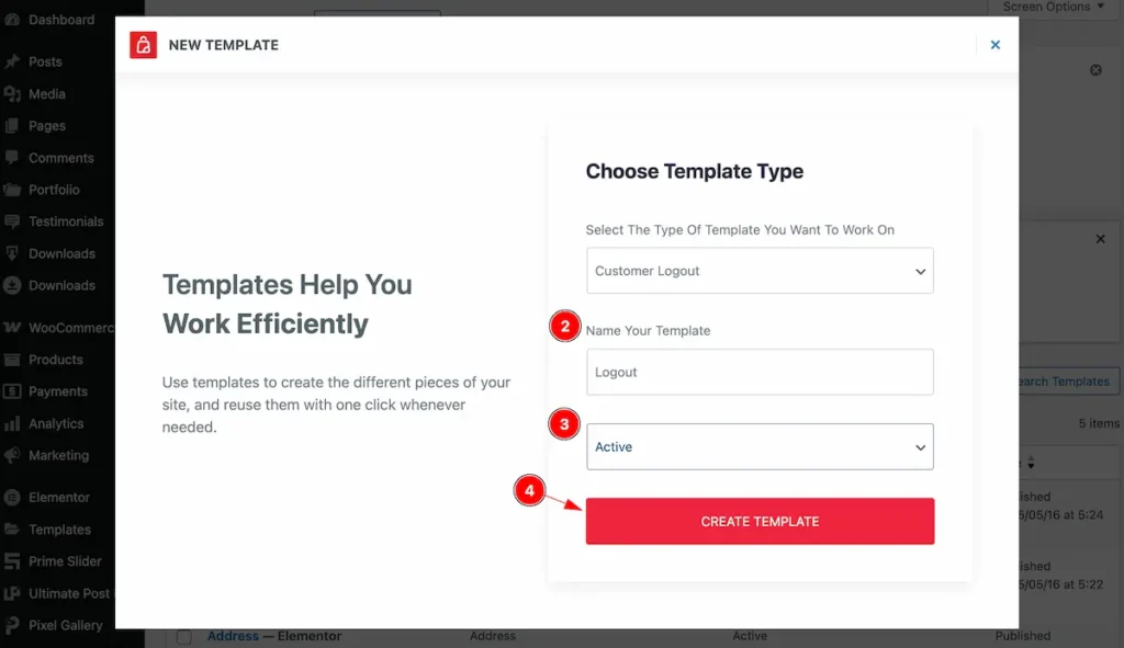
Dashboard Page
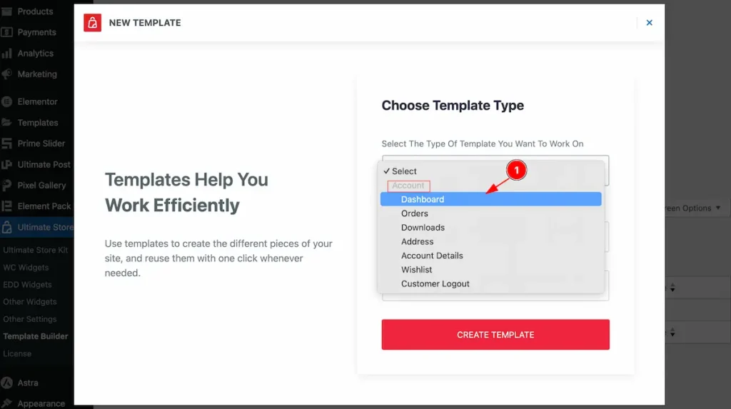
- Select the Dashboard from the option value.
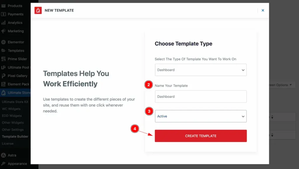
- Set the name of the Template.
- Select the status Active.
- Click on the Create Template button to create a dashboard page.
Insert the My Account ( Page ) Widget
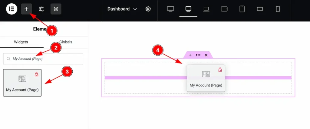
- Go to the Elementor Editor Page and Hit the Add Element ” + ” Icon.
- Search by the My Account Page widget name.
- The widget will appear, Check the Ultimate Store Kit logo on top right corner.
- Select the widget then Drag and Drop it on the editor page.
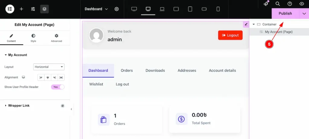
- After inserting the widget you don’t need to edit, Just leave as it and click on the ” Publish ” button.
Orders Page
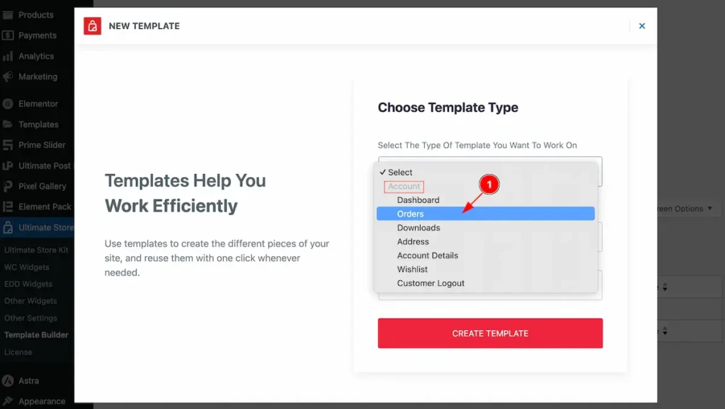
- Select the Orders from the option value.
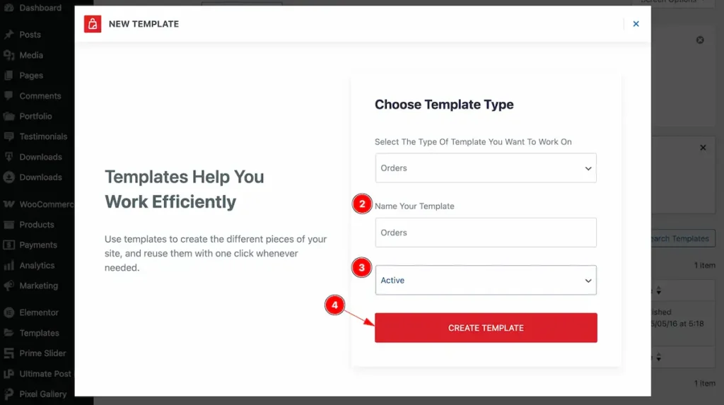
- Set the name of the Template.
- Select the status Active.
- Click on the Create Template button to create a Orders page.
Downloads Page
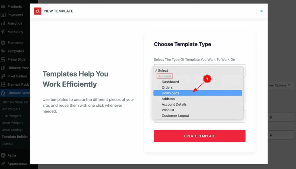
- Select the Downloads from the option value.
- Set the name of the Template.
- Select the status Active.
- Click on the Create Template button to create a Downloads page.
Address Page
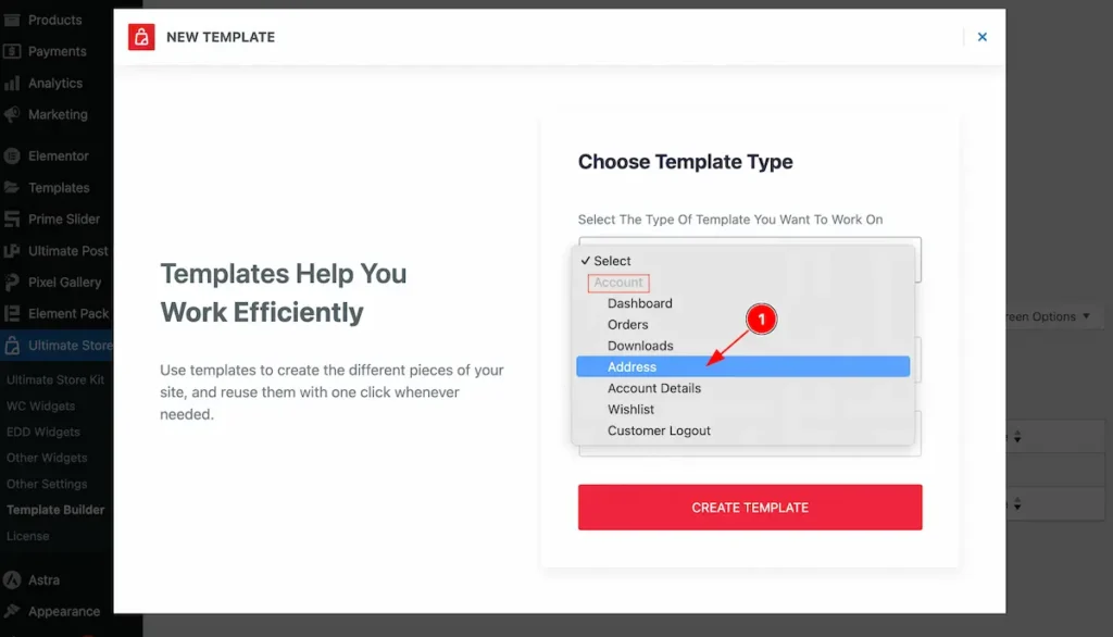
- Select the Address from the option value.
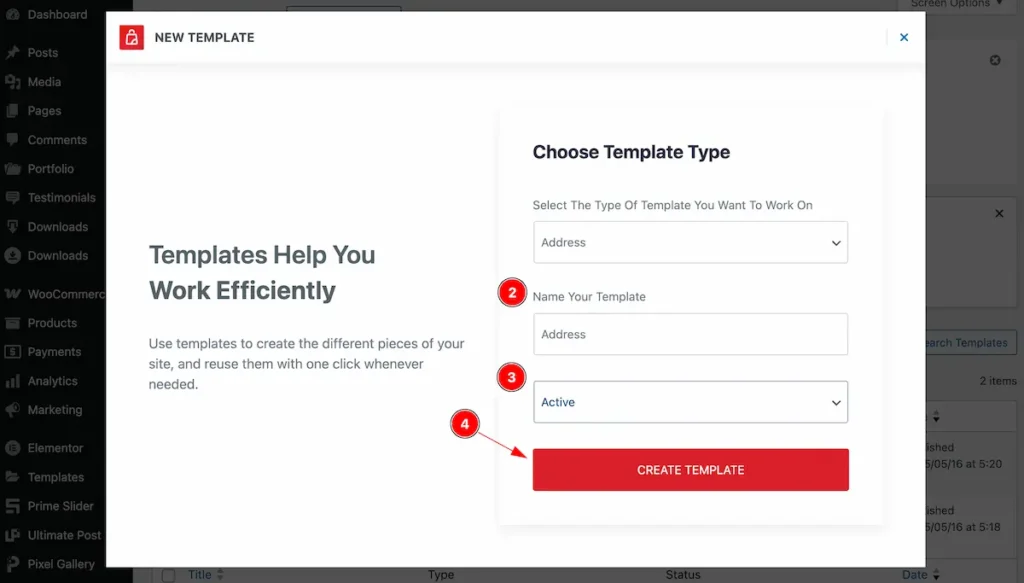
- Set the name of the Template.
- Select the status Active.
- Click on the Create Template button to create a Address page.
Account Details Page
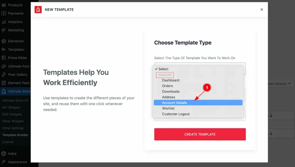
- Select the Account Details from the option value.
- Set the name of the Template.
- Select the status Active.
- Click on the Create Template button to create a Account page.
Wishlist Page
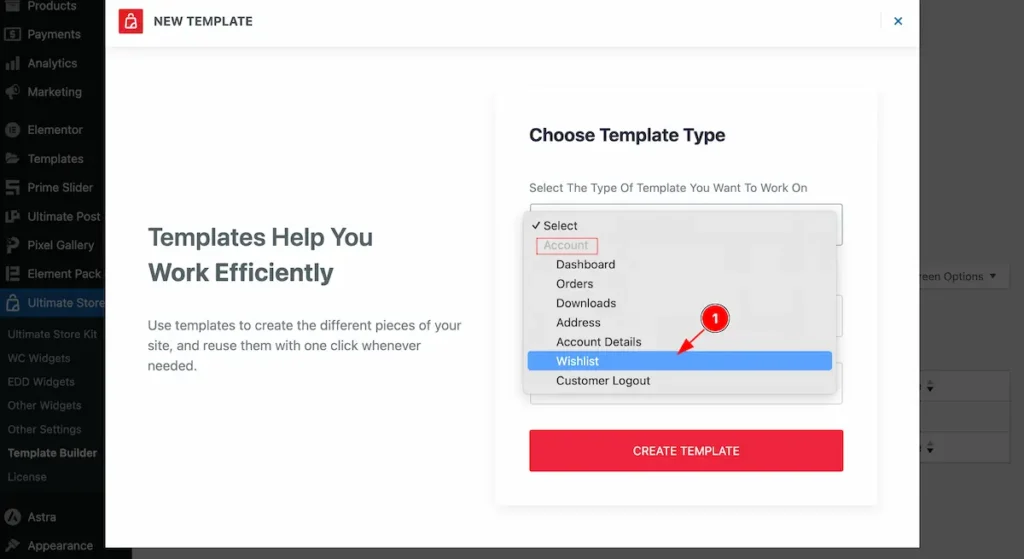
- Select the Wishlist from the option value.
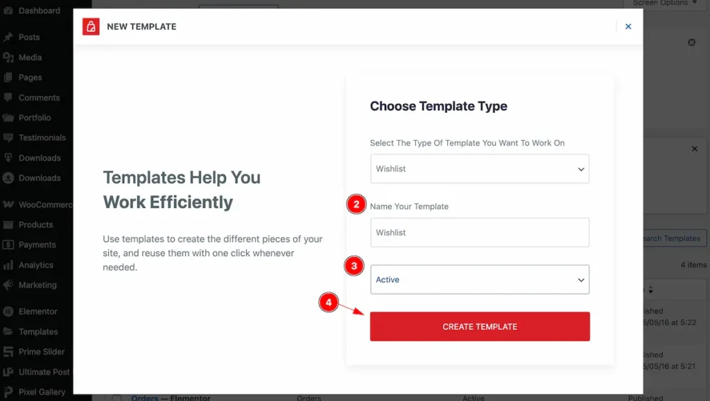
- Set the name of the Template.
- Select the status Active.
- Click on the Create Template button to create a Wishlist page.
Customer Logout Page
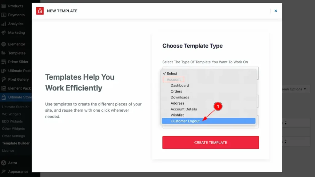
- Select the Customer Logout from the option value.
- Set the name of the Template.
- Select the status Active.
- Click on the Create Template button to create a Logout page.
Enable the My Account Page Widget

To use the My Account Page from Ultimate Store Kit Widget must be enabled. Navigate to WordPress Dashboard > Ultimate Store Kit Plugin dashboard.
- Navigate to WC Widgets Tab.
- Search by the My Account Page Widget Name.
- Enable the My Account Page Widget.
- Hit the Save Settings Button.
Inserting The My Account Page widget

- Go to the Elementor Editor Page and Hit the Add Element ” + ” Icon.
- Search by the My Account Page widget name.
- The widget will appear, Check the Ultimate Store Kit logo on top right corner.
- Select the widget then Drag and Drop it on the editor page.
Configuring the Content Tab
The Content Tab provides options to manage and structure the core settings of elements. It allows to define the content and functionality to align with design goals.
My Account Section
Go to Content > My Account
Horizontal Layout
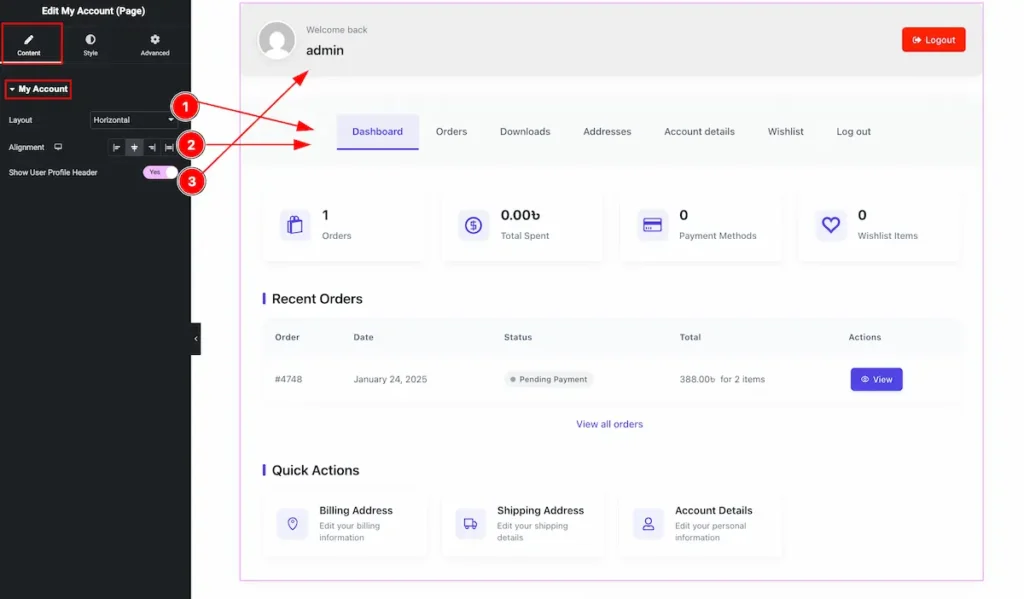
- Layout: Set the layout horizontal. The Navbar will appear in horizontal view.
- Alignment: Make the alignment of the content on Left, Right, Center,
- Show User Profile Header: Enable the switcher to show the Profile Header.
Vertical Layout

- Layout: Select the layout for the Horizontal Design.
- Alignment: Set the alignment for the Navigation. Select the position the Left, Center, Right, and Alignment.
- Show User Profile Header: Enable the switcher to show the Profile Header.
Designing with the Style Tab
The Style Tab offers a range of options to enhance the visual appearance of elements, enabling precise adjustments and creative design possibilities. It helps create polished and engaging layouts effortlessly.
My Account Header Section
Go to Style > My Account Header
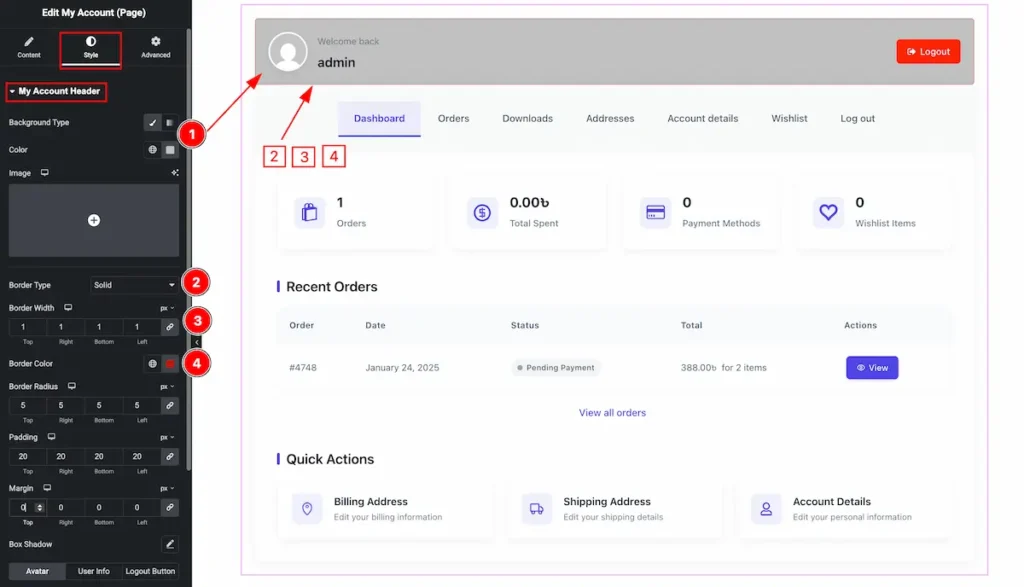
- Background Type: Select the background type color for the header section. Choose the color for it.
- Border Type: Set the type for the border.
- Border Width: Set the thickness for the border.
- Border Color: Choose the color for the border.
- Border Color: Choose the color for the border.
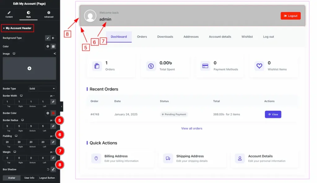
- Border Radius: Make the border radius for the account header.
- Padding: Set the padding for inner space.
- Margin: Set the margin by following.
- Box Shadow: Make a shadow for the Header Section.
Avatar
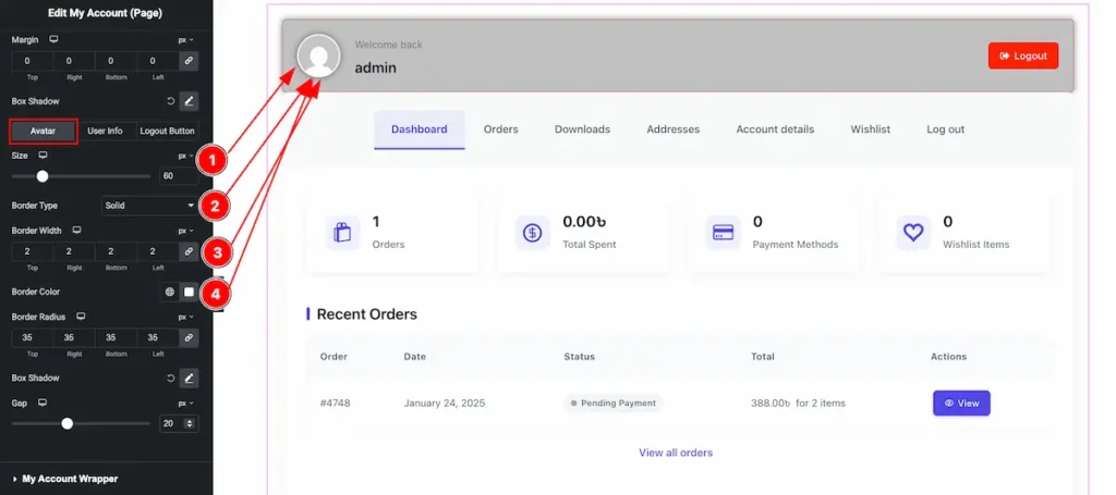
- Size: Set the size for the avatar of header section.
- Border Type: Select the border type solid, dashed, dotted, etc.
- Border Width: Set the thickness for the Border.
- Border Color: Choose color for the border.
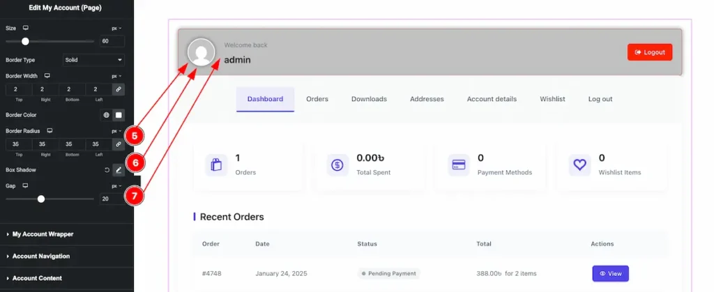
- Border Radius: Set the radius for the border.
- Box Shadow: Make a shadow for the avatar.
- Gap: Set the gap between the between the avatar and Text.
User Infor
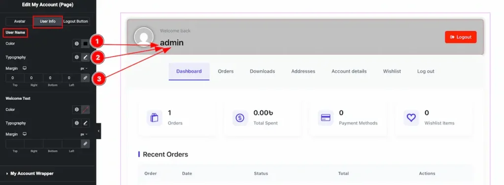
- Color: Set the color for the user info.
- Typography: Select typography for this.
- Margin: Choose margin for the user info.
Logout
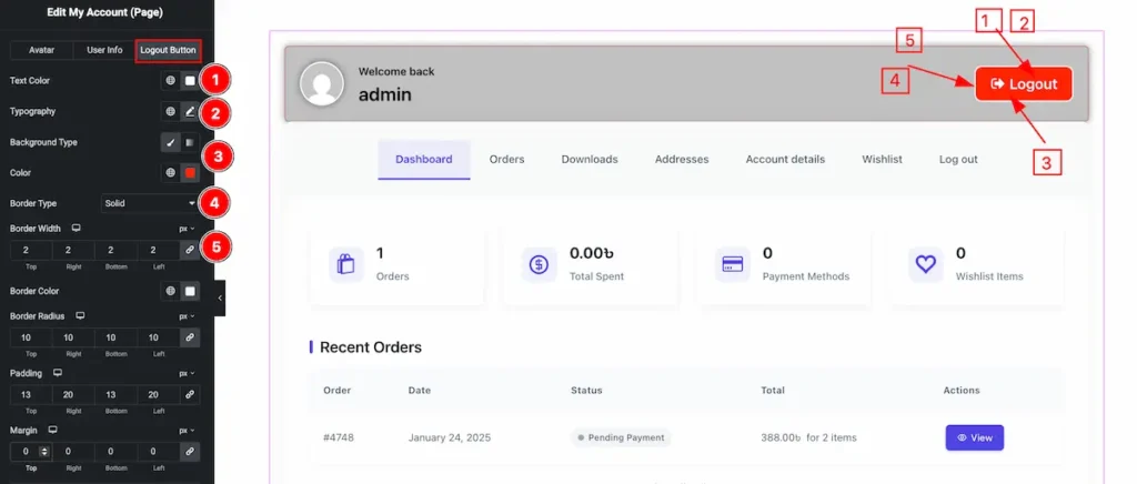
- Text Color: Set the color for the text.
- Typography: Choose the typography for the logout button.
- Background Type: Select the background type for the button.
- Border Type: Choose the Border Type.
- Border Width: Set the thickness for the border.
My Account Wrapper Section
Go to Style > My Account Wrapper
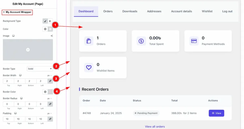
- Background Type: Set the background type color and choose the color for the wrapper section.
- Border Type: Select the type of the border, Solid, Dashed, Dotted, Double etc.
- Border Width: Set the thickness of the border.
- Border Color: Set the color for the border.
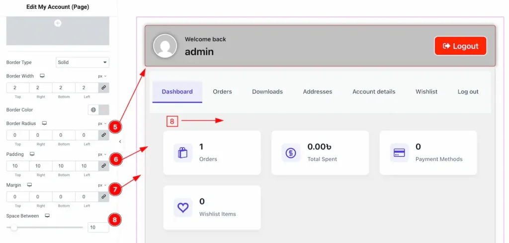
- Border Radius: Make the border radius for the wrapper.
- Padding: Set the inner space by following the padding.
- Margin: Set the margin for outer space.
- Space Between: Set the space between the wrapper and section.
Account Navigation Section
Go to Style > Account Navigation
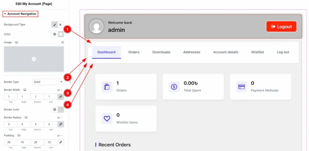
- Background Type: Set the background type color and choose the color for the Account Navigation section.
- Border Type: Select the type of the border, Solid, Dashed, Dotted, Double etc.
- Border Width: Set the thickness of the border.
- Border Color: Set the color for the border.
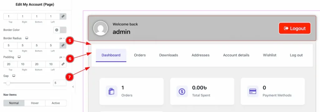
- Border Radius: Make the radius for the border.
- Padding: Set the inner space by following the padding.
- Gap: Set the gap from the wrapper section.
Nav Items
Normal
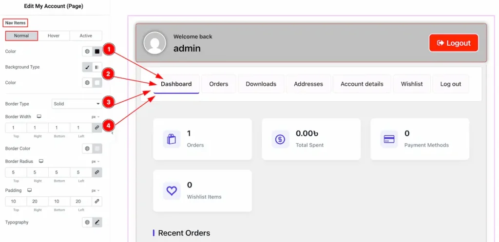
- Background Type: Set the background type color and choose the color for the Nav Items in normal state.
- Color: Set the color for the nav items.
- Border Type: Select the type of the border, Solid, Dashed, Dotted, Double etc.
- Border Width: Set the thickness of the border.
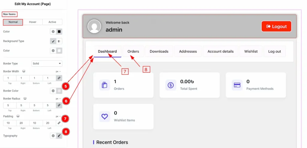
- Border Color: Set the color for the border.
- Border Radius: Make the radius for the border.
- Padding: Set the inner space by following the padding.
- Typography: Set the typography for the normal tab.
Hover
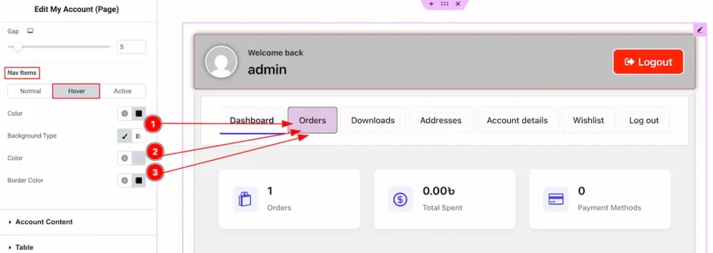
- Color: Set the color for the nav items.
- Background Type: Set the background type color and choose the color for the Nav Items in normal state.
- Border Type: Select the type of the border, Solid, Dashed, Dotted, Double etc.
Active
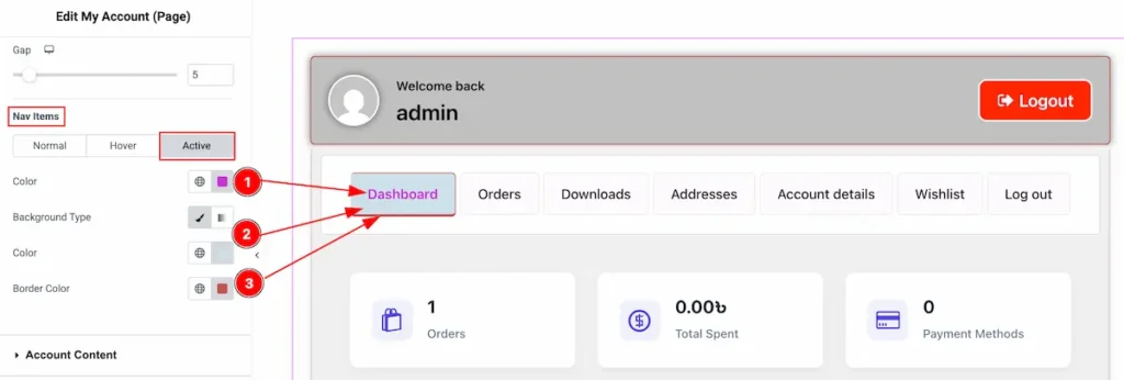
- Color: Choose the text color for the Nav Items.
- Background Type: Set the background type color and choose the color from the color plate.
- Border Color: Set the color for the border.
Account Content Section
Go to Style > Account Content
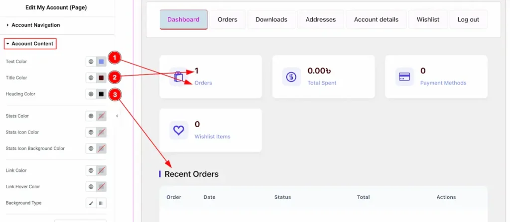
- Text Color: Set the color of the Text for the Account Content.
- Title Color: Set the color for the Title.
- Heading Color: Select the heading color for the account content.
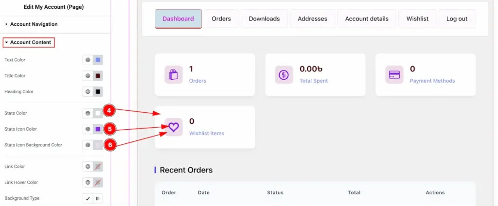
- Stats Color: Set the color for the status area.
- Stats Icon Color: Choose color for the stats icon color.
- Stats Icon Background Color: Select the background color for the stats icon.
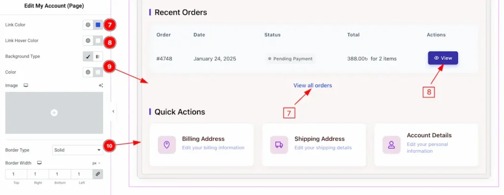
- Link Color: Set the color for the link.
- Link Hover Color: Choose the link hover color.
- Background Type: Select the background type color and choose color for the content.
- Border Type: Choose the type border for the area.
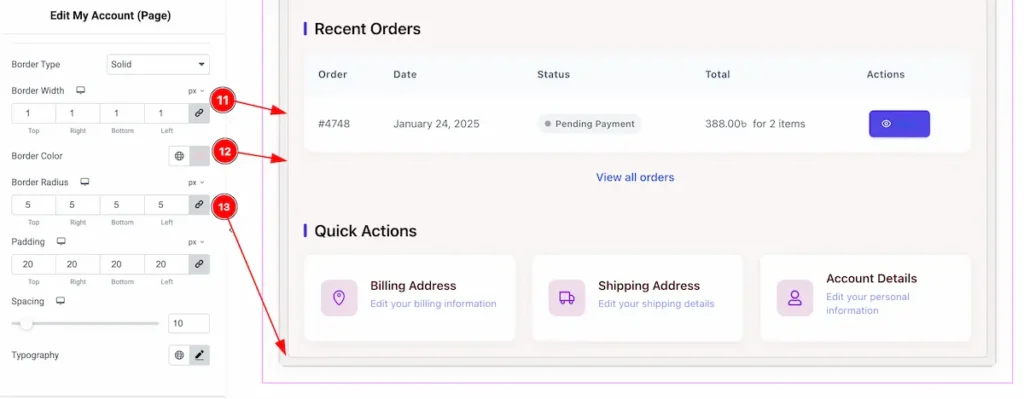
- Border Width: Set the width for the border.
- Border Color: Choose the color for the border.
- Border Radius: Make the border corner edges rounded by setting the border.
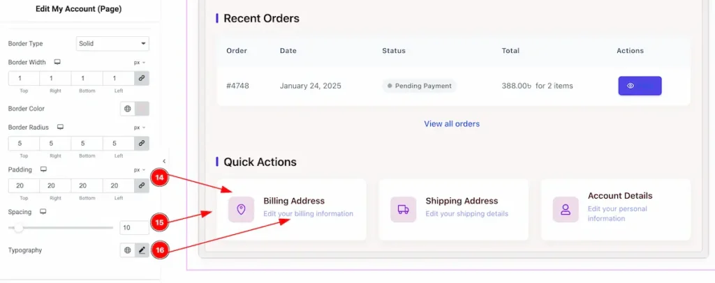
- Padding: Set the padding for the inner space of the content.
- Spacing: Set spacing from the left section.
- Typography: Choose the typography for this.
Table Section
Go to Style > Table
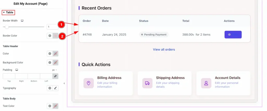
- Border Width: Set the width for the border.
- Border Color: Choose the color for the border.
Table Header
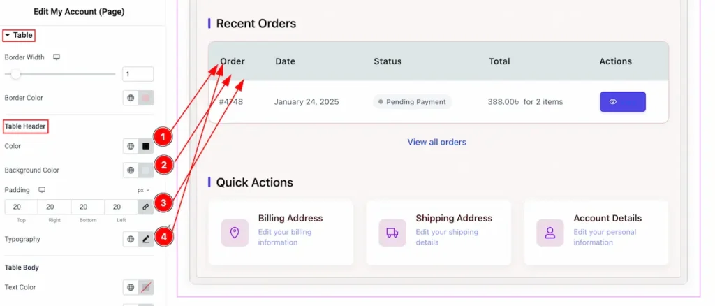
- Color: Choose the color for the Table Header.
- Background Color: Set the background color for the tabl.
- Padding: Set the inner spacing of the table header.
- Typography: Choose the typography of the table.
Table Body
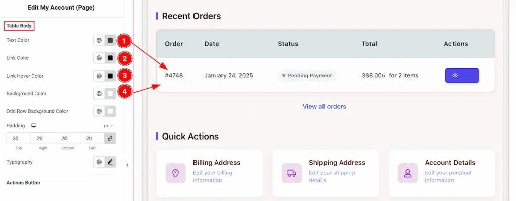
- Text Color: Choose the color of the Text.
- Link Color: Set the color for the link.
- Link Hover Color: Set the hover color for the link.
- Background Color: Set the background of the table body.
Action Button
Normal
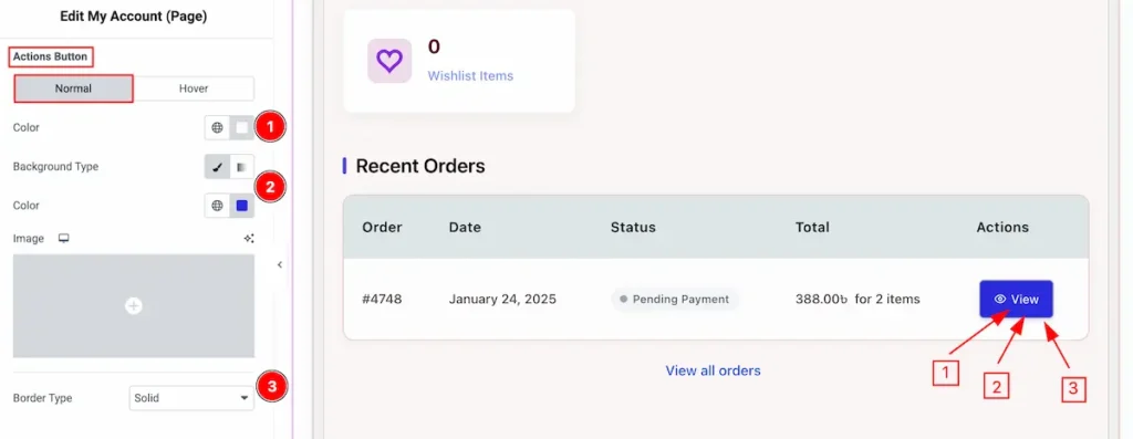
- Color: Choose the color for the action button.
- Background Type: Set the background type color of the button.
- Border Type: Set the border color for the button.
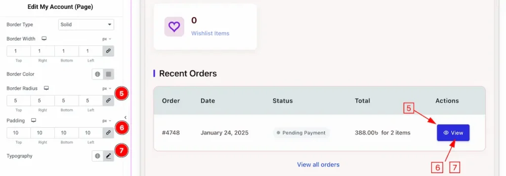
- Border Radius: Make the border corder edges rounded by setting the border.
- Padding: Set the padding for the button.
- Typography: Choose the typography of the button.
Hover
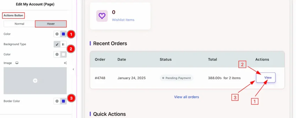
- Color: Choose the color for the action button.
- Background Type: Set the background for the button.
- Border Color: Choose the border color.
Address Section
Go to Style > Address
Address Info
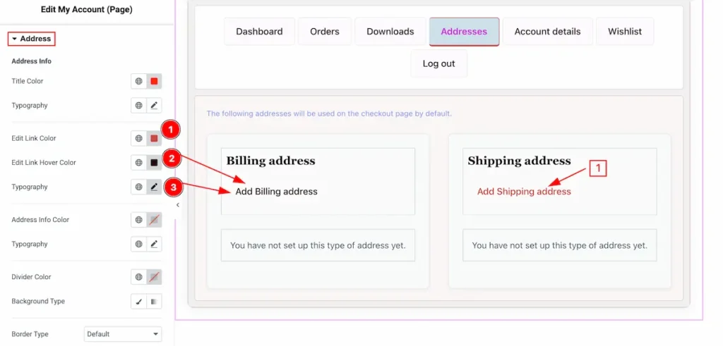
- Edit Link Color: Set the color for the Edit link.
- Edit Link Hover Color: Set the color for the hover link.
- Typography: Set the typography of the address info.
Address Info
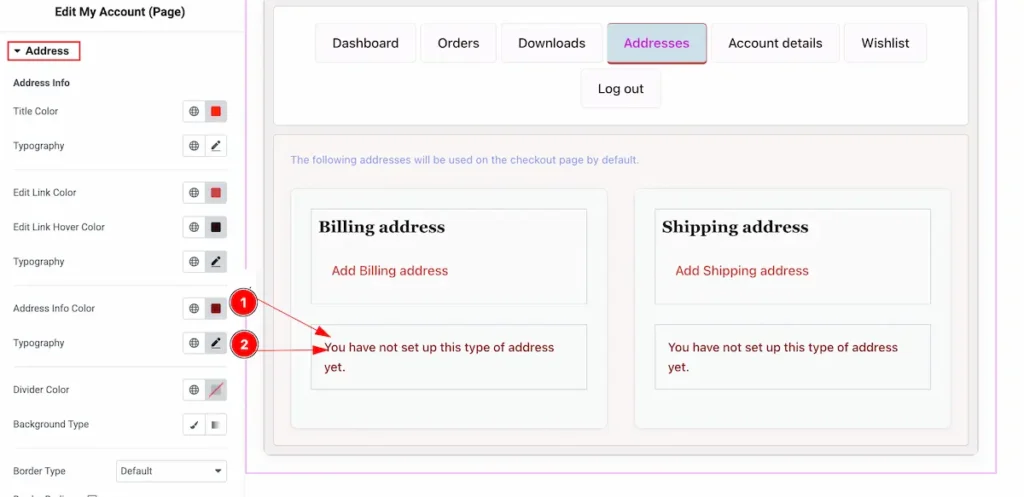
- Address Info Color: Set the color for the address info.
- Typography: Set the typography of the address.
Divider Color
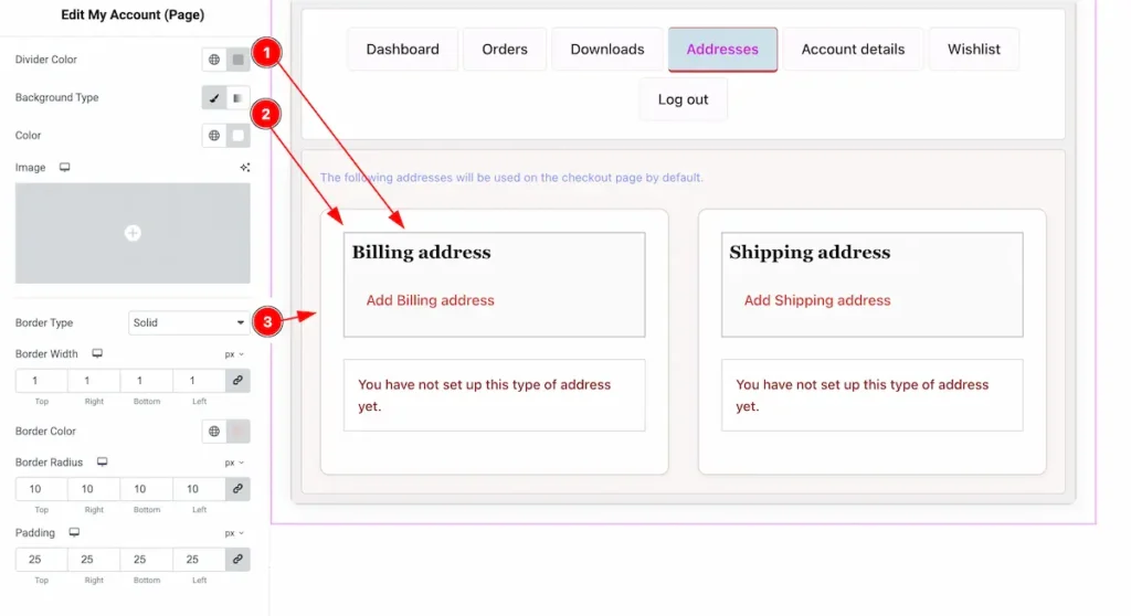
- Divider Color: Set the color for the divider.
- Background Type: Choose the background type color for the divider section.
- Border Type: Select the type border.
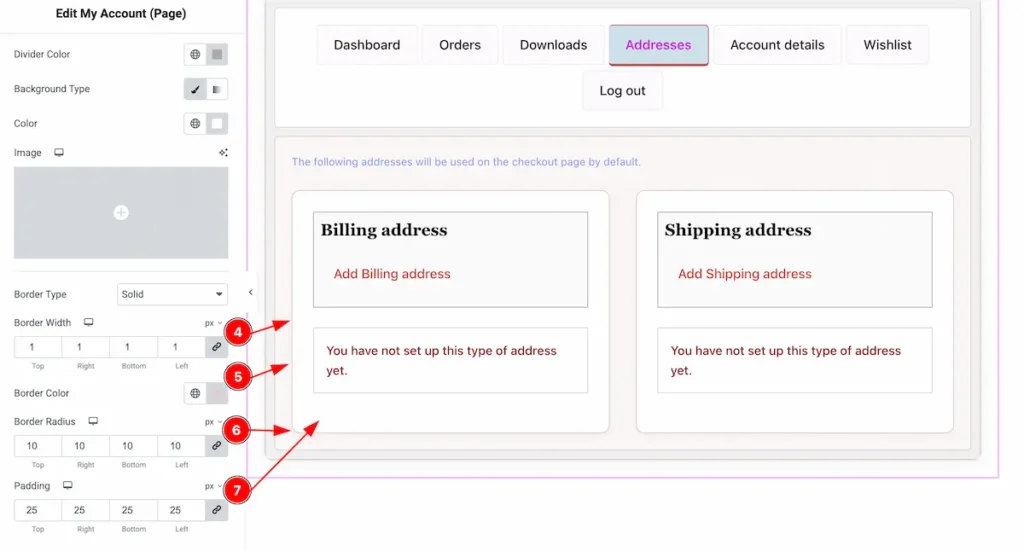
- Border Width: Set the thickness of the border.
- Border Color: Set the color for the border.
- Border Radius: Make the border radius to Border Corner edges rounded.
- Padding: Set the padding for the inner space.
Form Fields Section
Go to Style > Form Fields
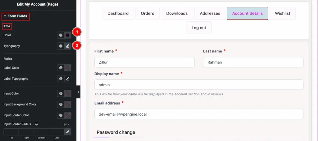
- Color: Choose the color for the Title of Form Fields.
- Typography: Set the typography for the fields section.
Fields
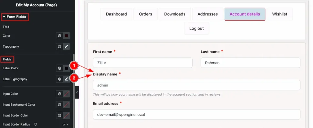
- Label Color: Set the label color for the forms fields.
- Label Typography: Set the typography for the label.
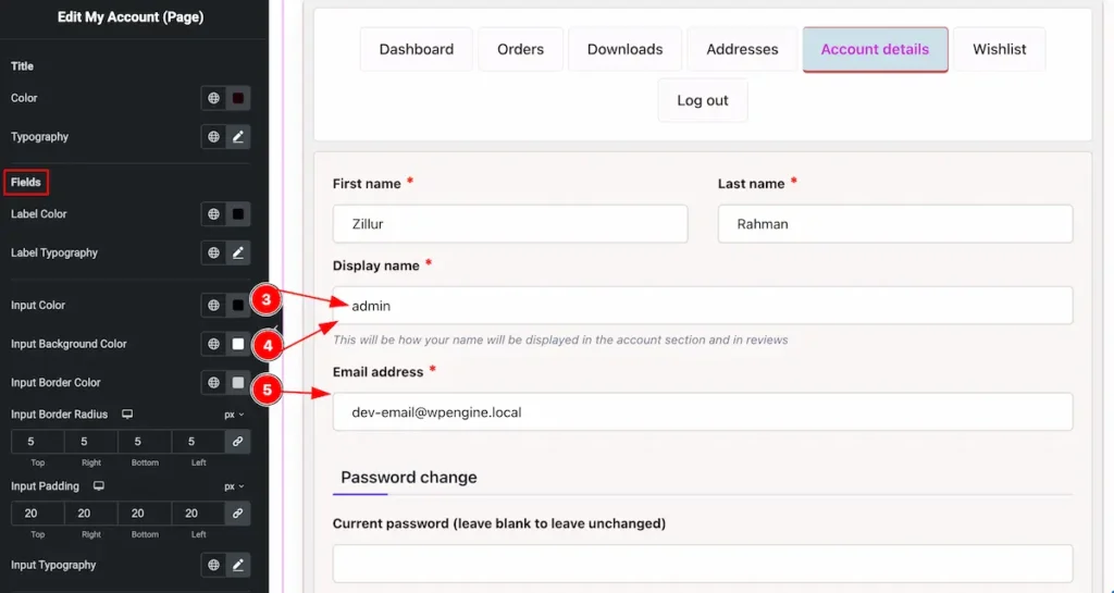
- Input Color: Set the color for the input fields.
- Input Background Color: Choose the background color of the input.
- Input Border Radius: Set the border corner edges rounded by setting the padding.
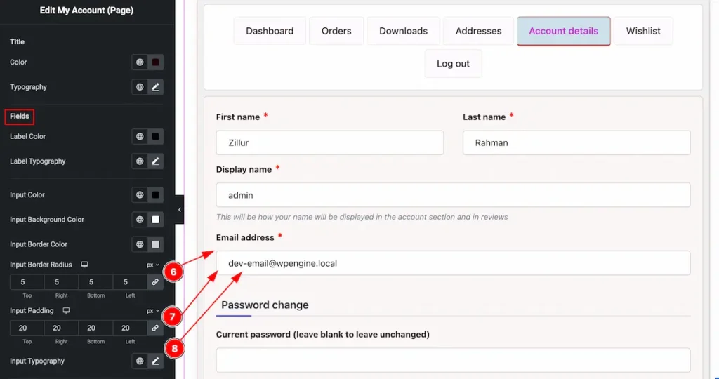
- Input Border Radius: Set the border radius for the input.
- Input Padding: Set the spacing for the input padding.
- Input Typography: Choose the typography of the Input section.
Submit Button
Normal
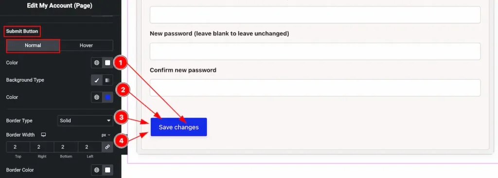
- Color: Choose the color for the submit button text.
- Background Type: Select the background type color for the button.
- Border Type: Set the border type, Different types of border are available double, dashed, dotted, solid, none etc.
- Border Width: Set the thickness of the border.
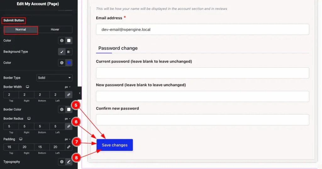
- Border Color: Choose the color for the border.
- Border Radius: Make the border corner edges rounded by setting the border radius.
- Padding: Set the padding for the button.
- Typography: Choose the typography for the button.
Hover
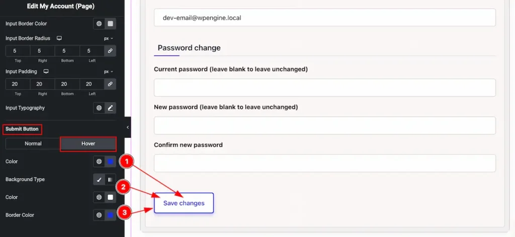
- Color: Choose the color for the submit button.
- Background Type: Set the background type color and select color for it.
- Border Color: Set the color for the border.
Video Assist
Video Tutorial Coming Soon and Check the demo by following.
Thanks in advance.