

In this documentation, we will show you how to customize the Cart Page widget by Ultimate Store Kit.
Enable the Cart Page Widget
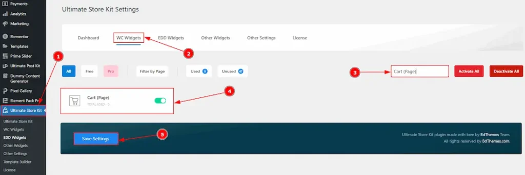
To use the Cart Page widget by Ultimate Store Kit, first, you have to enable the widget.
- Go to WordPress > Ultimate Store Kit Plugin dashboard.
- Then, Click the WC Widgets Tab.
- Search the Cart Page Widget Name.
- Enable the Cart Page Widget.
- Hit the Save Settings Button.
Inserting the Cart Page widget
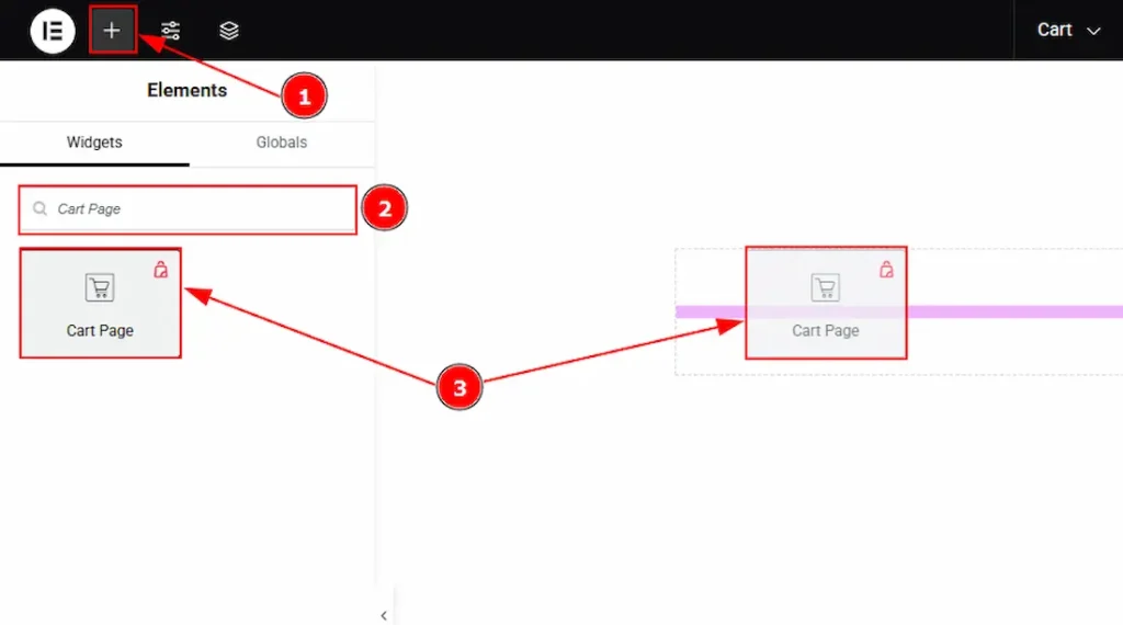
- Go to the Elementor Editor Page and Hit the “+” (Add Element) icon button.
- Search the Cart Page widget.
- Drag the widget and drop it on the editor page
Configuring the Content Tab of the Cart Page
The Content Tab provides options to manage and structure the core settings of elements. It allows defining the content and functionality to align with design goals.
Layout Section
Go to Content > Cart Layout
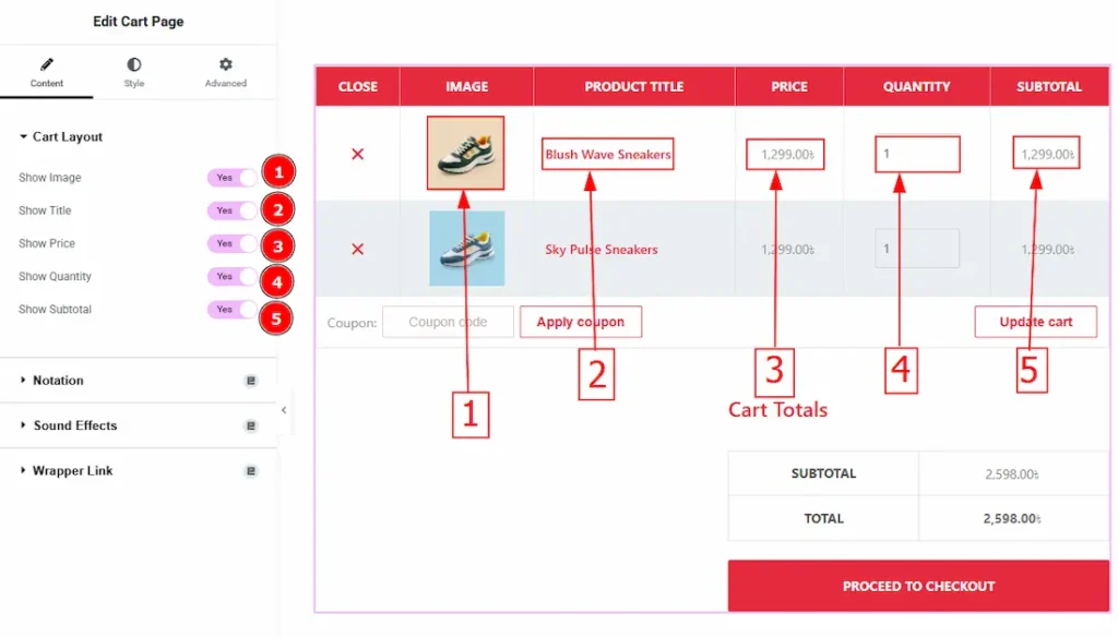
1. Show Image: Enable/disable the switcher to show/hide the image.
2. Show Title: Enable/disable the switcher to show/hide the title.
3. Show Price: Enable/disable the switcher to show/hide the price.
4. Show Quantity: Enable/disable the switcher to show/hide quantity.
5. Show Subtotal: Enable/disable the switcher to show/hide the subtotal.
Work with the Style Tab
Cart Heading Section
Go to Style > Cart Heading
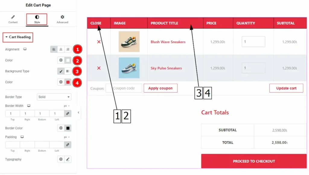
1. Alignment: You can select the heading position to left, center or right with this option.
2. Color: You can change the heading color with this option.
3. Background Type: You can change the color of any object background to classic or gradient. In Classic, you can change the background color and also set an image to the background. In the gradient option, you can also set background color along with locations and angle for each breakpoint to ensure the gradient adapts to different screen sizes. Also, you can change the gradient type (Radial & Linear) and positions.
4. Color: You can change the heading’s background color with this option.
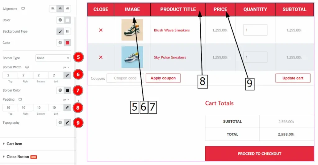
5. Border Type: This option allows you to add borders to your items. You can select various border types from this option. Such as Solid, Double, Dotted, Dashed, Groove.
6. Border Width: Set the thickness of the border with this option.
7. Border Color: You can change the border color with this option.
8. Padding: You can adjust the space inside the heading field with this option.
9. Typography: Change the heading’s font family, size, weight, transform, style, decoration, line height, letter spacing, and word spacing from here.
Cart Item Section
Go to Style > Cart Item
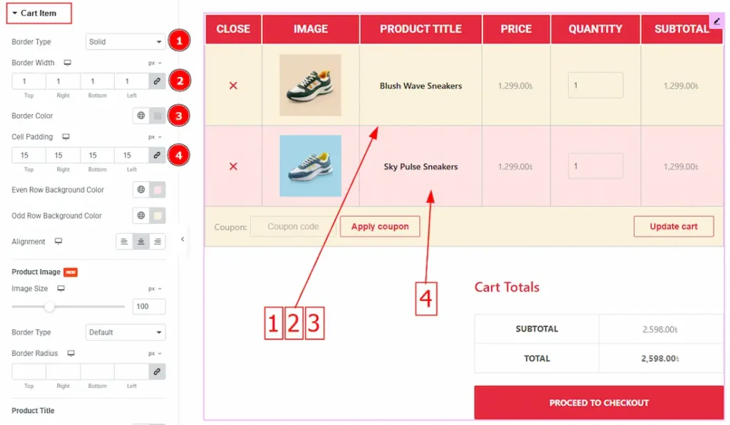
1. Border Type: This option allows you to add borders to your items. You can select various border types from this option. Such as solid, double, dots, dashes, and grooves.
2. Border Width: Set the thickness of the border with this option.
3. Border Color: You can change the border color with this option.
4. Cell Padding: This option controls the roundness of the border.
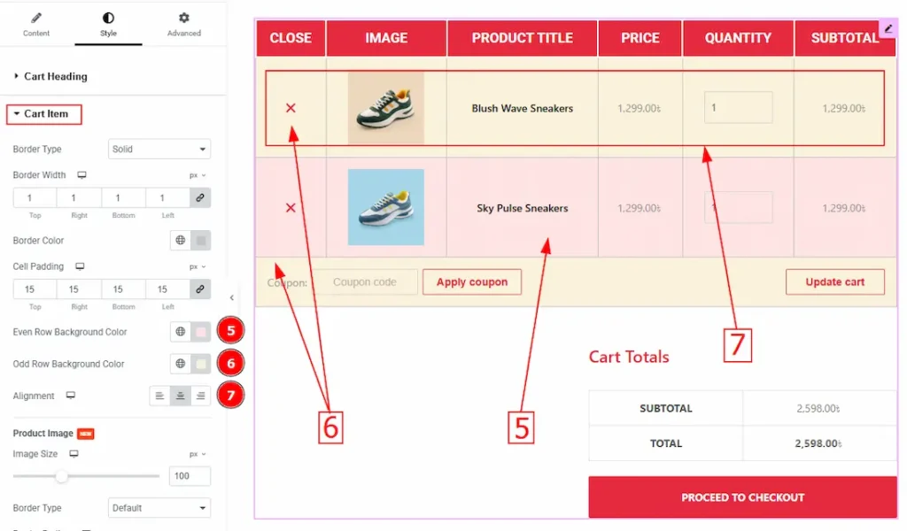
5. Even Row Background Color: You can change the even row background color with this option.
6. Odd Row Background Color: You can change the odd row background color with this option.
7. Alignment: You can set the label position to left or right with this position.
Product Image Sub-Section
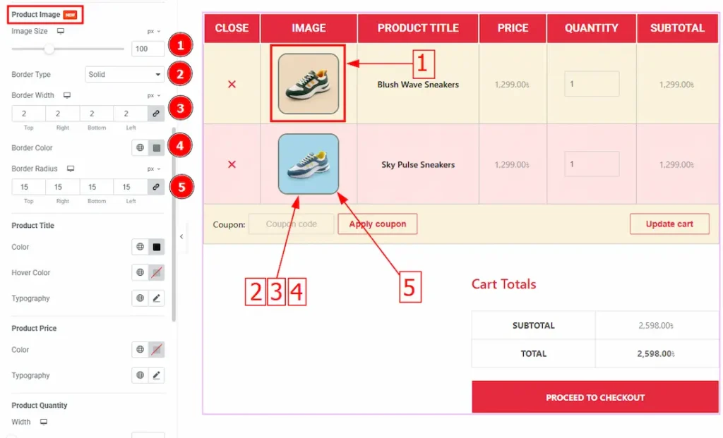
1. Image Size: You can adjust the image size with this option.
2. Border Type: This option allows you to add and change the border type.
3. Border Width: Set the thickness of the border with this option.
4. Border Color: You can change the border color with this option.
5. Border Radius: This option controls the roundness of the border.
Product Title Sub-Section
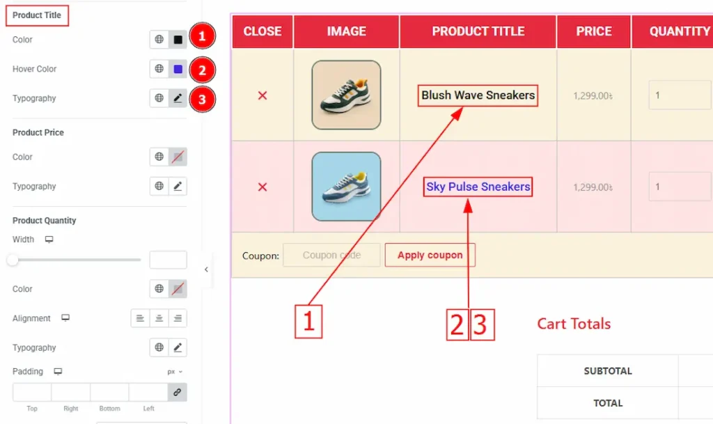
1. Color: You can change the title color with this option.
2. Hover Color: You can set the title hover color with this option.
3. Typography: Change the title’s text font family, size, weight, transform, style, decoration, line height, letter spacing and word spacing with this option.
Product Price Sub-Section
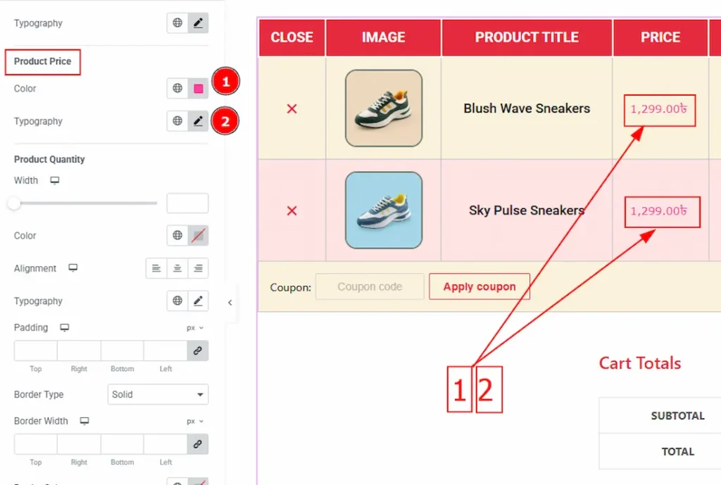
1. Color: You can change the product price color with this option.
2. Typography: Change the price’s text font family, size, weight, transform, style, decoration, line height, letter spacing and word spacing with this option.
Product Quantity Sub-Section
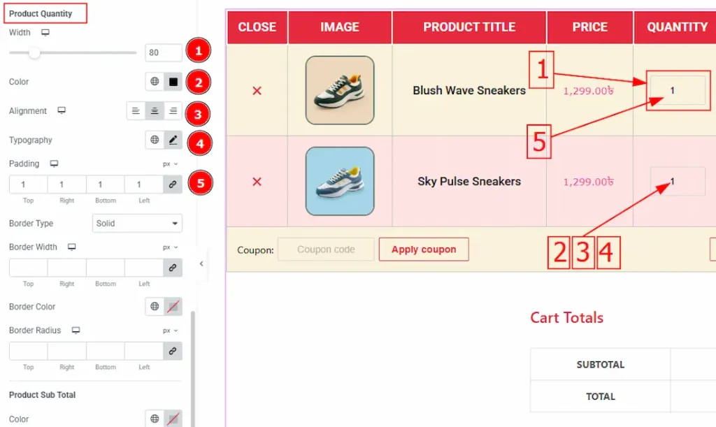
1. Width: You can set the width of the product quantity field with this option.
2. Color: You can change the quantity color with this option.
3. Alignment: This option allows you to move the quantity text position to left, center or right.
4. Typography: Change the quantity text font family, size, weight, transform, style, decoration, line height, letter spacing and word spacing with this option.
5. Padding: This option controls the inner space of the quantity field.
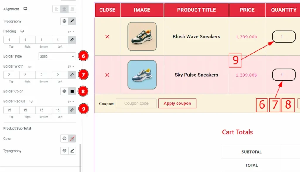
6. Border Type: You can add various types of borders with this option.
7. Border Width: Set the thickness of the border with this option.
8. Border Color: You can change the border color with this option.
9. Border Radius: This option controls the roundness of the border with this option.
Product Sub Total SubSection
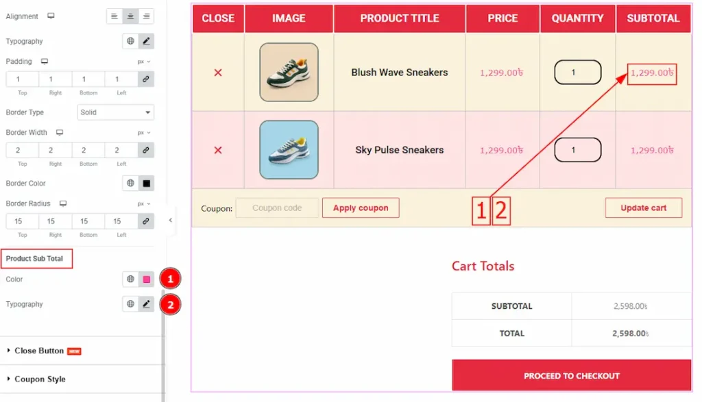
1. Color: You can change the product subtotal color with this option.
2. Typography: Change the subtotal text font family, size, weight, transform, style, decoration, line height, letter spacing and word spacing with this option.
Close Button Section
Go to Style > Close Button
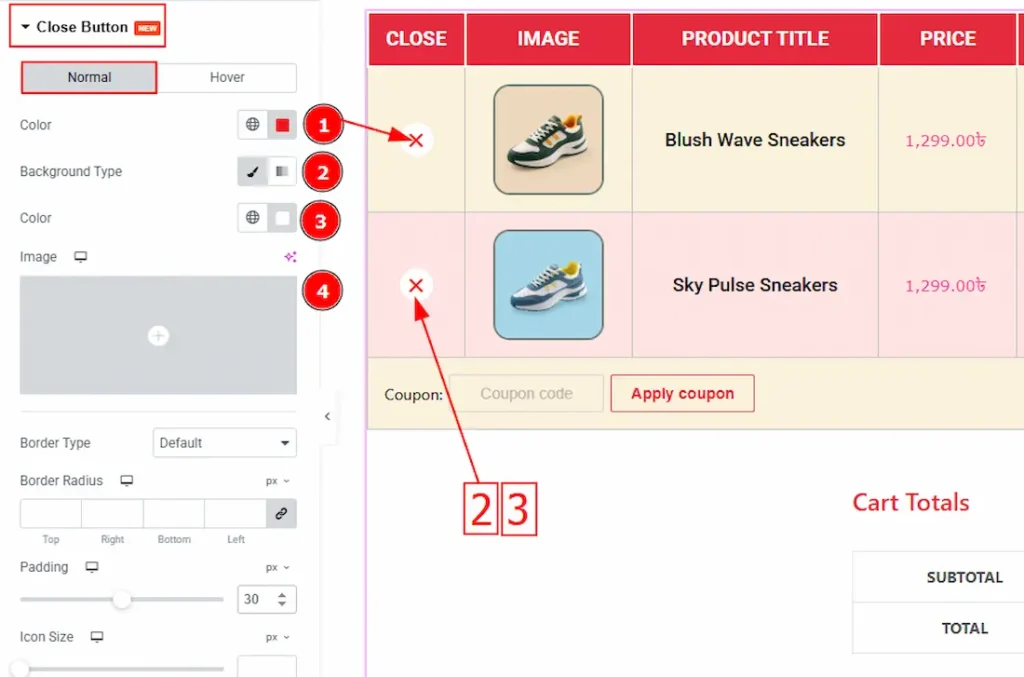
In this section, we have two tabs. One is Normal and the other is Hover. Let’s start with the Normal tab –
1. Color: You can change the label color with this option.
2. Background Type: You can change the required indicator color with this option.
3. Color: You can set the background color with this option.
4. Image: You can add a background image with this option.
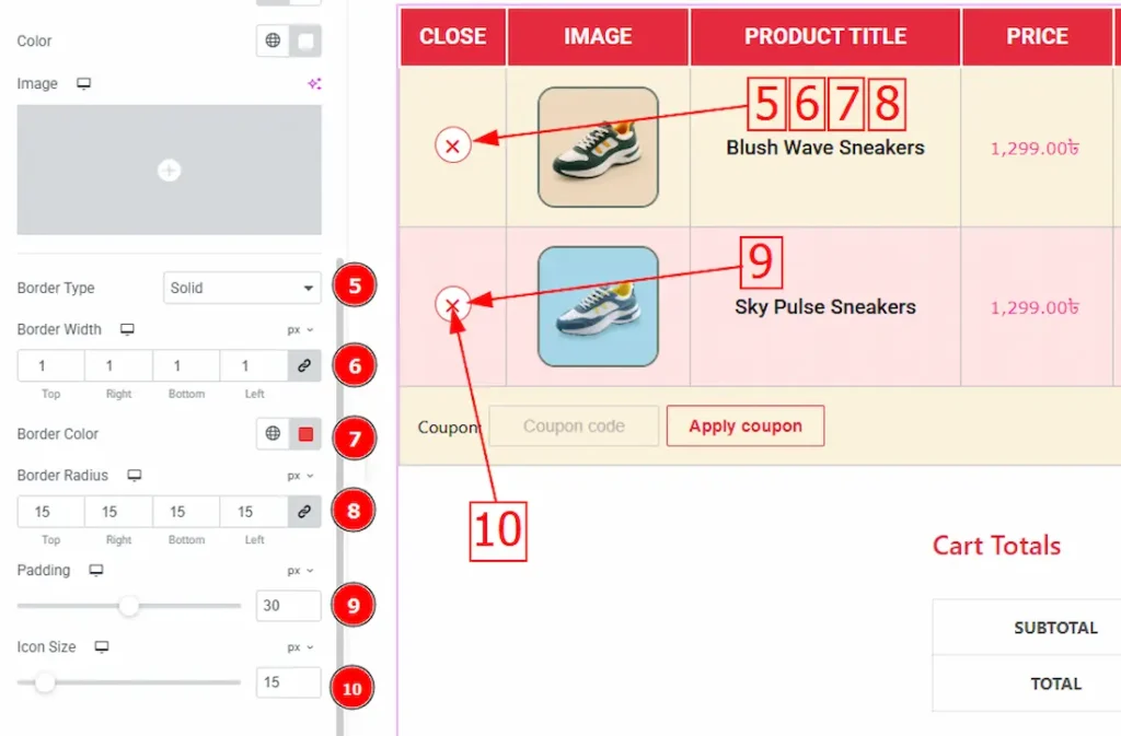
5. Border Type: This option allows you to add a border of different types.
6. Border Width: Set the thickness of the border with this option.
7. Border Color: You can change the border color with this option.
8. Border Radius: This option controls the roundness of the border.
9. Padding: You can adjust the inner space of the close button with this option.
10. Icon Size: You can adjust the close button icon size with this option.
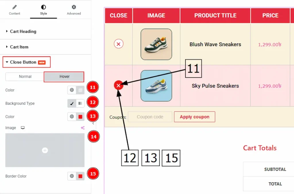
Now, let’s proceed to the Hover Tab –
1. Color: You can set the hover color with this option.
2. Background Type: This option allows to you to set the background to classic or gradient.
3. Color: You can change the background color with this option.
4. Image: You can change the background image with this option.
Coupon Style Section
Go to Style > Coupon Style
In this section, we have three sub sections. These are Coupon Label, Coupon Field & Coupon Button. Let’s explore those one by one –
Coupon Label
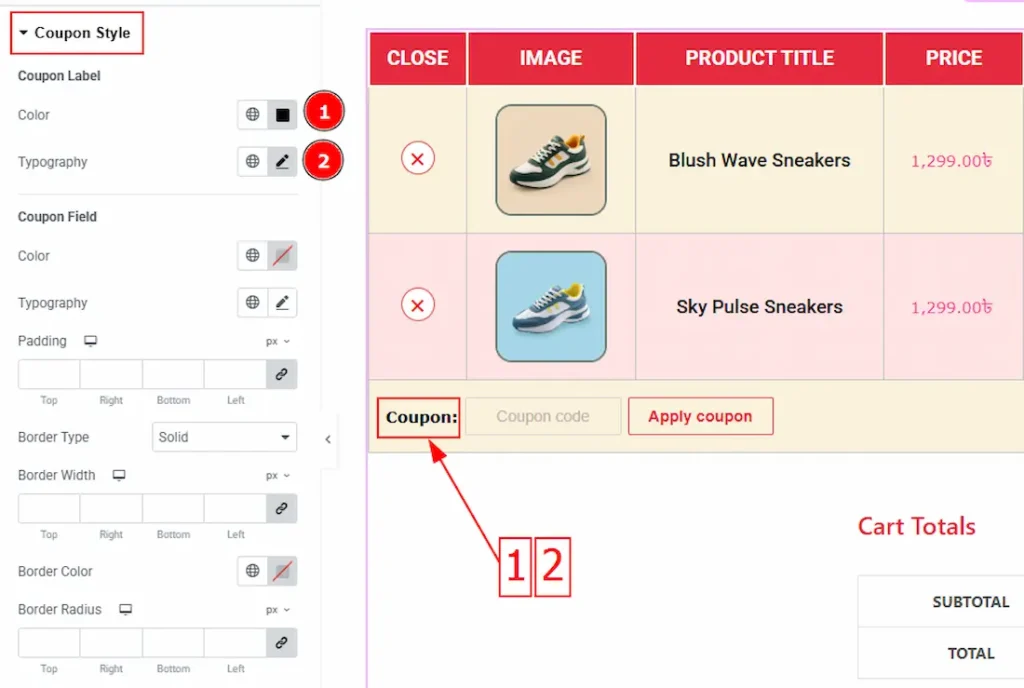
1. Color: You can change the coupon label color with this option.
2. Typography: Change the coupon label text font family, size, weight, transform, style, decoration, line height, letter spacing and word spacing with this option.
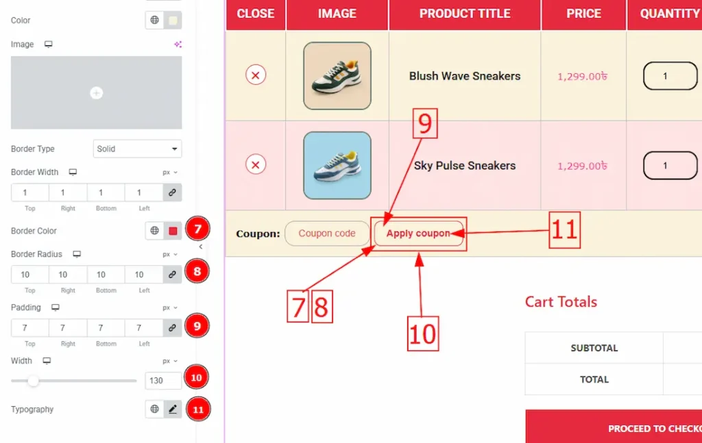
Coupon Field
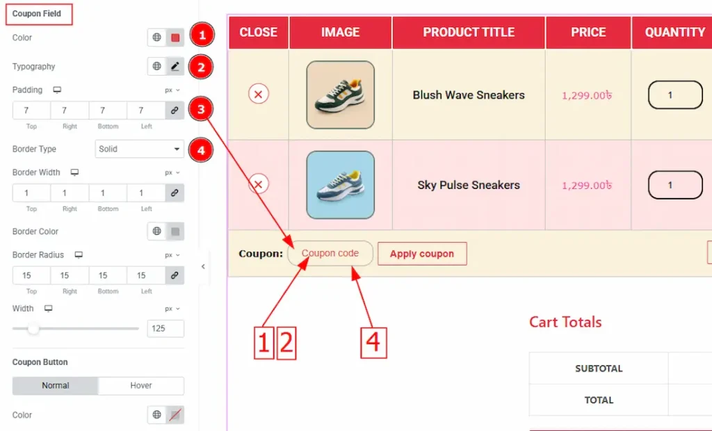
1. Color: You can change the coupon field text color with this option.
2. Typography: Change the coupon field text font family, size, weight, transform, style, decoration, line height, letter spacing and word spacing with this option.
3. Padding: This option allows you to adjust the inner space of the coupon field.
4. Border Type: This option allows you to add and change various types of borders.
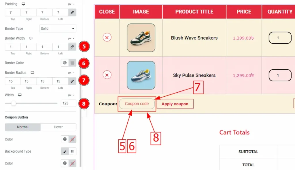
5. Border Width: Set the border’s thickness with this option.
6. Border Color: You can change the border color with this option.
7. Border Radius: This option controls the roundness of the border.
8. Width: You can adjust the width of the coupon field with this option.
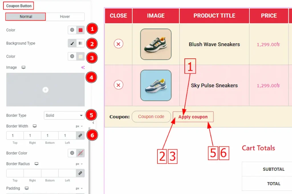
Coupon Button
In this sub-section we have two tabs. One is Normal and the other is Hover. Let’s proceed to the Normal Tab first:
1. Color: You can change the button text color with this option.
2. Background Type: This option allows you to set the background to classic or gradient. Here we selected classic.
3. Color: You can change the background color with this option.
4. Image: You can change the background image with this option.
5. Border Type: You can add various types of borders with this option.
6. Border Width: Set the thickness of the border with this option.
7. Border Color: You can change the border color with this option.
8. Border Radius: This option controls the roundness of the border.
9. Padding: This option allows you to adjust the inner space of the button.
10. Width: You can change the button width with this option.
11. Typography: Change the button’s text font family, size, weight, transform, style, decoration, line height, letter spacing and word spacing with this option.
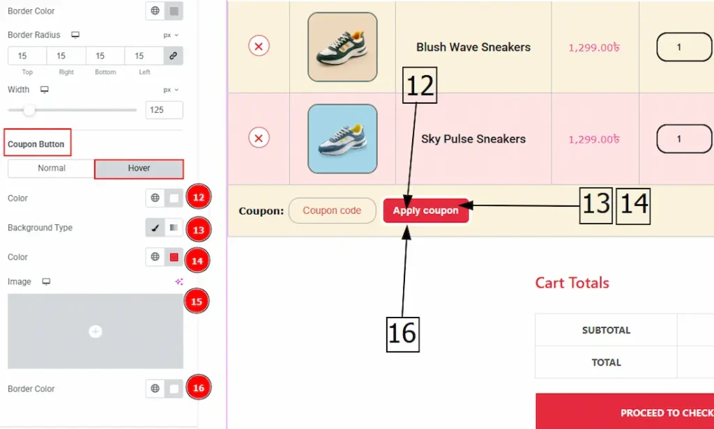
Now, let’s proceed to the hover tab –
12. Color: You can change the button text hover color with this option.
13. Background Type: This option allows you to change the background type to classic or gradient.
14. Color: You can change the background color with this option.
15. Image: You can change the background image with this option.
16. Border Color: You can change the border hover color with this option.
Cart Update Button Section
Go to Style > Cart Update Button
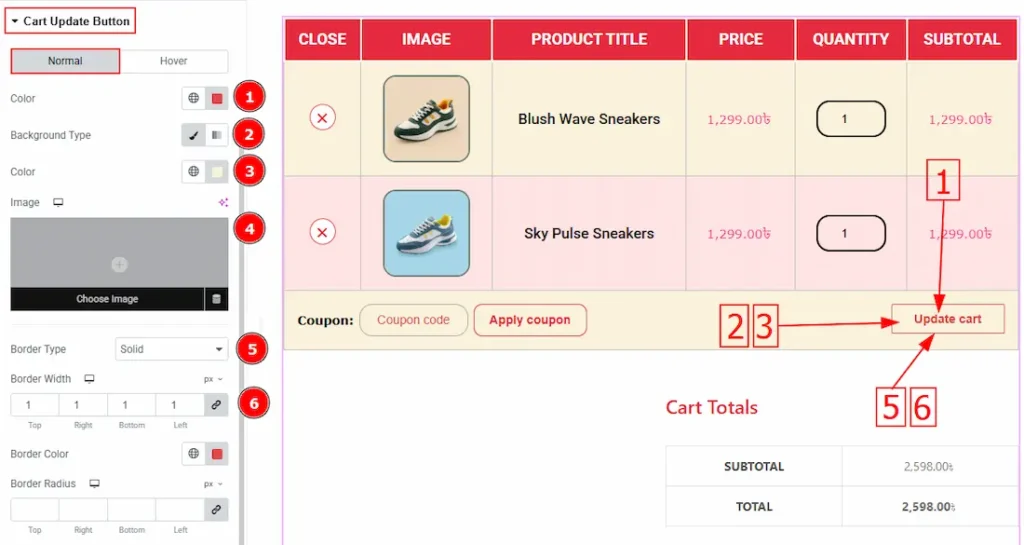
In this section, we have two tabs. One is Normal & the other is Hover. Let’s start with the Normal tab first –
1. Color: You can change the cart update button text with this option.
2. Background Type: This option allows you to change the background type to classic or gradient.
3. Color: You can change the background color with this option.
4. Image: You can change the background image with this option.
5. Border Type: You can add various types of borders with this option.
6. Border Width: Set the thickness of the border with this option.
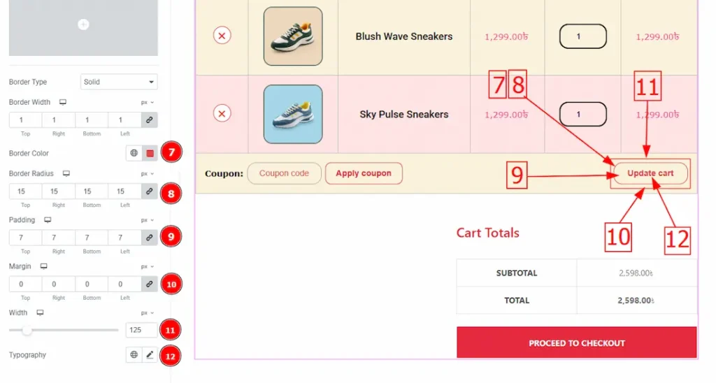
7. Border Color: You can change the border color with this option.
8. Border Radius: This option controls the roundness of the border.
9. Padding: This option allows you to adjust the inner space of the button.
10. Margin: You can adjust the space around the cart update button with this option.
11. Width: You can change the button width with this option.
12. Typography: Change the button’s text font family, size, weight, transform, style, decoration, line height, letter spacing and word spacing with this option.
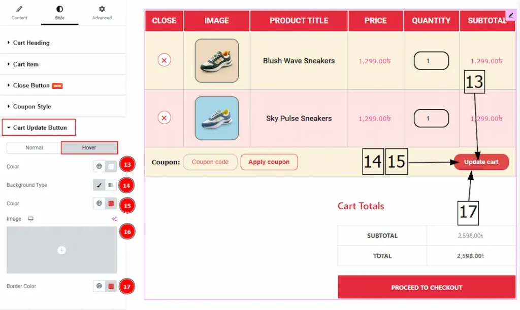
Now, let’s proceed to the Hover Tab –
1. Color: You can change the cart update button text hover color with this option.
2. Background Type: This option allows you to change the background type to classic or gradient.
3. Color: You can change the background hover color with this option.
4. Image: You can change the background image with this option.
5. Border Color: You can change the border hover color with this option.
Cart Collaterals Section
Go to Style > Cart Collaterals
In this section, we have two sub-sections & two tabs. Let’s explore those one by one –
Heading Sub-Section
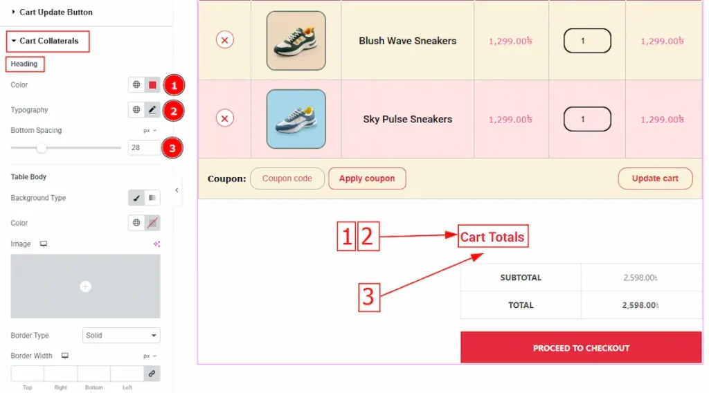
1. Color: You can change the heading color with this option.
2. Typography: Change the heading’s font family, size, weight, transform, style, decoration, line height, letter spacing & word spacing from here.
3. Bottom Spacing: You can adjust the bottom space of the heading with this option.
Table Body Sub-Section
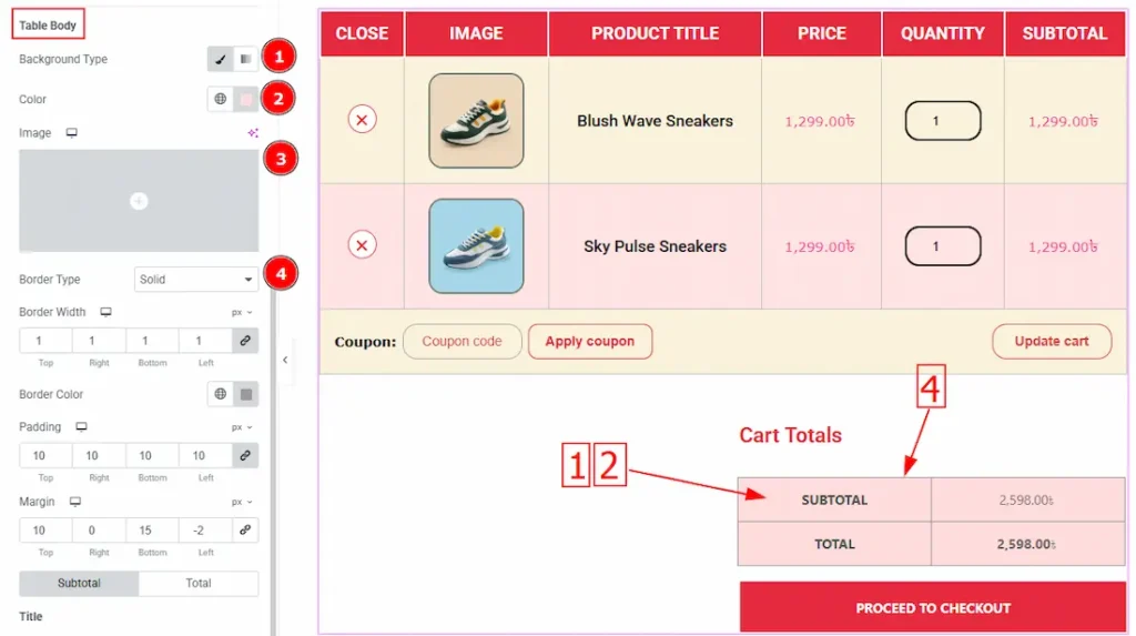
1. Background Type: This option allows you to change the background type to classic or gradient.
2. Color: You can change the background color with this option.
3. Image: You can change the background image with this option.
4. Border Type: You can add various types of borders with this option.
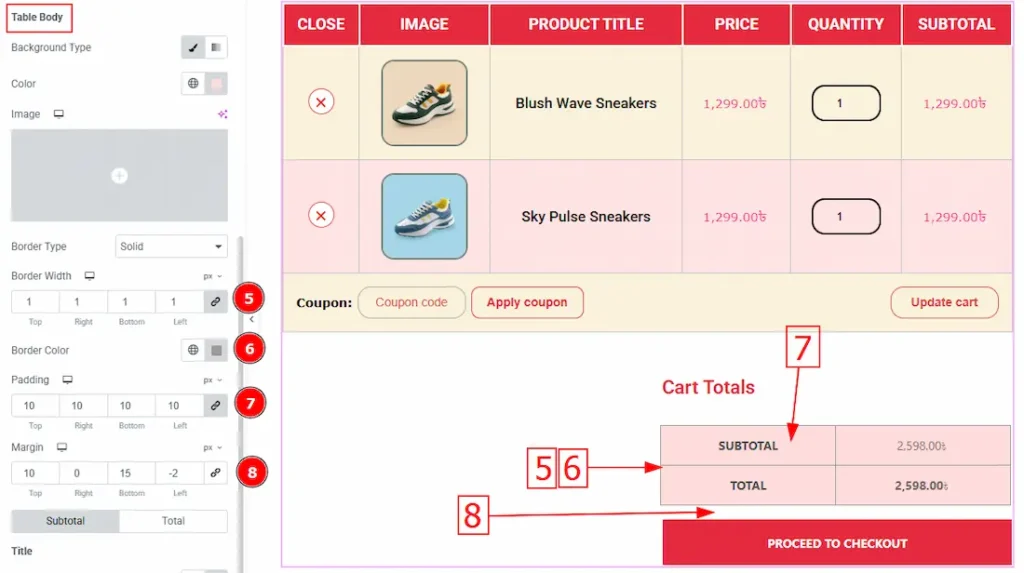
5. Border Width: Set the thickness of the border with this option.
6. Border Color: You can change the border color with this option.
7. Padding: This option allows you to adjust the inner space of the button.
8. Margin: You can adjust the space around the button with this option.
Subtotal subsection
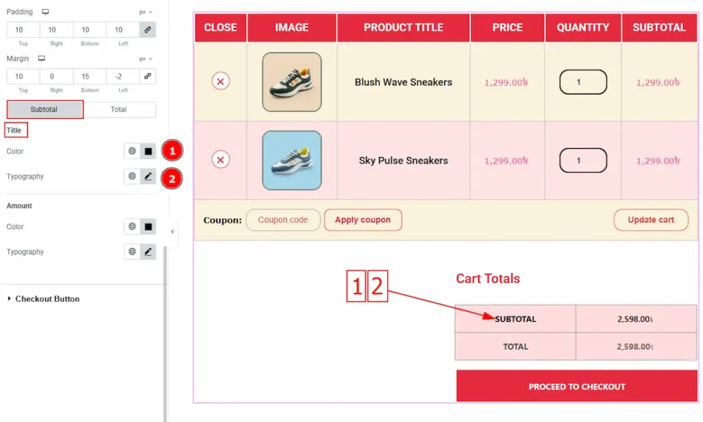
Come to the Subtotal subsection, you will get two subsections; Title & Amount. Lets explore the Title subsection-
1. Color: You can change the title color with this option.
2. Typography: Change the title’s font family, size, weight, transform, style, decoration, line height, letter spacing & word spacing from here.
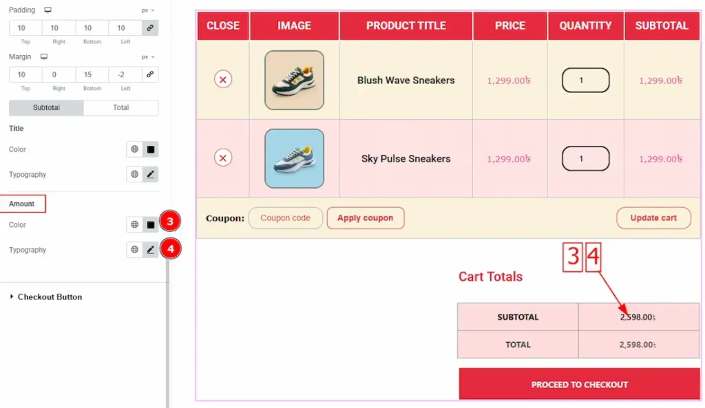
Lets explore the Amount subsection-
3. Color: You can change the amount color with this option.
4. Typography: Change the amount’s font family, size, weight, transform, style, decoration, line height, letter spacing & word spacing from here.
Total subsection
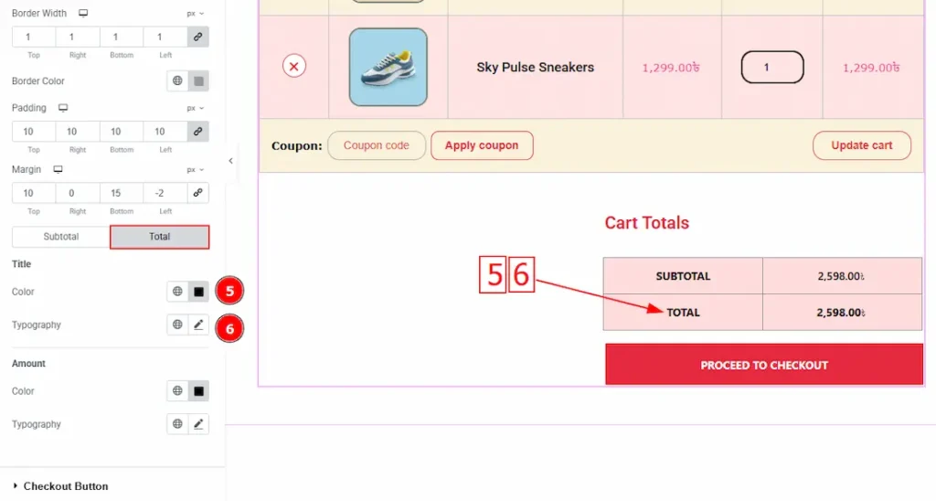
Come to the Total subsection, you will get two subsections; Title & Amount. Lets explore the Title subsection-
1. Color: You can change the title color with this option.
2. Typography: Change the title’s font family, size, weight, transform, style, decoration, line height, letter spacing & word spacing from here.
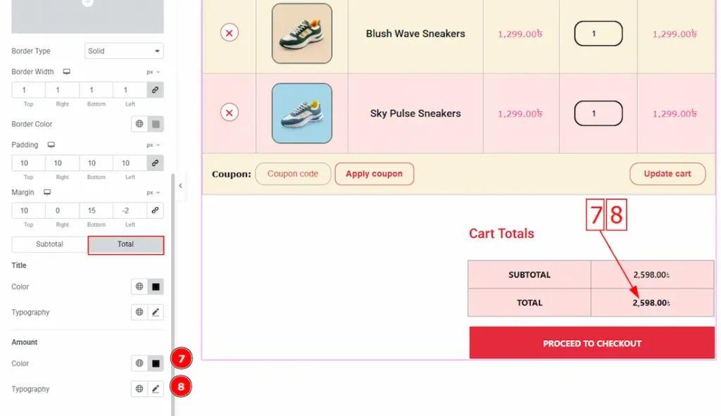
Lets explore the Amount subsection-
1. Color: You can change the amount color with this option.
2. Typography: Change the amount’s font family, size, weight, transform, style, decoration, line height, letter spacing & word spacing from here.
Checkout Button Section
Go to Style > Checkout Button
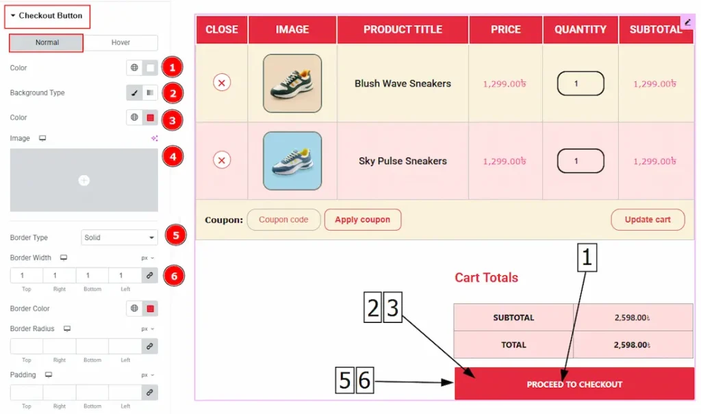
In this section, we have two tabs. These are Normal & Hover. Let’s start with the Normal Tab –
1. Color: You can change the checkout button text with this option.
2. Background Type: This option allows you to change the background type to classic or gradient.
3. Color: You can change the background color with this option.
4. Image: You can change the background image with this option.
5. Border Type: You can add various types of borders with this option.
6. Border Width: Set the thickness of the border with this option.
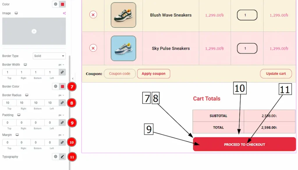
7. Border Color: You can change the border color with this option.
8. Border Radius: This option controls the roundness of the border.
9. Padding: This option allows you to adjust the inner space of the button.
10. Margin: You can adjust the space around the cart update button with this option.
11. Typography: Change the button’s text font family, size, weight, transform, style, decoration, line height, letter spacing and word spacing with this option.
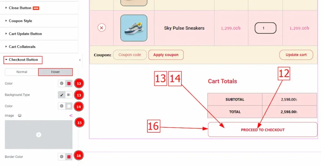
Now, let’s proceed to the Hover Tab –
12. Color: You can change the checkout button text hover color with this option.
13. Background Type: This option allows you to change the background type to classic or gradient.
14. Color: You can change the background hover color with this option.
15. Image: You can change the background image with this option.
16. Border Color: You can change the border hover color with this option.
All done! You have successfully customized the Cart Page widget on your website.
Video Assist
The video will come soon. Please visit the demo page for examples.
Thanks for being with us.