

The Dark Mode widget from Element Pack Pro lets you add a toggle for switching between light and dark themes on your website. It helps improve user experience and accessibility with customizable styling options. This documentation explains how to use and customize the Dark Mode widget in Elementor.
Enable The Dark Mode Widget
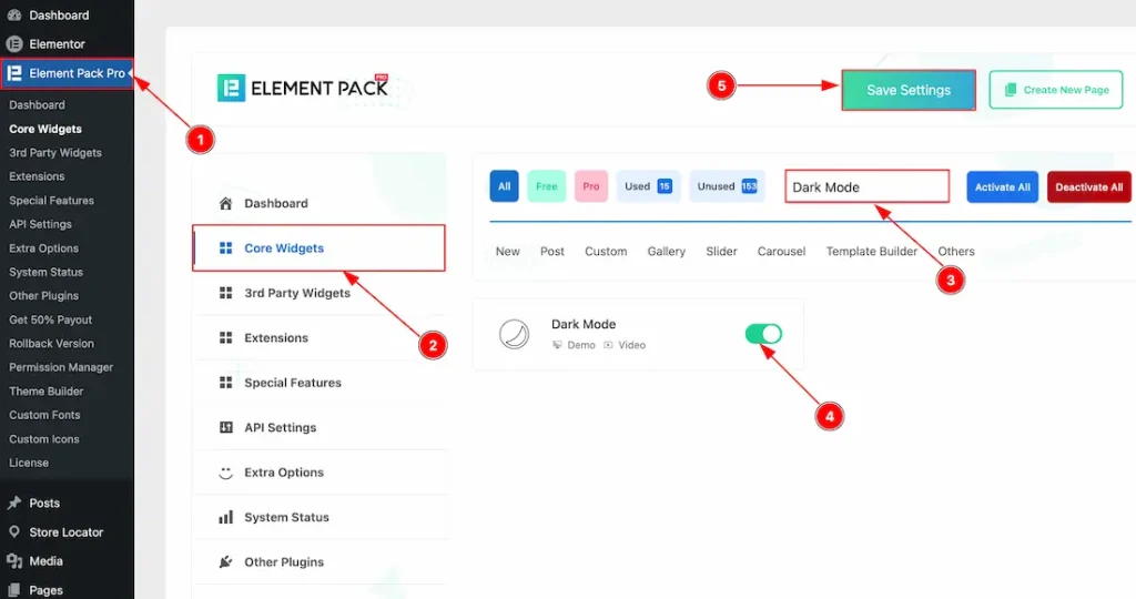
To use the Dark Mode widget from Element Pack, first, you have to enable the widget.
- Go to WordPress dashboard → Element Pack Plugin dashboard.
- Then, Click the Core Widgets Tab.
- Search the Dark Mode Widget Name.
- Enable the Dark Mode Widget.
- Hit the Save Settings Button.
Inserting The Dark Mode Widget
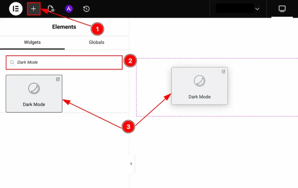
1. Go to the Elementor Editor Page and hit the “+” icon Button.
2. Search the Dark Mode name.
3. Drag the widget and drop it on the editor page.
Work With The Content Tab
Dark Mode Section
Go to Content → Dark Mode
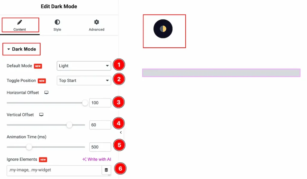
1. Default Mode: You can set the dark mode default as light or dark with this option.
2. Toggle Position: You can set the position of the toggle to top start, top end, bottom start or bottom end with this option.
3. Horizontal Offset: You can move the toggle horizontally with this option.
4. Vertical Offset: You can move the toggle vertically with this option.
5. Animation Time (ms): You can adjust the animation time while changing the mode with this option.
6. Ignore Elements: You can add the class or ID of any element you want to exclude from dark mode here.
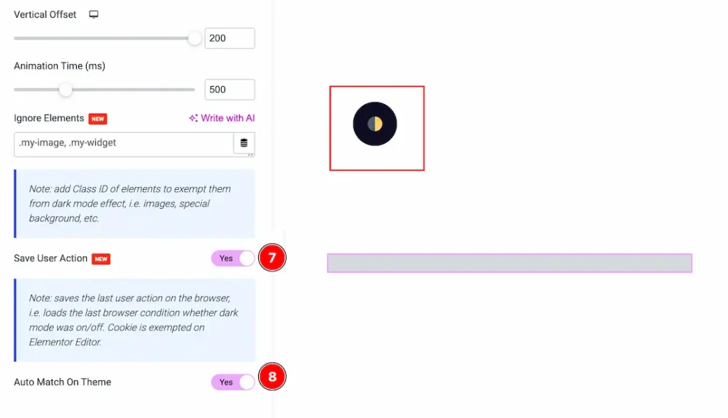
7. Save User Action: Enable this option to save the user’s dark mode preference and persist it across visits.
8. Auto Match On Theme: You can enable the switcher to auto-match the dark mode with the theme here.
Work with The Style Tab
Dark Mode Section
Go to Style → Dark Mode
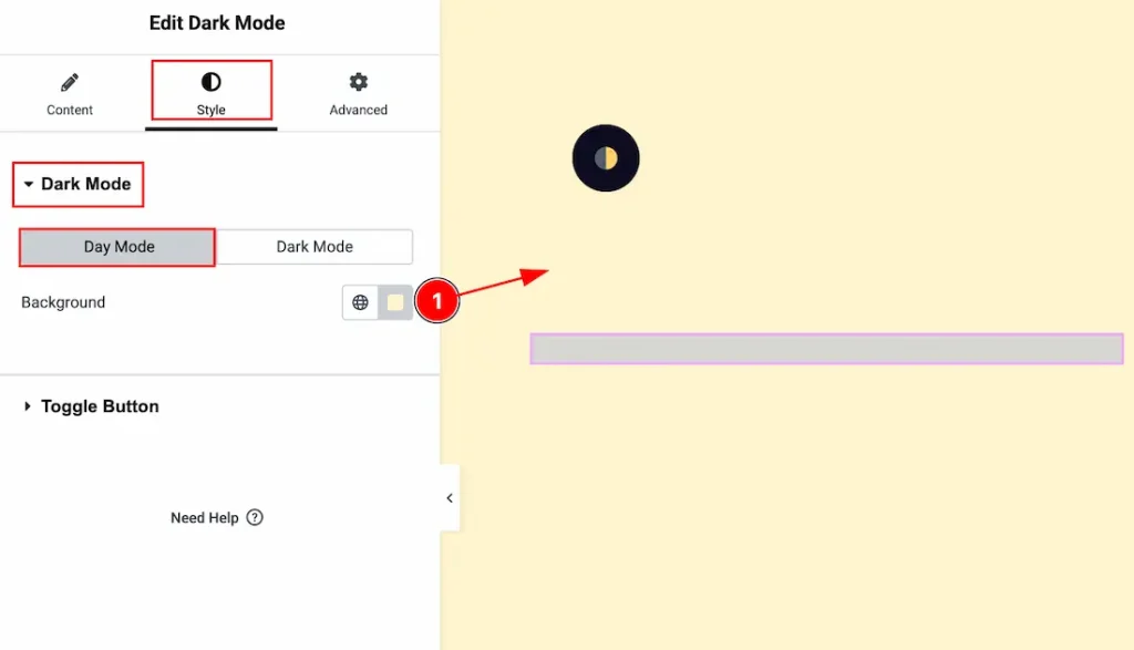
In this section, we have two more tabs. These are Day Mode & Dark Mode. Let’s start with the Day mode first –
1. Background: You can change the background when you are in day mode with this option.
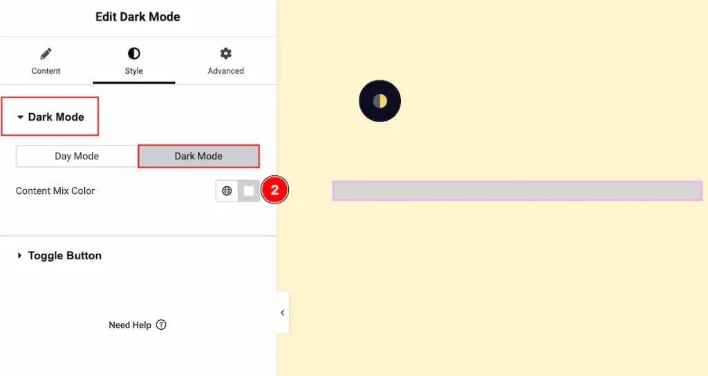
Now let’s proceed to the Dark mode –
2. Dark Mode: You can change the content mix color with this option, which will be visible when you activate the dark mode.
Toggle Button Section
Go to Style → Toggle Button
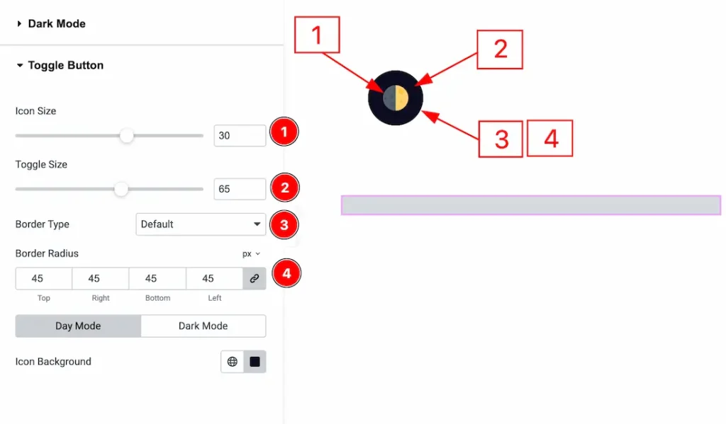
1. Icon Size: You can make changes to the icon size with this option.
2. Toggle Size: You can make changes to the toggle size with this option.
3. Border Type: You can add and change the border types with this option.
4. Border Radius: You can control the roundness of the border with this option.
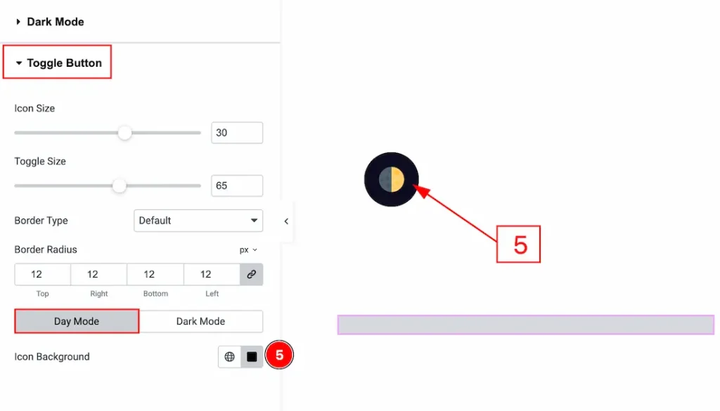
In this section, we again have two more tabs. These are Day Mode & Dark Mode. Let’s start with the Day Mode first –
5. Icon Background: You can change the icon background that will be visible when the user is in day mode with this option.
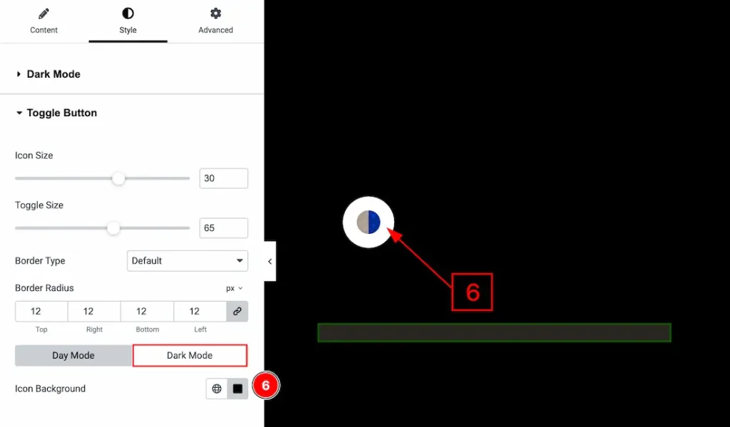
Now let’s proceed to the Dark Mode Tab –
6. Icon Background: You can change the icon background when the user is in dark mode with this option.
All done! You have successfully customized the Dark Mode widget on your website.
Video Assist
You can also watch the video tutorial to learn more about the Dark Mode widget. Please visit the demo page for examples.
Thanks for being with us.