

In this documentation, we will discuss the customization of the Sonic widget, brought to you by the Pixel Gallery addon for Elementor.
Enable Sonic Widget
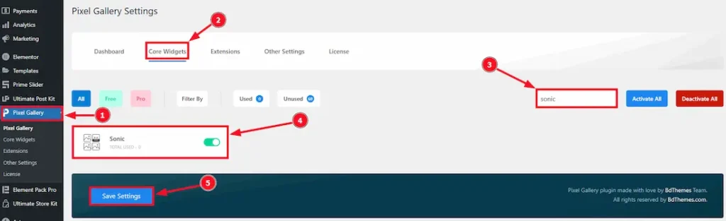
To use the Sonic widget from Pixel Gallery, first, you have to enable the widget.
- Go to WordPress > Pixel Gallery Plugin dashboard.
- Then Click the Core Widgets Tab.
- Search the Sonic Widget Name.
- Enable the Sonic Widget.
- Hit the Save Settings Button.
Inserting The Sonic Gallery widget
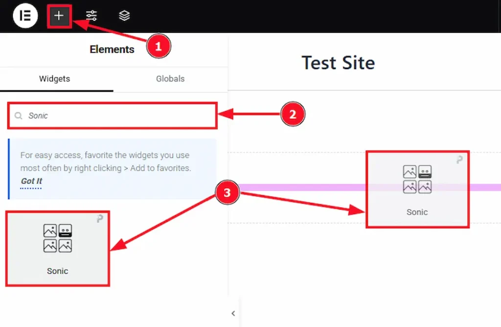
- Go to the Elementor Editor Page and Hit the “+” icon Button.
- Search the Sonic widget.
- Drag the widget and Drop it on the editor page.
Content Tab Customizations
Layout Section Customization
Go to Content > Layout
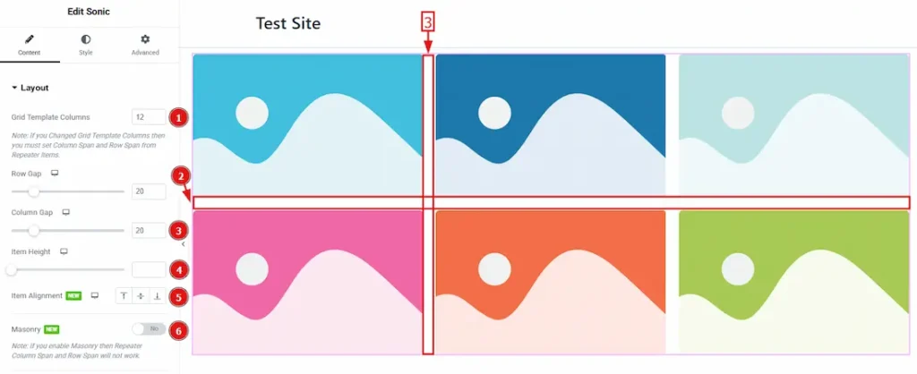
1. Grid Template Columns: The Grid Template Columns option controls how many columns your gallery layout will have and how they are sized.
Note: If you changed Grid Templates Columns then you must set column span and Row from Repeaters Items > Grid option.
2. Row gap: The Row Gap works between two rows to adjust their space/gap.
3. Column Gap: The Column Gap works between two columns to adjust their space/gap.
4. Item Height: The Height options allows you to customize all the items height.
5. Item Alignment: Alignment may refer to the positioning of text or data within a specified space or column. you can set the Alignment – Left, Center, and Right.
6. Masonry: By enabling masonry you can set image naturally based on their original aspect ratios. It forces all images to be the same height.
(Note: If you enable Masonry then (Repeater Items > Grid option) Column span and Row will not work.)
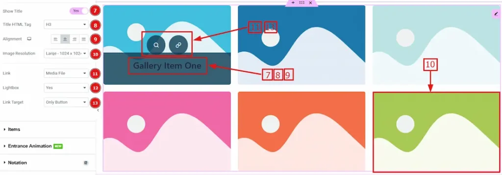
7. Show Title: By enabling this feature title will be visible on the image.
8. Title HTML tag: You can select the heading as per your will by using this option.
9. Alignment: By using this option you can adjust the title position to left, center, right or justified.
10. Image Resolution: This option allows you to adjust your picture resolution to various size.
11. Link: There are two options in this field. One is Media File and the other is Custom URL. By selecting the media files you can enable the lightbox feature which won’t appear on custom url selection.
12. Lightbox: This option allows you to display the large format of images in the center of the screen without page reloads and can browse multiple images using arrows or swipe gesture.
13. Link Target: This option lets you set two different types to see the images. One is the “Only button”, you can see the image by clicking on the button and the other is the “Whole item”, you can see the image by clicking anywhere on the image.
Items Section Customization
Go to Content > Items
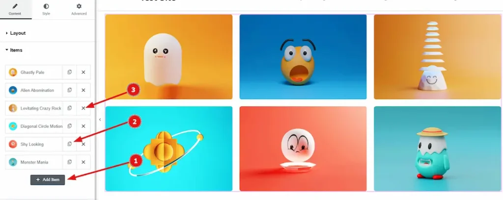
1. Add Item: You can add slide item by clicking the “+” Add Item button.
2. Copy Item: THis option lets you to copy the same item.
3. Close Item: You can delete the Gallery Item by clicking the Close Icon button.
There are two sub section in Items Field. One is content and the other is Grid.
Let’s explore the Content sub section first:
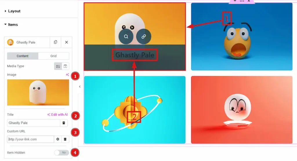
Media Type: You can select the media type from here. The given option is image or video. You can select any of those two option. If you select “image” then you will get these below options:
1. Image: You can select or upload a image by using this option.
2. Title: This option allows you to change the title name that will shown on the image.
3. Custom URL: You can add a url address to your image by using this option.
4. Item Hidden: You can hide your image/content by using this option. Also, by enable this option you will get one more option below it. The option is Blank space Hide on Tablet. You can enable or disable this feature also.
If you select “video” in Media Type option then you will get these below options:
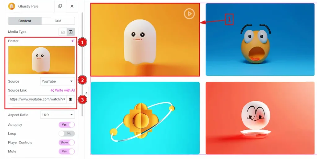
1. Poster: You can add your video poster/thumbnail with this option.
2. Source: In this option you will get to select the video source type. The provided types are YouTube, Vimeo, Dailymotion & Self Hosted.
If you want to upload videos from YouTube, Vimeo, Dailymotion then you just have to provide the video link below in Source Link.
3. Source Link: This option allows you to add video link.
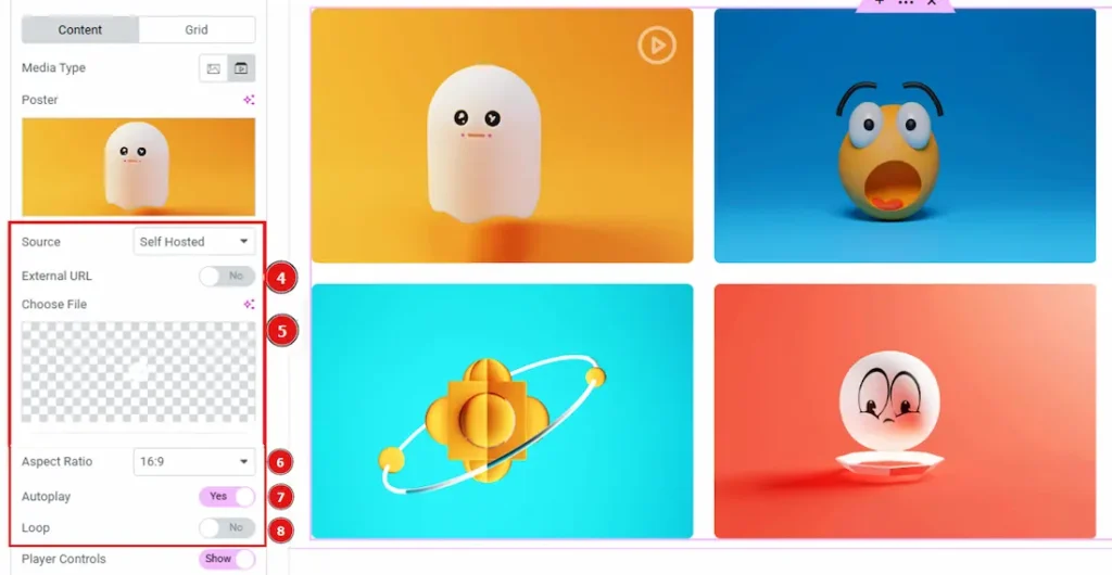
But if you select Self Hosted then you will get to two more options –
4. External url option: You have to enable this option and you will get a blank field where you have to paste the external video url.
5. Choose a file: If you keep the external url option disabled then you have to choose a video file from your device and have to upload that with this option.
6. Aspect ratio: This option allows you to adjust the video ratio.
7. Autoplay: By enabling this option you can make the video play automatically.
8. Loop: If you enable this option then the video will start again automatically when it will finish and it will go on.
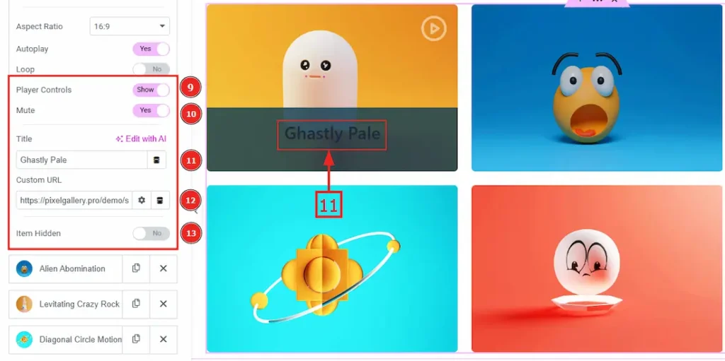
9. Player control: By enabling this option player controls will be visible to the audience.
10. Mute: By enabling this option your video will start with mute status but you can unmute the video and enjoy the audio. By disabling the mute option the alternative will happen.
11. Title: You can change the title from this option.
12. Custom URL: You can add a link in this option.
13. Item Hidden: You can hide your video by using this option. Also, by enabling this option you will get one more option below it. The option is Blank space Hide on Tablet. You can enable or disable this feature also.
Now Let’s explore the Grid Sub section –
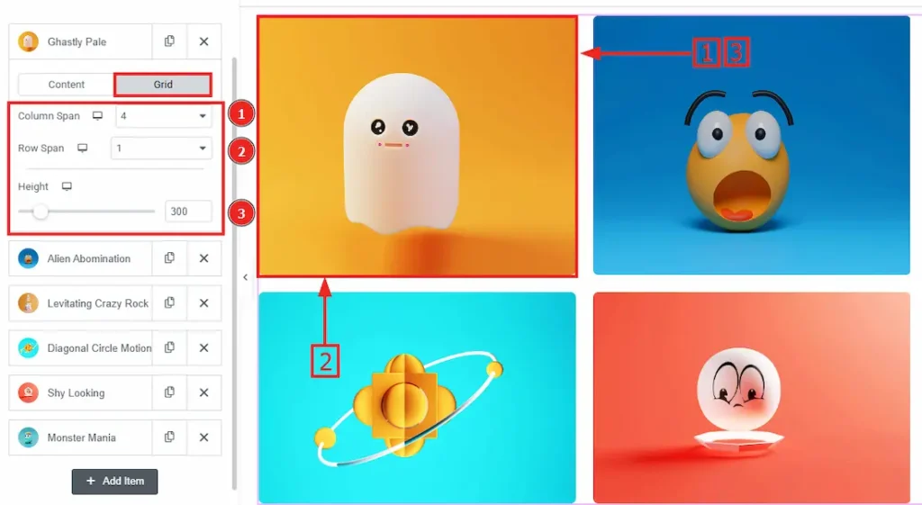
1. Column span: This option defines how many columns a single item will stretch across. You can adjust the number here.
2. Row Span: This item defines how many rows a single item will stretch across. You can adjust the number here.
3. Height: You can adjust the height in this option.
Entrance Animation Section
Go to Content > Entrance Animation
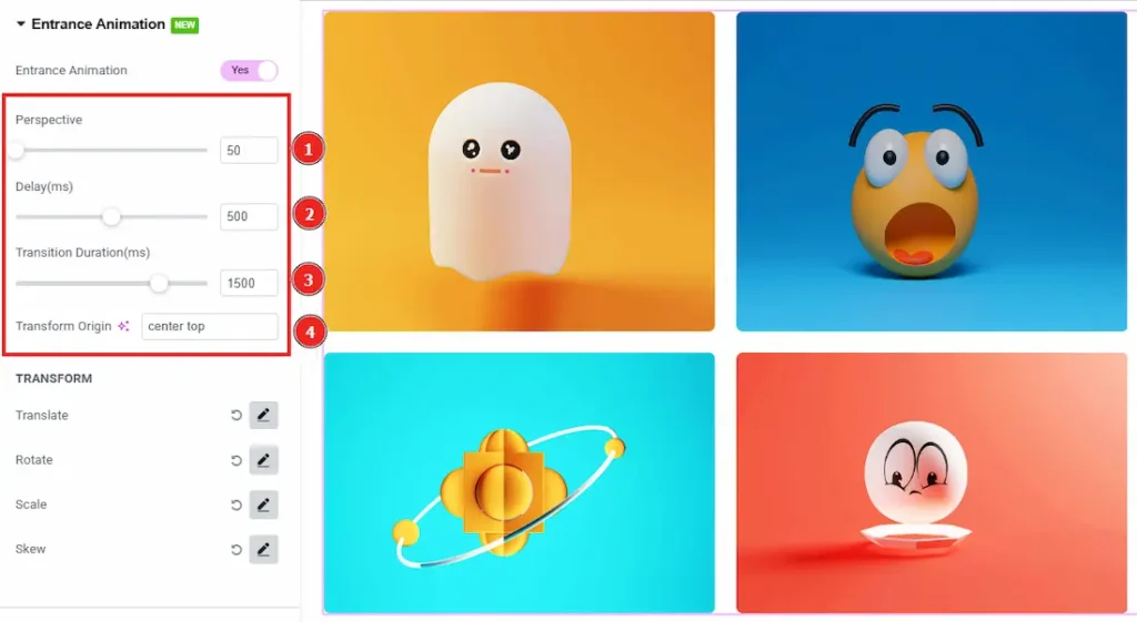
The Entrance Animation feature controls how images will appear on the page. This effect adds smooth, eye-catching motion, making the gallery more dynamic and engaging.
When customizing Entrance Animation in the Sonic Widget, you’ll find these key settings:
1. Perspective: You can control how 3D animation (Like flips, rotations & tilts) look on the screen by this option. With the smaller value it will look more strong and dramatic and with a larger value, the effect will look softer and more natural.
2. Delay(ms): With this options you can control how long the animation will wait before starting. (0ms (Default) → Animation starts immediately, 500ms (Half a second delay) → Animation starts after a short pause, 1000ms (1-second delay) → Image appears after 1 second.)
3. Transition Duration(ms): This option defines how long the animation takes to complete. For shorter animation you can use (200ms – 400ms) and for smooth, slow motion effects you can adjust the value to (800ms – 1500ms).
4. Transform Origin: In this option you will find the center top effect and it helps the animation to start from the top edge of the element.
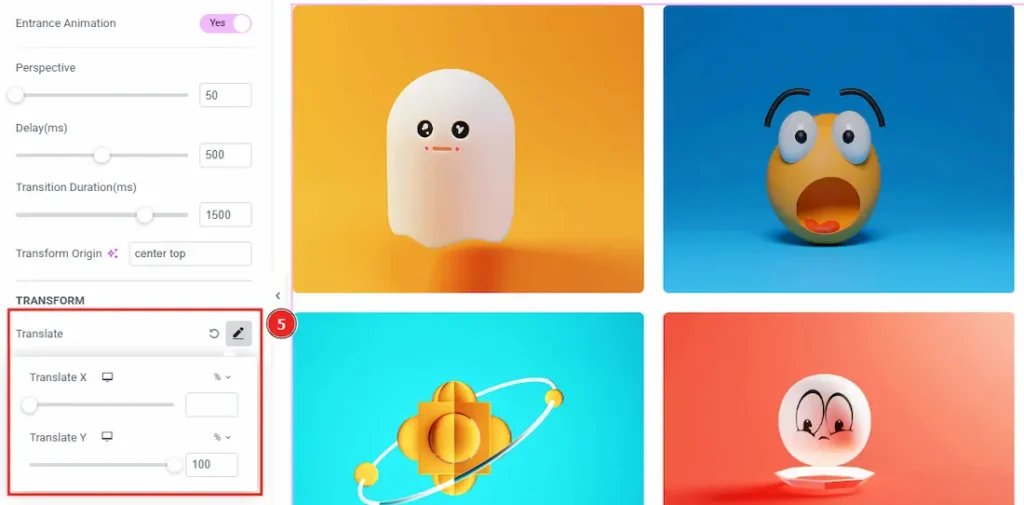
In Transform Option allows you to modify how elements move and change shape during animations. These transformations include:
5. Translate: This option allows you to move an element horizontally (X-axis) or vertically (Y-axis). There are two more options in this field.
Translate X: With the positive value it helps the item to move right & with the negative value it moves the item to left.
Translate Y: With the positive value it helps the item to move down & with the negative value it moves the item to up.
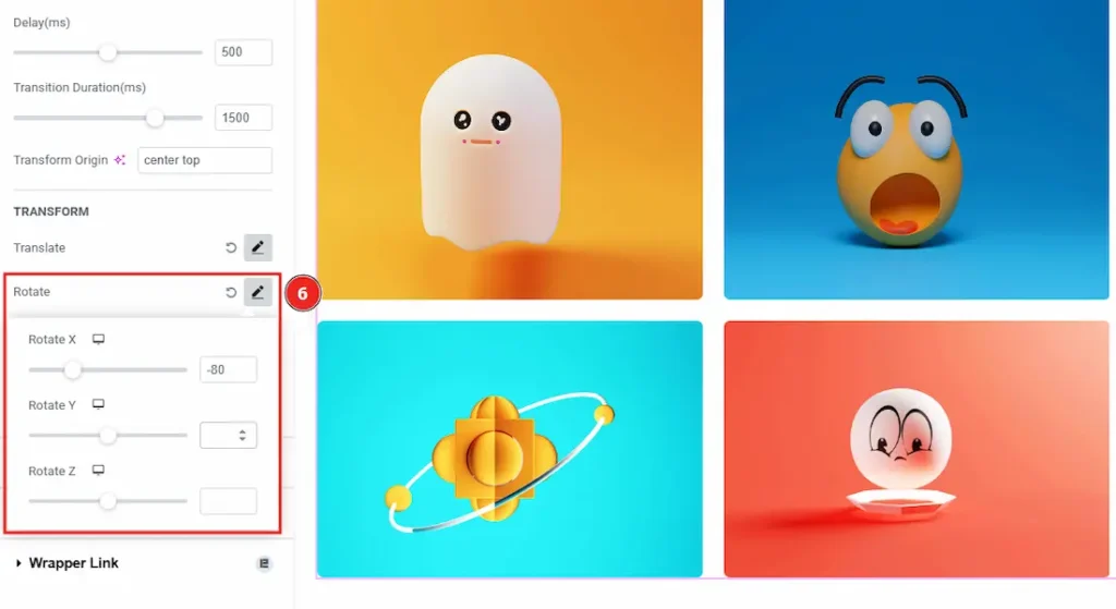
6. Rotate: With this option you can spin an element around a specific point (default: center). You can rotate along X, Y, or Z axes for 2D or 3D effects.
Rotate X: This option allows you to rotate the element horizontally. With the positive value you can tilts forwards and with the negative value you can tilts backward.
Rotate Y: This option allows you to rotate the element vertically. With the positive value you can spin the item to the right and with the negative value you can spin the item to the left.
Rotate Z: You can adjust spins of your item to clockwise (Positive Value) or Counterclockwise (Negative Value) with this option.
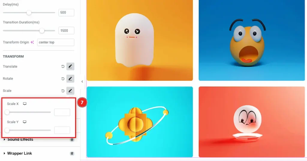
7. Scale: The scale option controls the size of an element during animation.
Scale X: It controls the width size of an element.
Scale Y: It controls the height size of an element.
Style Tab Customization
Items Section
Go to Style > Items
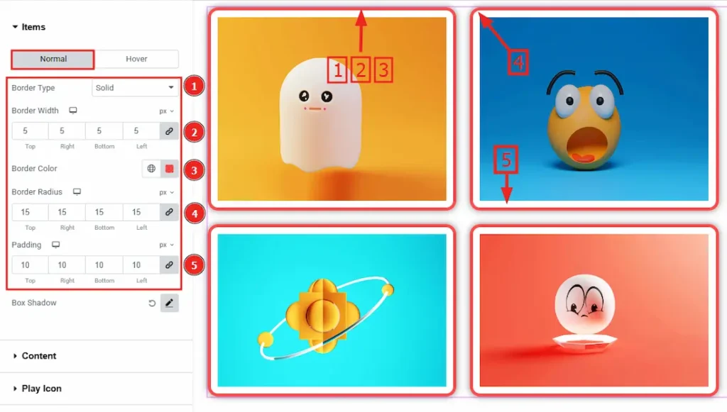
Come to the Items section, you will find two tabs sections; Normal and Hover. Let’s Start with the Normal tab –
1. Border Type: This option allows you to add borders to your items. You can select various border types from this option. Such as Solid, Double, Dotted, Dashed, Groove.
2. Border Width: After changing the border type from None/Default to others option you can set the border width.
3. Border Color: This option allows you to change the border color.
4. Border Radius: The Border Radius controls the roundness of the border.
5. Padding: Padding adds spaces around an object to increase the inner area. Padding allows you to control the internal space within an element.
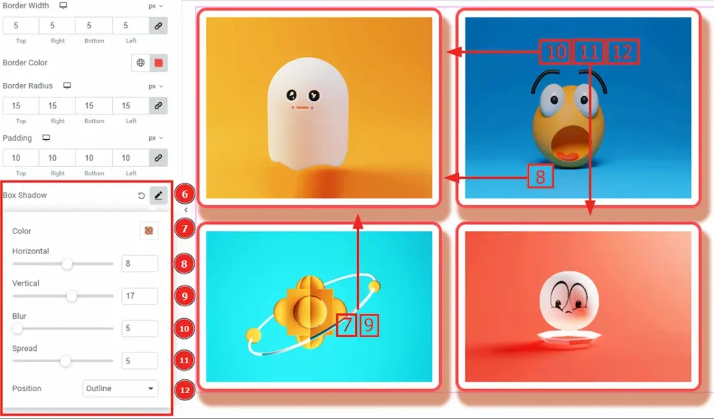
6. Box Shadow: By using this option you can create shadow around the items.
7. Color: You can change the shadow color with this option.
8. Horizontal: This option allows you to move the shadow’s left or right.
9. Vertical: This option allows you to move the shadow’s up or down.
10. Blur: You can control the shadow’s sharpness and softness by this option.
11. Spread: You can expand or shrink the overall shadow size by using this option.
12. Position: This option allows you to set the shadow outline or inside the items.
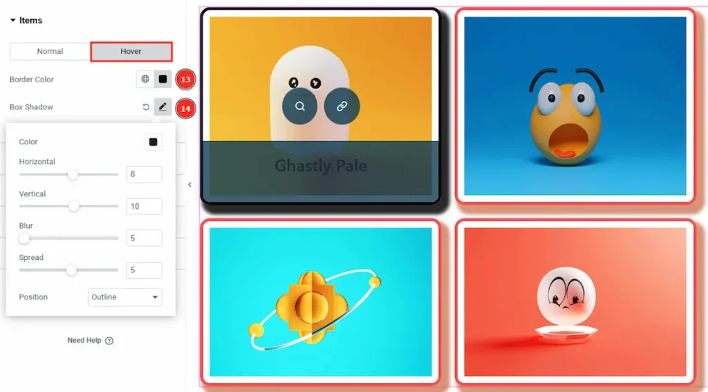
Now, Let’s proceed with the Hover tab –
13. Color: You can change the hover shadow color with this option.
14. Box Shadow: By using this option you can create a shadow around the box of the item border, add a color and you can set the shadow to horizontal or vertical. You can also set the opacity (Blur) of the shadow and adjust the shadow’s spreading. Also, you can set the position of the shadow by clicking on outline or insert option. (Please look on the Box Shadow of normal tab for the detailed description).
Content Section
Go to Style > Content
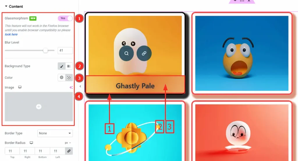
1. Glassmorphism: This option adds a soft blur effect to the background, making it look like frosted glass. By enable this option you will find the blur level option below to adjust the blur effect.
2. Background Type: You can change background type here. There are two options in background type. These are Classic & Gradient.
In classic you can change the background color and also set an image to the background.
In the gradient option you can also set background color along with locations and angle for each breakpoint to ensure gradient adapts to different screen sizes. Also, you can change the gradient type (Radial & Linear) and positions.
3. Color: You can change the content background color by this option.
4. Image: You can add an image to the content background by this option.
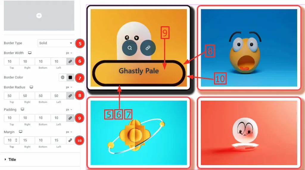
5. Border Type: This option allows you to add borders to your content. You can select various border type from this option. Such as Solid, Double, Dotted, Dashed, Groove.
6. Border Width: After changing the border type from None/Default to others option you can set the border width
7. Border Color: This option allows you to change the border color.
8. Border Radius: The Border Radius controls the roundness of the content box’s corners inside each slide.
9. Padding: Add spaces around an object to increase the inner area. Padding allows you to control the internal space within an element.
10. Margin: This option allows you to adjust the space & creating gaps between elements.
Title Section
Go to Style > Title
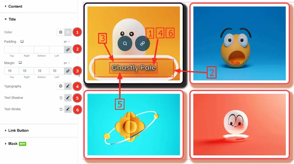
1. Color: This option allows you to change the title color.
2. Padding: Add spaces around the title to increase the inner area. Padding allows you to control the internal space within an element.
3. Margin: This option allows you to adjust the space & creating gaps between border and title.
4. Typography: Change the title’s font family, size, weight, transform, style, decoration, line height, letter spacing, and word spacing from here.
5. Text Shadow: While working with this option you will get three more options (Blur, Horizontal & Vertical). Blur Controls how sharp or soft the shadow will appear. By using the horizontal option you can move the shadow left or right and by using the vertical option you can move the shadow up or down.
6. Text Stroke: With the Text Stroke option you can add an outline around the text to enhance visibility and design aesthetics. Also, you can change the stroke colour and set the stroke level.
Link Button Section
Go to Style > Link Button
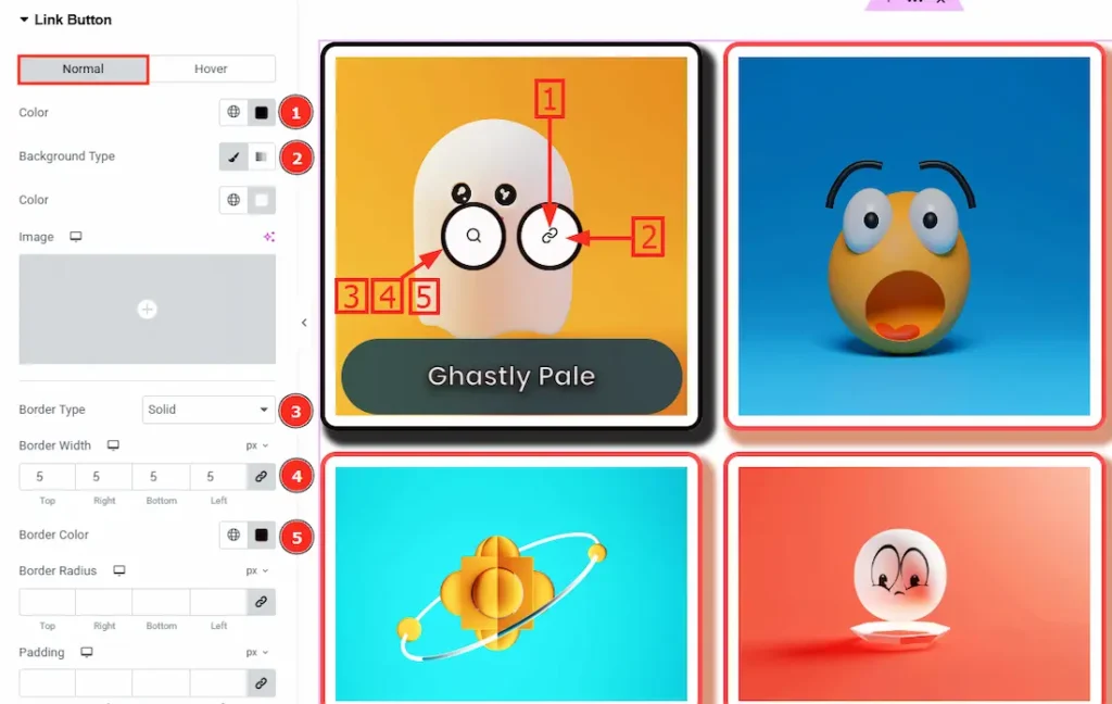
Come to the Link Button section, you will find two tabs sections; Normal and Hover. Let’s Start with the Normal tab –
1. Color: This option allows you to change the Link Button Color.
2. Background Type: Background Type: You can change background type here. There are two options in background type. These are Classic & Gradient.
In classic, you can change the background color and also set an image to the background.
In gradient option, you can also set background color along with locations and angle for each breakpoint to ensure gradient adapts to different screen sizes. Also, you can change the gradient type (Radial & Linear) and positions.
3. Border Type: This option allows you to add borders of your button. You can select various border type from this option. Such as Solid, Double, Dotted, Dashed, Groove.
4. Border Width: After changing the border type from None/Default to others option you can set the border width.
5. Border Color: This option allows you to change the border color.
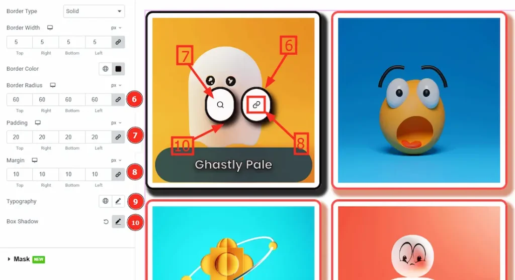
6. Border Radius: The Border Radius controls the roundness of the Link button’s corners.
7. Padding: Add spaces around the link button to increase the inner area. Padding allows you to control the internal space within an element.
8. Margin: This option allows you to adjust the space & creating gaps between border and link button.
9. Typography: Change the button’s font family, size, weight, transform, style, decoration, line height, letter spacing, and word spacing from here.
10. Box Shadow: While working with this option you will get three more options (Blur, Horizontal & Vertical). Blur Controls how sharp or soft the shadow will appear. By using the horizontal option you can move the shadow left or right and by using the vertical option you can move the shadow up or down.
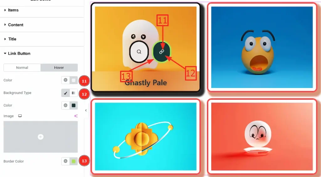
Now, Let’s proceed with the Hover tab –
11. Color: You can change the link button hover color with this option.
12. Background Type: You can change background type here. There are two options in background type. These are Classic & Gradient.
In classic option, you can change the background color and also set an image to the background.
In gradient option, you can also set background color along with locations and angle for each breakpoint to ensure gradient adapts to different screen sizes. Also, you can change the gradient type (Radial & Linear) and positions.
13. Border Color: This option allows you to change the border color.
Mask Section
Go to Style > Mask
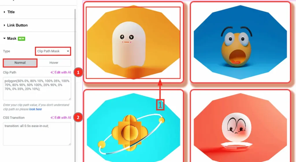
This feature allows you to clip or shape the content into different forms, creating unique design effects. It works by applying a predefined or custom shape to the content, making certain areas visible while hiding others. Come to the Mask section, you will find two type. One is Clip With Mask and the other is Svg Mask. Let’s start with the Clip With Mask Type –
In this type you will get the Normal and the Hover option. Let’s discuss the Normal option first –
1. Clip Path: Clip Path allows you to cut or clip an element into a custom shape. (Note: Below in the clip path option you will get to see “look Here” option. Click on that to understand it clearly. You can select a shape for your item and paste it in the blank field.)
2. CSS Transition: CSS Transition controls how smoothly an element changes from one style to another over time.
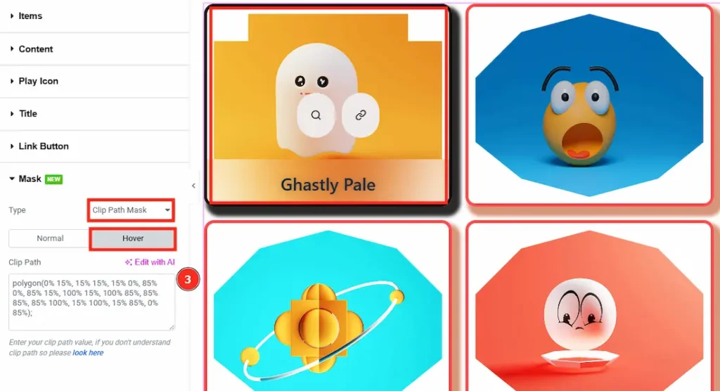
Now, let’s discuss the Hover option –
3. Clip Path: Clip Path allows you to cut or clip an element into a custom shape.
(Note: Below in the clip path option you will get to see the “look Here” option. Click on that to understand it clearly. You can select a shape for your item and paste it in the blank field.)
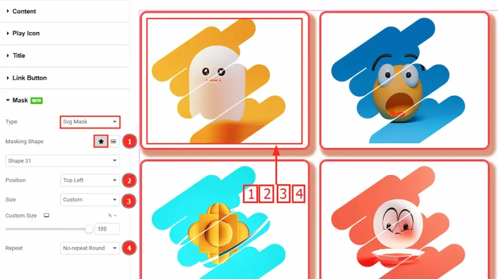
Now let’s process with the Svg Mask Type –
The SVG Mask feature in the Sonic Widget allows you to apply custom shapes or patterns to your content using an SVG file. There are two shape types. Default Shape Type & Custom Shape Type. Let’s start with Default Shape Type –
1. Masking Shape: You can customize your item into 31 different shapes using this option.
2. Position: You can customize your item position by using this option.
3. Size: This option allows you to adjust the size of your items. In this option you can select auto, cover, contain and custom. By selection custom you can adjust the size as per your need.
4. Repeat: This option determines whether the SVG mask pattern repeats across the content. There are various options added in this field. You can choose the options as per your need.
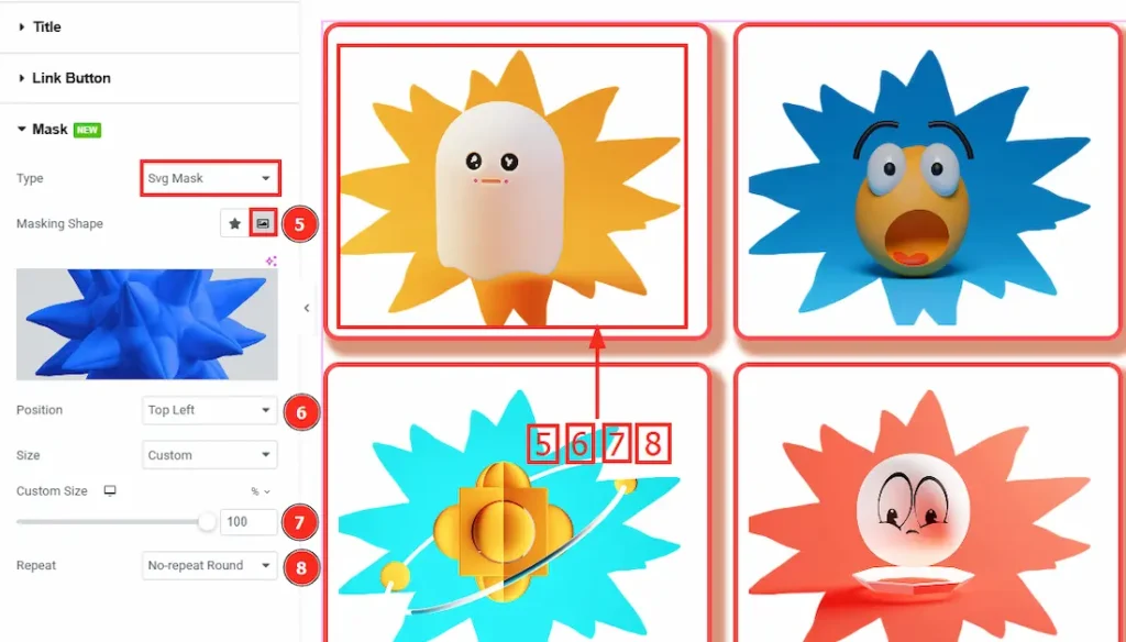
Now, Let’s discuss the custom shape type –
1. Masking Shape: You can upload an image in this field and your items will be shown inside of that image.
2. Position: You can customize your item position by using this option.
3. Size: This option allows you to adjust the size of your items. In this option you can select auto, cover, contain and custom. By selection custom you can adjust the size as per your need.
4. Repeat: This option determines whether the SVG mask pattern repeats across the content. There are various options added in this field. You can choose the options as per your need.
All done! You have successfully customized the Sonic widget on your website.
Video Assist
You can also watch the video tutorial Learn more about the Sonic Widget. Please visit the demo page for examples.
Thanks for being with us.