

The Global Badge Extension in Element Pack Pro lets you add customizable badges to widgets, sections, or elements to highlight important content. It’s ideal for displaying labels like New, Hot, Sale, or Featured with flexible styling options. This documentation explains how to use and customize the Global Badge Extension.
Enabling The Global Badge Extension
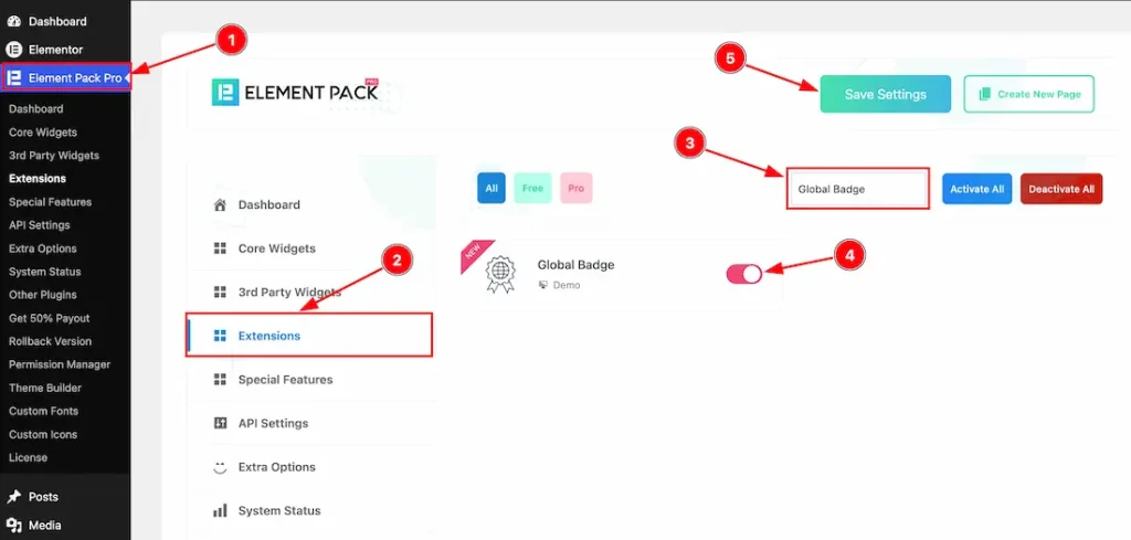
To use the Global Badge Extension from Element Pack, you must first enable the extension.
- Go to WordPress Dashboard > Element Pack Plugin dashboard.
- Then, click the Extension Tab.
- Search the Global Badge Extension Name.
- Enable the Global Badge Extension.
- Hit the Save Settings Button.
Where You Find the Extension inside the Editor
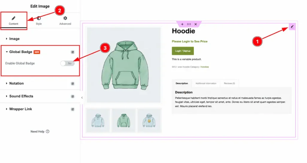
To get started with this feature, let’s first use an existing design or widget on the page. This will help you better understand how the feature works. For this demonstration, we’ll use the Image widget as an example.
Now, let’s begin the demonstration.
To use the Global Badge feature, just follow the instructions below-
- Select the widget.
- Go to the Content Tab of the widget.
- Navigate the Global Badge section and enable the switcher button to use the extension.
Let’s Describe the Global Badge Feature
When Global Badge Style Type- Default
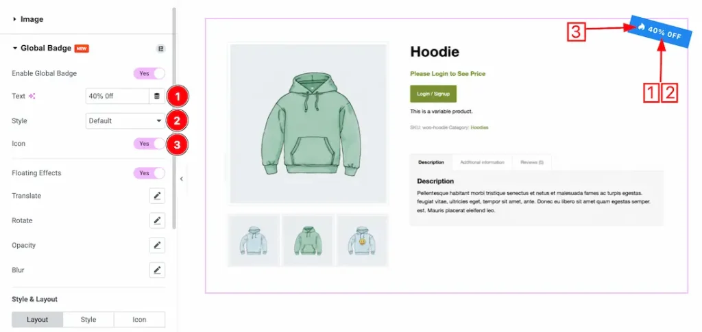
After enabling the Global Badge extension switcher button, you will get the following options-
1. Text: This option lets you add custom badge text based on your requirements.
2. Style: You can choose the badge style type- Default, and Custom. First, we set the style type default to demonstrate the feature.
3. Icon: Enable/disable the icon switcher button to show/hide the badge icon.
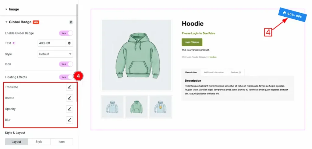
4. Floating Effects: Enable/disable the floating effects switcher button to show/hide the badge floating effects. After enabling the switcher button, you will get the following customization options-
- Translate: Adjusts the movement position of the badge along the X and Y axes.
- Rotate: Controls the rotation angle of the badge animation.
- Opacity: Sets the transparency level during the floating animation.
- Blur: Applies a blur effect to create a soft animated appearance.
Style and Layout for Default style
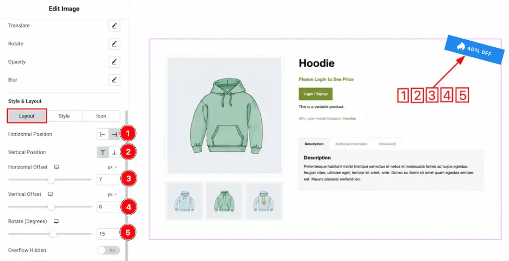
Come to the layout tab section, you will get the following options-
1. Horizontal Position: Sets the horizontal alignment of the badge on the image or container area.
2. Vertical Position: Controls the vertical alignment of the badge on the image or container area.
3. Horizontal Offset: Adjusts the horizontal spacing or distance of the badge from its selected position.
4. Vertical Offset: Adjusts the vertical spacing or distance of the badge from its selected position.
5. Rotate (Degrees): Sets the rotation angle of the badge in degrees for a tilted appearance.
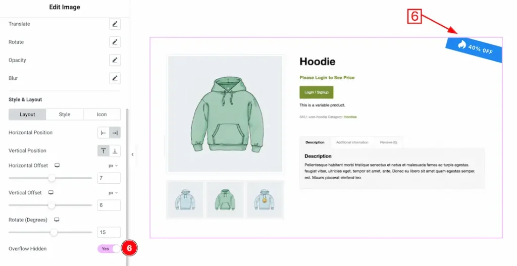
6. Overflow Hidden: Enable the switcher button to hide any badge content that extends outside the container area.
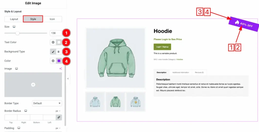
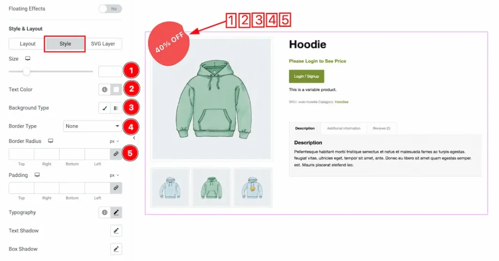
1. Size: This option lets you change the Badge size to your preferred requirement.
2. Text Color: This option lets you change the badge text color.
3. Background Type: You can change the badge background type to classic or gradient. Here we choose the Background type Classic.
4. Background color: This option lets you change the background color.
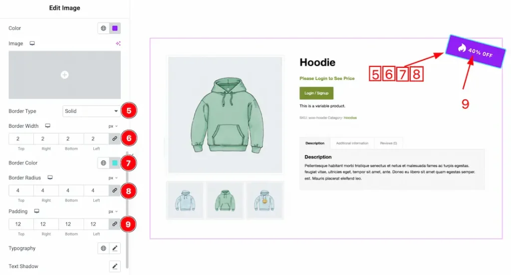
5. Border Type: You can set the Border Type to Default, None, Solid, Double, Dotted, Dashed, or Groove. We choose here the Border Type Solid.
6. Border Width: You can adjust the badge border width from here.
7. Border Color: This option lets you change the badge border color.
8. Border Radius: You can adjust the badge border radius from here.
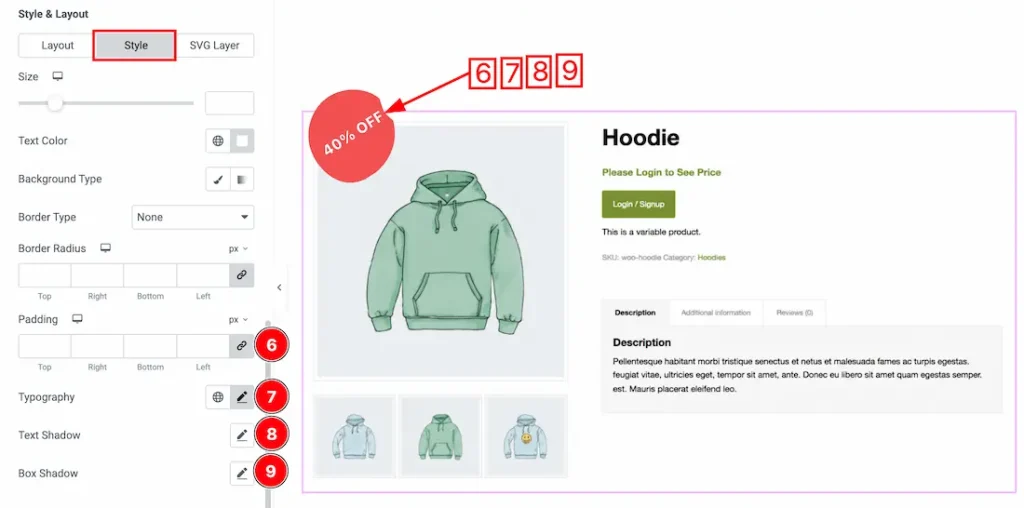
9. Padding: Adjust the badge padding from here.
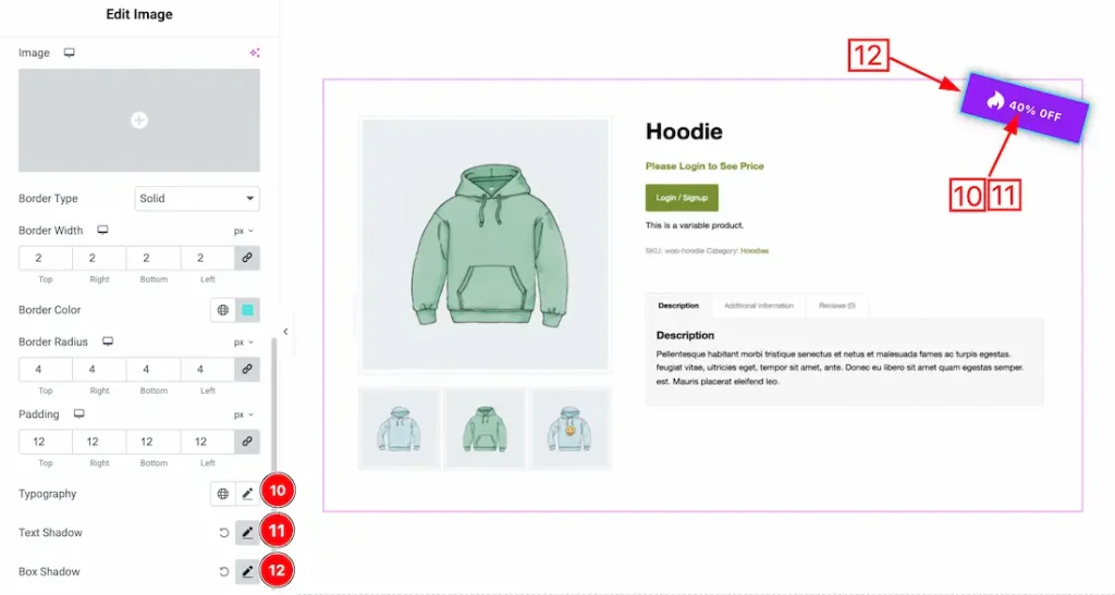
10. Typography: Change the font family, size, weight, style, transform, decoration, line height, letter spacing, and word spacing from here.
11. Text Shadow: The Text Shadow property is used to create the shadow around the text. It takes three values: horizontal offset, vertical offset, and blur radius. Here you can also change the Text Shadow Color.
12. Box Shadow: The Box Shadow property is used to create the shadow around the badge Button. It takes four values: Horizontal offset, Vertical offset, blur, and Spread to customize the Box shadow. From here, you can add a box shadow under the badge.
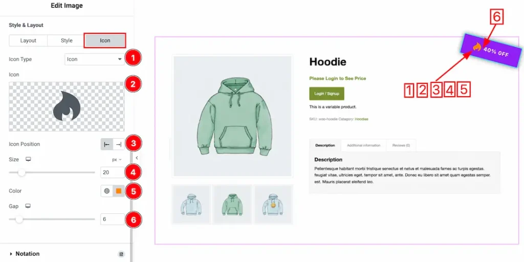
Come to the icon tab section, you will get the following options-
1. Icon type: You can choose the icon type- SVG and Lottie. Here, we select the icon type- SVG.
2. Icon: This option lets you upload your preferred icon.
3. Icon Position: You can set the icon position- left or right of the badge text.
4. Icon Size: This option lets you set the icon size.
5. Color: This option lets you change the icon color.
6. Gap: You can adjust the icon gap from here.
When Global Badge Style Type- Custom
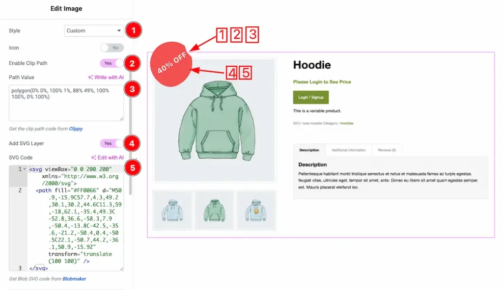
1. Style: Select the badge style type- custom.
2. Enable Clip Path: Enable/disable the clip path switcher button to show/hide the clip path of the custom SVG icon.
3. Path Value: Just put your required clip path value inside the value inbox field. Get the clip path code from Clippy.
4. Add SVG Layer: Enable/disable the add SVG layer switcher button, to show/hide the SVG layer of the custom badge.
5. SVG Code: Just keep your SVG code inside the SVG field. Get more SVG blob code here.
Style and Layout for Custom style
Come to the layout tab section, you will get the following customization options-
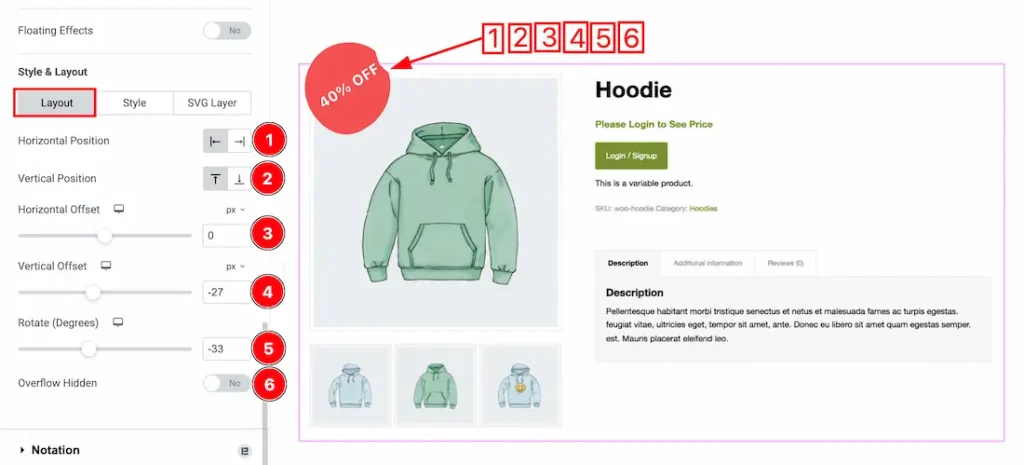
- Horizontal Position: Sets the horizontal alignment of the badge on the image or container area.
- Vertical Position: Controls the vertical alignment of the badge on the image or container area.
- Horizontal Offset: Adjusts the horizontal spacing or distance of the badge from its selected position.
- Vertical Offset: Adjusts the vertical spacing or distance of the badge from its selected position.
- Rotate (Degrees): Sets the rotation angle of the badge in degrees for a tilted appearance.
- Overflow Hidden: Enable the switcher button to hide any badge content that extends outside the container area.
Let’s proceed with the style tab section-
1. Size: This option lets you change the Badge size to your preferred requirement.
2. Text Color: This option lets you change the badge text color.
3. Background Type: You can change the badge background type to classic or gradient. Here we choose the Background type Classic.
4. Border Type: You can set the Border Type to Default, None, Solid, Double, Dotted, Dashed, or Groove. We choose here the Border Type Solid.
5. Border Radius: You can adjust the badge border radius from here.
6. Padding: Adjust the custom badge padding here.
7. Typography: Change the font family, size, weight, style, transform, decoration, line height, letter spacing, and word spacing from here.
8. Text Shadow: The Text Shadow property is used to create the shadow around the text. It takes three values: horizontal offset, vertical offset, and blur radius. Here you can also change the Text Shadow Color.
9. Box Shadow: The Box Shadow property is used to create the shadow around the badge Button. It takes four values: Horizontal offset, Vertical offset, blur, and Spread to customize the Box shadow. From here, you can add a box shadow under the badge.
Come to the SVG layer section, you will get the following options-
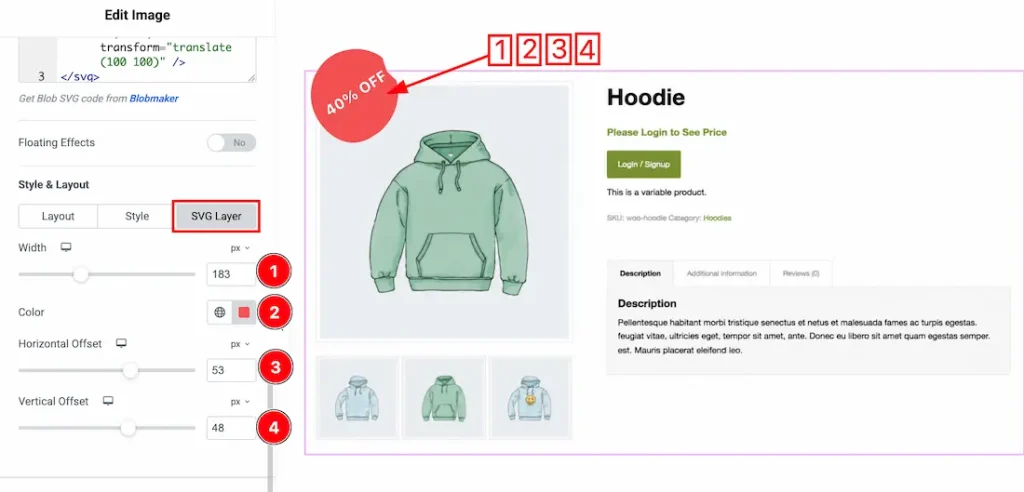
- Width: Sets the overall size of the SVG badge. Increasing the value makes the badge larger, while decreasing it makes the badge smaller.
- Color: Defines the color of the SVG badge. Select a color to match your design or branding requirements.
- Horizontal Offset: Adjusts the horizontal spacing or distance of the badge from its current position. Higher values move it further horizontally.
- Vertical Offset: Adjusts the vertical spacing or distance of the badge from its current position. Higher values move it further vertically.
Video Assist
The video and demo will come soon. Thanks for staying with us.