

In this documentation, we will discuss the customization of the Video block, brought to you by Zoloblocks.
Enable The Video Block
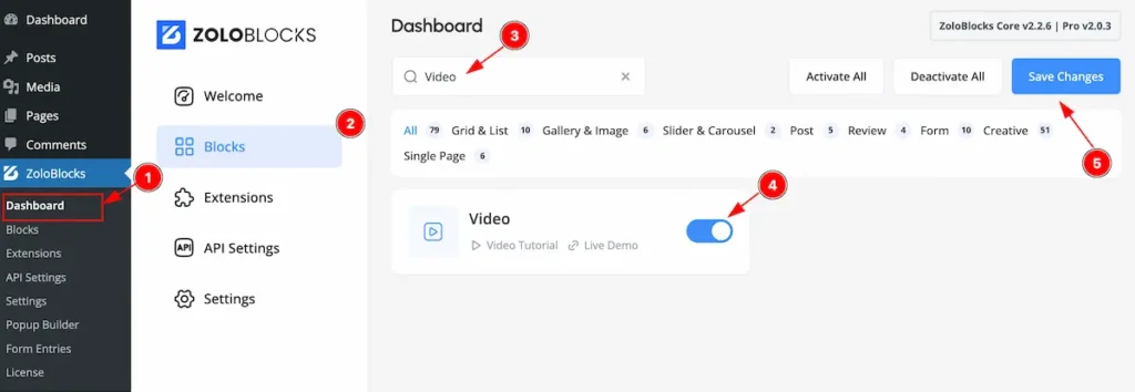
On WordPress Dashboard Navigate to ZoloBlocks from the sidebar menu.
- Select the Dashboard option under ZoloBlocks.
- Go to the Blocks tab.
- Use the search bar to search for “Video”
- Click Enable to activate the Table of Content block.
- Hit the ” Save Changes ” button.
Adding the Video Block to the editor
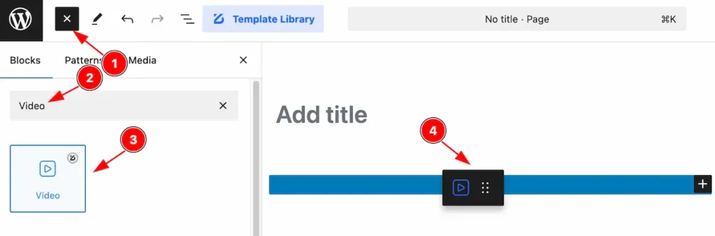
- Click the Toggle Block Inserter icon and a sidebar will appear on the left side, All the blocks will be visible here.
- Search by the Video block name.
- Then select the appear blocks ( with zoloblocks logo T.R corner).
- After Drag and Drop it on the page.
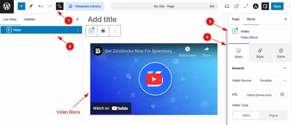
After Inserting the blocks, Follow this.
- Click on the Document Overviewer button and the Blocks list view will appear.
- Here the Selected block, the parent block, and its child block will appear.
- After on the right side, Click on the Block. Then the Video box details appear.
- Here show all the control tabs( Basic, Style, Extra ) of a block.
Basic Tab OF Video Block
The Basic tab controller displayed here offers the flexibility to adjust the layout of blocks according to your preferences.
General Section
Go to Basic > General
Video Source
Youtube
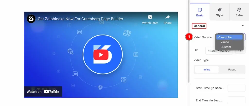
- Video Source: Select source Youtube to demonstrate the youtube video.
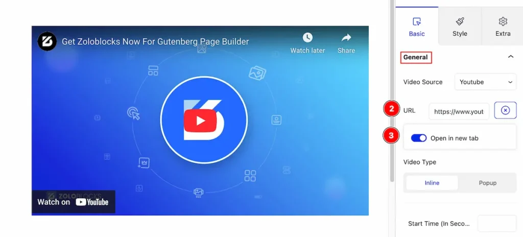
- URL: Set the url for the youtube video
- Open in new tab: Enable the switcher to open the link in new tab.
Vimeo
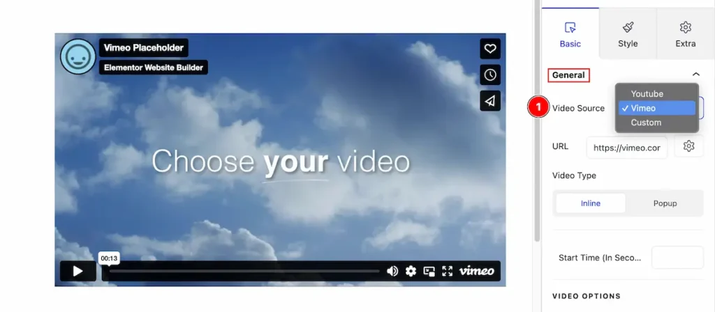
- Video Source: Select the Vimeo from dropdown. It demonstrate the Vimeo vide.
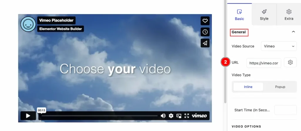
- URL: Set the url for the vimeo video.
Custom: URL
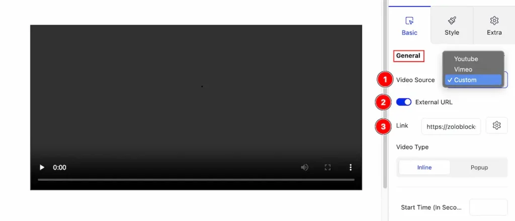
- Video Source: Select the video source: Custom. It support the custom link for video.
- External URL: Enable the switcher to demonstrate the Link input field.
- Link: Set the external link for the custom video.
Custom: Local Video
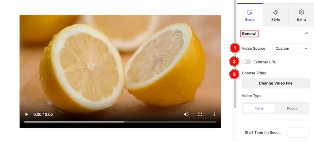
- Video Source: Select the video source: Custom. It allow to upload local video from.
- External URL: Disable the External Switcher. It shows the choose local file feature.
- Link: Set the external link for the custom video.
Video Type
Inline
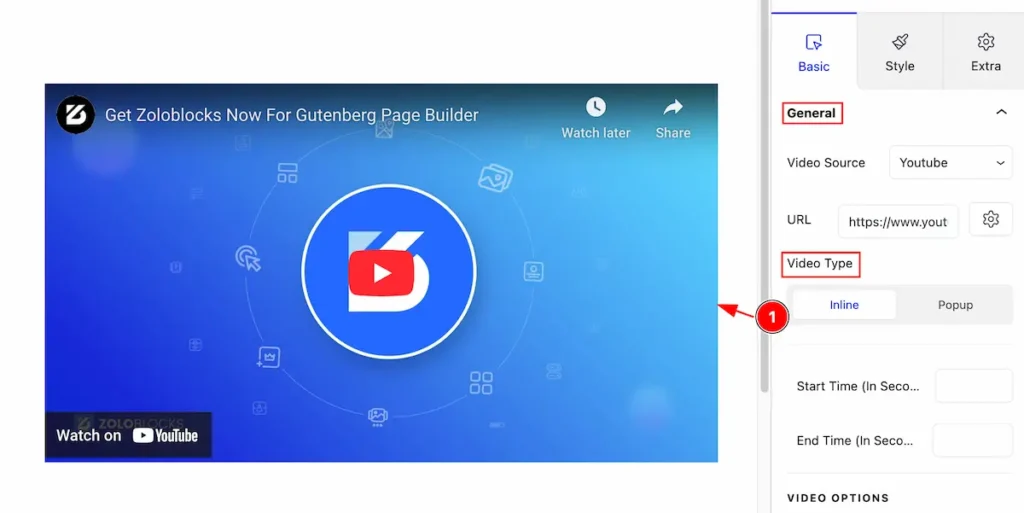
- Select the Inline tab to demonstrate the video inline view.
Popup
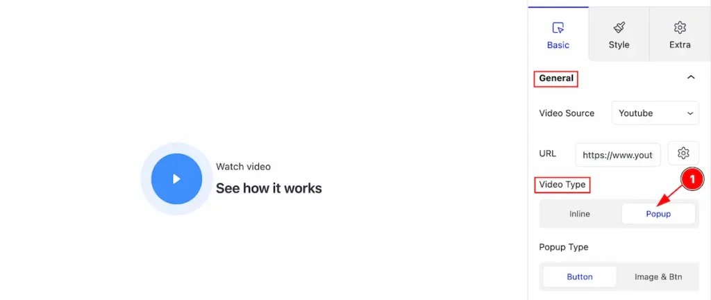
- Select the Popup tab for the Video type. The video will appear as popup after clicking in the video.
Popup Type : Button
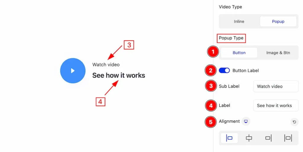
- Select the Button tab as popup type. All the available feature will appear here under the tab.
- Button Label: Enable the switcher to demonstrate the button label. Label and Sub Label will appear here.
- Sub Label: Set the sub label for popup type.
- Label: Set the label for the popup.
- Alignment: Make alignment of the popup button left, centre, right, and justify.
Popup Type : Image & Btn
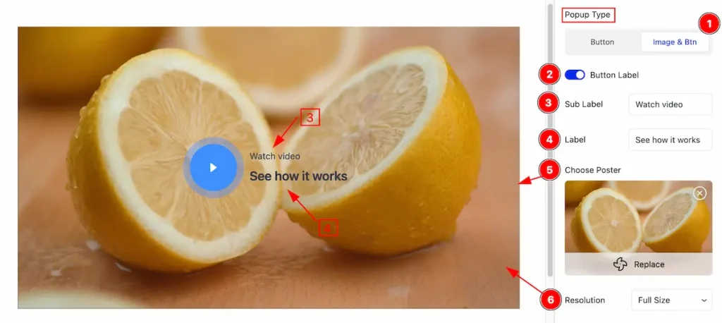
- Select the Button tab as popup type. All the available feature will appear here under the tab.
- Button Label: Enable the switcher to demonstrate the button label. Label and Sub Label will appear here.
- Sub Label: Set the sub label for popup type.
- Label: Set the label for the popup.
- Choose Poster: Select the poster from media or library section. It appears as background.
- Resolution: Set the resolution for the image. Available resolution are Thumbs, Medium, Large and Full.
VIDEO OPTIONS
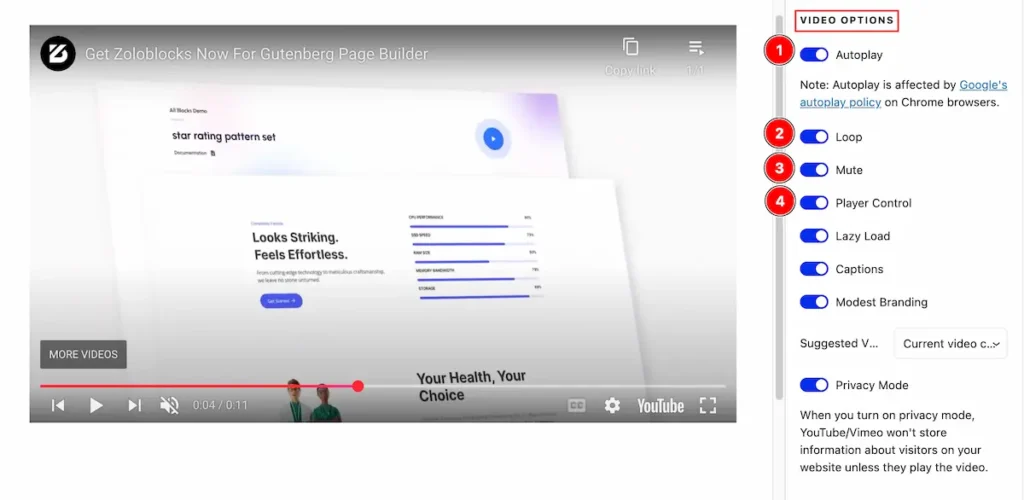
- Autoplay: Enable the switcher to automatically playing the Video. Note: Autoplay is affected by Google’s autoplay policy on Chrome browsers.
- Loop: Enable the switcher to loop the control. It will play the infinitely.
- Mute: Enable the switcher to Mute the video by following.
- Player Control: Enable the controls of the Video.
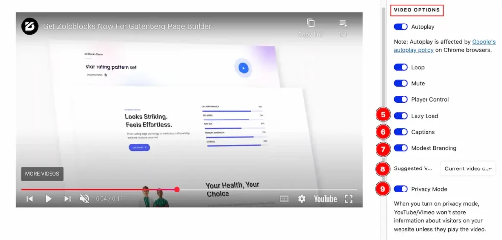
- Lazy Load: Enable the switcher for the Lazy Load. Lazy loading is a technique where videos are loaded only when they are needed.
- Captions: Enable the switcher to show the captions of the video.
- Modest Branding: Enable this switcher to attempt reducing YouTube branding in embedded videos.
- Suggested Video: Select the suggested video: Current video channel, Any Video.
Current Video Channel: It will suggest the video rom current channel.
Any Video: It will suggest any video from YouTube. - Privacy Mode: Enable the privacy mode by following. Note: When you turn on privacy mode, Youtube/Vimeo won’t store information about visitors on your website unless they play the video.
Style Tab
Provide the controller to make the visual appearance or presentation of the tabs. This includes aspects visually appealing and cohesive with the overall design of the interface.
Inline Player Section
Go to Style > Player
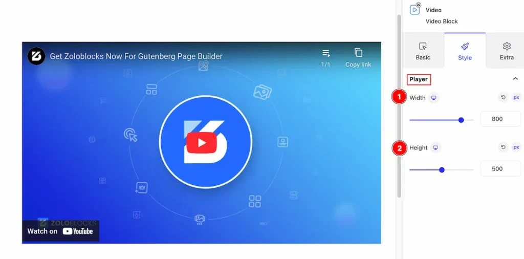
- Width: Set the width for the Video block.
- Height: Set the height of the Video block.
Popup
Popup Button
Go to Style > Popup Button
Normal
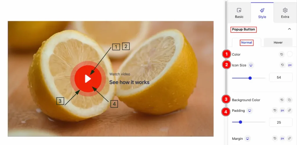
- Color: Set the Color for the Icon.
- Icon Size: Set the size for the Icon.
- Background Color: Make the background for the Icon.
- Padding: Set the padding of it.
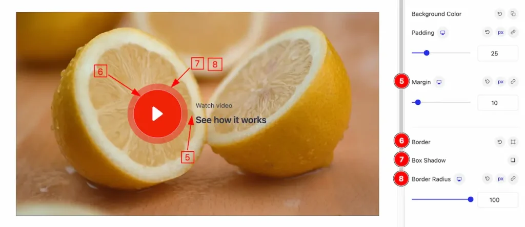
- Margin: Set the margin for the space.
- Border: Make the border for the play button.
- Box Shadow: Make the shadow for the box.
- Border Radius: Make the border radius.
Popup Button Label
Go to Style > Popup Button Label
Label
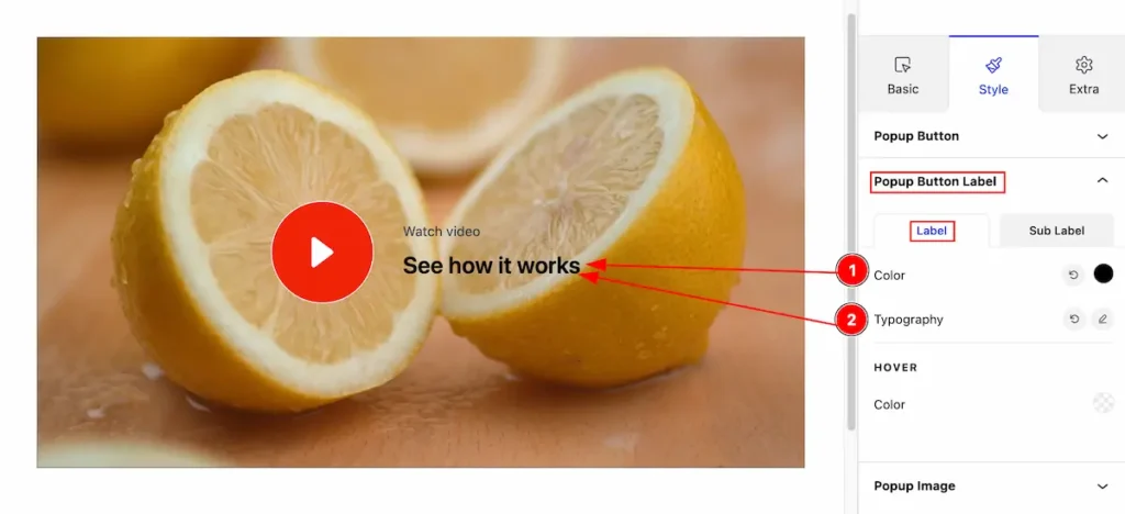
- Color: Set the color for the label.
- Typography: Set the typography for the Label.
HOVER
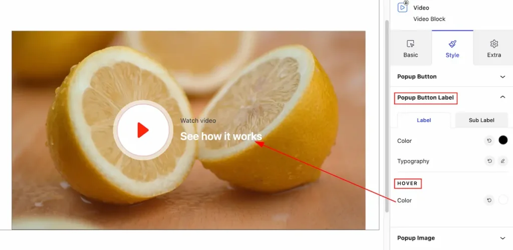
Color: Set the hover color for the button.
Sub Label
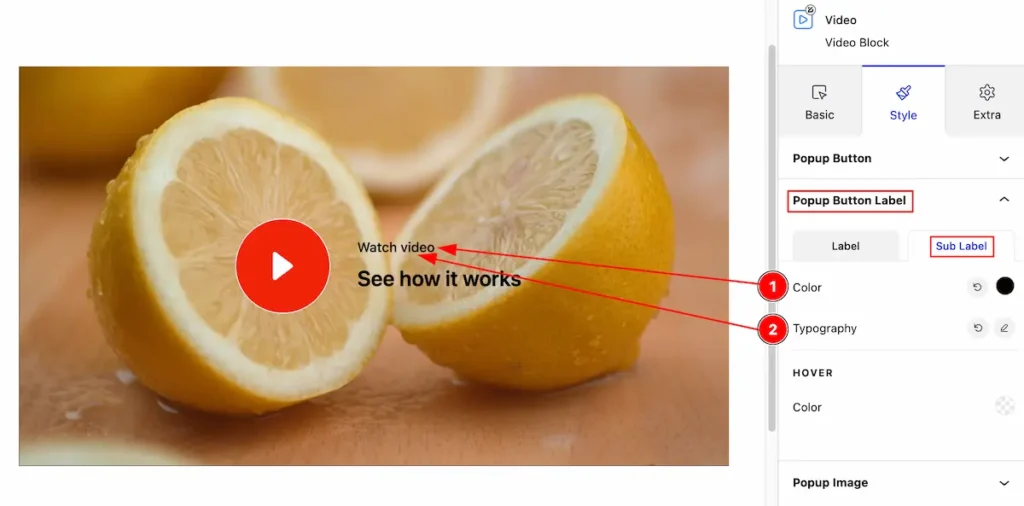
- Color: Set the color for he Sub Label
- Typography: Make the typography for the sub label.
HOVER
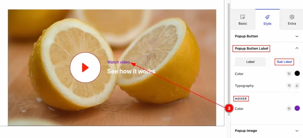
- Color: Set the color for the hover tab.
Popup Image
Go to Style > Popup Image
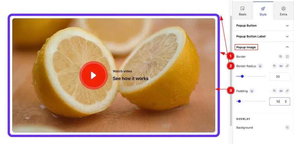
- Border: Set the border for the Popup Image.
- Border Radius: Make the border radius of the image.
- Padding: Set the padding of it.
OVERLAY
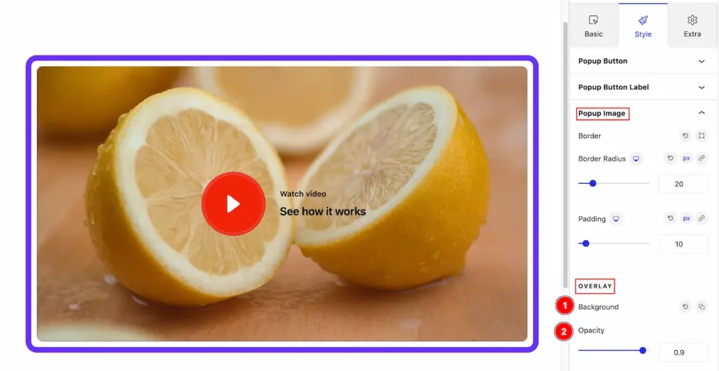
- Background : Set the background for the popup image.
- Opacity: Set the opacity of it.
Video Assist
Video Tutorial Coming Soon! Please check the demo page for more examples.
Thanks for being with us.