

The Switcher widget from Element Pack Pro lets you toggle between two types of content in an interactive layout. It’s ideal for comparing options like pricing or features, with flexible styling options. This documentation explains how to use and customize the Switcher widget in Elementor.
Enable The Switcher Widget
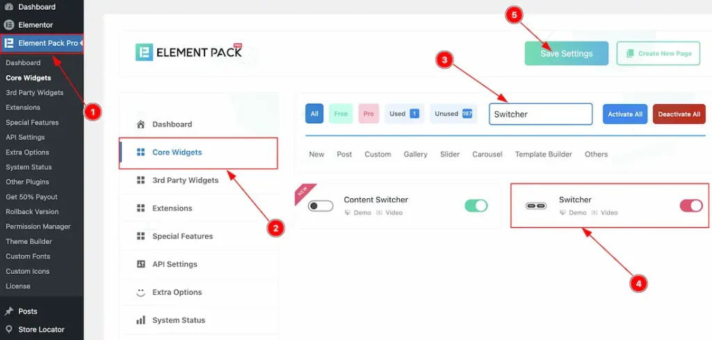
To use the Switcher widget from Element Pack, first, you have to enable the widget.
- Go to WordPress dashboard → Element Pack Plugin dashboard.
- Then, Click the Core Widgets Tab.
- Search the Switcher Widget Name.
- Enable the Switcher Widget.
- Hit the Save Settings Button.
Inserting The Switcher Widget
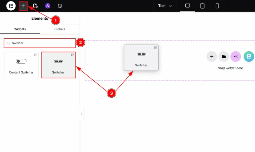
1. Go to the Elementor Editor Page and hit the “+” icon Button.
2. Search the Switcher widget name.
3. Drag the widget and drop it on the editor page.
Work With The Content Tab
Switch A Section
Go to Content → Switch A
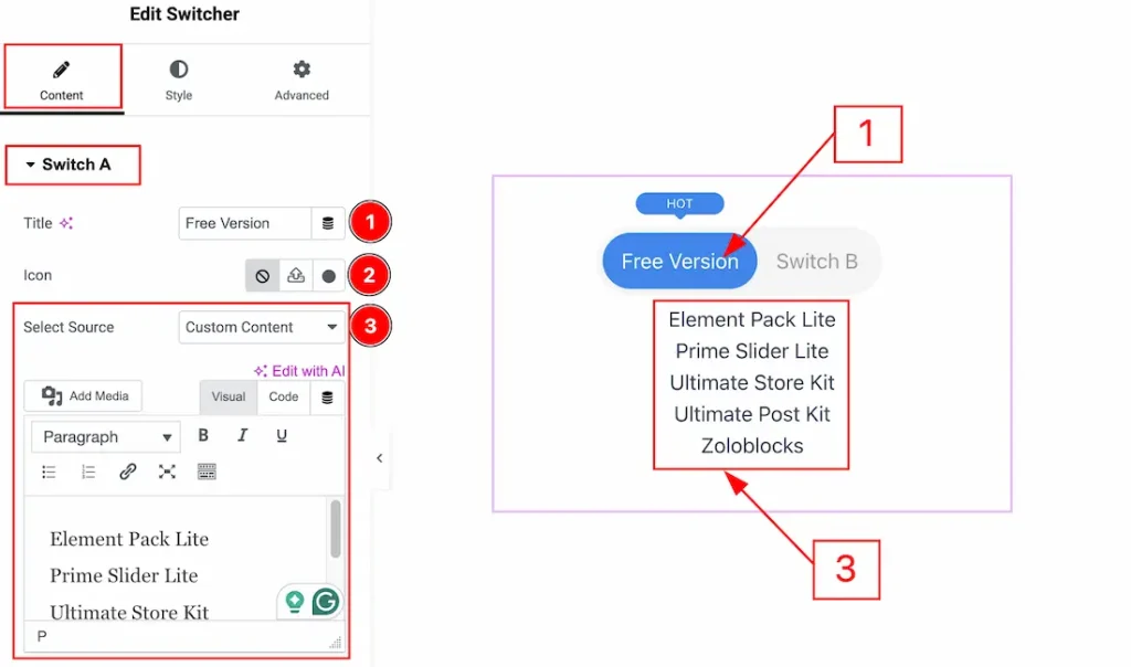
1. Title: You can change the Switch A title text with this option.
2. Icon: You can add an icon to the title with this option.
3. Select Source: You can select the source from where you want to import the content. By selecting the source as Custom Content, you can add the content manually yourself.
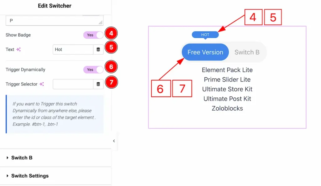
4. Show Badge: Enable the switcher to show the badge to the switcher with this option.
5. Text: You can make changes to the badge text with this option.
6. Trigger Dynamically: Enable the switcher to trigger this switch dynamically.
7. Trigger Selector: You can enter the ID or class of the target element here to trigger the switch dynamically from anywhere else.
Switch B Section
Go to Content → Switch B
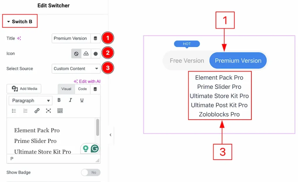
1. Title: You can change the Switch B title text with this option.
2. Icon: You can add an icon to the title with this option.
3. Select Source: You can select the source from where you want to import the content. By selecting the source as Custom Content, you can add the content manually yourself.
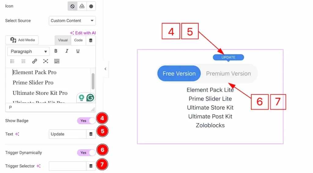
4. Show Badge: Enable the switcher to show the badge to the switcher with this option.
5. Text: You can make changes to the badge text with this option.
6. Trigger Dynamically: Enable the switcher to trigger this switch dynamically.
7. Trigger Selector: You can enter the ID or class of the target element here to trigger the switch dynamically from anywhere else.
Switch Settings Section
Go to Content → Switch Settings
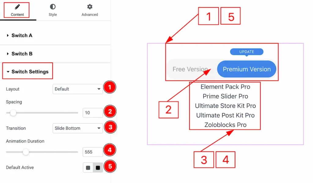
1. Layout: You can select the layout to be the default or bottom with this option.
2. Spacing: You can adjust the space between the switches with this option.
3. Transition: You can add a transition to the switch with this option.
4. Animation Duration: You can adjust the animation duration with this option.
5. Default Active: You can set the button as the default that you want to be active when the page loads with this option.
Work with The Style Tab
Switcher Wrapper Section
Go to Style → Switcher Wrapper
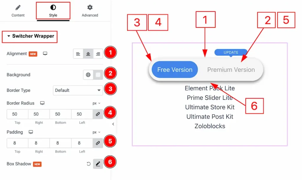
1. Alignment: You can adjust the position of the switcher to left, center or right with this option.
2. Background: You can make changes to the switcher background with this option.
3. Border Type: You can add and change the border types with this option.
4. Border Radius: You can control the roundness of the border with this option.
5. Padding: You can adjust the inner space of the switchers with this option.
6. Box Shadow: You can add a shadow effect to the switchers with this option.
Switch A Section
Go to Style → Switch A
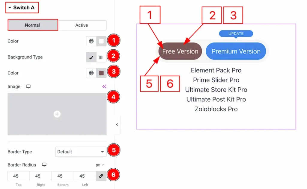
In this section, we have two more tabs. These are Normal & Active. Let’s start with the Normal Tab first –
1. Color: You can change the Switch A title text color with this option.
2. Background Type: You can change the background type to be classic or gradient with this option. Here, we have selected the background color as Classic.
3. Color: You can change the background color with this option.
4. Image: You can change the background image with this option.
5. Border Type: You can add and change the border types with this option.
6. Border Radius: You can control the roundness of the border with this option.
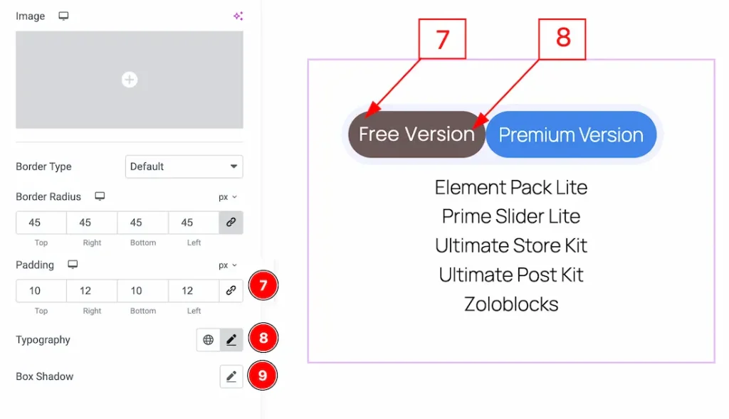
7. Padding: You can adjust the inner space of the Switch A field with this option.
8. Typography: Change the font family, size, weight, transform, style, decoration, line height, letter spacing, and word spacing from here.
9. Box Shadow: You can add a shadow effect to the Switch A with this option.
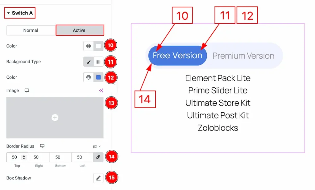
Now let’s proceed to the Active Tab –
10. Color: You can change the Switch A title text active color with this option.
11. Background Type: You can select the background type to be classic or gradient with this option.
12. Color: You can change the background active color with this option.
13. Image: You can change the background image with this option.
14. Border Radius: You can control the roundness of the border with this option.
15. Box Shadow: You can add a shadow effect to the active switcher A with this option.
Switch B Section
Go to Style → Switch B
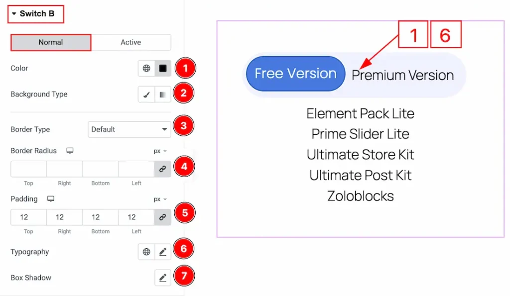
In this section, we have two more tabs. These are Normal & Active. Let’s start with the Normal Tab first –
1. Color: You can change the Switch A title text color with this option.
2. Background Type: You can change the background type to be classic or gradient with this option. Here, we have selected the background color as Classic.
3. Border Type: You can add and change the border types with this option.
4. Border Radius: You can control the roundness of the border with this option.
5. Padding: You can adjust the inner space of the Switch A field with this option.
6. Typography: Change the font family, size, weight, transform, style, decoration, line height, letter spacing, and word spacing from here.
7. Box Shadow: You can add a shadow effect to the Switch B with this option.
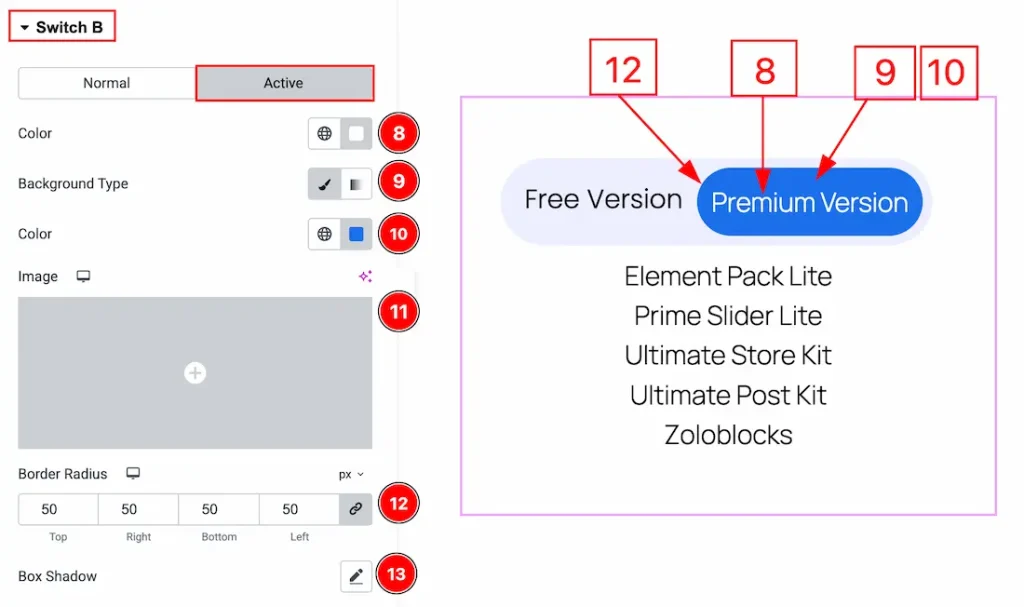
Now let’s proceed to the Active Tab –
8. Color: You can change the Switch B title text active color with this option.
9. Background Type: You can select the background type to be classic or gradient with this option.
10. Color: You can change the background active color with this option.
11. Image: You can change the background image with this option.
12. Border Radius: You can control the roundness of the border with this option.
13. Box Shadow: You can add a shadow effect to the active switcher B with this option.
Content Section
Go to Style → Content
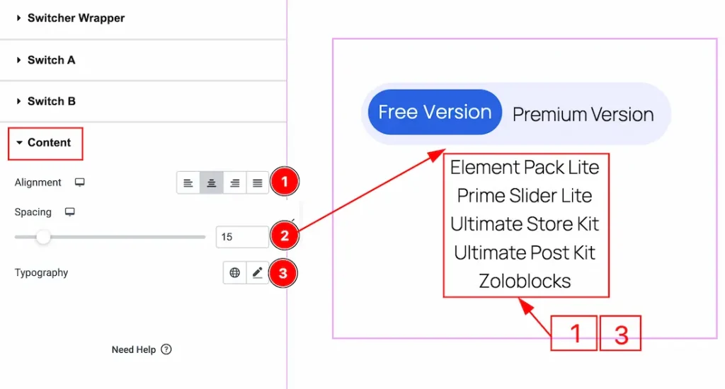
1. Content: You can adjust the content position to left, center, right or justify with this option.
2. Spacing: You can adjust the space between the content and the switchers with this option.
3. Typography: Change the font family, size, weight, transform, style, decoration, line height, letter spacing, and word spacing from here.
All done! You have successfully customized the Switcher widget on your website.
Video Assist
You can also watch the video tutorial to learn more about the Switcher widget. Please visit the demo page for examples.
Thanks for being with us.