In this documentation, we will show you how to customize the Checkout Login Form widget by Ultimate Store Kit.
Enable the Checkout Login Form Widget
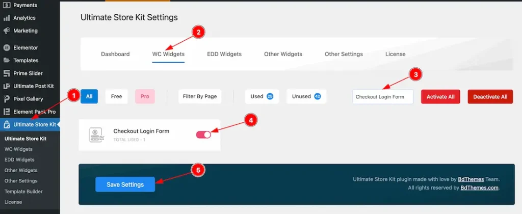
To use the Checkout Login Form widget by Ultimate Store Kit, first, you have to enable the widget.
- Go to WordPress > Ultimate Store Kit Plugin dashboard.
- Then Click the WC Widgets Tab.
- Search the Checkout Login Form Widget Name.
- Enable the Checkout Login Form Widget.
- Hit the Save Settings Button.
Inserting the Checkout Login Form widget
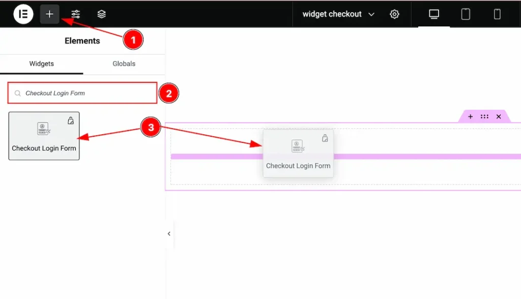
- Go to the Elementor Editor Page and Hit the “+” (Add Element) icon button.
- Search the Checkout Login Form widget.
- Drag the widget and drop it on the editor page.
Work with The Style Tab
Info Section
Go to Style > Info
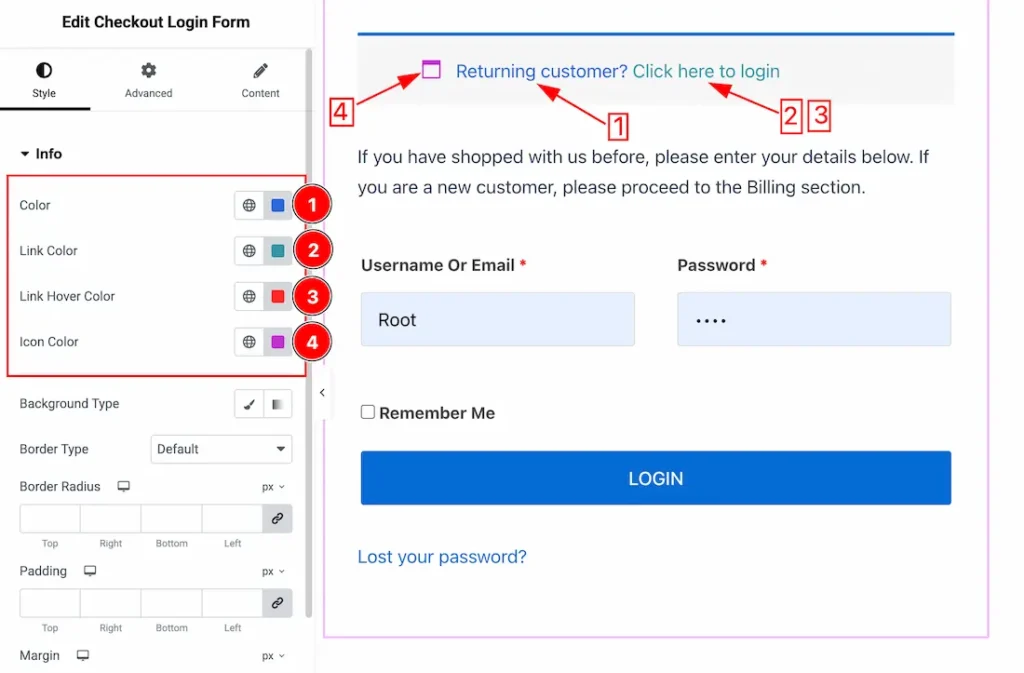
1. Color: This option lets you change the Info text color.
2. Link Color: This option lets you change the Info text link color.
3. Link Hover Color: This option lets you change the Info text link hover color.
4. Icon Color: This option lets you change the Info icon color.
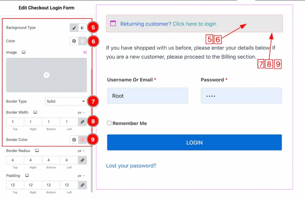
5. Background Type: you can change the color of any object background to classic or gradient. Here we choose the Background type Classic.
6. Background Color: This lets you change the info Background color.
7. Border Type: You can set the Border Type to Default, None, Solid, Double, Dotted, Dashed, or Groove. We choose here the Border Type Solid.
8. Border Width: The border width property allows you to control how thick or thin the border is.
9. Border Color: This lets you change the Border color.
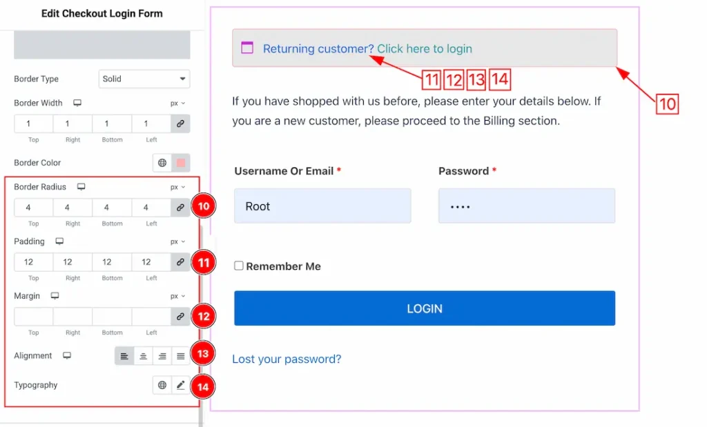
10. Border Radius: Customizes the border corners for roundness.
11. Padding: Add spaces around an object to increase the inner area. Padding allows you to control the internal space within an element.
12. Margin: Adjusts the position of an object over the canvas.
13. Alignment: You can set the info alignment as – Left, center, right, and justify.
14. Typography: Change the font family, size, weight, style, transform, decoration, line height, letter spacing, and word spacing from here.
Form Content Section
Go to Style > Form Content
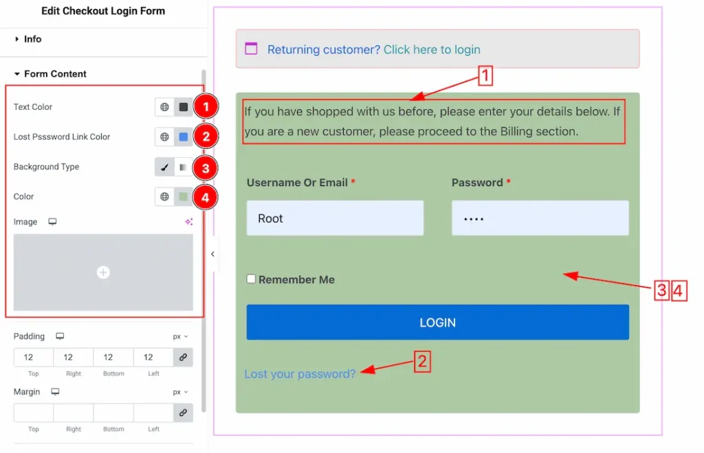
1. Text Color: This option lets you set the Form Content text color.
2. Lost Password Link Color: This option lets you set the lost password link color.
3. Background Type: You can change the color of any object background to classic or gradient. Here we choose the Background type Classic.
4. Background Color: This option lets you change the Form Content Background color. If you want, you also can change an image to the Background.
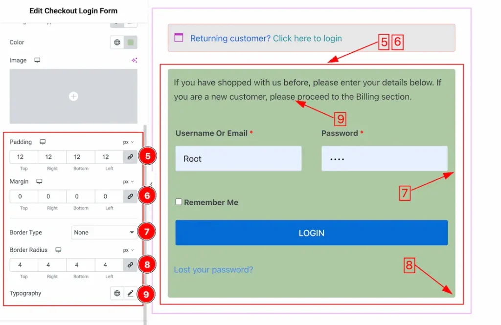
5. Padding: Add spaces around an object to increase the inner area. Padding allows you to control the internal space within an element.
6. Margin: Adjusts the position of an object over the canvas.
7. Border Type: You can set the Border Type to Default, None, Solid, Double, Dotted, Dashed, or Groove. We choose here the Border Type Solid.
8. Border Radius: Customizes the border corners for roundness.
9. Typography: Change the font family, size, weight, style, transform, decoration, line height, letter spacing, and word spacing from here.
Input Box Section
Go to Style > Input Box
Come to the Input Box section, you will get two subsections; Normal and Hover.
Lets explore the Normal subsections-
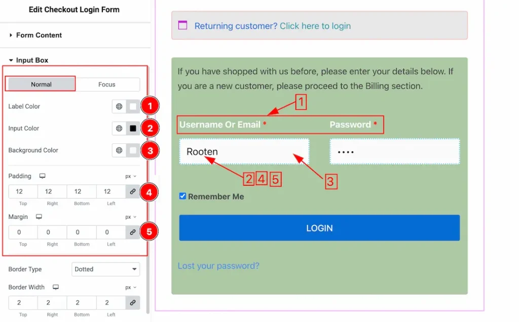
1. Label Color: This option lets you set the input box label color.
2. Input Color: This option lets you set the input box text color.
3. Background Color: This option lets you set the input box Background color.
4. Padding: Add spaces around an object to increase the inner area. Padding allows you to control the internal space within an element.
5. Margin: Adjusts the position of an object over the canvas.
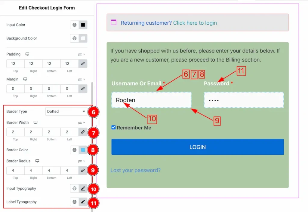
6. Border Type: You can set the Border Type to Default, None, Solid, Double, Dotted, Dashed, or Groove. We choose here the Border Type Solid.
7. Border Width: The border width property allows you to control how thick or thin the border is.
8. Border Color: This lets you change the Border color.
9. Border Radius: Customizes the border corners for roundness.
10. Input Typography: Change the font family, size, weight, style, transform, decoration, line height, letter spacing, and word spacing from here for the Input field.
11. Label Typography: Change the font family, size, weight, style, transform, decoration, line height, letter spacing, and word spacing from here for the label.
Submit Button Section
Go to Style > Submit Button
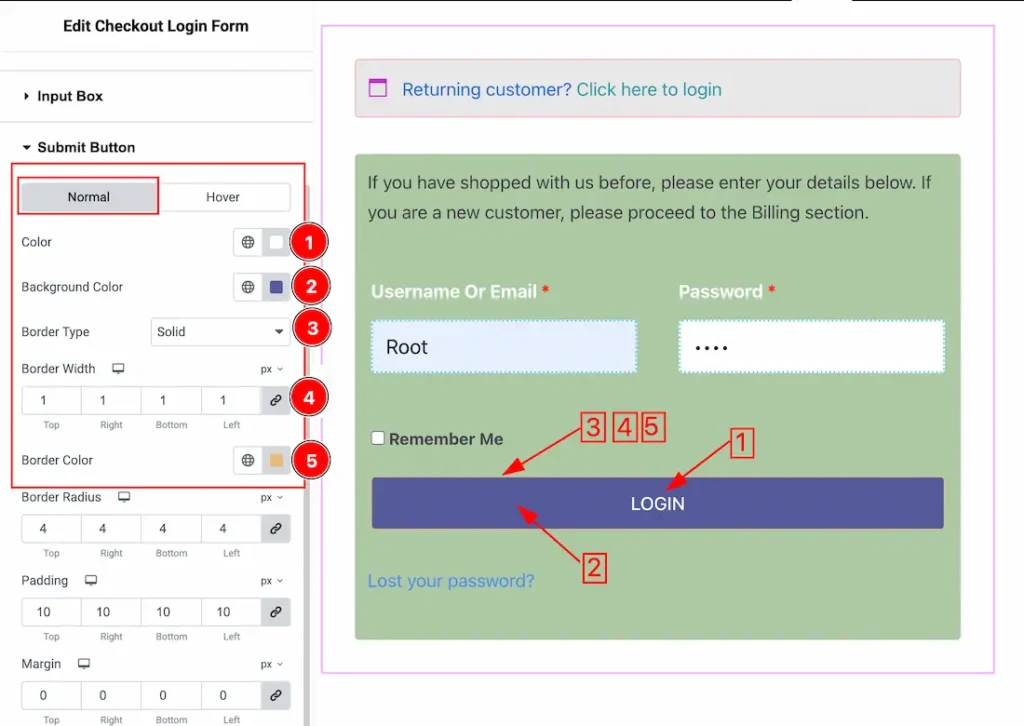
Come to the Submit Button section, you will get two subsections; Normal and Hover.
Lets explore the Normal subsection-
1. Color: This option lets you chnage the submit button text color.
2. Background Color: This option lets you set the submit button background color.
3. Border Type: You can set the Border Type to Default, None, Solid, Double, Dotted, Dashed, or Groove. We choose here the Border Type Solid.
4. Border Width: The border width property allows you to control how thick or thin the border is.
5. Border Color: This lets you change the Border color.
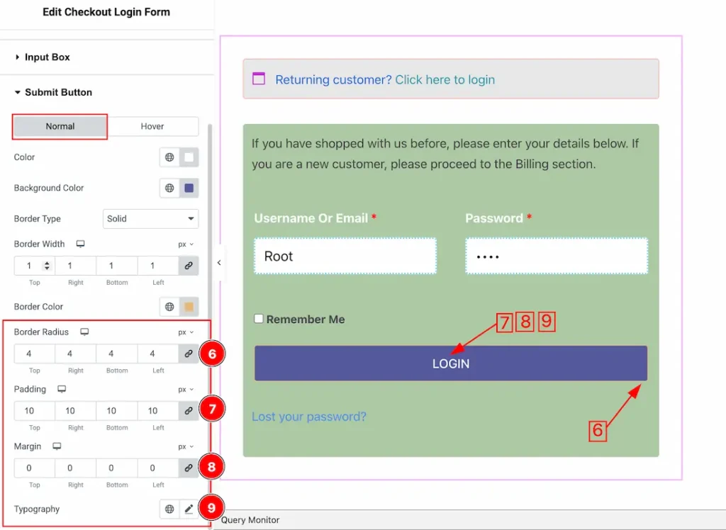
6. Border Radius: Customizes the border corners for roundness.
7. Padding: Add spaces around an object to increase the inner area. Padding allows you to control the internal space within an element.
8. Margin: Adjusts the position of an object over the canvas.
9. Typography: Change the font family, size, weight, style, transform, decoration, line height, letter spacing, and word spacing from here.
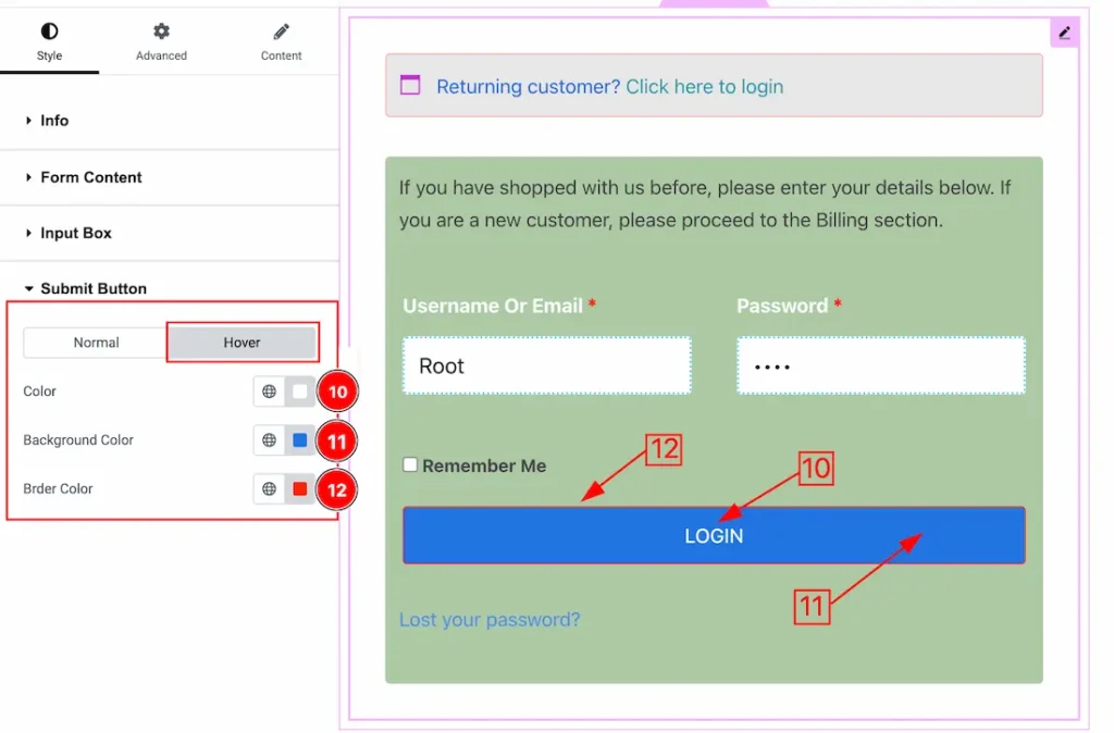
10. Color: This option lets you change the submit button hover text color.
11. Background Color: This option lets you change the submit button hover text background color.
12. Border Color: This option lets you change the submit button hover border color.
All done! You have successfully customized the Checkout Login Form widget on your website.
Video Assist
The video will come soon. Please visit the demo page for examples.
Thanks for being with us.