In this documentation, we will discuss the customization of the Post Featured Image block, brought to you by Zoloblocks.
Enable the Post Featured Image Block
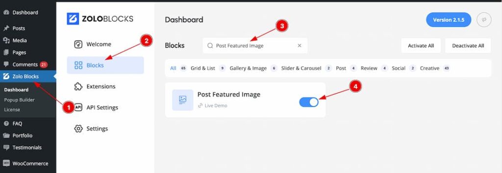
To use the Post Featured Image block from Zoloblocks, you must first enable the block.
- Go to WordPress Dashboard > Zoloblocks Plugin dashboard.
- Then Click the Blocks Tab.
- Search the Post Featured Image block Name.
- Enable the Post Featured Image block.
How and Where use the Post Featured Image Block
The Post Featured Image block is designed exclusively for Single pages and requires a Block Theme for functionality. In this regard, we offer the Axvart Theme, which is compatible with the Post Featured Image block. If you’re a ZoloBlocks Pro user, the Axvart Theme is included with the plugin for seamless use. If you want then you also can use another block Theme for using the Post Featured Image block. Lets explore the Post Featured Image block.
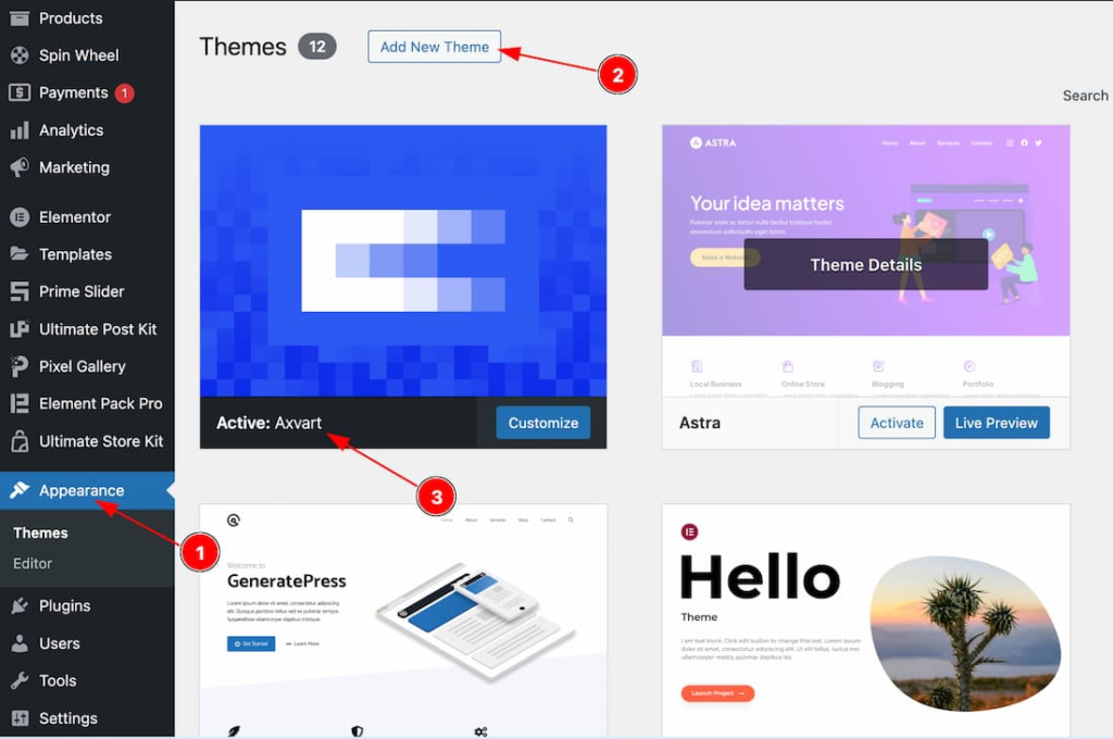
Go to your WP dashboard > Appearance > Add New Theme > Add the Theme > Install and Activate the Theme. If you want then you also can read the doc of how to install and activate the Axvart Theme from here.
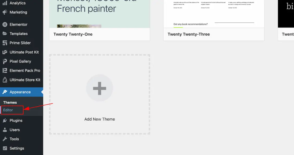
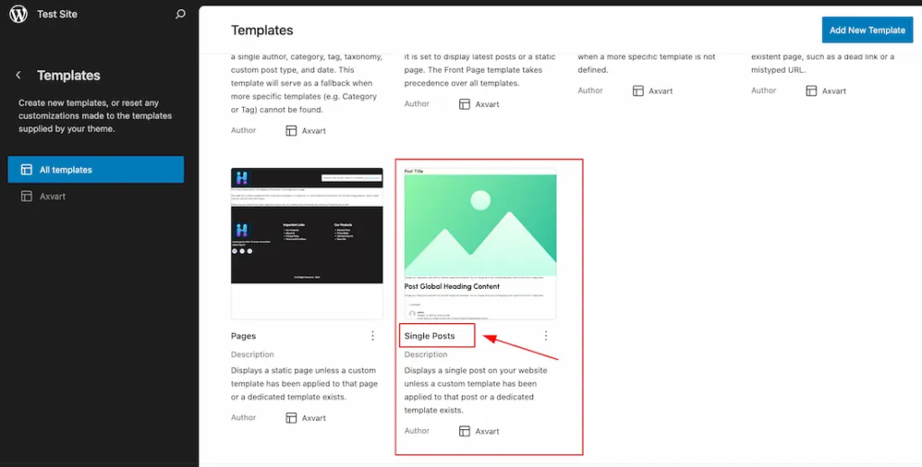
After installing and activating the block theme, just go to Appearance > Editor > All Templates > set the default Single Post Template and edit the template to your working demand by using Zoloblocks Single blocks like Post Title, Post Featured image, Post Meta, Post Content, Post Comments Form etc. Here we show how to add and customize the Post Featured Image Block.
Adding the Post Featured Image Block
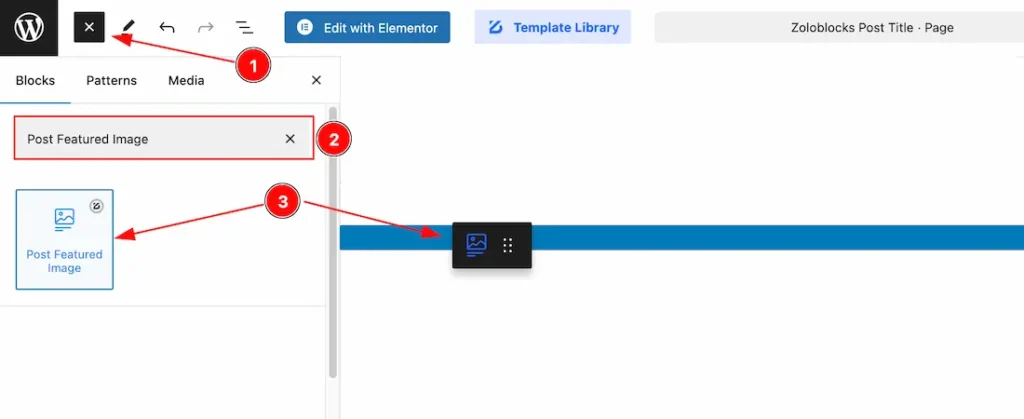
- Click the Toggle Block Inserter icon and a sidebar will appear on the left side, All the blocks will be visible here.
- Search by the Post Featured Image block name.
- Then select the appear blocks ( with zoloblocks logo T.R corner).
- After Drag and Drop it on the page.
Basic Tab
The Basic tab controller displayed here offers the flexibility to adjust the layout of blocks according to your preferences.
General Section
Go to Basic > General
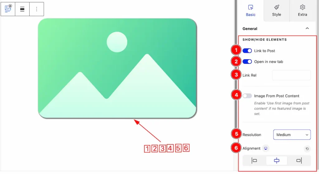
Come to the General section, you will get the below options to customize the Post Featured Image.
1.Link to Post: Enable or disable the Link to Post switcher button to show or hide the image Link.
2. Open In New Tab: Enable the Open in New Tab switcher button so that the Post Image open in new tab of the browser.
3. Link Rel: You can set the Link Rel type as – alternate, icon, help etc. For getting more link rel, you can visite this site from here.
4. Image From Post Content: If you enable the Image From Post Content switcher button then a featured image show by default from First Post when the Featured image is not set.
5. Resolution: You can set the image resolution type – Default, Thumbnail, Medium, Large, and Full.
6. Alignment: You can set the Alignment of the Post Featured image as – Left, Center and Right.
Style Tab
Provide the controller to make the visual appearance or presentation of the tabs. This includes aspects visually appealing and cohesive with the overall design of the interface.
Image Section
Go to Style > Image
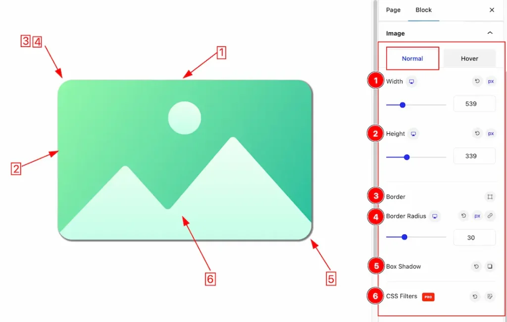
Come to the Image section, you will get two sub-sections; Normal and Hover.
In the Normal Tab section, you will get the below options to customize it.
1. Width: This option lets you set the Image Width.
2. Height: This option lets you set the Image Height.
3. Border: you can set the Border Type to Default, None, Solid, Double, Dotted, Dashed, or Groove. We choose here the Border Type Solid.
Border Width: The border width property allows you to control how thick or thin the border is.
Border Color: This lets you change the Border color.
4. Border Radius: Customizes the border corners for roundness.
5. Box Shadow: The Box Shadow property is used to create the shadow around the Category Button. It takes Four values: Horizontal offset, Vertical offset, blur, and Spread to customize the Box shadow.
Position: you can set the Box Shadow position Outline and Inset. Here we set the Box Shadow position Outline.
Box Shadow Color: This lets you change the Box Shadow color.
6. CSS Filter:
Blur: Adjusts the blurriness of the element. Higher values increase the blur effect.
Brightness: Controls the brightness level of the element. Values greater than 100% increase brightness, while values below 100% darken it.
Contrast: Adjusts the difference between the darkest and lightest areas. Increasing contrast makes colors more vivid.
Saturate: Modifies the color intensity. Higher values increase saturation, making colors appear more vibrant.
Hue Rotate: Rotates the color spectrum of the element, changing its overall hue.
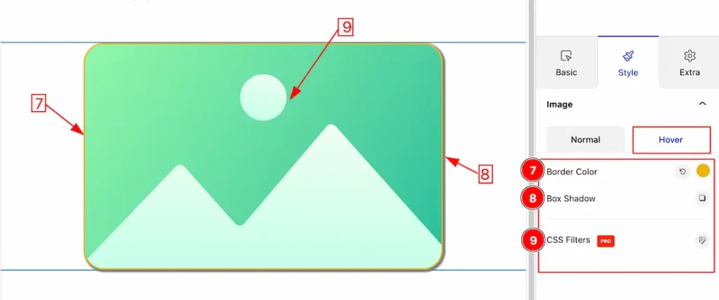
In the Hover Tab section, you will get the below options to customize it.
7. Border Color: This option lets you change the Hover Border color.
8. Box Shadow: You can add the Box shadow for the Hover mode.
9. CSS Filter: This option lets you add the CSS Filter for the Hover mode. If you want then you can learn more from the above description.
Extra Tab Control
The extra tabs provide the controls of any blocks. You can make different visual layouts by following these Controls.
Click to learn more>>.
Video Assist
You can also watch the video tutorial Learn more about the Post Featured Image Block.
Thanks for being with us!
