In this documentation, we will discuss the customization of the Text Path block, brought to you by Zoloblocks.
Inserting The Block into the Editor
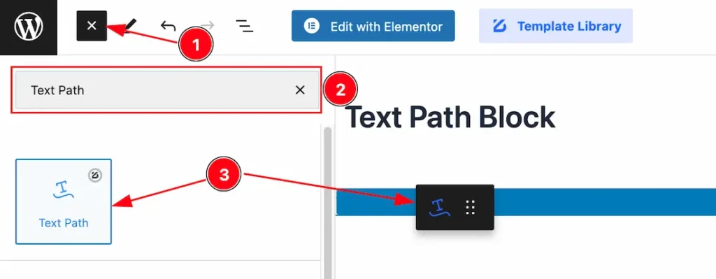
- Click the Toggle Block Inserter icon and a sidebar will appear on the left side, All the blocks will be visible here.
- Search the Text Path Block Name inside the search Box. otherwise, select the Icon blocks ( with Zoloblocks logo T.R corner).
- Then Drag and Drop it on the page.

After Inserting the blocks, Follow this.
- Click on the Document Overviewer button and the Blocks list view will appear.
- After on the right side, Click on the Block.
- Here show all the control tabs( Basic, Style, Extra ) of a block.
Basic Tab Customization
The Basic tab controller displayed here offers the flexibility to adjust the layout of blocks according to your preferences.
General Section
Go to Basic > General
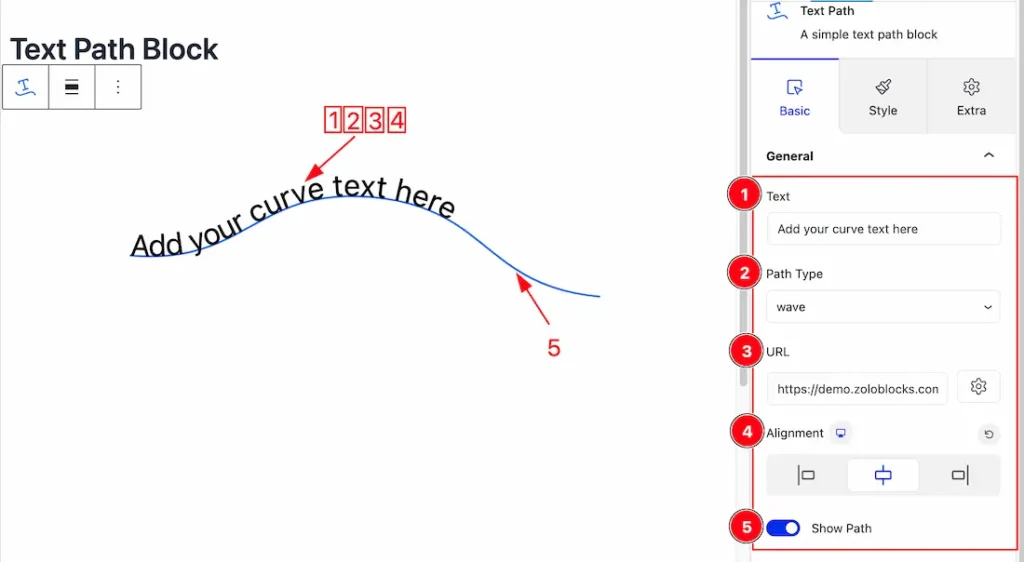
1. Text: This option lets you change the text for the Path.
2. Path Type: you can choose a Path Type ( Wave, Arc, Circle, Line, Oval, and Spairal ) from here.
3. URL: You can set a URL under the Text.
4. Alignment: This option lets you align the Text – Left, Right, and Center.
5. Show Path: Enable or Disable the Show Path switcher button to show or hide the Path.
Work with The Style Tab
Text Path Section
Go to Style > Text Path
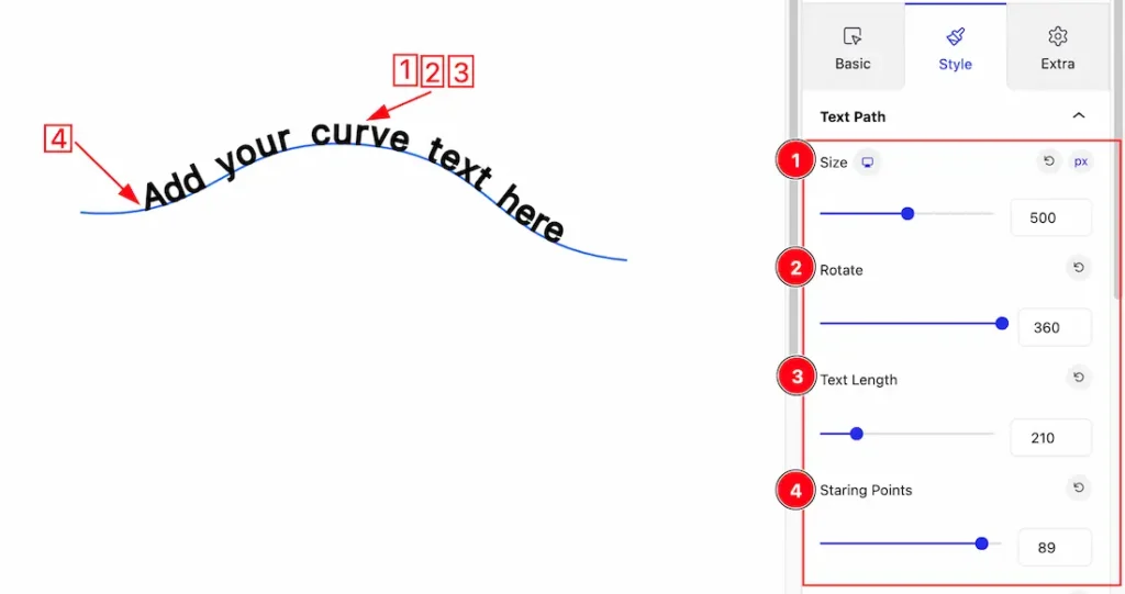
1. Size: you can set the Size of Text from here.
2. Rotate: This option lets you rotate the Text to your needs.
3. Text Length: This option lets you control the length of text.
4. Starting Points: you can set a starting point for the Text from here.
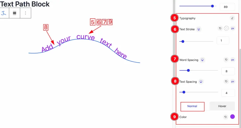
5. Typography: Change the font family, size, weight, style, transform, decoration, line height, letter spacing, and word spacing from here.
6. Text Stroke: If you want to add a stroke (outline) around the text, you can use the Text Stroke property. you also can change the Text Stroke Color as your working demand.
7. Word Spacing: This option lets you set a space within the Words.
8. Text Spacing: This option lets you set a space within the Text.
9. Color: In the Normal tabs section, you can set a color for the Text.
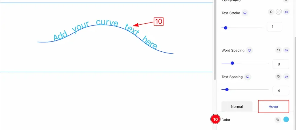
10. Hover Color: Under the Hover Tabs section, you change the hover color for the Text.
Extra Tab Controls
The extra tabs provide the controls of any blocks. You can make different visual layouts by following these Controls.
Click to learn more>>.
Video Assist
The video will help you properly to understand the block. For more examples please see the demo here.
Thanks for being with us.
