In this documentation, we will discuss the customization of the Pagepiling Slider widget, brought to you by the Prime Slider addon for Elementor.
Enable The Pagepiling Slider Widget
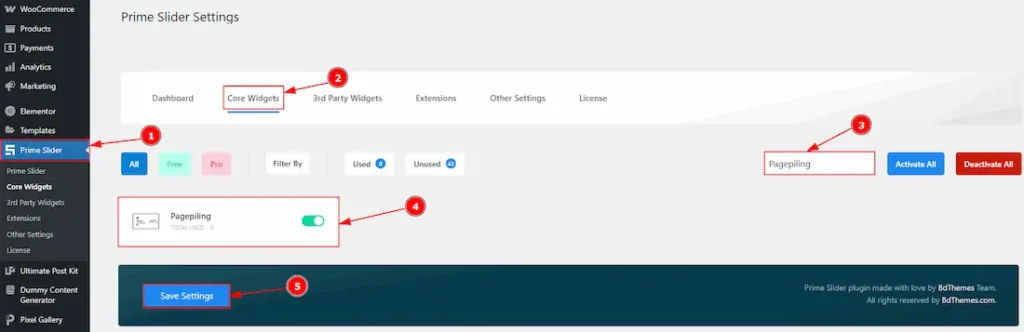
To use the Pagepiling widget from Prime Slider, first, you have to enable the widget.
- Go to WordPress dashboard > Prime Slider Plugin dashboard.
- Then, Click the Core Widgets Tab.
- Search the Pagepiling Widget Name.
- Enable the Pagepiling Widget.
- Hit the Save Settings Button.
Inserting the Pagepiling widget
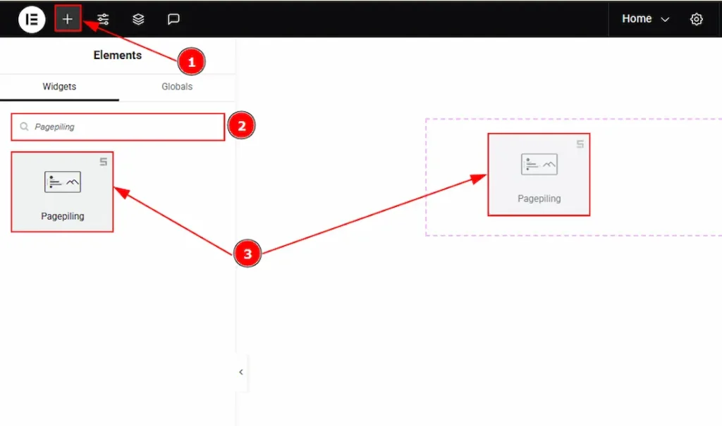
1. Go to the Elementor Editor Page and hit the “+” icon Button.
2. Search the Pagepiling widget.
3. Drag the widget and drop it on the editor page.
Work With The Content Tab
Slide Items Section
Go to Content > Slide Items
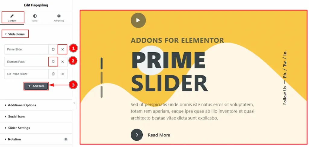
1. Close Item: You can delete the Slider item by clicking the Close icon button.
2. Copy Item: This option lets you copy the same item.
3. Add Item: You can add a new item by clicking the “+” Add Item button.
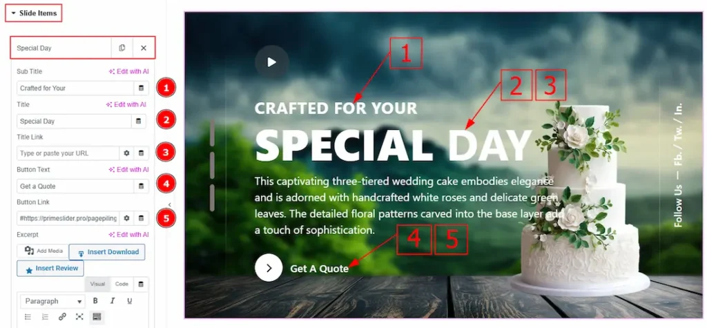
In the Slide Items, each item contains more options. Let’s explore those now –
1. Sub Title: You can add the sub title text with this option.
2. Title: You can add the title text with this option.
3. Title Link: You can add a link to the title with this option.
4. Button Text: You can add the button text with this option.
5. Button Link: You can add a link to the button with this option.
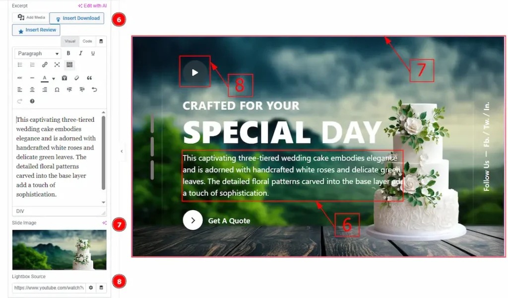
6. Excerpt: This option allows to to add a short summary and customize the description.
7. Image: You can add or change the image with this option.
8. Lightbox Source: This option allows you to add a YouTube video link.
Additional Options Section
Go to Content > Additional Options
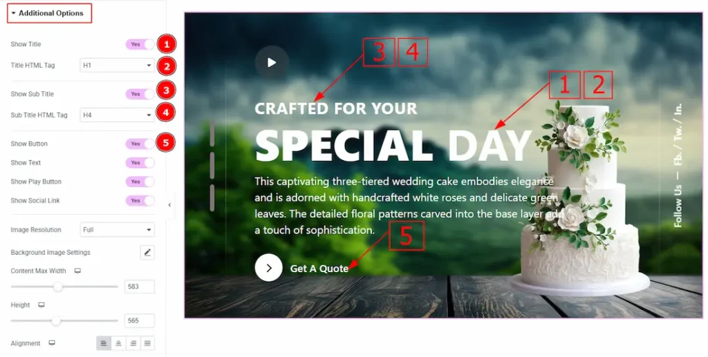
1. Show Title: Enable the switcher to show the title to the audience.
2. Title HTML Tag: This option lets you select the heading for the title.
3. Show Sub Title: Enable the switcher to show the sub title to the audience.
4. Sub Title HTML Tag: This option lets you select the heading for the sub title.
5. Show Button: Enable the switcher to show the button to the audience.
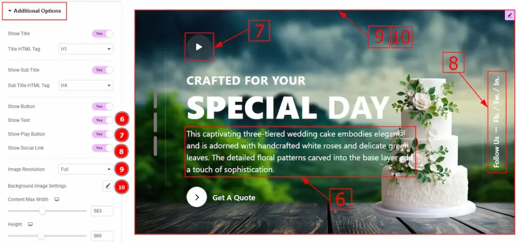
6. Show Text: Enable the switcher to show the description to the audience.
7. Show Play Button: Enable the switcher to show the play button to the audience.
8. Show Social Link: Enable the switcher to show the social links to the audience.
9. Image Resolution: You can change the image resolution with this option.
10. Background Image Settings: You can make changes to the background image with this option. Here you will get position, repeat & size options to set up the background image.
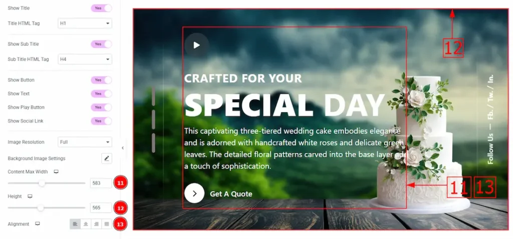
11. Content Max Width: You can adjust the content width with this option.
12. Height: Height: You can adjust the slider height with this option.
13. Alignment: You can set the content position to left, center, right or justified with this option.
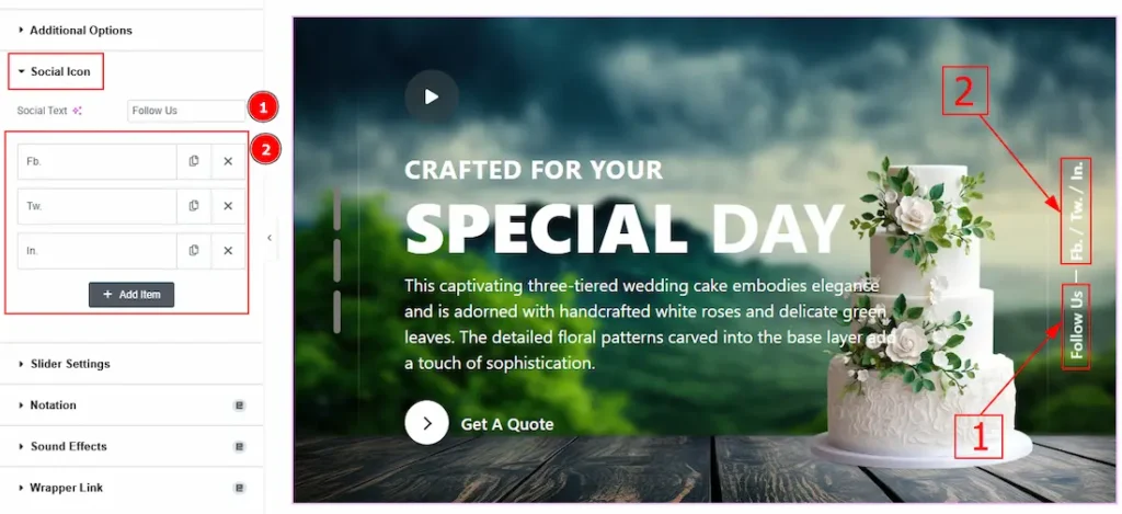
Social Icon Section
Go to Content > Social Icon
1. Social Text: You can change the social text with this option.
2. Marked Area: The settings in this section are the same as those in the Sliders section described above. For a detailed explanation, please refer to the Slide Items section to understand how these options work.
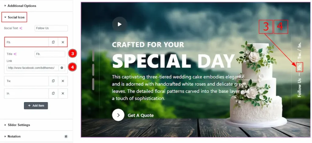
Now, let’s proceed to the inner options of the social icon –
3. Title: You can add a title to your social icon with this option.
4. Link: This option allows you to add a link to the social icon.
Slider Settings Section
Go to Content > Slider Settings
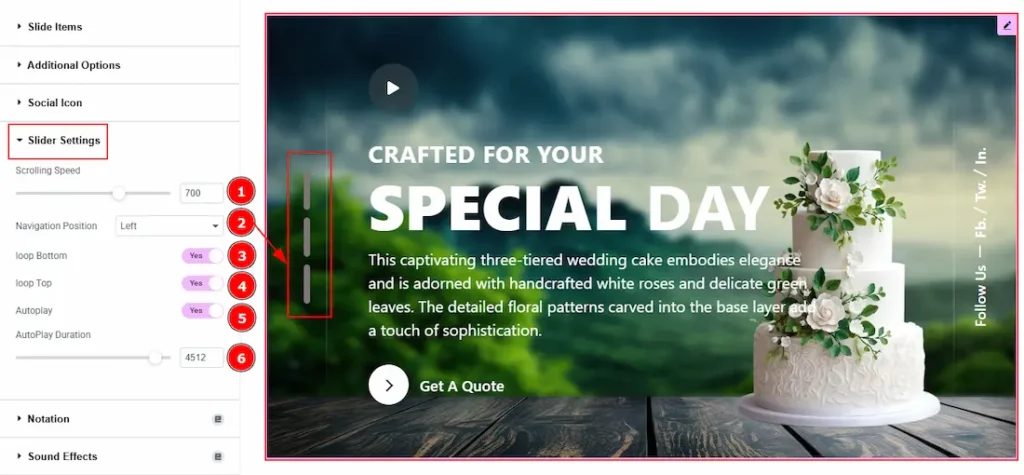
1. Scrolling Speed: A numerical input (currently set to 700) likely controls how fast the slides transition.
2. Navigation Position: You can set the navigation position to left or bottom with this option.
3. Loop Bottom: Enabled the switcher to allow the slider to loop back to the beginning after reaching the last slide.
4. Loop Top: Enable the switcher to allow the slider to loop back to the end after reaching the first slide.
5. Autoplay: Enable the switcher to automatically transits the slides without user interaction.
6. Autoplay Duration: This option lets you set the time between each slide transition.
Work with The Style Tab
Wrapper Section
Go to Style > Wrapper
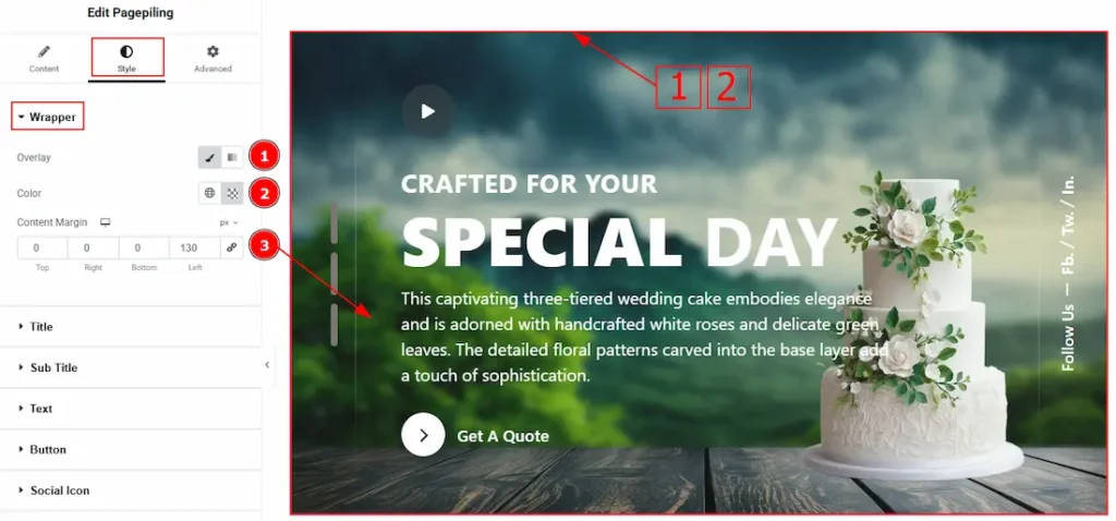
1. Overlay: Select the type of overlay to apply over the background.
2. Overlay Color: You can choose the overlay color and adjust its transparency to control the visual effect.
3. Content Margin: This option allows you to adjust the outer space and gaps of the content.
Title Section
Go to Style > Title
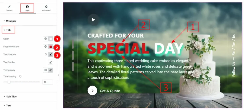
1. Color: You can change the title color with this option.
2. First Word Style: Enable this switcher to customize the title’s first word.
3. Text Shadow: This option allows you to add a shadow effect to the text.
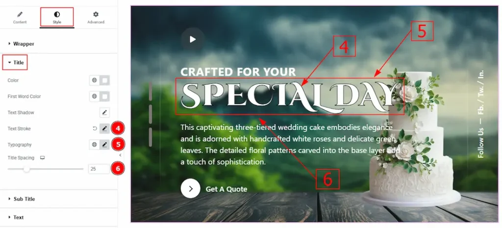
4. Text Stroke: This option allows you to add an outline or border around text, creating a visually distinct effect.
5. Typography: Change the font family, size, weight, transform, style, decoration, line height, letter spacing, and word spacing from here.
6. Title Spacing: You can adjust the space between the title and the description with this option.
Sub Title Section
Go to Style > Sub Title
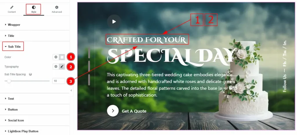
1. Color: You can change the sub title color with this option.
2. Typography: Change the font family, size, weight, transform, style, decoration, line height, letter spacing, and word spacing from here.
3. Sub Title Spacing: You can adjust the space between the title & the sub title with this option.
Text Section
Go to Style > Text
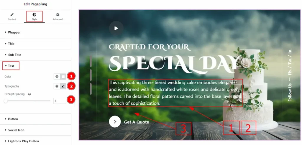
1. Color: You can change the text color with this option.
2. Typography: Change the font family, size, weight, transform, style, decoration, line height, letter spacing, and word spacing from here.
3. Excerpt Spacing: You can adjust the space between the excerpt and the button with this option.
Button Section
Go to Style > Button
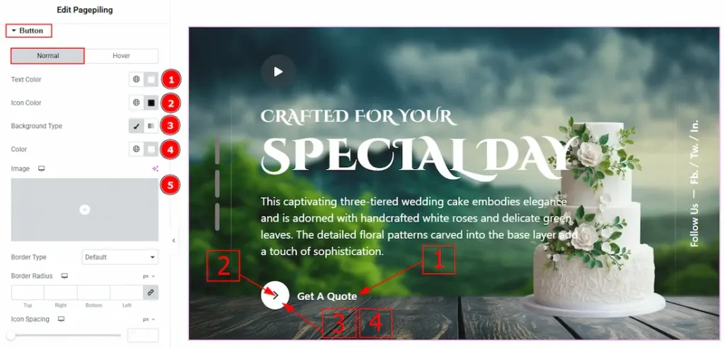
In this tab, we have two tabs. One is Normal and the other is Hover. Let’s start with the Normal Tab –
1. Text Color: You can change the button text color with this option.
2. Icon Color: You can change the icon color with this option.
3. Background Type: You can select the background type to classic or gradient with this option.
4. Color: You can change the background color with this option.
5. Image: You can change the background image with this option.
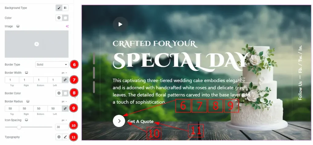
6. Border Type: You can add a border with this opt
7. Border Width: Set the thickness of the border with this option.
8. Border Color: You can change the border color with this option.
9. Border Radius: This option controls the roundness of the border.
10. Icon Spacing: You can adjust the space between the icon and the button text with this option.
11.Typography: Change the button text font family, size, weight, transform, style, decoration, line height, letter spacing, and word spacing from here.
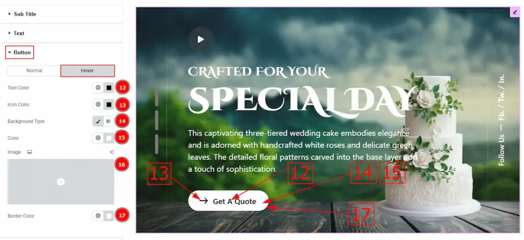
Now, Let’s Proceed to the Hover Tab –
12. Text Color: You can change the button text hover color with this option.
13. Icon Color: You can change the icon hover color with this option.
14. Background Type: You can select the background type to classic or gradient with this option.
15. Color: You can change the background hover color with this option.
16. Image: You can change the background image with this option.
17. Border Color: You can change the hover border color with this option.
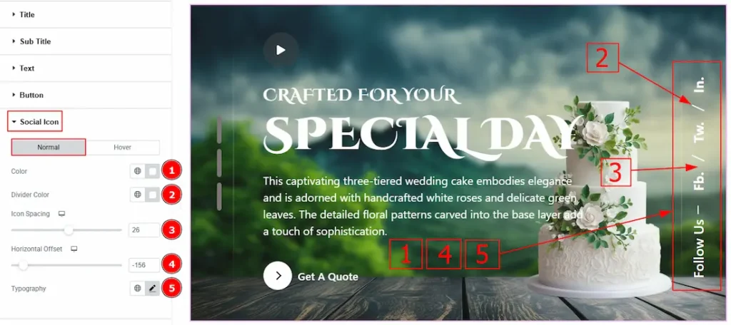
Social Icon Section
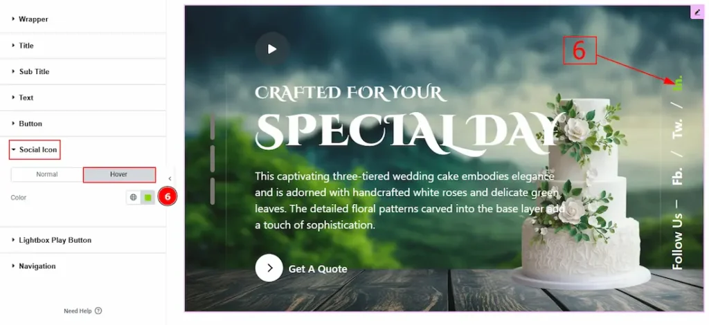
Go to Style > Social Icon
1. Color: You can change the social icon text color with this option.
2. Divider Color: You can change the divider color with this option.
3. Icon Spacing: You can adjust the space between the text & the divider with this option.
4. Horizontal Offset: This option allows you to move the social icon horizontally with this option.
5. Typography: Change the font family, size, weight, transform, style, decoration, line height, letter spacing, and word spacing from here.
Now, let’s proceed to the Hover Tab –
6. Color: You can change the social icon text hover color with this option.
Lightbox Play Button Section
Go to Style > Lightbox Play Button
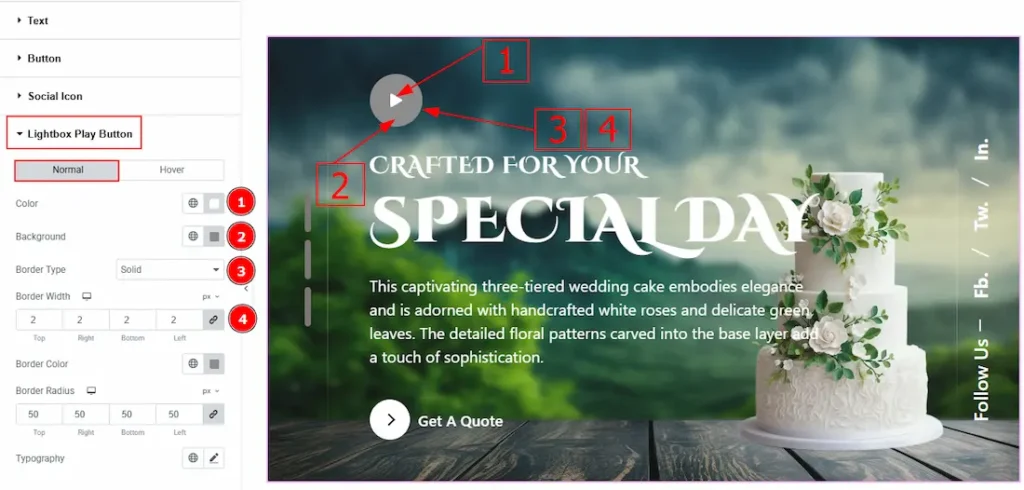
In this section, we have two more tabs. These are Normal & Hover. Let’s start with the Normal Tab –
1. Color: You can change the play button icon color with this option.
2. Background: You can change the background color with this option.
3. Border Type: This option allows you to add various types of borders to the lightbox play button.
4. Border Width: You can set the thickness of the border with this option.
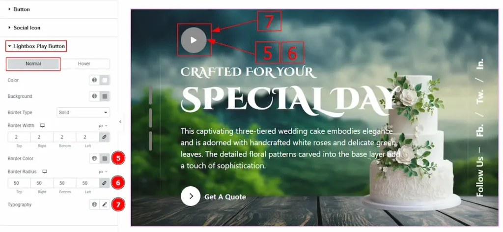
5. Border Color: You can change the border color with this option.
6. Border Radius: This option controls the roundness of the border.
7. Typography: Change the font family, size, weight, transform, style, decoration, line height, letter spacing, and word spacing from here.
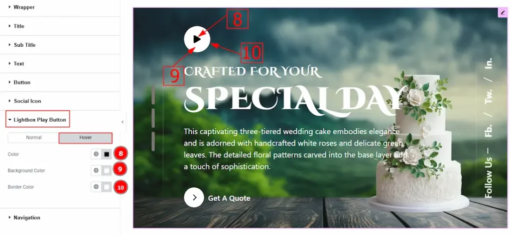
Now let’s proceed to the Hover Tab –
8. Color: You can change the play button icon hover color with this option.
9. Background Color: You can change the background hover color with this option.
10. Border Color: You can change the border hover color with this option.
Navigation Section
Go to Style > Navigation
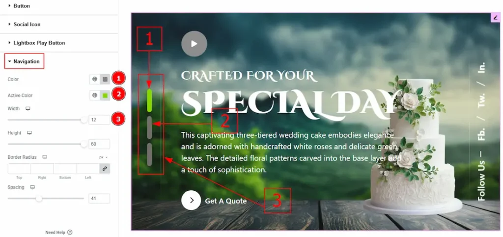
In this Section, we have two tabs. These are Normal & Hover. Let’s start with the Normal Tab –
1. Color: You can change the navigation icon’s color with this option.
2. Active Color: You can change the navigation icon’s active color with this option.
3. Width: You can make changes to the navigation width with this option.
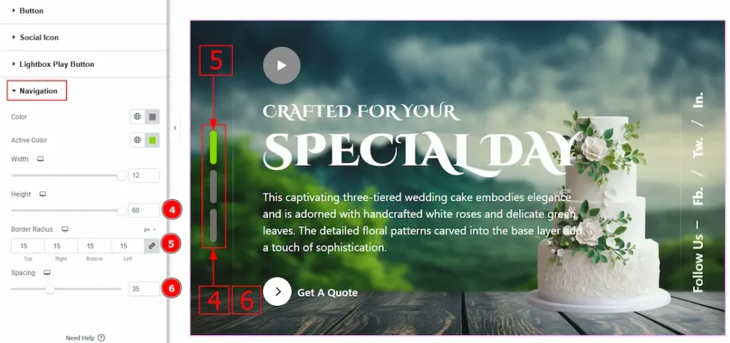
4. Height: You can make changes to the navigation height with this option.
5. Border Radius: This option controls the roundness of the border with this option.
6. Spacing: You can move the navigation position with this option.
All done! You have successfully customized the Pagepiling Slider widget on your website.
Video Assist
You can also watch the video tutorial to learn more about the Pagepiling widget. Please visit the demo page for examples.
Thanks for being with us.