
The gallery Flame widget is one of the most minimalistic widgets available with the Pixel Gallery addon for Elementor. With a partial hover animation, the widget helps create a simplistic gallery layout that does the job.
Customizations for the gallery Flame widget include the ability to change the color of the text, background, and borders. If you want to learn more about customizing your gallery widgets, continue reading this article.
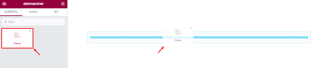
Inserting the Gallery Flame widget
The Flame widget can be easily added to any page on your WordPress website through the Elementor website builder. To add it to a page, simply open the page you want to use it on in Elementor and drag and drop the widget into the desired spot. Please note that both Elementor and Pixel Gallery must be installed on your website before you’ll be able to use this particular widget.
Introduction to Layout customizations
The content tab is the foundation of your widget, similar to how a frame is the foundation of a house. You can use it to adjust dimensions, columns, and spacing. You can also add individual items and customize their information. This tab has everything you need to get the layout you want, so let’s explore how to use these features!
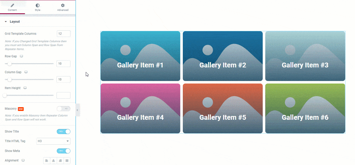
Take a look at the default appearance
By default, Elementor’s Grid gallery contains six images. However, you have the option to change this number to display more or fewer images as desired. Additionally, a hover effect appears over the background image, which shows the date, title, and description text.
Customize the layout of the gallery Flame widget
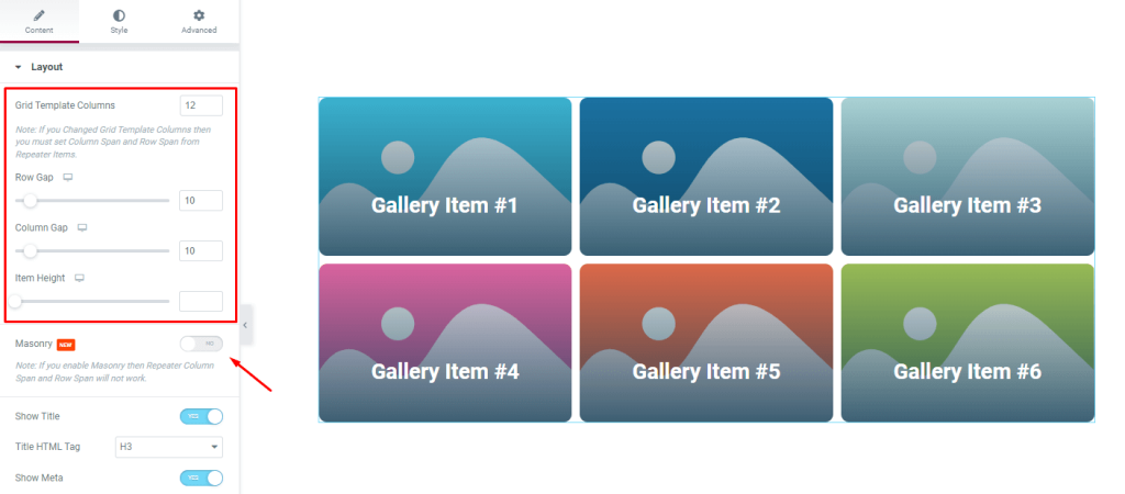
Go to Content> Layout
You can select how many columns you would like for your grid template in the Layout area of the gallery Flame widget. If you want to change the look of your gallery, you can do so by editing the item gap, column gap, and item height.
If the images in your gallery are different sizes, you can also turn on the masonry toggle to have more control over placement.
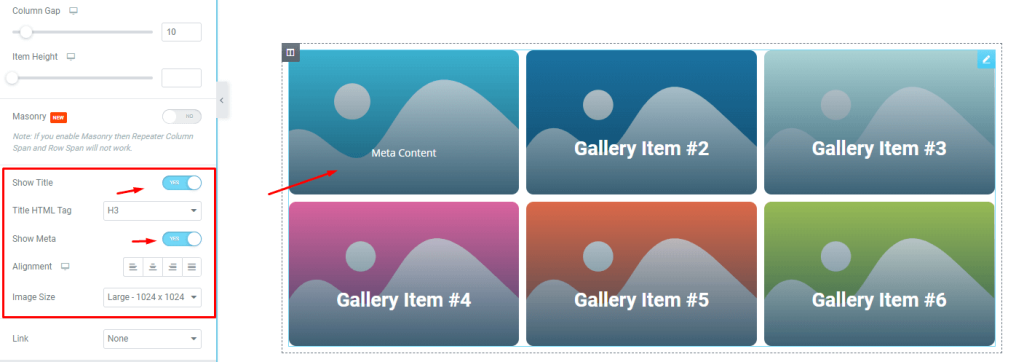
The switchers below let you control the visibility of the title, and meta text. You can also use custom HTML tags for the title. To change the image size of the Gallery Flame widget, select a custom dimension from the Image Size option.
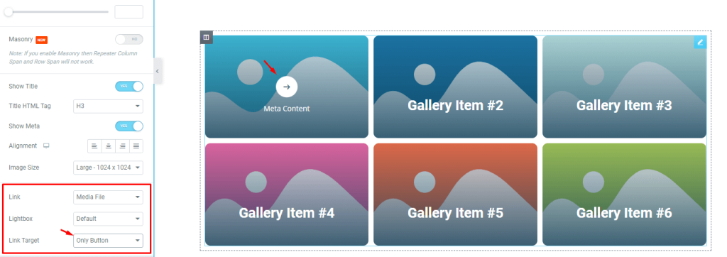
The ‘Link‘ field at the bottom of the page enables you to turn on the media file linking function for the widgets WordPress gallery items. Just click on the ‘Link‘ field and choose ‘Media File‘ or ‘Custom URL‘ to open the link fields on the items.
You can choose lightbox to open the images when clicked. Also, the link target can be selected as a button or the entire image.
This feature is really helpful if you want to add links to your images, for example if you want to link to a specific website or product page.
Customize Fabric WordPress gallery widget items individually
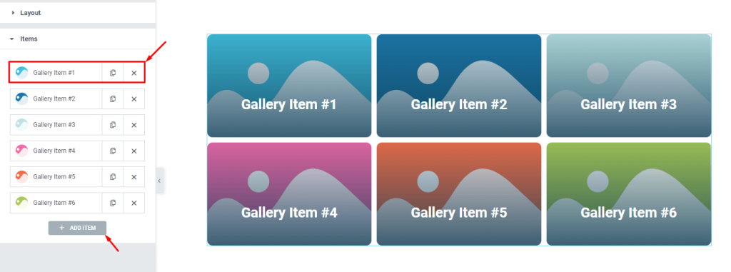
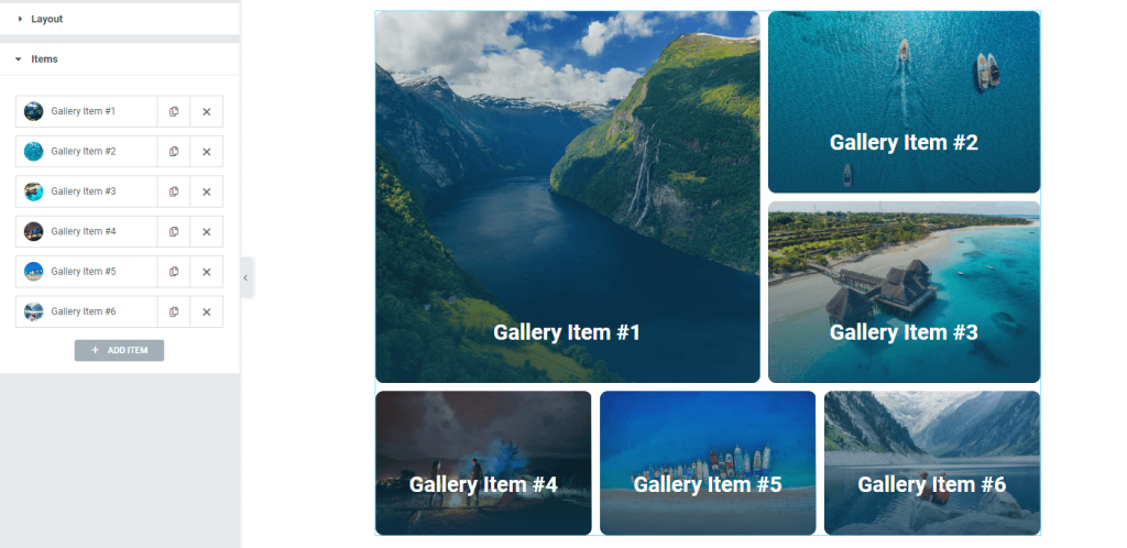
Go to Content> Items
Your gallery Flame widget items will all be displayed in one place here. They are small white boxes that contain a title, avatar, and copy/close buttons. You can add more items by clicking the ‘Add Item‘ button, or close any listed item by clicking the ‘X‘ button on the respective item box.
Content subsection controls
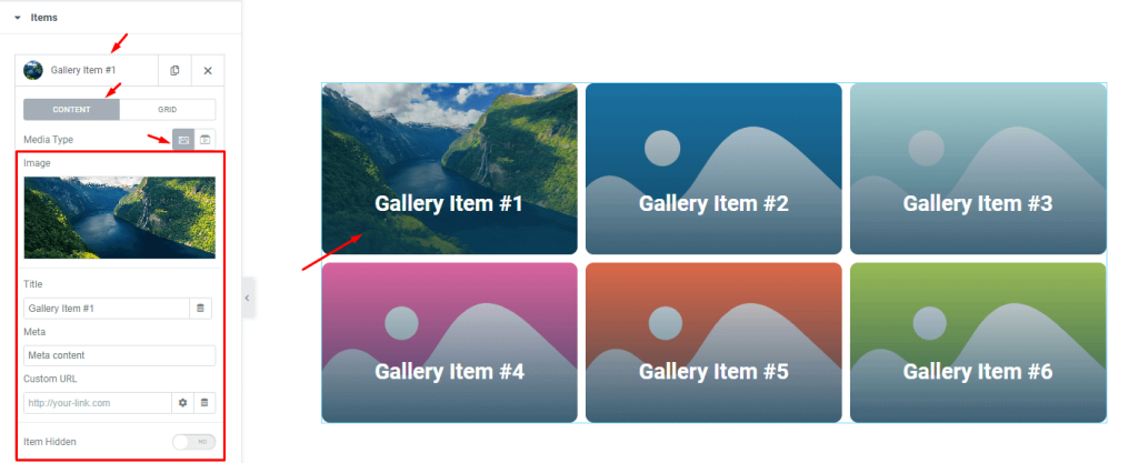
When you click on any item box, you will see all the options for that item in an expanded window. The ‘Content‘ subsection has been selected and the ‘Media type‘ has been set as images by default. If you wish, you can change the ‘Media type’ to video.
In the expanded window, there are various fields that will allow you to personalize the image, title, and meta text. There is also a field for inserting custom URL for each gallery item. The Item hidden button will hide the item and replace it with an invisible box on the display.
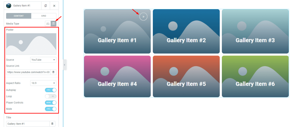
The “Video” media type option for widgets in WordPress’ gallery allows you to embed a video to each gallery Flame widget item. You will also have access to control options such as the video’s source, aspect ratio, autoplay, loop, player controls, and mute switcher.
Grid subsection controls
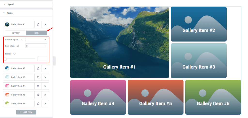
The grid controls in the WordPress gallery let you choose how many columns or rows each item can occupy. You can also change the height of each item to further adjust the size. By default, the column span is set to 4 and the row span is set to 1.
For instance, we made the first gallery item bigger by changing its column span to 7 and row span to 2.
After adjusting the span controls for all items and inserting images, the whole layout will resemble that on the display. At this point, the gallery Flame widget layout is complete for further style modifications.
Style tab for customizing widget interface appearance
At Pixel Gallery, we’re all about giving our users the power to easily customize and change their layouts with just a few clicks. Our simple and straightforward controls make it easy for beginners to get started, but also offer more advanced options for those who want to experiment and get creative with their interfaces.
To see how it’s done, just follow the steps below:
Image Customizations
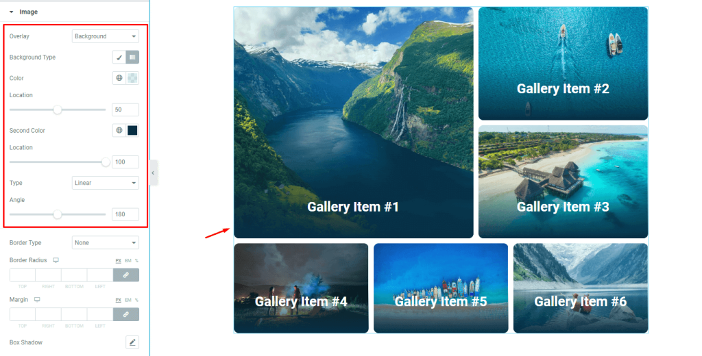
Go to Style> Image
You can easily customize the images in your gallery to better display your images. For example, you can add an overlay gradient background for ambient color cycles, or you can use the border radius field to create curved corners on your images. You can also add shadows behind the images using the box shadow option.
Customize the play icon
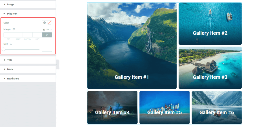
Go to Style> Play Icon
If you choose video from the media type options in the items section, a play button icon will appear on the selected grid item. You can customize the play icon according to your preference of color, margin, and size.
Gallery Flame widget title customization
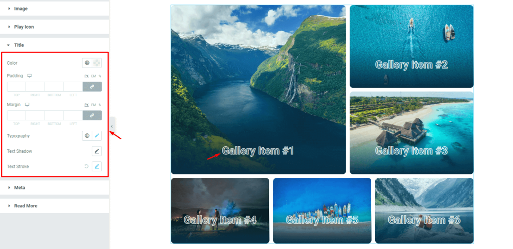
Go to Style> Title
You can make your WordPress gallery widget content stand out and look more unique by customizing the title text with different colors, padding, margins, typography, text shadows, and strokes!
Meta text customizations
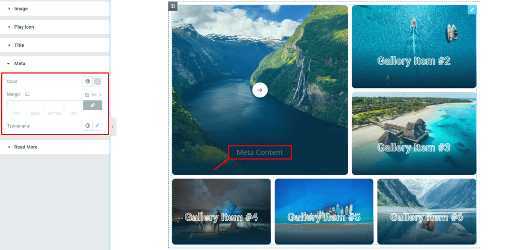
Go to Style> Meta
Customizing the meta takes priority to enhance the visual experience. Here, you can change the color of the text, adjust margin and change the font settings from the typography option for the meta.
Read More button customizations
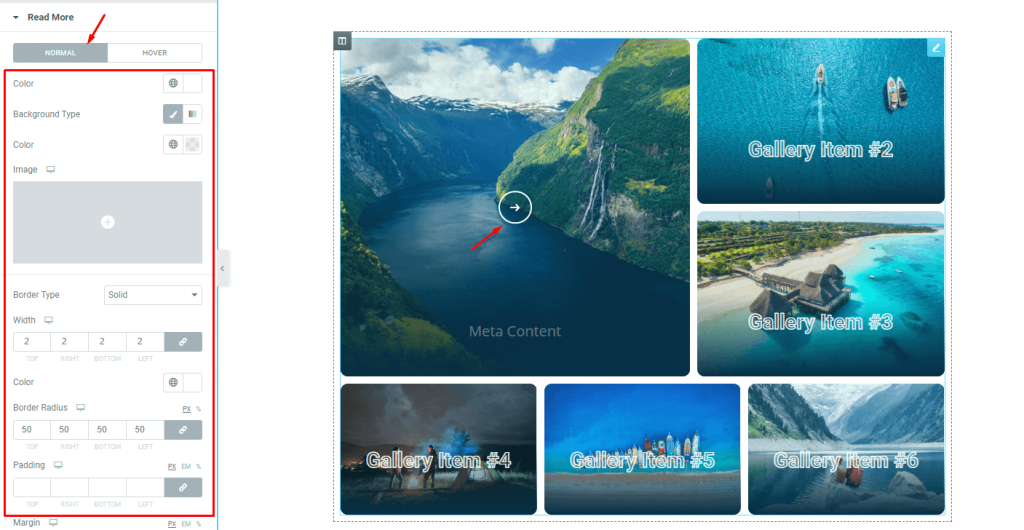
Go to Style> Read More
Finally, you can customize the read more button that pops up upon hover. The controls give you options like color, border, border radius, padding, margin, and box shadow to customize the appearance of the read more button.
The end result looks amazing! The WordPress gallery images are organized perfectly and the hover effect is extremely smooth and polished. It’s super easy to create stunning and sophisticated galleries like this one using the gallery Flame widget by Pixel Gallery addon for Elementor.
Video assist
If you want to see a tutorial of the gallery Flame widget by Pixel Gallery with more visual details, watch the video above. For similar examples, you can also check out the demo page.
Brought to you by BdThemes.