
In the documentation we will provide you comprehensive input about The Element Pack Pro‘s Advanced Calculator widget in Elementor brings a new dimension to your WooCommerce website by adding a user interactive multi-functional calculator on the page. This is a sophisticated widget made for a wide range of applications.
Advanced Calculator – Key Features
- Unlimited Custom Input Fields
Add as many input fields as needed for complex calculations. - Multiple Field Types
Supports text, number, dropdown (select), radio buttons, checkboxes, and disabled fields. - Flexible Calculation Logic
Create simple or advanced calculations based on your requirements. - Real-Time Results
Instantly updates results as users change input values. - No Coding Required
Build powerful calculators visually without writing code. - Highly Versatile
Suitable for pricing calculators, cost estimators, conversions, and custom logic.
Activate the Advanced Calculator
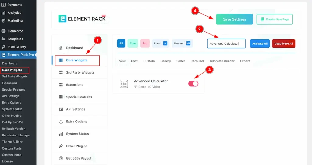
To use the Advanced Calculator widget from Element Pack Pro, first, you have to enable the Core Widgets. Navigate to the WordPress Dashboard.
- Go to Element Pack Pro > Core Widgets section.
- Search by the Widget Name ” Advanced Calculator ” and it will appear the.
- Now Enable the Switcher of the Advanced Calculator Widget.
- Hit the Save Settings button.
Inserting Advanced Calculator widget
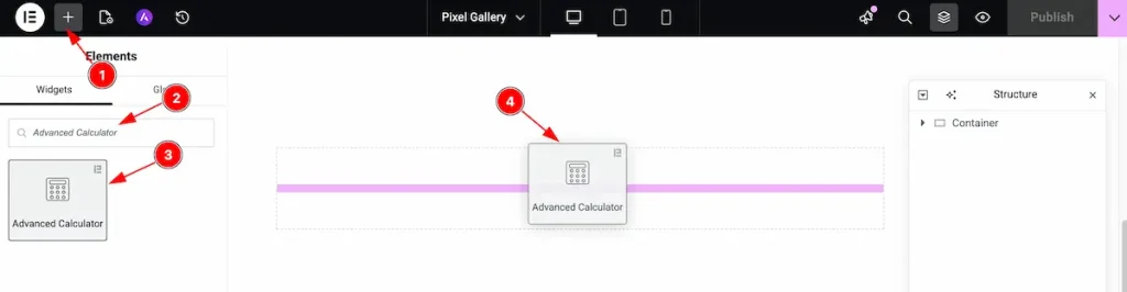
- Go to the Elementor Editor page and click the Add Element “+” icon.
- Search for the Advanced Calculator widget by name.
- The widget will appear — you can check the Advanced Calculator logo on the top-right corner.
- Select the widget, then drag and drop it onto the editor page.
Customize the layout under the Content tab
For almost all widgets, the Content tab holds all the base settings that will help your shift the content layout of this cost calculator widget. This is where we put all the required adjustments that you need to make variations to the default setup and make unique content out of it.
Let us briefly describe everything inside the content tab.
Content Tab Customization
Go to Content > Form Fields
Once you drop the widget inside the Elementor editor page, you will see the default layout of the widget. It has two fields, a submit button, and a result text displayed at the bottom. To find the form fields, you have to-
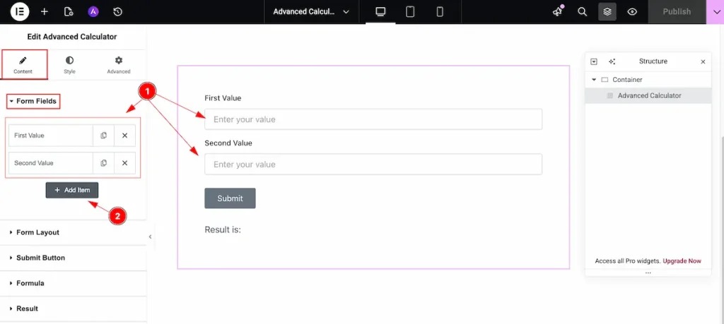
- All the input fields are appearing, like Text Input fields, button etc.
- “ Click on the “ + Add Item ” button to add new form fields. You can add many fields accordion to your needs.
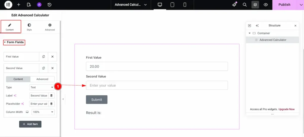
Content Tab
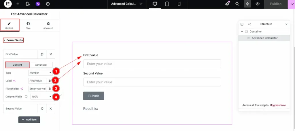
- Type: Choose the type for the fields. Different types are available for this fields.
- Label: Set the label for the input fields. It refers the representation of this fields.
- Placeholder: Set the placeholder for the text. It direct user to input according the fields input.
- Column Width: Set the width for fields.
100%: It represent the full width based on the content.
~ 50%: It represent the half with of the content.
~ Default: Set the width of this fields to default.
Advanced Tab
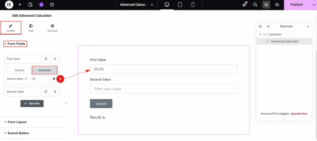
- Default Value: Set the default value for this tab. It will work as default. Without inputing the value it will works with another fields.
All the Fields Types
- Text: The type text is for appearing in the input fields.

- Number: Set the number type for number section of the input fields.
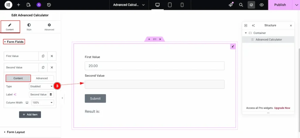
- Disable: These fields represent the disabled form fields. User can’t input any value for this fields.
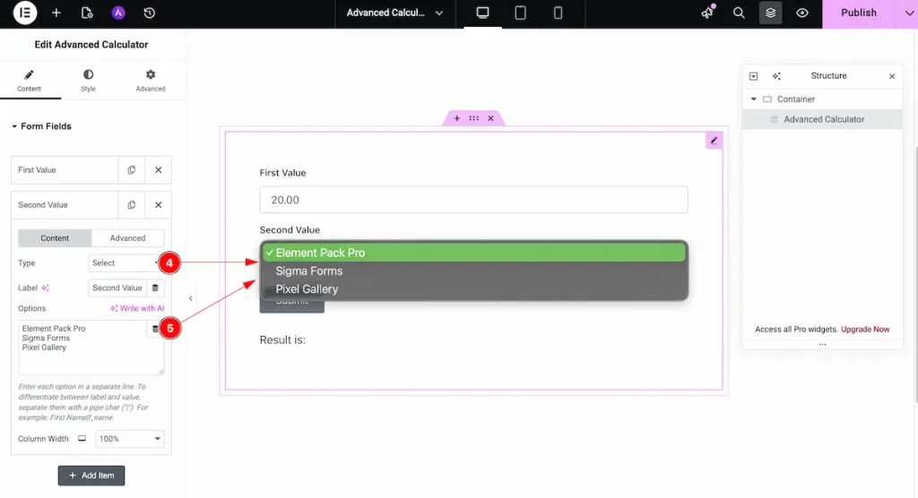
- Select: Choose the select type. It represent the new items for selecting. You can choose multiple selections for the fields.
- Options: Select the options for selecting many options. The first selection represents the name and another option selects the value for the fields.
E.g.: Element Pack Pro – Agency | 600
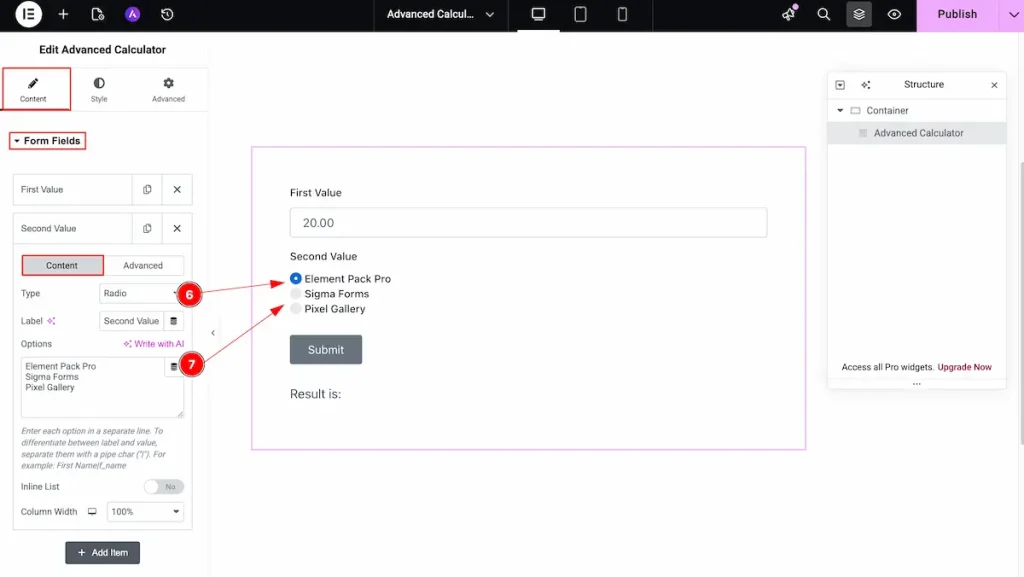
- Radio: Choose the radio button for the text. You can select any option from the selection options.
- Options: Select the options for the selecting many options. The first selection represent the name and another option select the value for the fields.
E.g.: Element Pack Pro – Agency | 600
Form Layout Section
Go to Layout > Form Layout
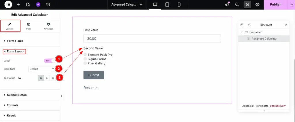
- Label: Enable the switcher to show the label for the Form Layout section.
- Input Size: Set the size for the input fields.
- Text Align: Set the alignment for the text. Position on the Left, Center, Right.
Submit Button Section
Go to Content > Submit Button
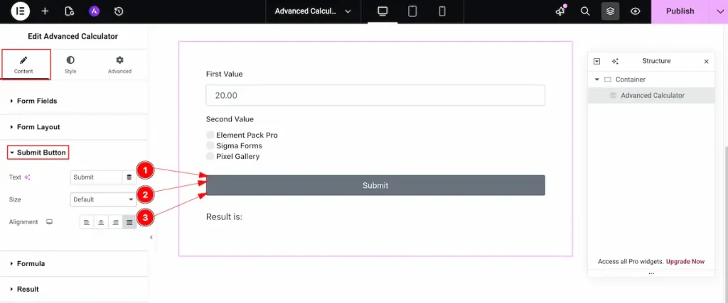
- Text: Set the title for the submit button.
- Size: Set the size for the submit button. e.g.: Default, Small, Big, etc.
- Alignment: Set the alignment for the submit button. Left, Center, Right and Justified.
Formula Section
Go to Content > Formula
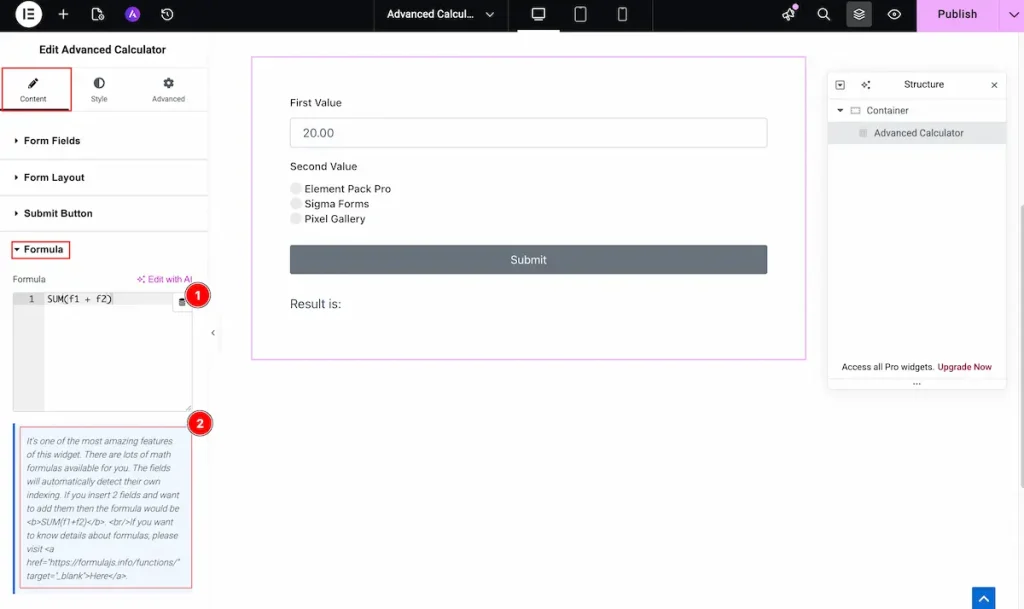
- Set the formula on this fields. One input fields represent as one fields. Now you can set the formula according to your needs. You can make simple to complex calculation.
E.g: If you want to add the fields just simple SUM(f1 + f2) . It will add two input values.
If you like you can set a complex by using this. SUM(( f1 *5 ) + ( f2 *3.14 ) + ( f1 + f2 )) - Instruction appear on there. It’s one of the most amazing features of this widget. There are lots of math formulas available for you. The fields will automatically detect their own indexing. If you insert 2 fields and want to add them then the formula would be <b>SUM(f1+f2)</b>.<br/>If you want to know details about formulas, please visit <a href=”https://formulajs.info/functions/” target=”_blank”>Here</a>.
Result Section
Go to Content > Result
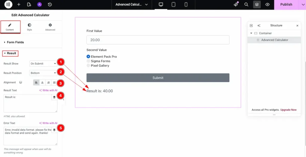
- Result Show: Select the button for showing the result.
On Submit: Result will appear on submitting the result.
On Change: Result will appear on changing the value on the input fields. - Result Position: Set the position for the button. On the Top or Bottom.
- Alignment: Set the position for the result. Left, Center, Right, and Justified.
- Result Text: Set the text for the result. It’s previous text of appearing result.
- Error Text: Set the text if any error occurs.
Designing with the Style Tab
The Style Tab offers a range of options to enhance the visual appearance of elements, enabling precise adjustments and creative design possibilities. It helps create polished and engaging layouts effortlessly.
Form Style Section
Go to Style > Form Style
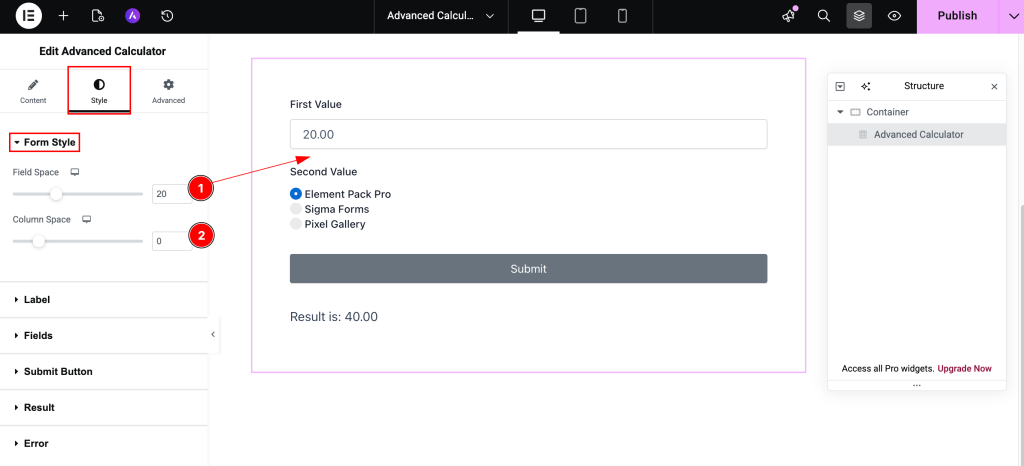
- Field Space: Set the space between the fields for the space.
- Column Space: Set the space between the column for the space.
Label Section
Go to Style > Label
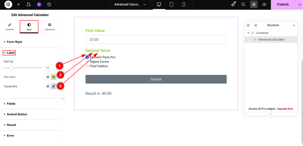
- Spacing: Set the spacing for the text. It refer the space between the label and input fields.
- Text Color: Set the color for the Text. It refer the label color.
- Typography: Set the typography for the label.
Fields Section
Go to Style > Fields
Normal Tab
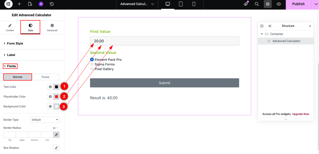
- Text Color: Set the text color for the fields. This is inputed text color on the fields.
- Placeholder Color: Set the placeholder color.
- Background Color: Choose the background color of the input fields.
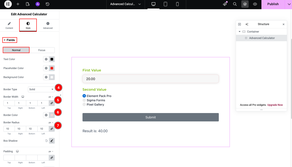
- Border Type: Set the border type for the fields. e.g.: Solid, Dashed, Dotted etc.
- Border Width: Set the thickness for the border.
- Border Color: Choose the color for the border.
- Border Radius: Make the border corner radius for the border.
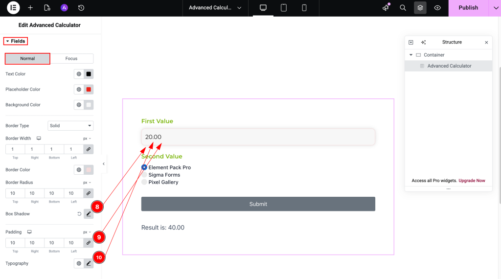
- Box Shadow: Set the shadow for the box.
- Padding: Set the padding for the inner space for the fields.
- Typography: Set the typography for the fields text.
Focus Tab
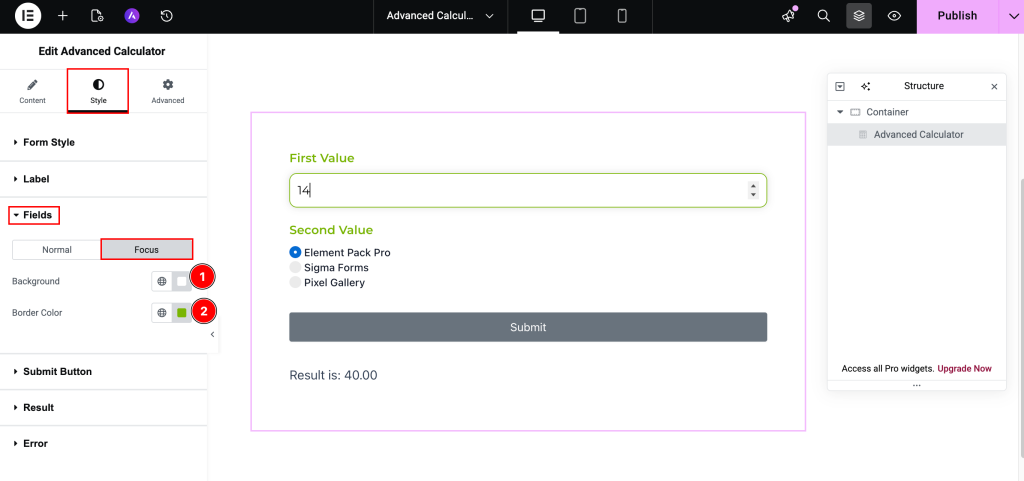
- Background: Set the background color of the input fields at focusing on it.
- Border Color: Choose the border color of the input fields.
Submit Button Section
Go to Style > Submit Button
Normal Tab
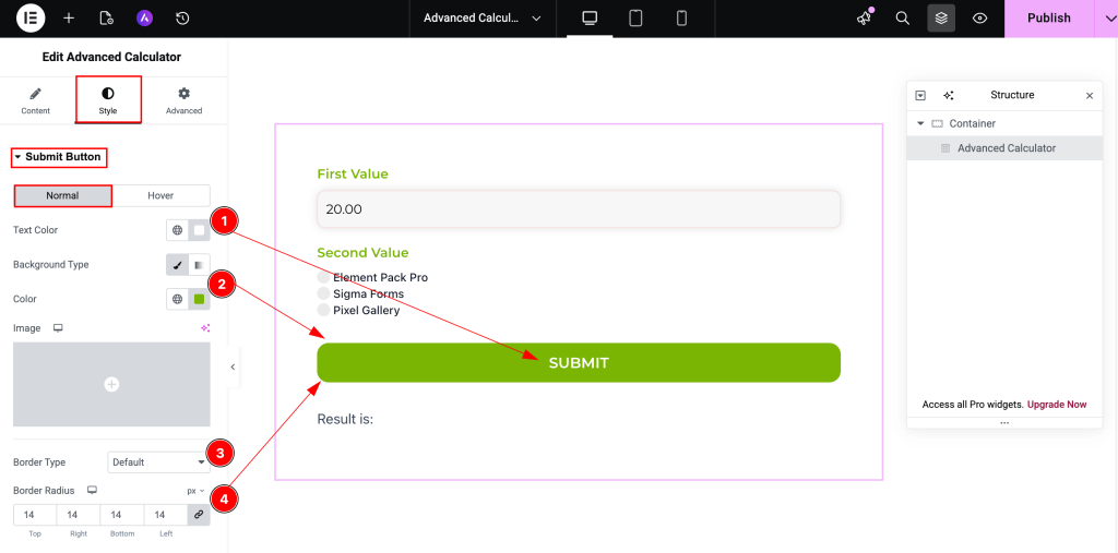
- Text Color: Choose the color for the Text of the Submit Button.
- Background Type: Select the background type color for the submit button and choose the color for this.
- Border Type: Choose the border type.
- Border Radius: Make the border radius by inputing the value.
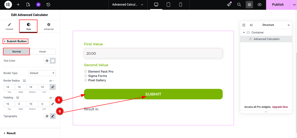
- Padding: Set the padding for the button inner space.
- Typography: Set the topography for the button.
Hover Tab
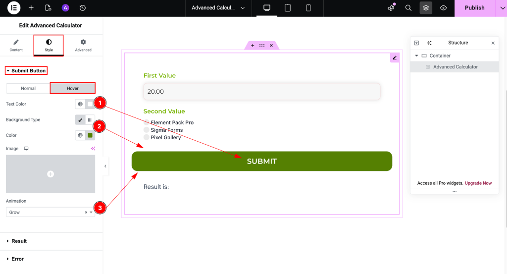
- Text Color: Set the color for the text.
- Background Type: Set the background type color and choose the color for the submit button.
- Animation: Choose the animation for the button. It will animate while clicking on the submit button.
Result Section
Go to Style > Result
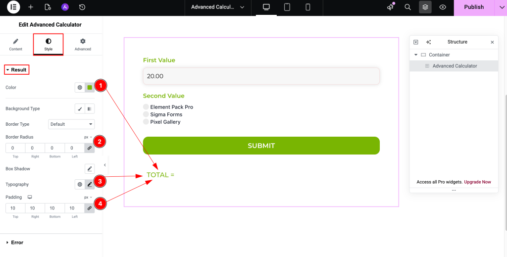
- Color: Choose the color for the result text.
- Border Radius: Make the border corner radius.
- Typography: Choose the typography for the text.
- Padding: Set the padding for the text of inner space.
Error Section
Go to Style > Error
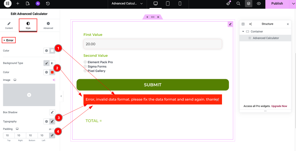
- Color: Choose the color for the error text.
- Background Type: Select the background type.
- Typography: Choose the typography for the error text.
- Padding: Set the spacing for the error.
Conclusion
Don’t forget to check the demo page for more styles of the Advanced Calculator widget. Also, you can watch this video that speaks about the working procedures in detail.
This widget is presented by BdThemes.
Watch Tutorial
Thanks for following.