In this documentation, we will discuss the customization of the Circle Menu widget, brought to you by the Element Pack Pro addon for Elementor.
Enable The Circle Menu Widget
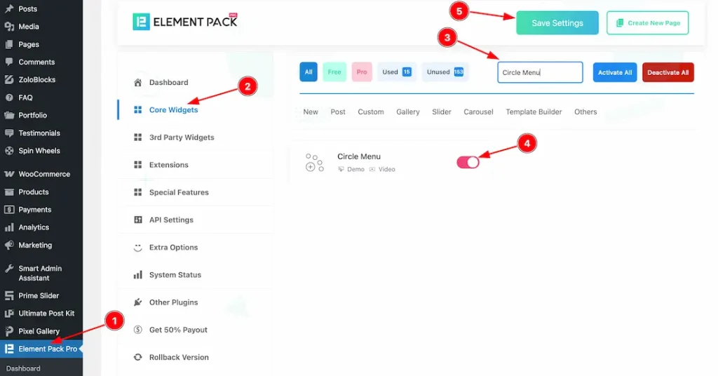
To use the Circle Menu widget from Element Pack Pro, first, you have to enable the widget.
- Go to WordPress dashboard → Element Pack Pro Plugin dashboard.
- Then, Click the Core Widgets Tab.
- Search the Circle Menu Widget Name.
- Enable the Circle Menu Widget.
- Hit the Save Settings Button.
Inserting the Circle Menu widget
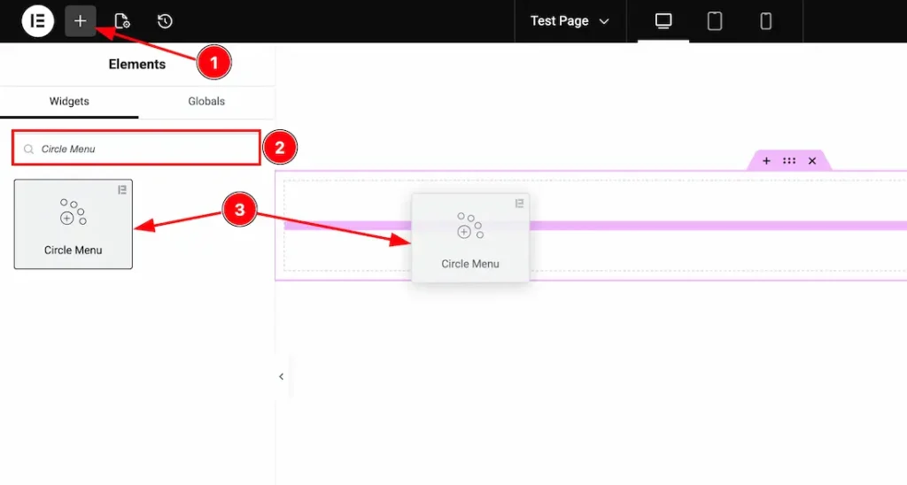
1. Go to the Elementor Editor Page and hit the “+” icon Button.
2. Search the Circle Menu widget.
3. Drag the widget and drop it on the editor page.
Work With The Content Tab
Circle Menu Section
Go to Content → Circle Menu
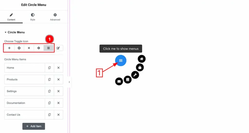
1. Choose Toggle Icon: Here, you will get some ready-made toggle icons and you can choose one of them.
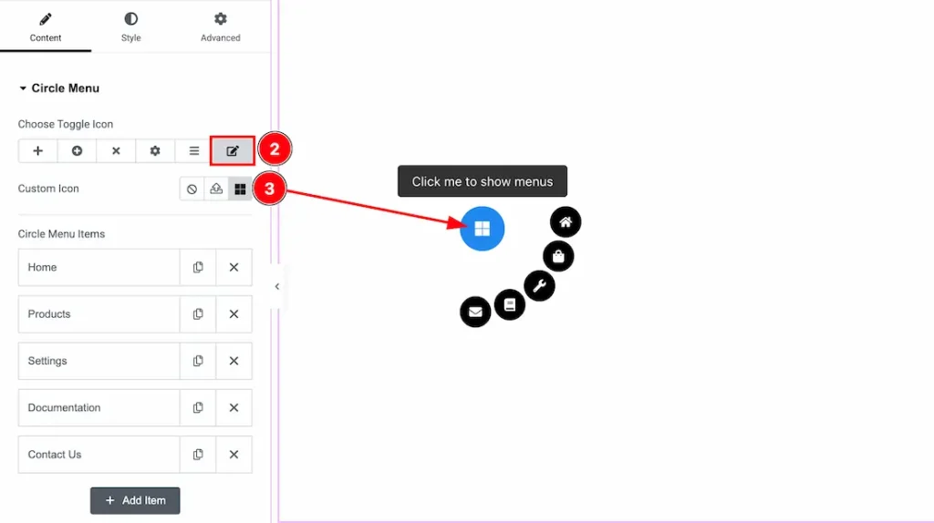
2. Custom Icon: Here, you will get the custom icon upload option. After selecting the custom icon option, the custom icon upload option will appear.
3. Custom Icon Upload: Just click on the icon upload option, and you can upload your custom icon here.
Menu Item
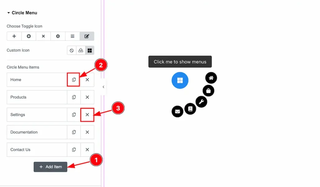
1. Add Item: You can add a new circle menu item by clicking the “Add Item” button.
2. Copy Item: You can copy the same item by clicking the “Copy Item” button.
3. Close Item: You can delete/close the item by clicking the “Close” button.
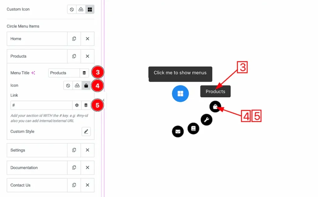
3. MenuTitle: You can set the Menu title from here.
4. Icon: This option allows you to set the menu item icon.
5. Link: You can set a link under the menu item from here.
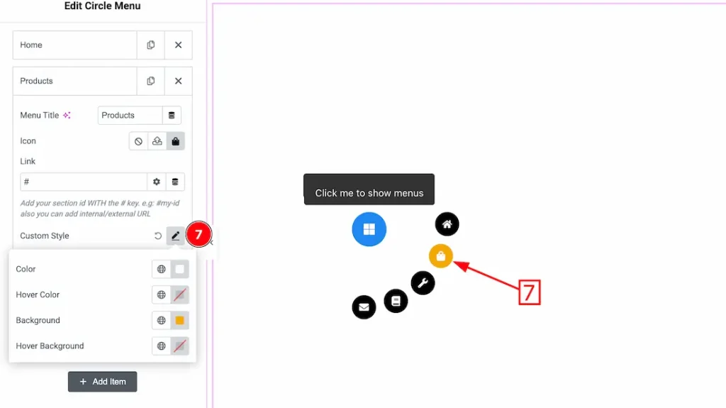
6. Custom Style: From here, you can customize the individual menu items like- Color, Hover color, Background color, and Hover Background color.
Additional Settings Section
Go to Content → Additional Settings
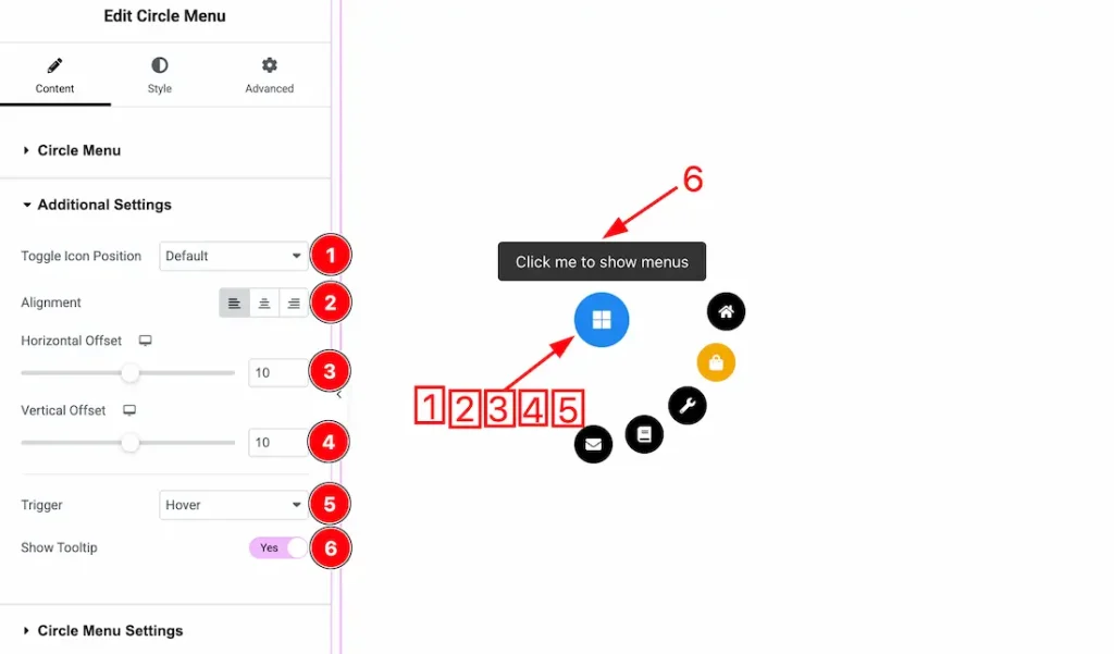
1. Toggle Icon Position: You can set the toggle icon position – Default, Top Left, Top Center, Top Right, Center, Center Left, Center Right, Bottom Left, Bottom Center, and Bottom Right.
2. Alignment: You can set the Toggle icon Alignment – Left, Center, and Right.
3. Horizontal Offset: This option allows you to set the Horizontal Offset of the toggle icon.
4. Vertical Offset: This option allows you to set the Vertical Offset of the toggle icon.
5. Trigger: Here you can set the trigger type- Hover, and Click.
6. Show Tooltip: Enable/disable the tooltip switcher button to show/hide the tooltip from the menu.
Circle Menu Settings Section
Go to Content → Circle Menu Settings
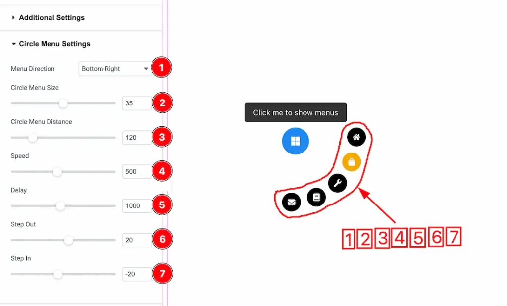
1. Menu Direction: You can set the Menu direction – Top, Right, Bottom, Left, Full, Top, Top Left, Top Right, Top Half, Bottom Left, Bottom Right, Bottom Half, Left Half, and Right Half.
2. Circle Menu Size: This option lets you set the circle menu size.
3. Circle Menu Distance: You can adjust the circle menu distance from here.
4. Speed: You can adjust the menu animation speed from here.
5. Delay: You can adjust the menu delay speed from here.
6. Step Out: Controls how much each menu item moves outward from the center when the circle menu opens. Higher values spread the items farther apart.
7. Step In: Controls how much each menu item moves inward toward the center when closing or animating back. Negative values pull items closer to the center.
Tooltip Settings Section
Go to Content → Tooltip Settings
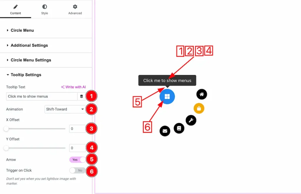
1. Tooltip Text: You can set the Tooltip Text from here.
2. Animation: You can set the tooltip animation from here.
3. X Offset: You can adjust the tooltip X Offset from here.
4. Y Offset: You can adjust the tooltip Y Offset from here.
5. Arrow: Enable/disable the arrow switcher button to show/hide the arrow.
6. Trigger on Click: Enable the switcher button if you want to show the tooltip when you click on the menu icon.
Work with The Style Tab
Toggle Icon Section
Go to Style → Toggle Icon
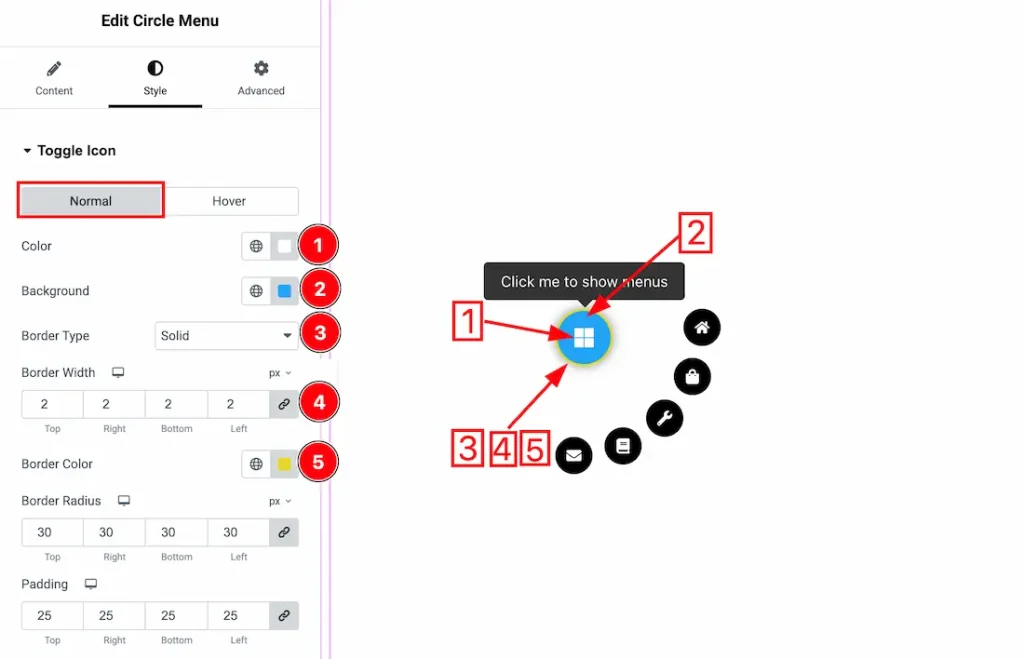
Come to the Toggle Icon section, you will get two sub-sections: Normal and Hover.
Let’s proceed with the Normal Tab-
1. Color: You can change the toggle icon color with this option.
2. Background Color: You can change the toggle icon background color with this option.
3. Border Type: You can add and change the border type with this option.
4. Border Width: You can set the thickness of the border with this option.
5. Border Color: You can change the border color with this option.
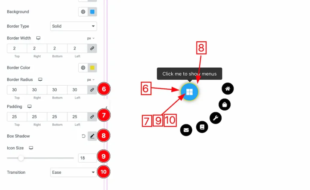
6. Border Radius: You can control the roundness of the border with this option.
7. Padding: You can adjust the inner space of the toggle icon field with this option.
8. Box Shadow: You can add a shadow effect to the toggle icon with this option.
9. Icon Size: You can make changes to the icon size with this option.
10. Transition: You can use this option to apply an animated visual effect to the icon when the menu items appear.
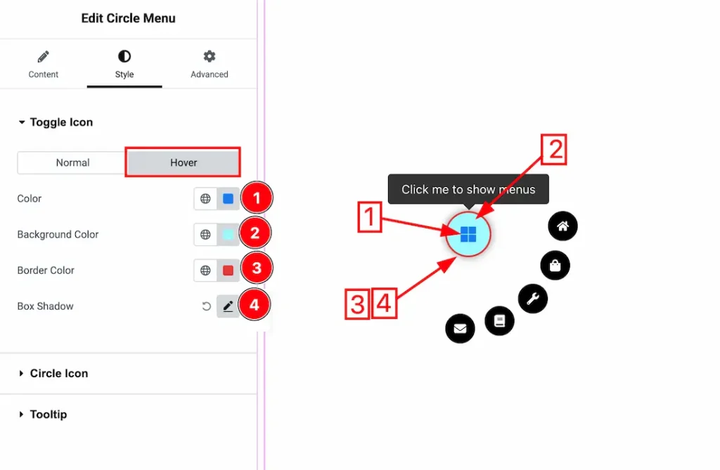
Now, let’s proceed to the Hover Tab –
1. Color: You can change the icon hover color with this option.
2. Background Color: You can change the icon’s background hover color with this option.
3. Border Color: You can change the border hover color with this option.
4. Box Shadow: You can add a hover shadow effect to the icon field with this option.
Circle Icon Section
Go to Style → Circle Icon
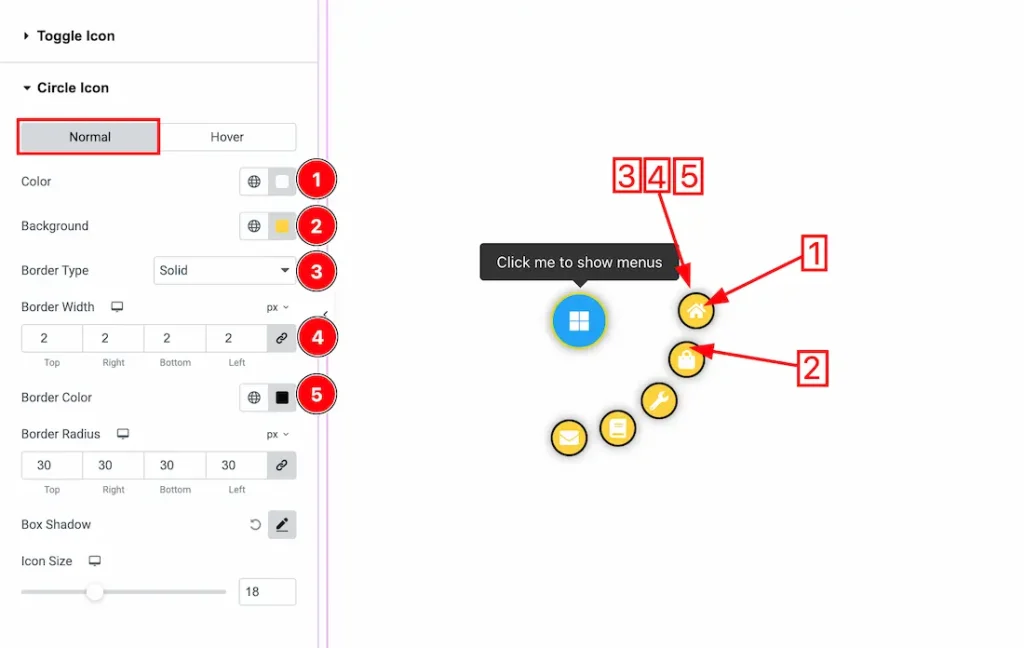
In this section, we have two more tabs. These are Normal & Hover. Let’s start with the Normal Tab first –
1. Color: You can make changes to the circle menu icons with this option.
2. Background: You can change the circle menu icon background color with this option.
3. Border Type: You can add and change the border type with this option.
4. Border Width: Set the thickness of the border with this option.
5. Border Color: You can change the border color with this option.
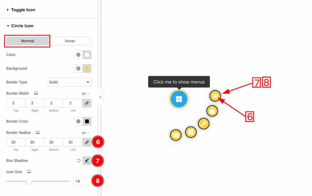
6. Border Radius: You can control the roundness of the border with this option.
7. Box Shadow: You can add a shadow effect to the circle menu items icon with this option.
8. Icon Size: You can adjust the circle menu item icon size with this option.
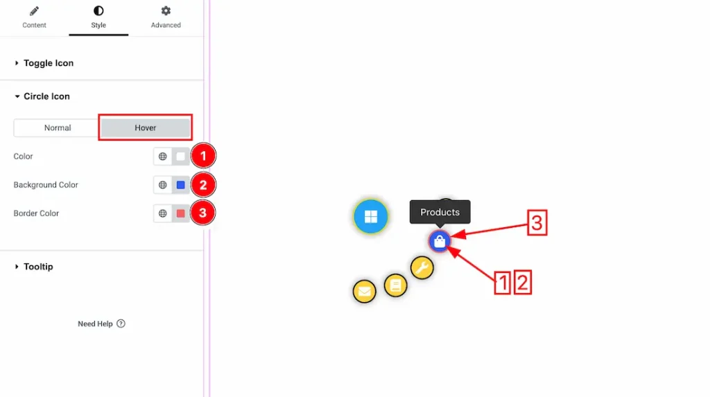
Now, let’s proceed to the Hover Tab –
1. Color: You can change the circle icon hover color with this option.
2. Background Color: You can change the circle icon menu background hover color with this option.
3. Border Color: You can change the border hover color with this option.
Tooltip Section
Go to Style → Tooltip
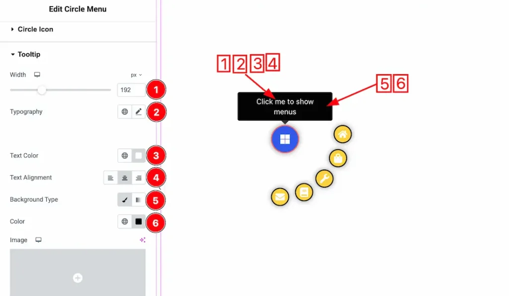
1. Width: You can adjust the width of the tooltip with this option.
2. Typography: Change the font family, size, weight, transform, style, decoration, line height, letter spacing, and word spacing from here.
3. Text Color: You can change the tooltip’s text color with this option.
4. Text Alignment: You can set the position of the text to left, center, or right with this option.
5. Background Type: You can change the background type to Classic or Gradient with this option.
6. Color: You can change the background color with this option.
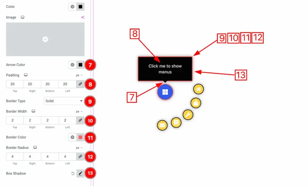
7. Arrow Color: You can change the arrow color of the tooltip with this option.
8. Padding: You can adjust the inner space of the tooltip field with this option.
9. Border Type: You can add and change the border types with this option.
10. Border Width: You can set the thickness of the border with this option.
11. Border Color: You can change the border color with this option.
12. Border Radius: You can control the roundness of the border with this option.
13. Box Shadow: You can add a shadow effect to the tooltip with this option.
All done! You have successfully customized the Circle Menu Widget on your website.
Video Assist
You can also watch the video tutorial to learn more about the Circle Menu widget. Please visit the demo page for examples.
Thanks for being with us.