This documentation provides comprehensive insights into the Container Blocks developed by Zoloblocks.
Container Block
A container block for other containers. Containers play a crucial role in creating responsive web designs that adapt to different screen sizes and device content to adjust appropriately across various viewports.
Overall, containers are essential building blocks in web design and development, providing structure, organization, and styling control for web page layouts.
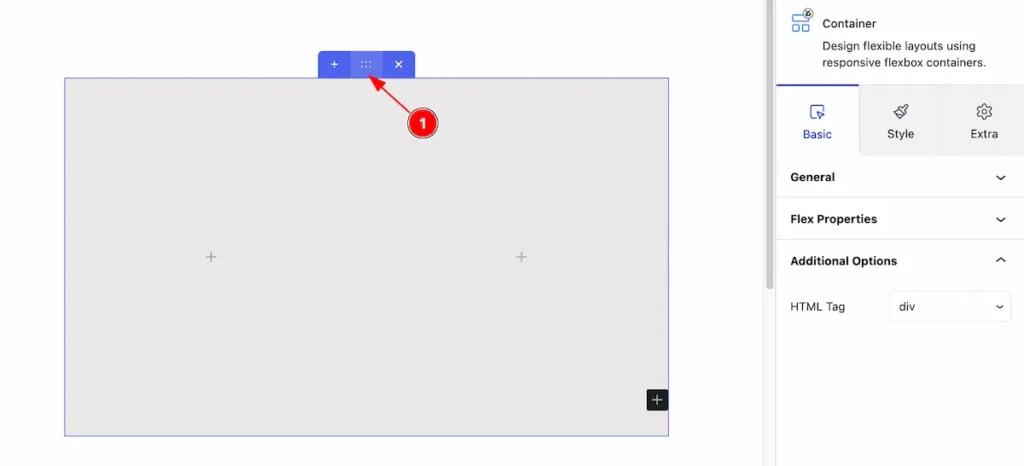
Adding Container block to the editor
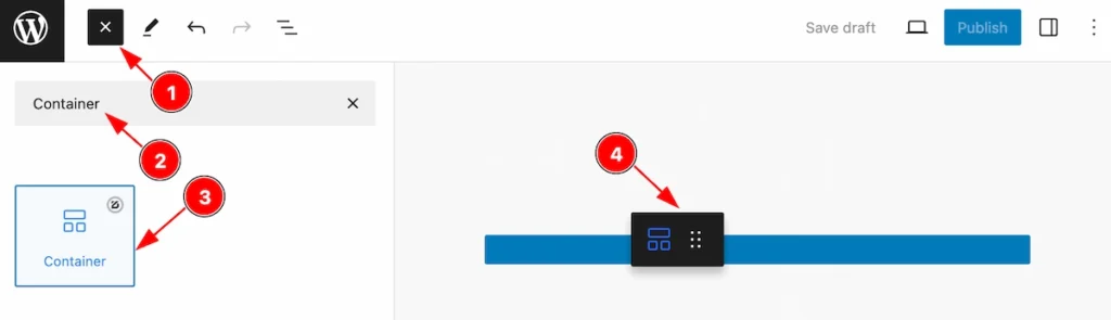
- Click the Toggle Block Inserter icon and a sidebar will appear on the left side, All the blocks will be visible here.
- Search by the Container block name.
- Then select the appear blocks ( with zoloblocks logo T.R corner).
- After Drag and Drop it on the page.
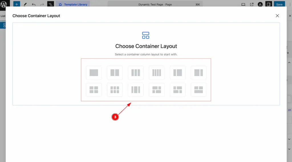
Choose Container Layout
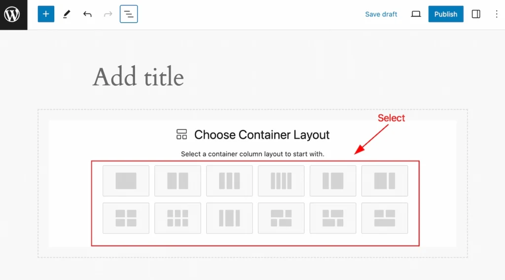
After selecting the container block, It will be visible as a block you can choose a container column layout. There are various styles of layout (e.g.: One Column, Two Columns, Three Columns, Four Columns, Grid columns, etc. )
Single Column Layout
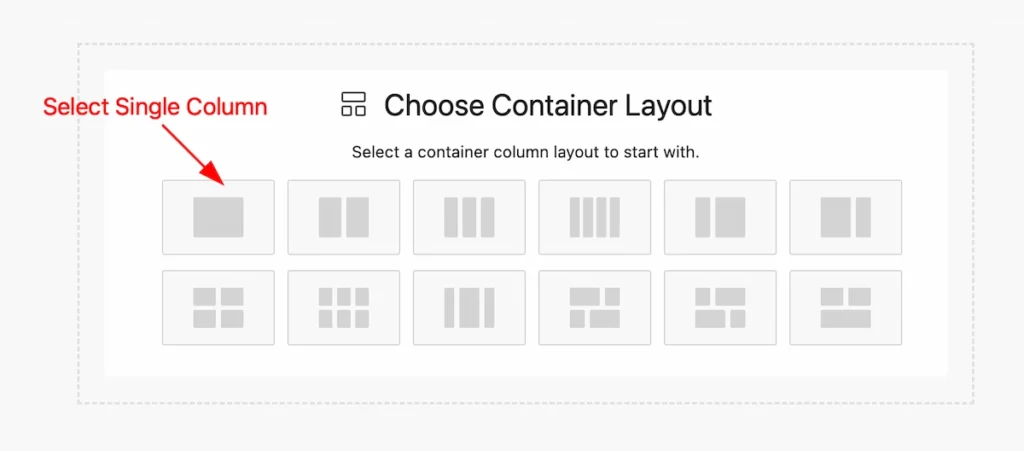
Select a single column layout from the container layout.
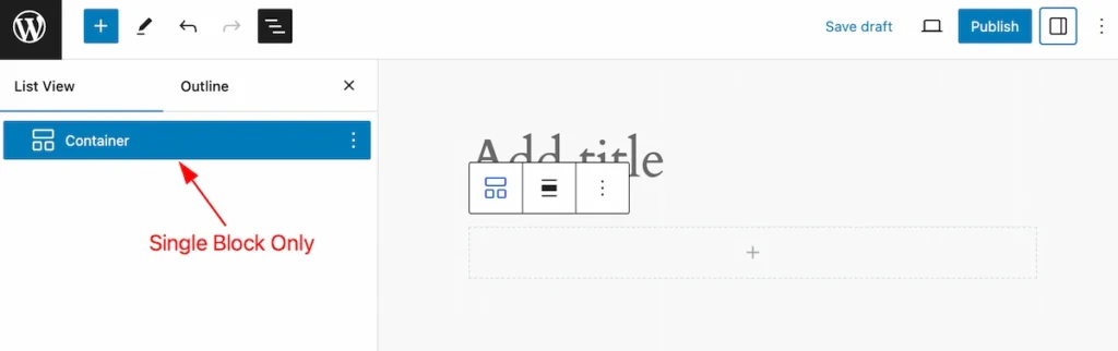
Single selecting the layout will appear only a single block. It’s only called the parent block.
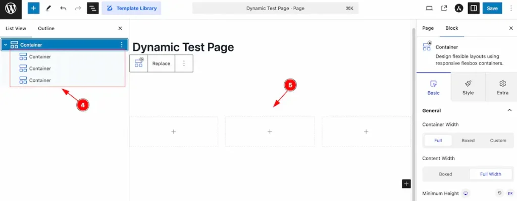
Multiple Column Layout
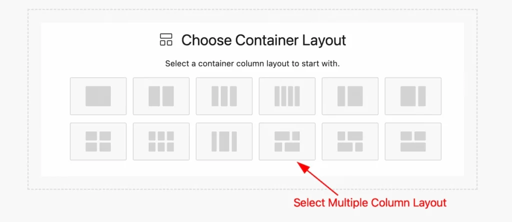
Select multiple columns from the layout container,
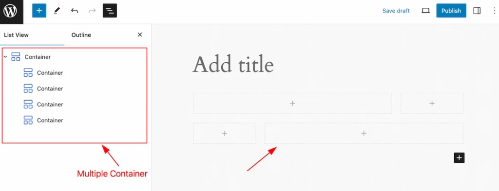
It shows the multiple blocks for the container one Parent block and another child block.
Customize the Single Layout
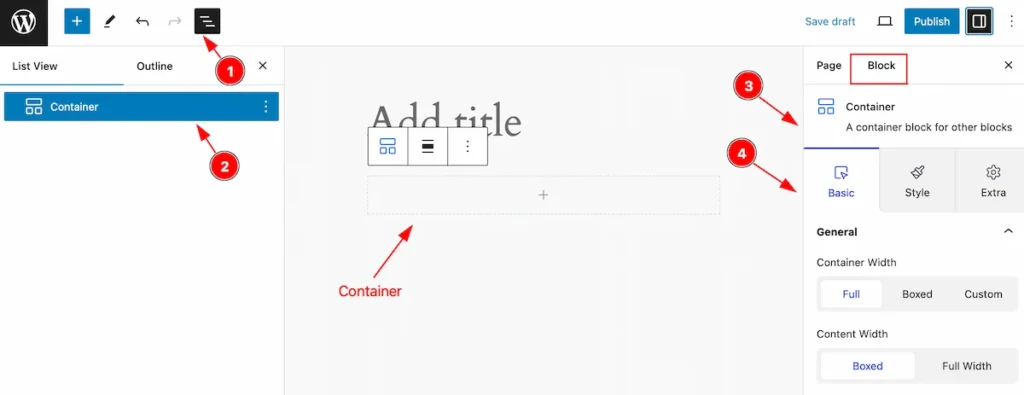
After Inserting the blocks, Follow this.
- Click on the Document Overviewer button and the Blocks list view will appear.
- Here appears the Container block.
- After on the right side, Click on the Block. Then the fancy list details appear.
- Here show all the control tabs( Basic, Style, Extra ) of a block.
Replace Container
Replace any container with one click only. The Replace feature available on the Toolbar section. Follow the instruction.
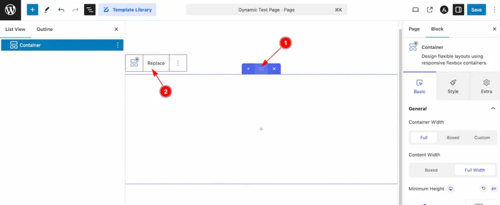
- Click on the Container section it will appear the Block Toolbar.
- Find the ” Replace ” on the toolbar and click on it will appear a modal.
- Choose Container Layout from here. All the layout are available you can choose any of them.
- After selecting the container , check all the ” Container ” appear on the List View section.
- The container appear on there. It will replace with the current one.
Basic Tab Single Container
The Basic tab controller displayed here offers the flexibility to adjust the layout of blocks according to your preferences.
General Section
Go to Basic > General
This section provides control for the container, Let the explore the options,
Container Width Full
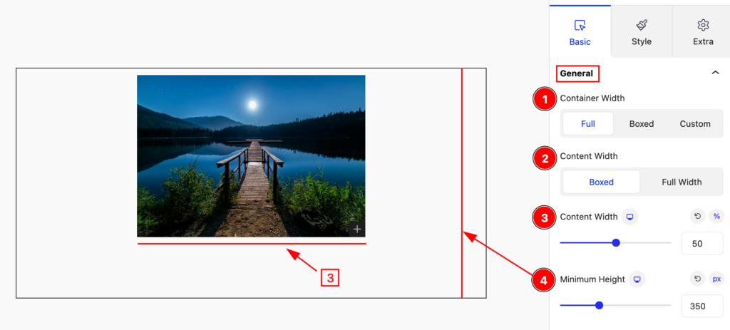
Set the container width full,
- Container Width: Set the width for the container Full.
- Content Width: Set the width for the content Boxed.
- Content Width: Set width for the content.
- Minimum Height: Set the minimum height for the content.
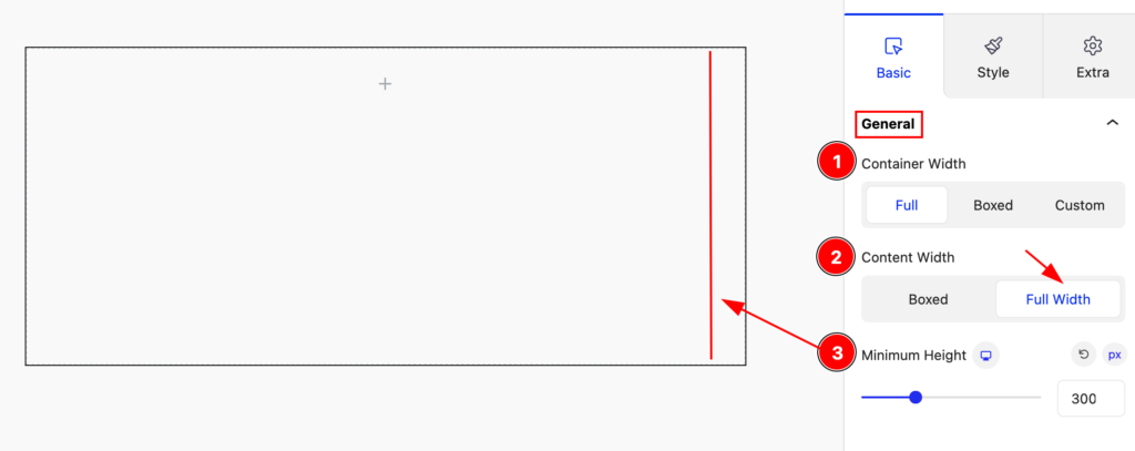
- Container Width: Set the width for the container Full.
- Content Width: Set the width for the content Full Width.
- Minimum Height: Set the minimum height for the content.
Container Width Boxed
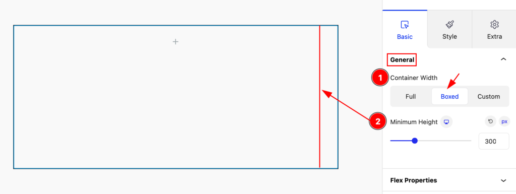
- Container Width: Set the container width Boxed.
- Minimum Height: Set the minimum height for the container.
Container Width Custom
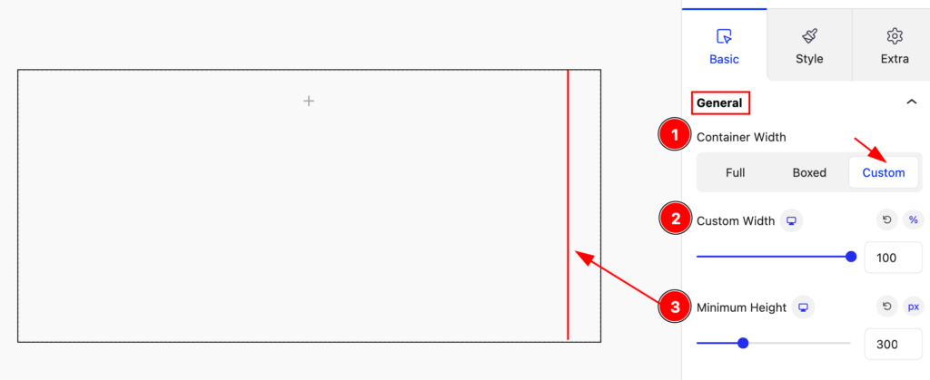
- Container Width: Set the container width Custom.
- Content Width: Set width for the content.
- Minimum Height: Set minimum height for the content.
Flex Property
The flex CSS shorthand property sets how a flex item will grow or shrink to fit the space available in its flex container.
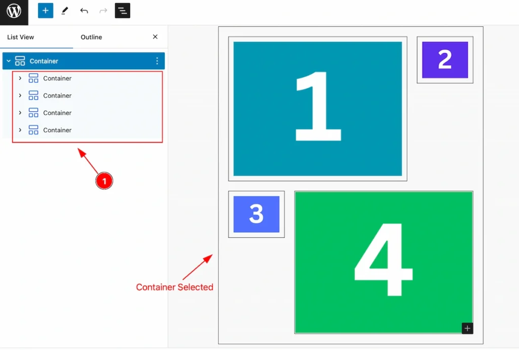
- Selected the multiple containers, We set the images a number so that the changes appear easily.
Direction
Set direction for the flex property, Four kins of direction for the flex property. ( e.g.: Row, Column, Row Reverse, Column Reveres ).
Row Direction
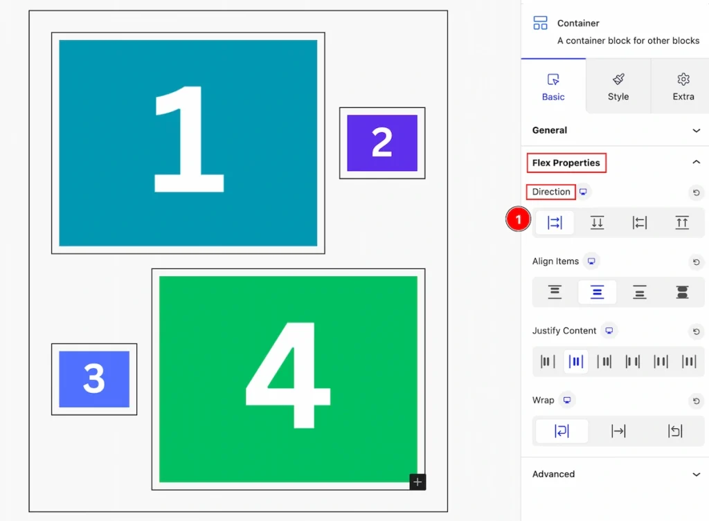
- Row: Set the direction row for the container. The container appears in the row direction.
Column Direction
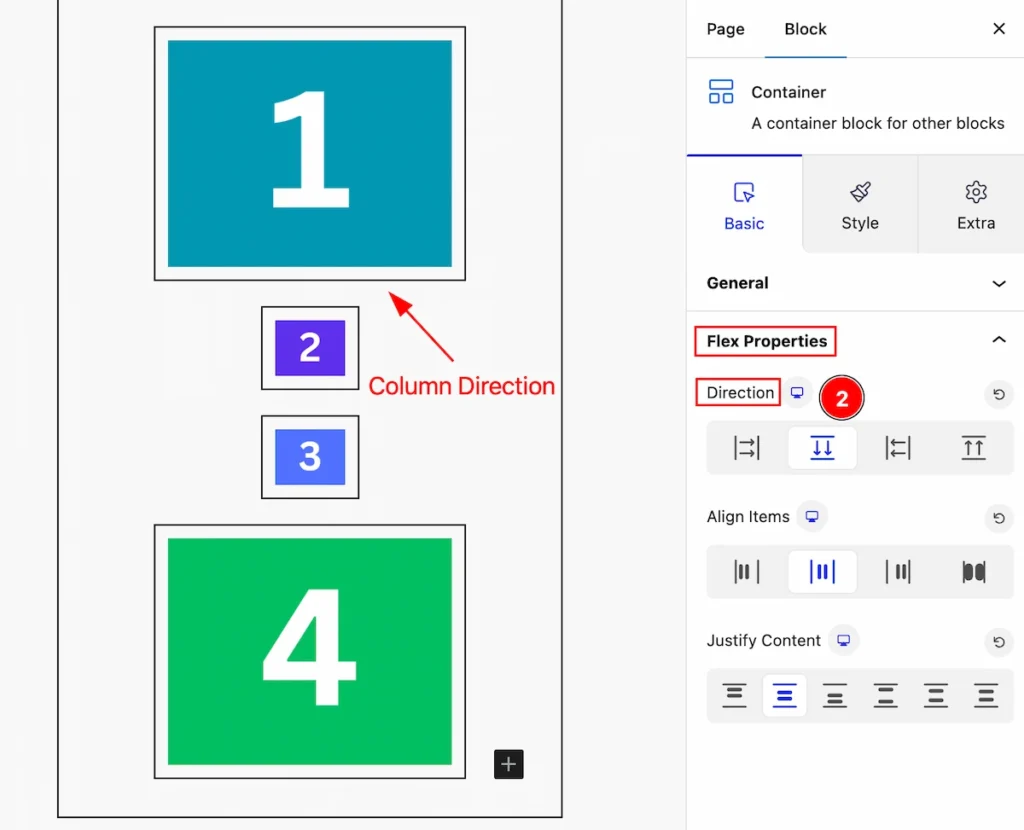
- Column: Select the direction column. The containers appear vertically.
Row Reverse
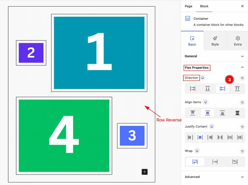
- Row Reverese: Set the direction reveres in a row. You can see the changes by following it.
Column Reverse
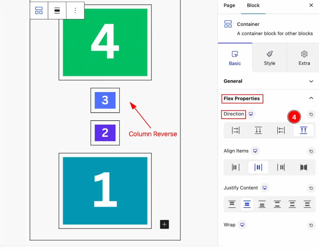
- Column Reverse: Set the direction reverse in the column. You will see the changes appear vertically in reverse.
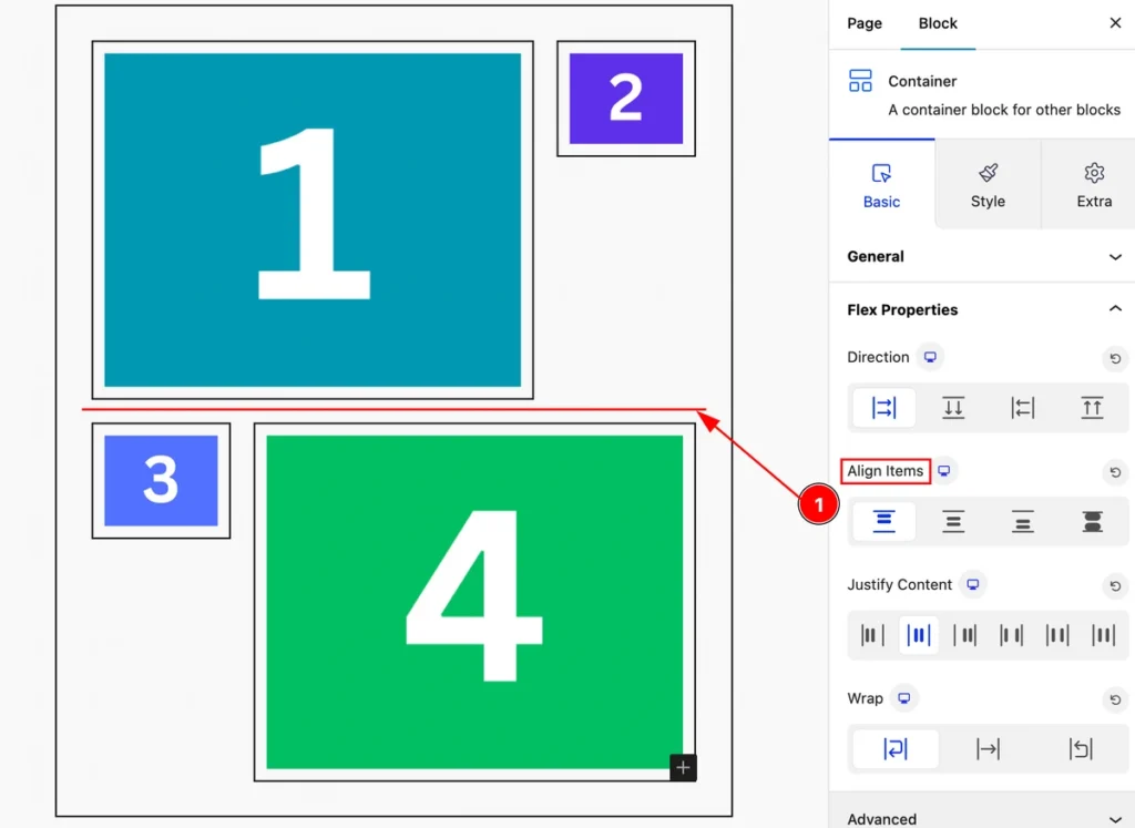
Align Items
Align-items is a CSS property used in flexbox layouts to control how items are aligned along the cross-axis of a flex container. It offers several options.
Flex Start
- Flex Start: The flex-start value aligns the flex items at the top of the container.
Center
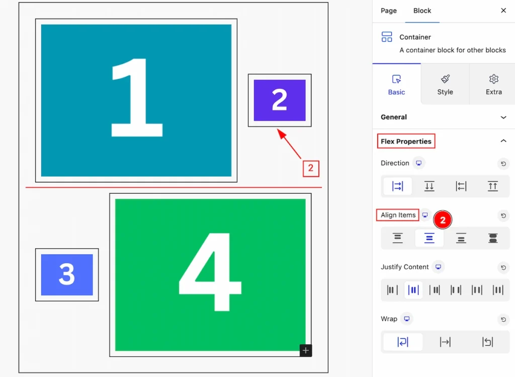
- Center: The center value aligns the flex items at the center of the container:
Flex End
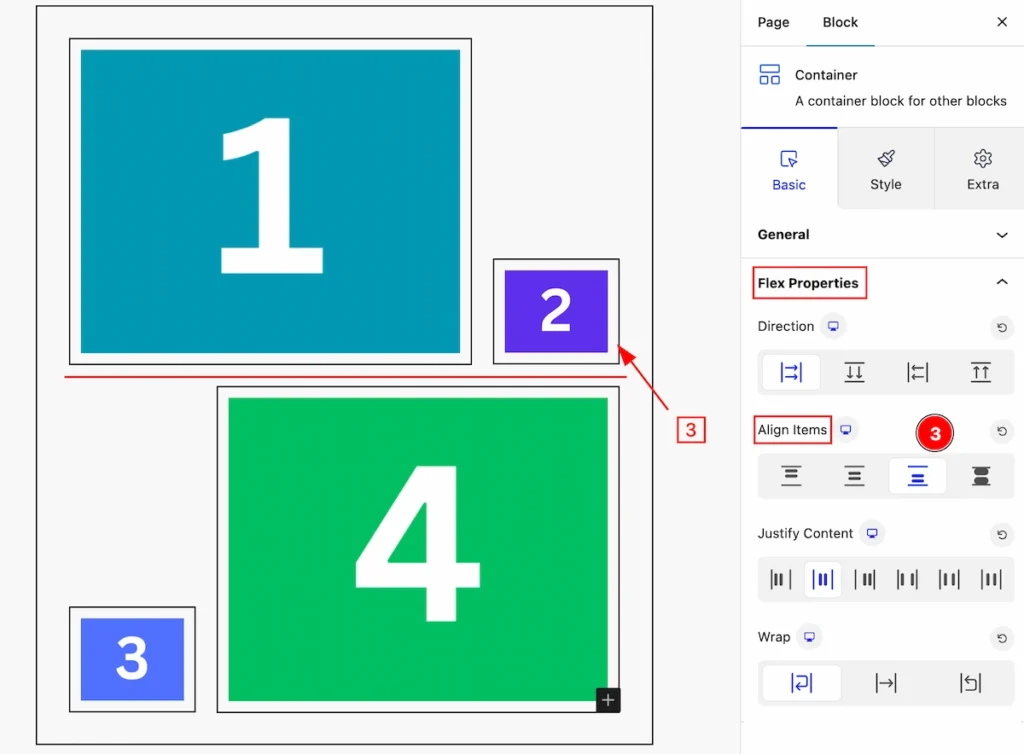
- Flex End: The flex-end value aligns the flex items at the end of the container.
Stretch
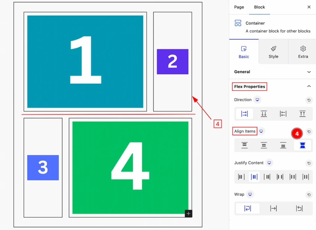
- Stretch: Adapting container sizes to fit different content, ensuring layout flexibility and responsiveness without compromising design or usability.
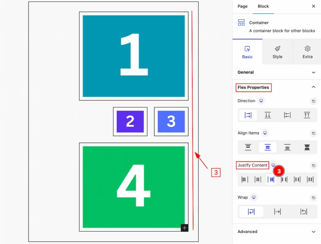
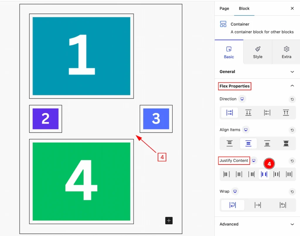
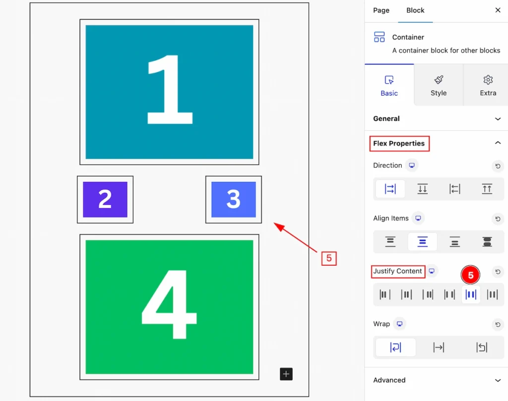
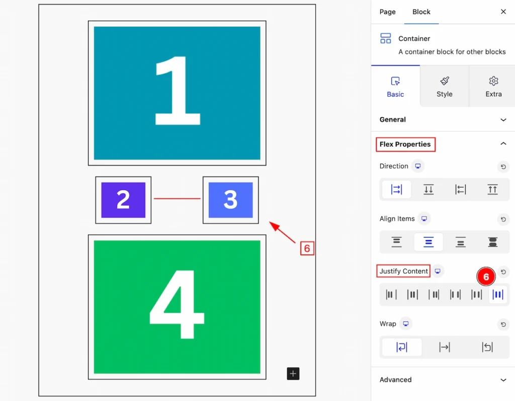
Justify Content
Justify content is a property used in flexbox layouts to control how the content is aligned along the main axis. It can distribute space between and around content items in a flex container.
Flex Start
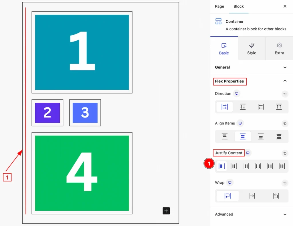
- Flex Start: Items are aligned towards the start of the flex container.
Center
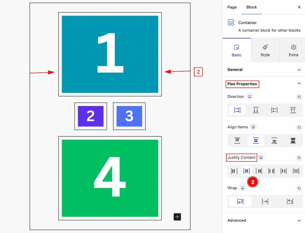
- Center: Items are centered along the main axis.
Flex End
- Flex End: Items are aligned towards the end of the flex container.
Space Between
- Space Between: Items are evenly distributed along the main axis, with the first item aligned to the start and the last item aligned to the end.
Space Around
- Space Around: Items are evenly distributed along the main axis with equal space around them.
Space Evenly
- Space Evenly: Items are evenly distributed along the main axis with equal space between them.
Wrap
The flex-wrap property in CSS, used within flexbox layouts, determines whether items within a flex container should wrap onto multiple lines or stay on a single line.
Nowrap
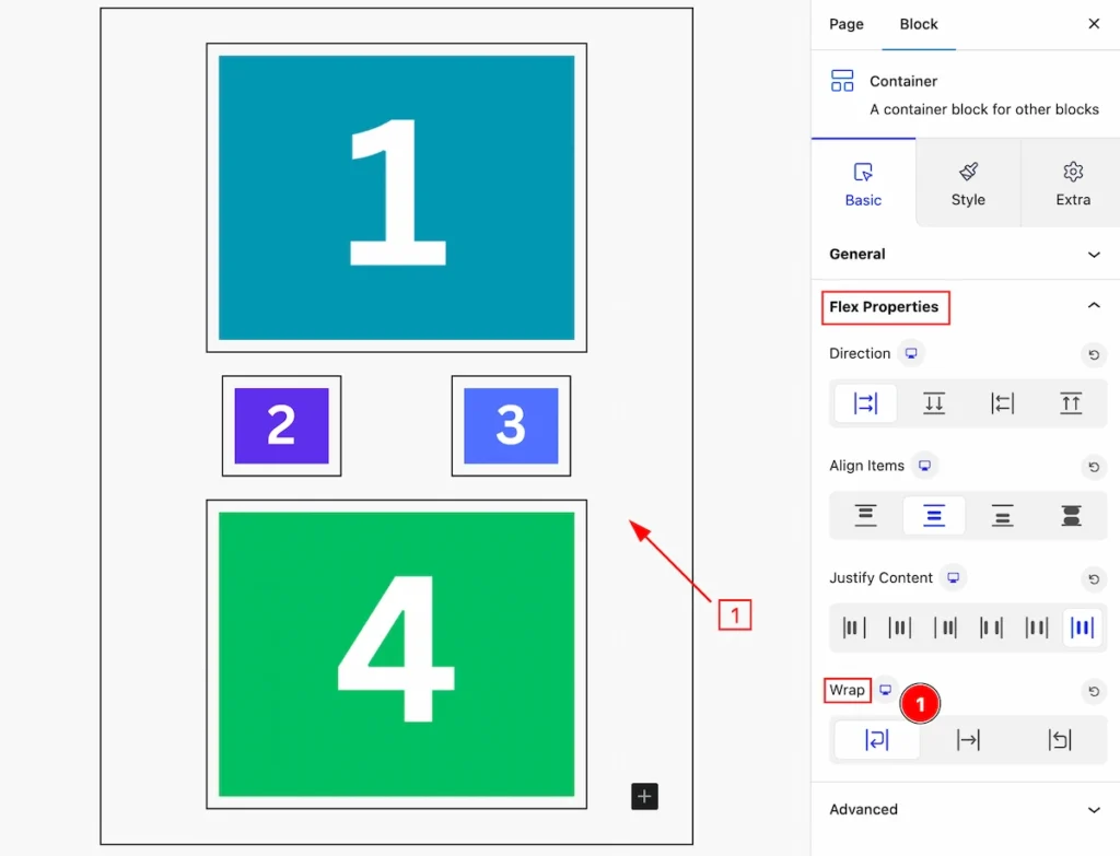
- Nowrap: Items are forced to stay in a single line, potentially causing overflow.
Wrap
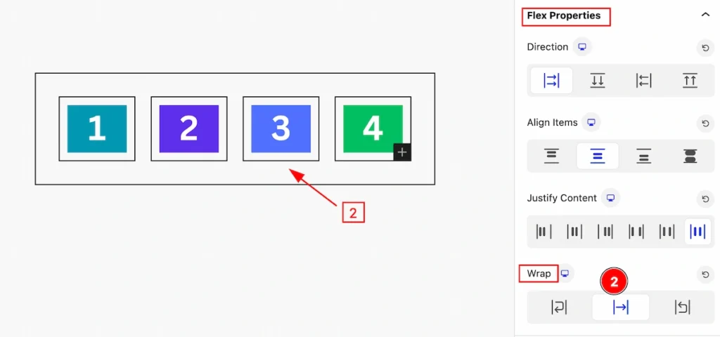
- Wrap: Items are allowed to wrap onto multiple lines if necessary.
Wrap-reverse
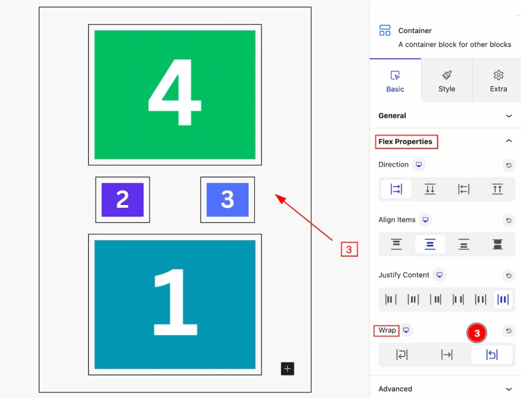
- Wrap-reverse: Items wrap onto multiple lines but in the reverse order.
Additional Options Section
Go to Basic > Additional Options
- Select the Container and navigate to the ” Additional Options ” section.
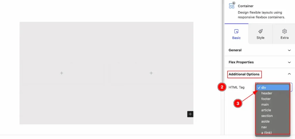
- HTML Tag: Set any HTML Tag for Container ( div, header, footer, main, article, section, aside, nav, a ( link) ). The Container tag is essential for both user experience and search engine optimization (SEO).
- Select the HTML tag for the container from the selection panel.
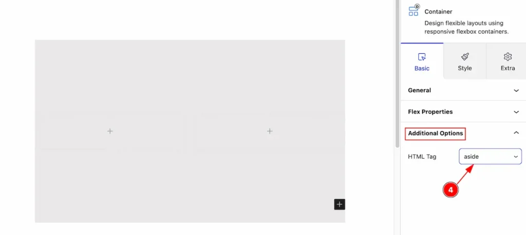
- Select the tag ” aside ” of the container and it will appear on the Dom section.
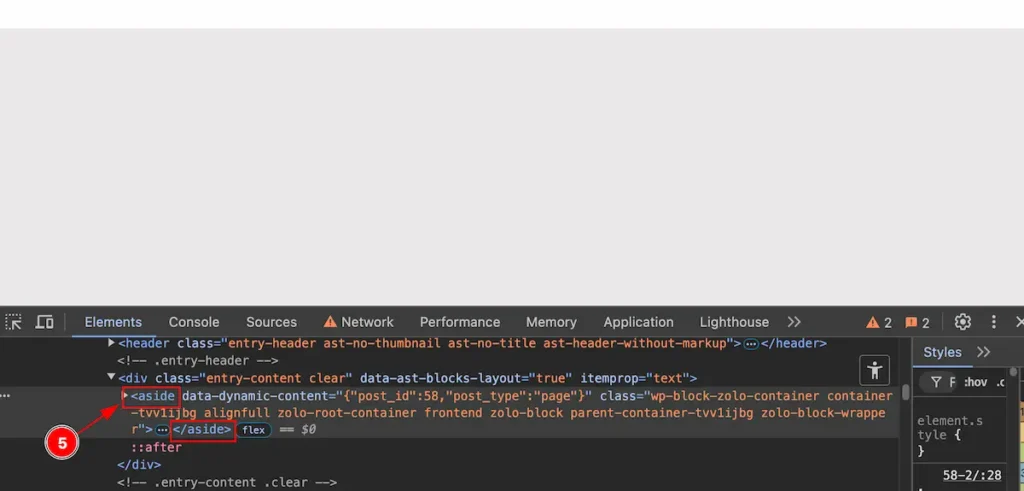
- Inspect the page and the container tag is showing the ” <aside>….</aside> ” tag.
Style Tab
Provide the controller to make the visual appearance or presentation of the tabs. This includes aspects visually appealing and cohesive with the overall design of the interface.
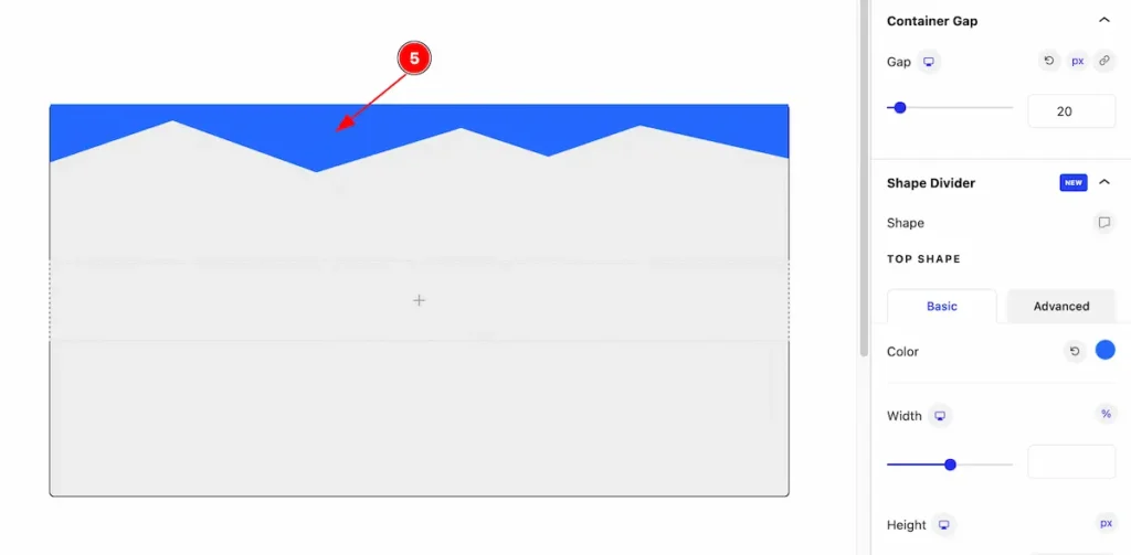
Container Gap
Go to Style > Container
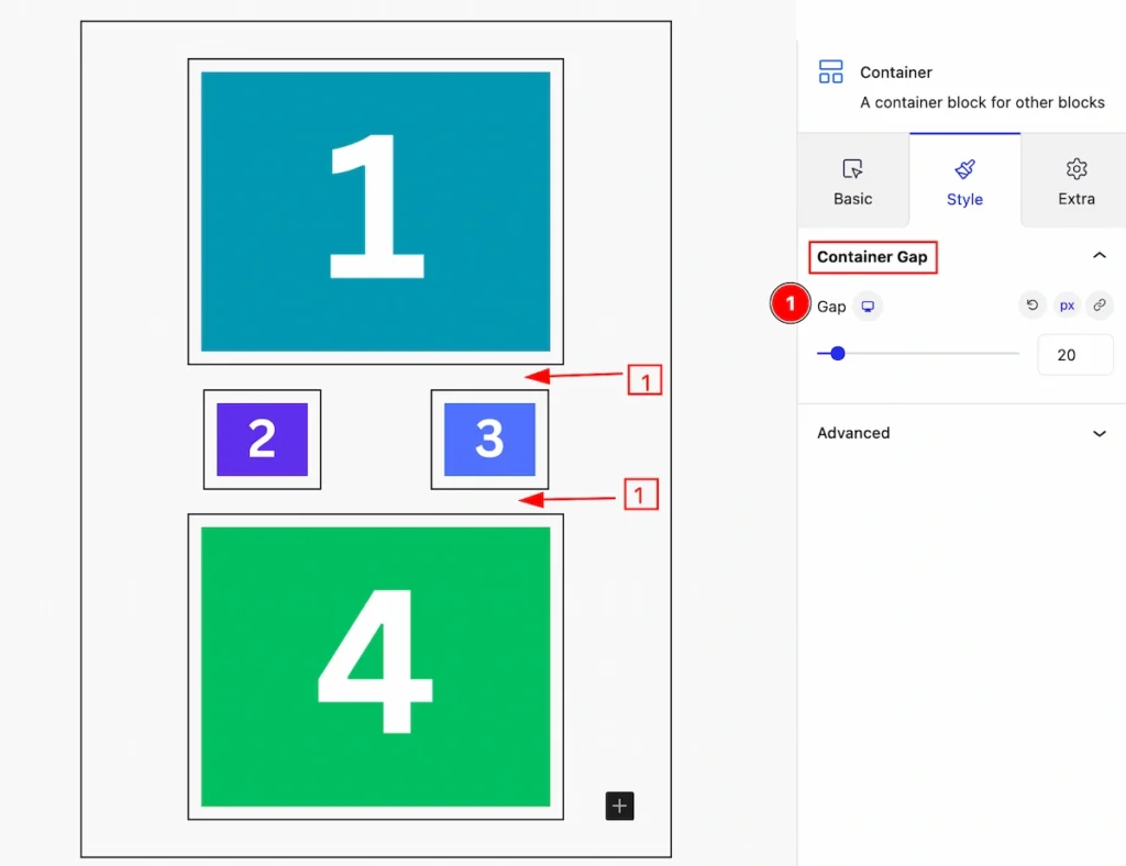
- Gap: Set the gap between the containers.
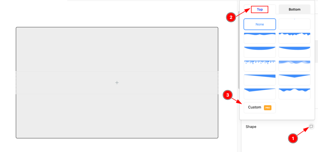
Shape Divider Section
Go to Style > Shape Divider
Shape Divider is an interactive feature for adding shape on the container. Top and Bottom shape are available.
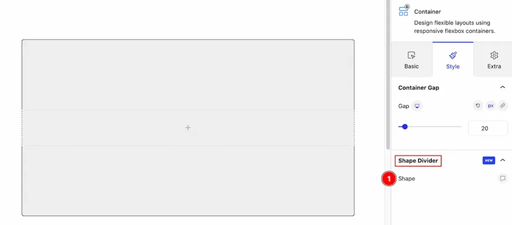
- Shape: The shape are available on this section.
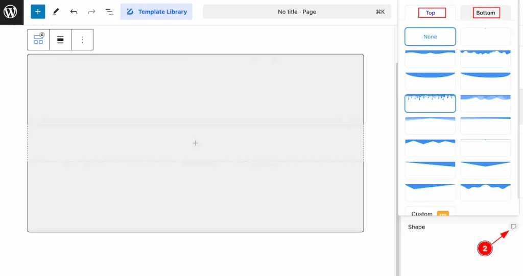
- Click on the Icon and a pop will appear containing two tabs. Top and Bottom tabs and all the ready preset shape are available on there. By default it’s none.
Top Shape
- Navigate to the ” Top ” tabs and all the shape are available on there.
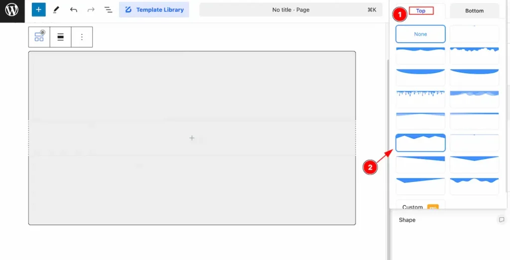
- Select any shape you prefer.
- After selecting the Top shape, It appear on the top on the container.
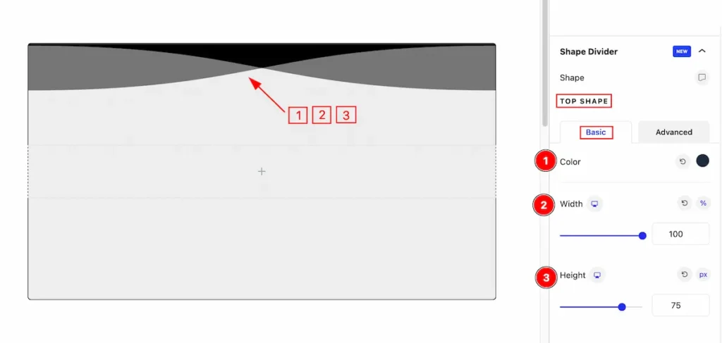
TOP SHAPE Customize
Basic Tab
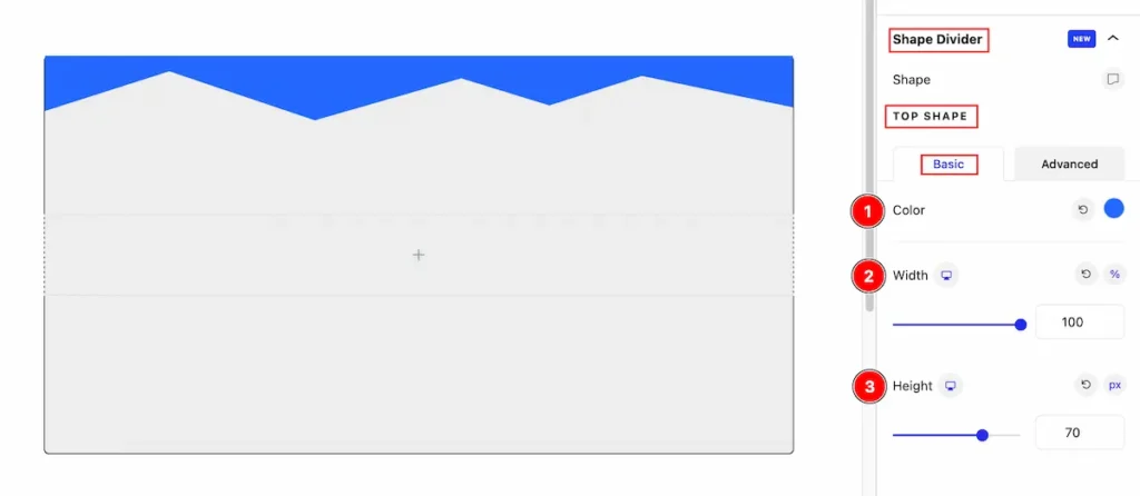
- Color: Set the color for the top shape divider.
- Width: Set the width of the shape, The available mertics are ( %, px, em, vh, vw ).
- Height: Set the height for the shape, The available mertics are ( %, px, em, vh, vw ).
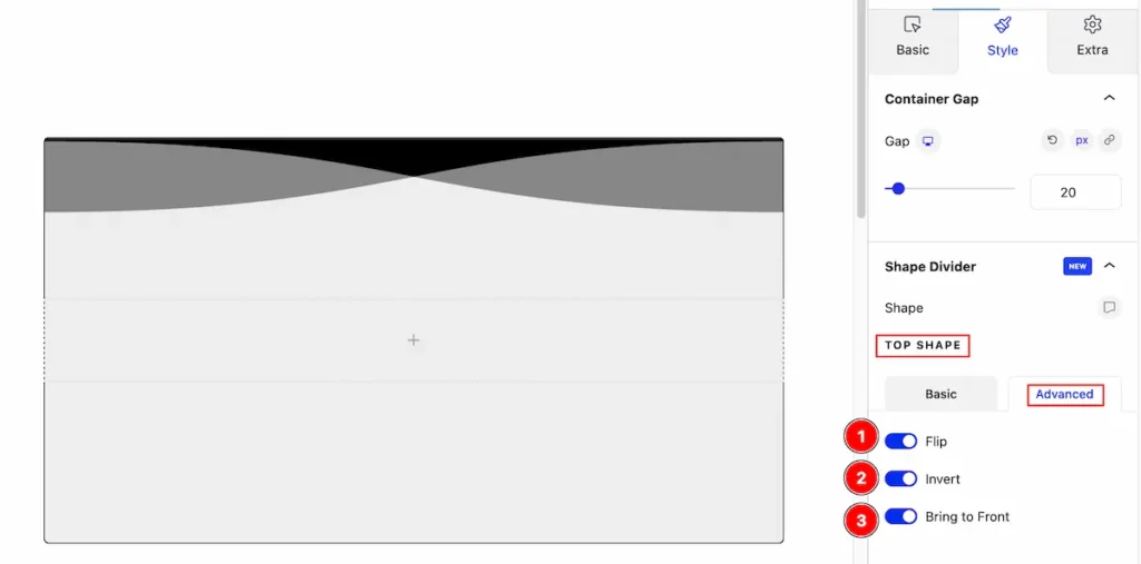
Advanced Tab
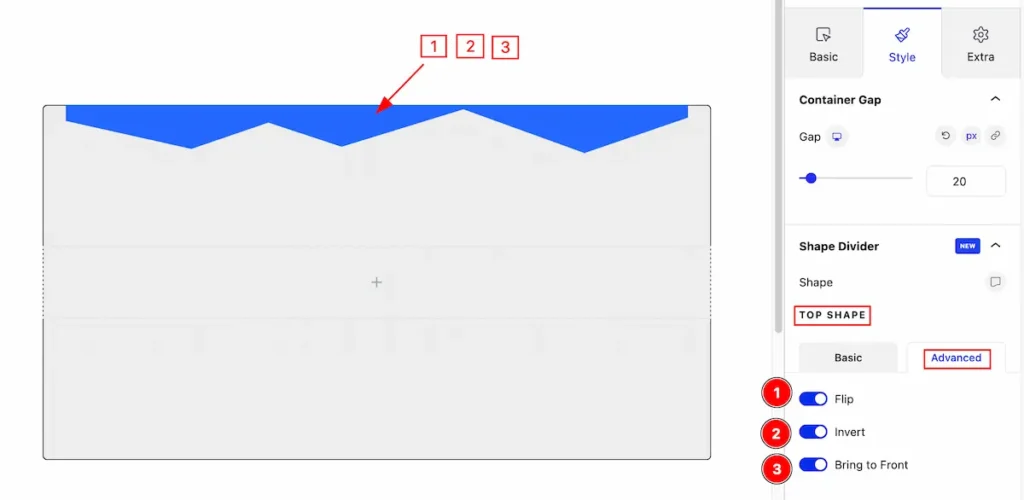
- Flip: Enable the switcher to flip the current shape.
- Invert: Enable the switcher to invert it.
- Bring to Front: Enable this to bring in the front of the shape.
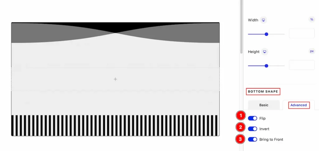
BOTTOM SHAPE
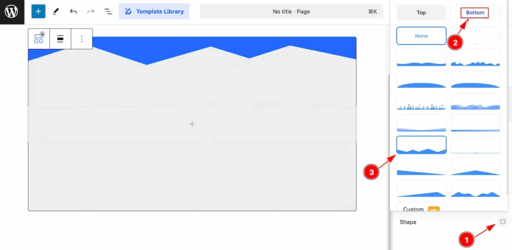
- Click on the Icon of the shape section and a popup will appear.
- Navigate to the “Bottom” tab, All the bottom shape presets are available on there.
- Select one of them and click on it.
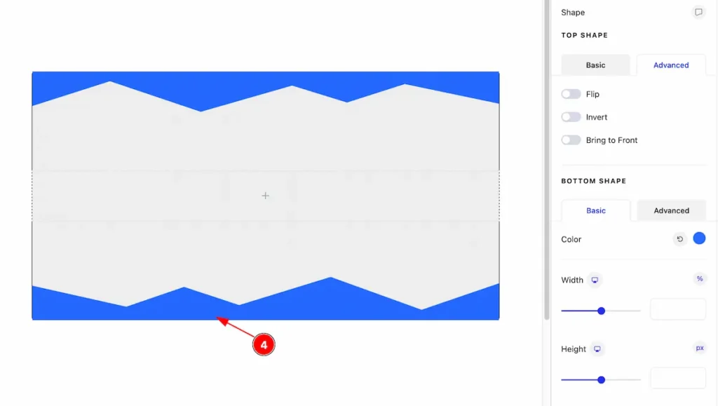
- After selecting this will appear on the bottom of the container.
BOTTOM SHAPE
Basic Tab
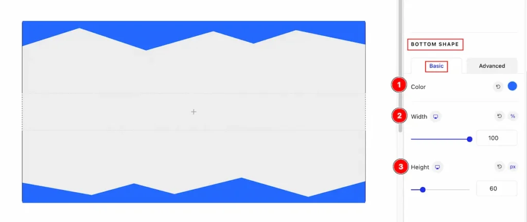
- Color: Set the color for the top shape divider.
- Width: Set the width of the shape, The available mertics are ( %, px, em, vh, vw ).
- Height: Set the height for the shape, The available mertics are ( %, px, em, vh, vw ).
Advanced Tab
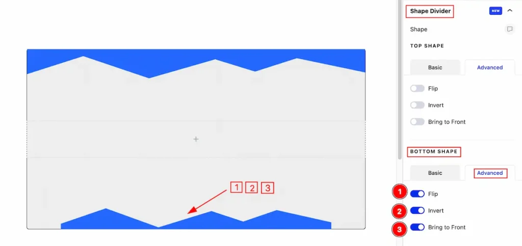
- Flip: Enable the switcher to flip the current shape.
- Invert: Enable the switcher to invert it.
- Bring to Front: Enable this to bring in the front of the shape.
Use Custom Shape
Select the custom shape that prefer for you. Make sure its SVG file.
Select the TOP SHAPE
- Select the shape Icon and here it will appear a Toggler.
- Select the Tiop tab and all the bottom shape are available on there
- Now click on the ” Custom ( Pro ) ” button and it will appear on there.
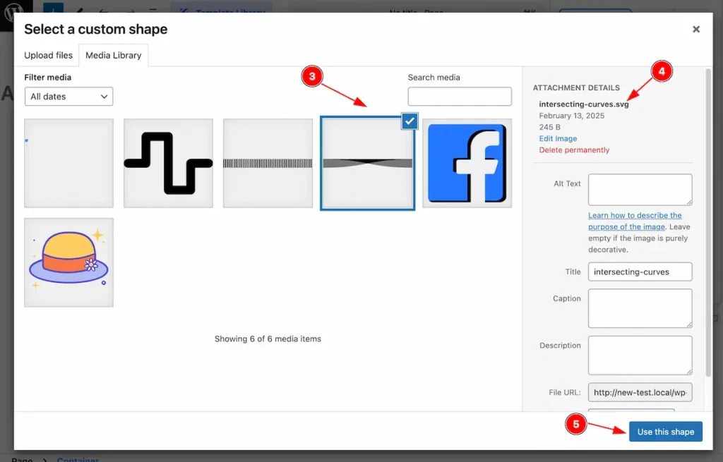
- Select the SVG file from the Media Library.
- Make sure that the file is on SVG format.
- After selecting hit enter the ” Use this shape ” button it will insert.
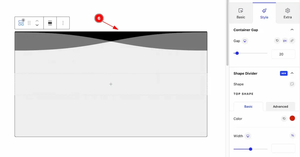
- After selecting the Shape Divider it appear on the container section.
TOP SHAPE
Basic Tab
- Color: Select the color for the shape divider.
- Width: Set the width for adjusting the shape divider.
- Height: Set the height for the divider.
Advanced Tab
- Flip: Enable the switcher to Flip the shape.
- Invert: Enable the switcher to invert the shape.
- Bring to Front: Make the shape in front of by enabling the switcher.
Select BOTTOM SHAPE
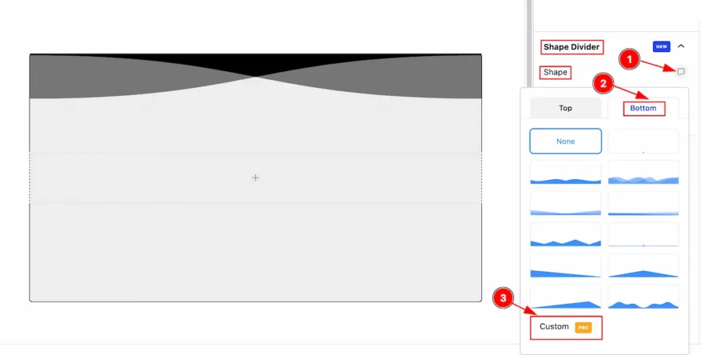
- Select the shape Icon and here it will appear a Toggler.
- Select the Bottom tab and all the bottom shape are available on there
- Now click on the ” Custom ( Pro ) ” button and it will appear on there.
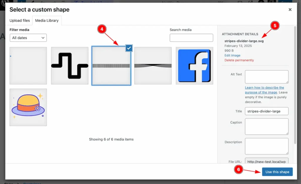
- Select the SVG file from the Media Library.
- Make sure that the file is on SVG format.
- After selecting hit enter the ” Use this shape ” button it will insert.
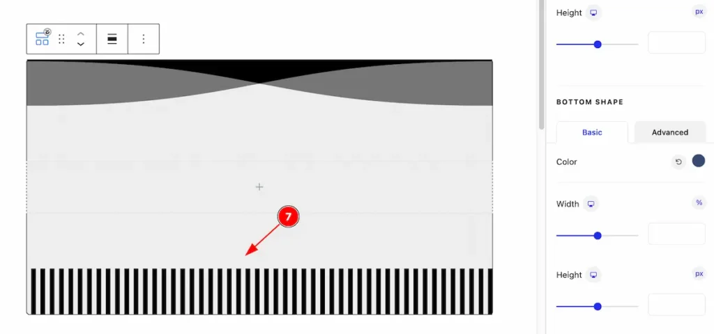
- After selecting the shape The Bottom shape is appear on the bottom of the container.
BOTTOM SHAPE
Basic Tab
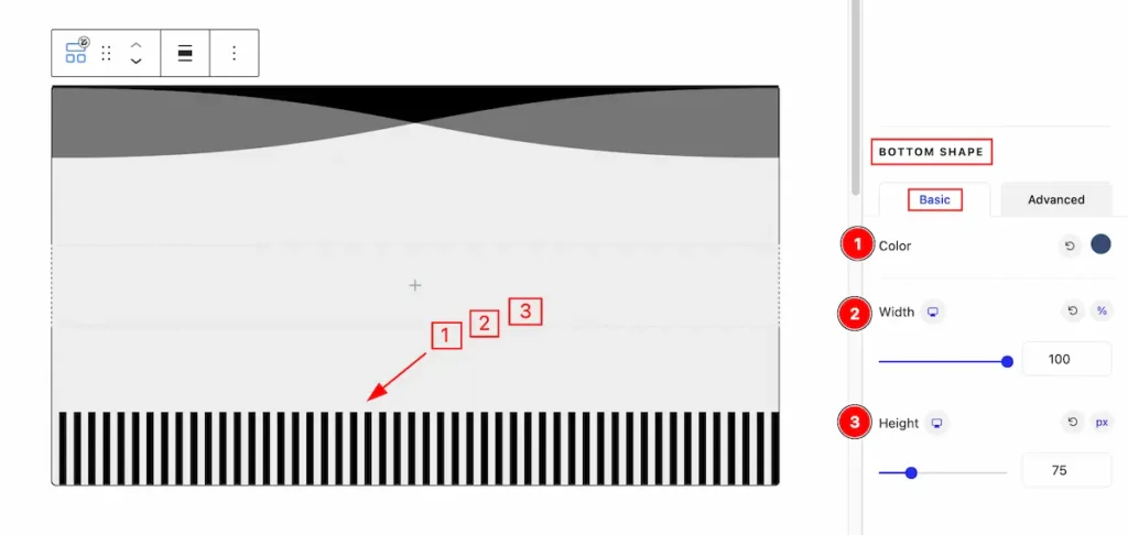
- Color: Select the color for the shape divider.
- Width: Set the width for adjusting the shape divider.
- Height: Set the height for the divider.
- Flip: Enable the switcher to Flip the shape.
- Invert: Enable the switcher to invert the shape.
- Bring to Front: Make the shape in front of by enabling the switcher.
Extra Tab Controls
The extra tabs provide the controls of any blocks. You can make different visual layouts by following these Controls.
Click to learn more>>.
Video Assist
Video Tutorial Coming Soon!
Thanks for being with us!