This documentation provides comprehensive insights into the Slider Block developed by Zoloblocks.
Adding a block to the editor
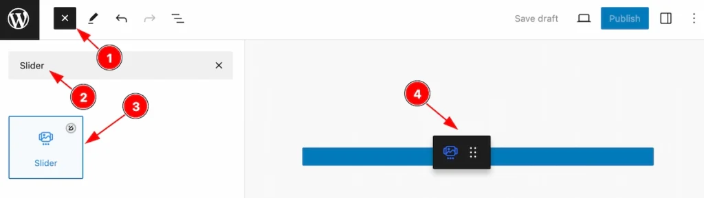
- Click the Toggle Block Inserter icon and a sidebar will appear on the left side, All the blocks will be visible here.
- Search by the Slider block name.
- Then select the appear blocks ( with zoloblocks logo T.R corner).
- After Drag and Drop it on the page.
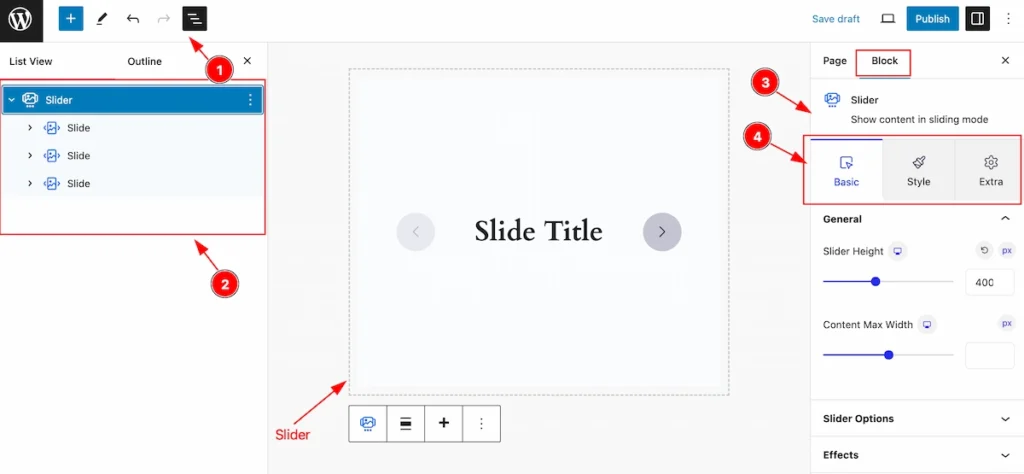
After Inserting the blocks, Follow this.
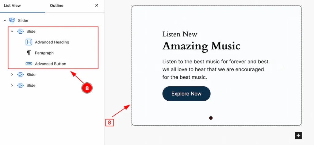
- Click on the Document Overviewer button and the Blocks list view will appear.
- Here appears the Slider block.
- After on the right side, Click on the Block. Then the Slider details appear.
- Here show all the control tabs( Basic, Style, Extra ) of a block.
Basic Tab (Parents Blocks)
The Basic tab controller displayed here offers the flexibility to adjust the layout of blocks according to your preferences. Customize for the Parent’s blocks. Any changes applied will all items
General Section
Go to Basic > General
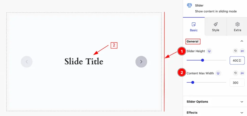
This section provides controls for the slider,
- Slider Height: Set the height for the slider.
- Content Max Width: Set the max width for the content.
Slider Options Section
Go to Basic > Slider Options
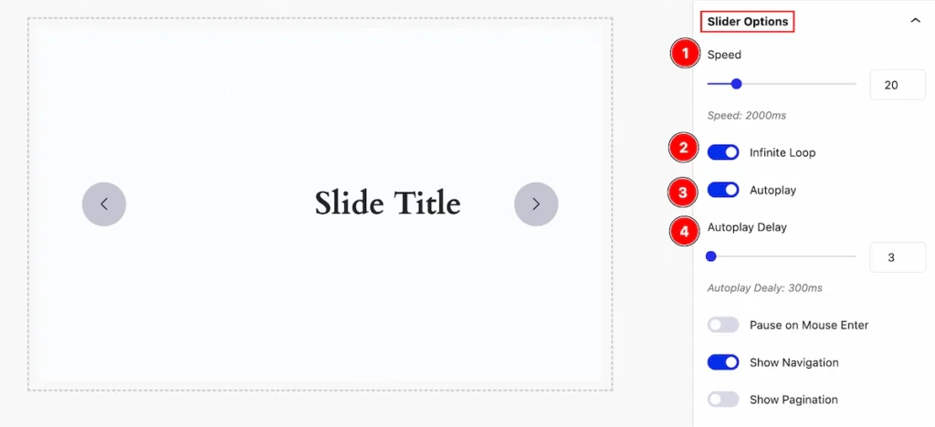
Set controls for the slider by following it,
- Speed: Set the speed for the slider. The speed counts in ms.
- Infinite Loop: Enable the switcher to loop the slider for infinite time.
- Autoplay: Enable the switcher for the playing automatically.
- Autoplay Delay: Set the delay time for automatic play. The speed counts in ms.
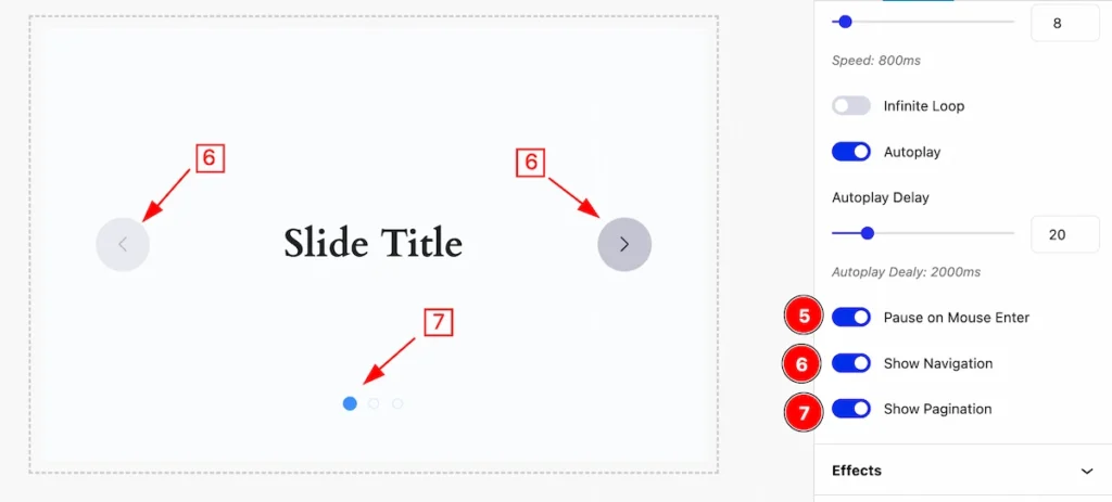
- Pause on Mouse Enter: Enable the switcher to pause the slider on mouse enter.
- Show Navigation: Enable the switcher to show the navigation.
- Show Pagination: Enable the switcher to show the pagination.
Effects Section
Go to Basic > Effects
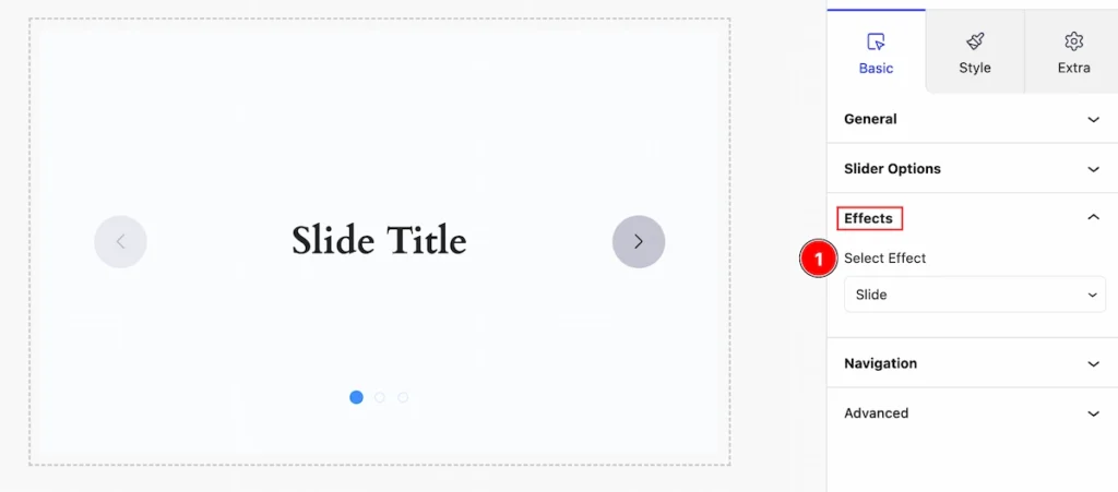
Set effects for the slider,
- Select Effect: Select the effects for the slider (e.g.: Slide, Fade, Cube, etc. ).
Navigation Section
Go to Basic > Navigation
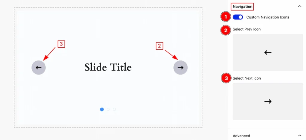
Set the navigation for the slider,
- Custom Navigation Icons: Enable the switcher to customize the navigation icon.
- Select Prev Icon: Set the icon for the prev.
- Select Next Icon: Set the icon for the next.
Style Tab (Parents Blocks)
Provide the controller to make the visual appearance or presentation of the tabs. This includes aspects visually appealing and cohesive with the overall design of the interface.
Content Section
Go to Style > Content
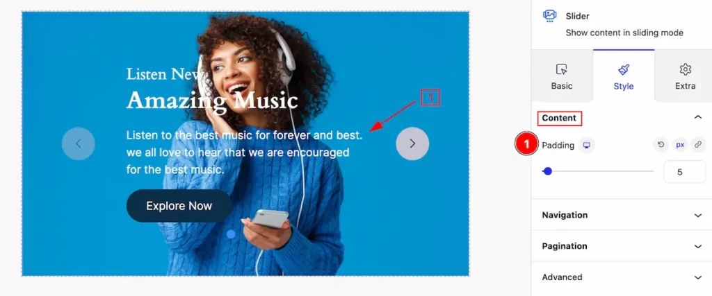
Customize the content by following,
- Padding: Set the padding for the content.
Content Position
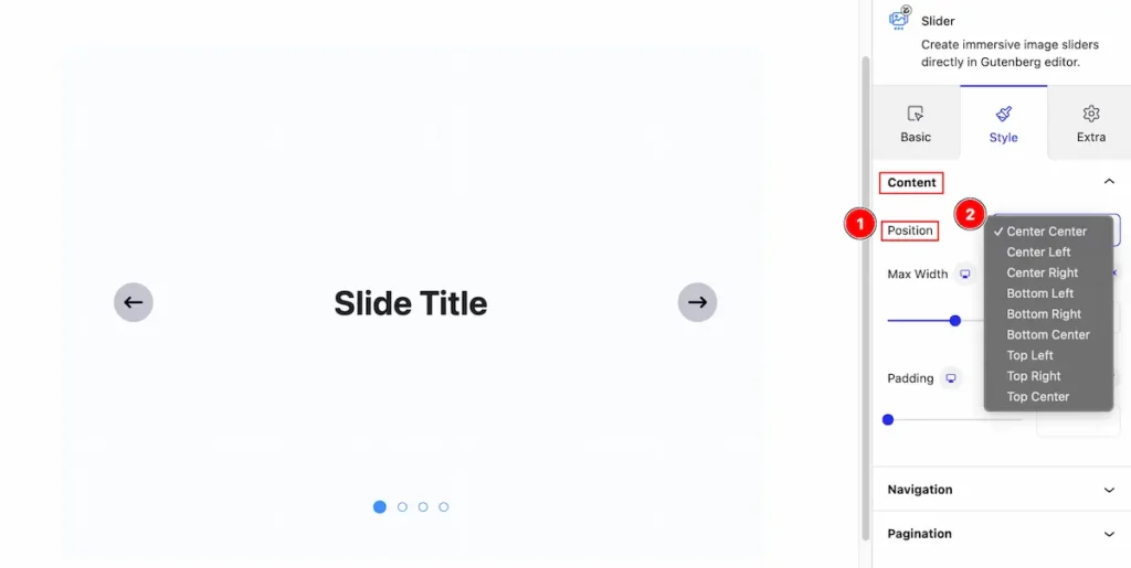
- Position: Set the position of the Content.
- Select the position from. e.x: Center Center, Center Left, Center Right, Bottom Left, Bottom Right, Bottom Center, Top Left, Top Right, Top Center.
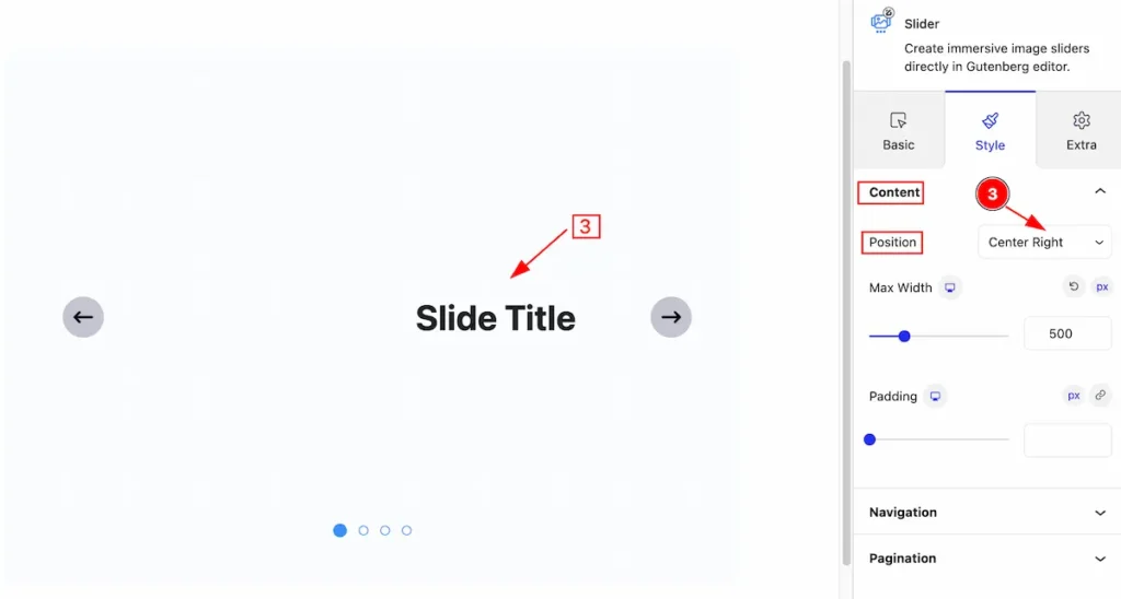
- Select the position “Center Right,” and the content will adjust accordingly.
Navigation Section
Go to Style > Navigation
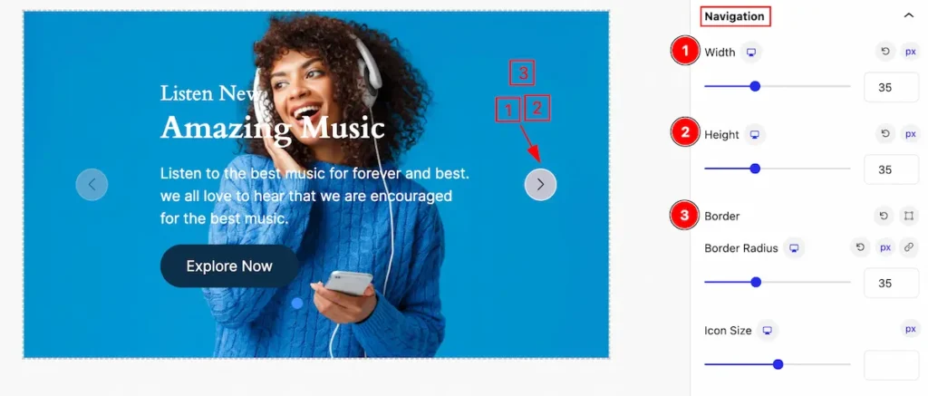
Make the navigation section more stylish by following the controls,
- Width: Set the width for the navigation section.
- Height: Set the height for the navigation.
- Border: Set the border for this.
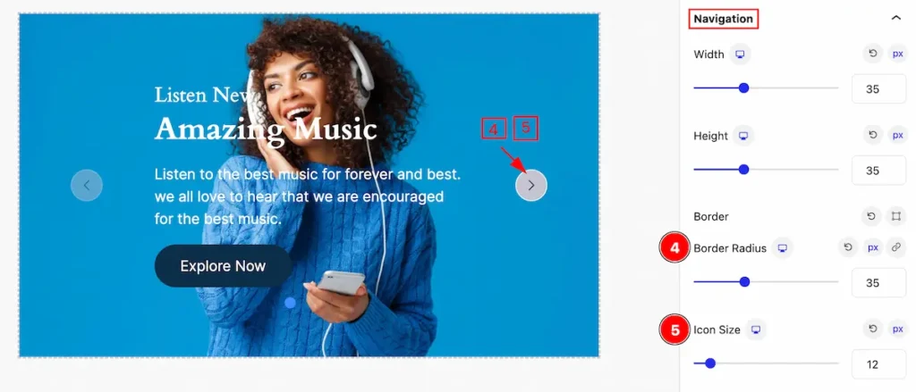
- Border Radius: Set the border radius for navigation.
- Icon Size: Set the icon size for navigation.
Normal State for Navigation
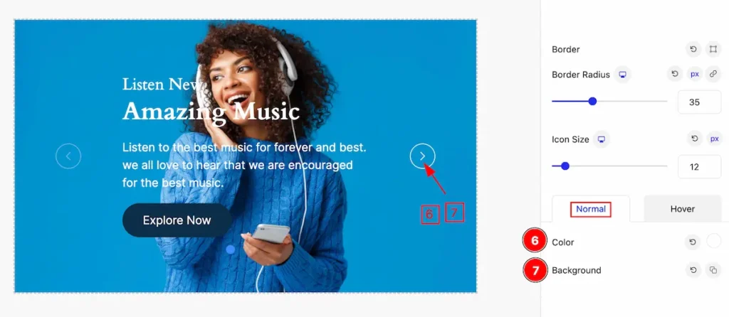
- Color: Set the color for the navigation.
- Background: Set the background color for navigation.
Hover State for Navigation
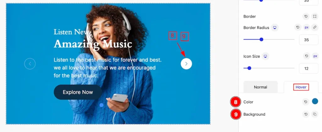
The changes appear on the mouse hovering,
- Color: Set the color for the navigation.
- Background: Set the background color for navigation.
Pagination Section
Go to Style > Pagination
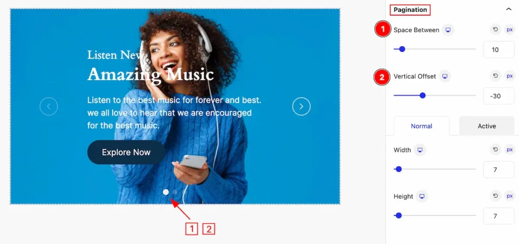
Make the appearance changes for the pagination section,
- Space Between: Set the space between the pagination.
- Vertical Offset: Set the vertical offset for it.
Normal State for Pagination
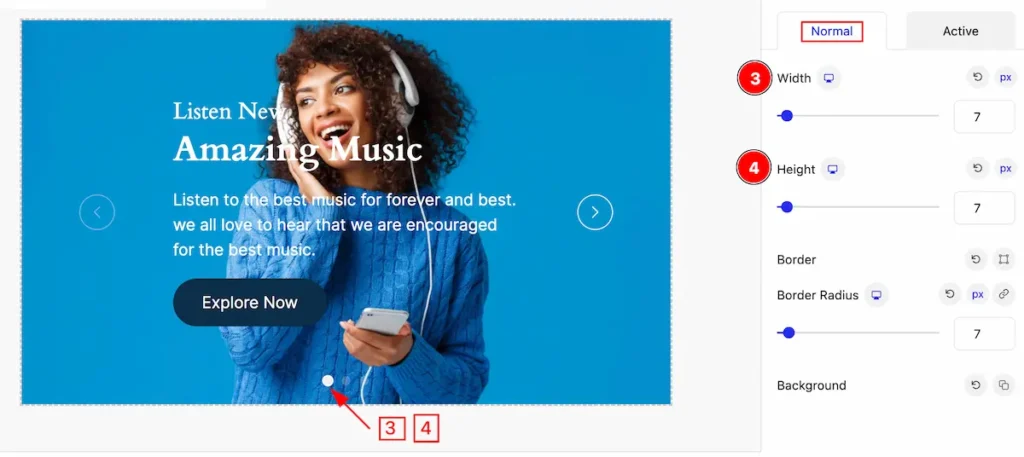
The changes appear on the normal state of the pagination,
- Width: Set the width for the pagination.
- Height: Set the height for the pagination.
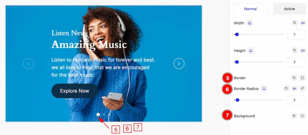
- Border: Set the border for the icon.
- Border Radius: Make the border corner rounded.
- Background: Set the background for the pagination.
Active State for Pagination
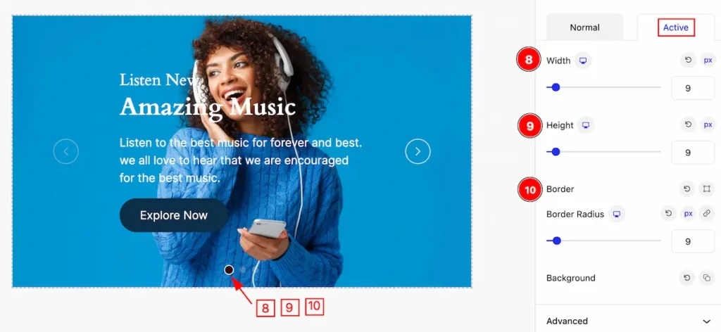
The appearance changes are visible when the pagination is active,
- Width: Set the width for the pagination.
- Height: Set the Height for the pagination.
- Border: Set the border corner edges rounded by setting it.
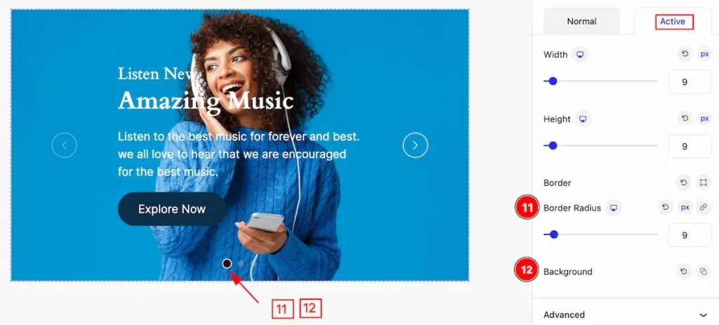
- Border Radius: Set the border radius for the pagination.
- Background: Set the background for this.
Slider (Child Blocks)
Here we will work with the Child blocks of Slider. The changes will applied to the relevant item only. Let’s follow this.
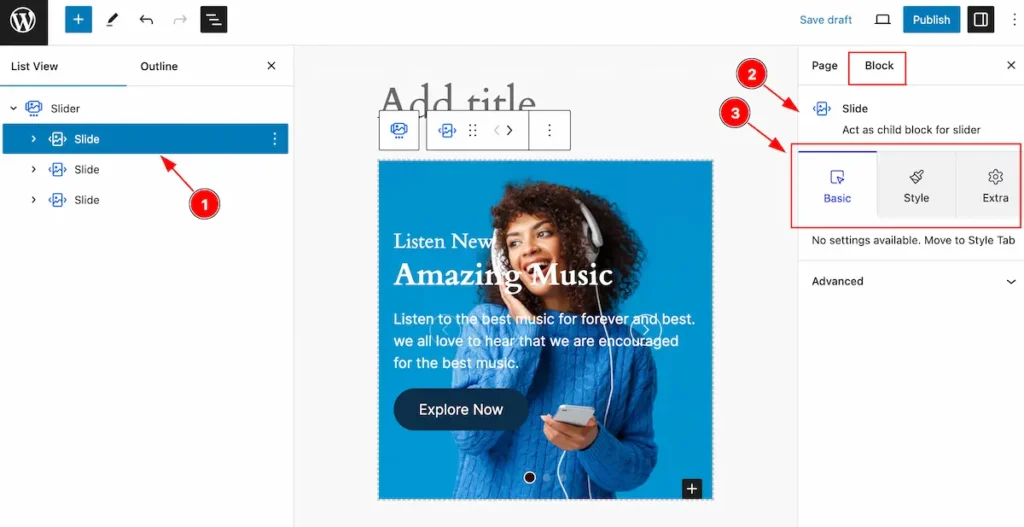
- Select the Slide Child block under the Slider parent blocks.
- On the right side, the selected Slide Child details will appear.
- The Slide Child controls will appear here. ( Basic, Style, Extra ).
Add a New block on Slide
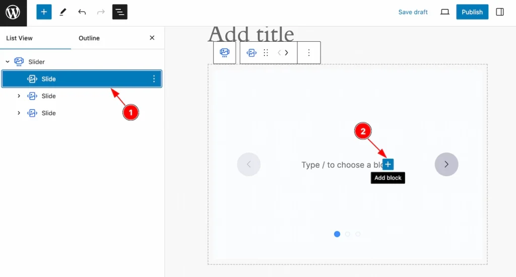
- Select any single item( Child block ) from the slider parents section.
- Click on the ” + ” Icon ( Add Blcok ) icon to add a new block.
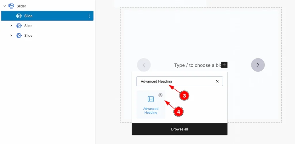
- Search by the block name and it will appear new block.
- Select the desired block and customize it.
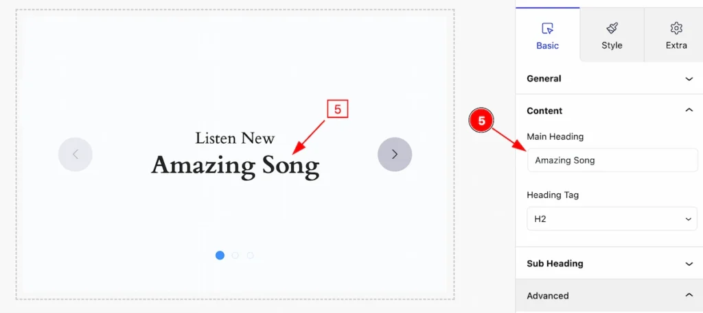
- Edit the selected block.
Add More Block For Slider
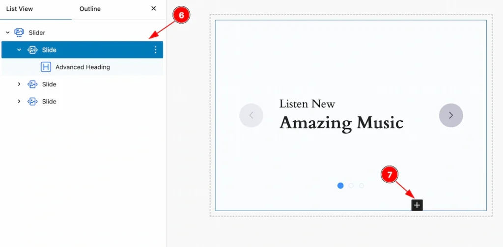
- Select the Slide child item again.
- Click on the ” Add block ” Icon and add as many blocks as you need.
- After customizing all the blocks, The slide shows all the blocks.
Set Background for Slider
Go to Slide > Extra
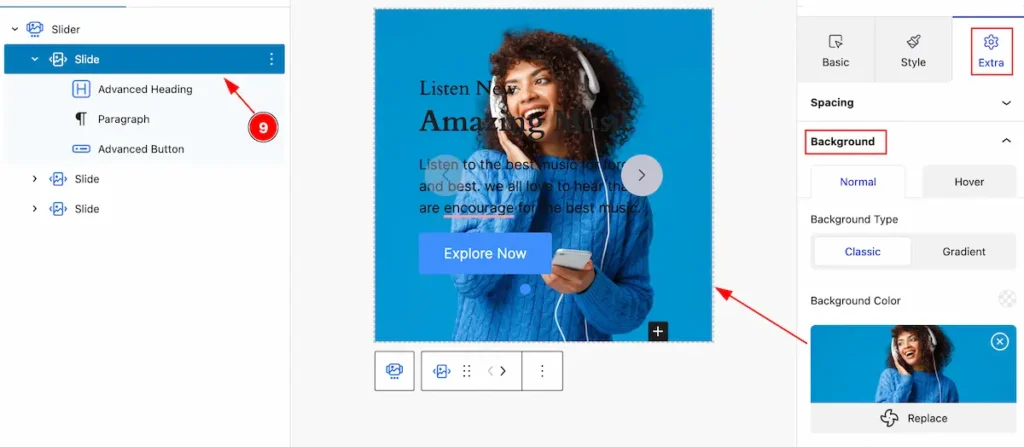
- Select the slide item then go to Background and select an image from the media library,
By following it you can set the background for the slide ( Child Item ).
Style Tab ( Child Block )
This tab provides the controls of the Fancy List Child Items. The changes will apply only to relevant items. Let’s Explore all the controls.
Item Section
Go to Style > Item
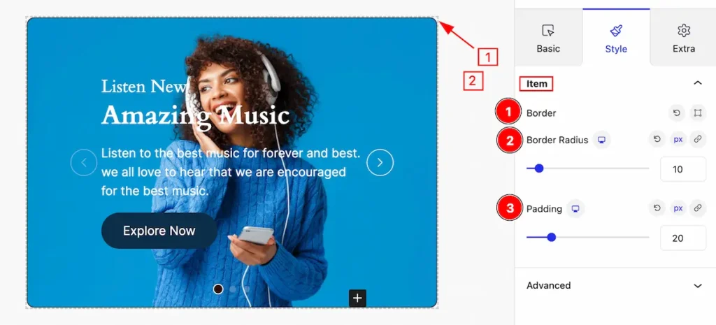
This section provides control for the slide ( Child item ),
- Border: Set the border for the single slide item.
- Border Radius: Set the radius for the slide.
- Padding: Set inner space by setting the padding.
Extra Tab Controls
The extra tabs provide the controls of any blocks. You can make different visual layouts by following these Controls.
Click to learn more>>.
Video Assist
Video Tutorial Coming Soon! Check the Demo Page.
Thanks for being with us!