In this documentation, we will show you how to customize the WooCommerce Mini Cart widget presented by the Element Pack Pro add-on.
Insert WooCommerce Mini Cart Widget
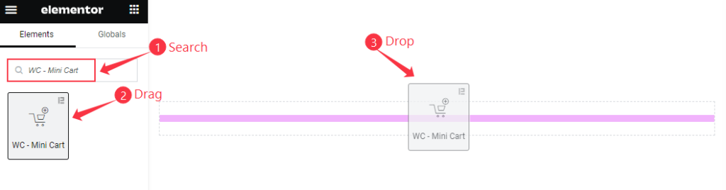
- Search by the WC – Mini Cart widget name.
- The widget will appear, Check the Element Pack Pro logo on top right corner.
- Select the widget then Drag and Drop it on the editor page.
The default view of WooCommerce Mini Cart widget
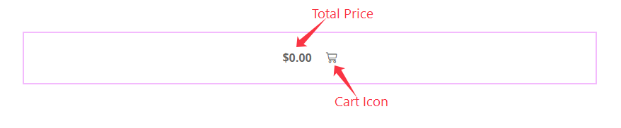
The Mini Cart displays the Total Price and Icon.
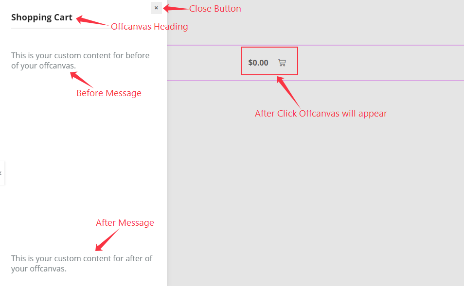
After Clicking on the Mini Cart appears the Offcanvas. The Offcanvas displays the Title, Before And After Message, and Empty Products Message.
The WooCommerce Mini Cart with Products
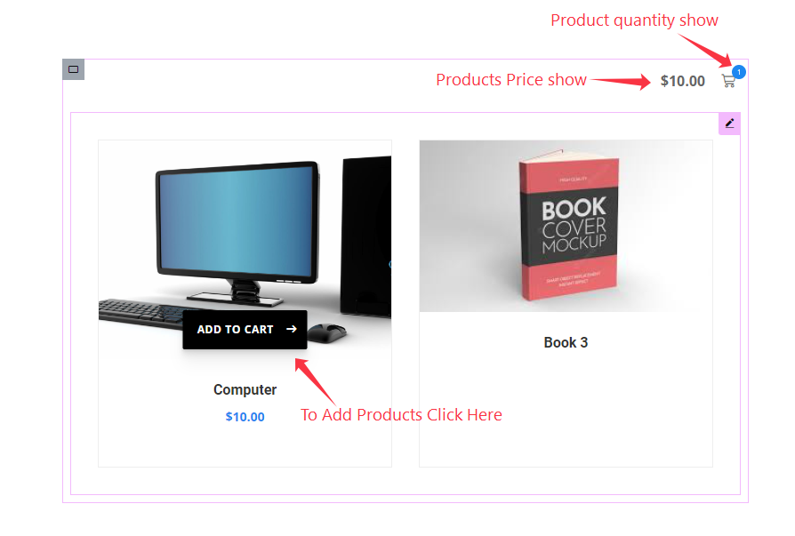
After Adding any Products the Mini Cart displays the Quantity of Products and Total price.
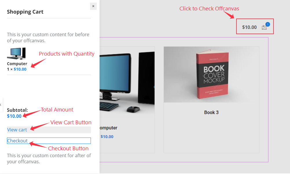
The Offcanvas displays the Products with Image, Title and Quantity, Total Amount, and Two Buttons to View Cart and Checkout.
Content Tab Customization
Mini Cart Section
Go to Content > Mini Cart
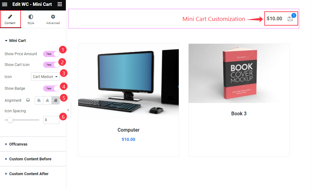
- Show Price Amount: Enable the switcher to show the Total Price of the Products after adding to Cart.
- Show Cart Icon: Enable the toggle switcher to show the Cart Icon.
- Icon: Set the cart icon different presets are available.
- Show Badge: Enable the switcher to show the Badge. It demonstrate the Count of total products.
- Alignment: Set the position for the Cart, Left, Center, Right.
- Icon Spacing: Set the spacing for the Icon.
Offcanvas Section
Go to Content > Offcanvas
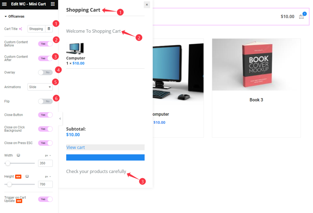
- Cart Title: Set the Title for the Cart.
- Custom Content Before: Enable the toggle switcher to show to custom content before.
- Custom Content After: Enable the toggle switcher to show to custom content before.
- Overlay: It allows to show the overlay cart.
- Animations: Set different kind of animations for the cart sliding.
- Flip: It will flip the cart to opposite direction.
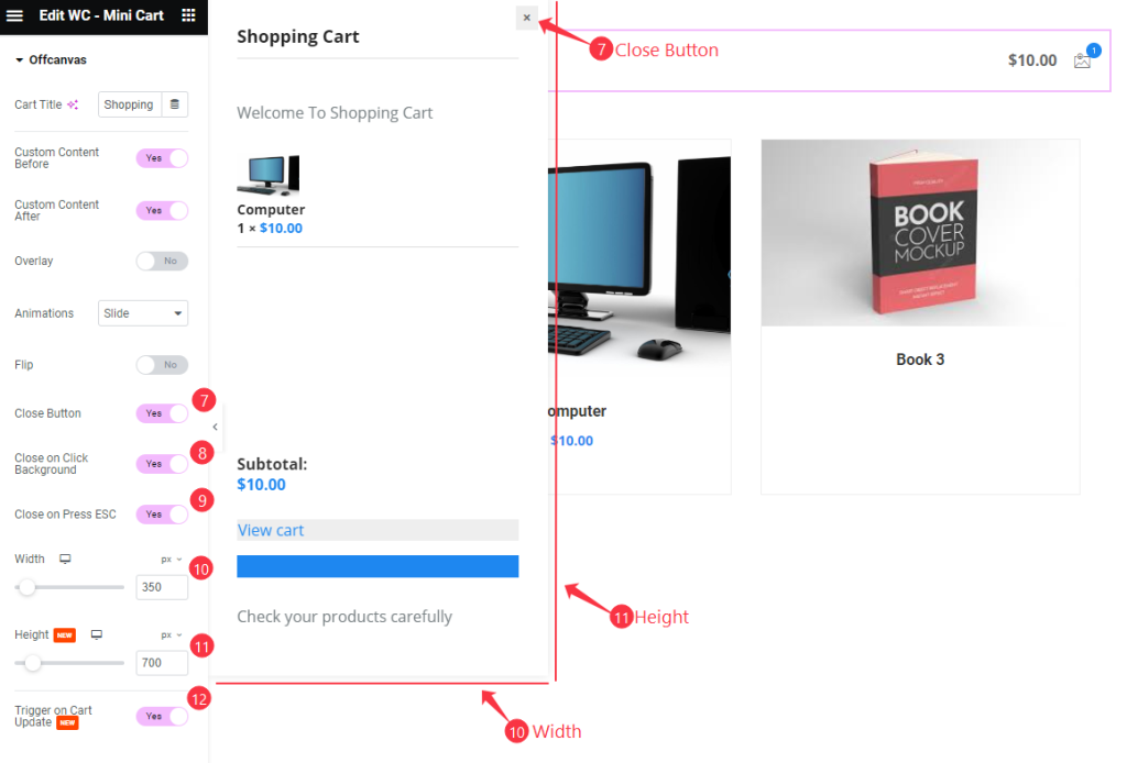
- Close Button: Enable the switcher to demonstrate the Close button.
- Close on Click Background: Enable the switcher to close it by clicking on the Background.
- Close on Press ESC: It allows to close the Cart by pressing on ESC Button.
- Width: Set the width for the Cart.
- Height: Set the height for the Cart.
- Trigger to Cart Update: Enable the switcher to update the cart on triggering.
Custom Content Before Section
Go to Content > Custom Content Before
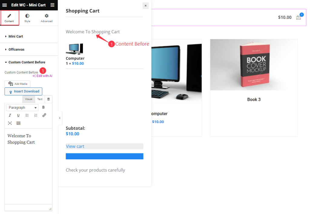
- Custom Content Before: Set the content Before Text.
Custom Content After Section
Go to Content > Custom Content After
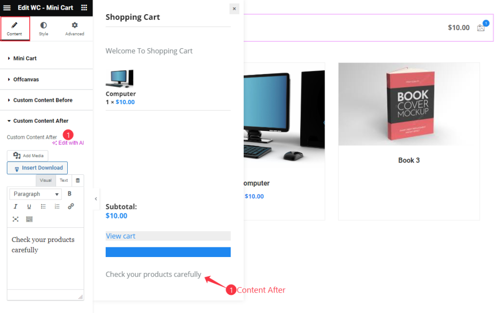
- Custom Content After: Set the content After Text.
Style Tab Customization
Mini Cart Section
Go to Style > Mini Cart
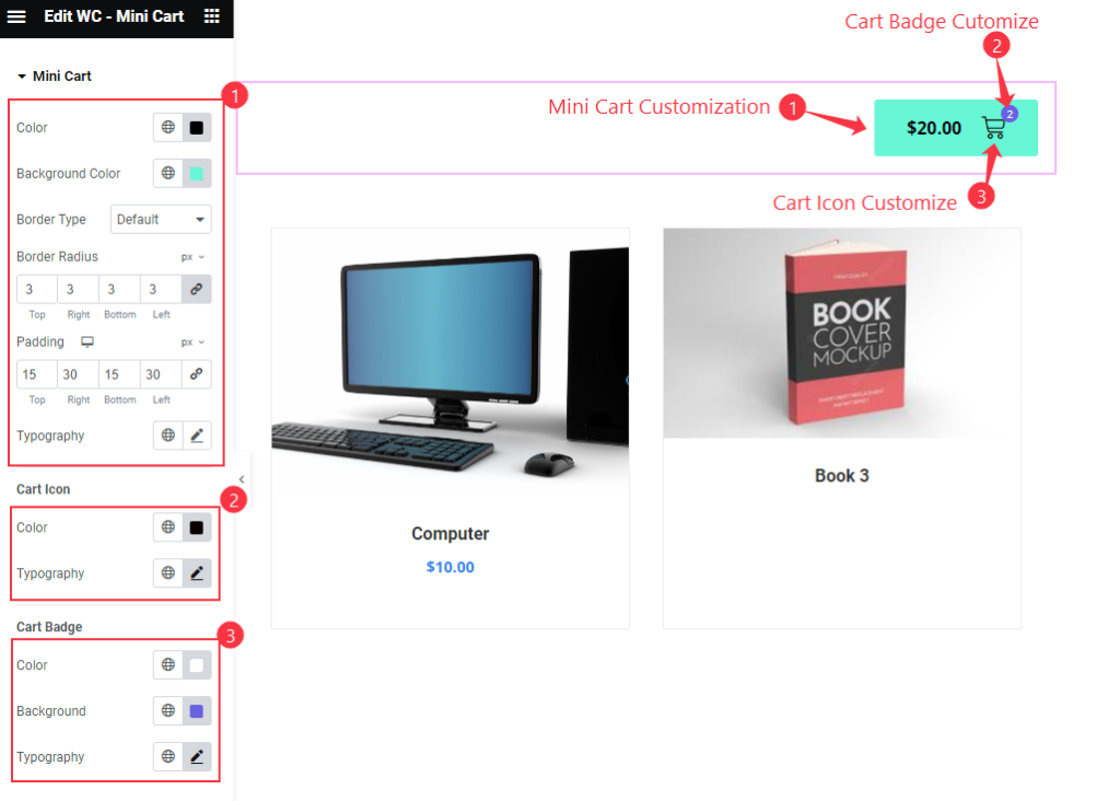
- Mini Cart Customization:
- Color: Select the Color for the Background.
- Background Color: Set the Background color for the Cart.
- Border Type: Choose the border type for the Mini cart area.
- Border Radius: Set the border radius.
- Padding: Set the padding for the cart.
- Typography: Choose the typography for the Text.
- Cart Icon:
- Color: Choose the Color for the Cart Icon.
- Typography: Choose the typography for the Icon. It changes the size according to the Cart Size.
- Cart Badge:
- Color: Set the color for the Badge.
- Background: Set the background color for the cart.
- Typography: Choose the typography for the badge.
Offcanvas Section
Go to Style > Offcanvas
Product List
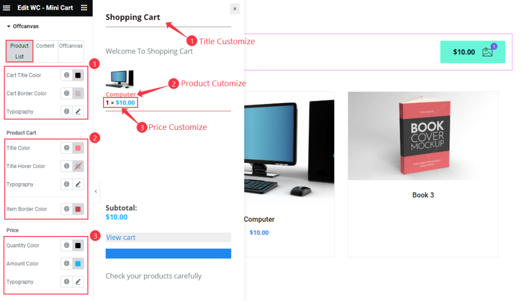
- Cart Title
- Cart Title Color: Set the color for the Cart Title.
- Cart Before Color: Set the Cart Before text.
- Typography: Set the typography for the title.
- Product Cart
- Title Color: Set the color for the Product Title.
- Title Hover Color: Choose the hover color for the Title.
- Typography: Set the typography for the this.
- Item Border Color: Choose the Item Border color.
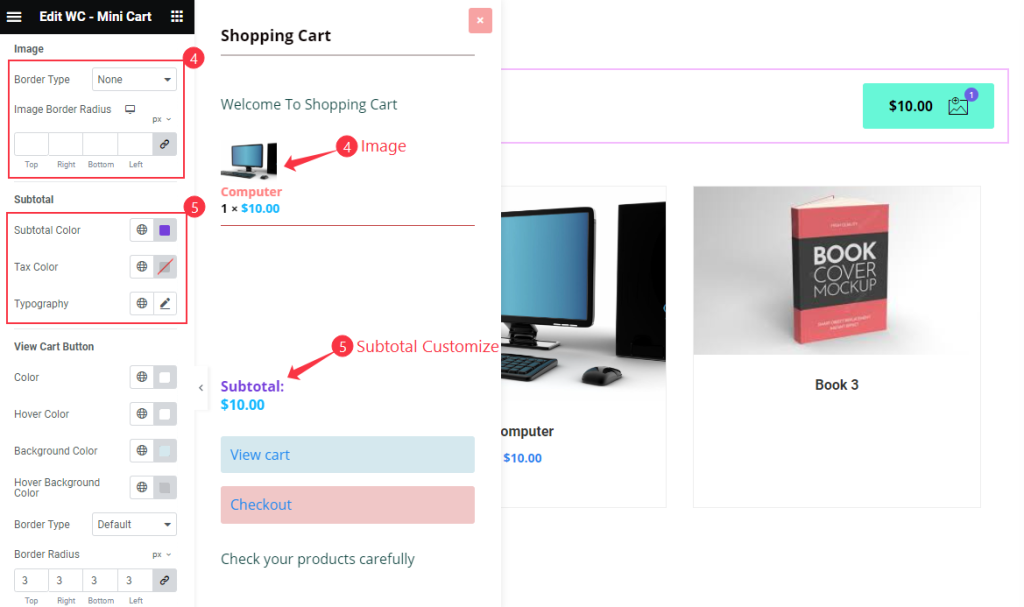
- Image
- Border Type: Choose the border type for the Image.
- Image Border Radius: Set the border corner edges rounded.
- Subtotal
- Subtotal Color: Choose the subtotal color.
- Tax Color: Set the Tax Color.
- Typography: Set the typography for the Subtotal.
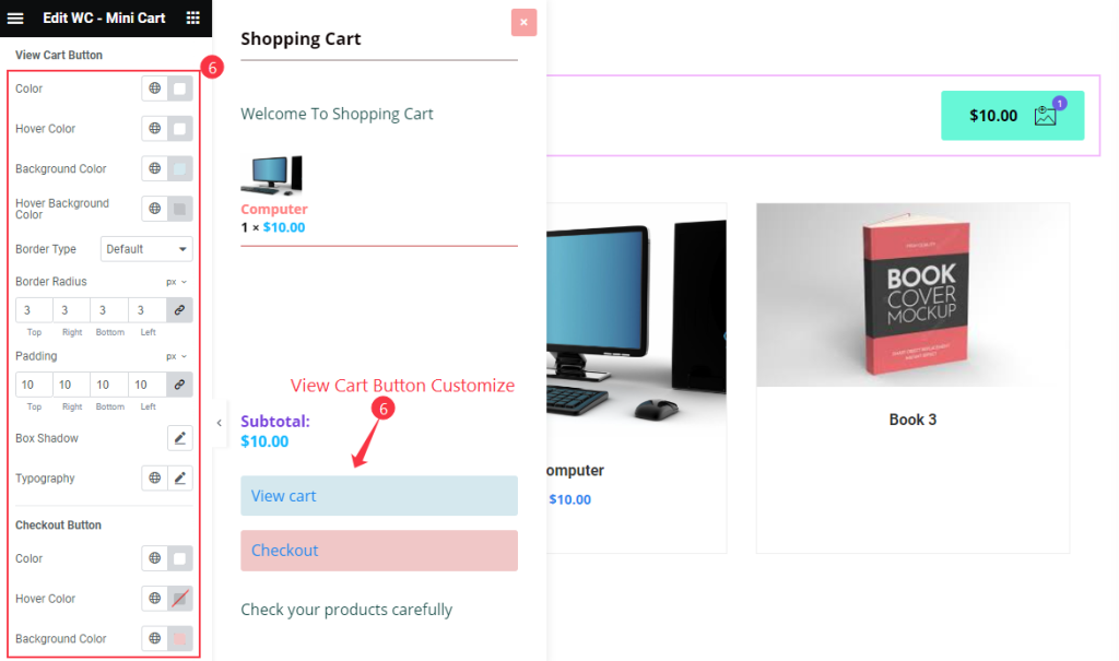
- View Cart Button
- Color: Set the color for the View Cart Button text.
- Hover Color: Set the hover color for the View Cart Button text.
- Background Color: Set the Background color for the View Cart Button.
- Hover Background Color: Set the Hover Background color for the View Cart Button.
- Border Type: Choose the border type for the Button. Different type are available dotted, dashed, grove, none, etc.
- Border Radius: Set the border radius for the button.
- Padding: Choose the padding for the border.
- Box Shadow: Make a box shadow for the button.
- Typography: Set the typography for the box.
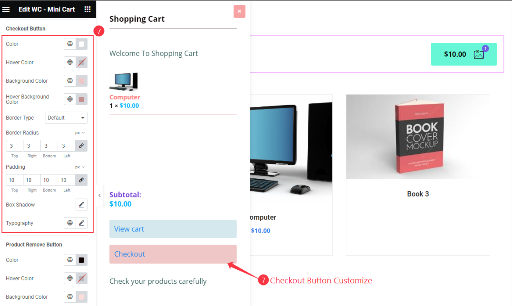
- Checkout Buttons
- Color: Choose the color for the Checkout buttons.
- Hover Color: Select the hover color for the buttons.
- Background Color: Set the background color of the button.
- Hover Background Color: Select the hover background color.
- Border Type: Set the border type.
- Border Radius: Make the border radius.
- Padding: Set the padding for inner space of the button.
- Box Shadow: Make a Box shadow for the Buttons.
- Typography: Choose the typography of the buttons.
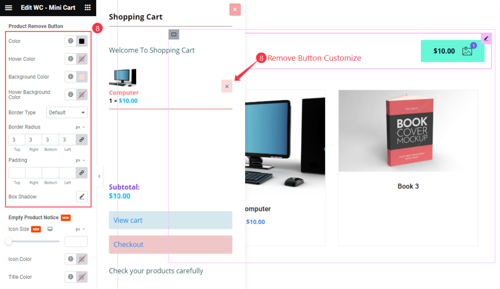
- Product Remove Button
- Color: Choose the color for the Product Remove buttons.
- Hover Color: Select the hover color for the buttons.
- Background Color: Set the background color of the button.
- Hover Background Color: Select the hover background color.
- Border Type: Set the border type.
- Border Radius: Make the border radius.
- Padding: Set the padding for inner space of the button.
- Box Shadow: Make a Box shadow for the Buttons.
Offcanvas Close Button Section
Go to Style > Offcanvas Close Button
Normal
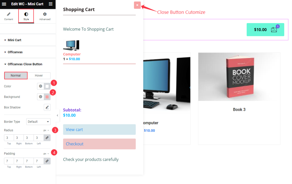
- Color: Choose the Color for the offcanvas close button.
- Background: Select the Background Color.
- Box Shadow: Make a shadow for the button.
- Border Type: Choose the border type.
- Radius: Make the border radius.
- Padding: Set the inner spacing of the button.
Hover
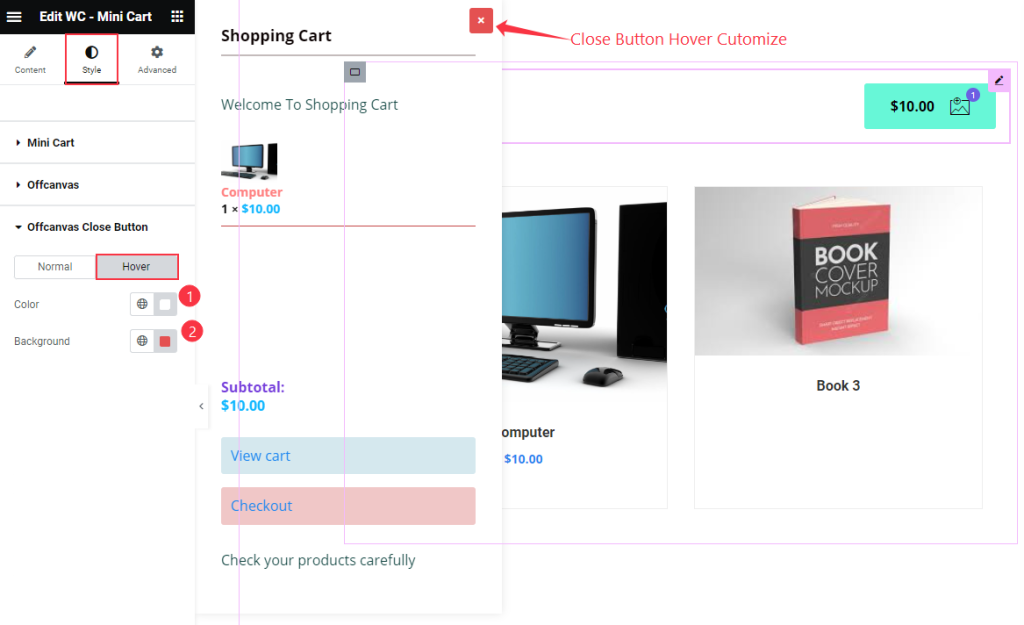
- Color: Choose the color for the offcanvas close button.
- Background: Choose the background color.
Video Assist
Thanks for watching the WooCommerce Mini Cart Widget Video Tutorial. Please visit the demo page for examples.
Thanks for being with us.