In this documentation, we will show you how to customize the Fancy Card widget presented by Element Pack Pro.
Inserting The Fancy Card Widget
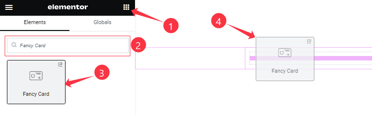
Open your page in the Elementor editor, search by the widget name, then drag and drop it on the page.
Content Tab Customizations
Icon Box Section
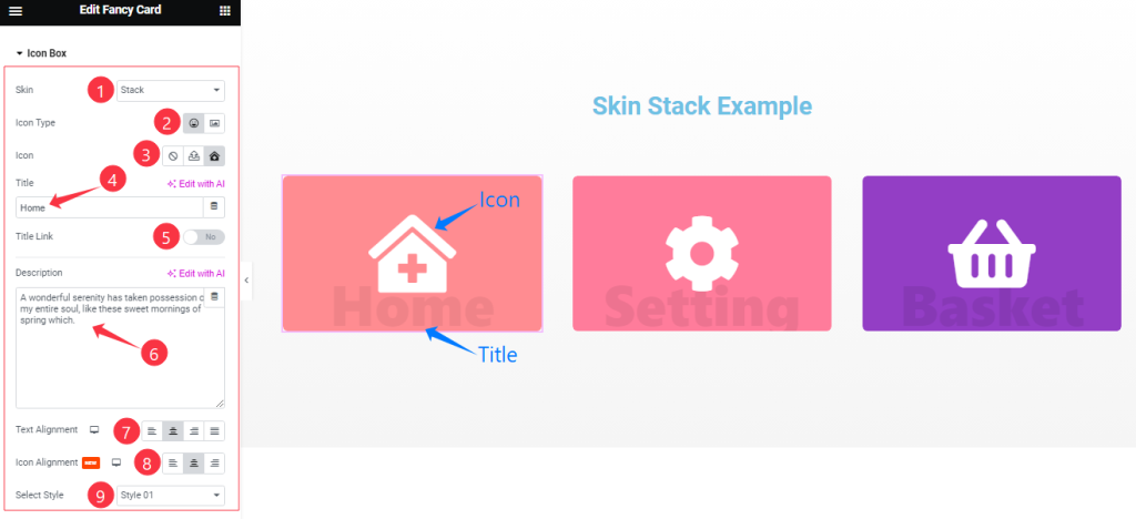
Go to Content > Icon Box
Come to the Icon Box section, Find the Skin (Default, Stack, Batty, Climax, and Flux), Icon Type, Select Icon, Title, Title Link, Description, Text Alignment, Icon Alignment, and Select Style ( 4 Styles ) options.
Read More Button Section
Go to Content > Read More
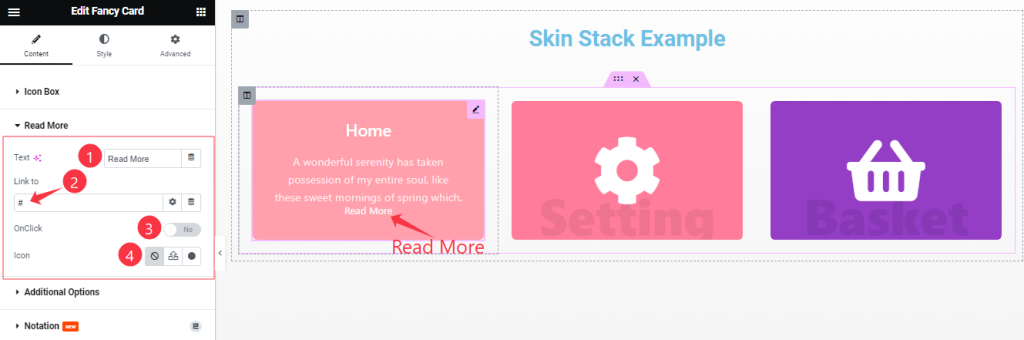
Find the Read More Button Text, Link to, Click On, and Icon options.
Badge Section
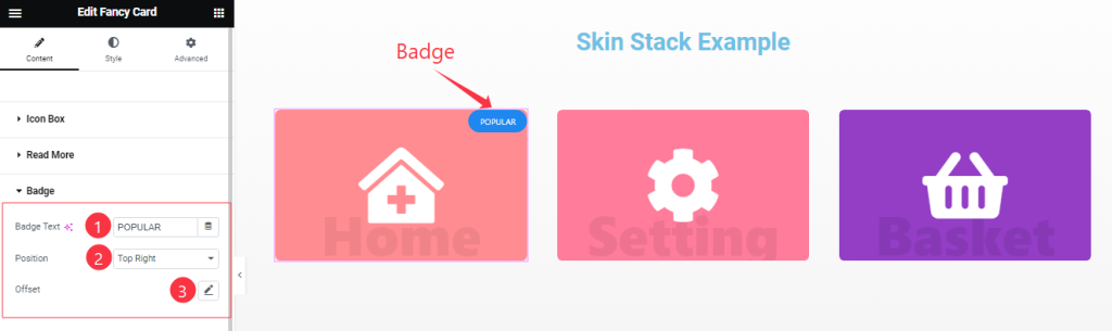
Go to Content > Badge
Here Find the Badge Text, Position (9 Positions), and Offset options.
Additional Options Section
Go to Content > Additional Options
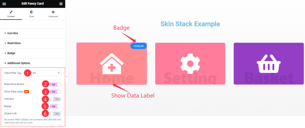
Here you will find the Title HTML Tag option at the Top and also Find the Read More Button, Show Data Label, Indicator, Badge, and Global Link switchers.
Work with The Style Tab
Style The Icon/Image Section
Go to Style > Icon/Image
Step-1
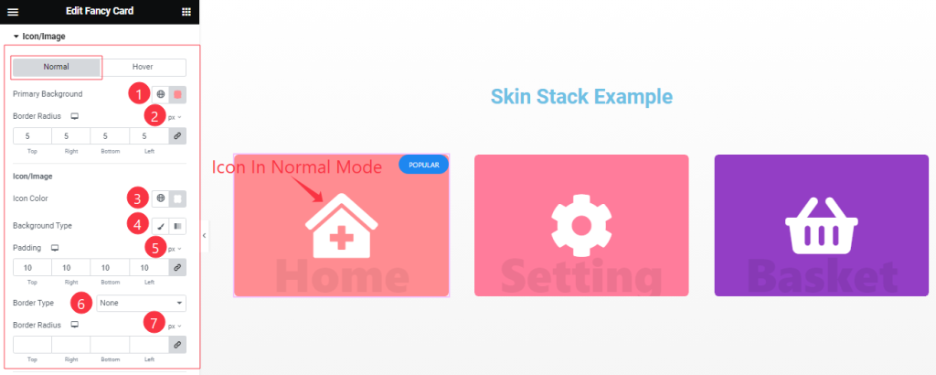
Come to the Icon/Image section, you will find two sub-sections; Normal and Hover.
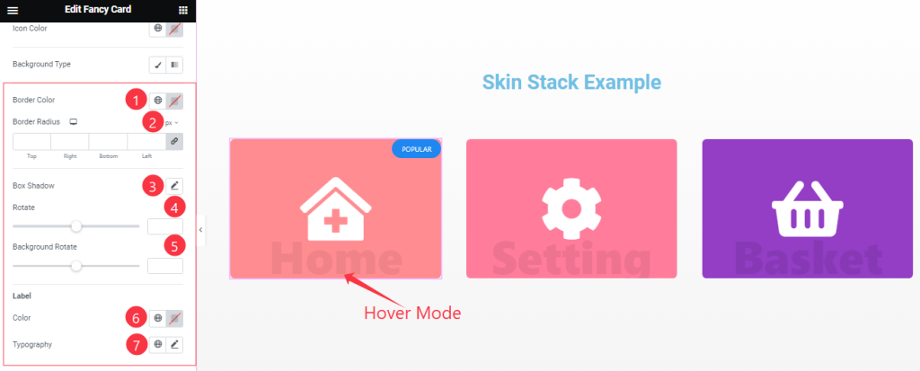
In the Normal Mode, Find the Primary Background Color, Border Radius, Icon/Image Color, Background Type ( Classic, and Gradient), Background Color, Padding, Border Type, and Border Radius options.
Step-2
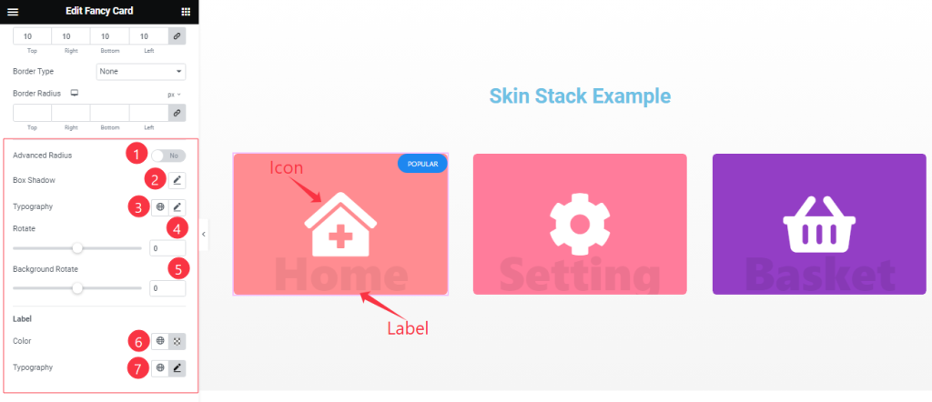
Here in Normal Mode, also Find the Advanced Radius, Box Shadow, Typography, Rotate, Background Rotate, Label Color, and Typography options.
Step-3
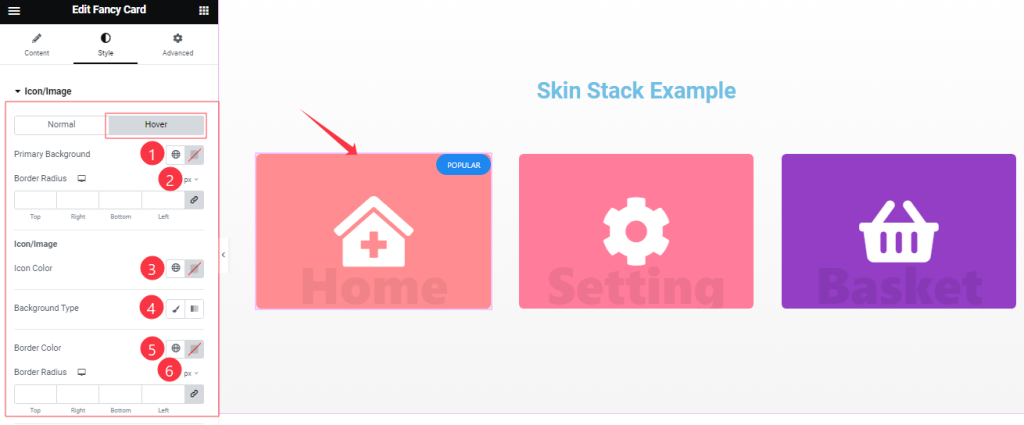
In the Hover Mode, you will get a similar customization option as in the Normal mode. So please try it yourself.
Title Section Customization
Go to Style > Title
Step-1
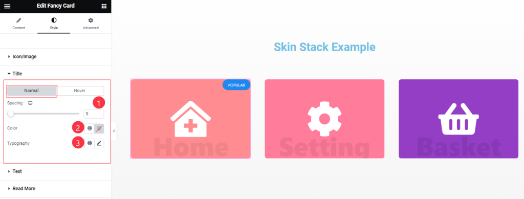
Come to the Title section, you will find two sub-sections; Normal and Hover.
In the Normal Mode, Find the Spacing, Color, and Typography options.
Step-2
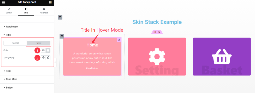
In the Hover Mode, find the Title Color, and Typography options.
Text Section Customization
Go to Style > Text
Step-1
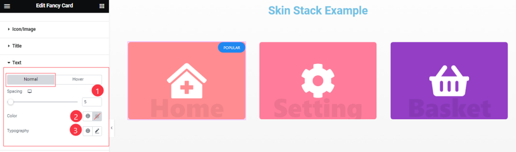
Come to the Text Section, Find the Text Color, Spacing, and Typography options.
Step-2
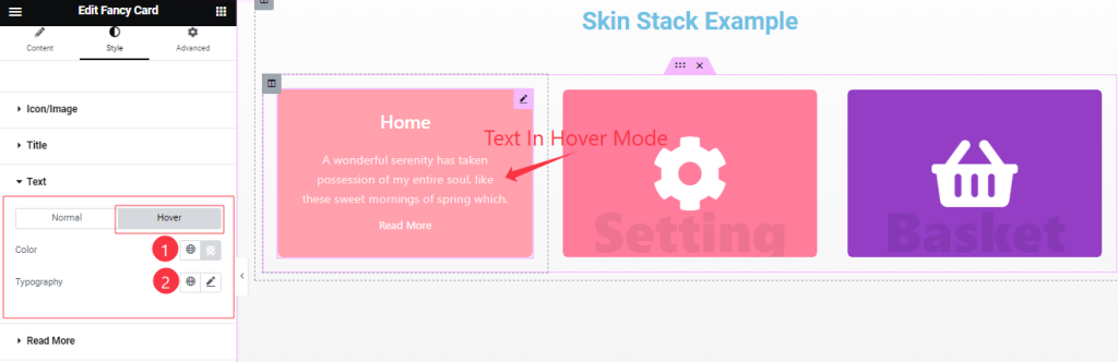
In the Hover mode, you also find the Text Color, and Typography options as in the Normal Mode.
Read More Button Section
Go to Style > Read More
Step-1
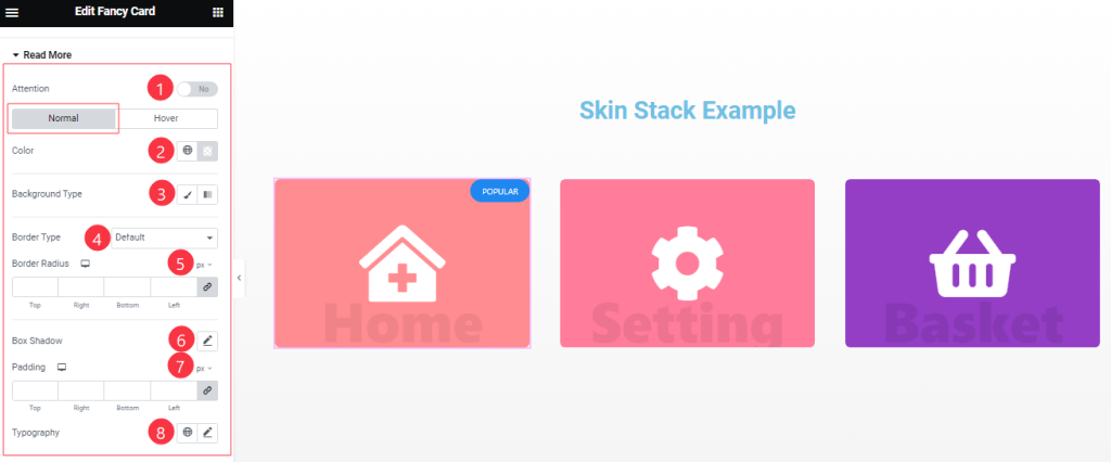
Come to the Read More section, you will find two sub-sections; Normal and Hover.
In the Normal Mode, Find the Read More Text Color, Background Type ( Classic, and Gradient), Background Color, and Image options.
Also find the Border Type, Width, Color, Border Radius, Padding, Box Shadow, and Typography options.
Step-2
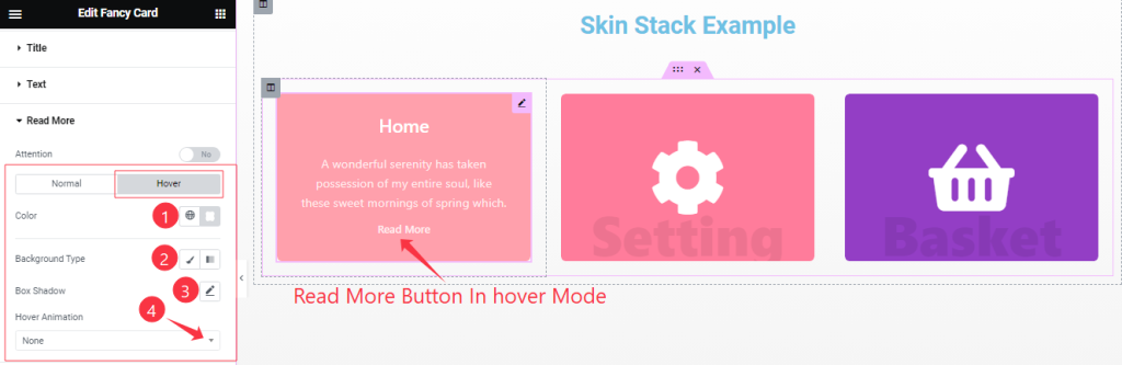
In the Hover Mode, Find the Read More button text Color, Background Type, Background Color, Box Shadow, and Hover Animation (27 Styles) options.
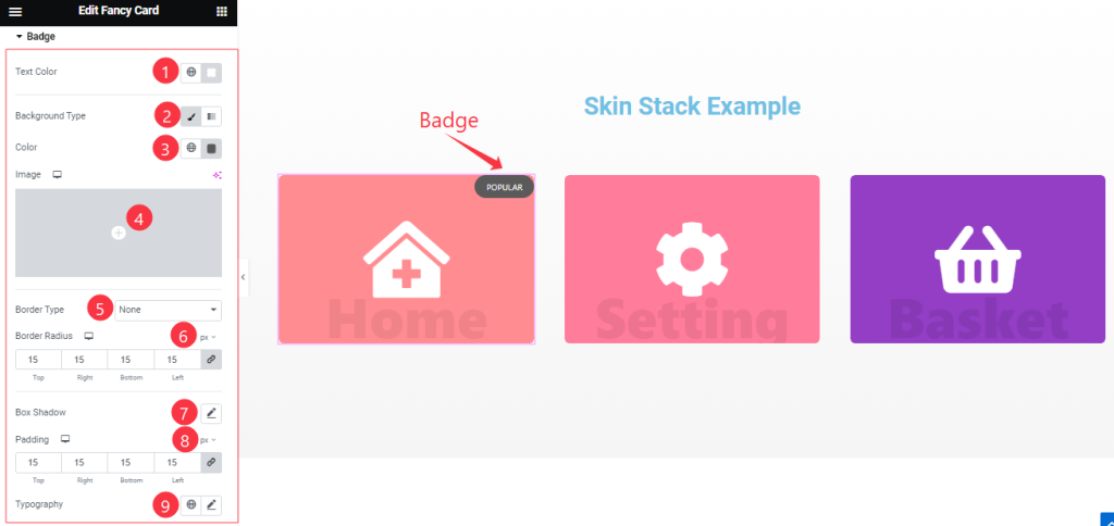
Style The Badge Section
Go to Style > Badge
Find the Badge Text Color, Background Type ( Classic, and Gradient), Background Color, and Image options.
Also find the Border Type, Width, Color, Border Radius, Padding, Box Shadow, and Typography options.
Style The Additional Section
Go to Style > Additional
Step-1
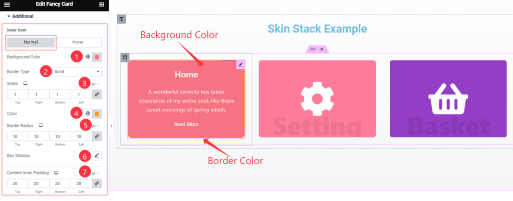
Come to the Additional section, you will find two sub-sections; Normal and Hover.
In the Normal Mode, Find the Background Color, Border Type, Width, Color, Border Radius, Padding, Box Shadow, and Content Inner Padding options.
Step-2
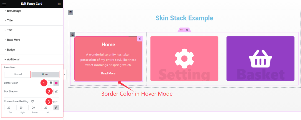
In the Hover Mode, Find the Border Color, Box Shadow, and Content Inner Padding options.
All done! You have successfully customized the Fancy Card widget on your website.
Video Assist
You can also watch the tutorial video about the Fancy Card widget. Please visit the demo page for examples.
Thanks for staying with us.
