In this documentation, we will show you how to customize the Custom Gallery widget presented by Element Pack Pro.
Inserting Widget
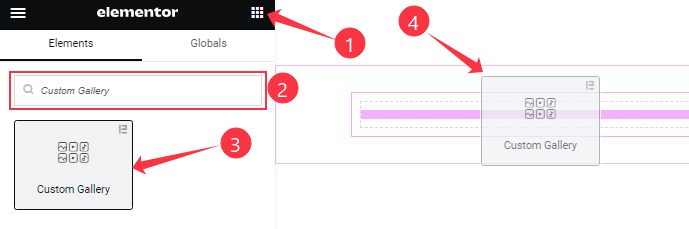
Open your page in the Elementor editor, search by the Custom Gallery widget name, then drag and drop it on the page.
Note: You need both Elementor and Element Pack Pro installed to use this widget.
Content Tab Customizations
Custom Gallery Section
Go to Content > Custom Gallery
Step-1
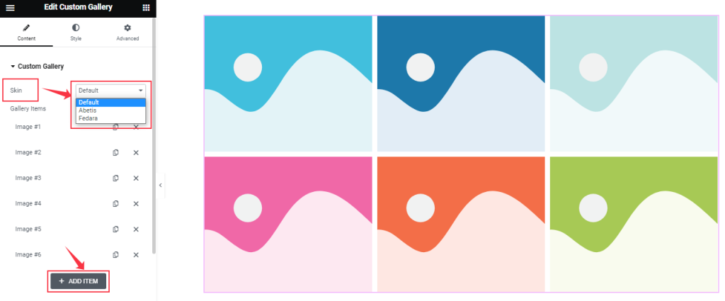
Find the Skin (Default, Abetis, and Fedara), and add Custom Gallery widget items here (with the Add Item button).
Step-2
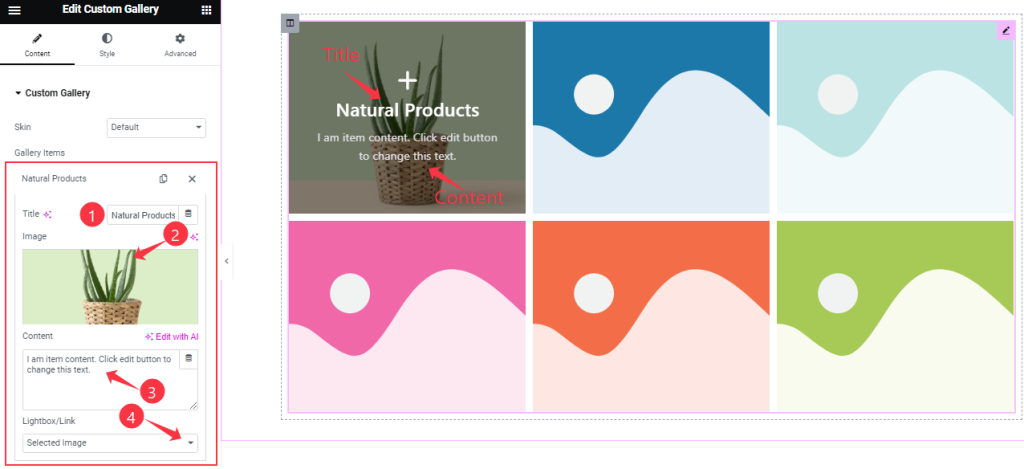
For each Gallery item, find the Item Title, Image, Content, and Lightbox/Link options.
Layout Section Customization
Go to Content > Layout
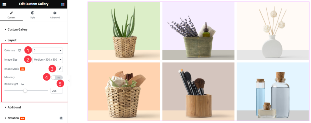
Come to the Layout section, Find the Columns, Image Size, Image Mask, Masonry, and Item Height options.
Additional Section
Go to Content > Additional
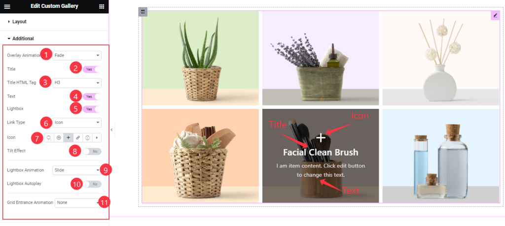
Here, find the Overlay Animation, Title HTML Tag, Link Type, Icon, Lightbox Animation, and Grid Entrance Animation options.
Also, find the Title, Text, Lightbox, Title Effect, and Lightbox Autoplay switchers.
Work with The Style Tab
Items Section
Go to Style > Items
Step-1
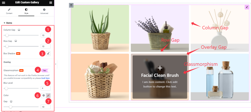
Come to the Items section and find the Column Gap, Row Gap, Box shadow, Glassmorphism, Blur Level, Color, and Gap options.
Step-2
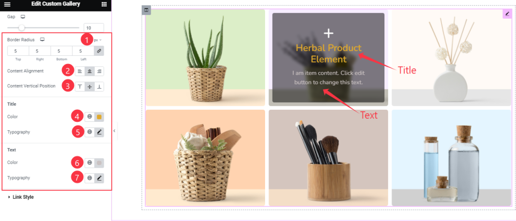
Here also Find the Border Radius, Content Alignment, Content Vertical Position, Title Color, Text Color, and Typography options.
Link Style Section
Go to Style > Link Style
Step-1
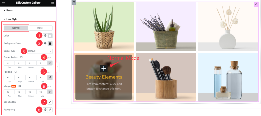
Come to the LInk Style section, you will find two sub-section; Normal and Hover.
In the Normal Mode, find the Color, Background Color, Border Type, Border Radius, Padding, Margin, Box Shadow, and Typography options.
Step-2
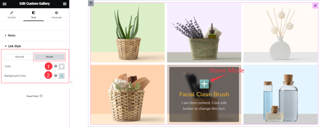
In the Hover Mode, Find the Color, and Background Color options.
All done! You have successfully customized the Custom Gallery widget on your website.
Video Assist
You can also watch the tutorial video about the Custom Gallery widget. Please visit the demo page for examples.
Thanks for staying with us.