In this documentation, we will show you how to customize/use the FAQ / Accordion / Spoiler widget presented by Element Pack Pro.
Inserting The FAQ / Accordion / Spoiler Widget
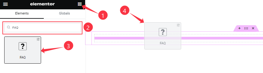
On the Elementor editor page, Just Search by the FAQ widget name and drag it and drop it on the page.
Note: You need both Elementor and Element Pack Pro installed to use this widget.
Content Tab Customizations
Layout section
Go to Content > Layout
Step-1
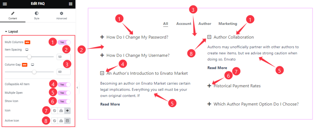
Find the Item Spacing, Column Gap, Icon, and Active Icon options.
Also, find the Multi Columns, Collapsible All Item, Multiple Open, and Show Icon switchers.
Step-2
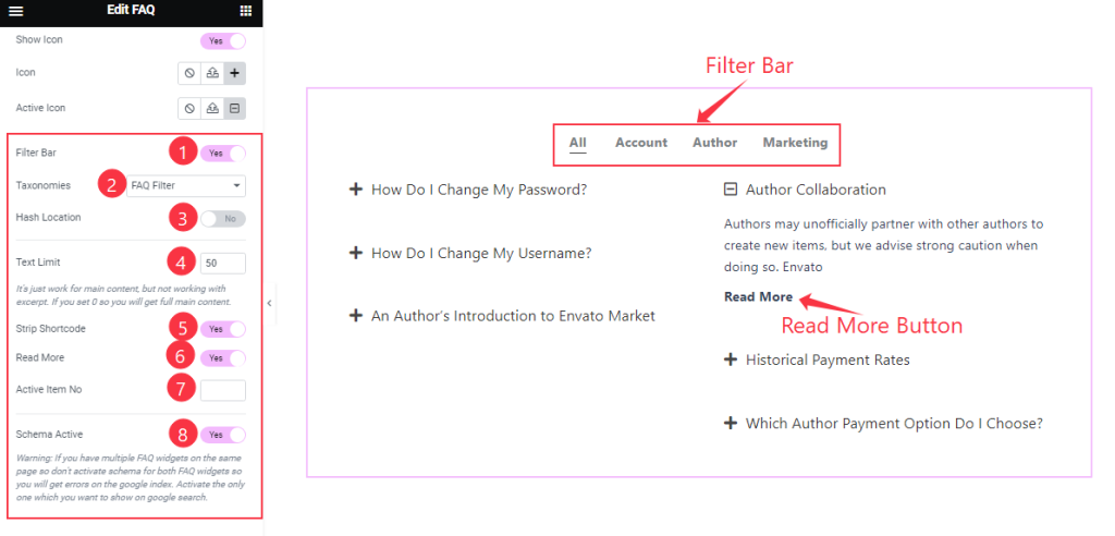
Find The Taxonomies and Active Item No Options.
Also Find The Filter Bar, Hash Location, Strip Shortcode, Read More, and Schema Active switchers.
Query Section
Go to Content > Query
Step-1
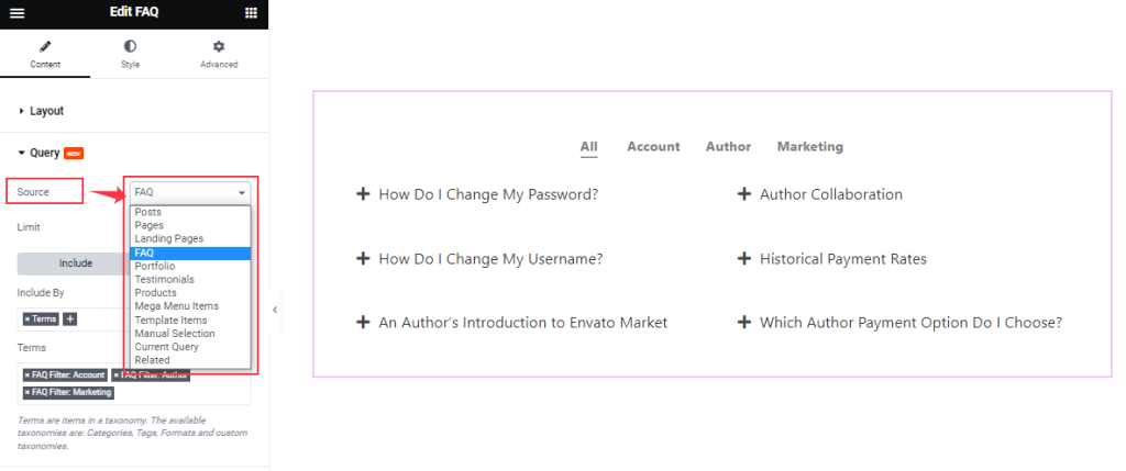
Here, you can easily select the Source of the items that you want to show. The source can be diversified according to the resources of your WordPress site.
Step-2
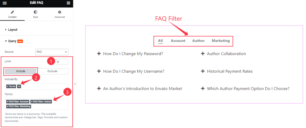
Then you can set your FAQ Limit to control the number of items to show on the Editor page. Also, you can show only selected FAQs using the Include filter.
Step-3
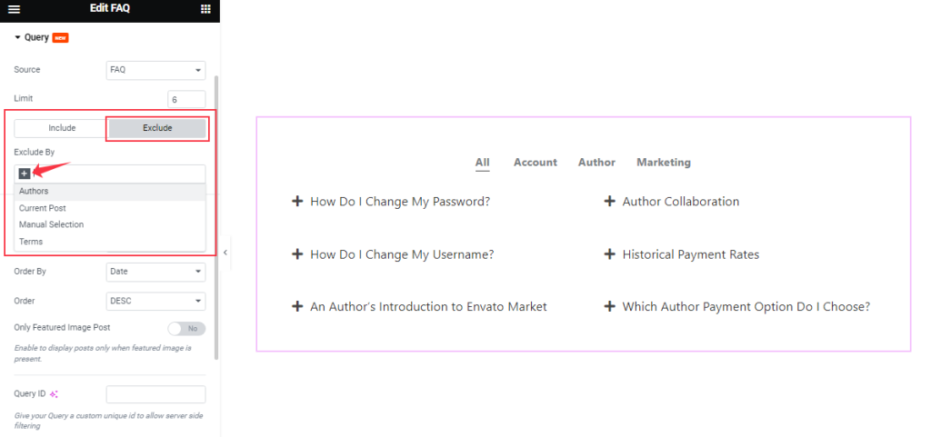
The Exclude filter works in the opposite way of the Include filter as the Exclude filter hides the selected FAQ from showing in the display.
Step-4
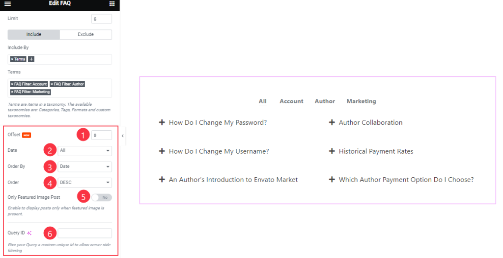
Order By and Order controls are here to arrange the data you want to display through Random, Title, Date, or Menu order wise and also with ascending or descending order.
There is one more switcher Only Featured Image Post below. With the Query ID field, you may use custom queries that you have coded inside your WP Dashboard.
Read More Button section
Go to Content > Read More Button
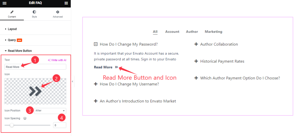
Find the Text, Icon, Icon Position (Before, After), and Icon Spacing options.
Work with The Style Tab
Title section
Go to Style > Title
Step-1
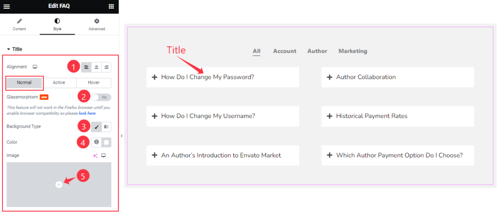
Come to the Title section, you will find three subsections; Normal, Active, and Hover.
In Normal Mode, Find the Alignment, Background Type(Classic, Gradient), and Background Color Options.
Also, find the Glassmorphism switcher.
Step-2
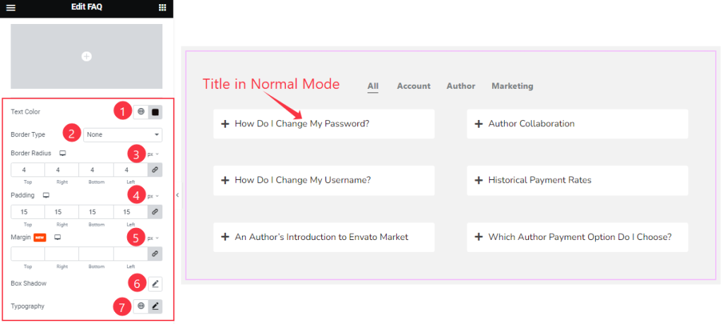
Below, you also find the Text Color, Border Type, Border Radius, Padding, Margin, Box Shadow, and Typography options.
Step-3
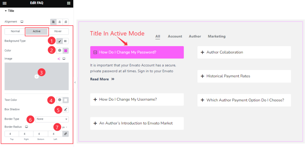
In Active Mode, find the Background Type (Classic, Gradient), Background Color, Text Color, Box Shadow, Border Type, and Border Radius options.
Step-4
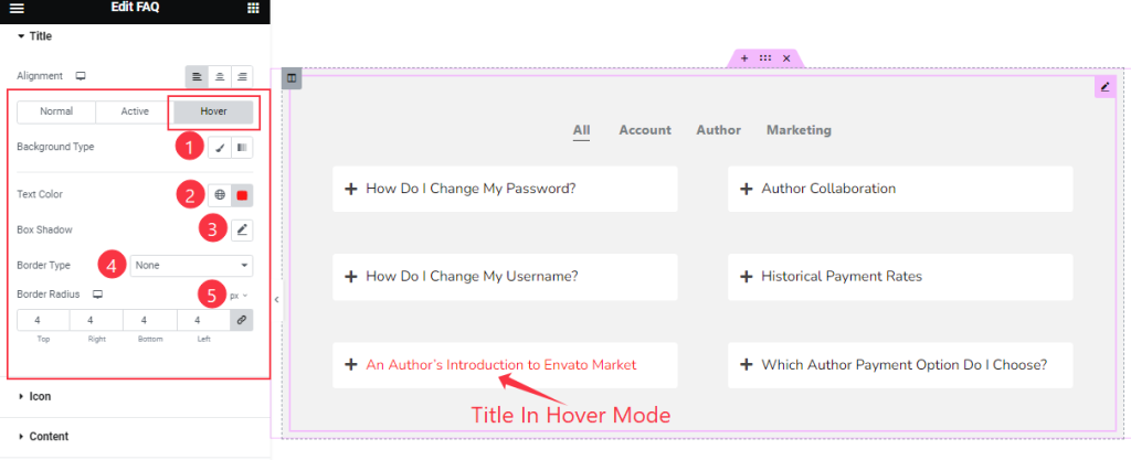
In The Hover Mode, you will get a similar set of Cotrols to customize the Hover section as in the Active Mode. So please try it yourself.
Icon section
Go to Style > Icon
Step-1
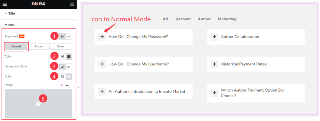
Come to the Icon section, you will find three subsections; Normal, Active, and Hover.
In Normal Mode, Find the Alignment, Icon Color, Background Type(Classic, Gradient), And Background Color Options.
Step-2
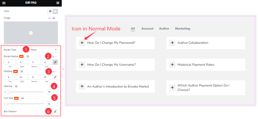
Below, you also find the Border Type, Border Radius, Padding, Spacing, Icon Size, and Box Shadow options.
Step-3
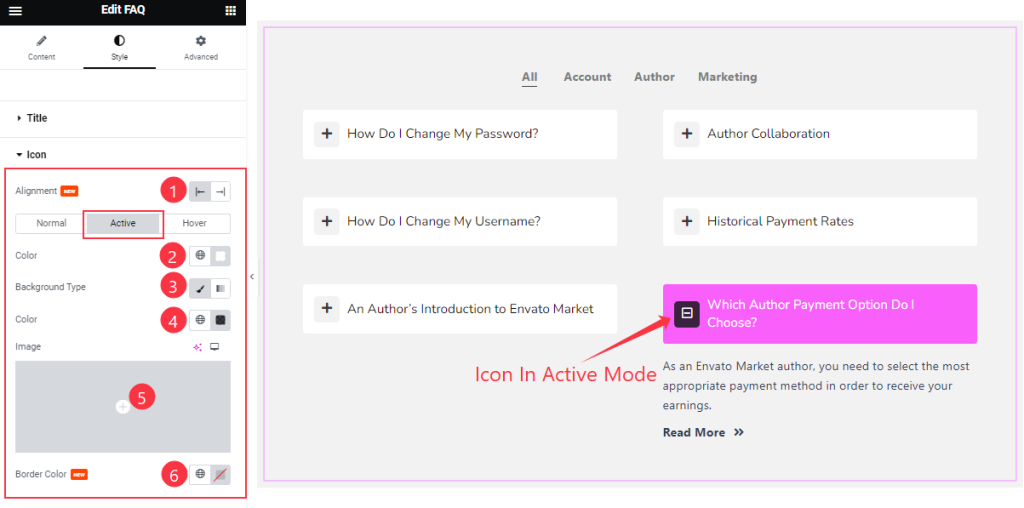
In Active Mode, Find the Icon Color, Background Type (Classic, Gradient), Background Color, and Border Color options.
Step-4
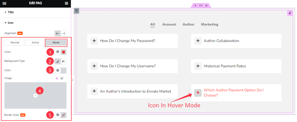
In The Hover Mode, you will get a similar set of Cotrols to customize the Hover section as in the Active Mode. So please try it yourself.
Content section
Go to Style > Content
Step-1
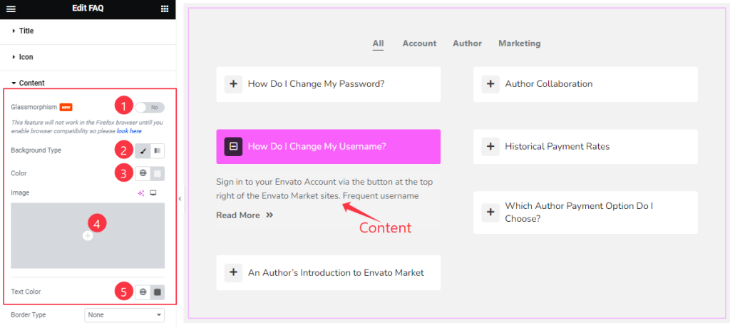
Come to the Content section, Find the Glassmorphism switcher at the top. Then find the Background Type (Classic and Gradient), Background Color, and Text Color options.
Step-2
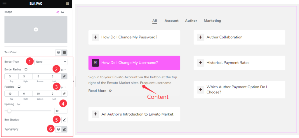
Here also find the Border Type, Border Radius, Padding, Spacing, Box Shadow, and Typography options.
Filter Bar section
Go to Style > Filter Bar
Step-1
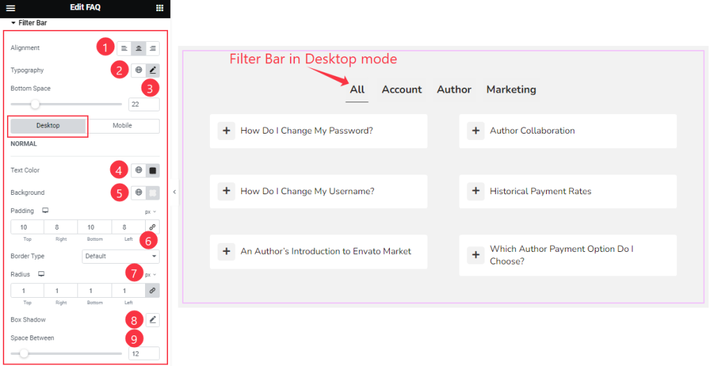
Come to the Filter Bar section, you will find two subsections; Desktop and Mobile.
In Desktop Mode, find the Alignment, Typography, Button Space, Text Color, Background Color, Padding, Border Type, Radius, Box Shadow, and Space Between options.
Step-2
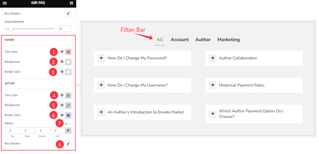
Here Find also Hover (Text Color, Background Color, Border Color), Active ( Text Color, Background Color, Border Color), Radius, and Box Shadow options.
Step-3
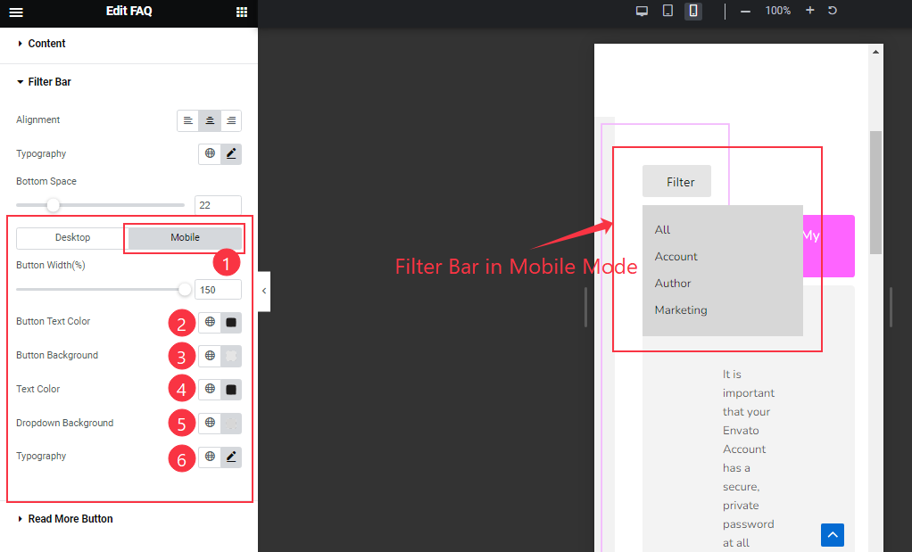
In Mobile Mode, Find the Button Width, Button Text Color, Button Background, Text Color, Dropdown Background, and Typography options.
Read More Button section
Go to Style > Read More Button
Step-1
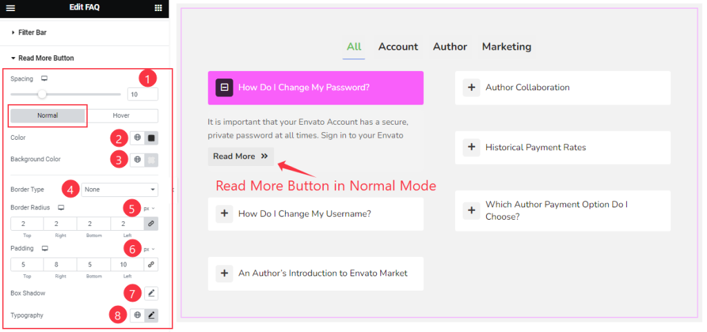
Come to the Read More Button section, you will find two subsections; Normal and Hover.
In Normal Mode, find the Spacing, Color, Background Color, Border type, Border Radius, Padding, Box Shadow, and Typography options.
Step-2
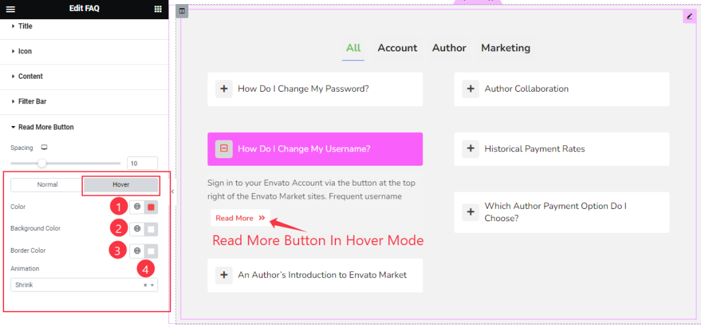
In Hover Mode, also Find the Button Text Color, Background Color, Border Color, and Animation options.
All done! You have successfully customized the FAQ / Accordion / Spoiler widget on your website.
Video Assist
You can watch the video above to learn about the FAQ / Accordion / Spoiler widget. Please visit the demo page for examples.
Thanks for staying with us.