In this documentation, we will show you how to customize the Carousel widget brought to you by the Element Pack Pro addon.
Inserting Widget
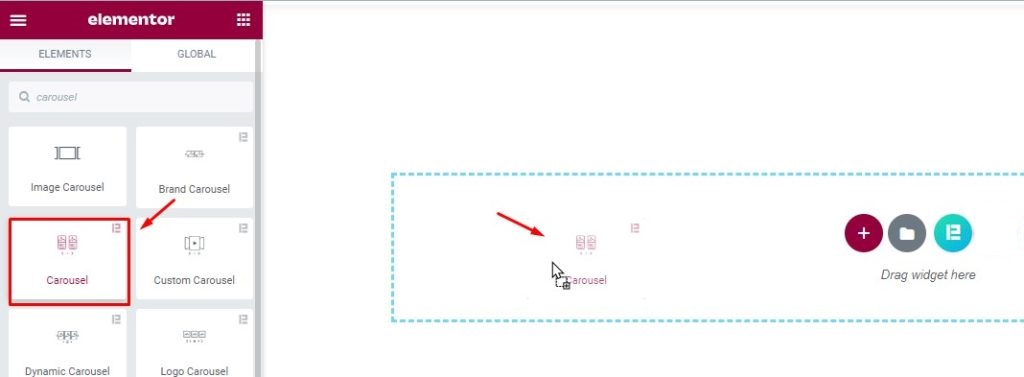
Select the Carousel widget and just drag and drop it on the Element editor page. Make sure you have enabled the widget from within the Element Pack Pro dashboard beforehand.
Default view of the widget
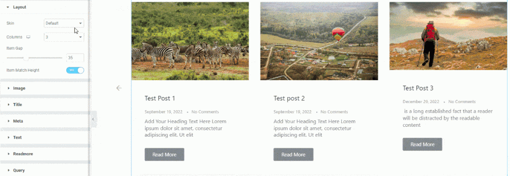
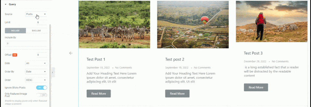
The widget contains post image, title, meta, description, and read more button.
Get introduced to the Content tab
Layout section
Go to Content > Layout
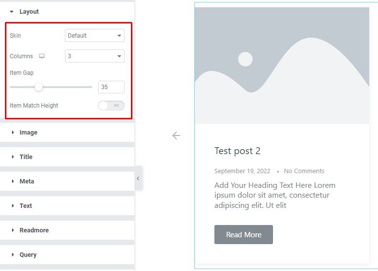
Find the Skin (default, vertical, alice, & ramble), Columns, Item Gap, and Item Match Height options.
Image section
Go to Content > Image
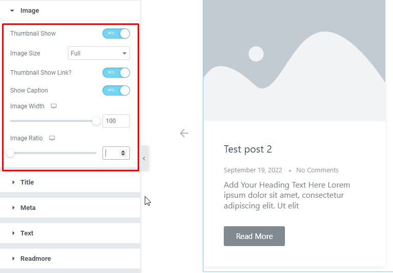
Find the Thumbnail show, Image size, Thumbnail Show Link?, Show Caption, Image width, and Image Ratio options.
Title section
Go to Content > Title
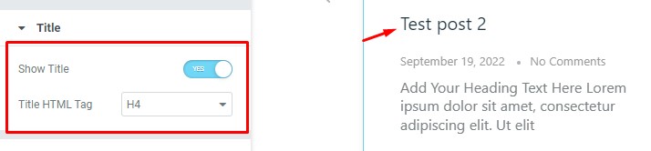
Find the Show Title and Title HTML Tag options.
Meta section
Go to Content > Meta
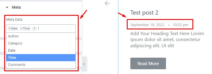
Find the Meta Data (Author, Category, Date, Time, Comments) option.
Text section
Go to Content > Text
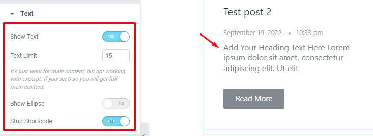
Find the Show Text, Text Limit, Show Ellipse, and Strip Shortcode options.
Readmore section
Go to Content > Readmore
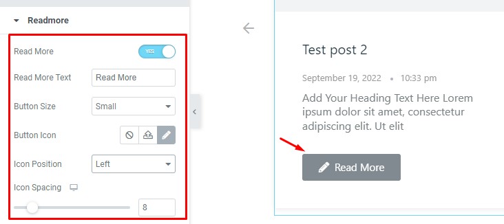
Find the Read More switcher, Read More Text field, Button size (Extra small, small, Medium, Large, & Extra Large), Button Icon, Icon Position, and Icon Spacing options.
Query section
Go to Content > Query
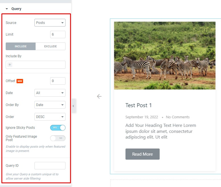
Find the Source (Posts, Pages, Landing Pages, FAQ, Portfolio, etc.) and Limit options.
Also, find the Include > Include By and Terms filters. Include filter helps show only selected posts.
Exclude filter does exactly the opposite of the Include filter and helps hide selected posts.
Then find the Offset, Date, Order By, Order, Ignore Sticky Posts, Only Featured Image Post, and Query ID options.
Navigation section
Go to Content > Navigation
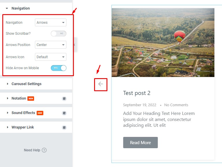
Find the Navigation (arrows, dots, progress, arrows & dots, and arrows & fraction), Show Scrollbar, Arrows Position , Arrows Icon, and Hide Arrow on Mobile options.
Carousel Settings section
Go to Content > Carousel Settings
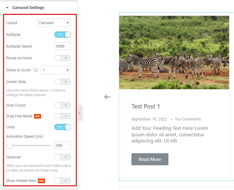
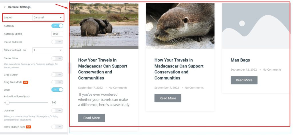
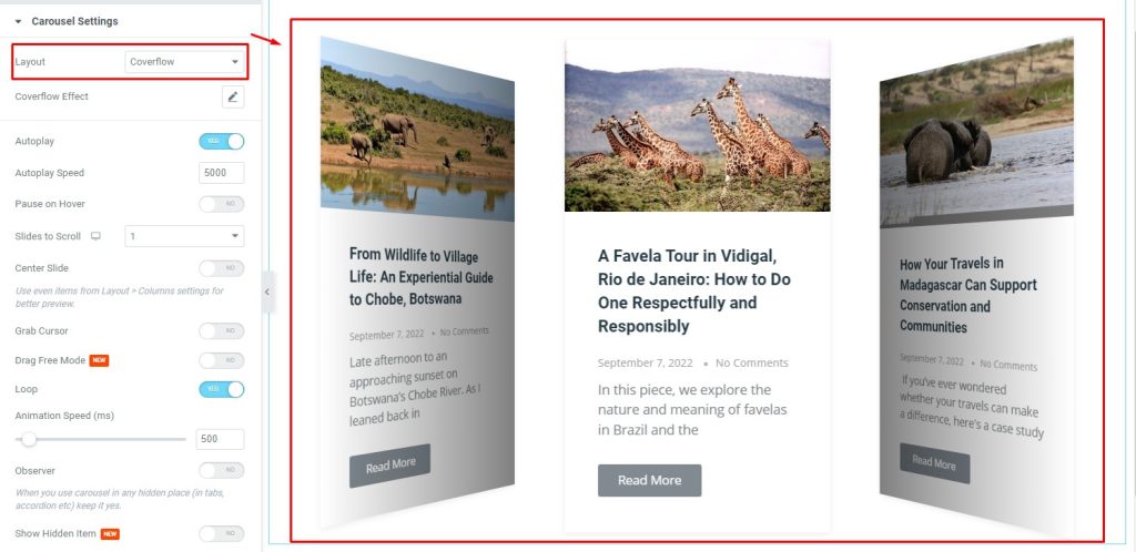
Here, the Layout option offers two unique content layout styles.
1. Carousel
2. Coverflow
Also, find the Autoplay and Autoplay speed, Pause on hover, Slider to Scroll, Center Slide, Grab Cursor, Drag Free Mode, Loop, and Animation speed options.
Style Tab Customizations
Items section
Go to Style > Items
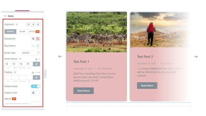
Find the Alignment (Left, Center, Right) option at the top.
In Normal mode, find the Background color, Box Shadow, Border Type, Border Radius, Padding, Shadow Mode, Shadow color, and Opacity options.
Image section
Go to Style > Image
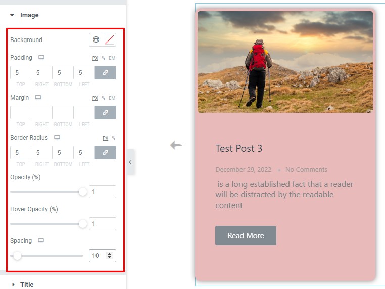
Find the Background color, Padding, Margin, Border Radius, Opacity, Hover Opacity, and Spacing options.
Title section
Go to Style > Title
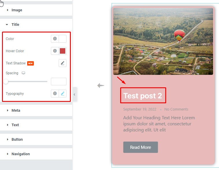
Find the Color, Hover Color, Text Shadow, Spacing, and Typography options.
Meta section
Go to Style > Meta
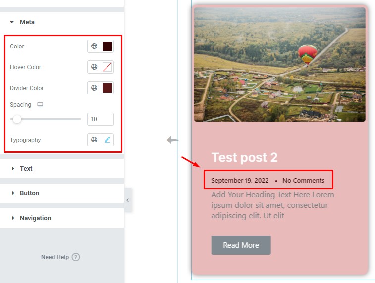
As you see Meta Tag there you can add your own Color, Hover Color, Divider Color, Spacing, And Typography.
Text section
Go to Style > Text
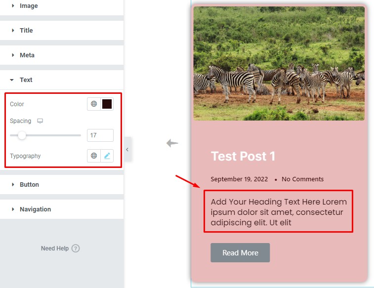
Text can be made more styled using Color, Spacing, and Typography.
Button section
Go to Style > Button
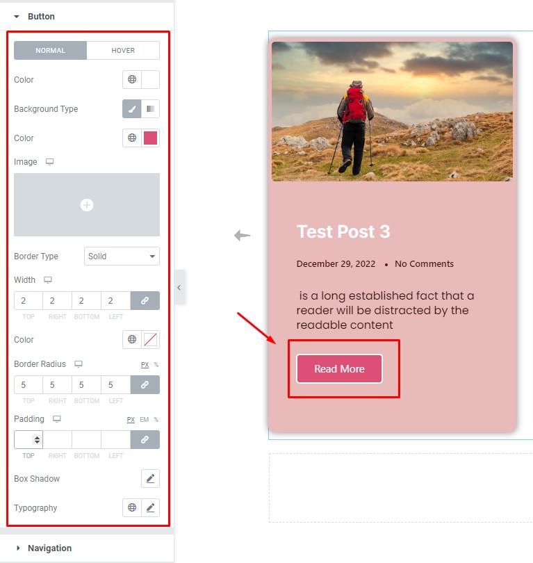
Make the button look more interactive and stylish. It has Two modes Normal and Hover. Add Button Text Color and Background Color using Image (Instead of Color). Border Type, Width, Color, and Border Radius make borders more interactive. For space between text and area, you can add Padding. Box shadow Whole button makes a shadow. Typography for changing Font several options.
Navigation section
Go to Style > Navigation
ARROWS
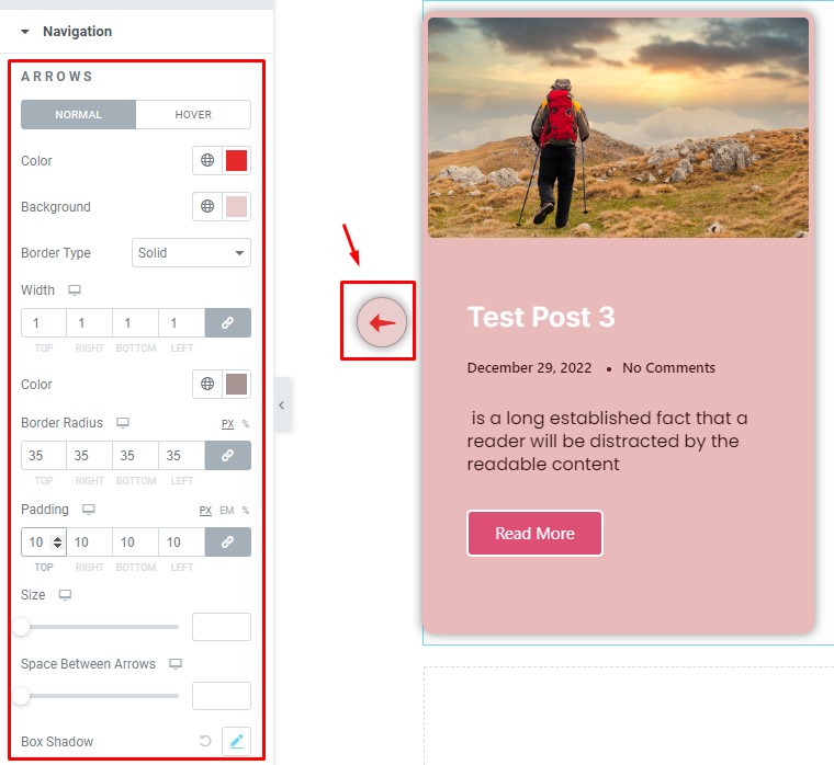
Let’s Work with Arrows. Here also has two Magical Options ( Normal and Hover ). You can add Color, Background, Border Type, Width, Color, Border Radius, and Padding. You can add Size, Space Between Arrows, and Box Shadow.
DOTS
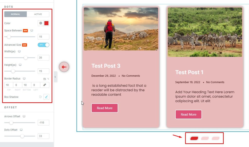
You can Make DOTS more stylish (Normal and Activate). Color, Space Between, Advanced Size ( Width, Height) , Border Radius, Box Shadow by following this.
OFFSET
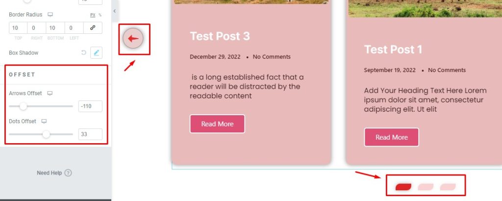
Here you can select OFFSET for Arrows and Dots. You can change position for this option.
Video Assist
Find this whole documentation in the video to learn about the Carousel widget by Element Pack.
You can also visit the demo page for examples.
Thanks for being with us.