In this documentation, we will discuss the customization of the Brand Carousel block, brought to you by Zoloblocks.
Enable the Brand Carousel Block
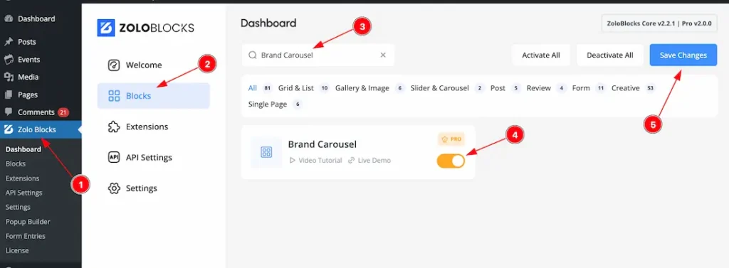
To use the Brand Carousel block from Zoloblocks, you must first enable the block.
- Go to WordPress Dashboard > Zoloblocks Plugin dashboard.
- Then Click the Blocks Tab.
- Search the Brand Carousel block Name.
- Enable the Brand Carousel block.
- Hit the Save Button.
Inserting The Block into the Editor
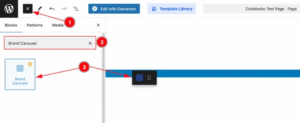
- Click the Toggle Block Inserter icon and a sidebar will appear on the left side, All the blocks will be visible here.
- Search the Brand Carousel Block Name inside the search Box. otherwise, select the Icon blocks ( with Zoloblocks logo T.R corner).
- Then Drag and Drop it on the page.
Basic Tab Customization
The Basic tab controller displayed here offers the flexibility to adjust the layout of blocks according to your preferences.
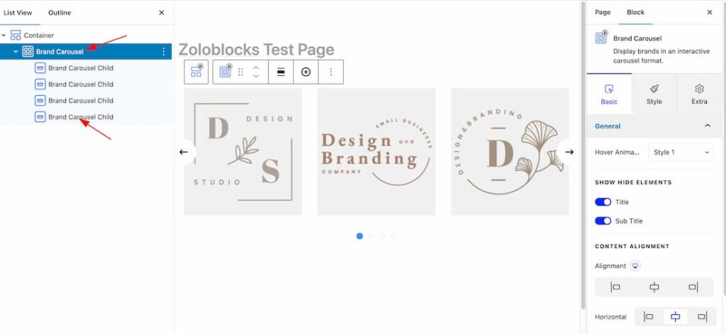
After inserting the Brand Carousel block, you will get the parent & Child option to customize the block.
We will show how to customize the block as parent and child both. Lets explore the features-
Customize as Parent
General Section
Go to Basic > General
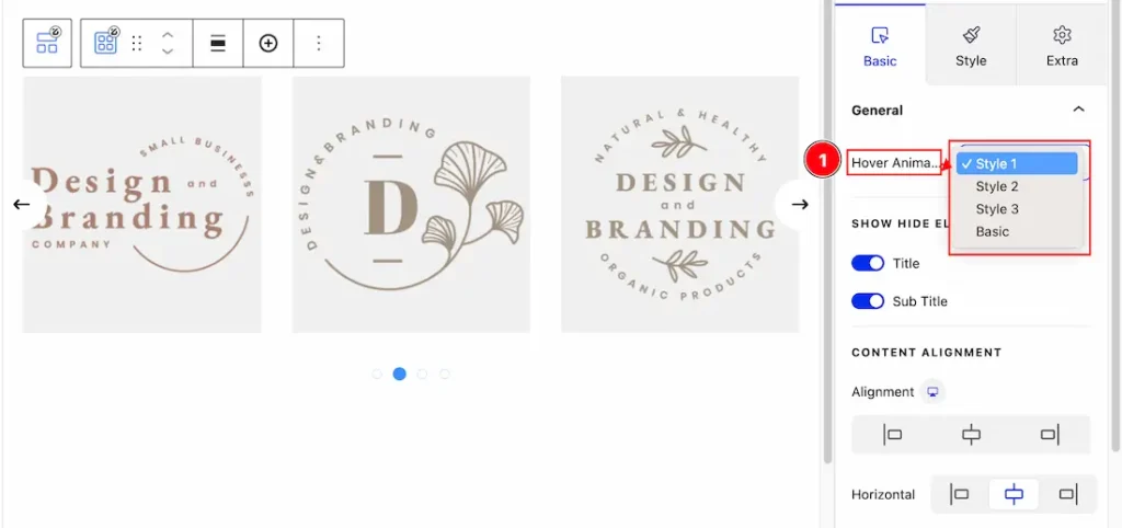
1. Hover Animation: Come to the Hover animation section, you will get 4 hover styles. Like – Style 1, Style 2, Style 3, & Basic. Please check it.
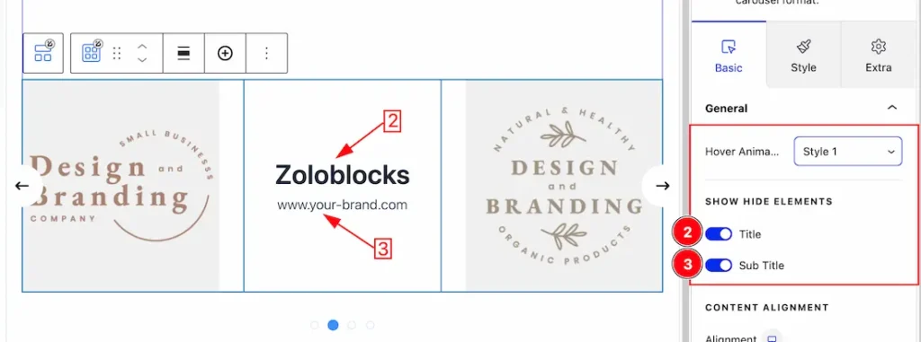
2. Title: Enable/Disable the Title switcher button to show/hide the title from Carousel.
3. Sub Title: Enable/Disable the Sub Title switcher button to show/hide the sub title from Carousel.
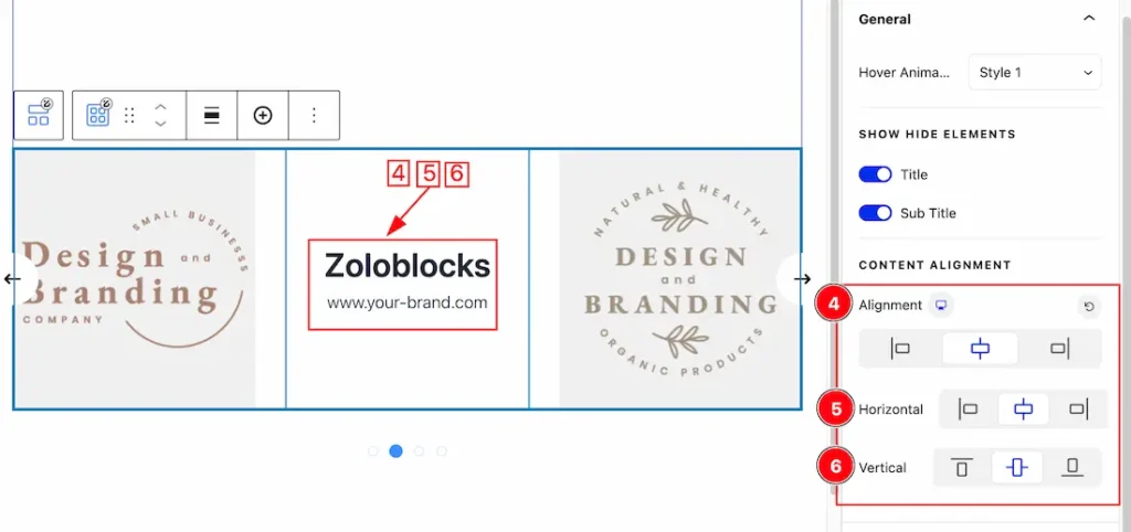
4. Alignment: You can set the Content Alignment as – Left, Center, & Right.
5. Horizontal: This option lets you set the Horizontal alignment.
6. Vertical: This option lets you set the Vertical alignment.
Carousel Option Section
Go to Basic > Carousel Option
Come to the Carousel options section, you will get the below customization options-
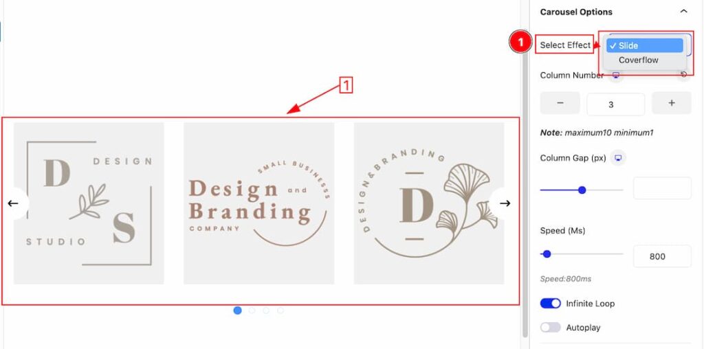
1. Select Effect(Slide): From here you can set the carousel effect type – Slide & Coverflow. First here, we have seen the Slide effect.
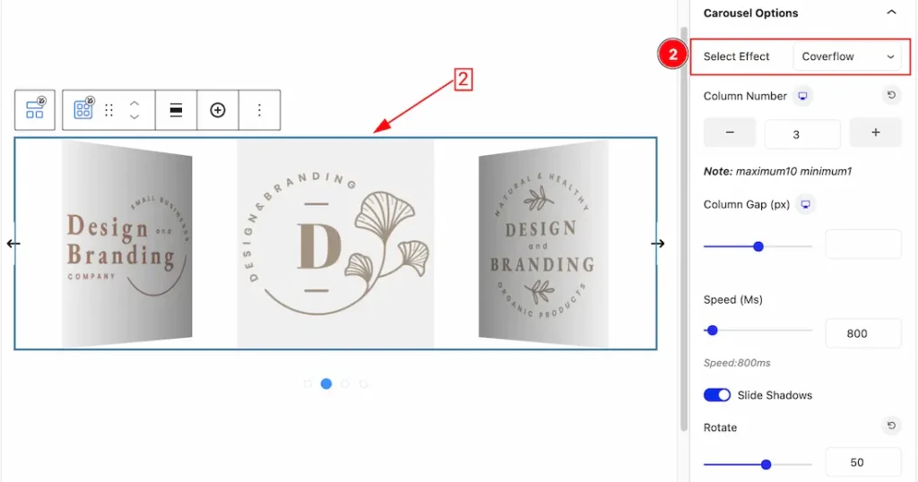
2. Select Effect(Coverflow): You can also set the effect type – Coverflow.
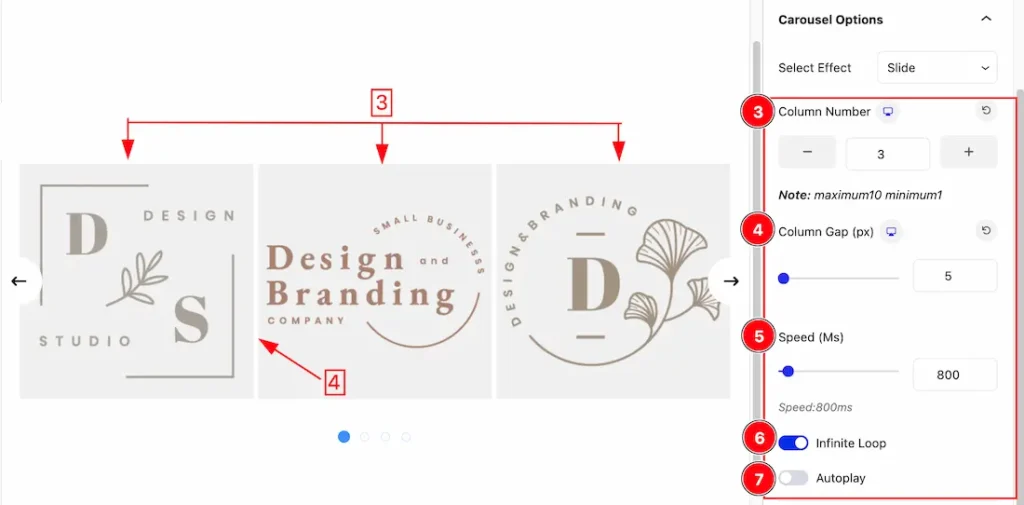
3. Columns: You can set the number of columns to show the carousel. Here we set the columns -3.
4. Column Gap: This option lets you set the carousel Column gap.
5. Speed: This option lets you set the slider speed.
6. Infinite Loop: An infinite loop option allows content to cycle endlessly without interruptions, creating a smooth browsing experience. It keeps users engaged by avoiding abrupt stops or empty endpoints. From here you can enable or disable the feature.
7. Autoplay: The autoplay feature allows automatically showcase content without user interaction, capturing attention instantly. From here you can enable or disable the feature.
Navigation Section
Go to Basic > Navigation
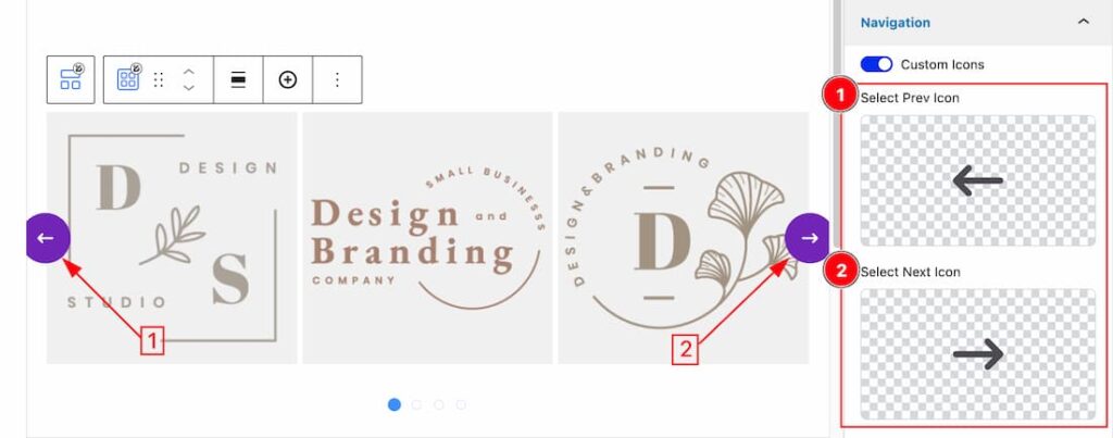
Come to the Navigation section, you can choose the custom icons for the Navigation.
1. Select Prev Icon: This option lets you to set the prev icon for the Navigation.
2. Select Next Icon: This option lets you to set the Next icon for the Navigation.
Work with The Style Tab
Container Section
Go to Style > Container
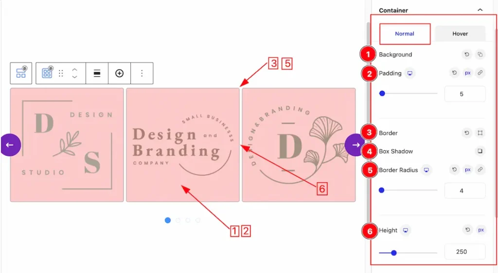
Come to the Container section, you will get two subsections; Normal & Hover.
In the Normal subsections, you will get the below options-
1. Background: you can change the color of any object background to classic or gradient. Here we choose the Background type Classic.
Background Color: This lets you change the Background color. If you want, you also can change an image to the Background.
2. Padding: Add spaces around an object to increase the inner area. Padding allows you to control the internal space within an element.
3. Border: Border Type: you can set the Border Type to Default, None, Solid, Double, Dotted, Dashed, or Groove. We choose here the Border Type Solid.
Border Width: The border width property allows you to control how thick or thin the border is.
Border Color: This lets you change the Border color.
4. Box Shadow: The Box Shadow property is used to create the shadow around the Category Button. It takes Four values: Horizontal offset, Vertical offset, blur, and Spread to customize the Box shadow.
Position: you can set the Box Shadow position Outline and Inset. Here we set the Box Shadow position Outline.
Box Shadow Color: This lets you change the Box Shadow color.
5. Border Radius: Customizes the border corners for roundness.
6. Height: This option lets you change the Carousel Height.
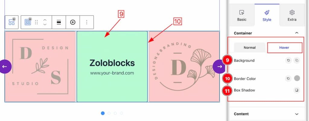
In the Hover subsections, you will get the below options-
9. Background: This option lets you change the Hover Background color.
10. Border Color: This option lets you change the Hover Border color.
11. Box Shadow: This option lets you add the Hover Box Shadow.
Content Section
Go to Style > Content
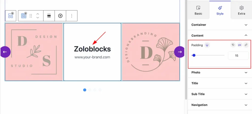
Padding: This option lets you add the Content Padding.
Photo Section
Go to Style > Photo
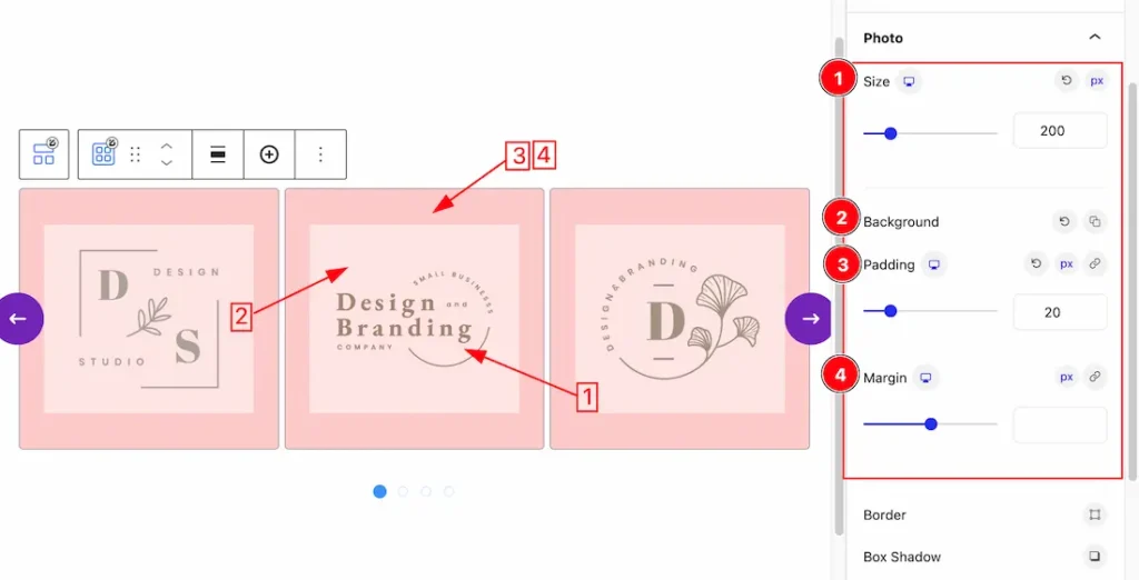
1. Size: This option lets you change the Photo Size.
2. Background: This option lets you set the Photo Background Color.
3. Padding: Set the padding from here for the photo.
4. Margin: Set the Margin from here for the photo.
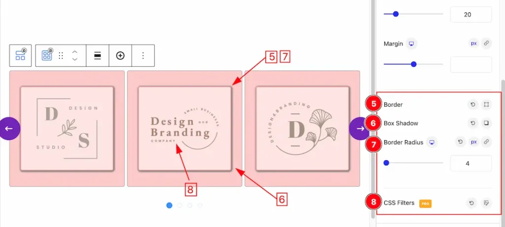
5. Border: Set the Border Type, color, Border Width from here for the photo.
6. Box Shadow: This option lets you add the Box Shadow for the photo.
7. Border Radius: Customizes the border corners for roundness.
8. Css Filter: You can customize the Blur, Brightness, Contrast, Saturate, & Hue Rotate option for the photo. Lets explore the details-
Blur: Controls the amount of Gaussian blur applied to the elements. A higher value results in a more blurred appearance.
Brightness: Adjusts the brightness of the elements. The default value is 100%. Lowering it darkens the image, and increasing it brightens it.
Contrast: Changes the difference between light and dark colors. Values below 100% reduce contrast, and values above 100% increase it.
Saturate: Modifies the color intensity. The default is 100%, where higher values create more vibrant colors, and lower values lead to muted tones.
Hue Rotate: Shifts the colors along the hue wheel by the specified degree, creating artistic color variations.
Title Section
Go to Style > Title
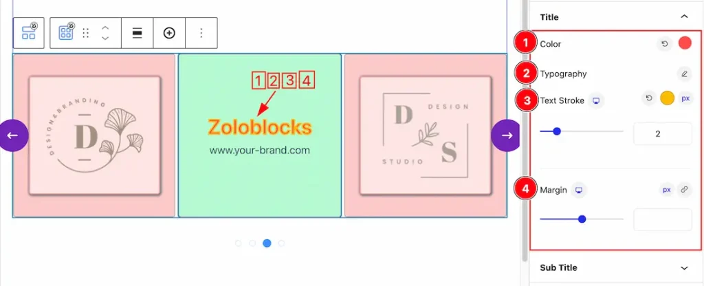
1. Color: This option lets you change the Title Color.
2. Typography: Change the font family, size, weight, style, transform, decoration, line height, letter spacing, and word spacing from here for the Title.
3. Text Stroke: If you want to add a stroke (outline) around the text, you can use the Text Stroke property. you also can change the Text Stroke Color as your working demand.
4. Margin: Adjusts the position of an object over the canvas.
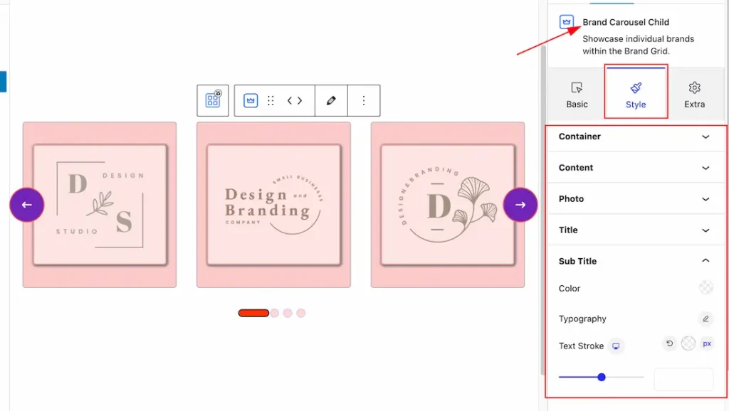
Sub Title Section
Go to Style > Sub Title
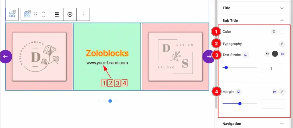
1. Color: This option lets you change the Sub Title Color.
2. Typography: Change the font family, size, weight, style, transform, decoration, line height, letter spacing, and word spacing from here for the Sub Title.
3. Text Stroke: If you want to add a stroke (outline) around the text, you can use the Text Stroke property. you also can change the Text Stroke Color as your working demand.
4. Margin: Adjusts the position of an object over the canvas.
Navigation Section
Go to Style > Navigation
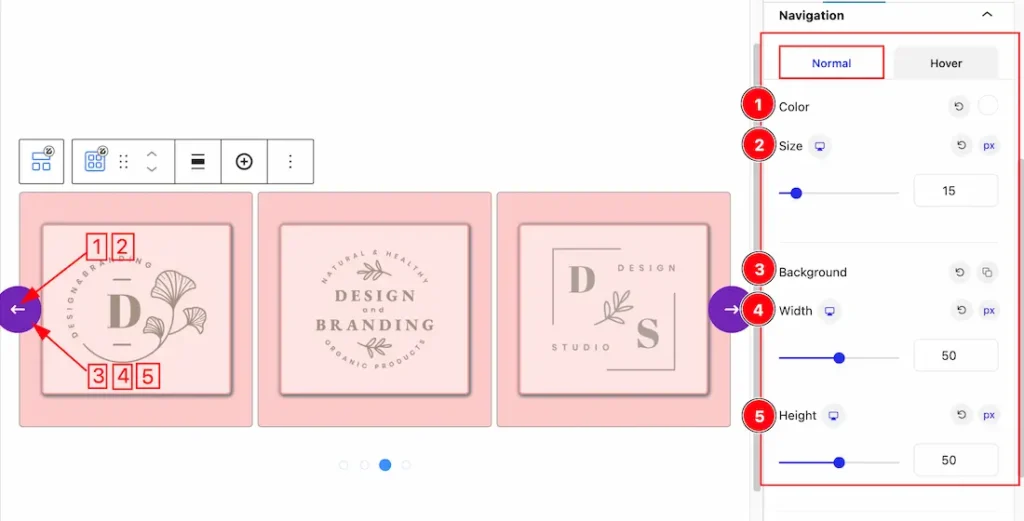
Come to the Navigation section, you will get two subsections; Normal & Hover.
In the Normal subsections, you will get the below options-
1. Color: This option lets you set the Navigation Normal Color.
2. Size: This option lets you set the Navigation Size.
3. Background: This option lets you add the Navigation Normal Background Color.
4. Width: You can set the Navigation Width from Here.
5. Height: You can set the Navigation Height from Here.
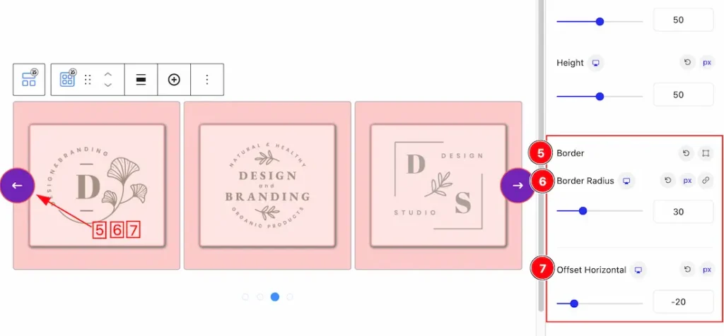
5. Border: Set the Border Type, color, Border Width from here for the Navigation.
6. Border Radius: Customizes the border corners for roundness.
7. Offset Horizontal: This option lets you set the Horizontal offset for the Navigation.
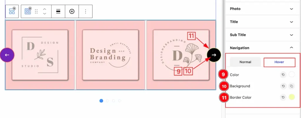
In the Hover subsections, you will get the below options-
9. Color: This option lets you set the hover naviagtion color.
10. Background: This option lets you set the Hover navigation Background color.
11. Border Color: This option lets you change the Hover Border color.
Pagination Section
Go to Style > Pagination
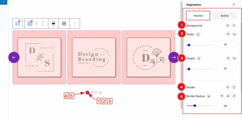
Come to the Pagination section, you will get two subsections; Normal & Hover.
In the Normal subsections, you will get the below options-
1. Background: This option lets you set the Pagination Background normal color.
2. Width: This option lets you set the width of the Pagination.
3. Height: This option lets you set the Height of the Pagination.
4. Border: Set the Border Type, color, Border Width from here for the Pagination.
5. Border Radius: Set the Pagination border redius.
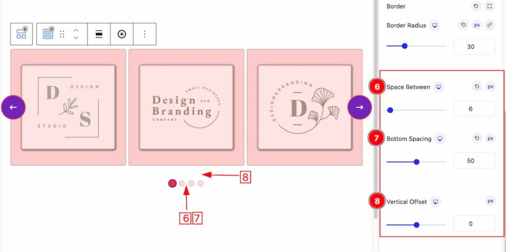
6. Space Between: This option lets you set the space between pagination & carousel items section.
7. Bottom Spacing: This option lets you set the bottom spacing of the pagination.
8. Vertical Offset: You can set the pagination vertical offset from here.
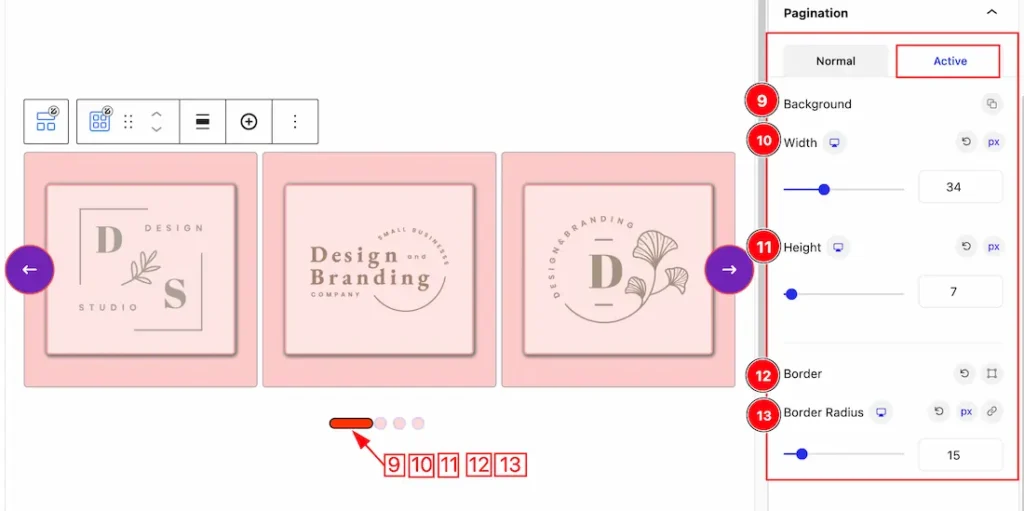
Come to the Active subsection, you will get the same customization options as like normal mode. So please try it yourself.
Customize as Child
The Child customization feature lets you customize the induvisual carousel item. When click over the carousel item then you will get the induvisual customization option for the selecting carousel item. Lets explore the feature.
Layout Section
Go to Basic > Layout
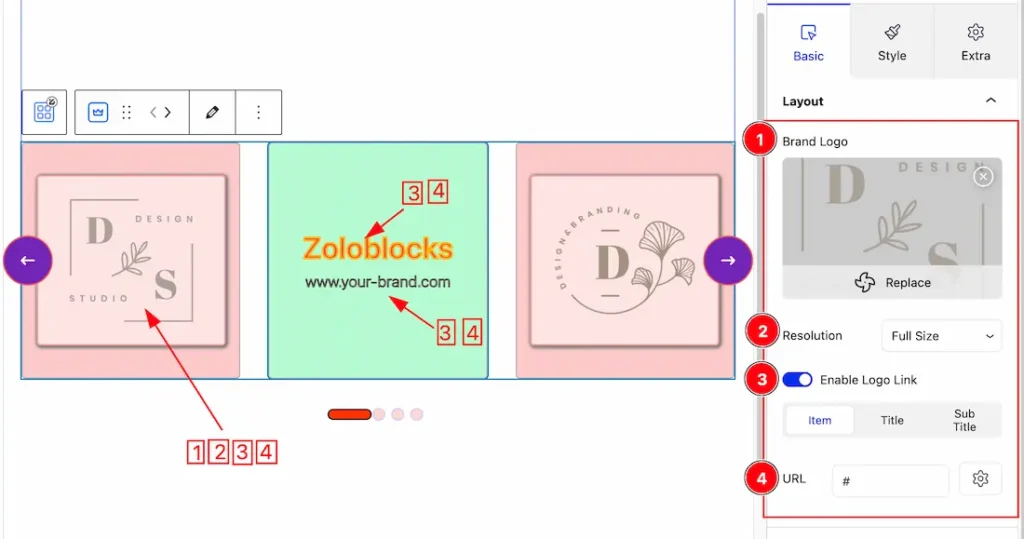
1. Brand Logo: This option lets you change the Brand Logo for the selected carousel item.
2. Resolution: You can set the Carousel Image resolution from here.
3. Enable Logo link: Enable or disable the logo link switcher button to show/hide the logo link from Item, Title, or Sub Title.
4. URL: After enabling the logo link switcher button then the URL option will appear. This URL option lets you set a link under Item, Title, or sub title.
Content Section
Go to Basic > Content
Come to the Content section, you will get the below customization options-
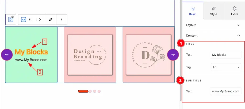
1. Title Text & Tag: This option lets you change the Title Text & Tag for the Carousel selected item.
2. Sub Title Text: This option lets you change the Sub Title Text for the Carousel selected item.
Work with Style Tab For Induvisual Carousel Item
Come to the Child Style tab customization section, you will get the same customization options as like in the parent style tab section. So please try it yourself.
Extra Tab Controls
The extra tabs provide the controls of any blocks. You can make different visual layouts by following these Controls.
Click to learn more>>.
Video Assist
You can also watch the video tutorial Learn more about the Brand Carousel Block. Please visit the demo page for examples.
Thanks for being with us.