In this documentation, we will show you how to customize the Mini Cart widget by Ultimate Store Kit.
Enable the Mini Cart Widget
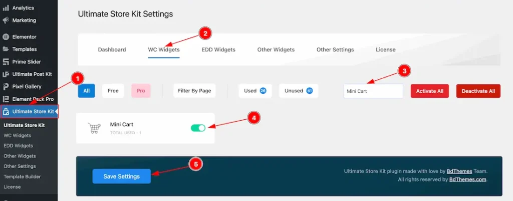
To use the Mini Cart widget by Ultimate Store Kit, first, you have to enable the widget.
- Go to WordPress > Ultimate Store Kit Plugin dashboard.
- Then Click the WC Widgets Tab.
- Search the Mini Cart Widget Name.
- Enable the Mini Cart Widget.
- Hit the Save Settings Button.
Inserting The Mini Cart widget
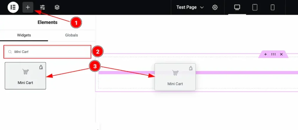
- Go to the Elementor Editor Page and Hit the “+” (Add Element) icon button.
- Search the Mini Cart widget.
- Drag the widget and drop it on the editor page.
Work with the Content Tab
Offcanvas Section
Go to Conetent > Offcanvas
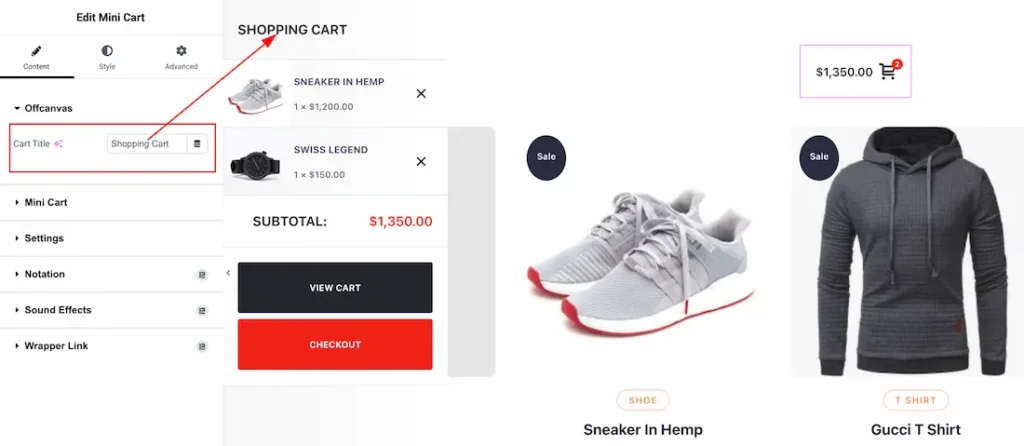
Cart Title: You can set the Offcanvas Title from here.
Mini Cart Section
Go to Conetent > Mini Cart
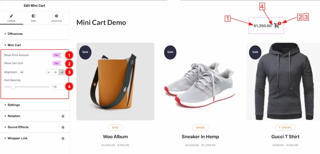
1. Show Price Amount: Enable/disable the Show Price Amount switcher button to show/hide the price.
2. Show Cart Icon: Enable/disable the Show Cart Icon switcher button to show/hide the Cart Icon.
3. Alignment: This option lets you set the alignment as – left, center and right.
4. Icon Spacing: You can adjust the icon spacing from here.
Settings Section
Go to Conetent > Settings
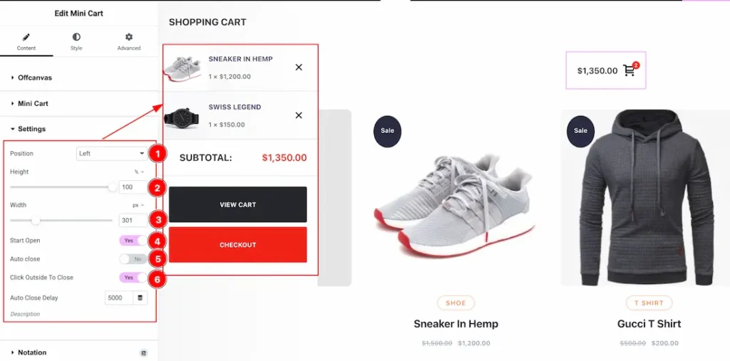
1. Position: This option lets you set the position of the Offcanvas.
2. Height: You can set the Offcanvas height from here.
3. Width: You can set the Offcanvas width from here.
4. Start Open: If you enable the Start Open swither button then the mini cart open by default.
5. Auto Close: If you enable the Auto Close swither button then automatically closes the cart after a delay.
6. Click Outside To Close: After enabling the swither button, Clicking outside the cart closes automatically.
Work with the Style Tab
Mini Cart Section
Go to Style > Mini Cart
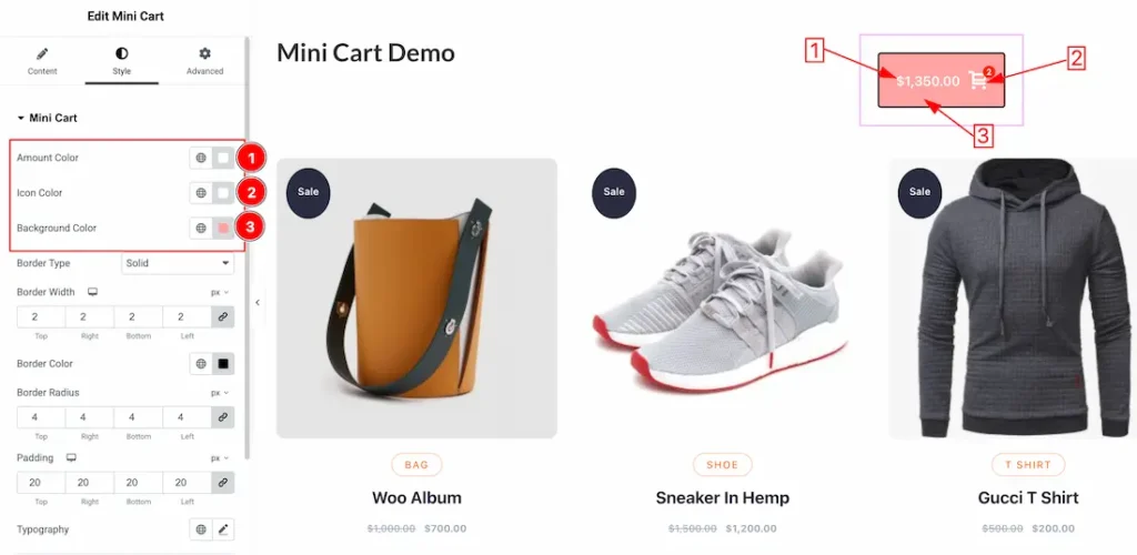
1. Amount Color: This option lets you set the Amount Color.
2. Icon Color: This option lets you set the Icon Color.
3. Background Color: This option lets you set the Background Color.
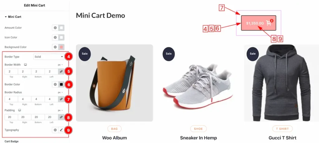
4. Border Type: You can set the Border Type to Default, None, Solid, Double, Dotted, Dashed, or Groove. We choose here the Border Type Solid.
5. Border Width: The border width property allows you to control how thick or thin the border is.
6. Border Color: This lets you change the Border color.
7. Border Radius: Customizes the border corners for roundness.
8. Padding: Add spaces around an object to increase the inner area. Padding allows you to control the internal space within an element.
9. Typography: Change the font family, size, weight, style, transform, decoration, line height, letter spacing, and word spacing from here.
Cart Badge Sub section
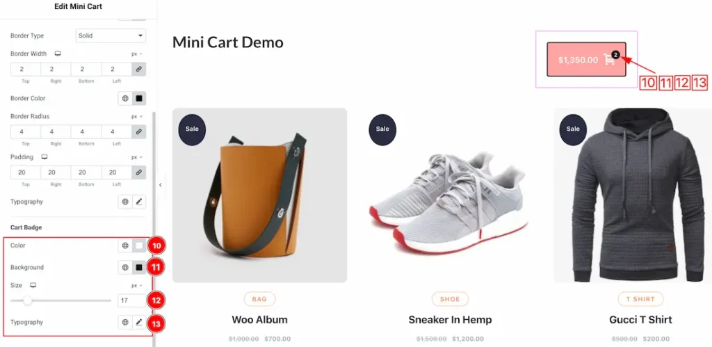
10. Color: This option lets you set the Cart Badge color.
11. Background Color: This option lets you set the Cart Badge Background Color.
12. Size: This option lets you set the Cart Badge size.
13. Typography: Change the font family, size, weight, style, transform, decoration, line height, letter spacing, and word spacing from here.
Offcanvas Section
Go to Style > Offcanvas
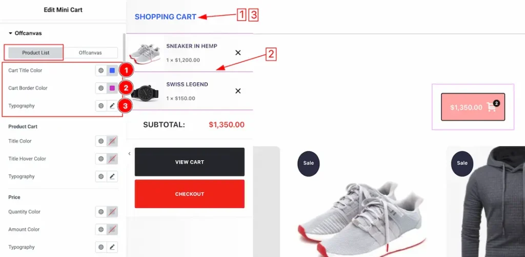
Come to the Offcanvas section, you will get two sub sections; Product List and Offcanvas.
Lets explain, the Product List sub section
1. Cart Title Color: This option lets you set the Cart Title Color.
2. Cart Border Color: This option lets you set the Cart Border Color.
3. Typography: Change the font family, size, weight, style, transform, decoration, line height, letter spacing, and word spacing from here.
Product Cart Sub section
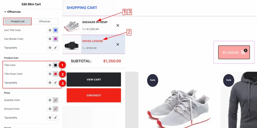
1. Title Color: This option lets you set the Product Cart Title Color.
2. Title Hover Color: This option lets you set the Product Cart Title Hover Color.
3. Typography: Change the font family, size, weight, style, transform, decoration, line height, letter spacing, and word spacing from here.
Price Sub section
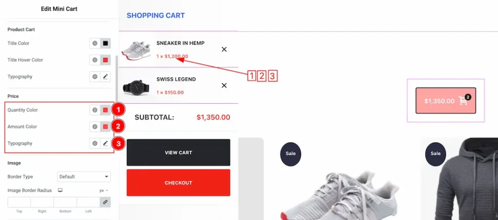
1. Quantity Color: This option lets you set the Quantity Color.
2. Amount Color: This option lets you set the Amount Color.
3. Typography: Change the font family, size, weight, style, transform, decoration, line height, letter spacing, and word spacing from here.
Price Sub section
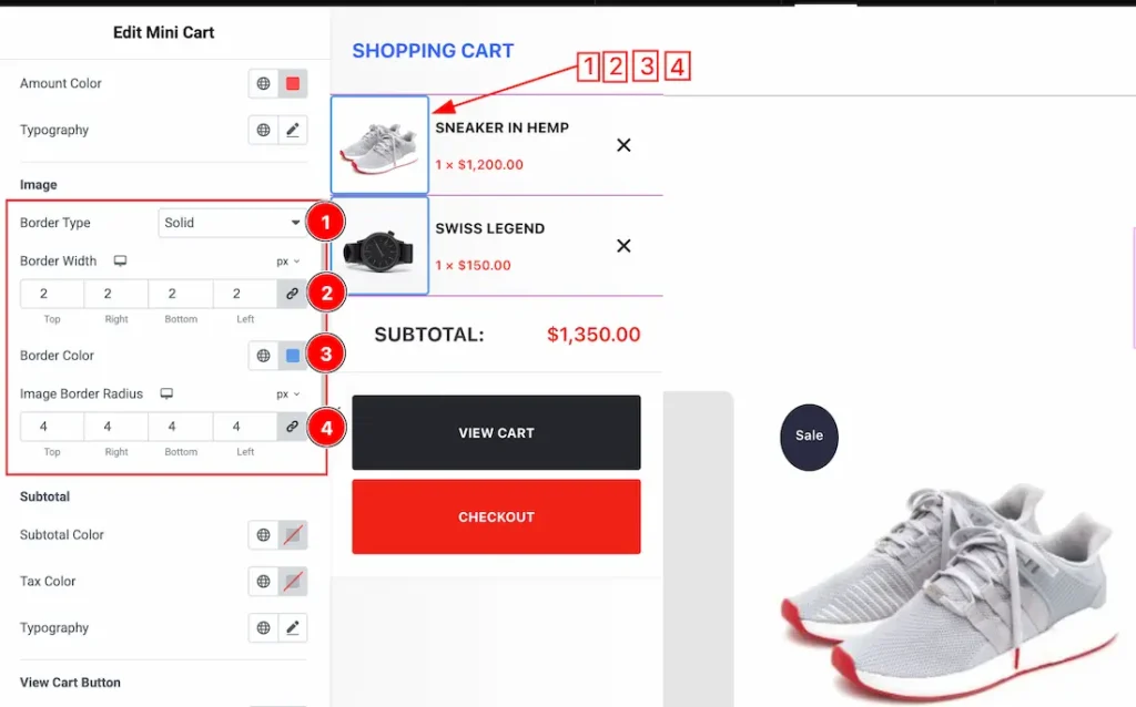
1. Border Type: You can set the Border Type to Default, None, Solid, Double, Dotted, Dashed, or Groove. We choose here the Border Type Solid.
2. Border Width: The border width property allows you to control how thick or thin the border is.
3. Border Color: This lets you change the Image Border color.
4. Image Border Radius: This lets you change the Image Border radius.
SubTotal Sub section
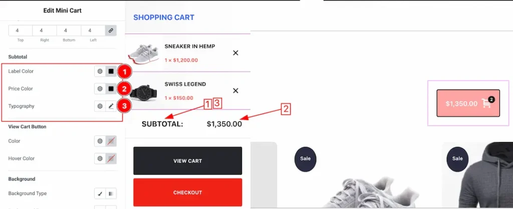
1. Label Color: This option lets you set the Subtotal Label Color.
2. Price Color: This option lets you set the Subtotal Price Color.
3. Typography: Change the font family, size, weight, style, transform, decoration, line height, letter spacing, and word spacing from here.
View Cart Sub section
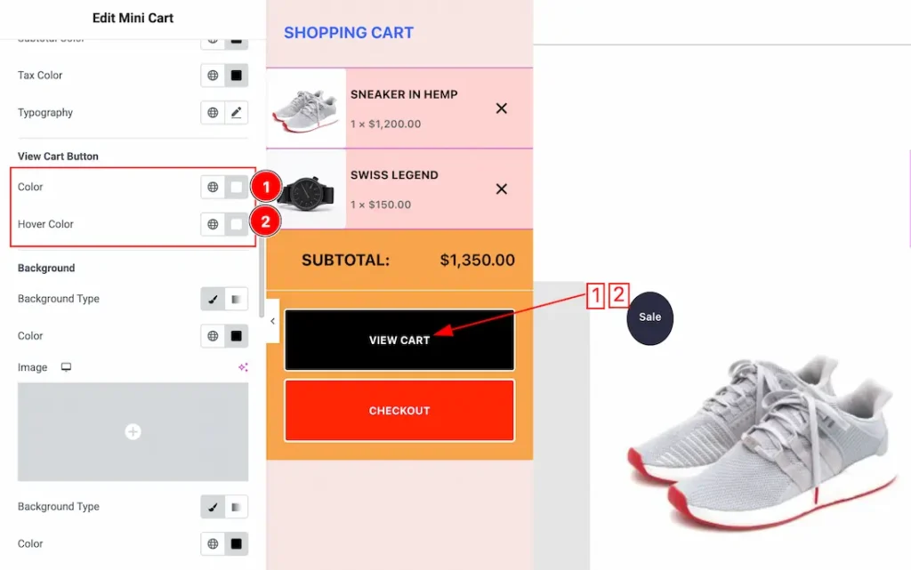
1. View Cart Normal Color: This option lets you set the View Cart Normal color.
2. View Cart Hover Color: This option lets you set the View Cart Hover color.
Background Sub section
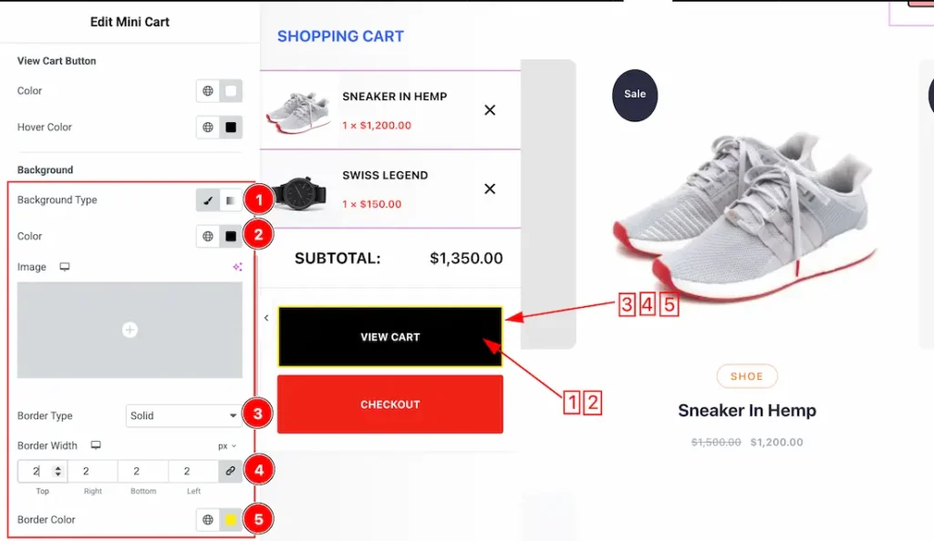
1. Background Type: you can change the color of any object background to classic or gradient. Here we choose the Background type Classic.
2. Background Color: This lets you change the Background color. If you want, you also can change an image to the Background.
3. Border Type: You can set the Border Type to Default, None, Solid, Double, Dotted, Dashed, or Groove. We choose here the Border Type Solid.
4. Border Width: The border width property allows you to control how thick or thin the border is.
5. Border Color: This lets you change the Border color.
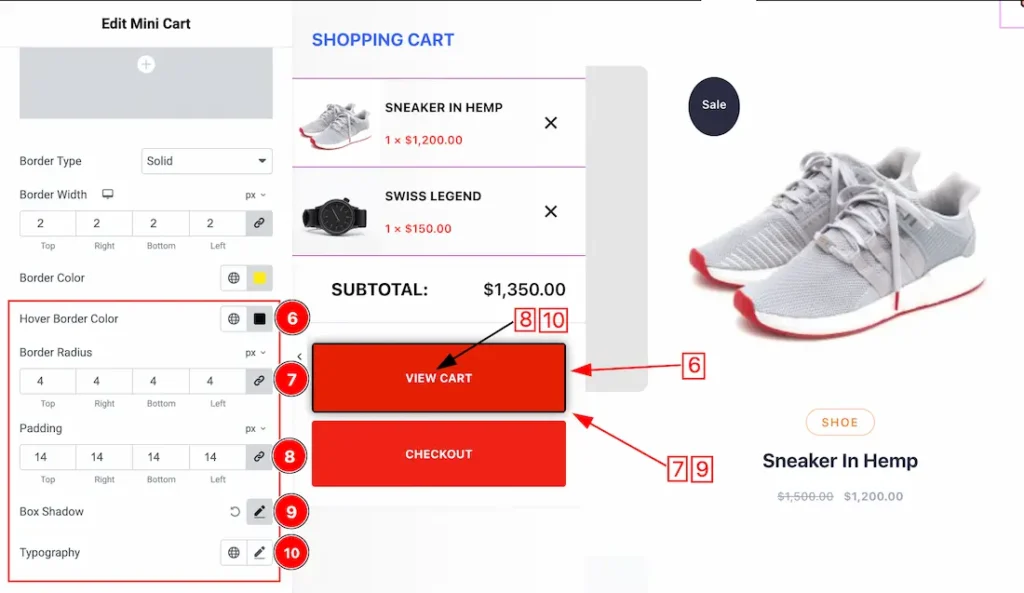
6. Hover Border Color: This option lets you set the Hover boder color.
7. Border Radius: Customizes the border corners for roundness.
8. Padding: Add spaces around an object to increase the inner area. Padding allows you to control the internal space within an element.
9. Box Shadow: The Box Shadow property is used to create the shadow around the Category Button. It takes Four values: Horizontal offset, Vertical offset, blur, and Spread to customize the Box shadow.
Position: you can set the Box Shadow position Outline and Inset. Here we set the Box Shadow position Outline.
Box Shadow Color: This lets you change the Box Shadow color.
10. Typography: Change the font family, size, weight, style, transform, decoration, line height, letter spacing, and word spacing from here.
Product Remove Button Subsection
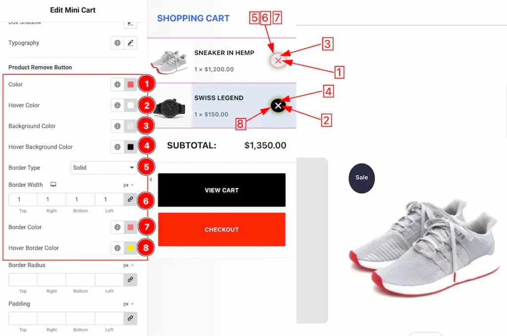
1. Color:This option lets you set the product remove button normal color.
2. Hover Color: This option lets you set the product remove button hover color.
3. Background Color: This option lets you set the product remove button background normal color.
4. Hover Background Color: This option lets you set the product remove button background hover color.
5. Border Type: You can set the Border Type to Default, None, Solid, Double, Dotted, Dashed, or Groove. We choose here the Border Type Solid.
6. Border Width: The border width property allows you to control how thick or thin the border is.
7. Border Color: This lets you change the Border color.
8. Hover Border Color: This lets you change the Border hover color.
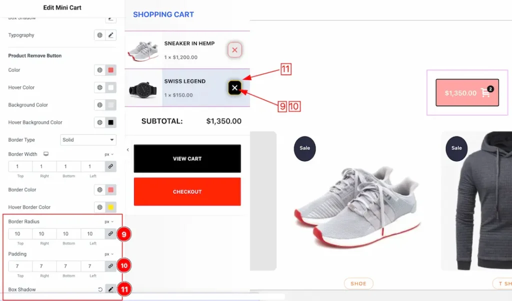
9. Border Radius: Customizes the border corners for roundness.
10. Padding: Add spaces around an object to increase the inner area. Padding allows you to control the internal space within an element.
11. Box Shadow: The Box Shadow property is used to create the shadow around the Category Button. It takes Four values: Horizontal offset, Vertical offset, blur, and Spread to customize the Box shadow.
Position: you can set the Box Shadow position Outline and Inset. Here we set the Box Shadow position Outline.
Box Shadow Color: This lets you change the Box Shadow color.
Offcanvas Subsection
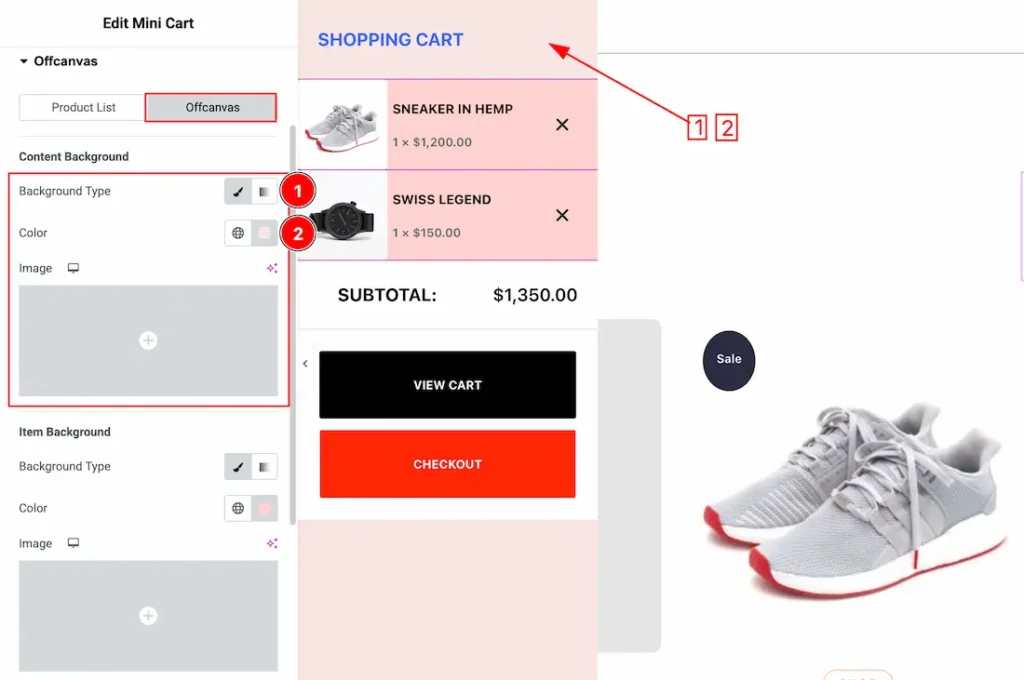
Lets explore the Content Background subsection:
1. Background Type: You can change the color of content background to classic or gradient. Here we choose the Background type Classic. If you want then you also can set an image as Content Background.
2. Color: This option lets you set the content background color.
Item Background Subsection
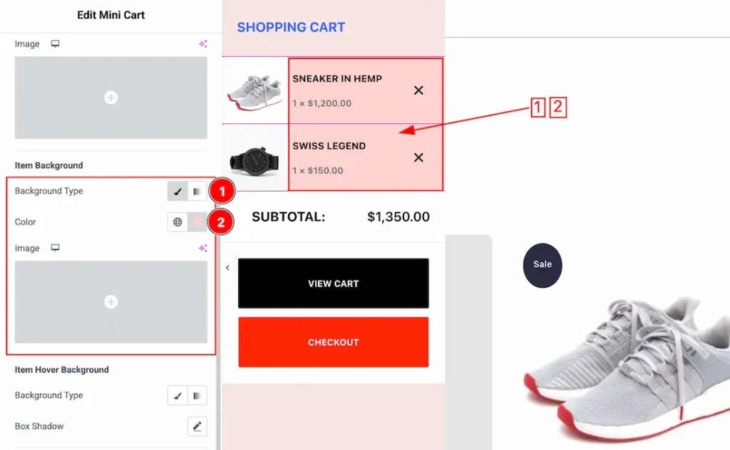
1. Background Type: You can change the color of Item background to classic or gradient. Here we choose the Background type Classic. If you want then you also can set an image as Item Background.
2. Color: This option lets you set the item background color.
Item Hover Background Subsection
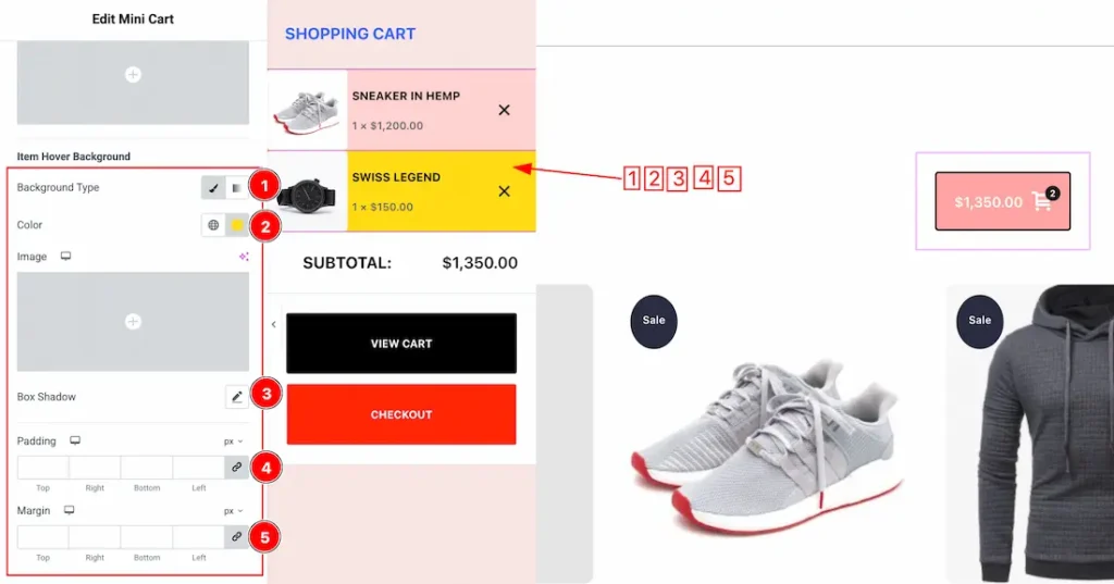
1. Background Type: You can change the color of Item hover background to classic or gradient. Here we choose the Background type Classic. If you want then you also can set an image as Item hover background.
2. Color: This option lets you set the item hover background color.
3. Box Shadow: You can set the item hover box shadow from here.
4. Padding: Set the item hover padding.
5. Margin: Set the item hover margin.
Footer Subsection
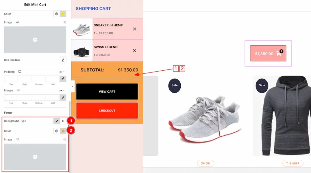
1. Background Type: You can change the color of footer background to classic or gradient. Here we choose the Background type Classic. If you want then you also can set an image as footer background.
2. Color: This option lets you set the footer background color.
All done! You have successfully customized the Mini Cart widget on your website.
Video Assist
The video will come soon. Please visit the demo page for examples.
Thanks for being with us.