In this documentation, we will discuss the customization of the Static Carousel widget, brought to you by the Element Pack Pro.
Activate Static Carousel Widget
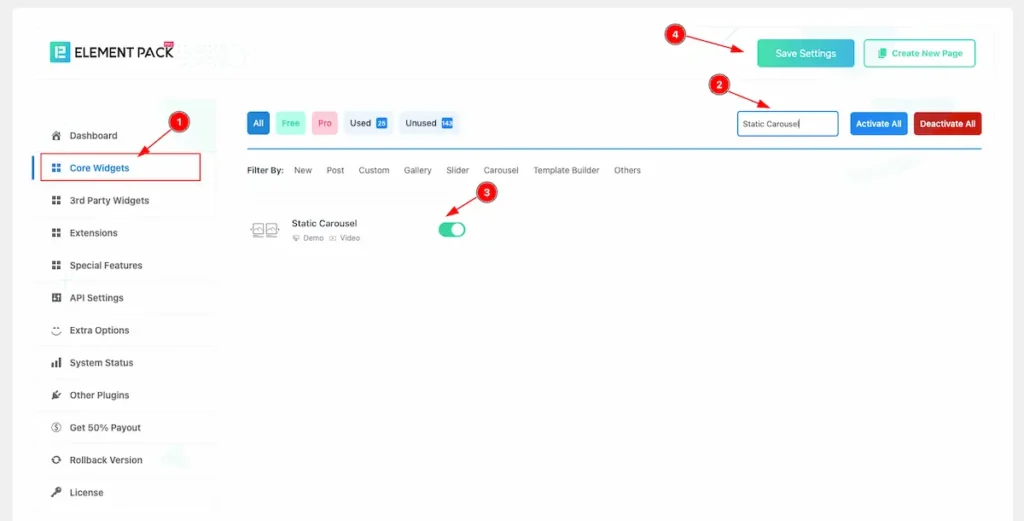
To use the Static Carousel from Element Pack Pro Widget must be enabled. Navigate to WordPress Dashboard > Element Pack Pro Plugin dashboard.
- Navigate to Core Widgets Tab.
- Search by the Static Carousel Widget Name.
- Enable the Static Carousel Widget.
- Hit the Save Settings Button.
Inserting the Static Carousel widget
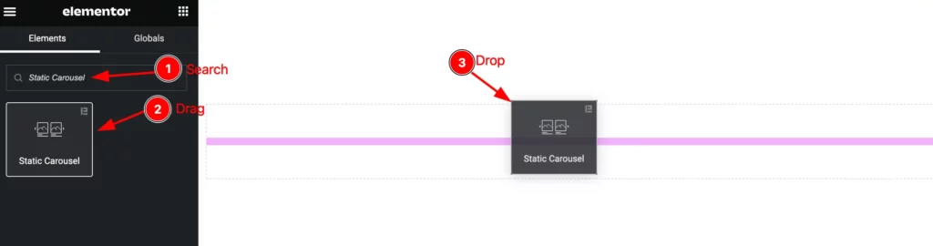
- Go to the Elementor Editor Page and Hit the Add Element ” + ” Icon.
- Search by the Static Carousel widget name. The widget will appear, Check the Element Pack Pro logo on top right corner.
- Select the widget then Drag and Drop it on the editor page.
The Default view of the Static Carousel
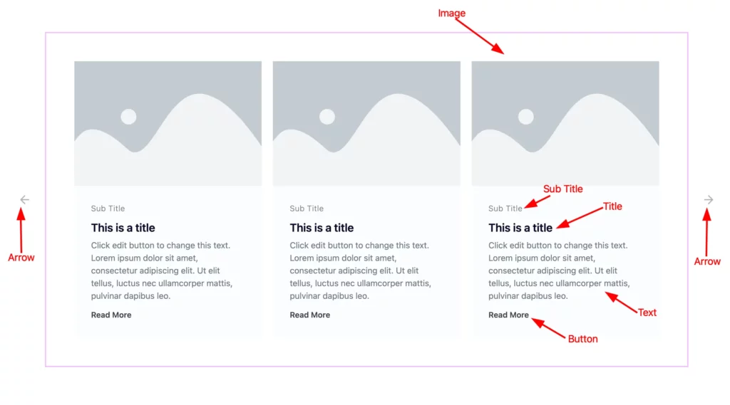
The Default displays the Image, Title, Sub Title, Text, Button, and Arrow.
Content tab customization
Items section
Go to Content > Items
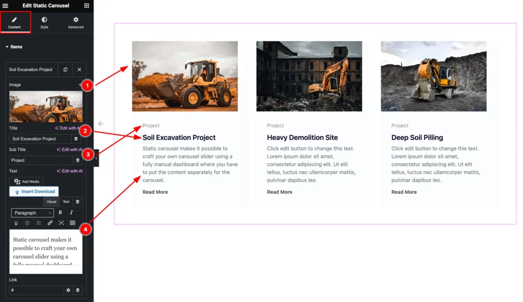
- Image: Set the Image for the Items.
- Title: Set the Title for the items.
- Sub Title: Set the Sub Title.
- Text: Set the Text for content.
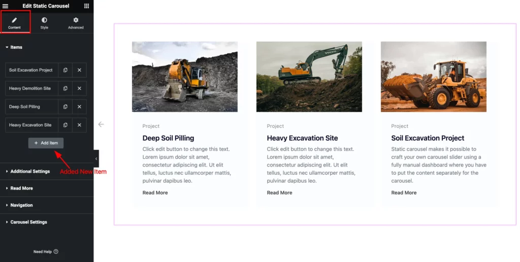
Then find the “ + Add Item ” button to add new items.
Additional Settings Section
Go to Content > Additional Settings
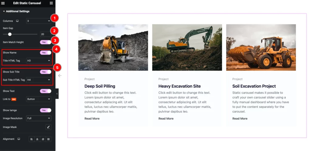
- Columns: Set the number of columns for displaying.
- Item Gap: Set the gap between the Items.
- Item Match Height: Enable it to adjus the height of the Items.
- Show Name: Enable the switcher to show the Name.
- Title HTML Tag: Set any HTML Tag for Title ( H1, H2, H3, H4, H5, H6, p, span ). The title tag is essential for both user experience and search engine optimization (SEO).
- Show Sub Title: Enable the switcher to show the sub title.
- Sub Title HTML Tag: Set any HTML Tag for Title ( H1, H2, H3, H4, H5, H6, p, span ). The title tag is essential for both user experience and search engine optimization (SEO).
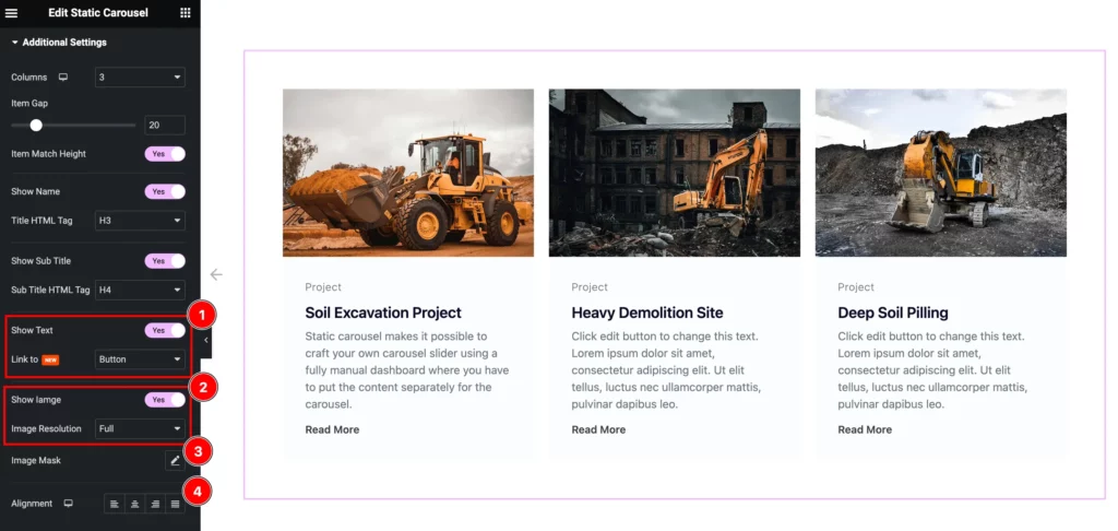
- Show Text: Enable the switcher to show the Text.
- Link To: Set the link of the Text to Button,
- Show Image: Enable the switcher to show the Image.
- Image Resolution: Set the resolution for the Image.
- Image Mask: Set the masking for the Images. Different premade masking style are available.
- Alignment: Set the alignment of the content, Left, Center, Right, and Justified.
Read More Section
Go to Content > Read More
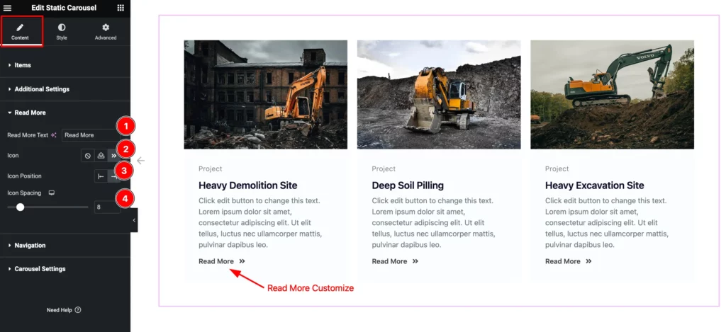
- Read More Text: Set the text for the Read More button.
- Icon: Choose the Icon for the Button.
- Icon Position: Set the position of the Icon left or right.
- Icon Spacing: Set the spacing for the Icon.
Navigation Section
Go to Content > Navigation
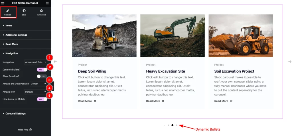
- Navigation: Set the navigation for the content, Set it Arrows and Dots.
- Dynamic Bullets?: Turn of the switcher to show the dynamic bullets.
- Show Scrollbar?: Enable it to demonstrate the scrollbar.
- Arrows Icon: Set the Icon for the Arrows.
- Hide Arrows on Mobile: Enable the switcher to hide the arrows.
Carousel Settings Section
Go to Content > Carousel Settings
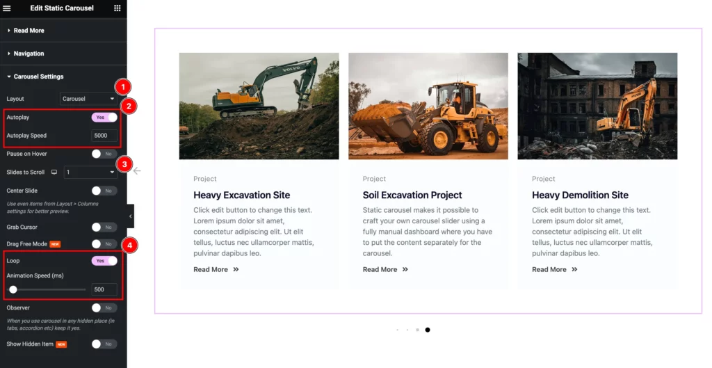
- Layout: Set the layout for the Carousel. Carousel and Coverflow layout available.
- AutoPlay: Enable the switcher to turn on the Autoplay.
- Autoplay Speed: Set the animation speed for the autoplay.
- Slides to Scroll: Set the number of slides for scrolling.
- Loop: Enable it to loop the Items infinity time.
- Animations Speed( ms): Set the speed for the animation.
Style tab customization
Items section
Go to Style > Items
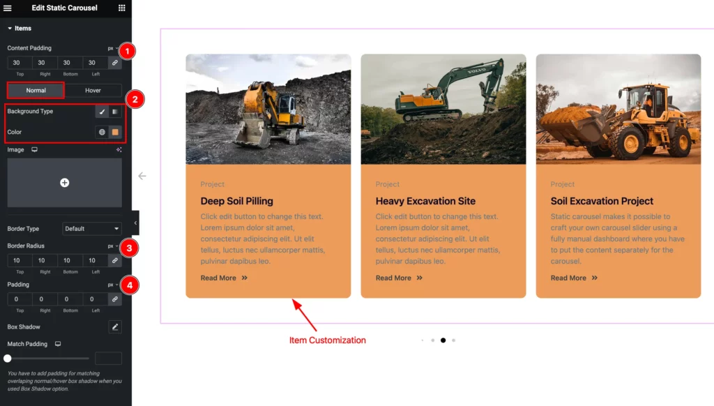
- Content Padding: Set the inner space for the Content.
Normal
- Background Type: Set the Background type color for the Items.
- Border Radius: Set the radius for the Border.
- Padding: Set the padding for the items.
- Box Shadow: Set the shadow for the Box.
- Match Padding: Set the padding for the Match items.
Image Section
Go to Style > Image
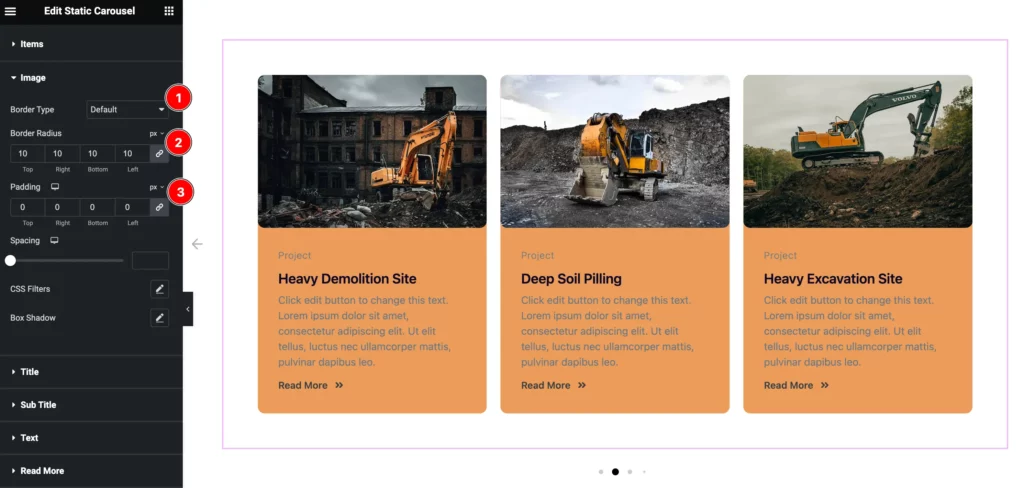
- Border Type: Choose the border type for Image.
- Border Radius: Make the border corner edges rounded.
- Padding: Set the padding for the Image.
- Spacing: Set the pacing from content.
- CSS Filters: Set the CSS Filters for the image.
- Box Shadow: Set the shadow for the Box.
Title Section
Go to Style > Title
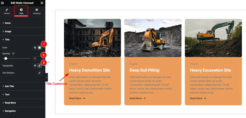
- Color: Set the color for the Title.
- Spacing: Set the spacing of the Title.
- Typography: Set the typography for the Title.
- Text Shadow: Set the shadow of the Text.
Sub Title Section
Go to Style > Sub Title
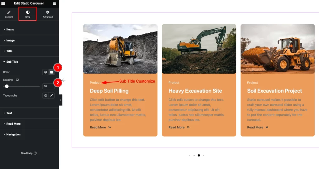
- Color: Set the color for the Sub Title.
- Spacing: Set the spacing for the Sub Title.
- Typography: Set the typography of the title.
Text Section
Go to Style > Text
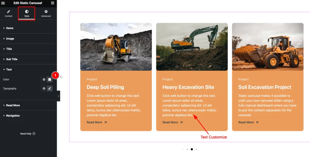
- Color: Set the Color for the Text.
- Typography: Set the typography for the Text.
Read More Section
Go to Style > Read More
Normal
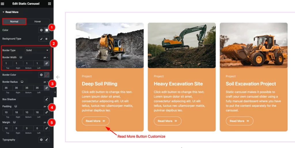
- Color: Select the Color for the Button.
- Background Type: Choose the background type color and select the color.
- Border Type: Set the border type and set the border.
- Border Width: Set the thickness of the border.
- Border Color: Set the color for the border.
- Border Radius: Set the border radius.
- Box Shadow: Set the shadow of the Box.
- Padding: Set the padding.
- Margin: Set the Margin.
- Typography: Set the typography of the Button.
Hover
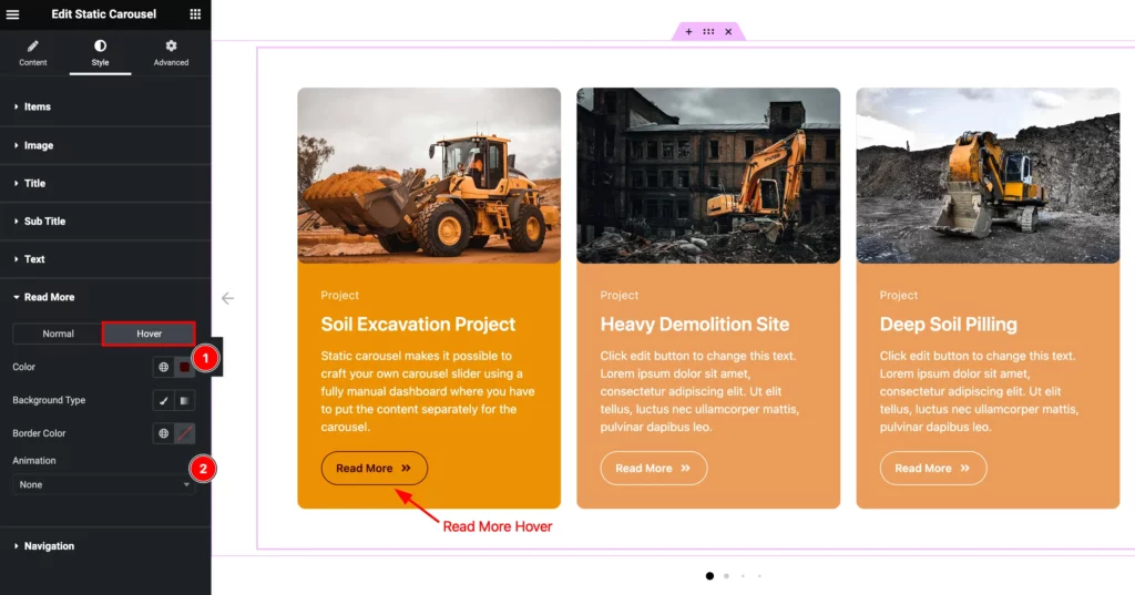
- Color: Choose the color for the Read More Button.
- Background Type: Set the background type color and select the color.
- Border Color: Set the border color for read more button.
- Animation: Set the animation of the button.
Navigation Section
Go to Style > Navigation
ARROWS
Normal
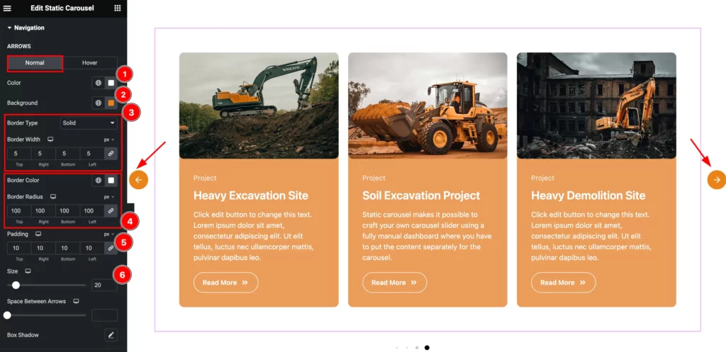
- Color: Set the color for the Arrows.
- Background: Se the background for the arrow.
- Border Type: Set the border type radius.
- Border Width: Set the width for the Border.
- Border Color : Set the color of the Border.
- Border Radius: Make the border corner edges rounded.
- Padding: Set the padding for the Arrows.
- Size: Set the size of the Icon.
- Space Between Arrows: Set the space between the arrows.
Hover
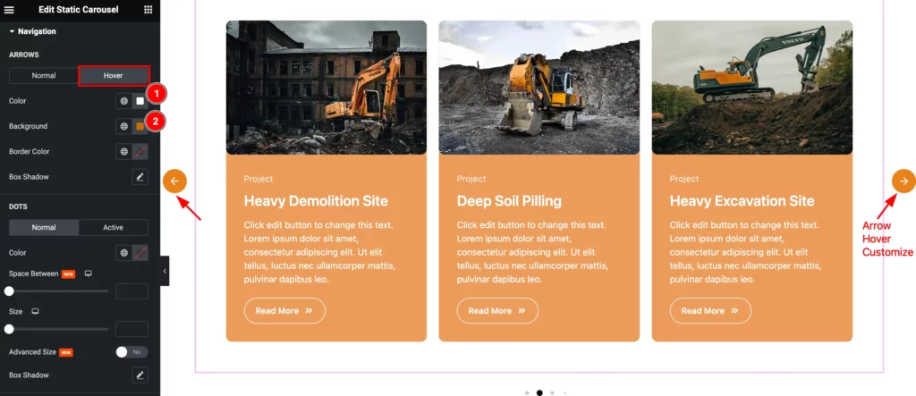
- Color: Set the Color for the arrows.
- Background: Set the background color.
- Border Color: Set the border color.
- Box Shadow: Make a shadow for the Box.
DOTS
Normal
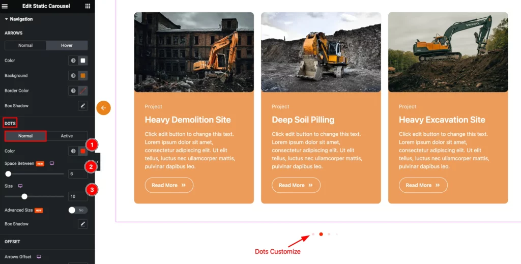
- Color: Set the color for this.
- Space Between: Set the space between the arrows.
- Size: Set the size for the navigation.
- Advanced Size: Set the size for the advanced Box.
- Box Shadow: Make a shaow for the Box.
Active
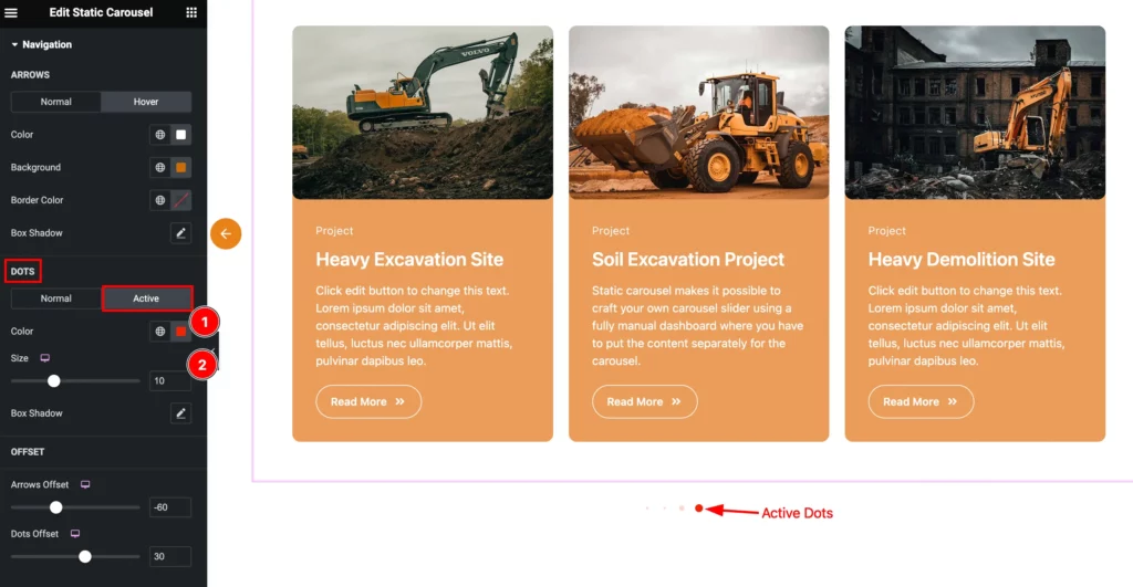
- Color: Set the color for the Dots.
- Size: Set the size for the Arrows.
- Box Shadow: Set the shadow for the Box.
OFFSET
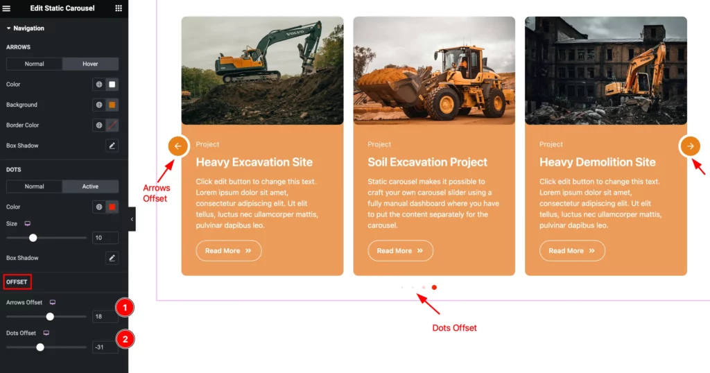
- Arrows Offset: Set the offset for the arrows.
- Dots Offset: Set the offset for the dots.
Video Assist
You can watch the Static Carousel widget video tutorial above. Please visit the demo page for examples.
Thanks for staying with us.