In this documentation, we will show you how to customize the Source Code widget presented by the Element Pack Pro add-on.
Inserting Widget
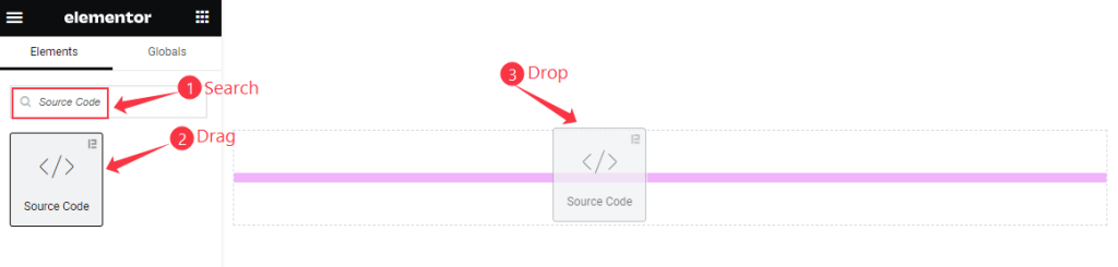
- Go to the Elementor Editor Page and Search by the ” Source Code “ widget name.
- The widget will appear, Check the Element Pack Pro logo on top right corner.
- Select the widget then Drag and Drop it on the editor page.
The Default view of Widget
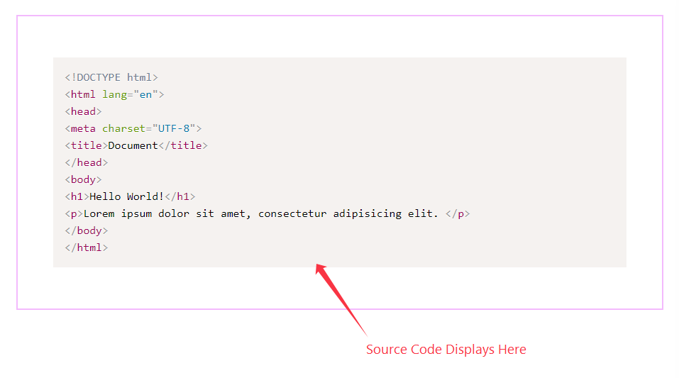
Display codes from the console with customizations.
Content Tab Customization
Source Code Content section
Go to Content > Source Code Content
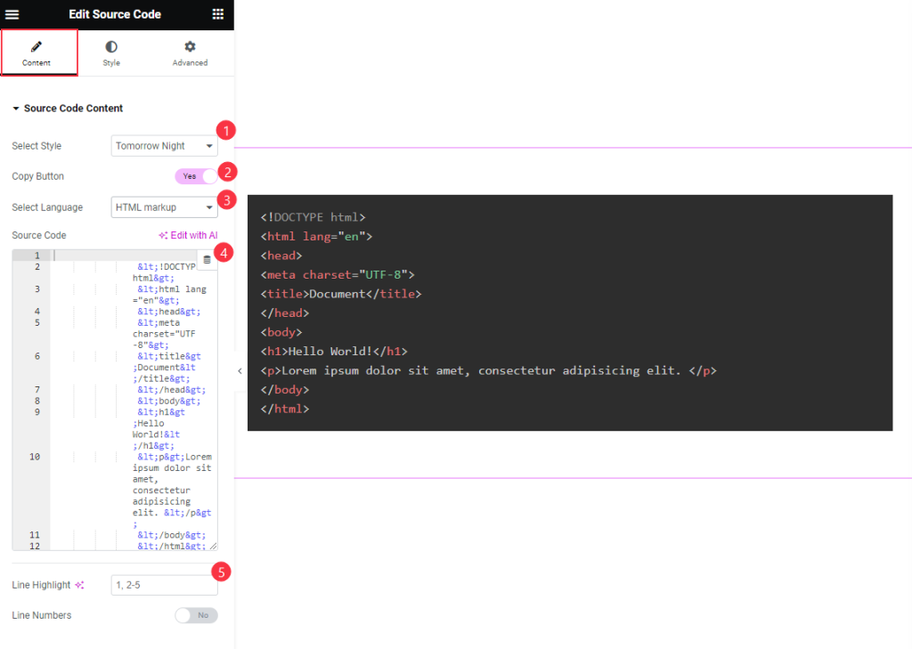
- Select Style: Ready made presets are available. Select any of them.e.g.: Default, Dark, Coy , Funky, Tomorrow Night etc.
- Copy Button: Enable the switcher to Copy the button.
- Select Language: Choose the language for the code. e.g.: HTML markup, CSS, JS, PHP, C, C++, Bash etc.
- Source Code: Input the source code here.
- Line Highlight: Refers to the act of applying a background color to a line of text, similar to using a physical highlighter pen on paper.
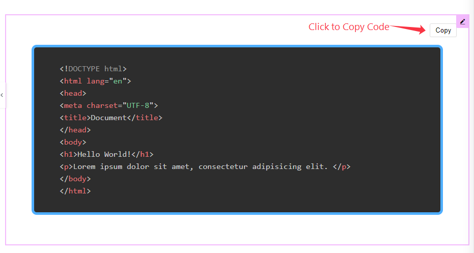
Hovering over the content, the Copy Button will appear.
Style Tab Customization
Item Section
Go to Style Tab > Items
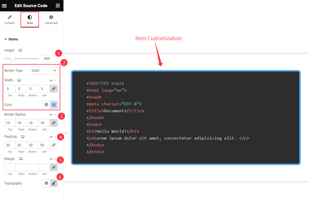
- Height: Set the height for the Items to be appear.
- Border Type: Choose the border type and Set width the select the Color for the border.
- Border Radius: Make the border corner edges rounded by setting the radius.
- Padding: Set the padding for the inner space.
- Margin: Set the margin for the Text.
- Typography: Set the typography for the text. e.g: Font size, Weight, Line Height etc.
Copy Button
Normal
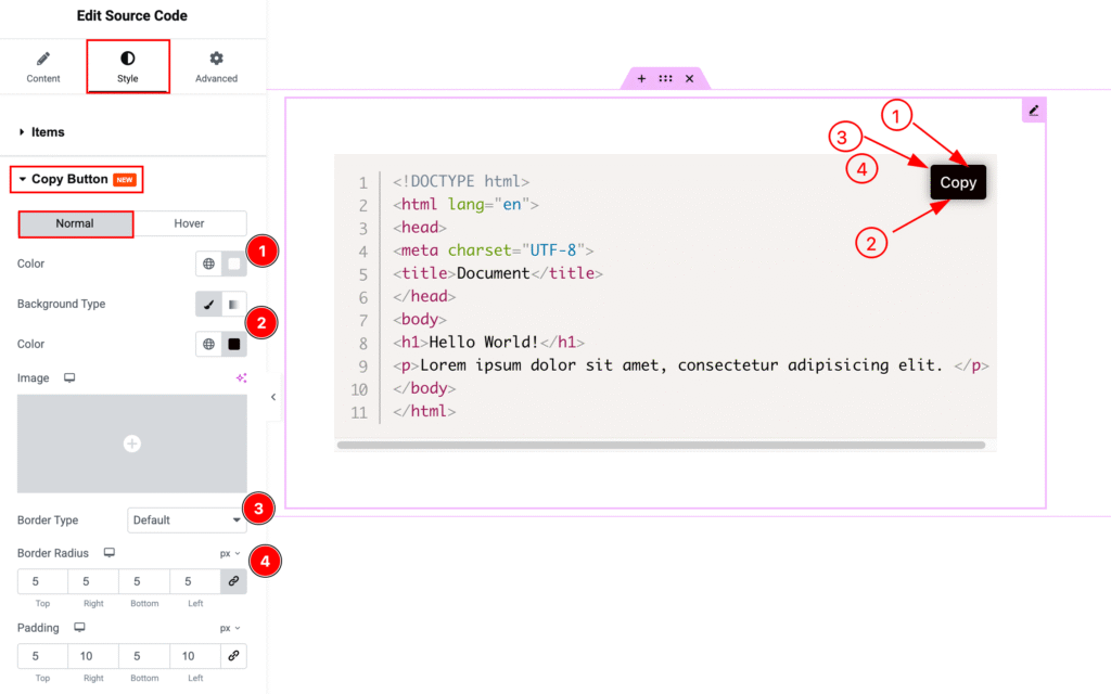
- Color: Set the color for the Copy Button.
- Background Type: Choose the background type color and select the color.
- Border Type: Set the border type. e.g.: Default, none, double, dashed.
- Border Radius: Set the border radius.
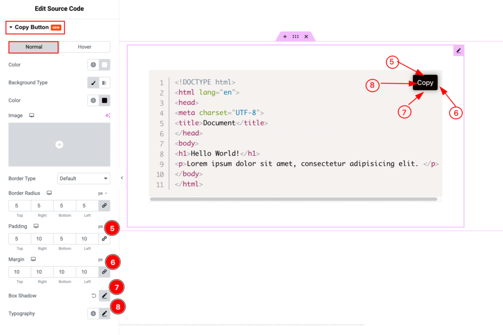
- Padding: Set the inner spacing by padding.
- Margin: Set the margin for outer space.
- Box Shadow: Make a shadow for the Box.
- Typography: Choose the typography for the Copy Button.
Hover
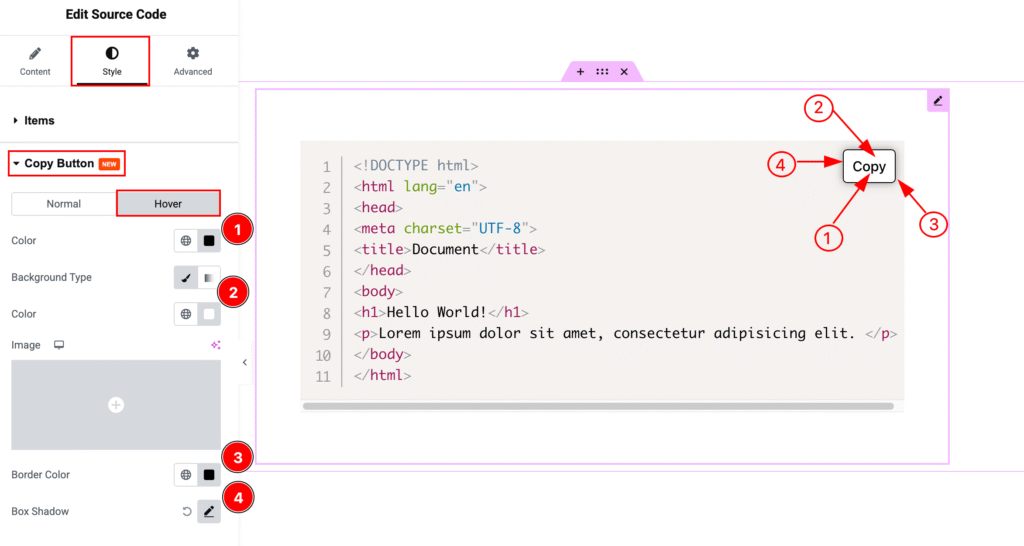
- Color: Choose the text Color for the copy button.
- Background Type: Set the background type color and select the color.
- Border Color: Set the border color for the text.
- Box Shadow: Make a shadow for the box.
Video Assist
Watch the Source Code video tutorial here. Please visit the demo page for examples.
Thanks for being with us.