In this documentation, we will show you how to customize the Search widget presented by Element Pack Pro.
Inserting The Search Widget
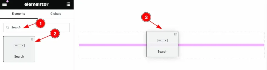
Inserting the widget by following this,
- Search by the Search widget name.
- Then select the appear widget ( with Element Pack Pro logo T.R corner).
- After Drag and Drop it on the Elmentor Editor page.
Content Tab
The Content tab controller displayed here offers the flexibility to adjust the layout of the widget according to your preferences.
Search Layout Section
Go to Content > Search Layout
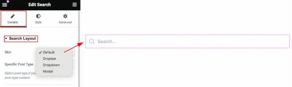
This section provides control for the search.
- Skin: Select the available skin for the layout (e.g.:Default, Dropbar, Dropdown, Modal).
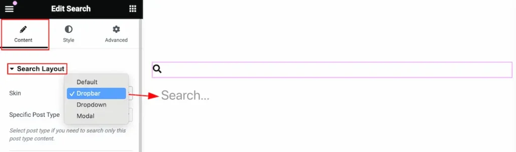
The Dropbar Skin was selected. Click on the search icon the search box will appear on the bottom right after it.
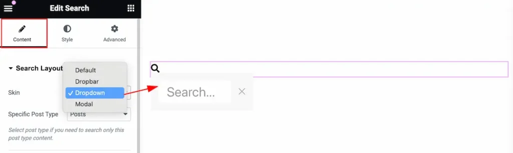
Select the Dropdown skin. The search box will appear right after it and the Close button feature is included here.
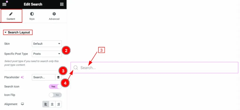
- Specific Post Type: Select the post type for searching (e.g.: Post, Pages, Type).
- Placeholder: Set the placeholder.
- Search Icon: Enable the switcher to show the search Icon.
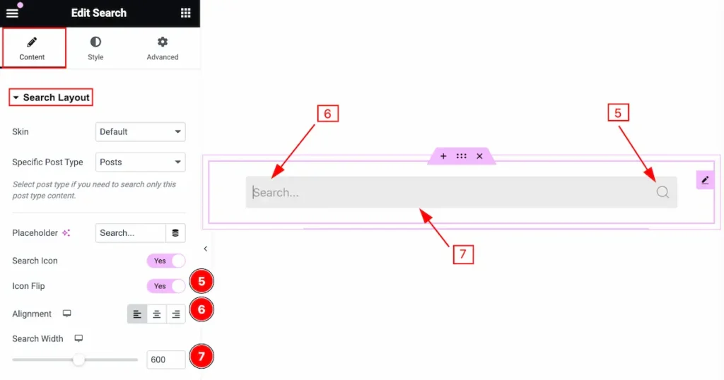
- Icon Flip: Enable the switcher to flip the icon.
- Alignment: Set alignment for the search button.
- Search Width: Select the width for the search.
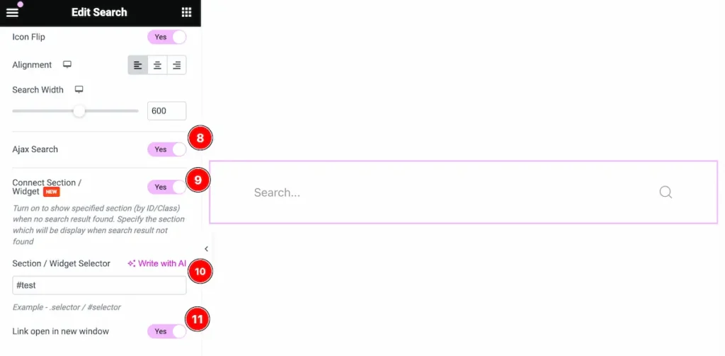
- Ajax Search: Enable the switcher to Ajax search. The following example will demonstrate a live search, where you get search results while you type
- Content Section / Widget: Enable the switcher to show a specific section.
- Section / Widget Selector: Set the section or widget selector to show the search result specifically.
- Link open in new window: Enable the switcher to open the search in a new window.
AJAX Query Section
Go to Content > AJAX Query
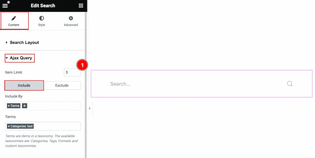
Here make the query for the Ajax search.
- Item Limit: Set the showing limit number for the Ajax search.
Please read more to work with the query.
Style Tab
Provide the controller to make the visual appearance or presentation of the tabs. This includes aspects that are visually appealing and cohesive with the overall design of the interface.
Search Container Section
Go to Style > Search Container
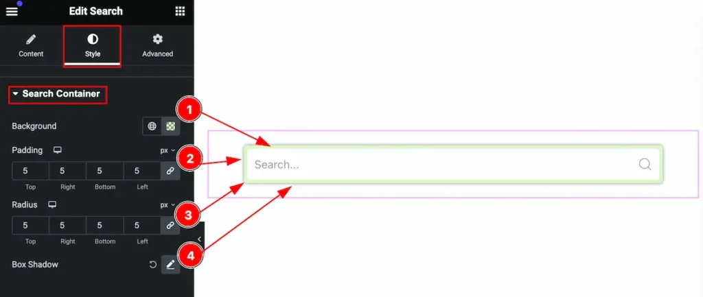
This section provides control for the search container,
- Background: Set the background for the search.
- Padding: Set the padding for the inner space.
- Radius: Make the border radius for the corner of the edge rounded.
- Box Shadow: Set the shadow for the Box.
Input Section
Go to Style > Input
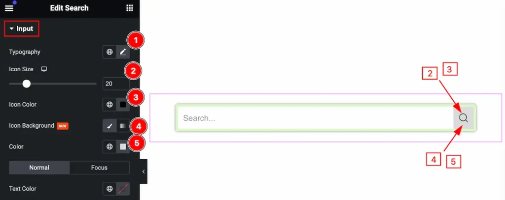
This section provides control for the input section to make it visually interactive,
- Typography: Set the typography for the input.
- Icon Size: Set the size for the Icon.
- Icon Color: Set the color for the Icon.
- Icon Background: Select the icon background.
- Color: Set the color for the background.
The normal State of the Input
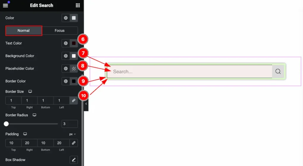
- Text Color: Set the color for the input text.
- Background Color: Set the background for the color.
- Placeholder Color: Set the placeholder color.
- Border Color: Set the border color for the border.
- Border Size: Set the size for the border.
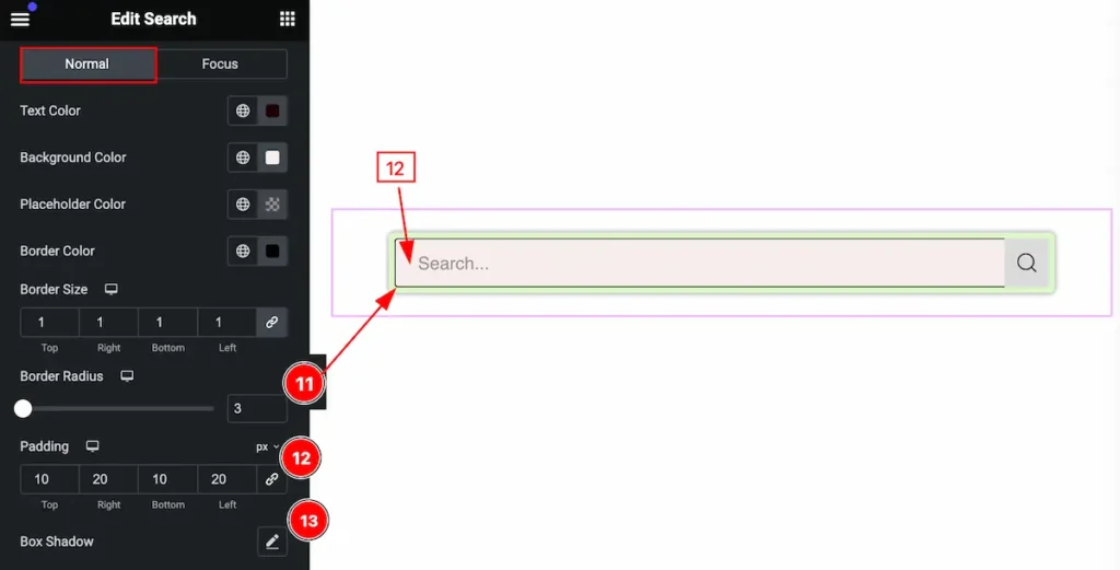
- Border Radius: Set the radius for the border.
- Padding: Set the padding for the input.
- Box Shadow: Set the shadow for the box.
Focus State for the Input
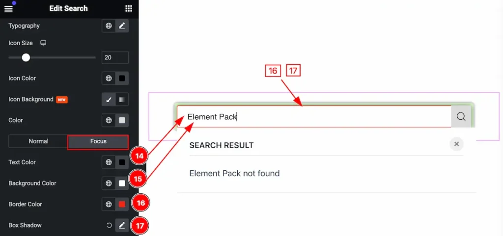
Set the focus for the input state,
- Text Color: Set the color for the text.
- Background Color: Set the background for the input focus.
- Border Color: Set the color for the border.
- Box Shadow: Set the shadow for the box.
Ajax Dropdown Section
Go to Style > Ajax Dropdown
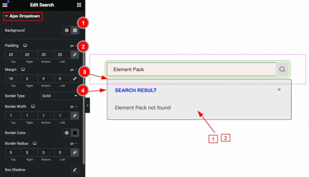
This section provides control for the Ajax dropdown,
- Background: Set the background for the dropdown.
- Padding: Set the padding for the dropdown.
- Margin: Set the margin for the outer space.
- Border Type: Set the type for the border.
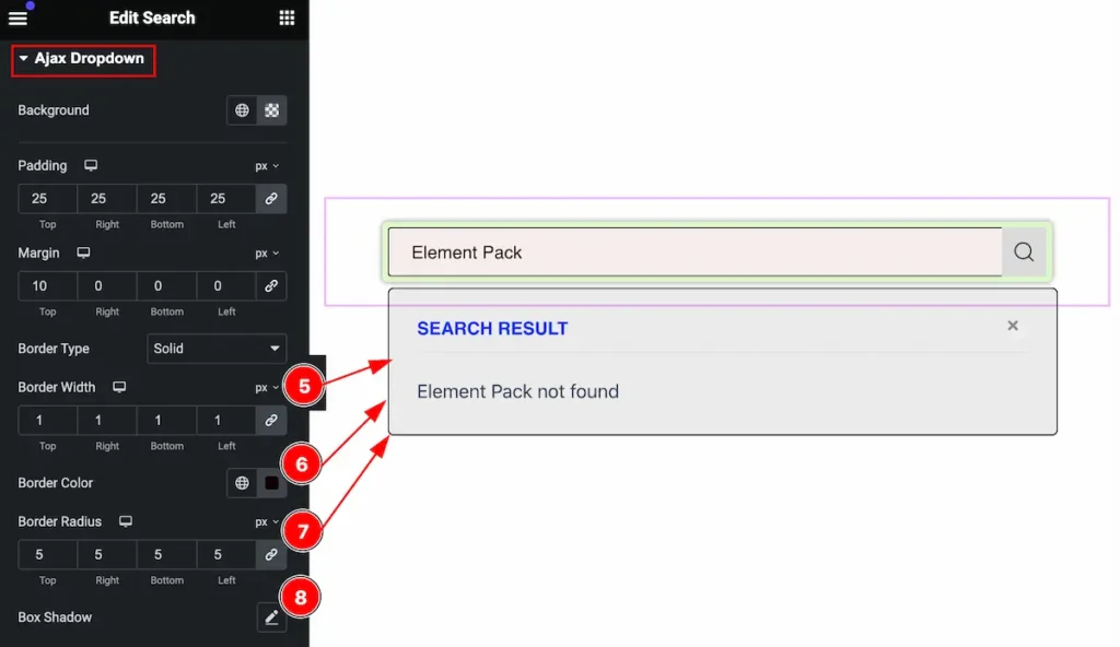
- Border Width: Set the width for the border.
- Border Color:Set the color for the border.
- Border Radius: Make the border cornder egdes rounded by setting the radius.
- Box Shadow: Set the shadow for the box.
Heading
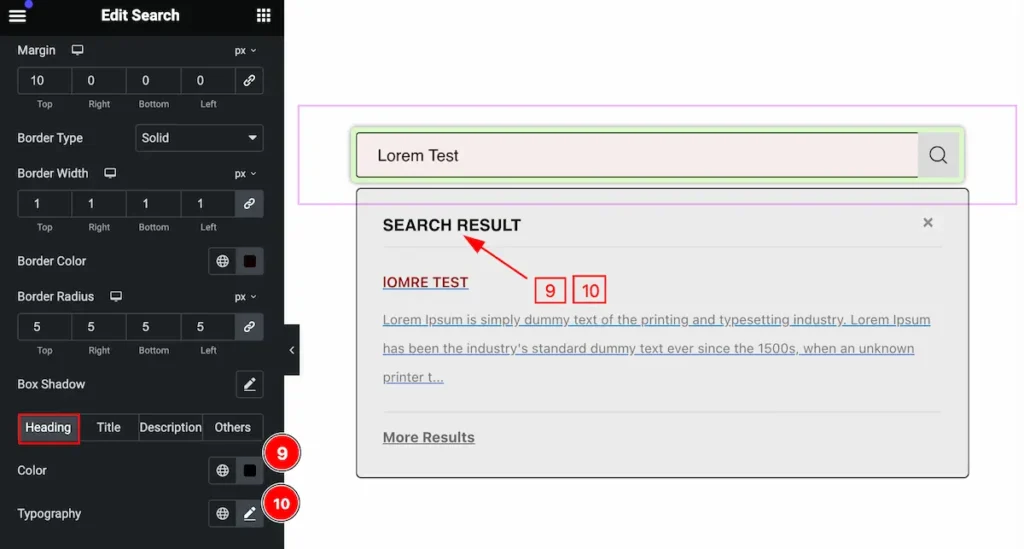
- Color: Set the Color for the Heading.
- Typography: Set the typography for the heading.
Title
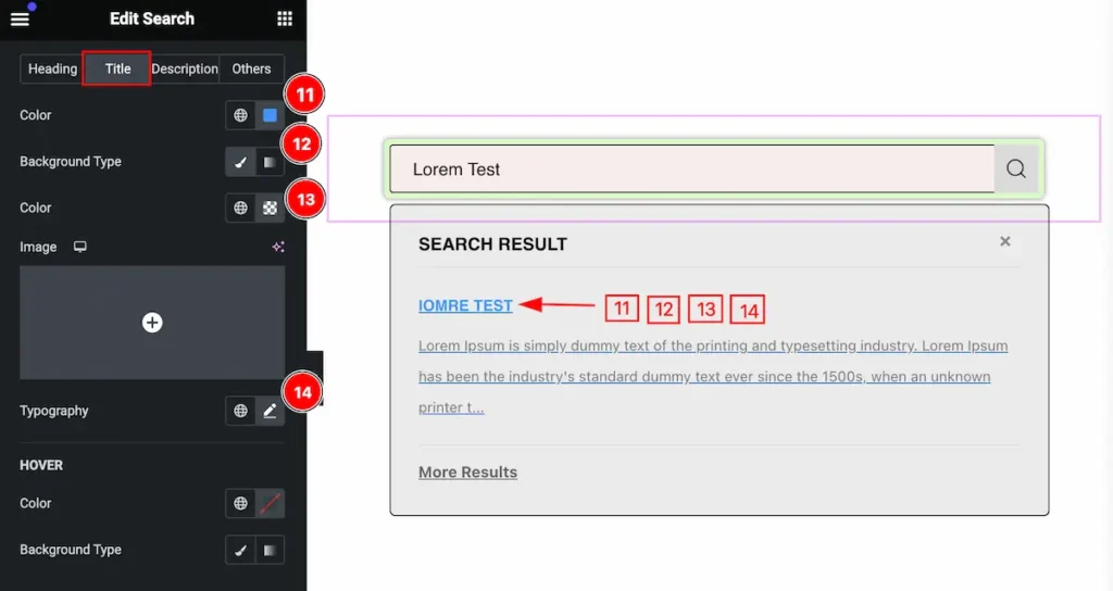
- Color: Set the color for the ajax search title.
- Background Type: Set the type for the background.
- Color: Set the background Color.
- Typography: Set the typography for the title.
Hover State of Title
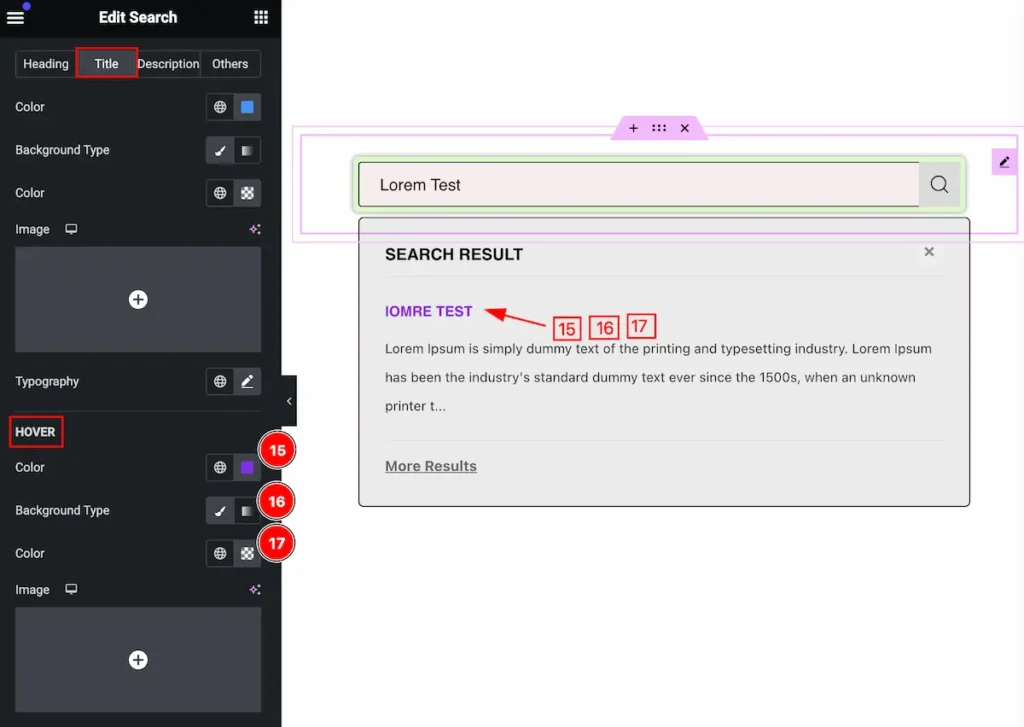
Set the Title for the search.
- Color: Set the color for the title.
- Background Type: Set the type for background.
- Color: Set the background color.
Description
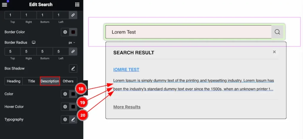
- Color: Set the color for the description.
- Hover Color: Set hover color for description. This works on mouse hover.
- Typography: Set the typography for the description.
Others
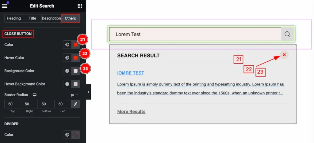
- Color: Set the color for the close button.
- Hover Color: Set hover color for close button. This works on mouse hover.
- Background Color: Set the background for the close button.
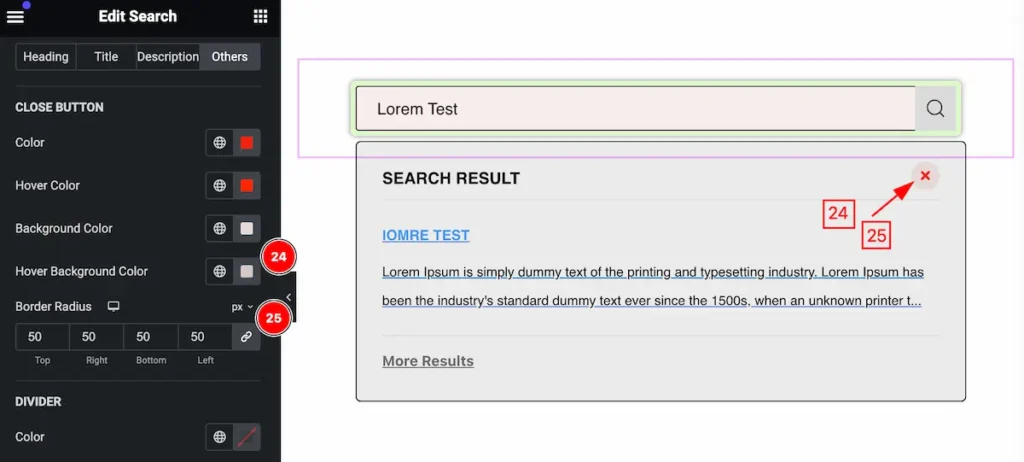
- Hover Background Color: Set the background color. The changes will appear on mouse hover.
- Border Radius: Set the radius for the border.
DIVIDER
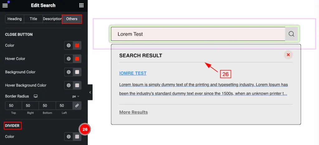
- Color: Set the color for the divider.
No Post
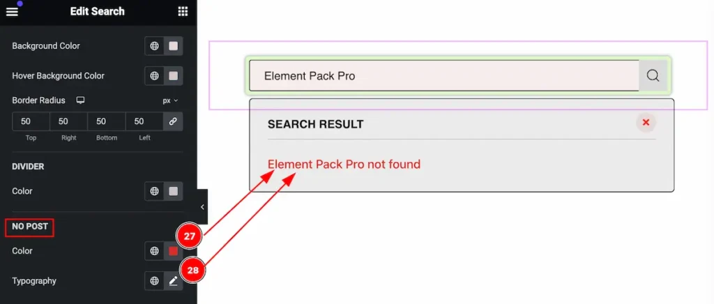
- Color: Set the color for the no post.
- Typography: Set the typography for the No post.
Video Assist
You can watch the video above to learn about the Search widget.
Please visit the demo page for examples.
Thanks for staying with us.