In this documentation, we will discuss the customization of the Marquee widget, brought to you by the Element Pack Pro.
🌀 Marquee Widget – Overview
The Marquee Widget in Element Pack Pro allows you to display scrolling text or content horizontally across your page — creating an eye-catching animation effect perfect for announcements, news tickers, promotions, or highlights.
✨ Key Features
- Smooth Scrolling Effect:
Create continuously moving text or elements from left to right or right to left. - Direction Control:
Choose the scrolling direction — left or right — based on your design need. - Speed Adjustment:
Easily adjust scroll speed to make it fast or slow for better readability. - Pause on Hover:
Users can hover over the marquee to pause the scrolling for a smoother experience. - Content Flexibility:
Add text, icons, or even dynamic post content. - Style Customization:
Change typography, colors, and background for complete design freedom.
Activate Marquee Widget
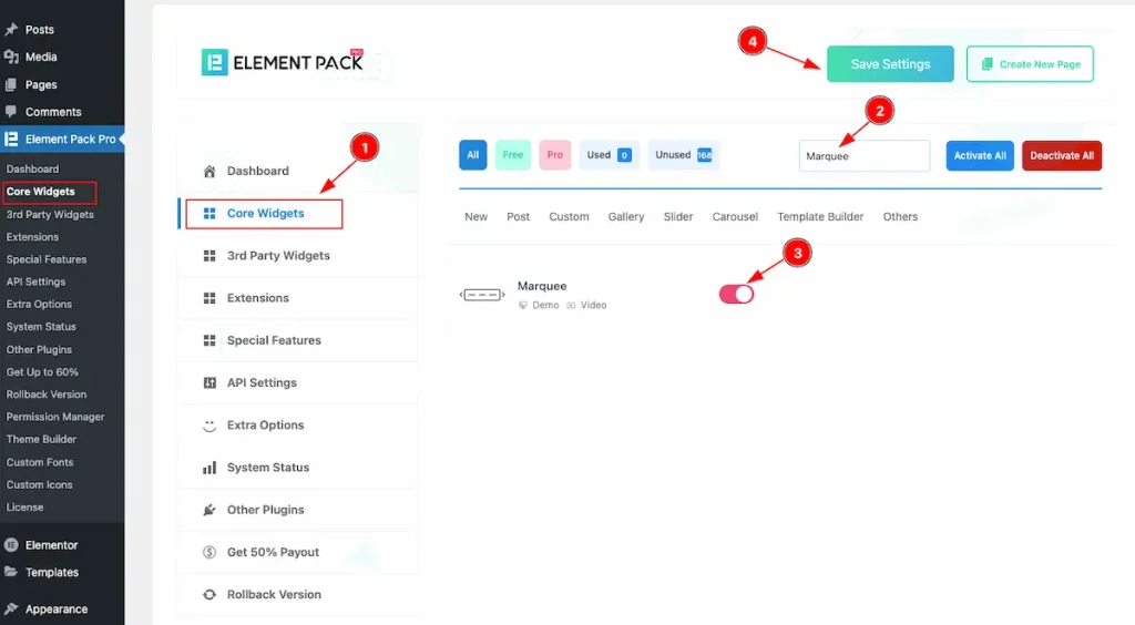
To use the Marquee widget from Element Pack Pro, first, you have to enable the widget. Navigate to the WordPress Dashboard.
- Go to Element Pack Pro > Core Widgets section.
- Search by the Widget Name ” Marquee ” and it will appear the.
- Now Enable the Switcher of the Marquee.
- Hit the Save Settings button.
Inserting the Marquee Widget
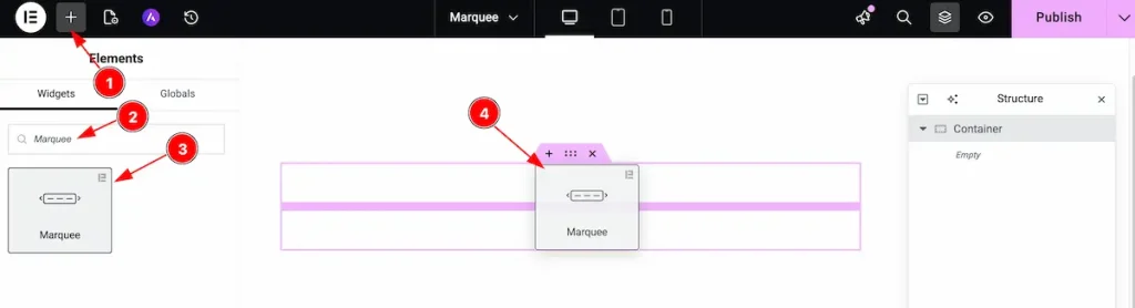
- Go to the Elementor Editor Panel section.
- Search the Marquee widget.
- Drag the widget.
- Drop it on the editor page.
Content Tab Customizations
Marquee Section
Go to Content > Marquee
Step-1
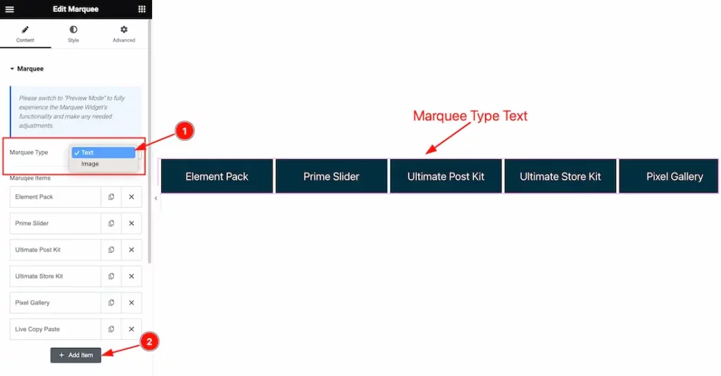
- Come to the Marquee section, and find the Marquee Type(Text, and Image) options.
- Here you can add more Marquee items by clicking the Add Item button.
Step-2
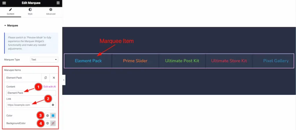
- Content: Set the Content for the Marquee Items.
- Link: Set the Link for the content.
- Color: Choose individual color for the Item. You can set each color for individual items.
- Background: Set the Background color for the Marquee Text also.
Step-3
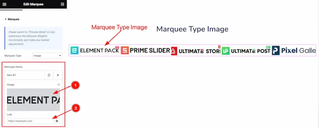
- Image: Set the image for the Marquee text. You can set the Image or Text.
- Link: Set the link for the Image.
Marquee Option Section
Go to Content > Marquee option
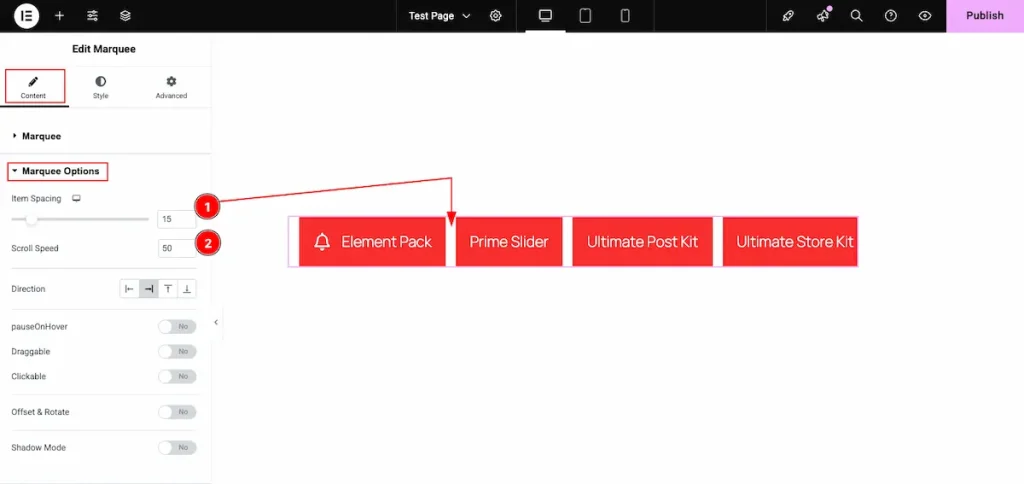
- Item Spacing: Adjust the gap or distance between individual items.
- Scroll Speed: Control how fast the items scroll across the marquee.
Direction ( Left , Right )
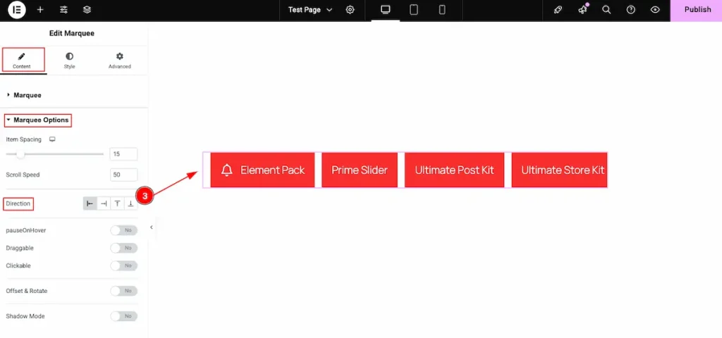
- Direction: Set the scrolling direction for the marquee — choose either Left or Right.
Direction ( Top, Bottom )
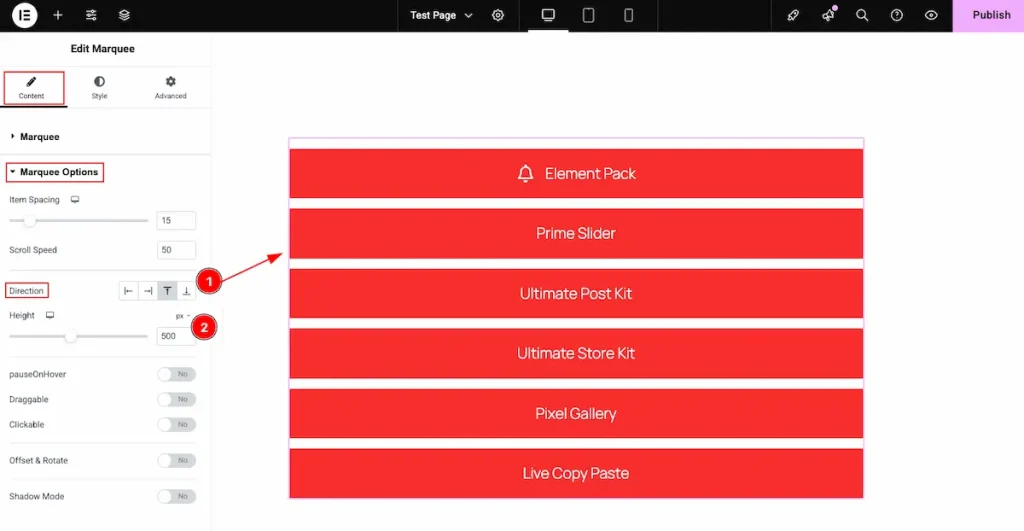
- Direction: Choose the scrolling direction — from top to bottom or bottom to top. The content will move accordingly.
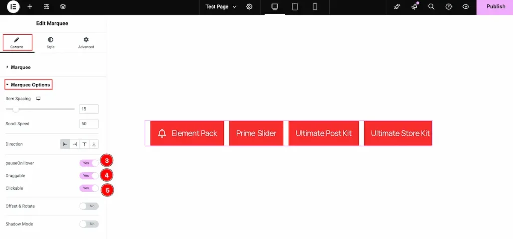
- Pause On Hover: Enable this switcher to pause the scrolling when the mouse hovers over the element.
- Draggable: Turn this on to allow users to drag and scroll the items manually.
- Clickable: Enable this option to make the scrolling items clickable, allowing interaction while they move.
Offset & Rotate
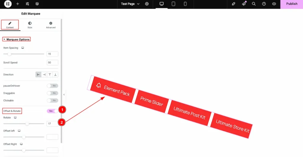
- Offset & Rotate: Enable the switcher to activate the offset and rotation features for the element.
- Rotate: Adjust the rotation angle in degrees — the element will rotate based on the value you set.
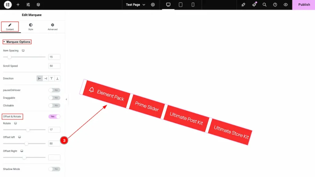
- Offset Left: Adjust the horizontal spacing from the left side to position the element accurately within the layout.
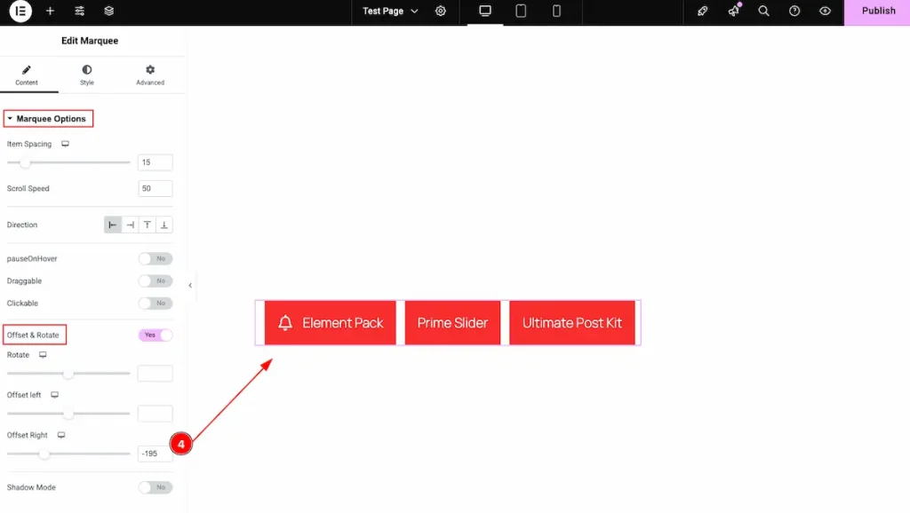
- Offset Right: Adjust the horizontal spacing from the right side to precisely position the element within the layout.
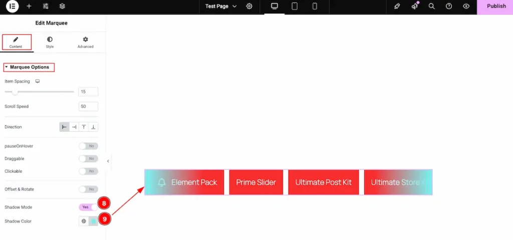
- Shadow Mode: Toggle this switch to enable or disable shadow effects for the icons or items.
- Shadow Color: Choose the desired color for the shadow to enhance the visual depth and highlight the elements.
Work with The Style Tab
Marquee Section
Go to Style > Marquee
Normal Tab
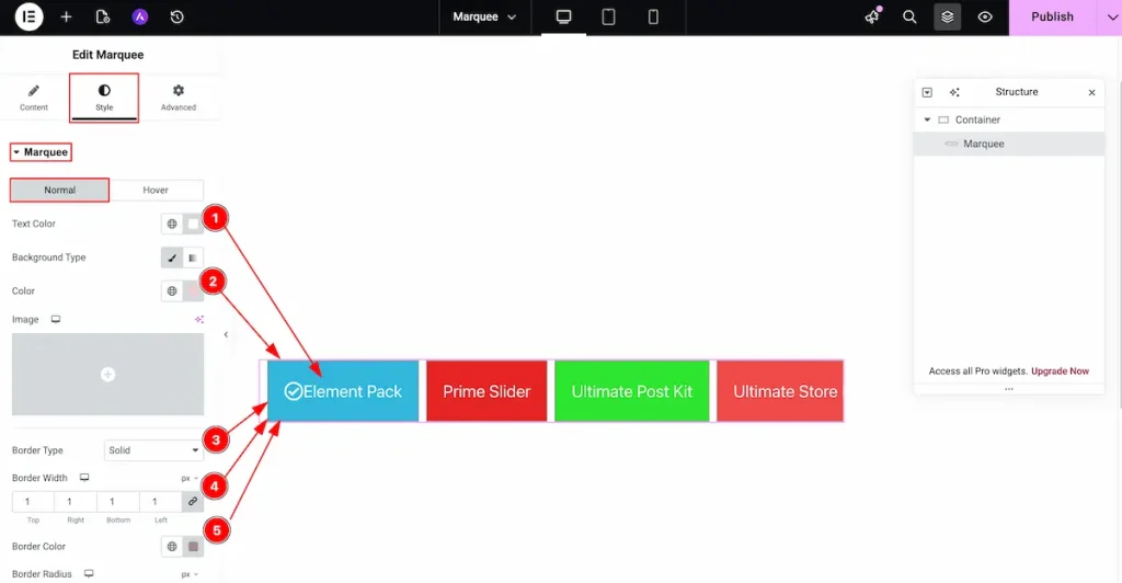
- Text Color: Select the color for the Text of the Marquee tag.
- Background Type: Choose the background color for the text. It will set the global color for all the items. But if you select the background before it will not work for you.
- Border Type: Choose the type for the Border.
- Border Width: Set the width for the border.
- Border Color: Choose the color for the border.
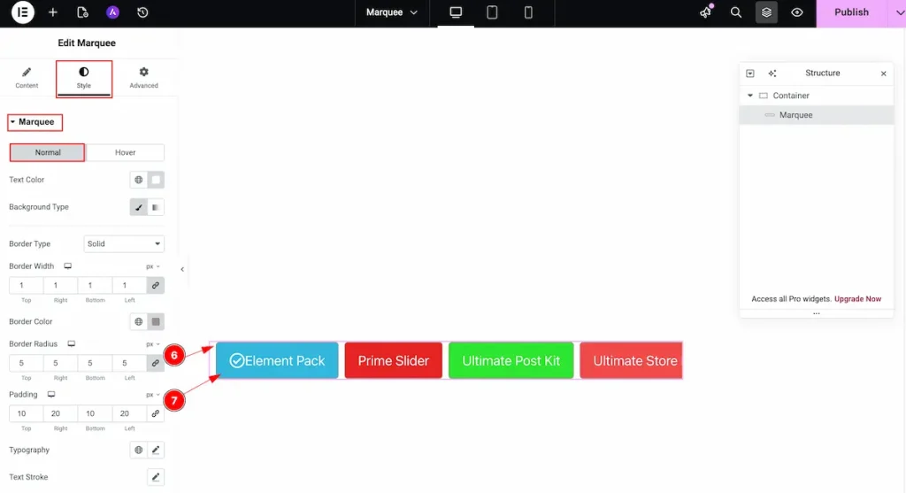
- Border Radius: Make the border corner radius for the edges.
- Padding: Make the padding for the inner spaces.
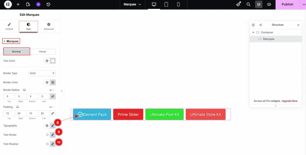
- Typography: Choose the typography for the marquee.
- Text Stroke: Select the stroke for the marquee.
- Text Shadow: Make a shadow for the Text.
Hover Tab
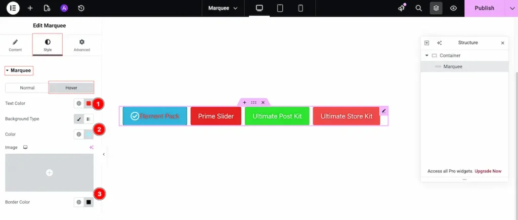
- Text Color: Choose the color of the Text. It will hover over the text.
- Background Type: Choose the Background type for the Color. Select the color.
- Border Color: Set the border for the Color.
Icon Section
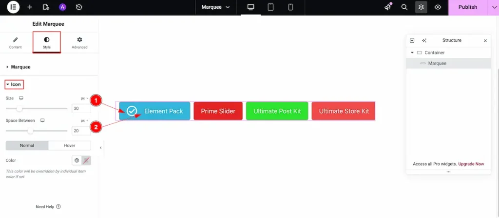
Go to Style > Icon
- Size: Set the size for the Icon. Adjust the size according to needs.
- Space Between: Make the space between the Icon and Text.
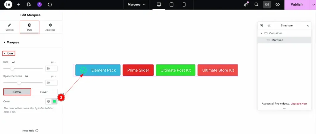
Normal Tab
- Color: Set the color for the icon.
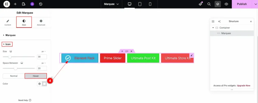
Hover Tab
- Color: Choose the color for the Icon. It will appear on hover over the Icon.
Video Assist
You can watch the quick video to learn about the Marquee widget. Please visit the demo page for examples.
Thanks for being with us.