In this documentation, we will discuss the customization of the Widget Tooltip Extension, brought to you by the Element Pack Pro addon for Elementor.
Enable The Widget Tooltip Extension
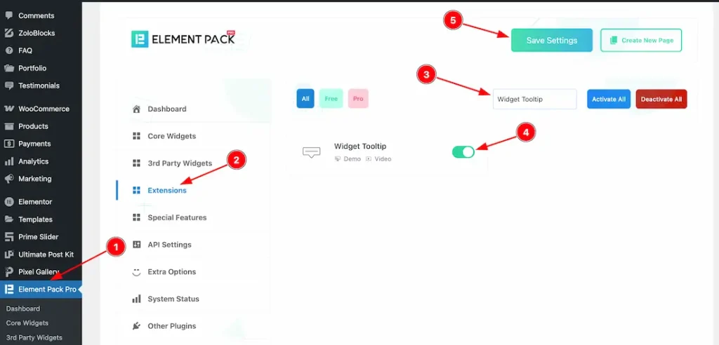
To use the Widget Tooltip Extension from Element Pack Pro, first, you have to enable the widget.
- Go to WordPress dashboard → Element Pack Pro Plugin dashboard.
- Then, Click the ExtensionTab.
- Search for the Widget Tooltip extension name.
- Enable the Widget Tooltip extension.
- Hit the Save Settings Button.
Where Find the Widget Tooltip Extension
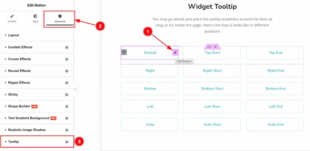
You can use the widget tooltip feature in every widget where you want to display the tooltip. For example, we are showing the tooltip feature for the button widget.
- Select your widget.
- Navigate the Advanced Tab section.
- Go to the Tooltip section > Enable the Tooltip switcher button to explore the feature.
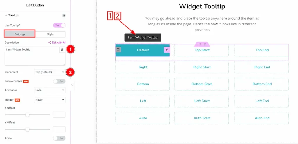
After enabling the use tooltip switcher button, you will get two tabs option; Settings and Style. Lets proceed with the Settings Tab-
1. Description: Just keep your tooltip data inside the description field.
2. Placement: You can set the tooltip position- Top(Default), Top Start, Top End, Right, Right Start, Right End, Bottom, Bottom Start, Bottom End, Left, Left Start, Left End, Auto, Auto Start, and Auto End.
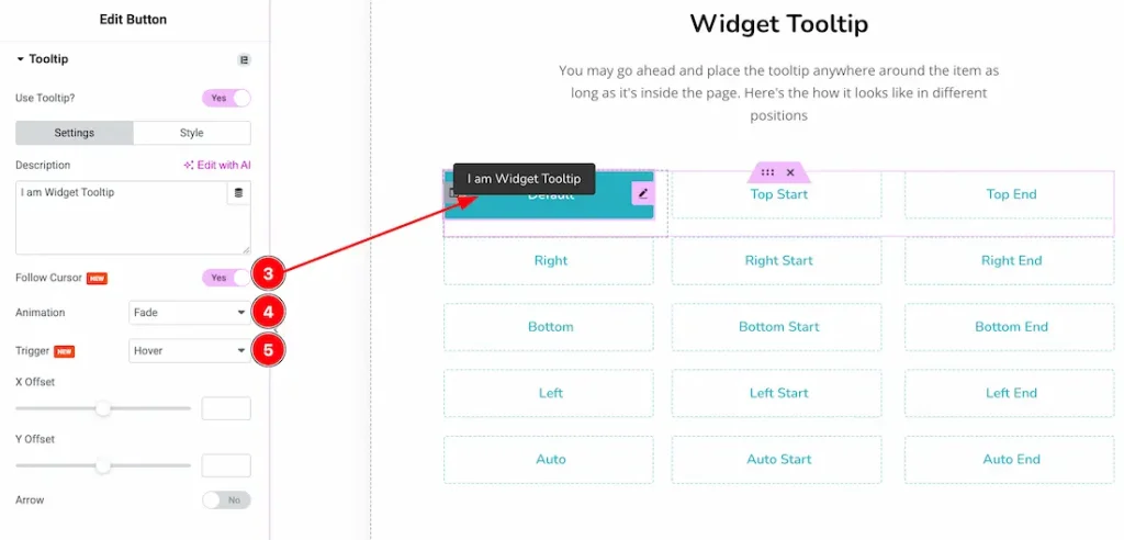
3. Follow Cursor: After activating the Follow Cursor Switcher button, the tooltip will move with the mouse cursor.
4. Animation: You can select the tooltip animation type- None, Fade, Shift Away, Shift Toward, Scale, Perspective, and Fill Effects.
5. Trigger: You can set the Trigger type- Hover, Click, and Custom Trigger. Here we select the trigger type- Hover.
Note: The Custom Trigger feature allows you to use any section, container, or widget class to trigger the tooltip.
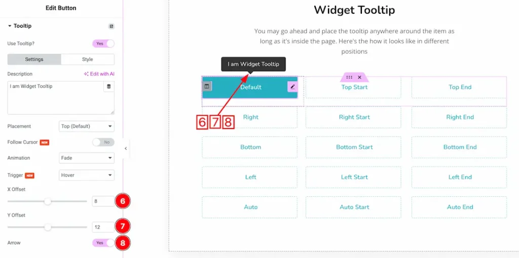
6. X Offset: This option lets you to set the tooltip X Offset.
7. Y Offset: This option lets you to set the tooltip Y Offset.
8. Arrow: Enable/disable the arrow switcher button to show/hide the tooltip arrow.
Lets proceed with the Style tab section-
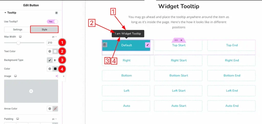
1. Max Width: This option lets you set the tooltip max width.
2. Text Color: This option lets you change the Tooltip text color.
3. Background Type: you can change the Tooltip background type classic or gradient. Here we choose the Background type Classic.
4. Background Color: This lets you change the tooltip background color. If you want, you also can change an image to the Background.
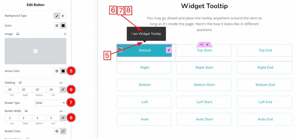
5. Arrow Color: This option lets you change the tooltip arrow color.
6. Padding: Adjust the tooltip padding from here.
7. Border Type: You can set the tooltip border type to Default, None, Solid, Double, Dotted, Dashed, or Groove. We choose the border type- solid.
8. Border Width: You can set the tooltip border width from here.
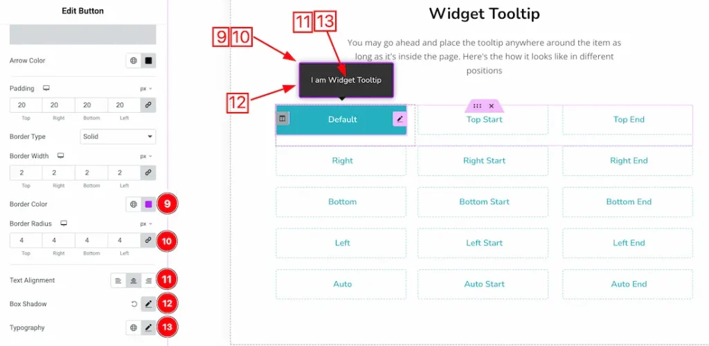
9. Border color: This option lets you change the tooltip border color.
10. Border Radius: You can adjust the tooltip border radius from here.
11. Text Alignment: Set the tooltip Text alignment – Left, Center, and Right.
12. Box Shadow: You can add the Tooltip Box shadow from here.
13. Typography: Change the font family, size, weight, style, transform, decoration, line height, letter spacing, and word spacing from here.
All done! You have successfully customized the Widget Tooltip Extension on your website.
Video Assist
You can watch the video tutorial to use the Widget Tooltip Extension. Please visit the demo page for examples.
Thanks for staying with us.