
The Video Player widget from Element Pack Pro is a versatile tool for embedding and showcasing video content beautifully on your website. It enables you to add fully responsive video players with customizable controls and display options, giving you the flexibility to enhance multimedia delivery and engage your audience effectively through Elementor. In this documentation, we will cover how to customize and use the Video Player widget provided by Element Pack Pro for Elementor.
Enable The Video Player Widget
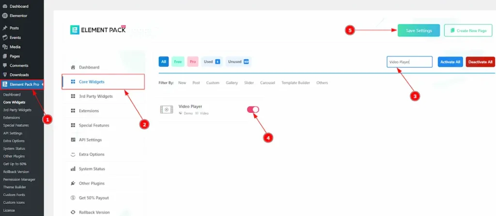
To use the Video Player widget from Element Pack Pro, first, you have to enable the widget.
- Go to WordPress dashboard → Element Pack Pro Plugin dashboard.
- Then, Click the Core Widgets Tab.
- Search the Video Player Widget Name.
- Enable the Video Player Widget.
- Hit the Save Settings Button.
Inserting The Video Player Widget
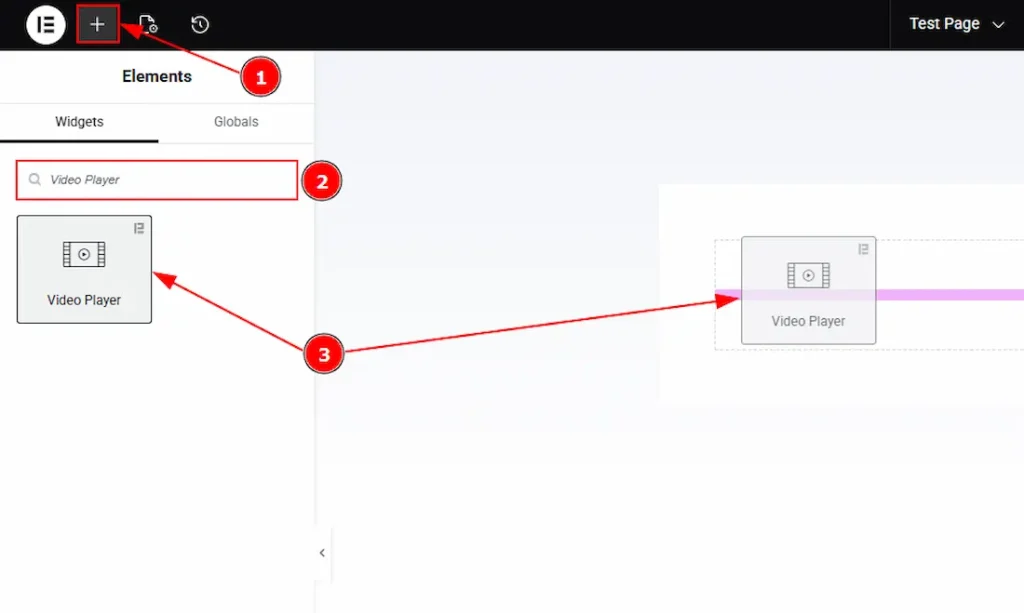
1. Go to the Elementor Editor Page and hit the “+” icon Button.
2. Search the Video Player name.
3. Drag the widget and drop it on the editor page.
Work With The Content Tab
Video Section
Go to Content → Video
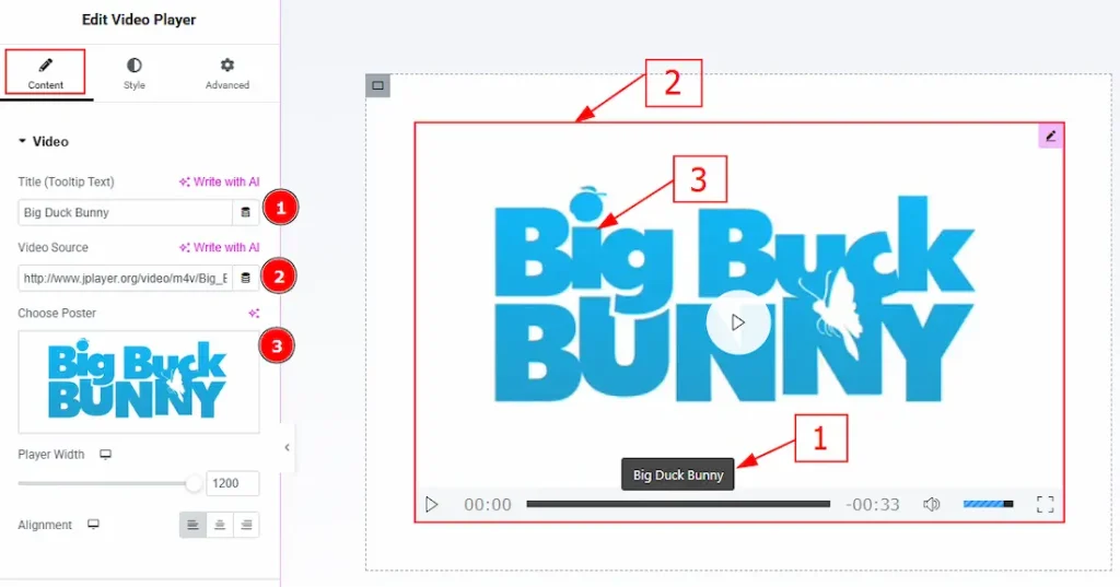
1. Title (Tooltip Text): You can make changes to the title (tooltip) text with this option. Please note that this will apply both on title tooltip and the title.
2. Video Source: You can add the video source link here to show the video to your audience. (You need to upload the video on WP media first, then paste the link in this field)
3. Choose Poster: You can add a poster to your video with this option.
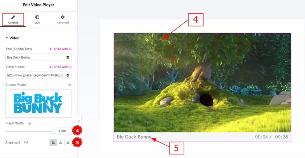
4. Player Width: You can make changes to the player width with this option.
5. Alignment: You can set the position of the title with this option. (Please note that this title will be visible only when you play the video and move your cursor from the video.)
Additional Section
Go to Content → Additional
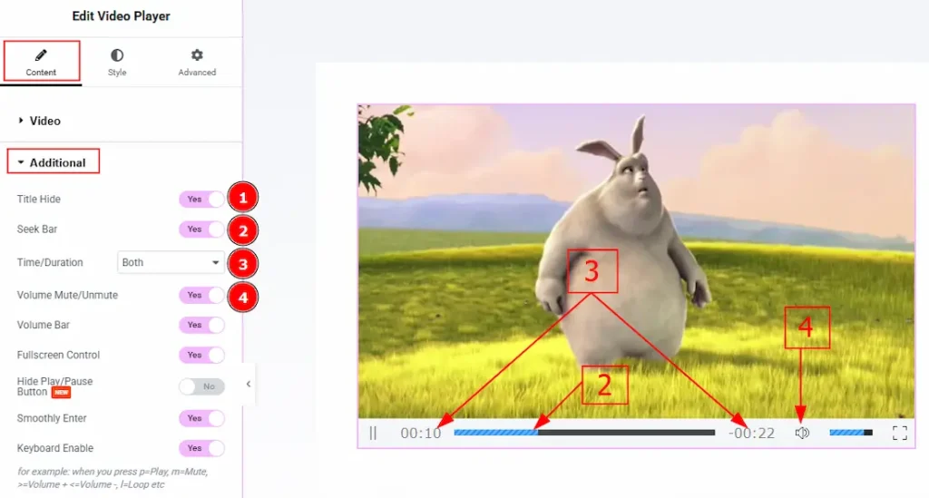
1. Title Hide: Enable the switcher to hide the title from the video player.
2. Seek Bar: Enable the switcher to show the seek bar to your audience.
3. Time/ Duration: Enable the switcher to show or hide time, duration or both to your audience.
4. Volume Mute/Unmute: Enable the switcher to allow the option of muting and unmuting volume to the audience.
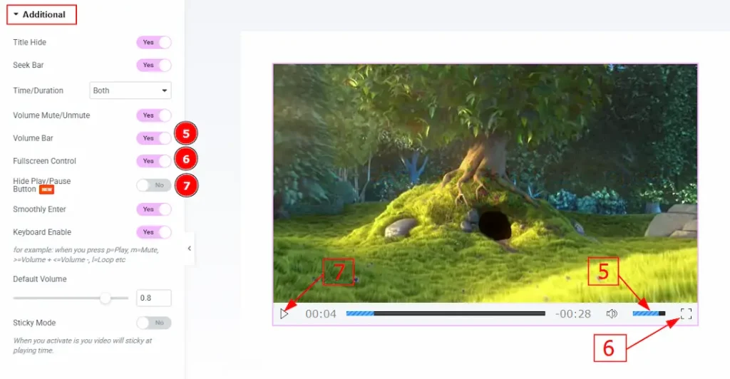
5. Volume Bar: Enable or disable the switcher to show or hide the volume bar for your audience.
6. Fullscreen Control: Enable or disable the switcher to the full-screen control option for your audience.
7. Hide Play/Pause Button: Enable the switcher to hide the play/pause button for your audience with this option.
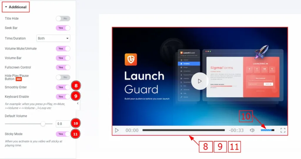
8. Smoothly Enter: Enabling this option, it allows a smooth entrance animation when the video player appears on the screen.
9. Keyboard Enable: When this option is enabled, users can control the video player using their keyboard. (for example: when you press p=Play, m=Mute, >=volume +, <=volume – , l=Loop etc)
10. Default Volume: You can set the default volume for the video player with this option.
11. Sticky Mode: Enable the switcher to allow the video player to remain visible on the screen while the user scrolls the page.
Work with The Style Tab
Video Player Section
Go to Style → Video Player
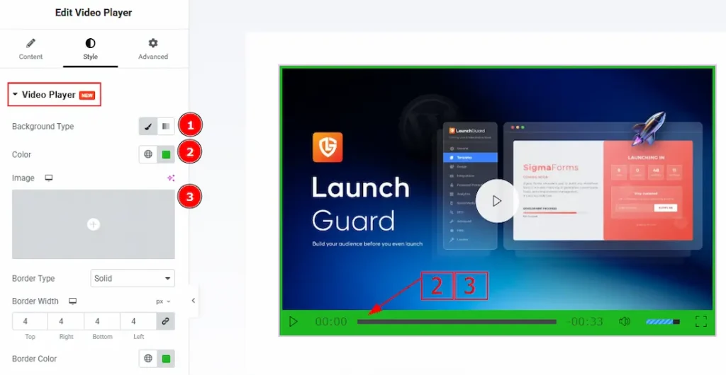
1. Background Type: You can select the background type to be Classic or Gradient with this option.
2. Color: You can change the background color with this option.
3. Image: You can change the background image with this option.
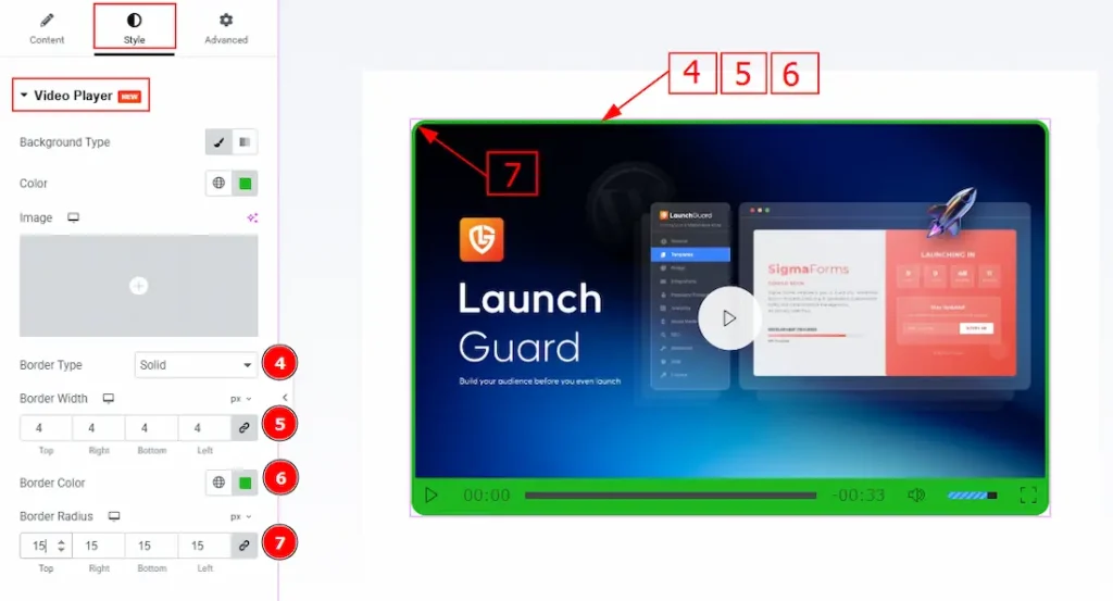
4. Border Type: You can add or change the border types with this option.
5. Border Width: You can set the thickness of the border with this option.
6. Border Color: You can change the border color with this option.
7. Border Radius: You can control the roundness of the border with this option.
Video Play Button Section
Go to Style → Video Play Button
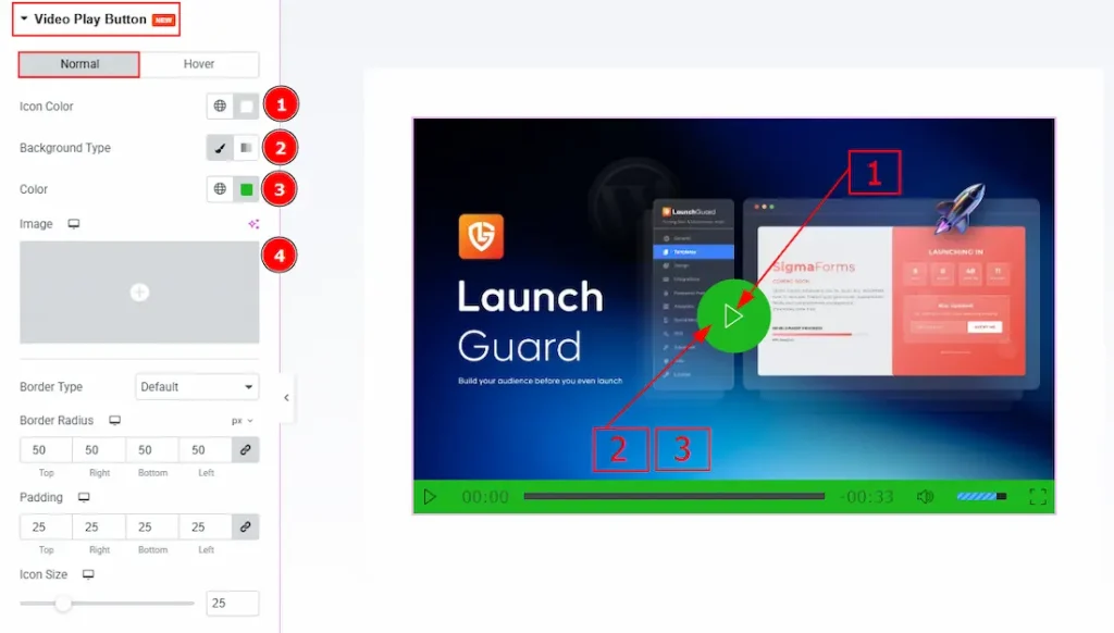
In this section, we have two more tabs. These are Normal & Hover. Let’s start with the Normal Tab first –
1. Icon Color: You can make changes to the icon color with this option.
2. Background Type: You can select the background type to be Classic or Gradient with this option.
3. Color: You can change the background color with this option.
4. Image: You can change the background image with this option.
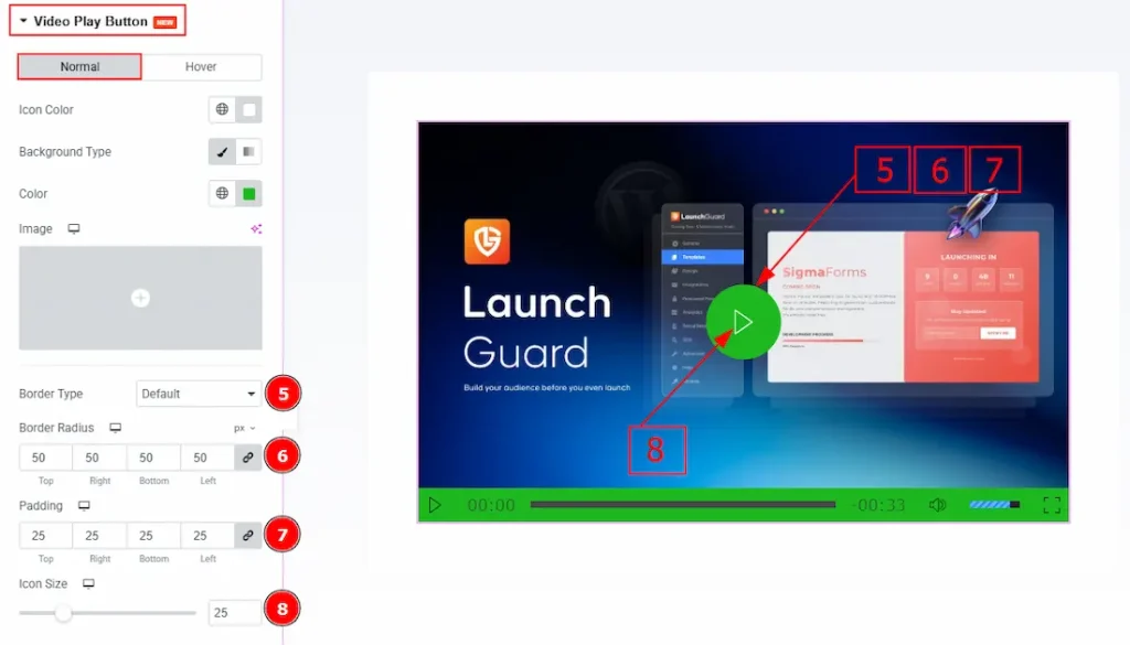
5. Border Type: You can add and change the border types with this option.
6. Border Radius: You can control the roundness of the border with this option.
7. Padding: This option allows you to adjust the inner space of the play button field.
8. Icon Size: You can make changes to the play icon size with this option.
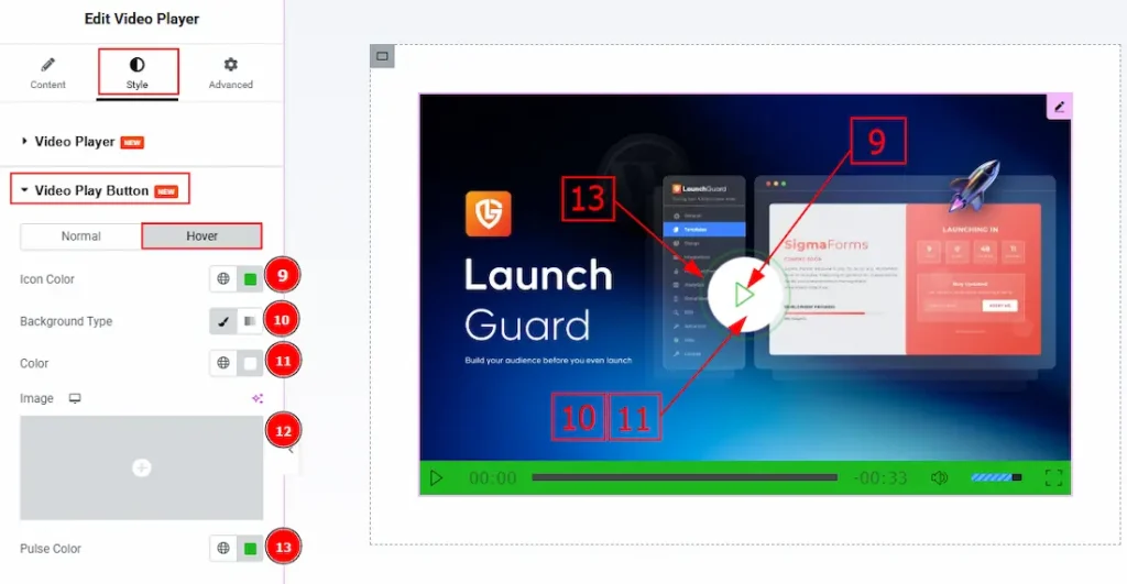
Now, let’s proceed to the Hover Tab –
9. Icon Color: You can change the play icon hover color with this option.
10. Background Type: You can select the background type to be classic or gradient with this option.
11. Color: You can change the background hover color with this option.
12. Image: You can change the background image with this opinion.
13. Pulse Color: You can make changes to the pulse color with this option.
Control Area Section
Go to Style → Control Area
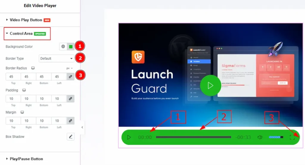
1. Background Color: You can change the background color of the control area with this option.
2. Border Type: You can add and change the border type with this option.
3. Border Radius: You can control the roundness of the border with this option.
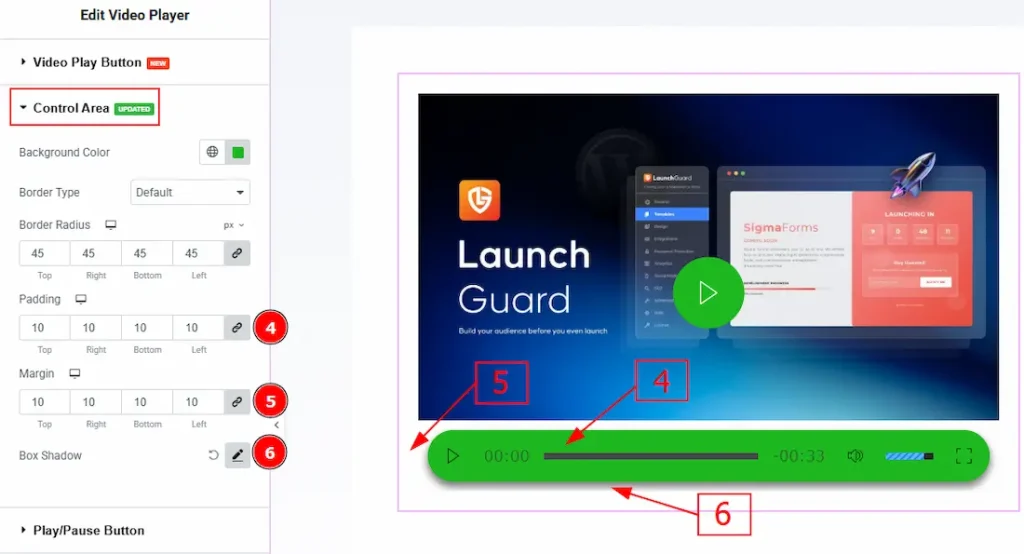
4. Padding: You can adjust the inner space of the control area field with this option.
5. Margin: You can adjust the outer space of the control area field with this option.
6. Box Shadow: You can add a shadow effect to the control area field with this option.
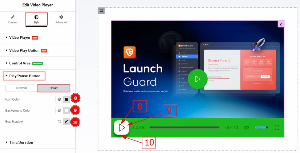
Play/Pause Button Section
Go to Style → Play/Pause Button
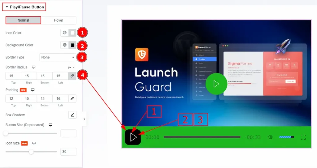
In this section, we have two more tabs. These are Normal & Hover. Let’s start describing the Normal Tab first –
1. Icon Color: You can make changes to the play button icon color with this option.
2. Background Color: You can change the background color of the play button with this option.
3. Border Type: This option allows you to add and change the border type.
4. Border Radius: This option controls the roundness of the border.
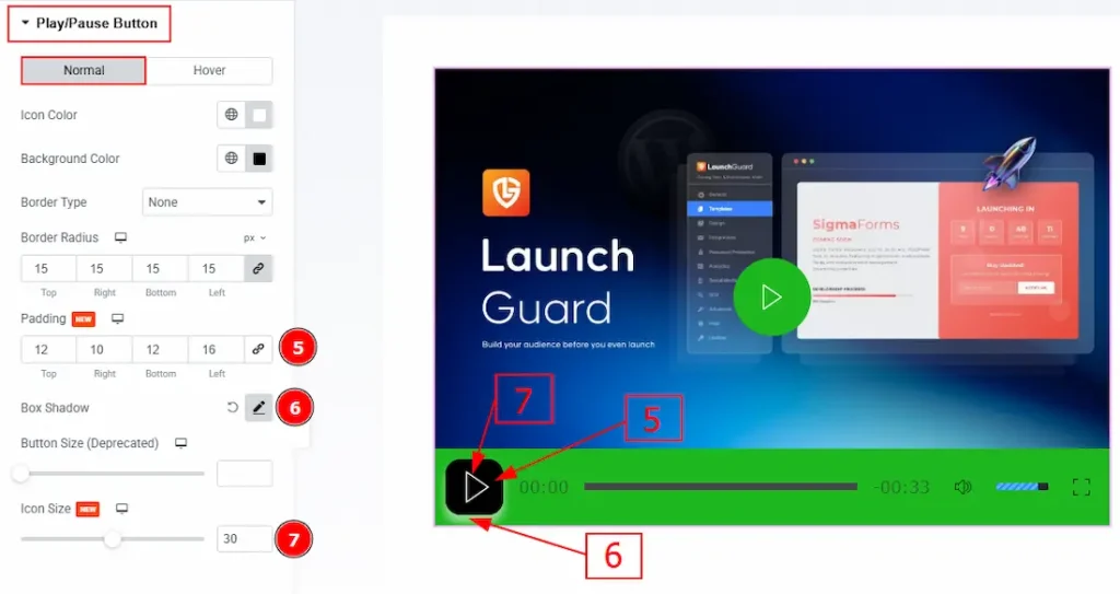
5. Padding: You can adjust the inner space of the play button with this option.
6. Box Shadow: You can add a shadow effect to the play/pause button with this option.
7. Icon Size: You can adjust the size of the play/pause icon with this option.
Now let’s proceed to the Hover Tab –
8. Icon Color: You can make changes to the play/pause icon hover color with this option.
9. Background Color: You can change the background hover color with this option.
10. Box Shadow: You can add a hover shadow effect to the play/pause button with this option.
Time/Duration Section
Go to Style → Time/Duration
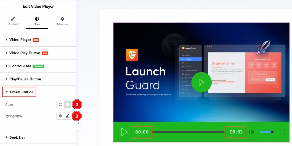
1. Color: You can make changes to the time/duration color with this option.
2. Typography: Change the font family, size, weight, transform, style, decoration, line height, letter spacing, and word spacing from here.
Seek Bar Section
Go to Style → Seek Bar
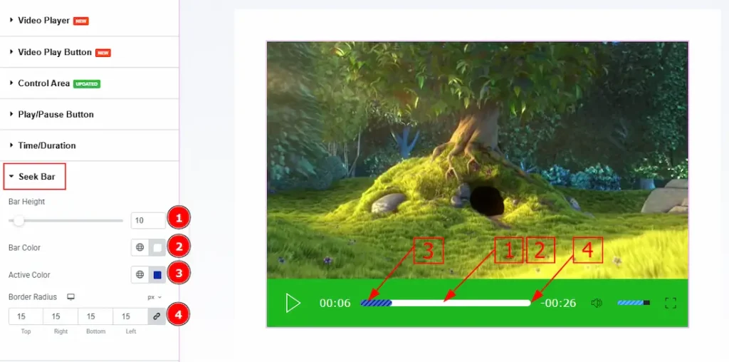
1. Bar Height: You can adjust the height of the seek bar with this option.
2. Bar Color: You can change the seek bar color with this option.
3. Active Color: You can change the seek bar’s active color with this option.
4. Border Radius: You can control the roundness of the border with this option.
Volume Button Section
Go to Style → Volume Button
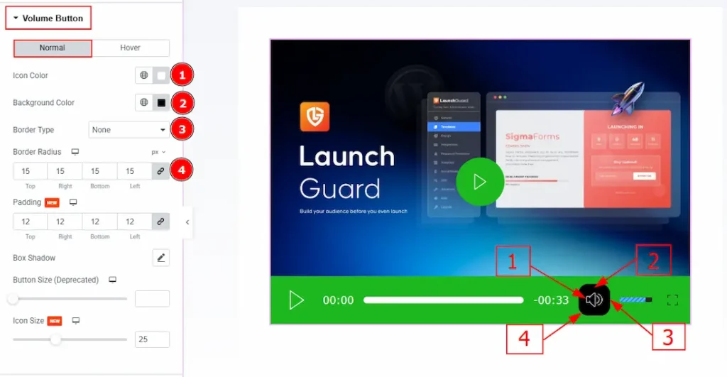
In this section, we have two more tabs. These are Normal & Hover. Let’s start with customizing the Normal tab –
1. Icon Color: You can make changes to the volume icon color with this option.
2. Background Color: You can change the background color of the volume button with this option.
3. Border Type: You can add and change the border types to the volume button with this option.
4. Border Radius: You can control the roundness of the border with this option.
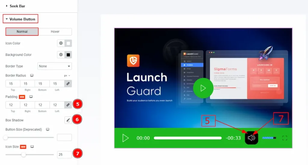
5. Padding: You can adjust the inner space of the volume button with this option.
6. Box Shadow: You can add a shadow effect to the volume button with this option.
7. Icon Size: You can make changes to the volume icon size with this option.
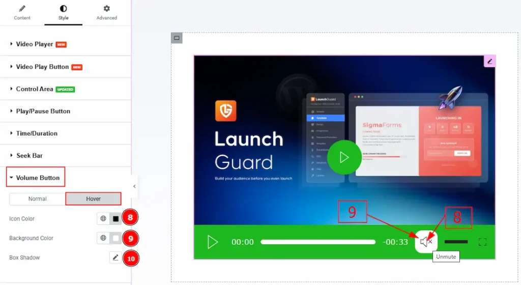
Now, let’s proceed to the Hover Tab –
8. Icon Color: You can change the volume icon hover color with this option.
9. Background Color: You can change the volume button background hover color with this option.
10. Box Shadow: You can add a hover shadow effect to the volume button with this option.
Volume Bar Section
Go to Style → Volume Bar
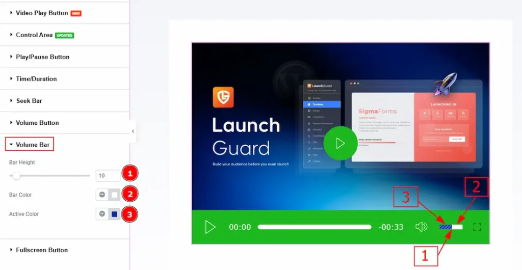
1. Bar Height: You can adjust the volume bar height with this option.
2. Bar Color: You can change the volume bar color with this option.
3. Active Color: You can change the volume bar’s active color with this option.
Fullscreen Button Section
Go to Style → Fullscreen Button
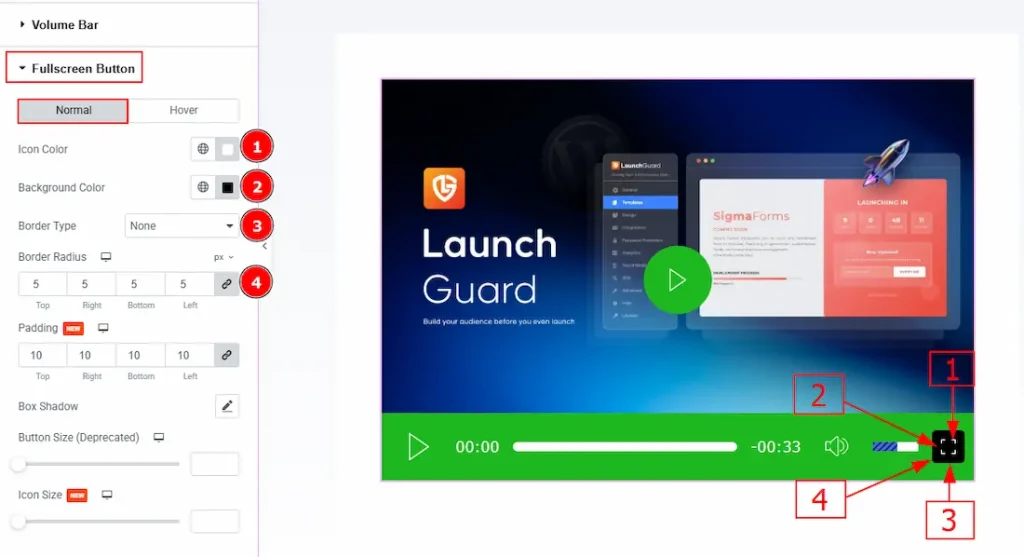
In this section, we have two more tabs. These are Normal and Hover. Let’s start with this Normal tab –
1. Icon Color: You can change the full-screen icon color with this option.
2. Background Color: You can change the background color of the full-screen button with this option.
3. Border Type: You can add or change the border type with this option.
4. Border Radius: You can control the roundness of the border with this option.
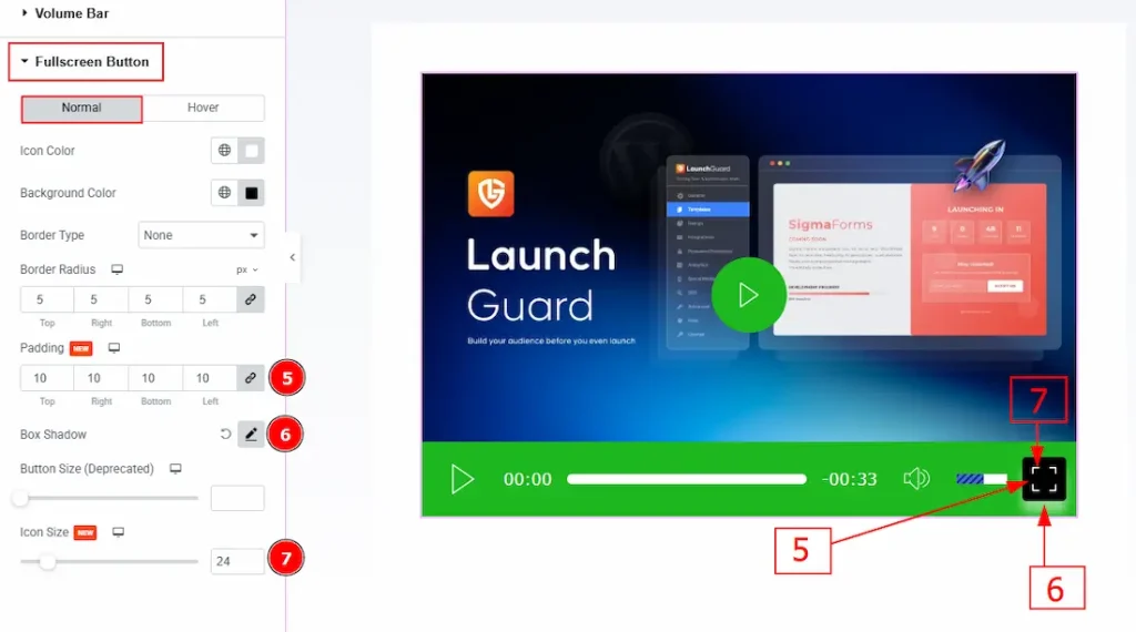
5. Padding: You can adjust the inner space of the full-screen button with this option.
6. Box Shadow: You can add a shadow effect to the full-screen button with this option.
7. Icon Size: You can make changes to the icon size with this option.
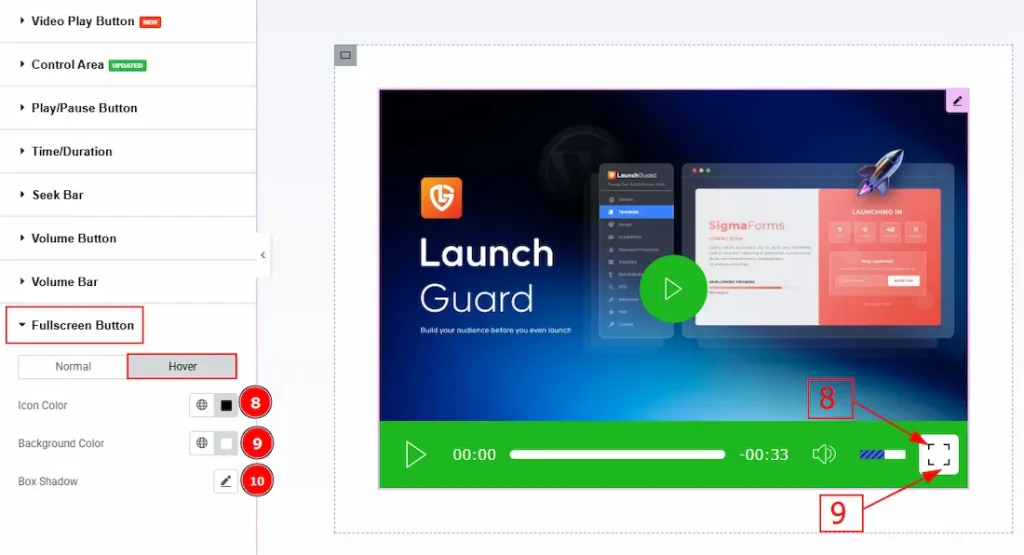
Now, let’s proceed to the Hover Tab –
8. Icon Color: You can change the icon hover color with this option.
9. Background Color: You can change the full-screen background hover color with this option.
10. Box Shadow: You can add a hover shadow effect to the button with this option.
All done! You have successfully customized the Video Player widget on your website.
Video Assist
You can also watch the video tutorial to learn more about the Video Player widget. Please visit the demo page for examples.
Thanks for being with us.