
The Vertical Menu widget from Element Pack Pro lets you display navigation links in a clean vertical layout. It helps organize pages or categories for easy browsing, with customizable styles and layout controls. This documentation explains how to use and customize the Vertical Menu widget in Elementor.
Enable The Vertical Menu Widget
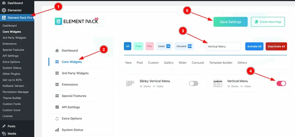
To use the Vertical Menu widget from Element Pack Pro, first, you have to enable the widget.
- Go to WordPress dashboard → Element Pack Pro Plugin dashboard.
- Then, Click the Core Widgets Tab.
- Search the Vertical Menu Widget Name.
- Enable the Vertical Menu Widget.
- Hit the Save Settings Button.
Inserting The Vertical Menu Widget
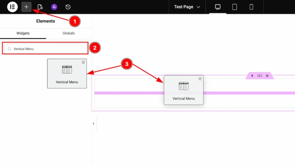
1. Go to the Elementor Editor Page and hit the “+” icon Button.
2. Search the Vertical Menu name.
3. Drag the widget and drop it on the editor page.
Work With The Content Tab
Vertical Menu Section
Go to Content → Vertical Menu
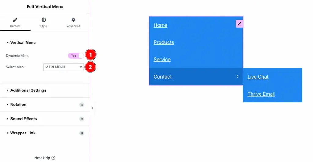
1. Dynamic Menu: Enable the switcher to get the option to add an existing menu that you have created before.
2. Select Menu: You can select the existing menu with this option.
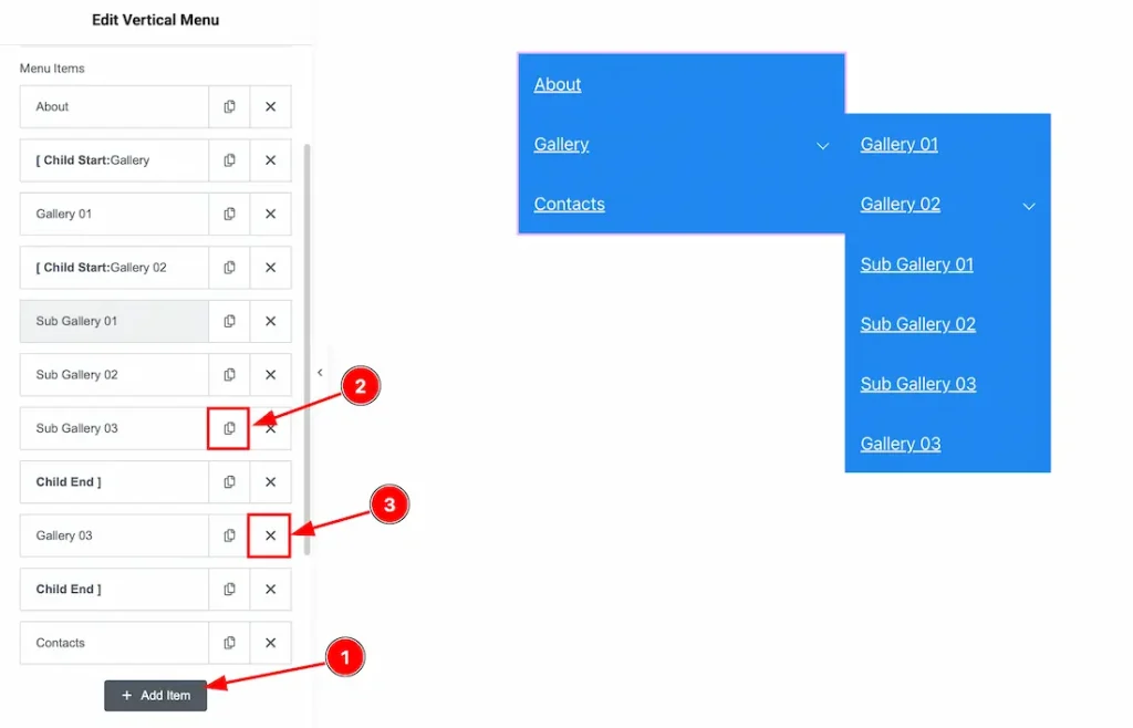
If you haven’t added any existing menu to the editor by using the upper dynamic menu option, then you can create a vertical menu by using the option below option-
1. Add Item: You can add a new item by clicking the “+” Add Item button.
2. Copy Item: This option lets you copy the same item.
3. Close Item: You can delete the menu item by clicking the Close icon button.
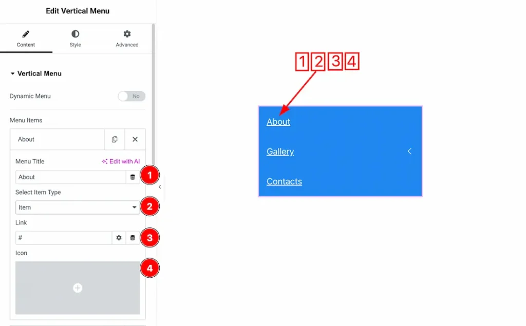
In the Vertical Menu Items, each item contains more options. There are –
1. Menu Title: You can add and make changes to the menu title text with this option.
2. Select Item Type: You can use this option to choose the item type: Item, Child Start, or Child End. Select Item for a single menu entry, Child Start to begin adding sub-items under a parent item, and Child End to close the sub-item group.
3. Link: You can add a link to the menu item with this option.
4. Icon: You can add an icon to the menu item with this option.
Additional Settings Section
Go to Content → Additional Settings
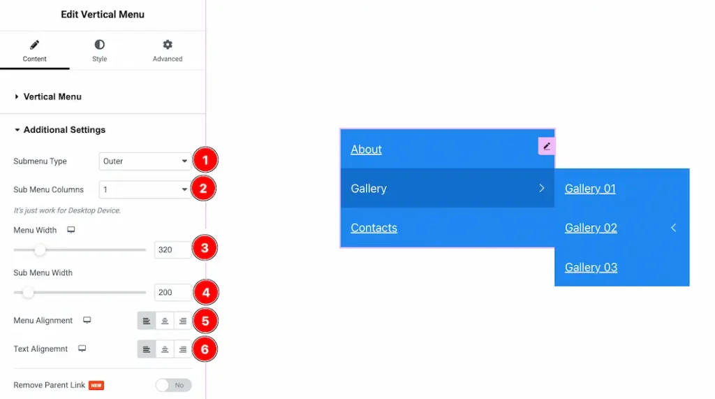
1. Submenu Type: You can choose the submenu type between outer and inner with this option. This option lets you decide how you want to show the menu items.
2. Sub Menu Columns: You can select the column number to show your menu items with this option. Please remember that this option will work only on a desktop device.
3. Menu Width: You can make changes to the menu items width with this option.
4. Sub Menu Width: You can make changes to the submenu item with this option.
5. Menu Alignment: You can adjust the position of the menu with this option.
6. Text Alignment: You can adjust the position of the menu item text with this option.
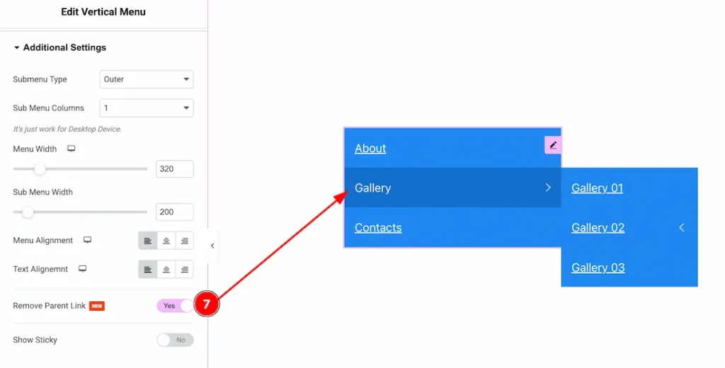
7. Remove Parent Link: Enable the switcher to remove the parent link from the parent menu item.
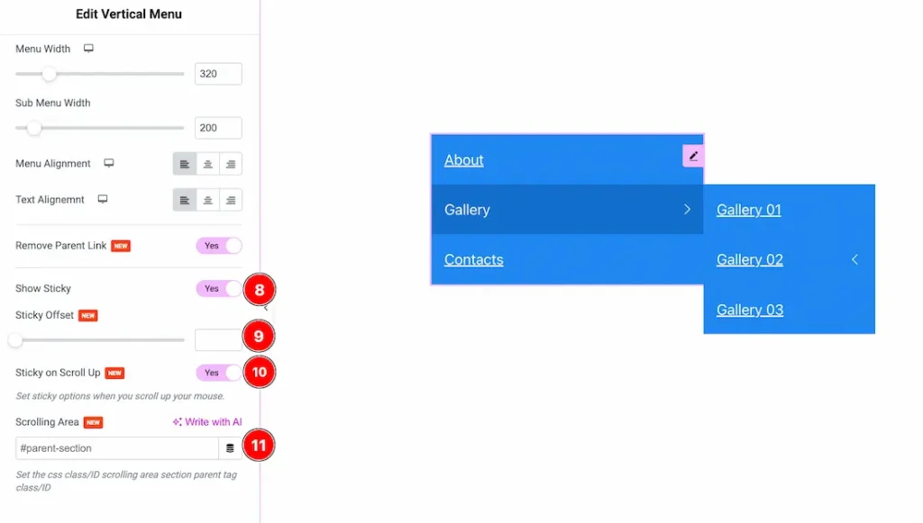
8. Show Sticky: Enable this option to keep the vertical menu fixed (sticky) while scrolling & to show more options to customize the menu as sticky.
9. Sticky Offset: You can set the top spacing (in pixels) before the sticky menu becomes active.
10. Sticky on Scroll Up: You can activate the sticky menu only when scrolling your mouse upward.
11. Scrolling Area: Define a specific parent section (CSS ID/Class) where the sticky behavior will apply.
Work with The Style Tab
Main Menu Section
Go to Style → Main Menu
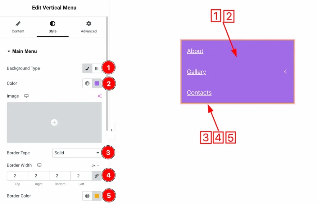
1. Background Type: You can choose the background type between the classic and gradient styles with this option. Here, we have selected the background type as classic.
2. Color: You can change the background color of the menu item with this option, and below you will get an option to add a background image.
3. Border Type: You can add and change the border type between none, solid, dotted, dashed, double & groove with this option.
4. Border Width: You can set the thickness of the border with this option.
5. Border Color: You can change the border color with this option.
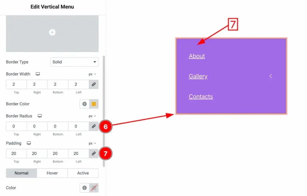
6. Border Radius: You can control the roundness of the border with this option.
7. Padding: You can adjust the inner space of the enu field with this option.
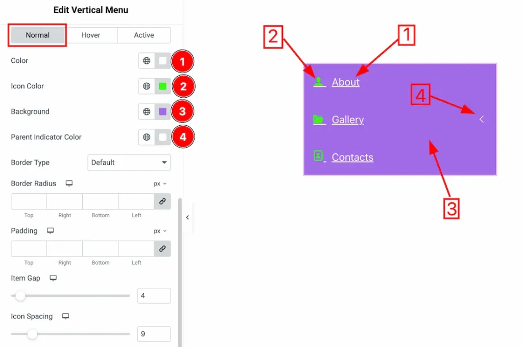
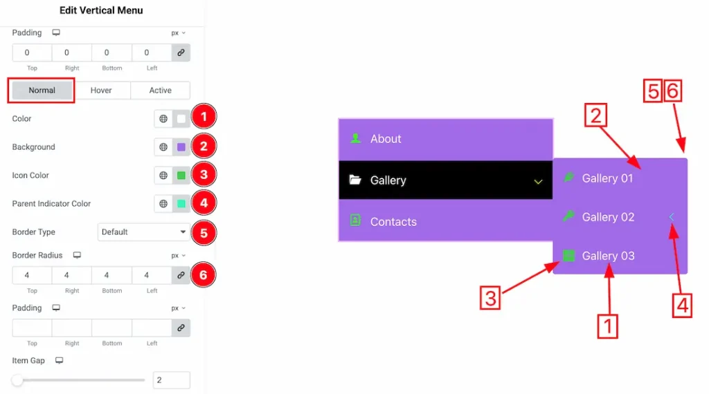
In this section, we have three more tabs. These are Normal, Hover & Active. Let’s start exploring those one by one.
1. Color: You can change the main menu item text color with this option.
2. Icon Color: You can make changes to the icon color with this option.
3. Background: You can change the background color of the menu item with this option.
4. Parent Indicator Color: You can change the menu item’s parent indicator color with this option.
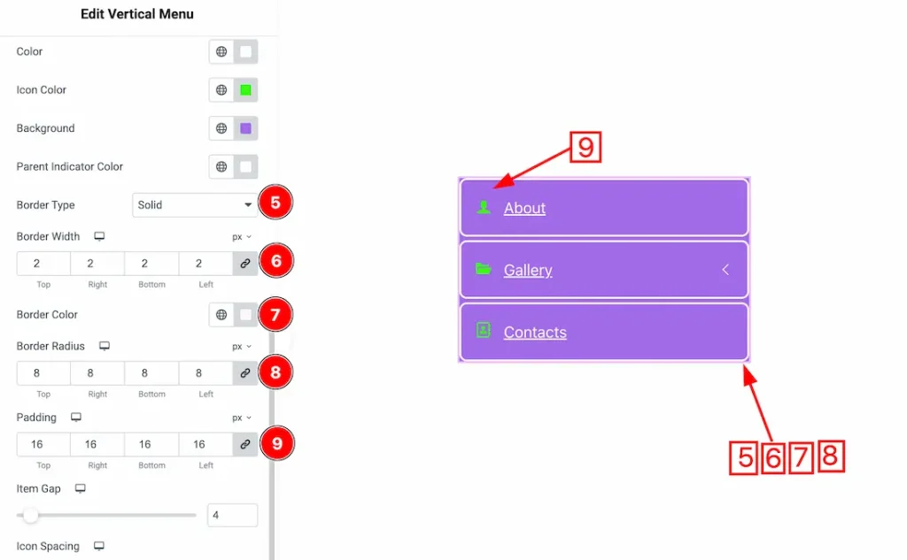
5. Border Type: You can add or change the border of the menu item with this option.
6. Border Width: Set the thickness of the border with this option.
7. Border Color: You can change the border color with this option.
8. Border Radius: This option controls the roundness of the border.
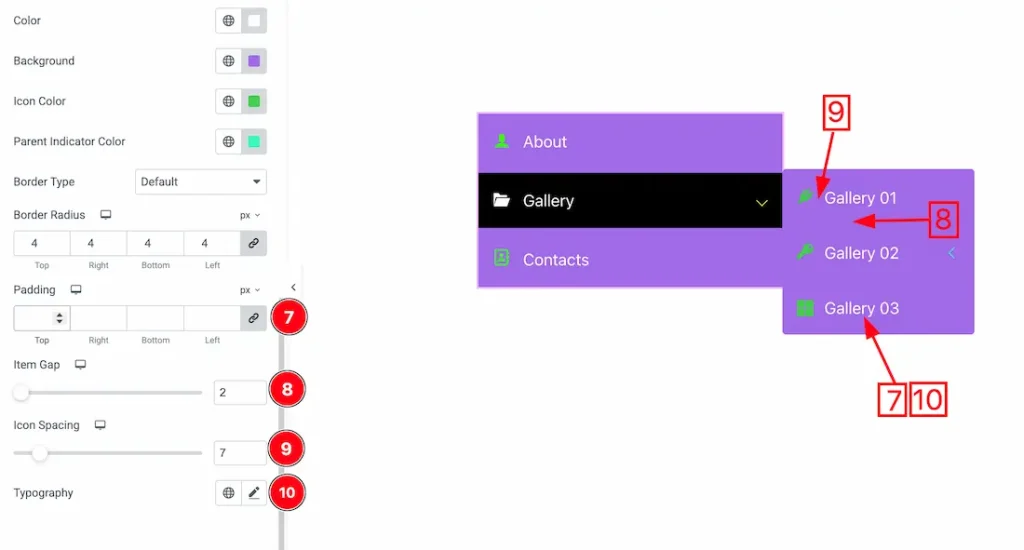
9. Padding: You can adjust the inner space of the main menu item with this option.
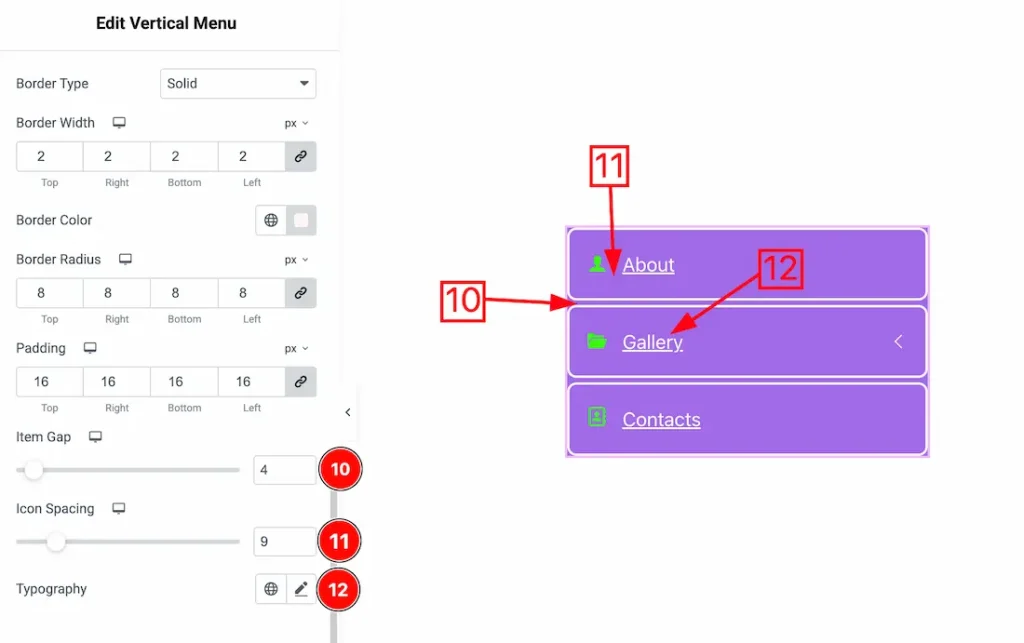
10. Item Gap: You can adjust the space between the menu items with this option.
11. Icon Spacing: You can adjust the space between the menu item text & the icon with this option.
12. Typography: Change the font family, size, weight, transform, style, decoration, line height, letter spacing, and word spacing from here.
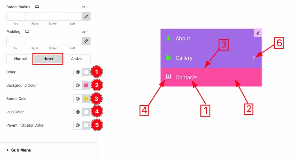
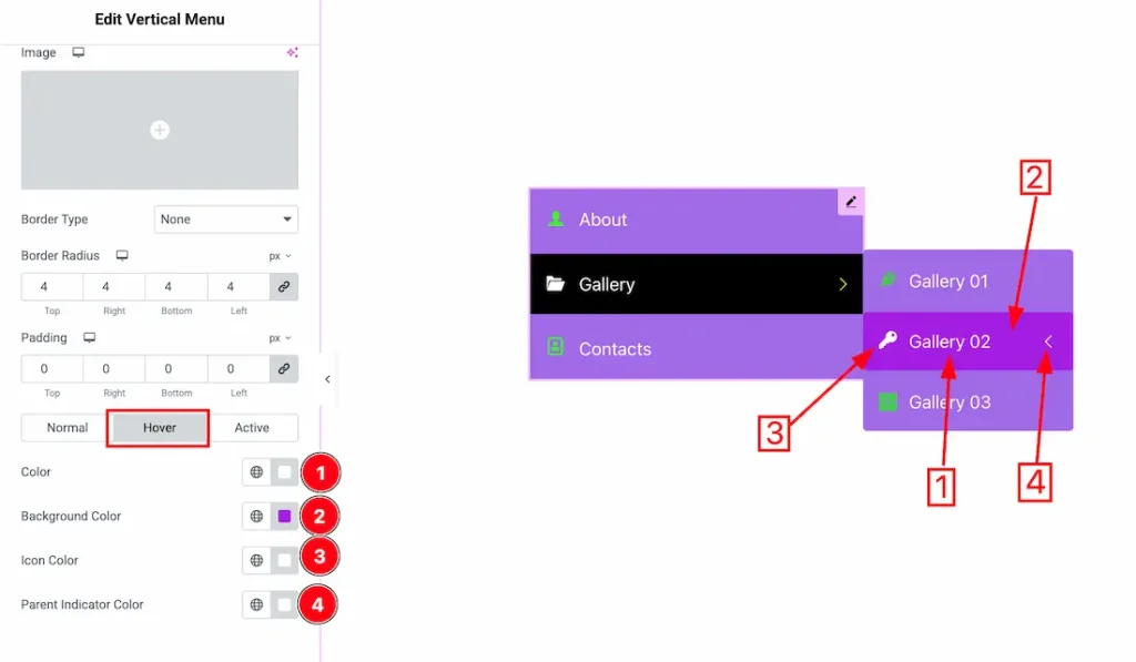
Now, let’s proceed to the Hover Tab –
1. Color: You can change the menu item text hover color with this option.
2. Background Color: You can change the background hover color of the menu item with this option.
3. Border Color: You can change the border hover color with this option.
4. Icon Color: You can change the icon hover color with this option.
5. Parent Indicator Color: You can change the hover parent indicator color with this option.
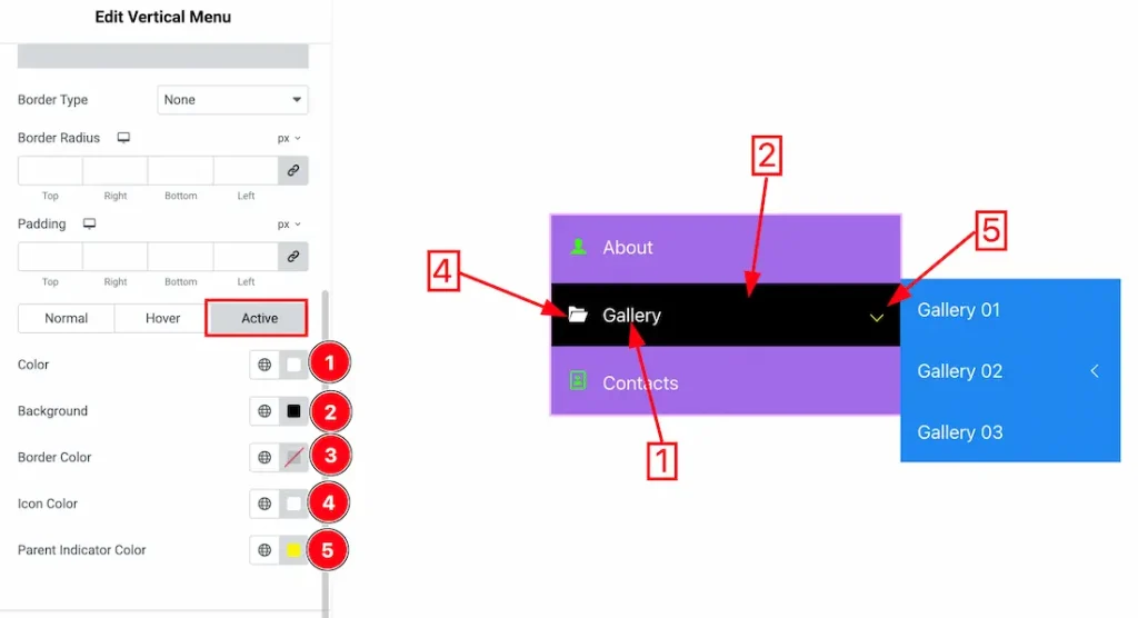
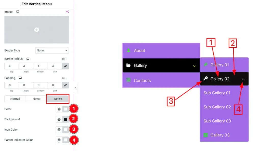
Now, let’s proceed to the Active Tab –
1. Color: You can change the menu item text’s active color with this option.
2. Background Color: You can change the background active color of the menu item with this option.
3. Border Color: You can change the border active color with this option.
4. Icon Color: You can change the icon’s active color with this option.
5. Parent Indicator Color: You can change the active parent indicator color with this option.
Sub Menu Section
Go to Style → Sub Menu
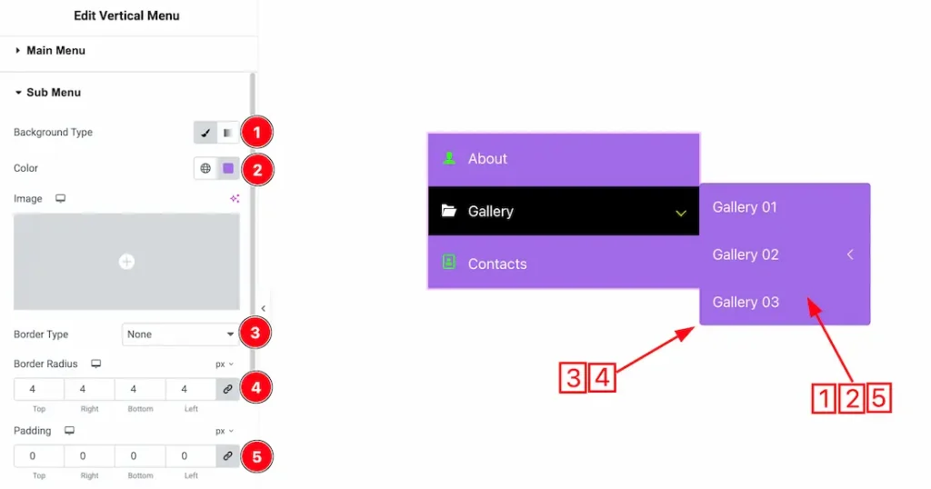
1. Background Type: You can select the background type to be classic or gradient with this option. Here, we have selected the background type as classic.
2. Color: You can change the background color of the submenu field with this option.
3. Border Type: You can add and change the border type with this option.
4. Border Radius: You can control the roundness of the border with this option.
5. Padding: You can adjust the inner space of the submenu field with this option.
In this section, we have three more tabs. These are Normal, Hover & Active. Let’s start with the Normal Tab first –
1. Color: You can change the sub-menu item text color with this option.
2. Background: You can change the submenu item background color with this option.
3. Icon Color: You can change the sub menu item icon color with this option.
4. Parent Indicator Color: You can change the submenu item parent indicator color with this option.
5. Border Type: You can add or change the border type with this option.
6. Border Radius: You can control the roundness of the border with this option.
7. Padding: You can adjust the inner space of the submenu item with this option.
8. Item Gap: You can adjust the space between the submenu items with this option.
9. Icon Spacing: You can control the space between the icon and the sub-menu item text with this option.
10. Typography: Change the font family, size, weight, transform, style, decoration, line height, letter spacing, and word spacing from here.
Now, let’s proceed to the Hover Tab –
1. Color: You can change the submenu item text hover color with this option.
2. Background Color: You can change the submenu item background hover color with this option.
3. Icon Color: You can change the icon hover color with this option.
4. Parent Indicator Color: You can change the parent indicator hover color with this option.
Now, let’s proceed to the Active Tab –
1. Color: You can change the submenu item active color with this option.
2. Background: You can change the active background color of the submenu field with this option.
3. Icon Color: You can change the icon’s active color with this option.
4. Parent Indicator Color: You can change the submenu item parent indicator active color with this option.
All done! You have successfully customized the Vertical Menu widget on your website.
Video Assist
You can also watch the video tutorial to use the Vertical Menu widget. Please visit the demo page for examples.
Thanks for being with us.