In this documentation, we will discuss the customization of the Total Count widget, brought to you by the Element Pack Pro addon for Elementor.
Enable The Total Count Widget
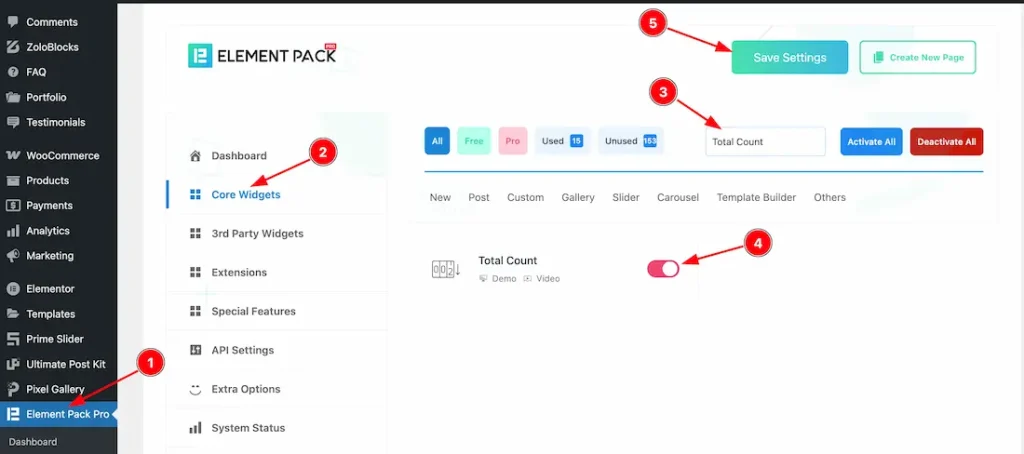
To use the Total Count widget from Element Pack Pro, first, you have to enable the widget.
- Go to WordPress dashboard → Element Pack Pro Plugin dashboard.
- Then, Click the Core Widgets Tab.
- Search the Total Count Widget Name.
- Enable the Total Count Widget.
- Hit the Save Settings Button.
Inserting the Total Count widget
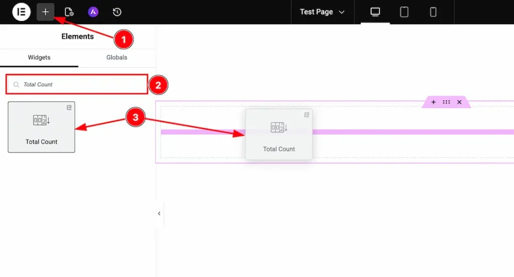
1. Go to the Elementor Editor Page and hit the “+” icon Button.
2. Search the Total Count widget.
3. Drag the widget and drop it on the editor page.
Work With The Content Tab
Count Layout Section
Go to Content → Count Layout
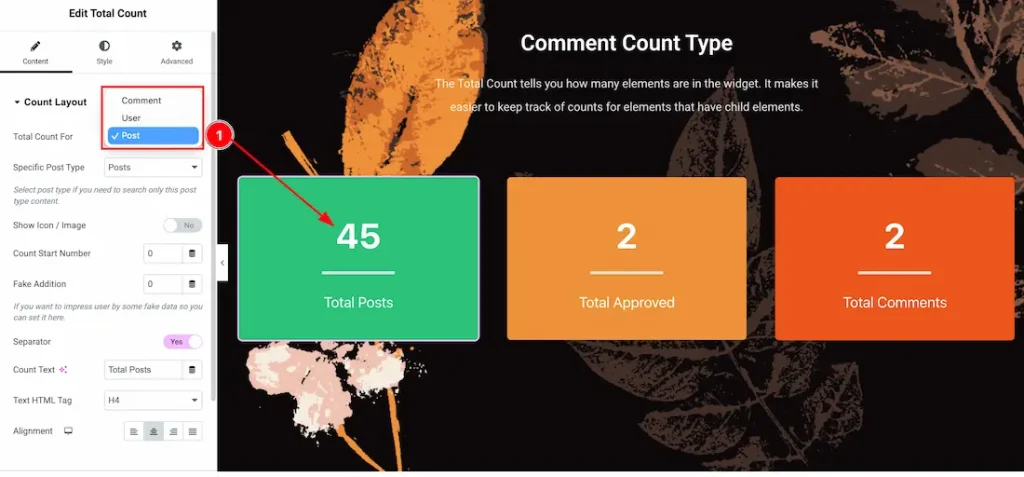
1. Total Count For: Inside this feature, you will get the Post, User, and Comment options. You can choose the preferred option that you want to display. Here we choose the post option.
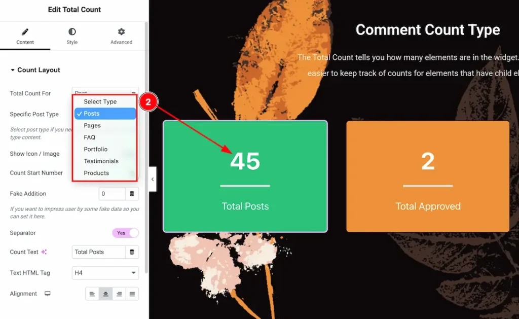
2. Specific Post Type: From here, you can choose the Post Type – Posts, Pages, FAQ, Portfolio, Testimonial, and Products. You can choose one of them.
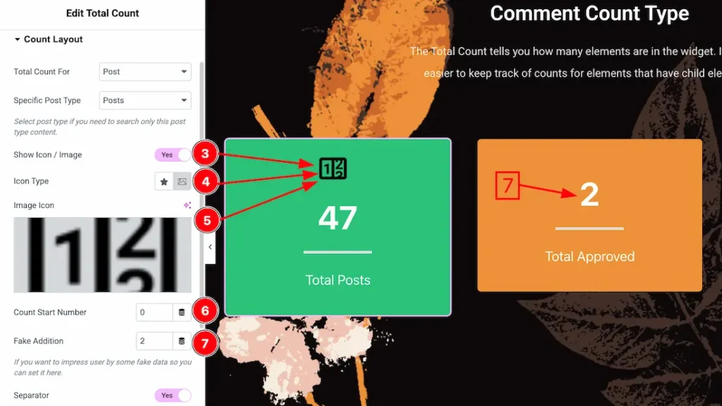
3. Show Icon/Image: Enable/disable the show icon/image switcher button to show/hide the icon/image from the counter.
4. Icon Type: Here, you will get the icon type – icon and image. You can choose one of them.
5. Choose icon/image: This option lets you change the icon/image of the counter.
6. Count Start Number: You can set the count start number from here.
7. Fake Addition: You can add the fake number from here.
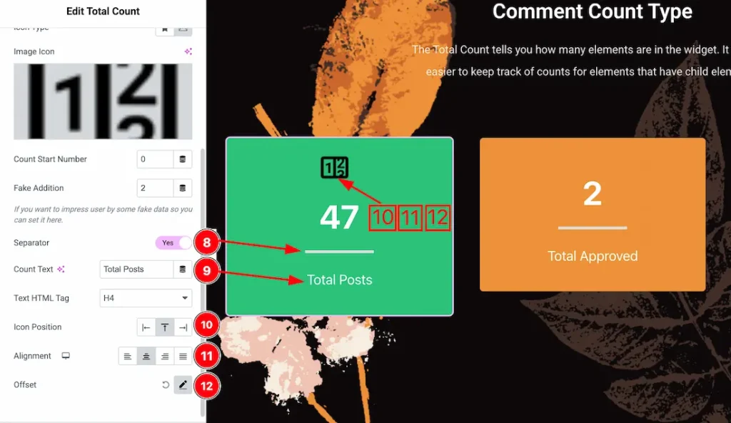
8. Separator: Enable/disable the separator switcher button to show/hide the separator from counter.
9. Count Text: This option lets you change the count text.
10. Icon Position: You can set the icon position – left, top, or right from here.
11. Alignment: You can set the counter content alignment – left, center, right, or justify.
12. Offset: You can set the icon/image horizontal and vertical offset from here.
Additional Option Section
Go to Content → Additional Option

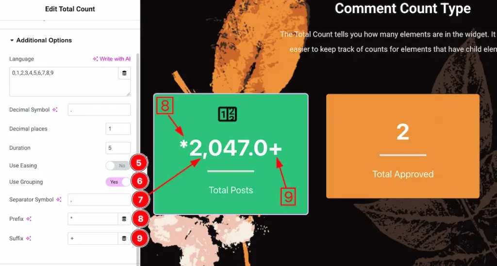
1. Language: You can keep your preferred language number inside the language field.
2. Decimal Symbol: You can add the decimal symbol from here.
3. Decimal Places: You can set the decimal place from here. For example, if you set the place to 1, then after the decimal symbol, it will take one character/number place.
4. Duration: You can set the count animation duration from here.
5. Use Easing: The easing option defines the animation timing behavior, making the counting effect feel more natural and visually appealing instead of moving at a constant speed.
6. Use Grouping: If you enable the use grouping switcher button, then the Separator symbol will appear.
7. Separator Symbol: You can add any symbol as a separator from here.
8. Prefix: You can add any symbol as a prefix.
9. Suffix: You can add any symbol as a suffix.
Work with The Style Tab
Icon/image Section
Go to Style → Icon/image
Lets Proceed with the Normal Tab section-
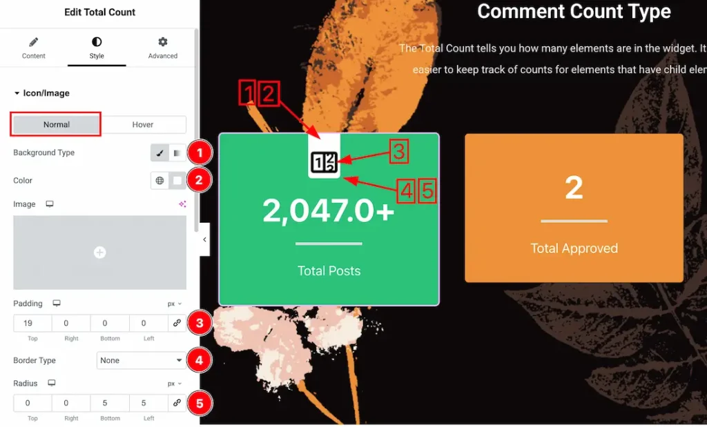
1. Background Type: You can change the image/icon background to classic or gradient. Here we choose the Background type Classic.
2. Background Color: This lets you change the icon/image Background color. If you want, you can also change an image to the Background.
3. Padding: Add spaces around an object to increase the inner area. Padding allows you to control the internal space within an element.
4. Border Type: You can set the Border Type to Default, None, Solid, Double, Dotted, Dashed, or Groove. We choose here the Border Type Solid.
5. Border Radius: Customizes the border corners for roundness.
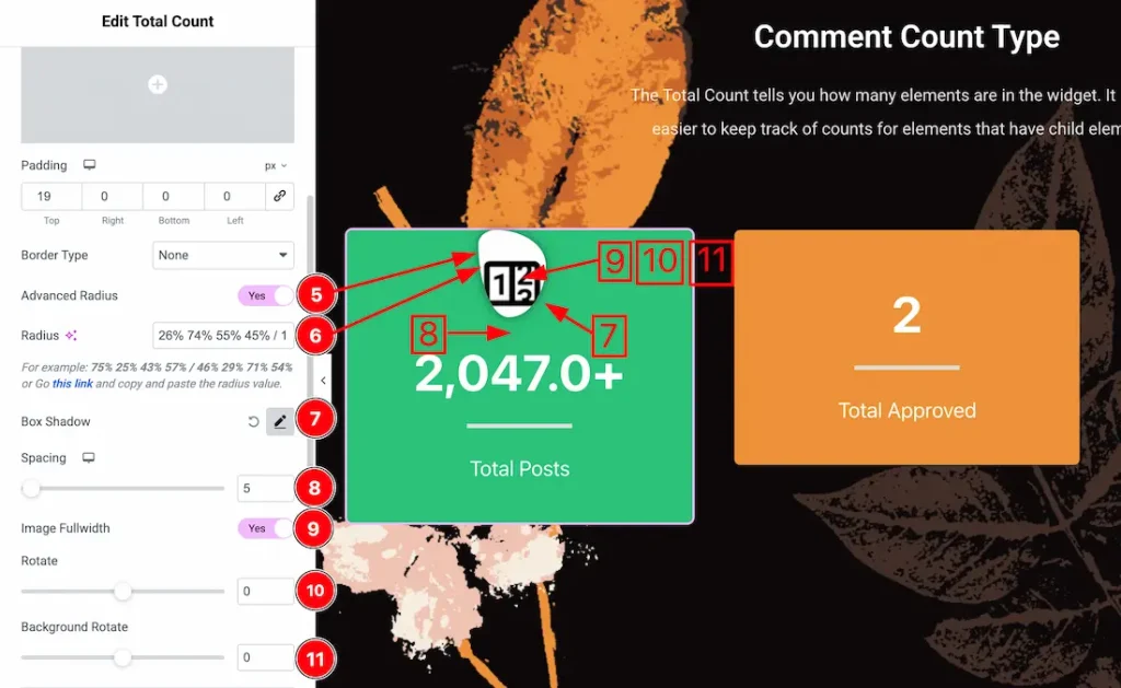
5. Advanced Radius: If you enable the advanced radius switcher button then you will get advanced option for the icon/image border radius.
6. Radius: Just keep the advanced radius value inside the radius field.
7. Box Shadow: You can add the image/icon box shadow from here.
8. Spacing: You can adjust the image/icon spacing from here.
9. Image Fullwidth: Enable the image fullwidth switcher button to make the image fullwidth.
10. Rotate: This option lets you rotate the icon/image.
11. Background Rotate: This option lets you rotate the icon/image background.
Image Effects Subsection

12. CSS Filters: You can apply CSS Filters for image/icon from here. Here are the feature details-
- Blur: Softens the image by reducing sharp edges, creating depth, or background focus effects.
- Brightness: Adjusts the overall lightness or darkness of the image to enhance visibility or mood.
- Contrast: Controls the difference between light and dark areas, making visuals appear sharper or flatter.
- Saturation: Increases or decreases color intensity to make images more vibrant or muted.
- Hue: Shifts the color spectrum of the image, allowing creative color transformations without changing the original asset.
13. Opacity: This option lets you control the visibility of the icon/image.
14. Transition Duration: You can set the CSS Filters transition duration from here.
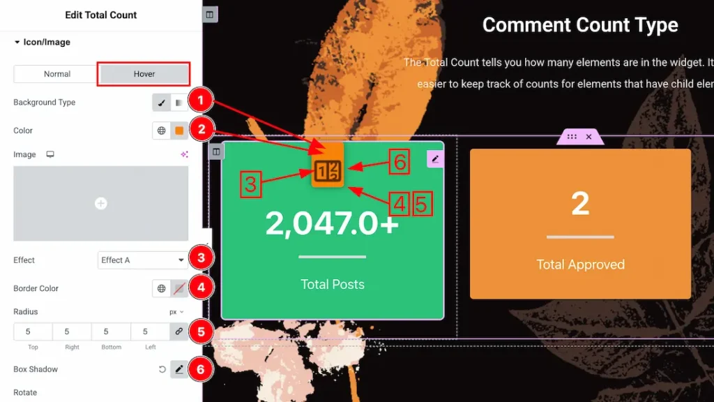
Lets Proceed with the Hover Tab section-
1. Background Type: You can change the icon/image hover background to classic or gradient. Here we choose the Background type Classic.
2. Background Color: This lets you change the icon/image hover Background color. If you want, you can also change an image to the Background.
3. Effects: You can set the icon/image hover effects from here.
4. Border Color: This option lets you set the image/icon hover border color.
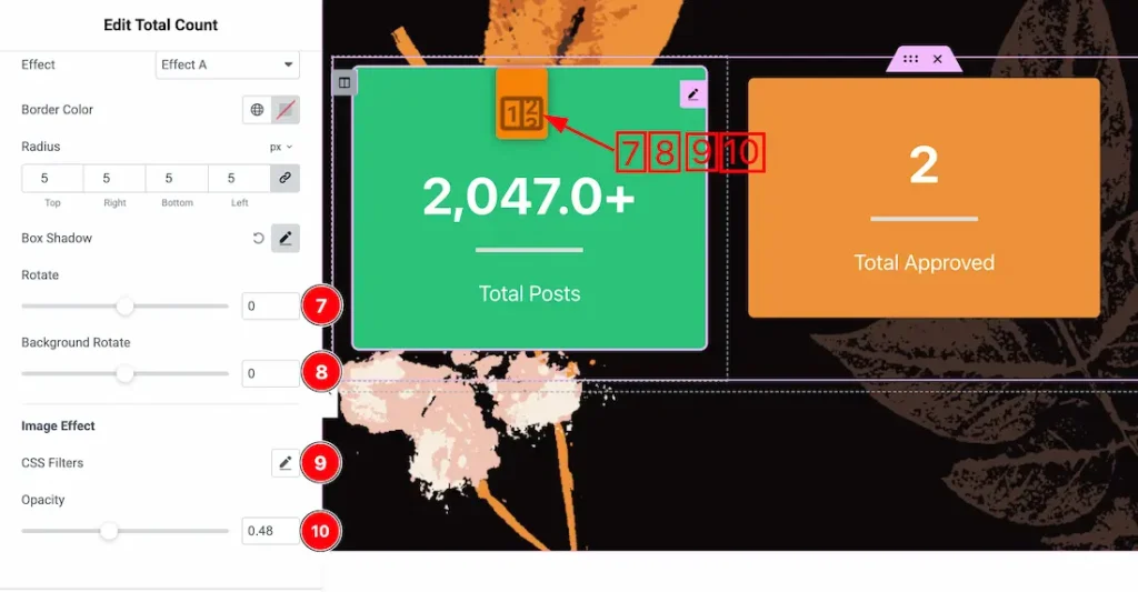
7. Rotate: This option lets you rotate the image/icon for hover.
8. Background Rotate: This option lets you rotate the image/icon background for hover.
9. CSS Filters: You can set the CSS filters for the hover image/icon.
10. Opacity: You can set the hover image/icon opacity value from here.
Count Number Section
Go to Style → Count Number
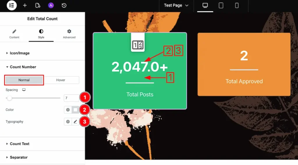
Come to the count number section. You will get two sub-sections; Normal, and Hover. Let’s proceed with the Normal Tab-
1. Spacing: You can adjust the count number spacing from here.
2. Color: This option lets you change the count number’s normal color.
3. Typography: Change the font family, size, weight, style, transform, decoration, line height, letter spacing, and word spacing from here.
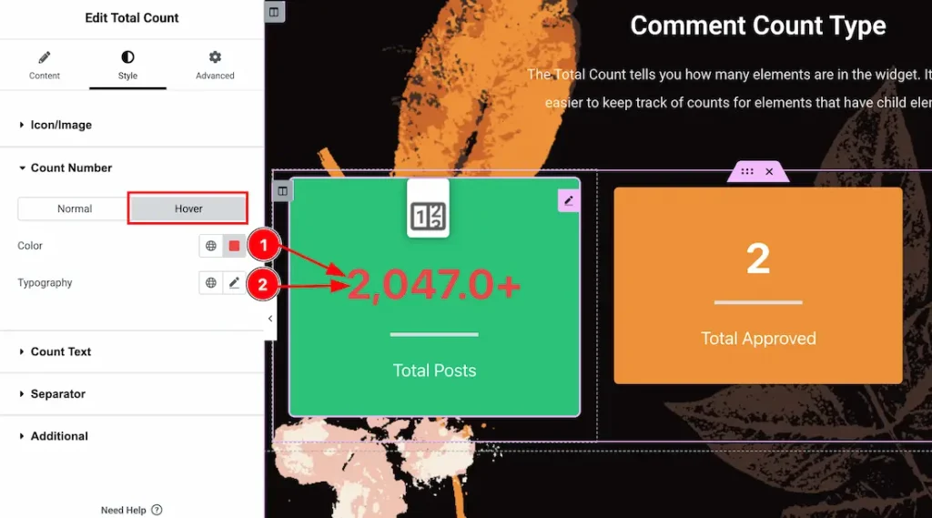
Let’s proceed with the Hover Tab-
1. Color: This option lets you change the count number hover color.
2. Typography: Change the font family, size, weight, style, transform, decoration, line height, letter spacing, and word spacing from here.
Count Text Section
Go to Style → Count Text
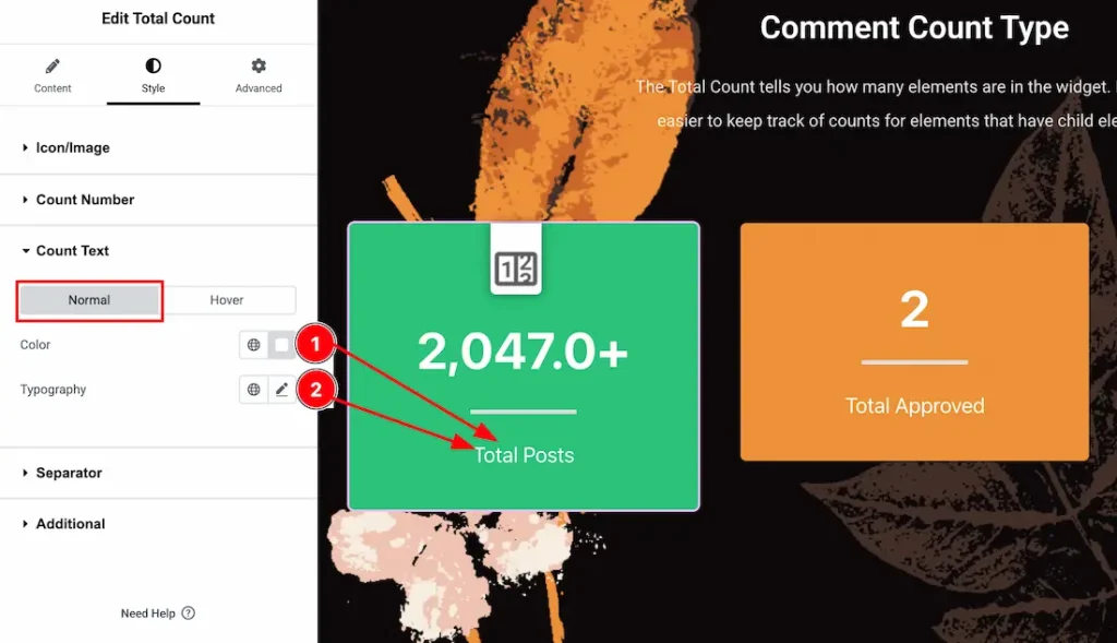
Come to the count text section, you will get two sub-sections: Normal, and Hover. Let’s proceed with the Normal Tab-
1. Color: This option lets you change the count text’s normal color.
2. Typography: Change the font family, size, weight, style, transform, decoration, line height, letter spacing, and word spacing from here.
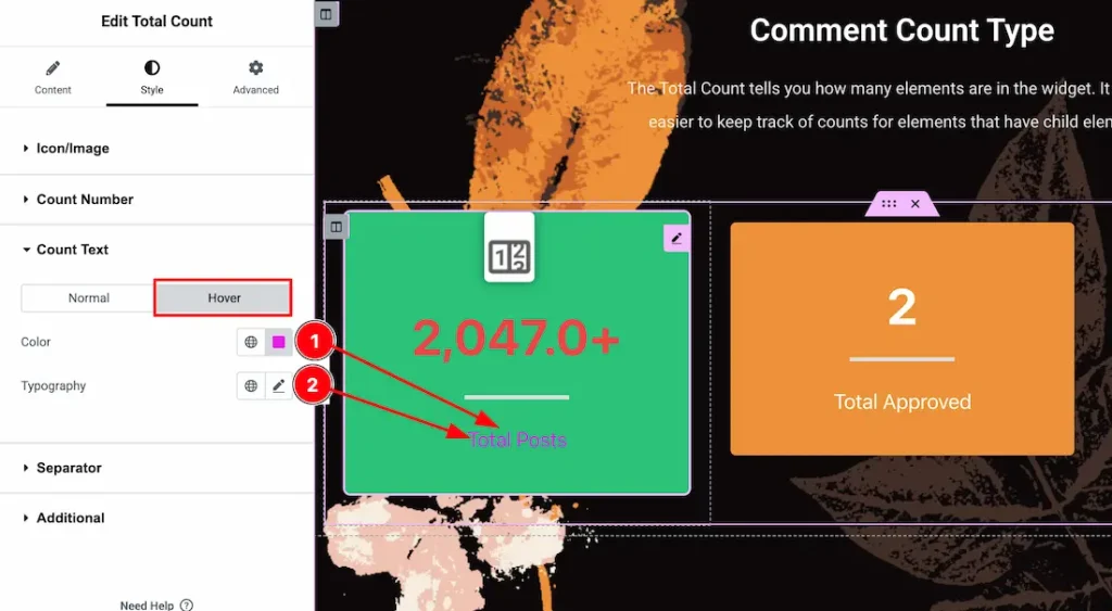
Let’s proceed with the Hover Tab-
1. Color: This option lets you change the count text hover color.
2. Typography: Change the font family, size, weight, style, transform, decoration, line height, letter spacing, and word spacing from here.
Separator Section
Go to Style → Separator
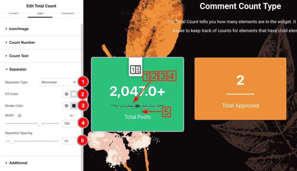
1. Separator Type: Here you will get many separator types, just select one of them.
2. Fill Color: This option lets you change the separator fill color.
3. Stroke Color: This option lets you change the separator stroke color.
4. Width: This option lets you set the separator width.
5. Separator Spacing: You can adjust the separator spacing from here.
Additional Section
Go to Style → Additional
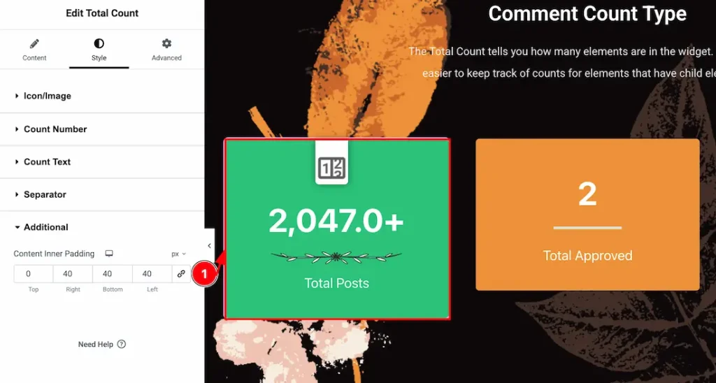
1. Content Inner Padding: You can adjust the content inner padding from here.
All done! You have successfully customized the Total Count Widget on your website.
Video Assist
You can also watch the video tutorial to learn more about the Total Count widget. Please visit the demo page for examples.
Thanks for being with us.