The Thumb Gallery widget from Element Pack Pro lets you display image thumbnails in a clean, organized, and responsive gallery. It offers customizable layouts, hover effects, and styling options to enhance visual presentation and user interaction. This documentation explains how to use and customize the Thumb Gallery widget in Elementor.
Enable The Thumb Gallery Widget
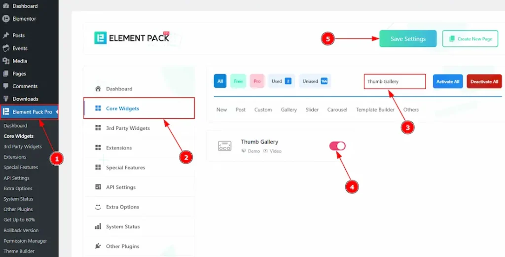
To use the Thumb Gallery widget from Element Pack Pro, first, you have to enable the widget.
- Go to WordPress dashboard → Element Pack Pro Plugin dashboard.
- Then, Click the Core Widgets Tab.
- Search the Thumb Gallery Widget Name.
- Enable the Thumb Gallery Widget.
- Hit the Save Settings Button.
Inserting the Thumb Gallery widget
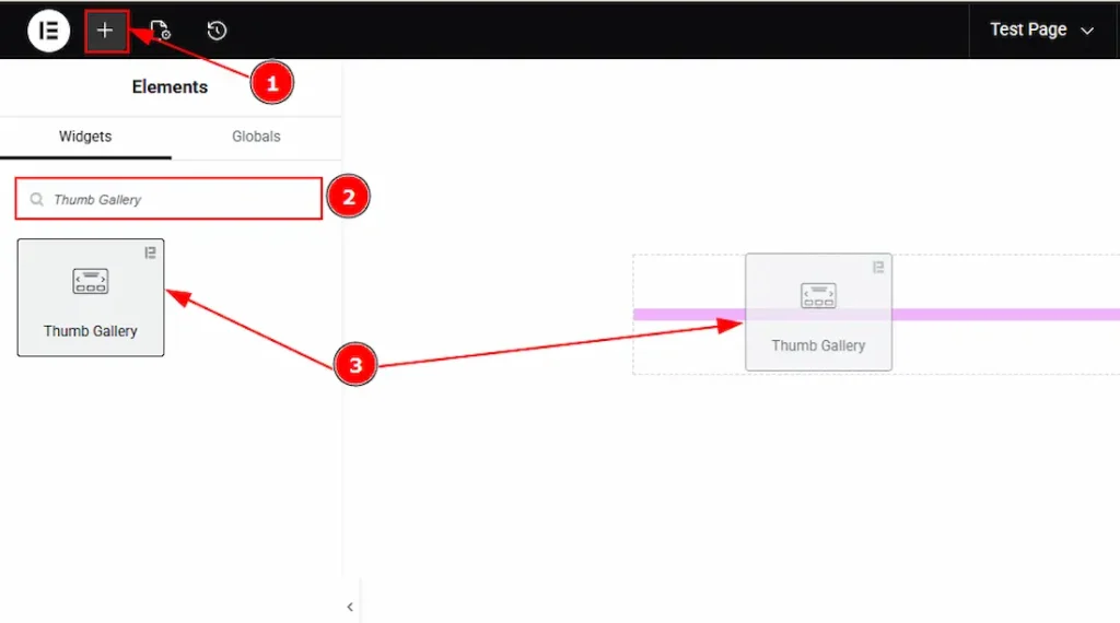
1. Go to the Elementor Editor Page and hit the “+” icon Button.
2. Search the Thumb Gallery widget.
3. Drag the widget and Drop it on the editor page.
Work With The Content Tab
Layout Section
Go to Content → Layout
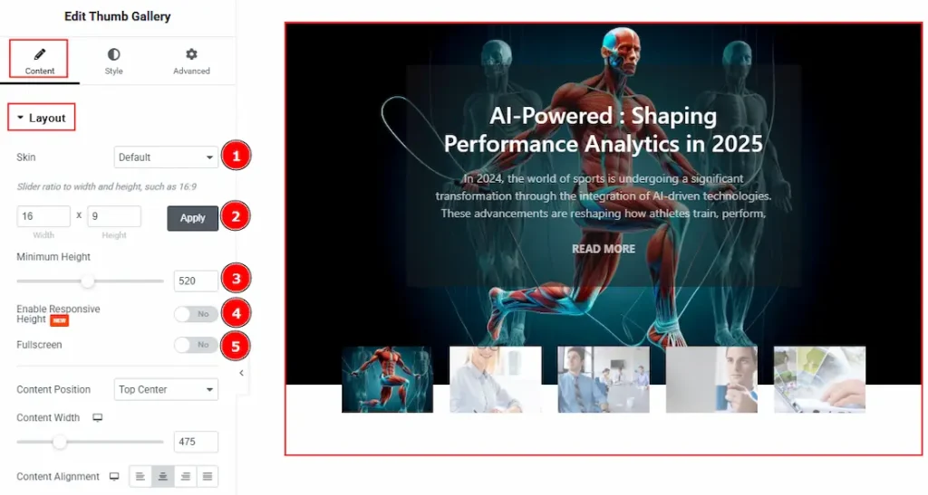
1. Skin: This option allows you to change the gallery skin to Default & Custom. Here, we selected the skin type as Default.
- Default Skin: You will get to see the posts that you have already created on your native WP Posts.
- Custom: You can add an image & content to create a gallery by yourself by selecting this option.
2. Slider Ratio: You can adjust the slider ratio by width & height with this option.
3. Minimum Height: You can adjust the gallery height with this option.
4. Enable Response Height: Enable the switcher to set the gallery slider height as responsive for all devices.
5. Fullscreen: Enable the switcher to make the slider full screen on your device with this option.
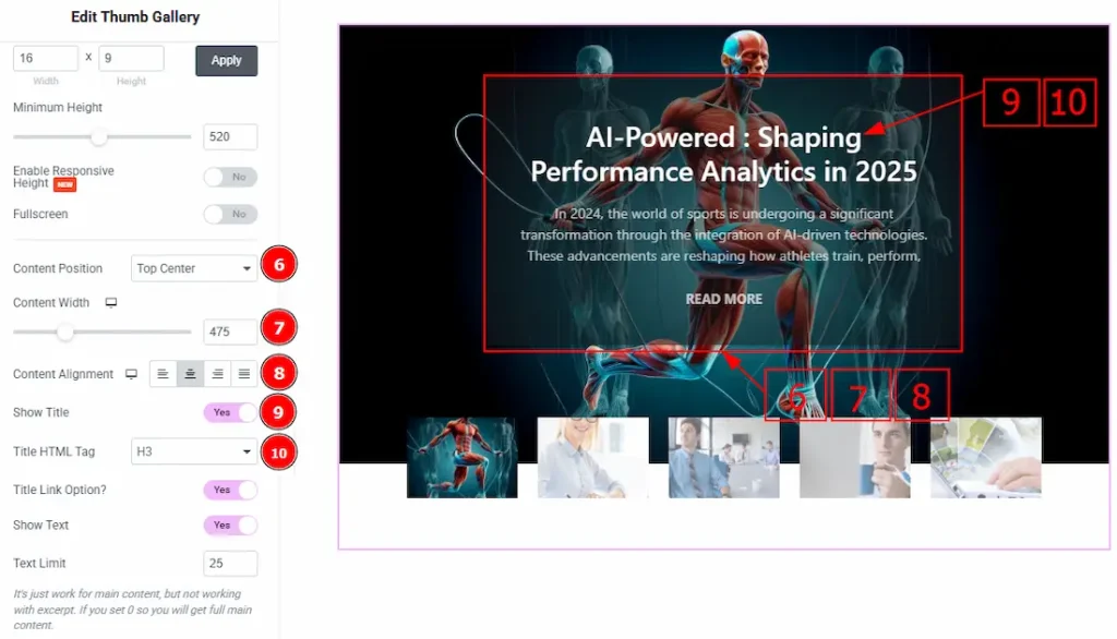
6. Content Position: You can adjust the placement of the content with this option. The available positions are – Default, Top Left, Top Center, Top Right, Center, Center Left, Center Right, Bottom Left, Bottom Center, Bottom Right.
7. Content Width: You can adjust the width of the content with this option.
8. Content Alignment: You can set the alignment of the content to left, center, right, or justified with this option.
9. Show Title: Enable the switcher to show the title to the audience.
10. Title HTML Tag: This option lets you select the heading for the title.
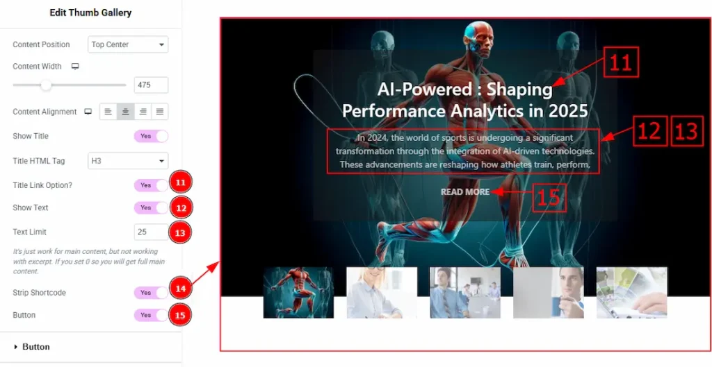
11. Title Link Option: Enable the switcher to make the title clickable and redirect to the post when clicked with this option.
12. Show text: Enable the switcher to show the text/description to the audience.
13. Text Limit: This option allows you to adjust the text’s word limit.
14. Strip Shortcode: This option removes any shortcodes from the Thumb Gallery’s main content.
15. Button: Enable the switcher to show the button to the audience.
Custom Content Section
Go to Content → Custom Content
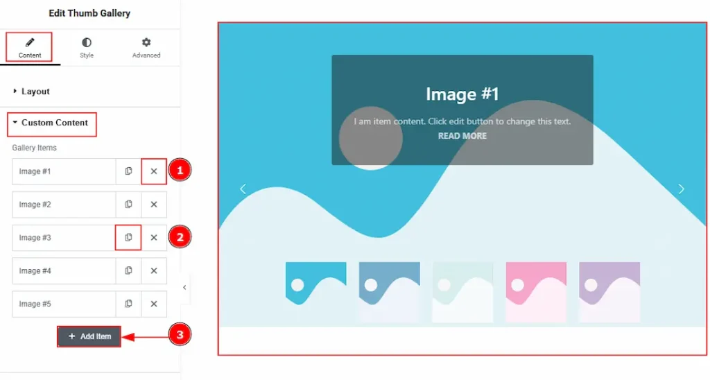
If you select the skin type as custom, then you will get to see this section to manually input the content that you want to show to your audience.
1. Close Button: You can click on the close button to close the gallery items with this option.
2. Copy Button: You can click on the copy button to copy exact same item or duplicate the gallery items with this option.
3. Add Item: You can click on this button to add more gallery items.
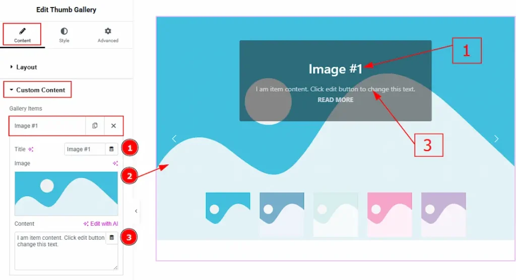
In each gallery item, we have more options to customize. Let’s start describing those options –
1. Title: You can add and make changes to the title with this option.
2. Image: You can add an image to the gallery item with this option.
3. Content: You can add the content to the gallery item with this option.
Button Section
Go to Content → Button
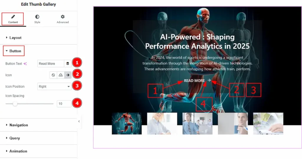
1. Button Text: You can make changes to the button text with this option.
2. Icon: You can add an icon and select one as per your preference with this option.
3. Icon Position: You can adjust the icon position to left or right of the text with this option.
4. Icon Spacing: You can adjust the space between the text and the icon with this option.
Navigation Section
Go to Content → Navigation
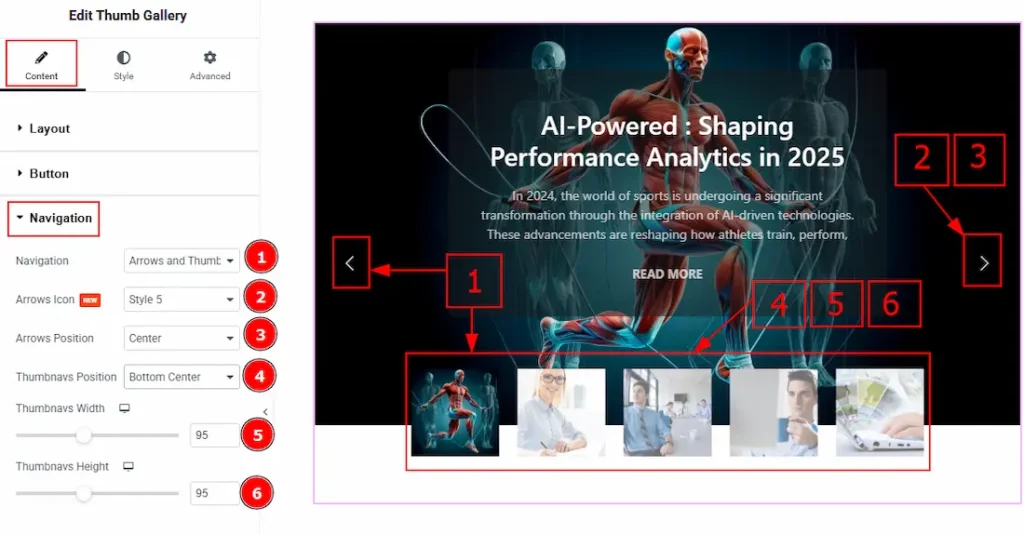
1. Navigation: You can set the navigation with this option. The available navigations are – Arrows, Thumbnavs, Arrows & Thumbnavs and none. Here, we have selected the navigation as Arrows & Thumbnavs.
2. Arrows Icon: You can make changes to the arrows icon style with this option.
3. Arrows Position: You can set the arrows position to Top Left, Top Center, Top Right, Center, Center Left, Center Right, Bottom Left, Bottom Center or Bottom Right with this option.
4. Thumbnavs Position: You can set the thumbnavs position with this option. Here we have selected the position as Bottom Center.
5. Thumbnavs Width: You can adjust the width of the thumbnavs with this option.
6. Thumbnavs Height: You can adjust the height of the thumbnavs with this option.
Query Section
Go to Content > Query
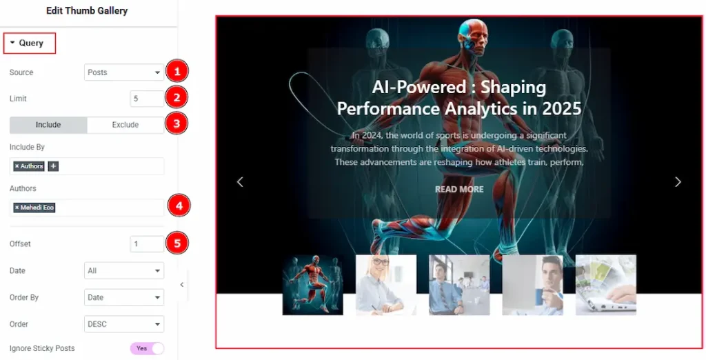
1. Source: Select the source for the slider from here. The types of sources are – Posts, Pages, Floating Elements, Downloads, Products, Mega Menu Items, Template Items, Manual Selection, Current Query, and Related. Here, we selected the type as posts.
2. Limit: You can adjust the limit here of how many posts you want to show in the thumbs gallery.
3. Include/Exclude Selection: Select the Include / Exclude filter to show/hide specific posts by Terms (Tags/Categories) or Authors. Here, we selected the include field as Author.
4. Author: This option lets you select the author’s name whose post you want to add to the slider.
5. Offset: The Offset option lets you skip a certain number of posts from the start, so the display begins from the next post instead.
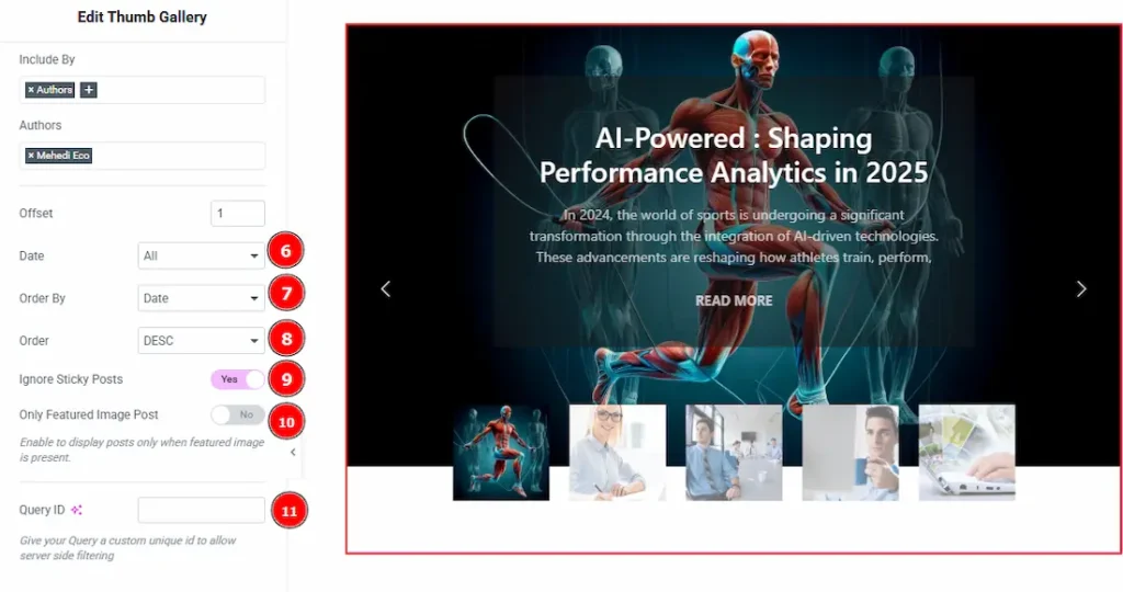
6. Date: You can select the post as per the date of creation with this option.
7. Order By: It controls the data you want to display through title, id, date, author, comment count, menu order & random. Here we selected the order as date.
8. Order: This option controls the order by which data is arranged. There are two types of order. Ascending Order (Starts from the smallest or lowest value and goes to the largest or highest.) & Descending Order (Starts from the largest or highest value and goes to the smallest or lowest.)
9. Ignore Sticky Posts: Enable or Disable the switcher to hide or show the sticky posts.
10. Only Featured Image Post: Enable or disable the switcher to show or hide the featured image post.
11. Query ID: Give your query a custom, unique ID to allow server-side filtering. Learn more about the Query.
Animation Section
Go to Content → Animation
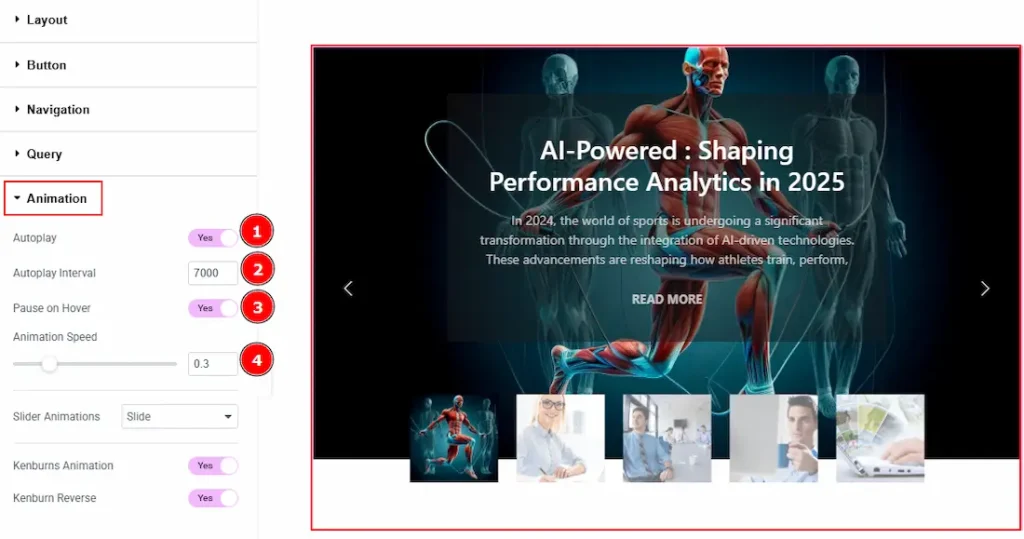
1. Autoplay: By enabling this option, you can automatically play the slides one after another.
2. Autoplay Interval (ms): This option lets you set the time delay between each slide transition.
3. Pause on Hover: Enable the switcher to pause autoplay when the user hovers over the slider.
4. Animation Speed: This option controls how fast the transition animation occurs between slides.
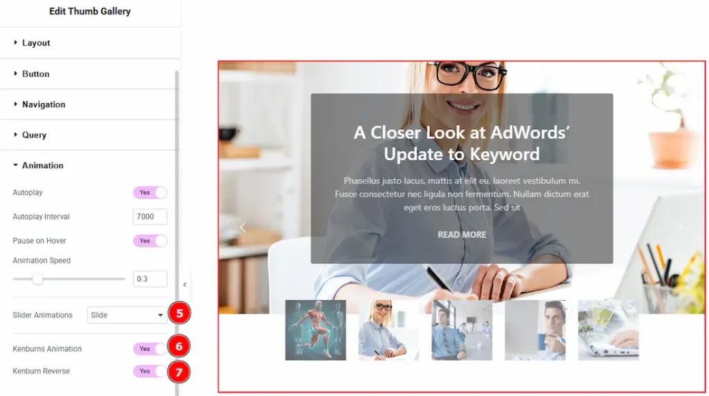
5. Slider Animation: You can choose the slider animation type with this option. The available options are – slide, fade, scale, push & pull.
6. Kenburns Animation: Enable the switcher to add a smooth zoom-in/out and pan effect on background images.
7. Kenburn Reverse: Enable the switcher to reverse the Kenburns animation direction (zoom-out instead of in, or pan the other way).
Work with The Style Tab
Content Section
Go to Style → Content
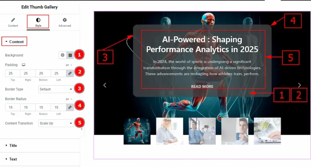
1. Background: You can change the content background color with this option.
2. Padding: You can adjust the inner space of the content with this option.
3. Border Type: You can add and change the border types with this option.
4. Border Radius: You can control the roundness of the border with this option.
5. Content Transition: You can set the content appearing animation with this option.
Title Section
Go to Style → Title
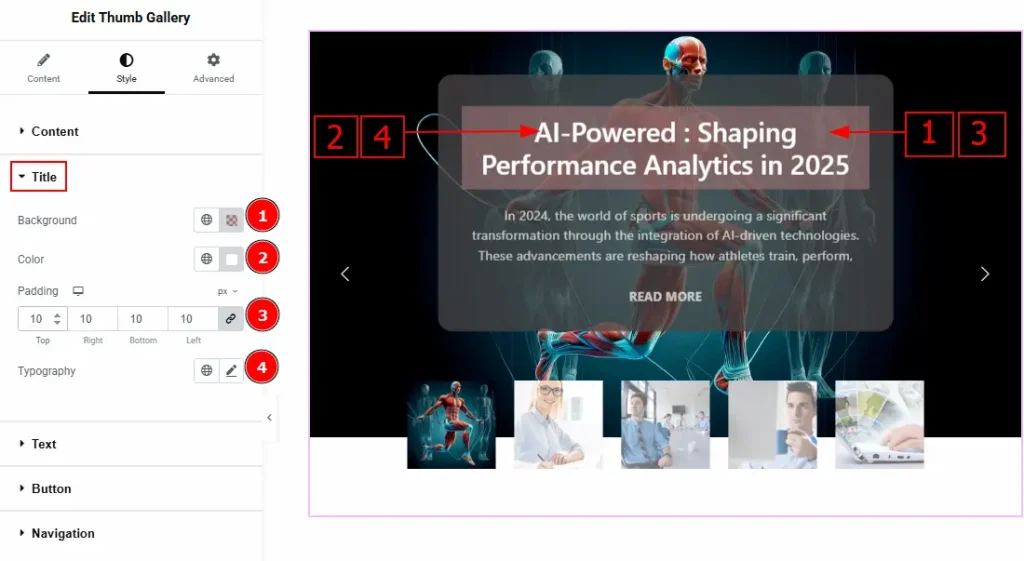
1. Background: You can change the title background color with this option.
2. Color: You can change the title text color with this option.
3. Padding: You can adjust the inner space of the title background with this option.
4. Typography: Change the font family, size, weight, transform, style, decoration, line height, letter spacing, and word spacing from here.
Text Section
Go to Style → Text
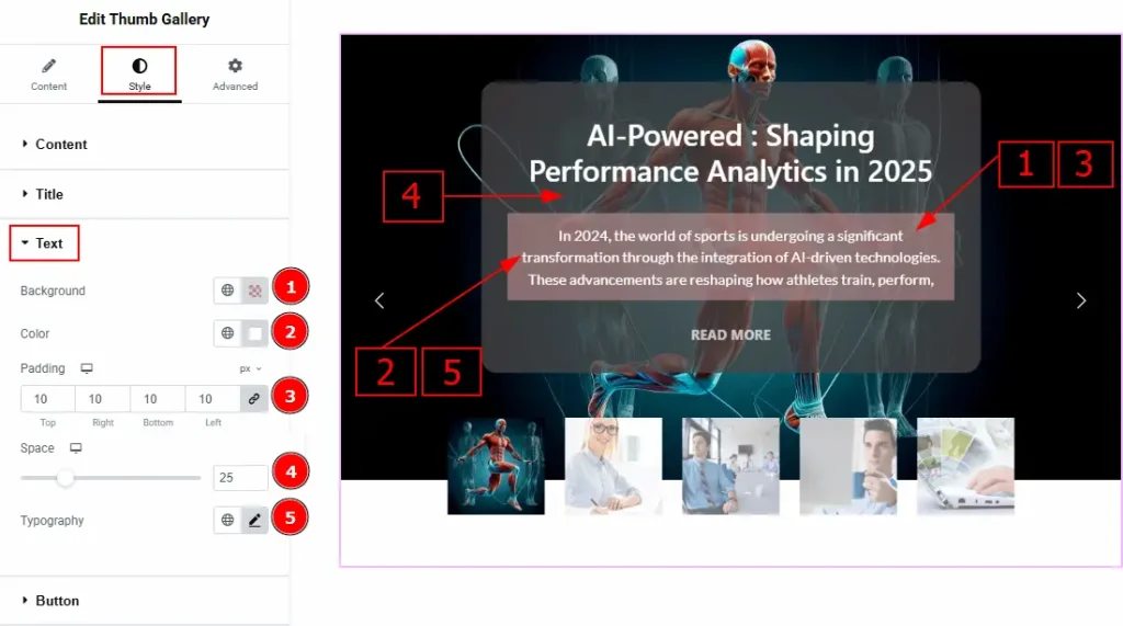
1. Background: You can change the text background color with this option.
2. Color: You can change the text color with this option.
3. Padding: You can adjust the inner space of the text field with this option.
4. Space: You can adjust the space between the title and the text with this option.
5. Typography: Change the font family, size, weight, transform, style, decoration, line height, letter spacing, and word spacing from here.
Button Section
Go to Style → Button
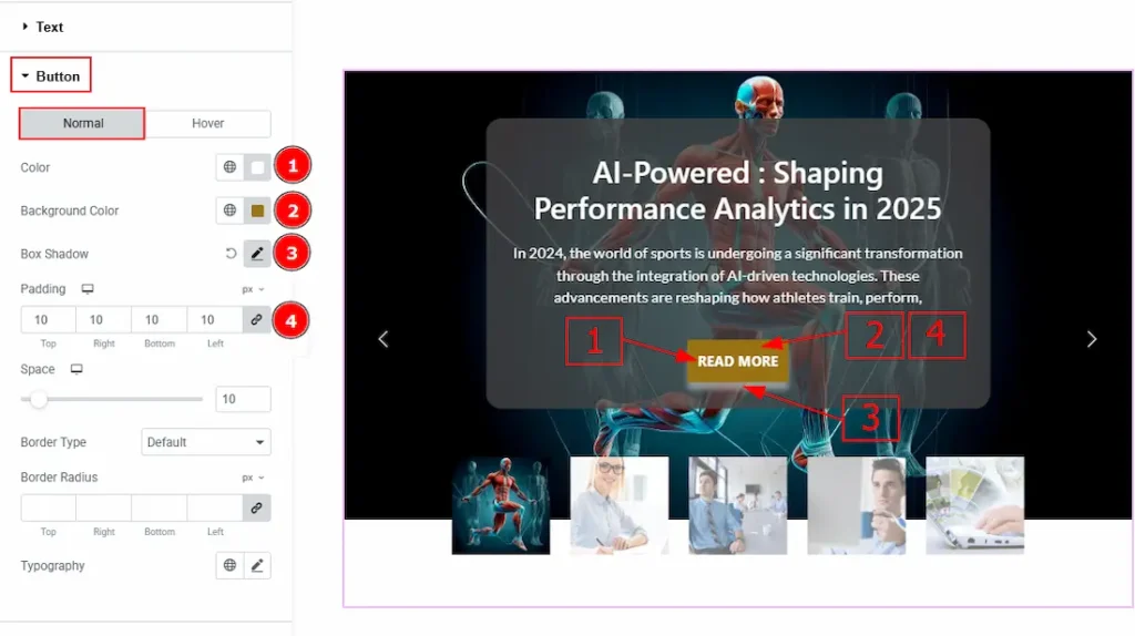
In this tab, we have two moretabs. One is Normal and the other is Hover. Let’s start with the Normal tab –
1. Color: You can change the button text color with this option.
2. Background Color: You can change the background color with this option.
3. Box Shadow: You can add the shadow effect to the button with this option.
4. Padding: Add spaces around an object to increase the inner area. Padding allows you to control the internal space within an element.
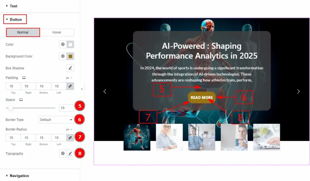
5. Space: You can adjust the space between the button and the text with this option.
6. Border Type: This option allows you to add borders to your items. You can select various border types from this option. Such as Solid, Double, Dotted, Dashed, Groove.
7. Border Radius: This option controls the roundness of the border.
8. Typography: Change the button text font family, size, weight, transform, style, decoration, line height, letter spacing, and word spacing from here.
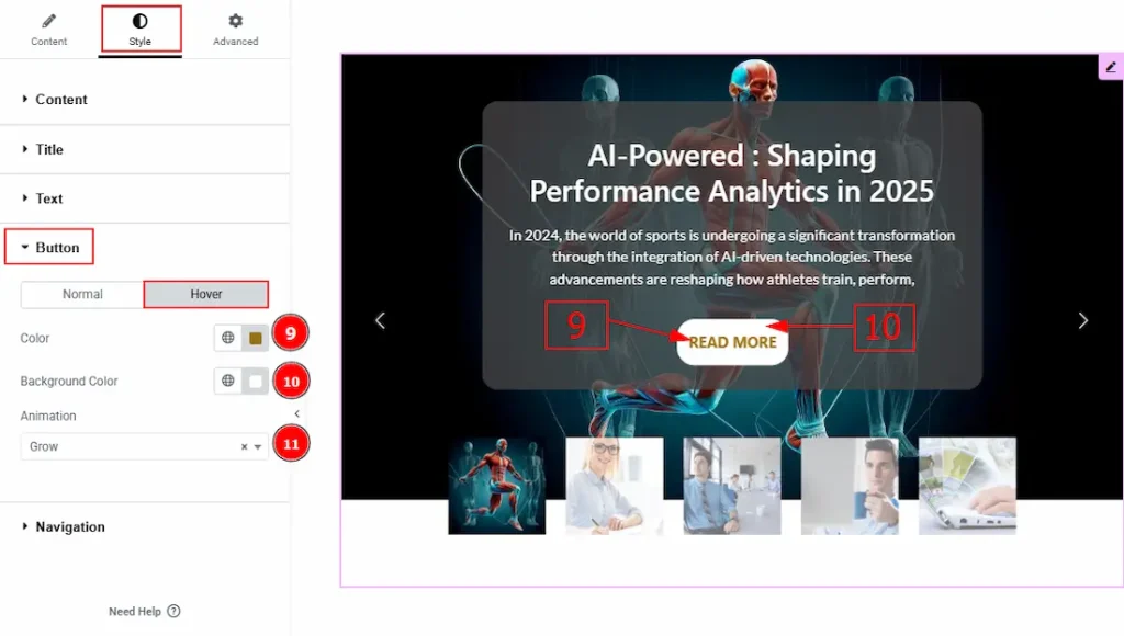
Now, Let’s Proceed to the Hover Tab –
9. Color: You can change the button text hover color with this option.
10. Background Color: You can change the background hover color with this option.
11. Animation: You can select the animation type of the button appearance with this option.
Navigation Section
Go to Style > Navigation
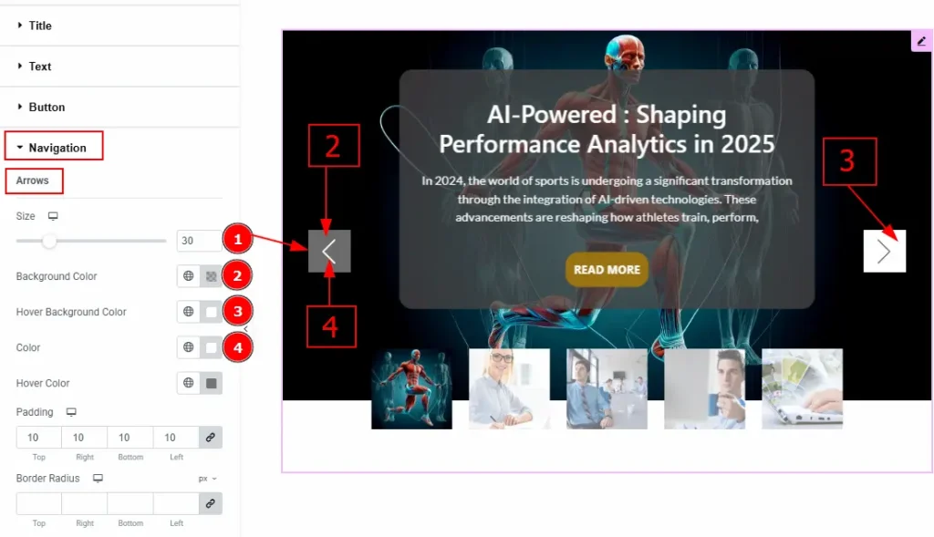
In this Section, we have three subsections. These are Arrows, Thumbnavs & Positions. Let’s start with the Arrows sub-section –
Arrows Sub Section
1. Size: You can make changes to the arrow’s size with this option.
2. Background Color: You can change the background color of the arrows with this option.
3. Hover Background Color: You can change the hover background color of the arrows with this option.
4. Color: You can change the Arrows icon color with this option.
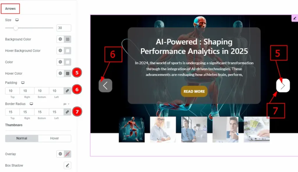
5. Hover Color: You can change the arrow icon hover color with this option.
6. Padding: You can adjust the inner space of the arrow’s field with this option.
7. Border Radius: You can control the roundness of the border with this option.
Thumbnavs Sub Section
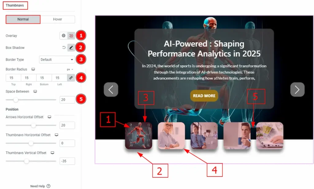
In this subsection, we have two more tabs. These are Normal & Hover. Let’s start with the Normal Tab –
1. Overlay: You can change the overlay color of the thumbnavs with this option.
2. Box Shadow: You can add a shadow effect to the thumbnails with this option.
3. Border Type: You can add and change the border type of the thumbnavs with this option.
4. Border Radius: You can control the roundness of the border with this option.
5. Space Between: You can adjust the space between the thumbnails with this option.
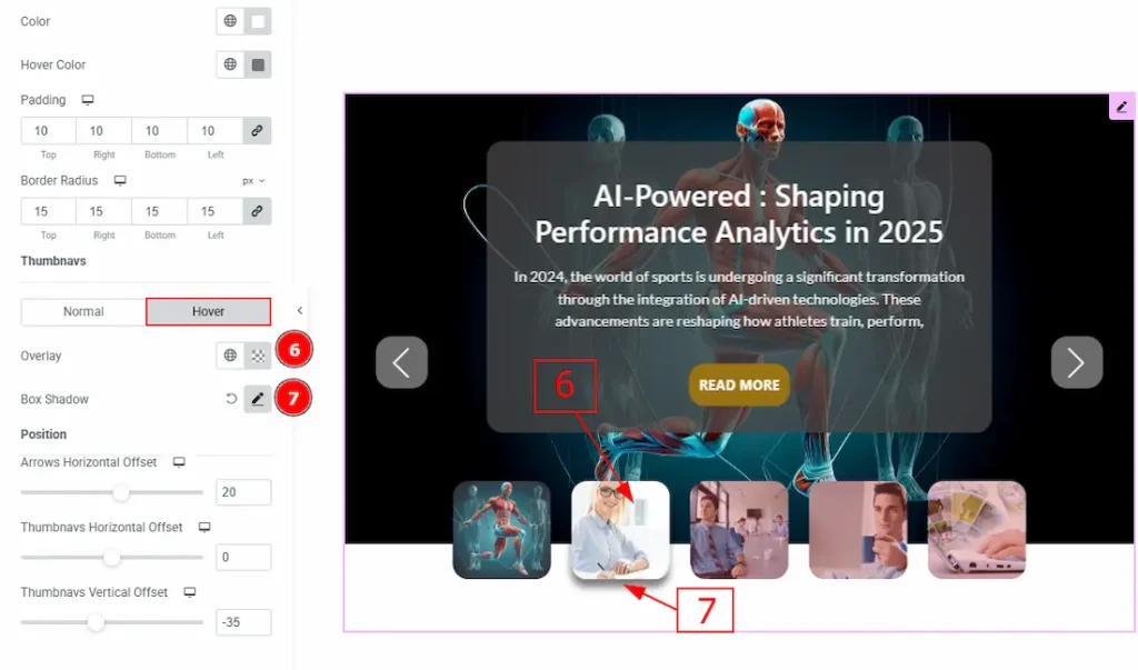
Now, let’s proceed to the Hover Tab –
6. Overlay: You can change the hover overlay color with this option.
7. Box Shadow: You can add a hover shadow effect to the thumbnavs with this option.
Position Sub Section
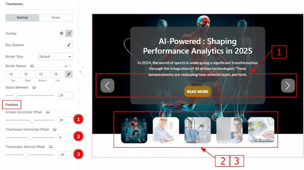
1. Arrows Horizontal Offset: You can move the arrows horizontally with this option.
2. Thumbnavs Horizontal Offset: You can move the thumbnavs horizontally with this option.
3. Thumbnavs Vertical Offset: You can move the thumbnavs vertically with this option.
All done! You have successfully customized the Thumb Gallery Widget on your website.
Video Assist
You can also watch the video tutorial to learn more about the Thumb Gallery Widget. Please visit the demo page for examples.
Thanks for being with us.