The Sub Menu widget is a flexible navigation solution designed to display secondary menu items in a clear and engaging layout, fully integrated into Element Pack Pro. It allows you to present and style submenu links independently from the main menu, improving navigation and user experience on your website. In this documentation, we will discuss the customization options of the Sub Menu widget provided by Element Pack Pro for Elementor.
Enable The Sub Menu Widget
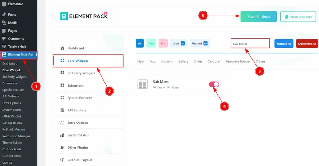
To use the Sub Menu widget from Element Pack Pro, first, you have to enable the widget.
- Go to WordPress dashboard → Element Pack Pro Plugin dashboard.
- Then, Click the Core Widgets Tab.
- Search the Sub Menu Widget Name.
- Enable the Sub Menu Widget.
- Hit the Save Settings Button.
Inserting The Sub Menu Widget
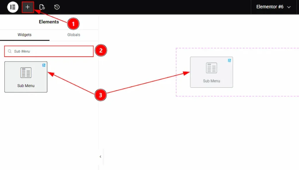
1. Go to the Elementor Editor Page and hit the “+” icon Button.
2. Search the Sub Menu name.
3. Drag the widget and drop it on the editor page.
Work With The Content Tab
Sub Menu Section
Go to Content → Sub Menu
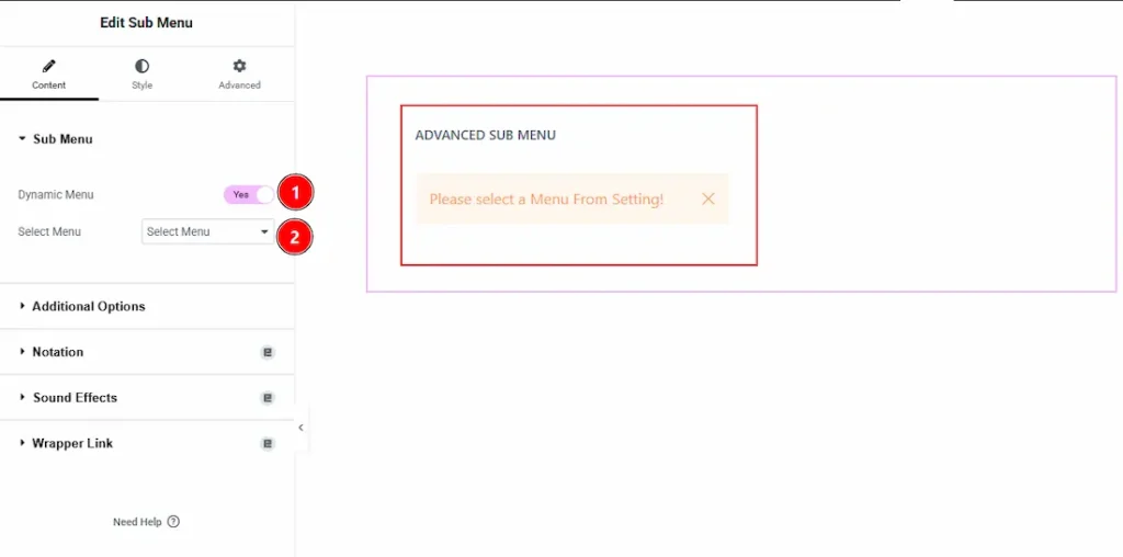
1. Dynamic Menu: Enable the switcher to dynamically import the menu that you have previously created on WP Dashboard > Appearance > Menus.
2. Select Menu: You can select menu from the existing menu with this option.
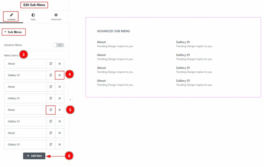
3. Menu Items: If you disable the switcher of the Dynamic Menu, then you will get the options to create the menu manually. Here, you can see the items list, customize and then delete the menu if you want.
4. Close Button: You can close the menu item with this option.
5. Copy Button: You can duplicate/copy the menu item with this option.
6. Add Item: You can add more menu items as per your needs with this option.
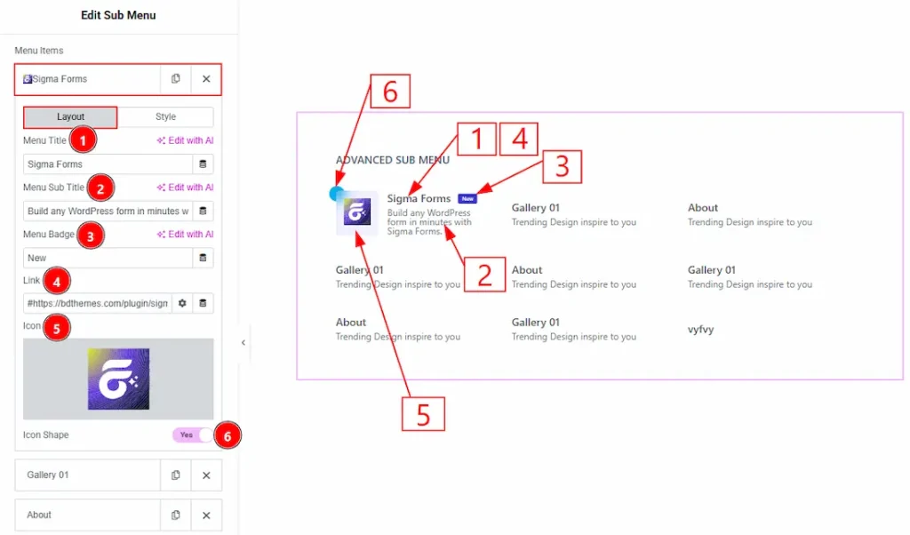
In the Menu Items, each item contains more options. There are two tabs that present those options. These are Layout & Style. Let’s start with the Layout Tab –
1. Menu Title: You can add and make changes to the menu title text with this option.
2. Menu Sub Title: You can add and make changes to the menu sub title text with this option.
3. Menu Badge: You can add and make changes to the badge text with this option.
4. Link: You can add a link to the menu item with this option.
5. Icon: You can add an icon by uploading SVG or from the icon library with this option.
6. Icon Shape: Enable the switcher to add a shape to the icon with this option.
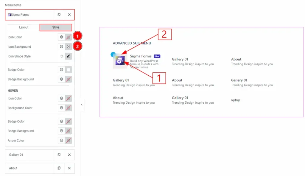
Now, let’s start customization of the Style Tab –
1. Icon Color: You can make changes to the icon color with this option.
2. Icon Background: You can change the background color of the icon with this option.
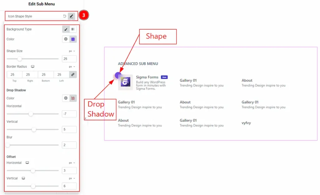
3. Icon Shape Style: You can customize the icon shape with this option. Below you can see the options to customize the icon shape –
- Background Type: You can select the background type to classic or gradient with this option.
- Color: You can change the background color of the icon shape with this option.
- Shape Size: You can adjust the size of the icon shape with this option.
- Border Radius: You can control the roundness of the shape border with this option.
Drop Shadow
- Color: You can make changes to the drop shadow color with this option.
- Horizontal: You can move the shape’s drop shadow horizontally with this option.
- Vertical: You can move the shape’s drop shadow vertically with this option.
- Blur: You can adjust the blurriness of the shape drop shadow with this option.
Offset
- Horizontal: You can move the icon shape horizontally with this option.
- Vertical: You can move the icon shape vertically with this option.
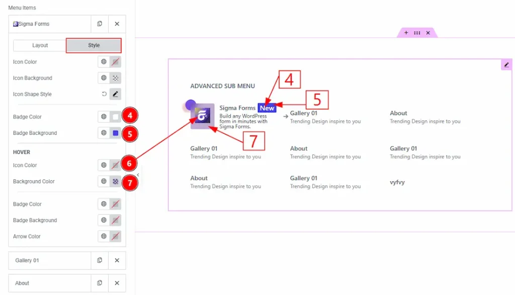
4. Badge Color: You can change the badge text color with this option.
5. Badge Background: You can change the background color of the badge with this option.
6. Icon Color: You can change the icon hover color with this option.
7. Background Color: You can change the icon’s background hover color with this option.
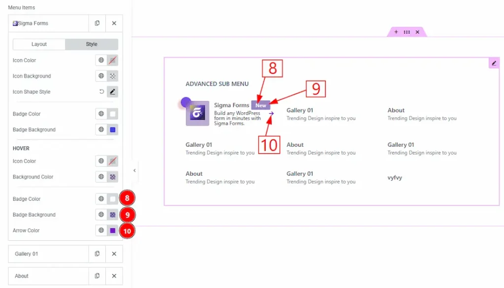
8. Badge Color: You can change the badge text hover color with this option.
9. Badge Background: You can change the badge background hover color with this option.
10. Arrow Color: You can change the arrow’s color with this option.
Additional Options Section
Go to Content → Additional Options
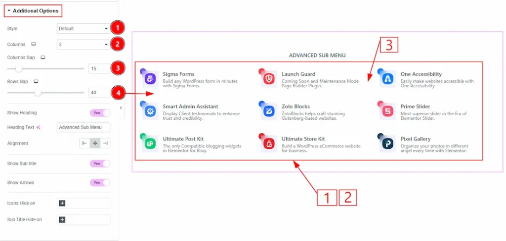
1. Style: You can choose the menu’s visual appearance style with this option. The available style options are Default, Reverse, Box & Shadow.
2. Columns: You can select the number of menu columns you want to show to your audience with this option.
3. Columns Gap: You can adjust the space between the menu items’ columns with this option.
4. Rows Gap: You can adjust the space between the menu items’ rows with this option.
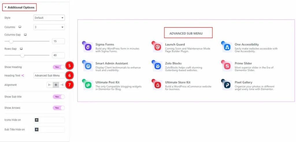
5. Show Heading: Enable the switcher to show the heading to your audience.
6. Heading Text: You can make changes to the heading text with this option.
7. Alignment: You can set the position of the heading to left, center or right with this option.
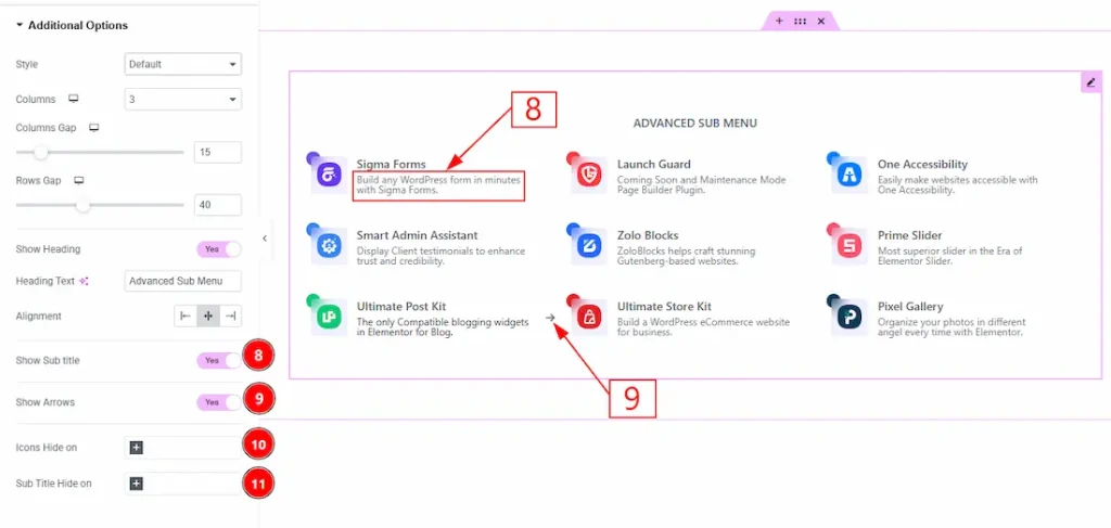
8. Show Sub title: Enable the switcher to show the menu’s sub title to your audience.
9. Show Arrows: Enable the switcher to show the arrows to your audience.
10. Icon Hides on: You can select the device’s name where you want to hide the menu icons.
11. Sub Title Hide on: You can select the device’s name where you want to hide the sub title.
Work with The Style Tab
Heading Section
Go to Style → Heading
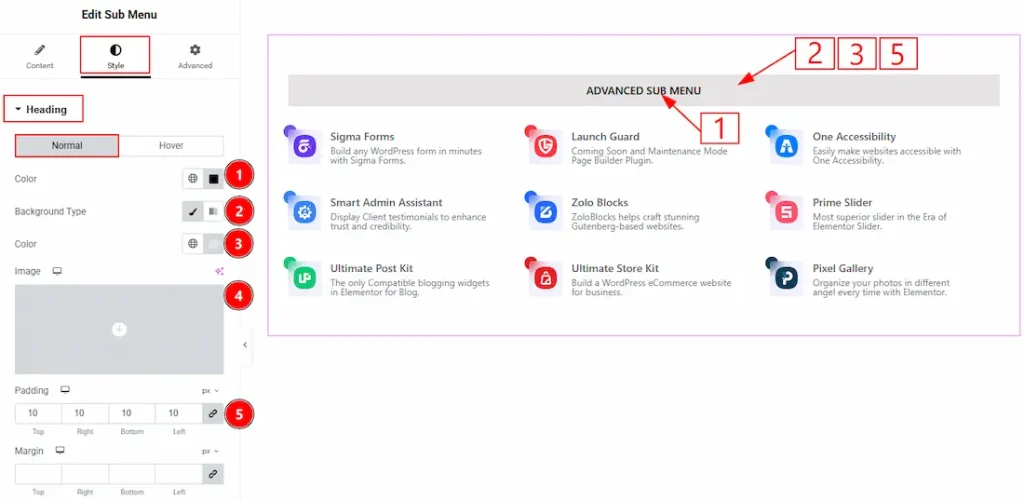
In this section, we have two more tabs. These are Normal & Hover. Let’s start describing the Normal Tab first –
1. Color: You can make changes to the heading text color with this option.
2. Background Type: You can choose the background type between classic or gradient with this option.
3. Color: You can change the background color with this option.
4. Image: You can change the background image with this option.
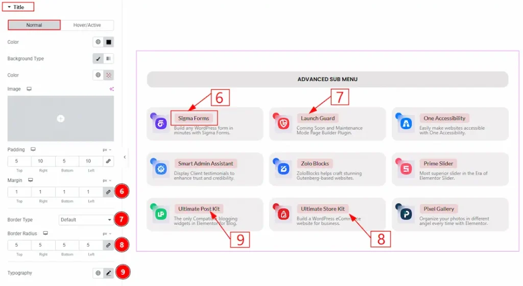
5. Padding: You can adjust the inner space of the heading field with this option.
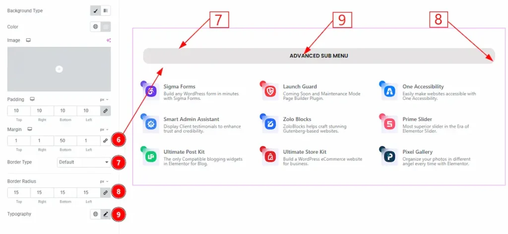
6. Margin: You can adjust the space around the heading field with this option.
7. Border Type: You can add and change the border types with this option.
8. Border Radius: You can control the roundness of the border with this option.
9. Typography: Change the font family, size, weight, transform, style, decoration, line height, letter spacing, and word spacing from here.
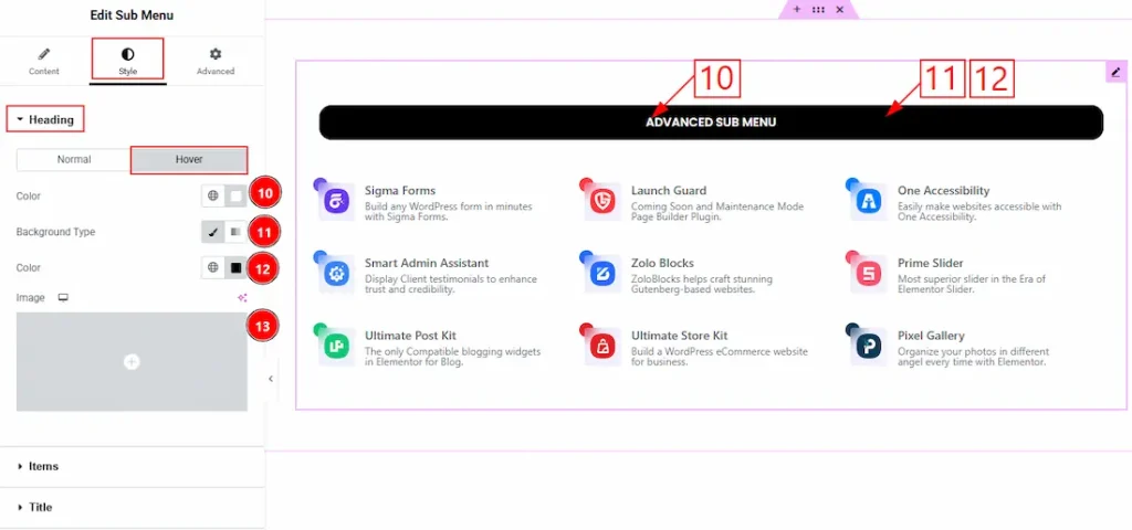
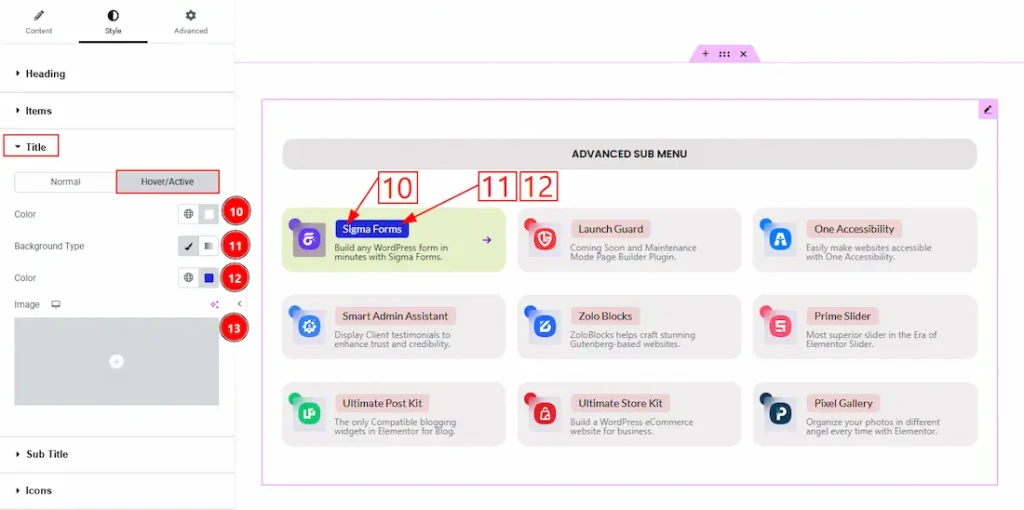
Now, let’s proceed to the Hover Tab –
10. Color: You can change the heading text hover color with this option.
11. Background Type: You can change the background type as classic or gradient with this option.
12. Color: You can change the background hover color with this option.
13. Image: You can change the background image with this option.
Items Section
Go to Style → Items
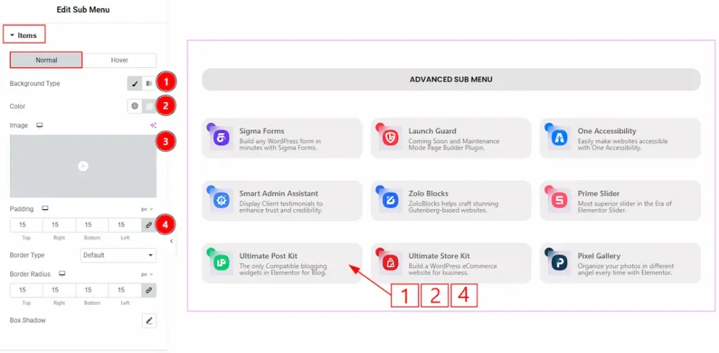
In this section, we have two more tabs. These are Normal & Hover. Let’s start describing the Normal Tab first –
1. Background Type: You can select the background type as classic or gradient with this option.
2. Color: You can change the menu items’ background color with this option.
3. Image: You can change the background image with this option.
4. Padding: You can adjust the inner space of the menu items with this option.
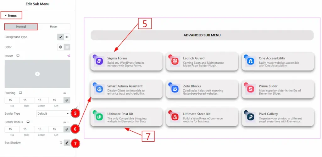
5. Border Type: You can add and change the border types with this option.
6. Border Radius: This option controls the roundness of the border.
7. Box Shadow: This option allows you to add & customize the shadow effect to the menu items.
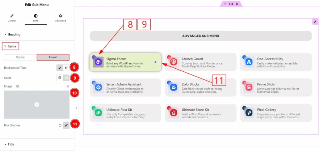
Now, let’s proceed to the Hover Tab –
8. Background Type: You can choose the background type between classic or gradient with this option.
9. Color: You can change the background hover color with this option.
10. Image: You can change the background image with this option.
11. Box Shadow: You can add a hover shadow effect to the menu items with this option.
Title Section
Go to Style → Title
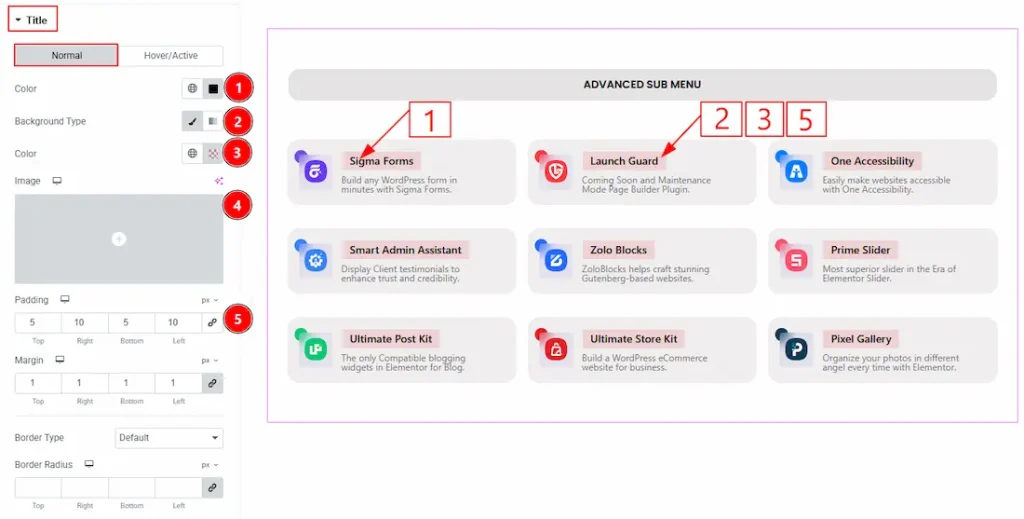
In this section, we have two more tabs. These are Normal & Hover. Let’s start customizing the Normal Tab first –
1. Color: You can change the title text color with this option.
2. Background Type: You can select the background type as Classic or Gradient with this option.
3. Color: You can change the title background color with this option.
4. Image: You can change the background image with this option.
5. Padding: You can adjust the inner space of the title field with this option.
6. Margin: You can adjust the space around the title field with this option.
7. Border Type: You can select the border type and change its type with this option.
8. Border Radius: You can control the roundness of the border with this option.
9. Typography: Change the font family, size, weight, transform, style, decoration, line height, letter spacing, and word spacing from here.
Now, let’s proceed to the Hover Tab –
10. Color: You can change the title hover color with this option.
11. Background Type: You can select the background type as Classic or Gradient with this option.
12. Color: You can change the title background hover color with this option.
13. Image: You can change the background image with this option.
Sub Title Section
Go to Style → Sub Title
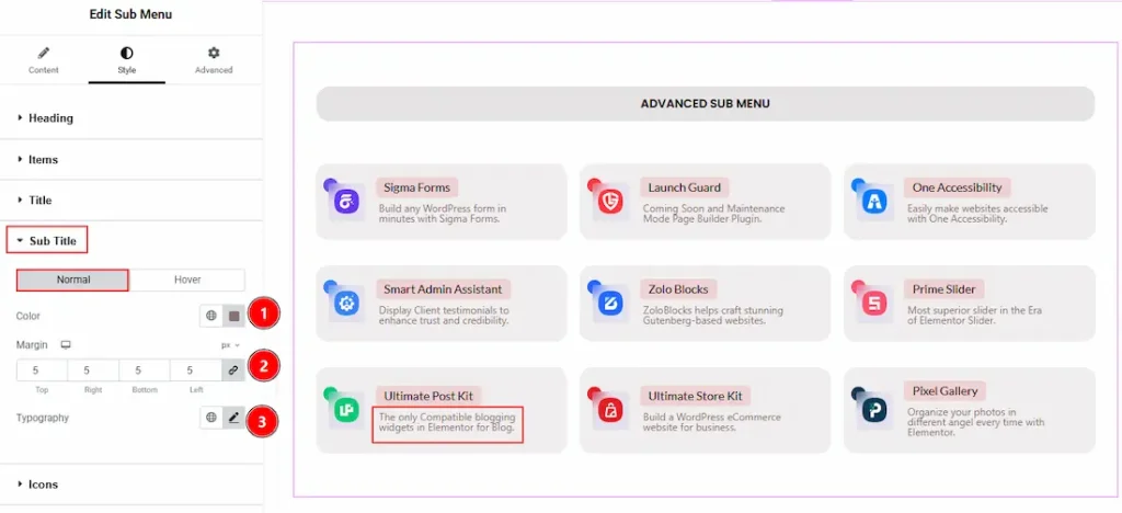
In this section, we have two more tabs. These are Normal & Hover. Let’s start with the Normal Tab first –
1. Color: You can change the sub title text color with this option.
2. Margin: You can adjust the space around the sub title with this option.
3. Typography: Change the font family, size, weight, transform, style, decoration, line height, letter spacing, and word spacing from here.
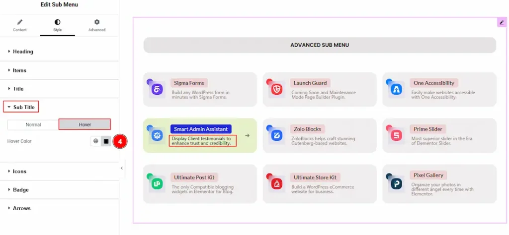
4. Hover Color: You can change the sub title hover color with this option.
Icons Section
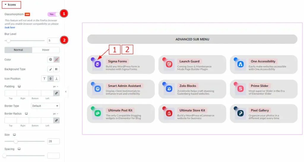
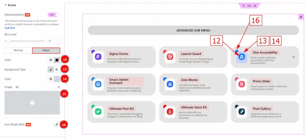
Go to Style → Icons
1. Glassmorphism: Enable the switcher to make the icon background blur for your audience.
2. Blur Level: You can adjust the blurriness level of the background with this option.
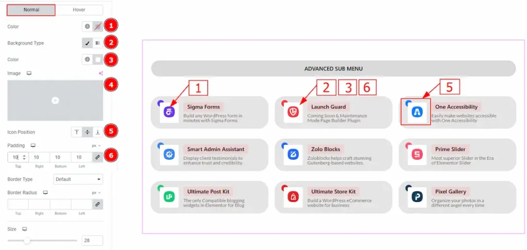
In this section, we have two more tabs. These are Normal & Hover. Let’s start with the Normal Tab first –
1. Color: You can make changes to the icon color with this option. As here we have used an SVG logo, we haven’t changed the color.
2. Background Type: You can choose the background type between the Classic & Gradient type background with this option.
3. Color: You can change the icon’s background color with this option.
4. Image: You can change the background image with this option.
5. Icon Position: You can set the icon position to top, center or bottom with this option.
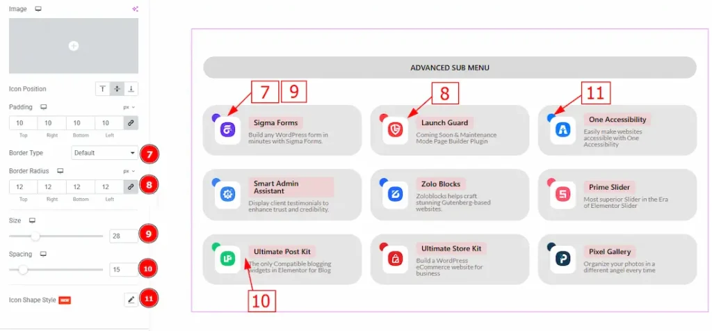
6. Padding: You can adjust the inner space of the icon field with this option.
7. Border Type: You can add and select the border types with this option.
8. Border Radius: You can control the roundness of the border with this option.
9. Size: You can adjust the size of the icon with this option.
10. Spacing: You can adjust the space between the icon and the content with this option.
11. Icon Shape Style: You can customize the icon shape using this option. As this has already been discussed in the Sub Menu section above, please refer to that section to understand how it works.
Now let’s proceed to the Hover Tab –
12. Color: You can change the icon hover color with this option.
13. Background Type: You can select the background type between classic & gradient with this option.
14. Color: You can change the background hover color with this option.
15. Image: You can change the background image with this option.
16. Icon Shape Style: You can customize the icon shape using this option. As this has already been discussed in the Sub Menu section above, please refer to that section to understand how it works.
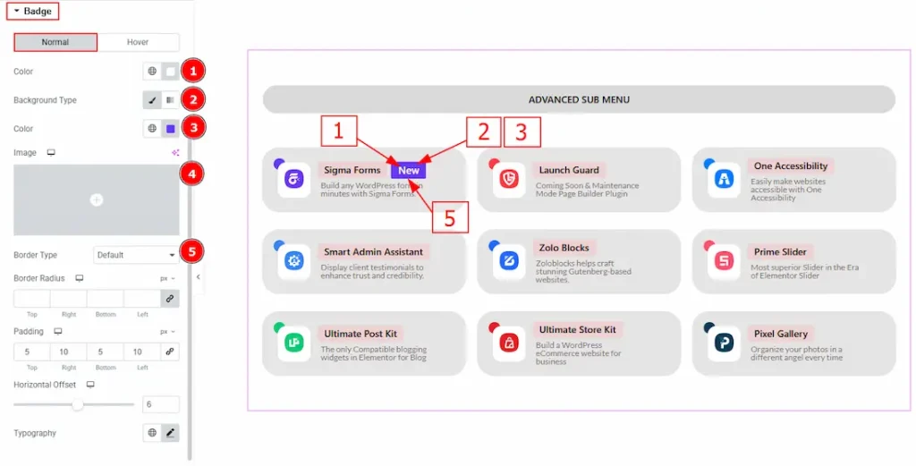
Badge Section
Go to Style → Badge
In this section, we have two more tabs. These are Normal & Hover. Let’s start customizing the Normal Tab first –
1. Color: You can change the badge text color with this option.
2. Background Type: You can select the background type as classic or gradient with this option.
3. Color: You can change the badge background color with this option.
4. Image: You can change the background image with this option.
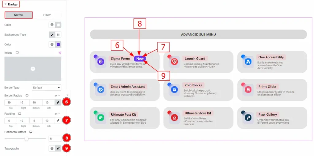
5. Border Type: You can add and change the border type with this option.
6. Border Radius: You can control the roundness of the border with this option.
7. Padding: You can adjust the inner space of the badge with this option.
8. Horizontal Offset: You can move the badge horizontally with this option.
9. Typography: Change the font family, size, weight, transform, style, decoration, line height, letter spacing, and word spacing from here.
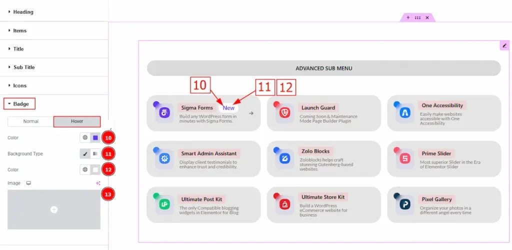
10. Color: You can change the badge text’s hover color with this option.
11. Background Type: You can select the background type as Classic or Gradient with this option.
12. Color: You can change the badge background hover color with this option.
13. Image: You can change the background image with this option.
Arrows Section
Go to Style → Arrows
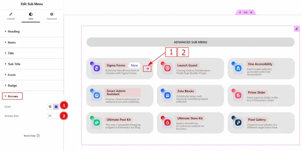
1. Color: You can change the arrow color with this option.
2. Arrow Size: You can adjust the size of the arrow icon with this option.
All done! You have successfully customized the Sub Menu widget on your website.
Video Assist
You can also watch the video tutorial to learn more about the Sub Menu widget. Please visit the demo page for examples.
Thanks for being with us.