In this documentation, we will discuss the customization options of the Remote Thumbs widget provided by Element Pack Pro for Elementor. Please note that Remote Thumbs are compatible only with Swiper-based slider or carousel widgets. They function as independent thumbnail navigation elements that can be customized and positioned separately from the main slider layout.
Enable The Remote Thumbs Widget
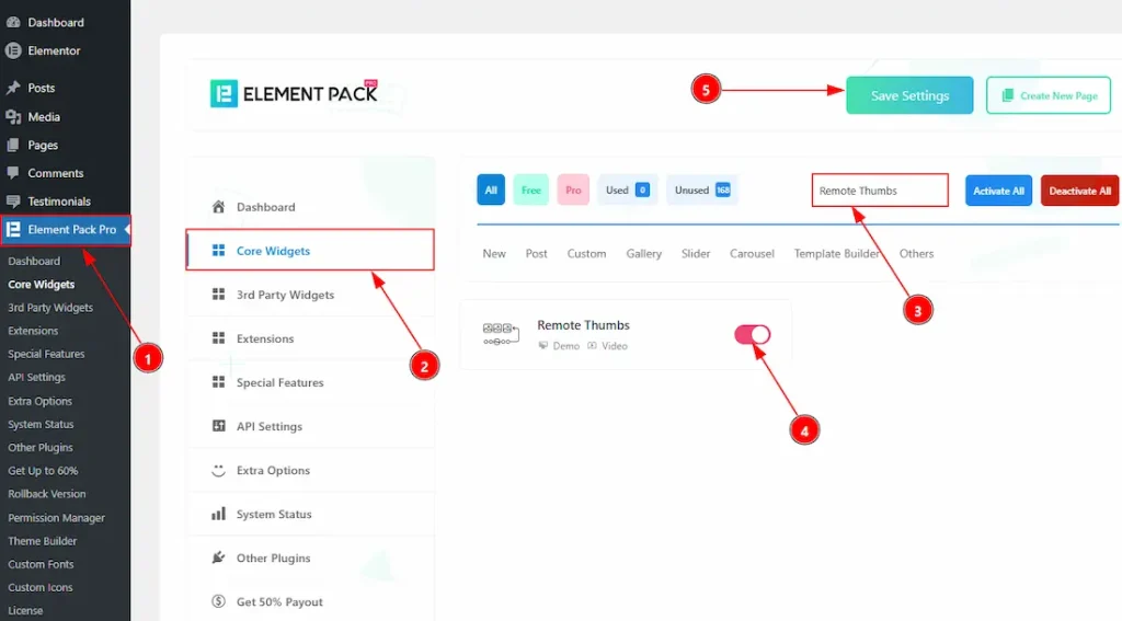
To use the Remote Thumbs widget from Element Pack Kit Pro, first, you have to enable the widget.
- Go to WordPress dashboard > Element Pack Kit Pro Plugin dashboard.
- Then, Click the Core Widgets Tab.
- Search the Remote Thumbs widget Name.
- Enable the Remote Thumbs widget.
- Hit the Save Settings Button.
Inserting The Remote Thumbs
To use a remote widget, first add a Swiper-based carousel like the Custom Carousel (for example) to your page in Elementor, then link it to the remote widget.
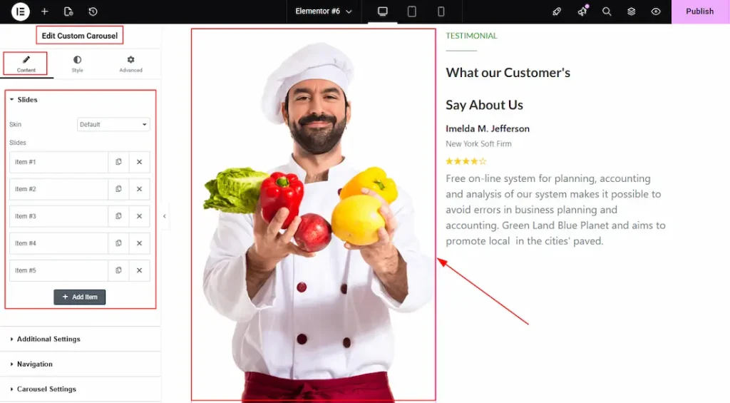
After dragging and dropping the Custom Carousel widget, you need to add the images to the carousel items and then customize it as you prefer. Also, make sure to go to the Navigation section and select none as the navigator.
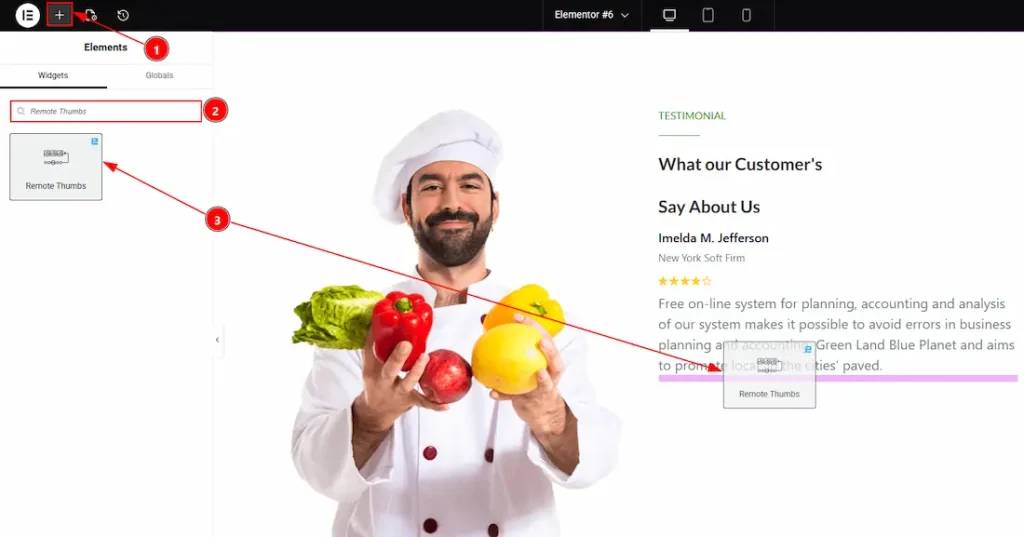
After adding the Custom Carousel, insert the Remote Thumbs widget anywhere on the page. It doesn’t need to be directly below the slider. It will work from any position.
1. Go to the Elementor Editor Page and hit the “+” icon Button.
2. Search the Remote Thumbs widget.
3. Drag the widget and drop it on the editor page.
Linking the Remote Thumbs with the Carousel
Set CSS ID for the Carousel
Select Custom Carousel → Advanced → Layout → CSS ID
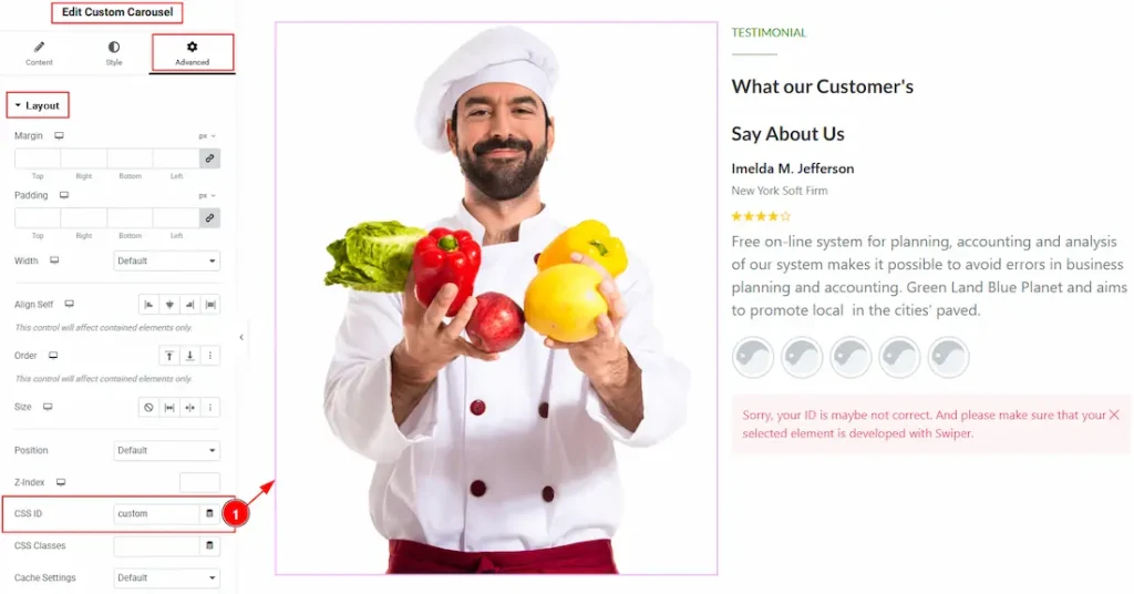
1. CSS ID: You have to assign a CSS ID to the slider to link up with the remote Thumbs. For example, we have used the CSS ID as “Custom” and copied it to use later on the remote Thumbs widget.
Set CSS ID for the Widget
Go to Content → Remote Thumbs
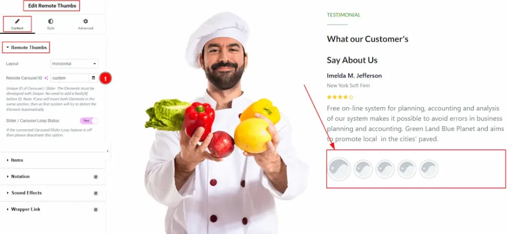
1. Remote Carousel ID: In this option, you have to paste the CSS ID that was already used and copied on the slider CSS ID option. (Note: Please remember that the CSS ID has to be the same on both the Carousel and the widget)
The link up with the Custom Carousel and the Remote Thumbs widget is done. Now let’s customize the Remote Thumbs.
Work With The Content Tab
Remote Thumbs Section
Go to Content > Remote Thumbs
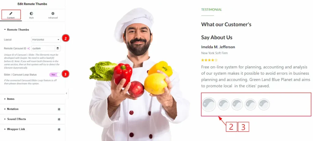
2. Layout: You can set the layout of the Thumbs to horizontal or vertical with this option. Here we have selected the remote thumbs layout as horizontal.
3. Slider / Carousel Loop Status: Enable the toggle to ensure proper syncing with the connected slider. Enable it only if the slider’s loop is active, and deactivate the toggle if the connected carousel or slider loop feature is off.
Items Section
Go to Content → Items
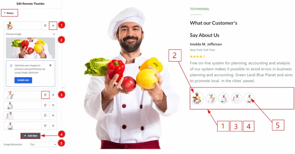
1. Choose Image: You can add an image to the remote thumbs item with this option.
2. Close Item: You can delete the carousel item by clicking the close icon button.
3. Copy Item: This option lets you copy the same item of the remote thumbs.
4. Add Item: You can add a new item by clicking the “+” Add Item button.
5. Image Resolution: You can adjust the resolution of the image with this option.
Work with The Style Tab
Remote Thumbs Section
Go to Style > Remote Thumbs
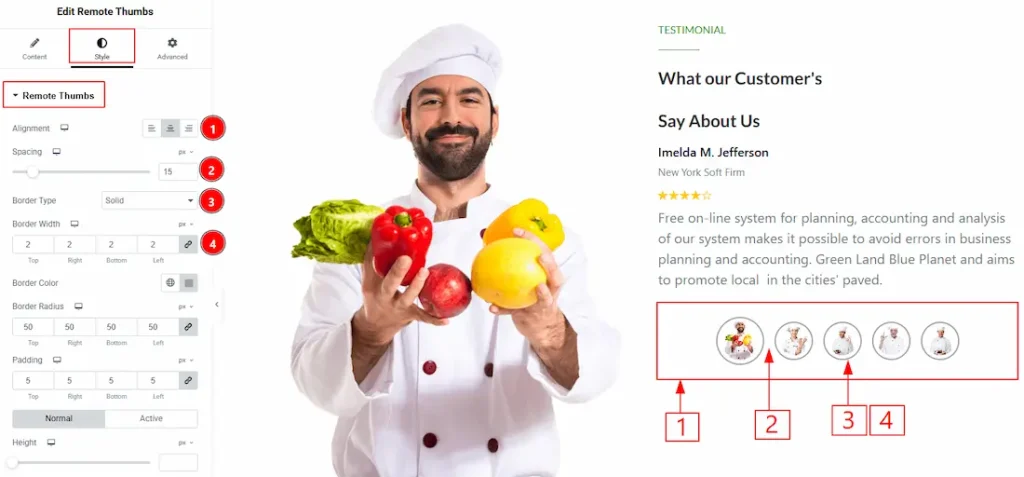
1. Alignment: You can move the Thumbs position to left, center, or right with this option. Here, we have selected the remote thumbs position as the center.
2. Spacing: You can adjust the space between the Thumbs items with this option.
3. Border Type: This option allows you to add borders to your items. You can select various border types from this option, such as Solid, Double, Dotted, Dashed, and Groove.
4. Border Width: You can set the thickness of the border with this option.
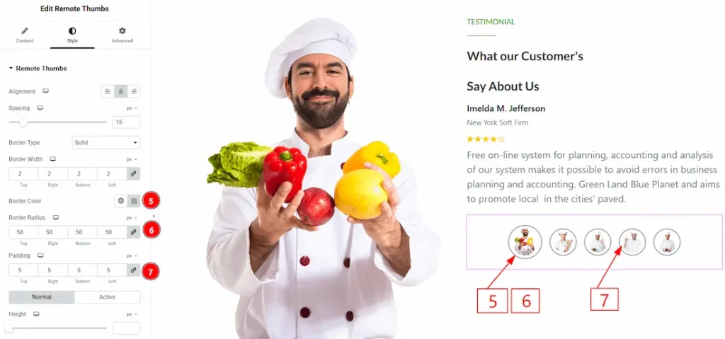
5. Border Color: You can make changes to the border color with this option.
6. Border Radius: This option controls the roundness of the border.
7. Padding: This option allows you to adjust the inner space of the thumb item.
In this section, we have two more tabs. These are Normal and Active. Let’s start with the customization of the Normal Tab –
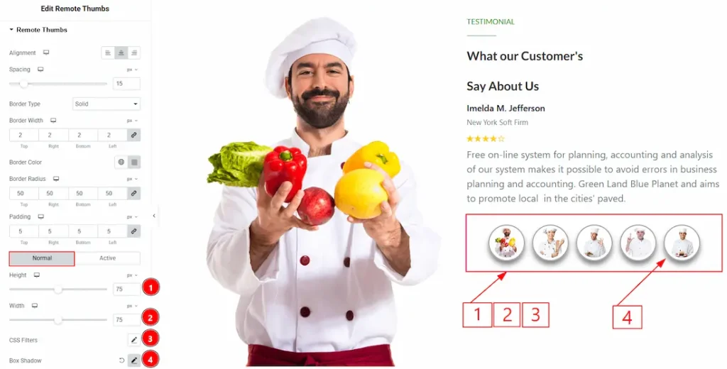
1. Height: You can adjust the Thumb items’ height with this option.
2. Width: You can adjust the width of the Thumb item with this option.
3. CSS Filters: This setting lets you apply visual changes to the image. In this setting, you can modify properties like Blur, Brightness, Contrast, Saturation, and Hue.
- Blur: Softens the image, reducing sharpness.
- Brightness: Adjusts the overall lightness or darkness.
- Contrast: Modifies the difference between light and dark areas.
- Saturation: Controls the intensity of the colors.
- Hue: Shifts the overall color spectrum.
4. Box Shadow: This option allows you to add a shadow overlay to the Thumb item and customize it.
Now, let’s proceed to the customization of the Active Tab –
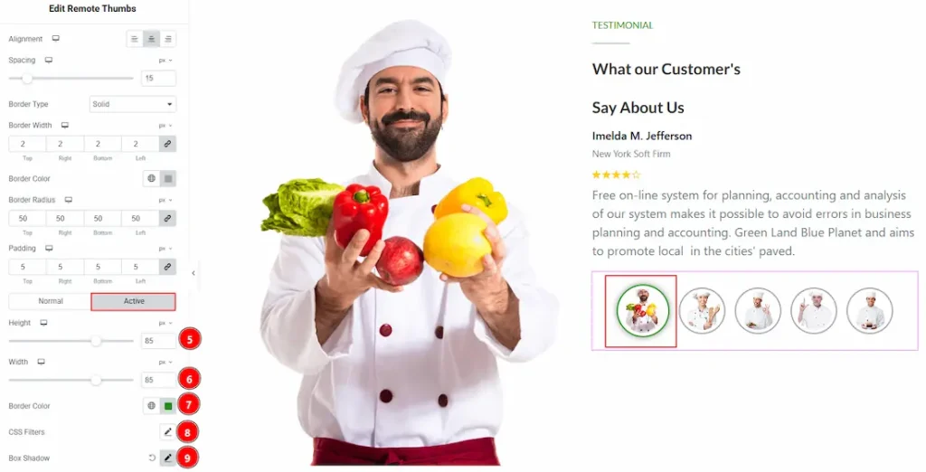
5. Height: You can adjust the Thumb item active height with this option.
6. Width: You can adjust the active width of the Thumb item with this option.
7. Border Color: You can change the active border color of the item with this option.
8. CSS Filters: This setting lets you apply visual changes to the image. In this setting, you can modify properties like Blur, Brightness, Contrast, Saturation, and Hue.
9. Box Shadow: This option allows you to add a shadow overlay to the Thumbs item and customize it.
All done! You have successfully customized the Remote Thumbs widget on your website.
Video Assist
Please watch the video tutorial to use the widget. Please visit the demo page for examples.
Thanks for being with us.