In this documentation, we will cover the customization options of the Remote Arrows feature provided by Element Pack Pro for Elementor. Please note that Remote Arrows are compatible only with Swiper-based carousels or carousel widgets. They function as independent navigation controls, allowing you to customize and position the arrows separately from the main carousel layout for greater design flexibility.
Enable The Remote Arrows Widget
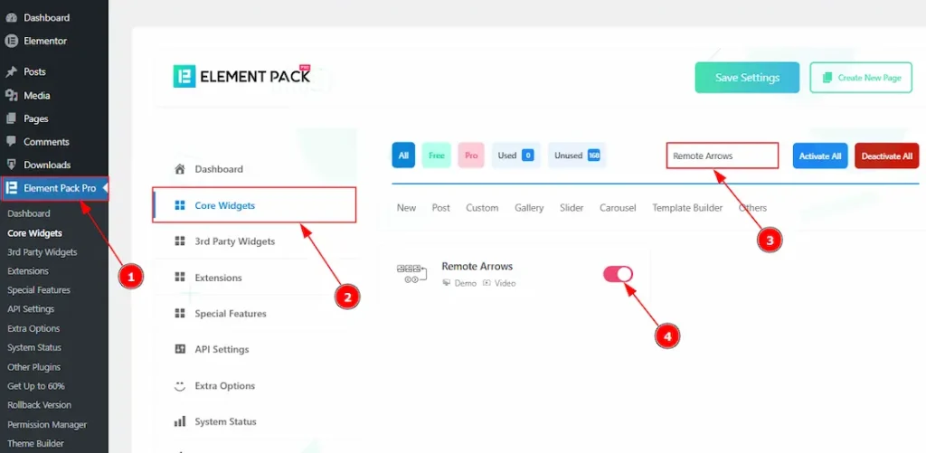
To use the Remote Arrows widget from Element Pack Pro, first, you have to enable the widget.
- Go to WordPress dashboard → Element Pack Pro Plugin dashboard.
- Then, Click the Core Widgets Tab.
- Search the Remote Arrows widget Name.
- Enable the Remote Arrows widget.
- Hit the Save Settings Button.
Inserting The Remote Arrows
To use a remote widget, first add a Swiper-based carousel like the Custom Carousel (for example) to your page in Elementor, then link it to the remote widget.

After dragging and dropping the Custom Carousel widget, you need to add the images to the carousel items and then customize it as you prefer. Also, make sure to go to the Navigation section and select none as the navigator.
After adding the Custom Carousel, insert the Remote Arrows widget anywhere on the page. It doesn’t need to be directly below the carousel. It will work from any position. If it’s placed in the same container, then you don’t need to add any CSS ID. It will auto detect and developed with the swiper.
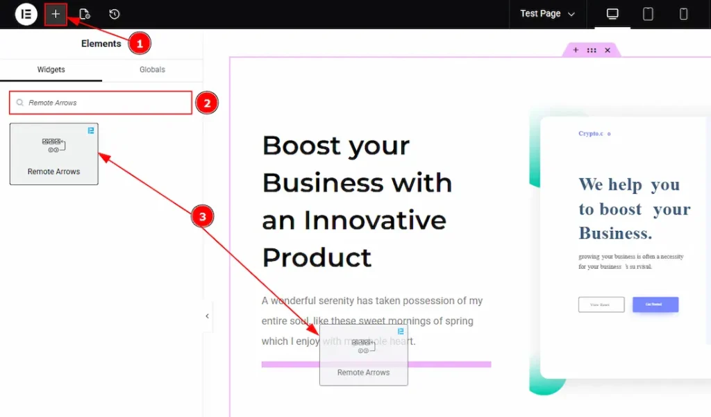
1. Go to the Elementor Editor Page and hit the “+” icon Button.
2. Search the Remote Arrows widget.
3. Drag the widget and drop it on the editor page.
Linking the Remote Arrows with the carousel
Set CSS ID for the carousel
Select carousel (Custom Carousel) → Advanced → Layout → CSS ID

1. CSS ID: If you are not using the remote carousel in the same container, then you have to assign a CSS ID to the carousel to link up with the remote Arrows. For example, we have used the CSS ID as Custom and copied it to use later on the remote Arrows widget.
Set CSS ID for the Widget
Go to Content > Remote Arrows

1. Remote Carousel ID: In this option, you have to paste the CSS ID that was already used and copied on the carousel CSS ID option. (Note: Please remember that the CSS ID has to be the same on both the carousel and the widget, or else the Arrows won’t work.)
The link up with the Custom Carousel and the Remote Arrows widget is done. Now let’s customize the Remote Arrows.
Work With The Content Tab
Remote Arrows Section
Go to Content → Remote Arrows

1. Remote Carousel ID: You can link the widget to the carousel with this option. (Note: Please see the Linking the Remote Arrows with the carousel Section above to find out how this option works.)
2. Arrows Icon: You can make changes to the arrows icon visual with this option. There are a total of 23 icon styles, along with the custom option.
3. Text: You can change the next arrows’ text with this option.
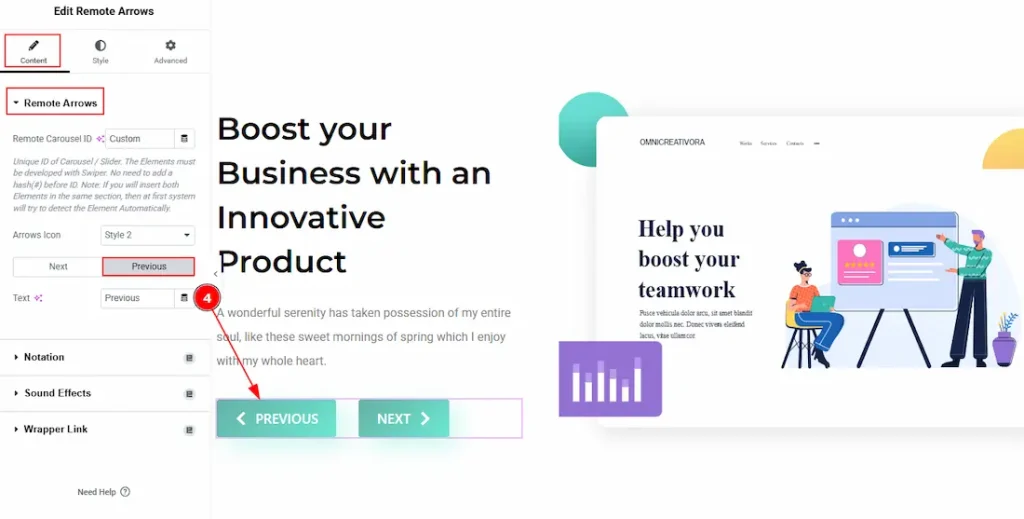
4. Text: You can change the previous arrow’s text with this option.
Work with The Style Tab
Remote Arrows Section
Go to Style → Remote Arrows
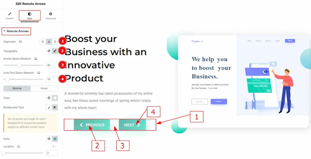
1. Alignment: You can move the arrow’s position to left, center, or right with this option.
2. Typography: Change the font family, size, weight, transform, style, decoration, line height, letter spacing, and word spacing from here.
3. Arrows Space Between: You can adjust the space between the previous and next arrow buttons with this option.
4. Icon/Text Space Between: You can adjust the space between the arrow’s icon and text with this option.

In this section, we have two more tabs. These are Normal & Hover. Let’s start with the Normal Tab –
1. Color: You can change the arrows’ text color with this option.
2. Background Type: You can select the background to be classic or gradient with this option.
3. Color: You can change the background color with this option.
4. Image: You can change the background image with this option.
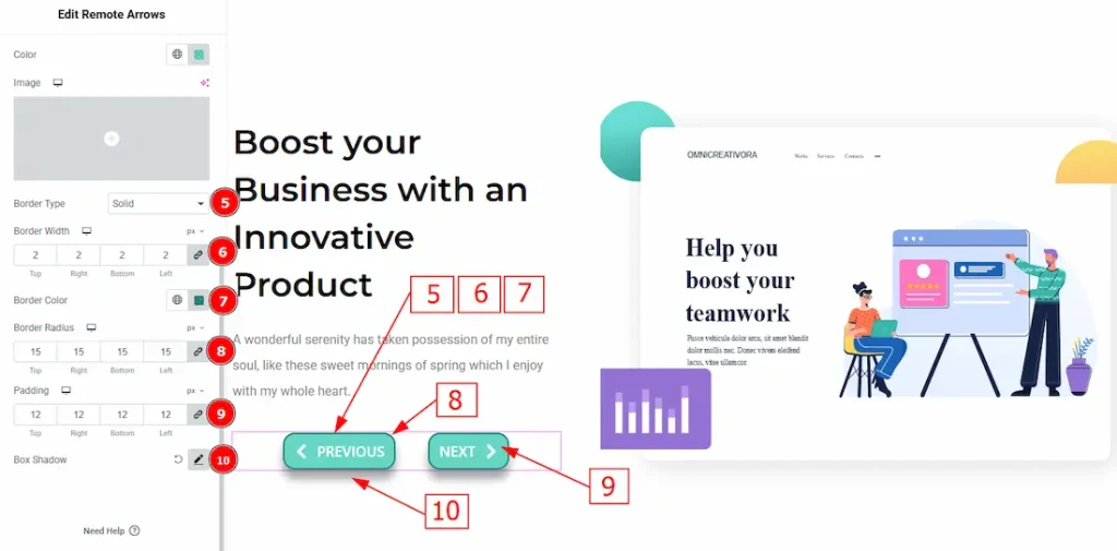
5. Border Type: You can add or change the border type with this option.
6. Border Width: Set the thickness of the border with this option.
7. Border Color: You can change the border color with this option.
8. Border Radius: This option controls the roundness of the border.
9. Padding: You can adjust the inner space of the arrow field with this option.
10. Box Shadow: You can add a shadow effect to the arrows with this option.
Now, let’s proceed to the Hover Tab –
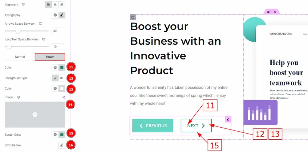
11. Color: You can change the arrow icon and text hover color with this option.
12. Background Type: You can change the background type to classic or gradient with this option.
13. Color: You can change the background hover color with this option.
14. Image: You can change the background image with this option.
15. Border Color: You can change the border hover color with this option.
16. Box Shadow: You can add a shadow effect to the arrow button with this option.
All done! You have successfully customized the Remote Arrows widget on your website.
Video Assist
You can also watch the video tutorial to learn more about the Remote Arrows widget. Please visit the demo page for examples.
Thanks for being with us.