In this documentation, we will discuss the customization of the Progress Pie widget, brought to you by the Element Pack Pro addon for Elementor.
Enable The Progress Pie Widget
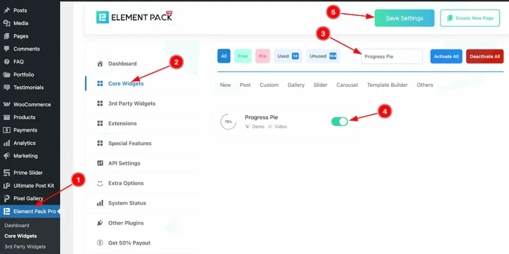
To use the Progress Pie widget from Element Pack Pro, first, you have to enable the widget.
- Go to WordPress dashboard → Element Pack Pro Plugin dashboard.
- Then, Click the Core Widgets Tab.
- Search the Progress Pie Widget Name.
- Enable the Progress Pie Widget.
- Hit the Save Settings Button.
Inserting the Progress Pie widget
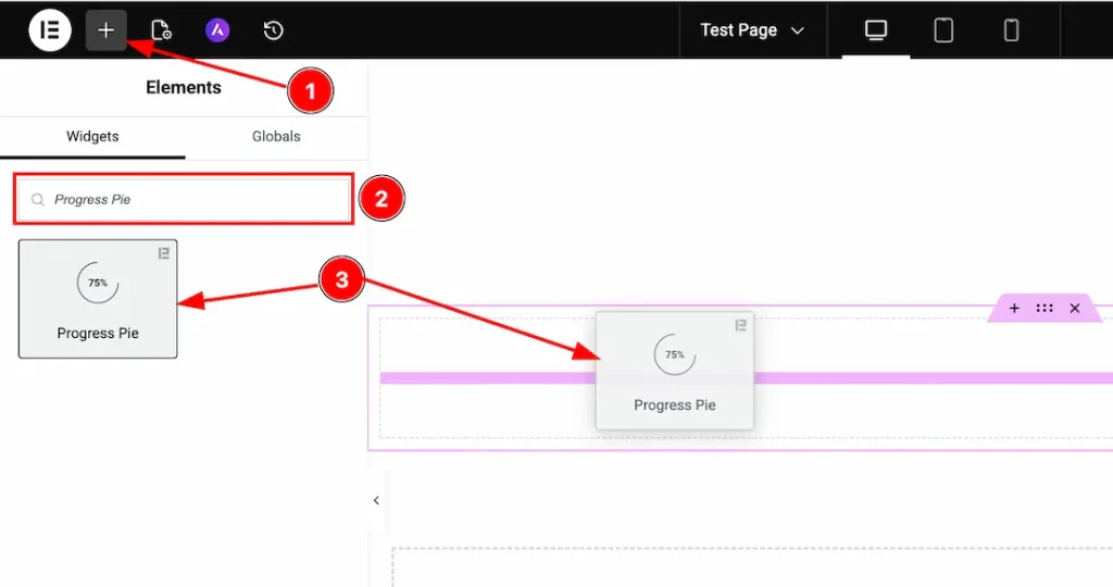
1. Go to the Elementor Editor Page and hit the “+” icon Button.
2. Search the Progress Pie widget.
3. Drag the widget and drop it on the editor page.
Work With The Content Tab
Layout Section
Go to Content → Layout
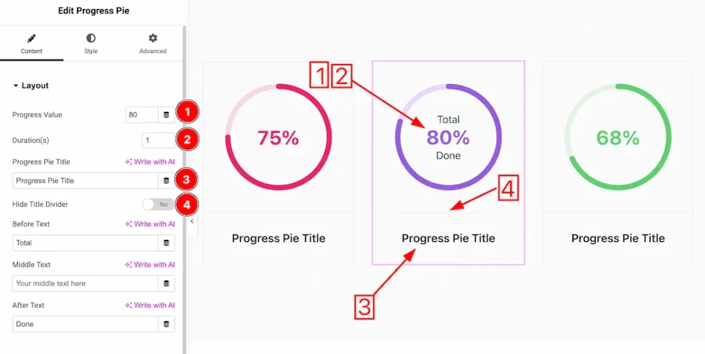
1. Progress Value: This option lets you change the progress value.
2. Duration: You can adjust the progress animation duration from here.
3. Progress Title: This option lets you change the progress title.
4. Hide Title Divider: Enable/disable the hide title divider switcher button to show/hide the divider from the progress pie.
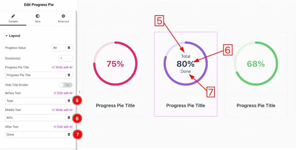
5. Before Text: This option lets you change the before text.
6. Middle Text: This option lets you change the Middle text.
7. After Text: This option lets you change the after text.
Work with The Style Tab
Style Section
Go to Style → Style
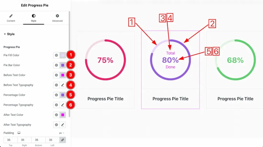
Come to the Style section, you will get two subsections: Progress Pie and Title. Let’s proceed with the Progress Pie section-
1. Pie Fill Color: This option lets you change the pie fill color.
2. Pie Bar Color: This option lets you change the pie bar color.
3. Before Text Color: This option lets you change the before text color.
4. Before Text Typography: Change the before text font family, size, weight, style, transform, decoration, line height, letter spacing, and word spacing from here.
5. Percentage Color: This option lets you change the percentage color.
6. Percentage Typography: Change the percentage text font family, size, weight, style, transform, decoration, line height, letter spacing, and word spacing from here.
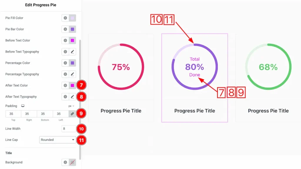
7. After Text Color: This option lets you change the after text color.
8. After Text Typography: Change the after text font family, size, weight, style, transform, decoration, line height, letter spacing, and word spacing from here.
9. Padding: You can adjust the pie padding from here.
10. Line Width: This option lets you change the pie line height.
11. Line Cap: You can set the line cap type- Rounded, Square, and Butt.
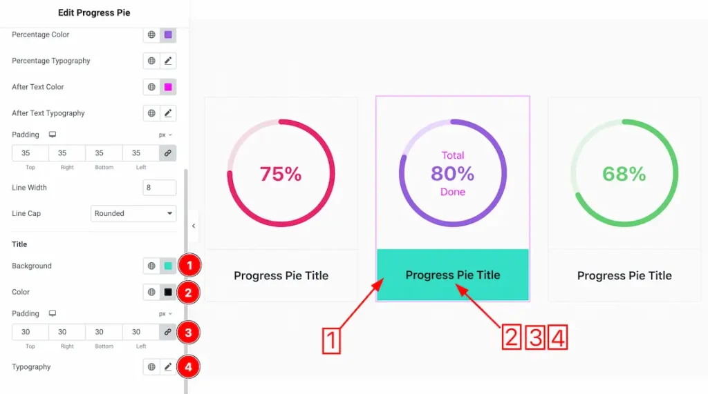
Let’s proceed with the Title section-
1. Background: This option lets you to change the Title background color.
2. Color: This option lets you to change the Title text color.
3. Padding: You can adjust the title padding from here.
4. Typography: Change the font family, size, weight, style, transform, decoration, line height, letter spacing, and word spacing from here.
All done! You have successfully customized the Progress Pie widget on your website.
Video Assist
You can also watch the video tutorial to learn more about the Progress Pie widget. Please visit the demo page for examples.
Thanks for being with us.