In this documentation, we will provide comprehensive guidance on how to use the Element Pack Pro Image Stack widget for Elementor. This widget allows you to display multiple images in a layered and interactive stack layout, creating a visually engaging presentation on your website. It is a creative and flexible tool designed to showcase images with depth, hover effects, and smooth transitions.
Suitable for portfolios, team sections, product highlights, galleries, and promotional content, the Image Stack widget helps you present visuals in a modern and dynamic way while maintaining full design control.
Now, let’s explore how to properly configure and use the Image Stack widget step by step.
Image Stack Widget – Key Features
- Layered Image Display
Show multiple images stacked on top of each other to create a modern, depth-based visual effect. - Interactive Hover Effects
Add smooth hover animations that reveal images dynamically for an engaging user experience. - Custom Stack Order Control
Easily control the position and order of each image within the stack. - Flexible Image Management
Add, remove, or rearrange images with a simple repeater interface. - Animation & Transition Effects
Apply smooth transitions and motion effects to enhance visual interaction. - Custom Spacing & Alignment
Adjust spacing, alignment, and positioning to perfectly fit your layout. - Responsive Controls
Optimize the image stack for desktop, tablet, and mobile devices. - Overlay & Styling Options
Customize overlay colors, opacity, borders, shadows, and border radius. - Link Support
Add custom links to individual images for navigation or promotional purposes. - No Coding Required
Create visually impressive stacked image layouts using a fully visual interface. - Highly Versatile
Ideal for portfolios, team showcases, product highlights, creative galleries, and promotional sections.
Activate Image Stack Widget
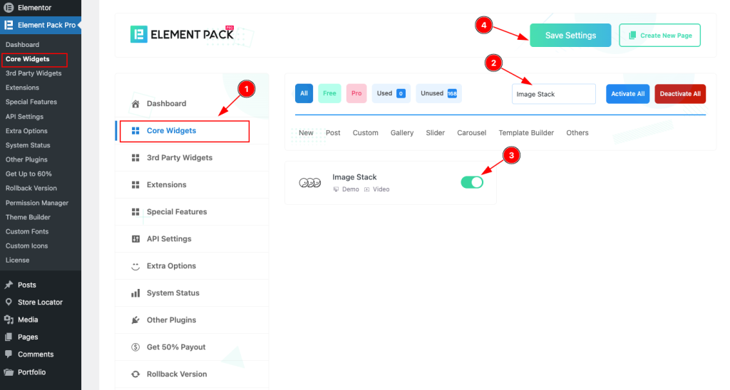
- To use the Image Stack widget from Element Pack Pro, first, you have to enable the Core Widgets. Navigate to the WordPress Dashboard.
- Go to Element Pack Pro > Core Widgets section.
- Search by the Widget Name ” Image Stack ” and it will appear the.
- Now Enable the Switcher of the Image Stack Widget.
- Hit the Save Settings button.
Inserting The Image Stack Widget
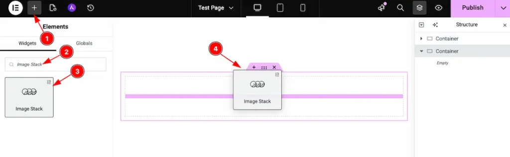
- Go to the Elementor Editor page and click the Add Element “+” icon.
- Search for the Image Stack widget by name.
- The widget will appear — you can check the Element Pack Pro logo on the top-right corner.
- Select the widget, then drag and drop it onto the editor page.
Work With The Content Tab
Image Stack Section Customizations
Go to Content > Image Stack
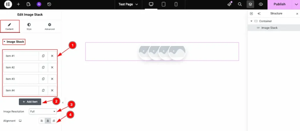
- All the items are available on the image stack section.
- Click on the ” + Add Item ” button to add the new item.
- Image Resolution: Select the full image resolution for the Image stack.
- Alignment: Set the alignment for the Image.
Add Content
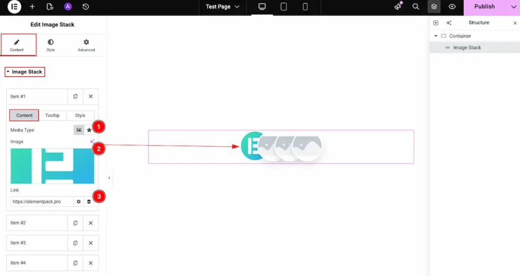
- Media Type: Choose the media type for the content.
- Image: Select the image from the library or local source.
- Link: Select the link for the images.
Add Tooltip
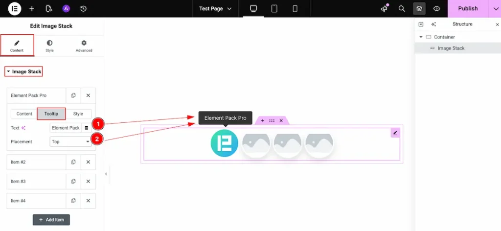
- Text: Choose the tooltip for the image.
- Placement: Set the position of the tooltip. It might be top, bottom, left, or right.
Style
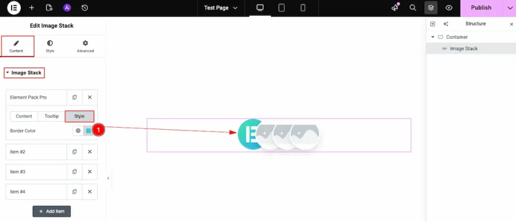
- Border Color: Choose the border color for the Image stack. It’s individual color for the image stack.
Work With The Style Tab
Items Section Customizations
Go to Style > Items
Normal Tab
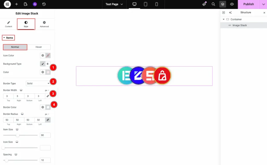
- Background Type: Choose the type Color for the background and select the color for it.
- Border Type: Select the type for the border.
- Border Width: Set the thickness for the border.
- Border Color: Choose the color for the border.
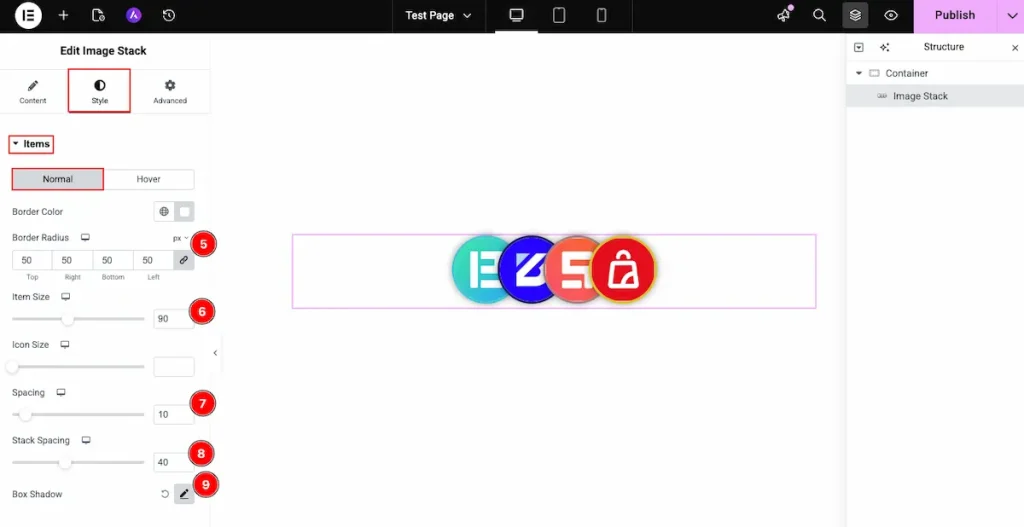
- Border Radius: Make the border corner edges rounded by selecting the border radius.
- Item Size: Set the size for the item.
- Spacing: Make the spacing between the items.
- Stack Spacing: Select the stack spacing. The spacing will appear while hover over the stack.
- Box Shadow: Make a shadow for the Box.
Hover Tab
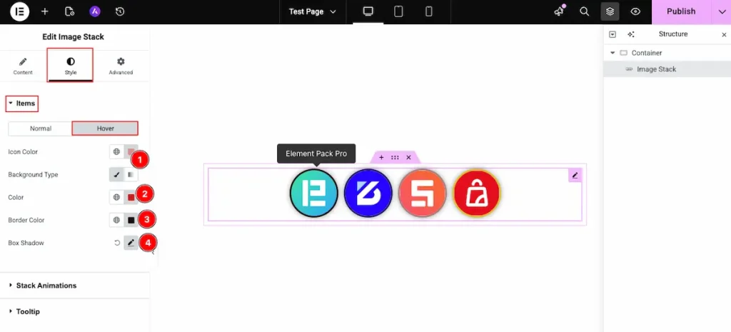
- Icon Color: Choose the Color for the Icon.
- Background Color: Select the background type Color and Set the color for the Background.
- Border Color: Select the border color. Choose the color for the border.
- Box Shadow: Make a shadow for the Box. The shadow will appear for the box items.
Stack Animation Section
Go to Style > Stack Animation
Item Hover
Translate
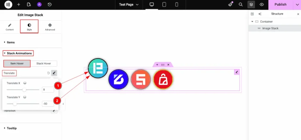
- Translate X: Adjust the horizontal position along the X-axis.
- Translate Y: Adjust the vertical position along the Y-axis.
Rotate
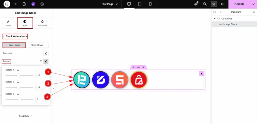
- Rotate X: Adjust the element’s rotation along the X-axis to control its tilt forward or backward in 3D space.
- Rotate Y: Adjust the element’s rotation along the Y-axis to control its left or right 3D rotation effect.
- Rotate Z: Adjust the element’s rotation along the Z-axis to rotate the element clockwise or counterclockwise on the screen.
Scale
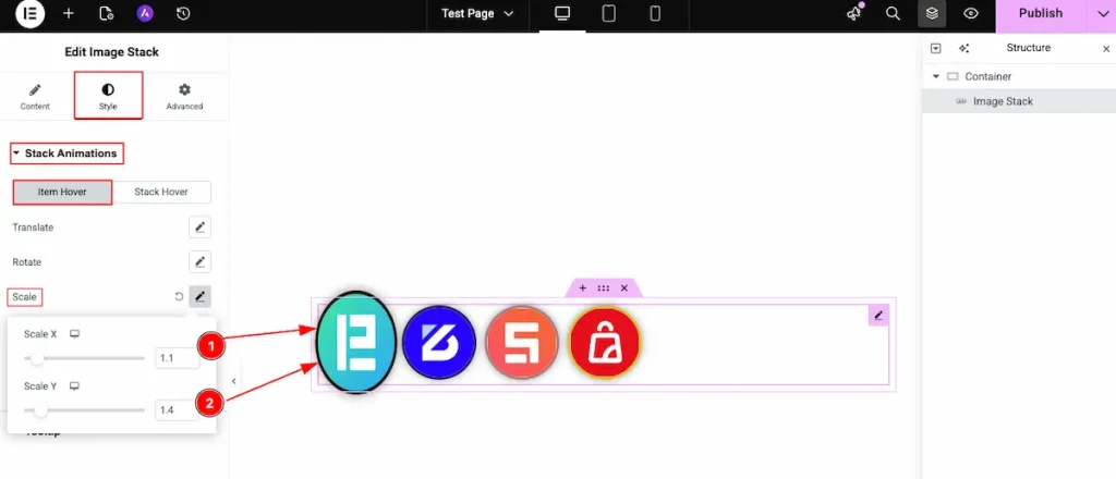
- Scale X: Adjust the element’s scale along the X-axis to control its horizontal size (width). Increasing the value stretches it wider, while decreasing the value makes it narrower.
- Scale Y: Adjust the element’s scale along the Y-axis to control its vertical size (height). Increasing the value makes it taller, while decreasing the value reduces its height.
Skew
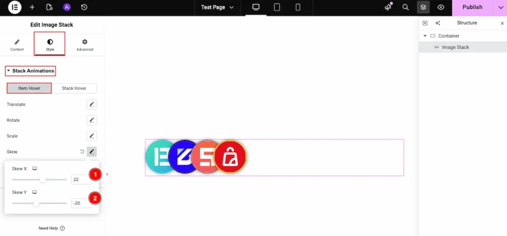
- Skew X: Control the horizontal skew of the element by adjusting the X-axis value, creating a slanted effect from left to right.
- Skew Y: Control the vertical skew of the element by adjusting the Y-axis value, creating a slanted effect from top to bottom.
Transition
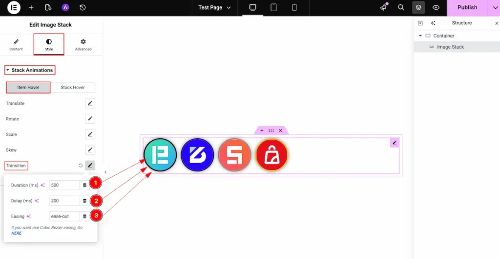
- Duration (ms): Set the duration of the transition in milliseconds. A higher value creates a slower animation, while a lower value makes it faster.
- Delay (ms): Set the delay time in milliseconds before the transition starts.
- Easing: Define the easing function for the transition to control how the animation accelerates and decelerates (e.g., ease, linear, ease-in, ease-out).
Stack Hover
Translate
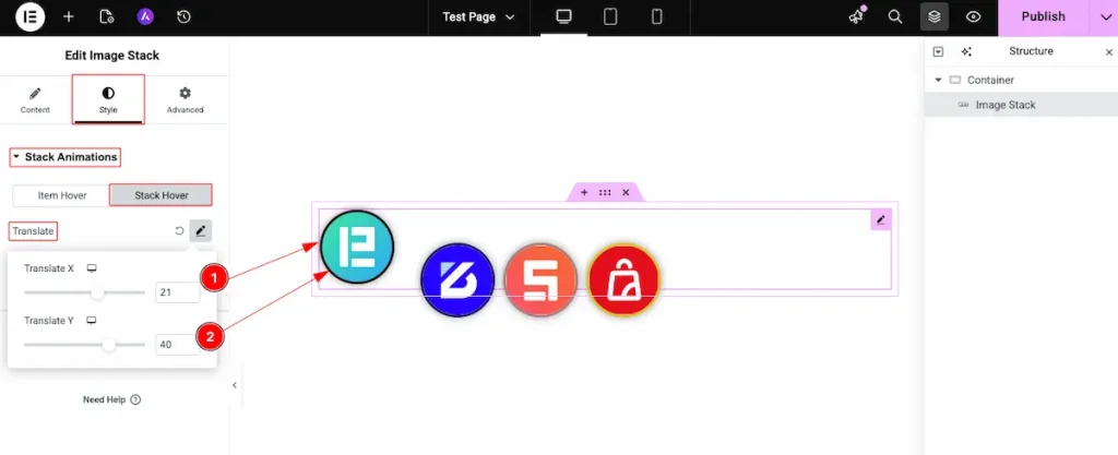
- Translate X: Adjust the horizontal translation along the X-axis to move the element left or right.
- Translate Y: Adjust the vertical translation along the Y-axis to move the element up or down.
Rotate
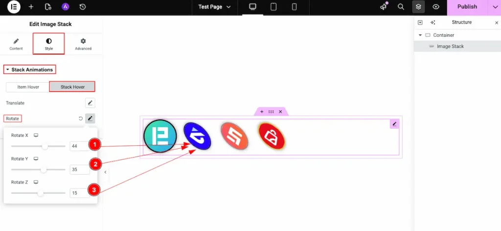
- Rotate X: Set the rotation value along the X-axis to tilt the element forward or backward.
- Rotate Y: Set the rotation value along the Y-axis to rotate the element left or right in 3D space.
- Rotate Z: Set the rotation value along the Z-axis to rotate the element clockwise or counterclockwise.
Video Assist
You can watch this video featuring the usage of the Image Stack widget. Don’t forget to visit the demo page for more examples and designs with this feature.
Thanks for staying with us.