The Honeycombs widget in Element Pack Pro lets you display content in a unique hexagonal grid layout. You can showcase images, icons, titles, and descriptions with customizable styles and hover effects to create engaging sections in Elementor. This documentation explains how to use and customize the widget.
Enable The Honeycombs Widget
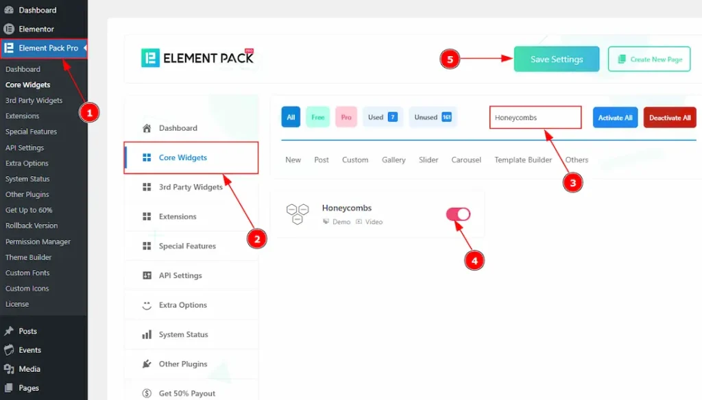
To use the Honeycombs widget from Element Pack Pro, first, you have to enable the widget.
- Go to WordPress dashboard → Element Pack Pro Plugin dashboard.
- Then, Click the Core Widgets Tab.
- Search the Honeycombs Widget Name.
- Enable the Honeycombs Widget.
- Hit the Save Settings Button.
Inserting The Honeycombs Widget
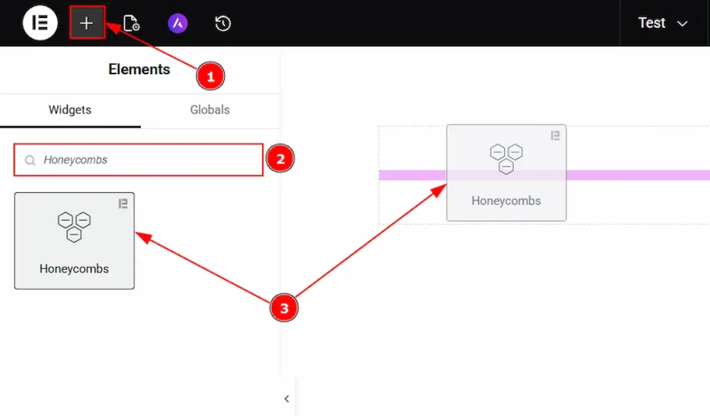
1. Go to the Elementor Editor Page and hit the “+” icon Button.
2. Search the Honeycombs name.
3. Drag the widget and drop it on the editor page.
Work With The Content Tab
Layout Section
Go to Content → Layout
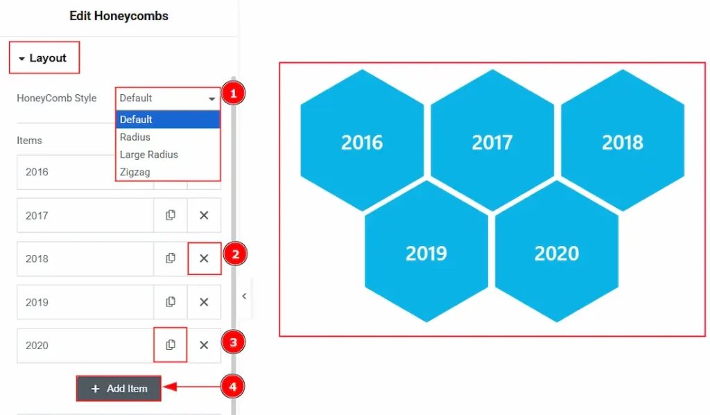
1. Honeycomb Style: You can choose the layout style for the honeycomb with this option. The available styles are Default, Radius, Large Radius & Zigzag. Here, we have selected the honeycomb style as the default.
2. Close Item: You can delete the Honeycombs item by clicking the Close icon button.
3. Copy Item: This option lets you copy the same item.
4. Add Item: You can add a new item by clicking the “+” Add Item button.
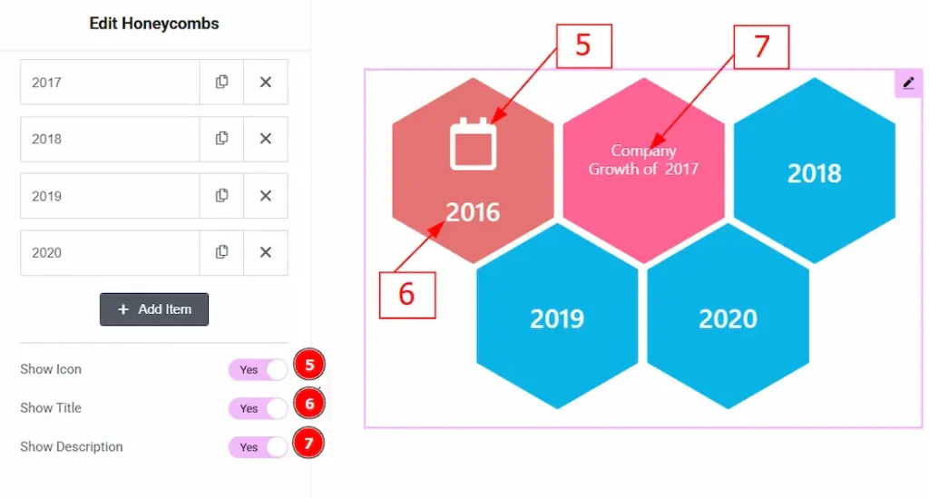
5. Show Icon: Enable the switcher to show the icon on the honeycomb.
6. Show Title: Enable the switcher to show the title on the honeycomb.
7. Show Description: Enable the switcher to show the description on the honeycomb.
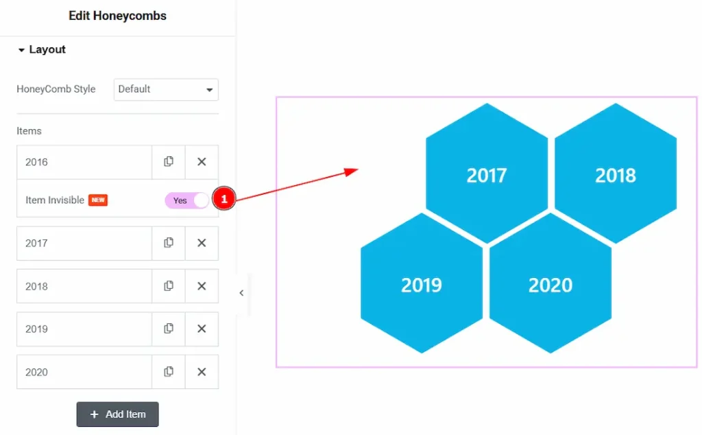
1. Item Invisible: Enable the switcher to make the honeycomb item invisible to your audience with this option.
In the Honeycombs Items, each item contains more options. There are two tabs that present those options. These are Front & Back. Let’s start with the Front Tab –
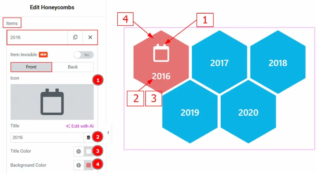
1. Icon: You can add an icon to the honeycomb item with this option.
2. Title: You can add and make changes to the title text of the Honeycombs item with this option.
3. Title Color: You can make changes to the title color with this option.
4. Background Color: You can make changes to the honeycomb item background color with this option.
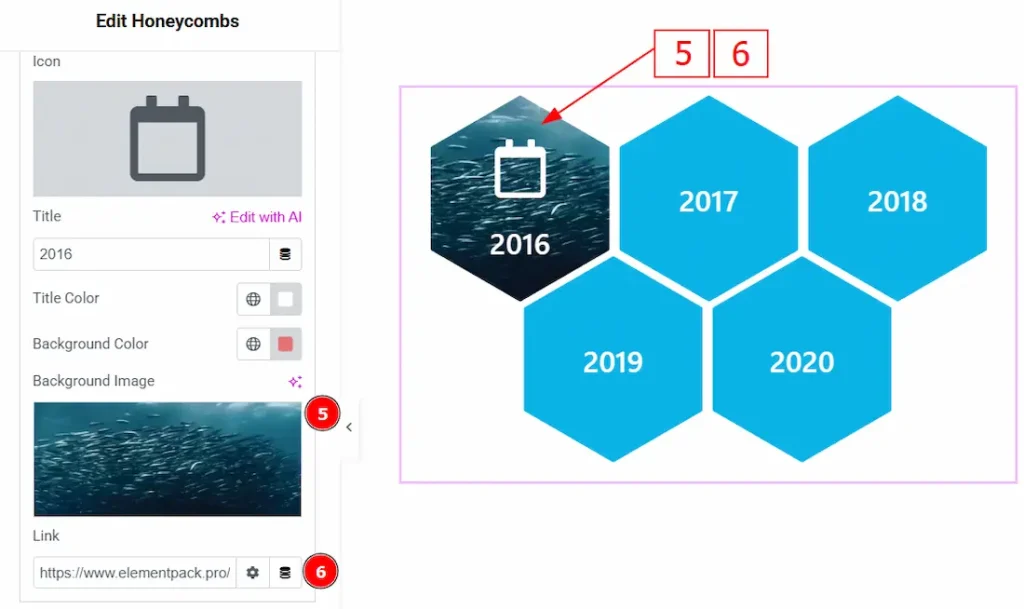
5. Background Image: You can add an image to the honeycomb item with this option.
6. Link: You can add a link to the icon with this option.
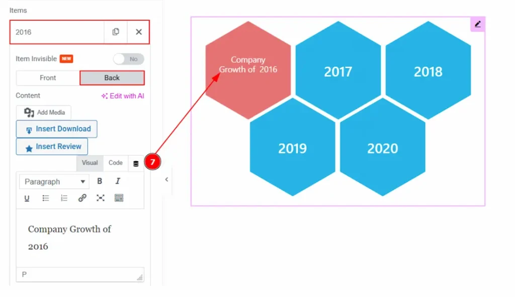
Now, let’s proceed to the Back Tab –
7. Content: You can add a description to the honeycomb item with this option.
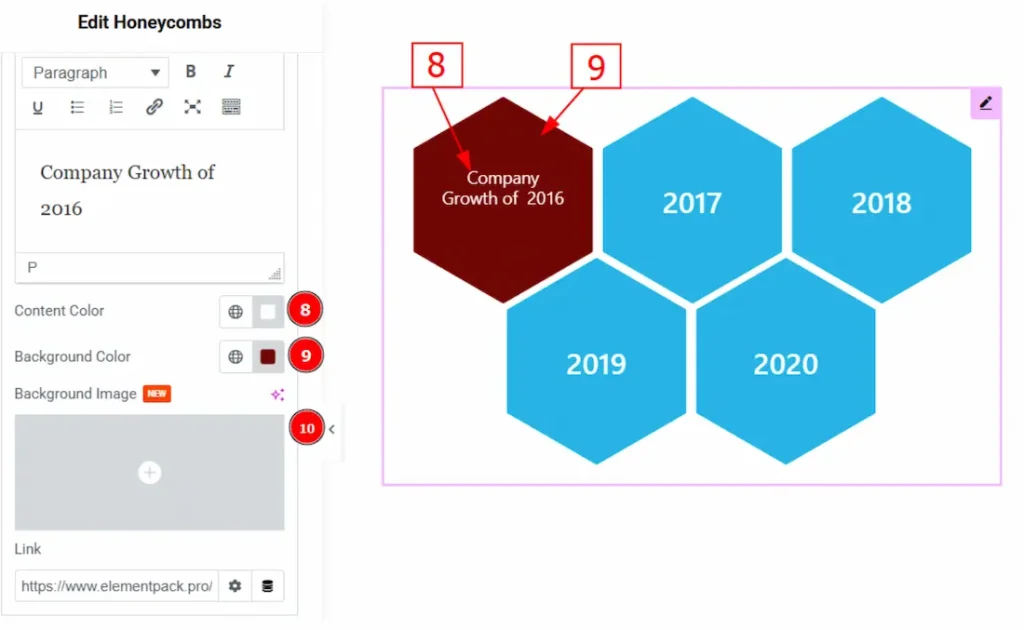
8. Content Color: You can make changes to the description text color with this option.
9. Background Color: You can change the background color of the back of the honeycomb item with this option.
10. Background Image: You can add an image to the honeycomb item back with this option.
Additional Section
Go to Content → Additional
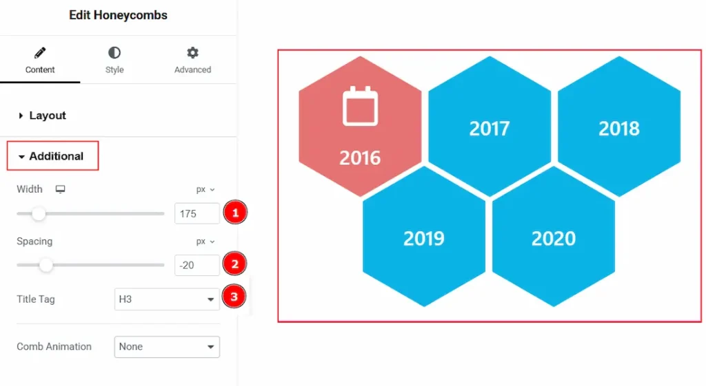
1. Width: You can adjust the width of the honeycomb items with this option.
2. Spacing: You can adjust the space between the honeycomb items with this option.
3. Title Tag: You can make changes to the HTML title tag of the title with this option.
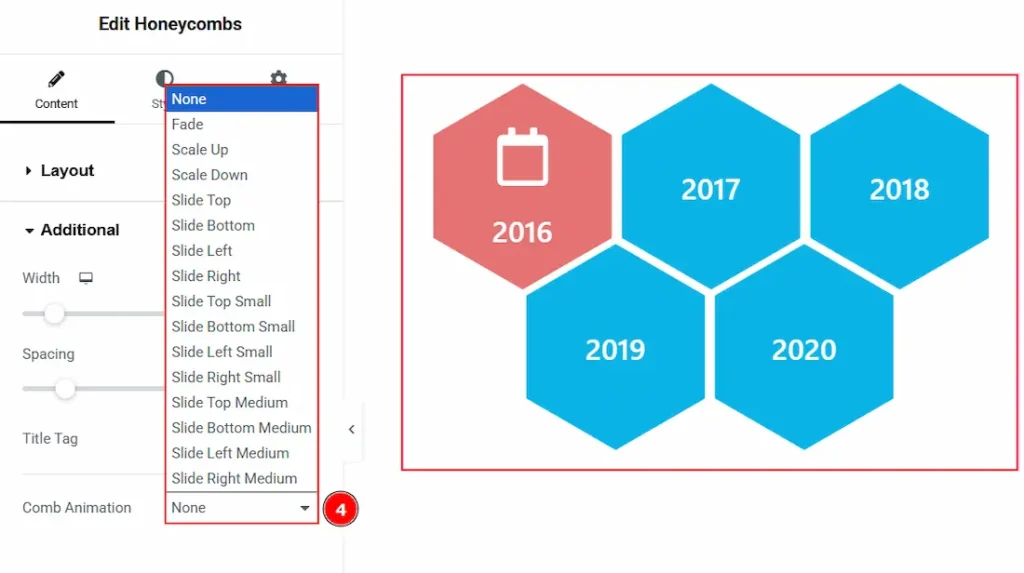
4. Comb Animation: You can set an animation to the honeycomb items appearance with this option.
Work with The Style Tab
Item Section
Go to Style → Item
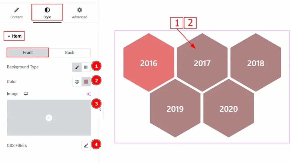
In this section, we have two more tabs. These are Front and Back. Let’s start with the Front tab first –
1. Background Type: You can choose the background type between the classic or gradient style with this option. Here, we have selected the background type as classic.
2. Color: You can change the background color of the back of the honeycomb item with this option.
3. Image: You can change the background image with this option.
4. CSS Filters: This setting lets you apply visual changes to the image. In this setting, you can modify properties like Blur, Brightness, Contrast, Saturation, and Hue.
- Blur: Softens the image, reducing sharpness.
- Brightness: Adjusts the overall lightness or darkness.
- Contrast: Modifies the difference between light and dark areas.
- Saturation: Controls the intensity of the colors.
- Hue: Shifts the overall color spectrum.
Note: This option will work only on an image. By adding the background image, you can customize the image with this option.
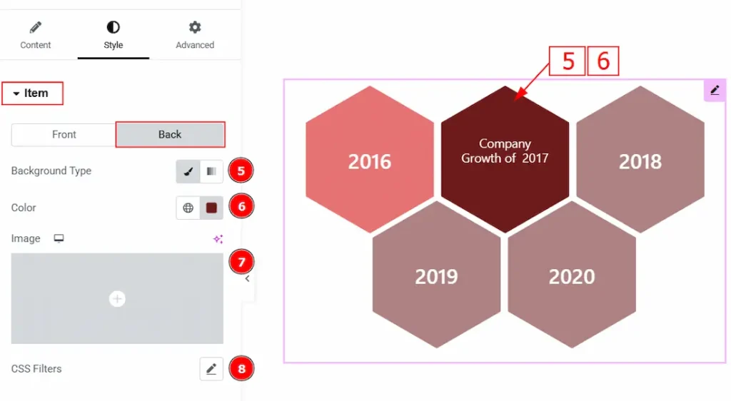
Now, let’s proceed to the Back Tab –
5. Background Type: You can choose the background type between the classic or gradient styles with this option. Here, we have selected the background type as classic.
6. Color: You can change the background color of the back of the honeycomb item with this option.
7. Image: You can change the background image to the back of the honeycomb item with this option.
8. CSS Filters: This setting lets you apply visual changes to the background image. In this setting, you can modify properties like Blur, Brightness, Contrast, Saturation, and Hue.
Icon Section
Go to Style → Icon
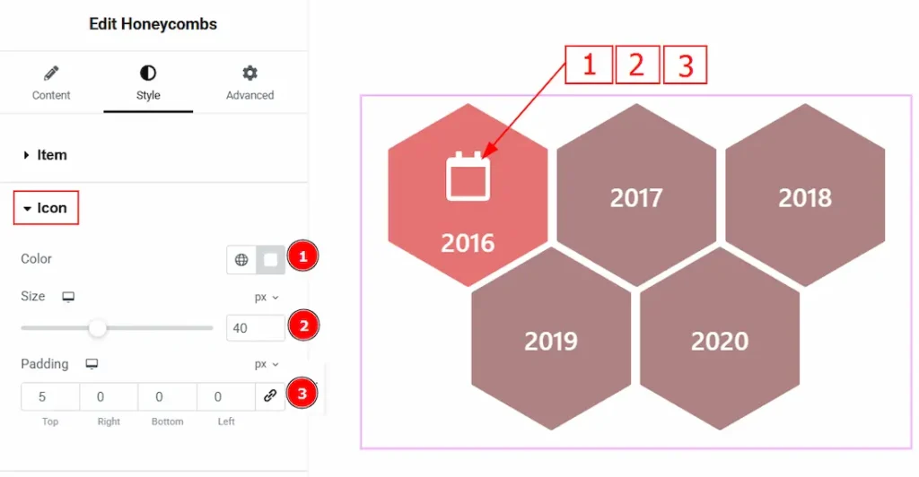
1. Color: You can change the icon color of the honeycomb item with this option.
2. Size: You can make changes to the icon size of the honeycomb item with this option.
3. Padding: You can adjust the inner space of the honeycomb item icon with this option.
Title Section
Go to Style → Title
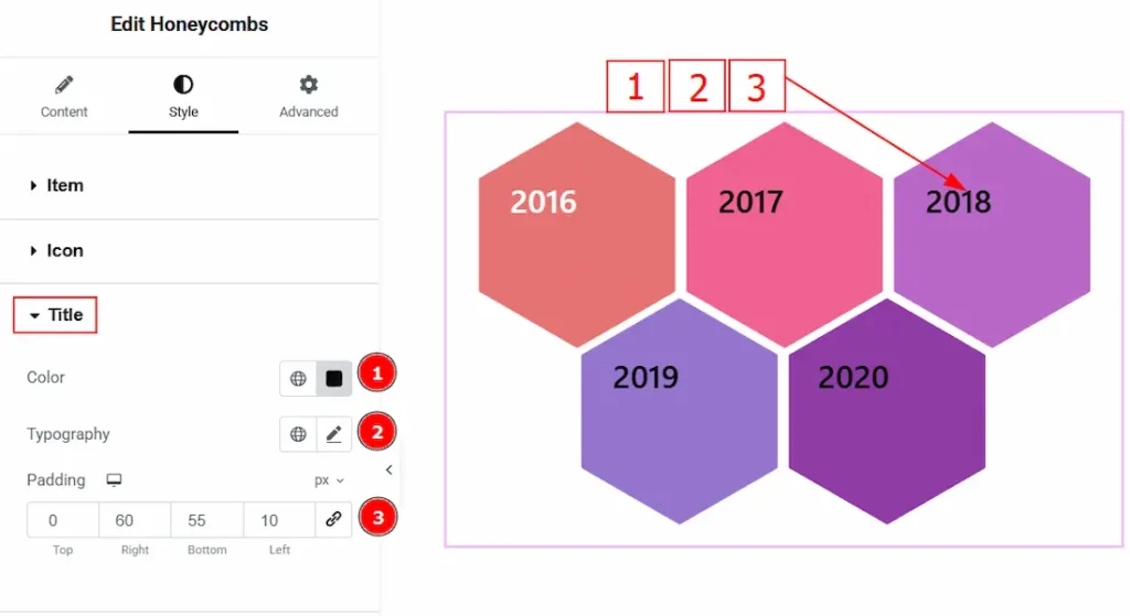
1. Color: You can make changes to the title text color with this option.
2. Typography: Change the font family, size, weight, transform, style, decoration, line height, letter spacing, and word spacing from here.
3. Padding: You can adjust the inner space of the title field with this option.
Description Section
Go to Style → Description
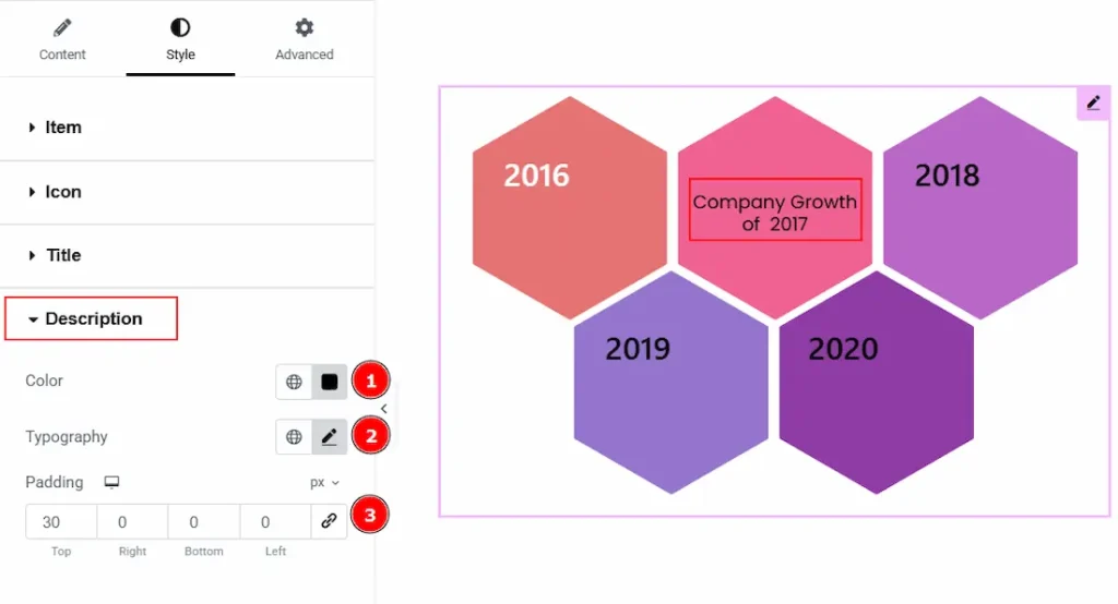
1. Color: You can make changes to the description text color with this option.
2. Typography: Change the font family, size, weight, transform, style, decoration, line height, letter spacing, and word spacing from here.
3. Padding: You can adjust the inner space of the description field with this option.
All done! You have successfully customized the Honeycombs widget on your website.
Video Assist
You can also watch the video tutorial to learn more about the Honeycombs widget. Please visit the demo page for examples.
Thanks for being with us.