The Dual Button widget in Element Pack Pro lets you display two buttons side by side for multiple calls to action. With flexible styling and layout options, you can create clean and interactive button groups in Elementor. In this documentation, we will guide you through how to use and customize the Dual Button widget.
Enable The Dual Button Widget
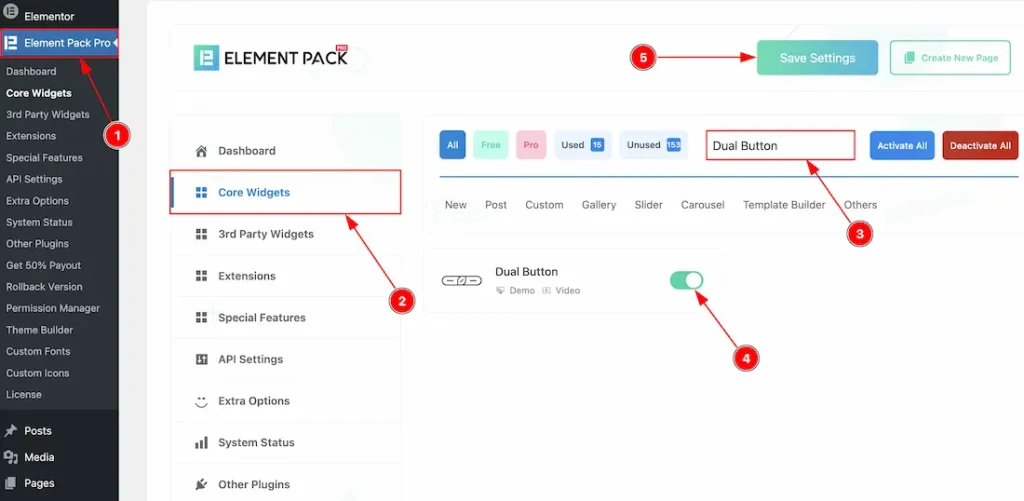
To use the Dual Button widget from Element Pack, first, you have to enable the widget.
- Go to WordPress dashboard → Element Pack Plugin dashboard.
- Then, Click the Core Widgets Tab.
- Search the Dual Button Widget Name.
- Enable the Dual Button Widget.
- Hit the Save Settings Button.
Inserting The Dual Button Widget
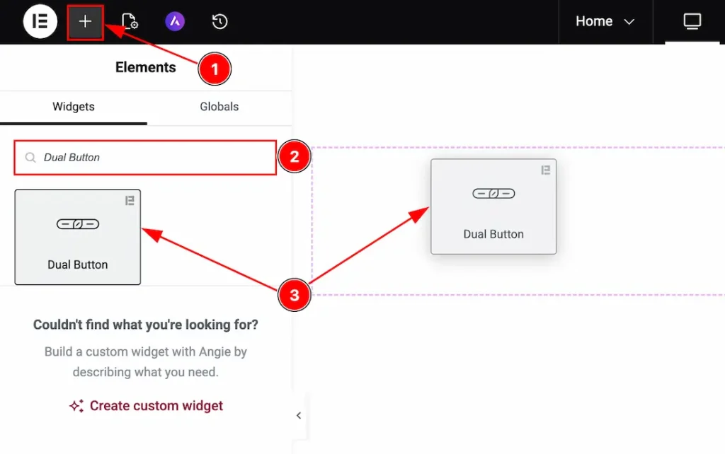
1. Go to the Elementor Editor Page and hit the “+” icon Button.
2. Search the Dual Button name.
3. Drag the widget and drop it on the editor page.
Work With The Content Tab
Button Section
Go to Content → Button
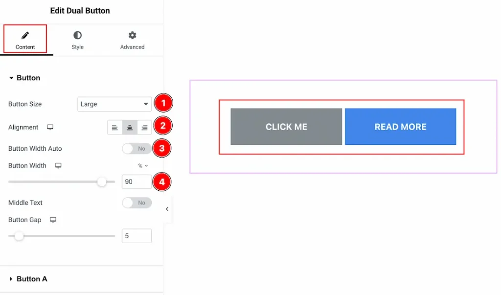
1. Button Size: You can make changes to the button size with this option.
2. Alignment: You can set the position of the button text to left, center or right with this option.
3. Button Width Auto: Enable the switcher to set the button width automatically.
4. Button Width: If you don’t enable the above switcher, then you will find this feature to adjust the button width manually.
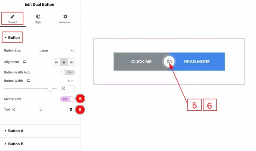
5. Middle Text: Enable the switcher to add the middle text between the buttons with this option.
6. Text: You can make changes to the middle text with this option.
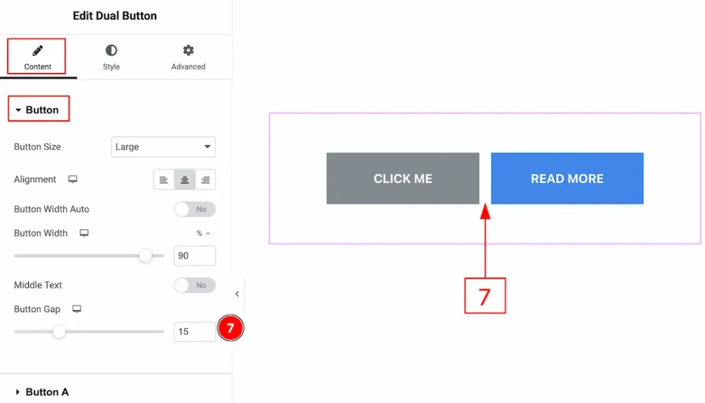
7. Button Gap: You can adjust the space between the buttons with this option.
Button A Section
Go to Content → Button A
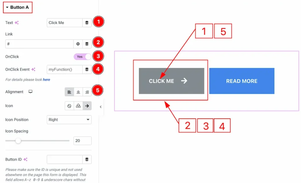
1. Text: You can add and make changes to the button text with this option.
2. Link: You can add a link to the button with this option.
3. OnClick: Enable the switcher to allow the button to trigger a custom JavaScript function when clicked.
4. OnClick Event: You can add the name of the JavaScript function that should run when the button is clicked here.
5. Alignment: You can adjust the position of the button text to left, center or right with this option.
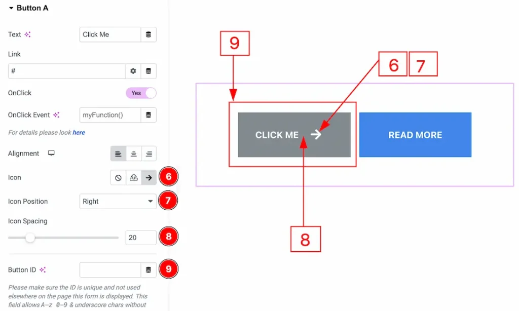
6. Icon: You can add an icon to the button with this option.
7. Icon position: You can adjust the position of the icon to the button with this option.
8. Icon Spacing: You can adjust the space between the button text and the icon with this option.
9. Button ID: You can add a button ID to the button with this option.
Button B Section
Go to Content → Button B
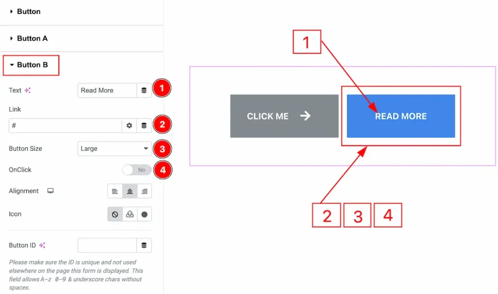
1. Text: You can add and make changes to the button text with this option.
2. Link: You can add a link to the button with this option.
3. Button Size: You can adjust the button size with this option.
4. OnClick: Enable the switcher to allow the button to trigger a custom JavaScript function when clicked.
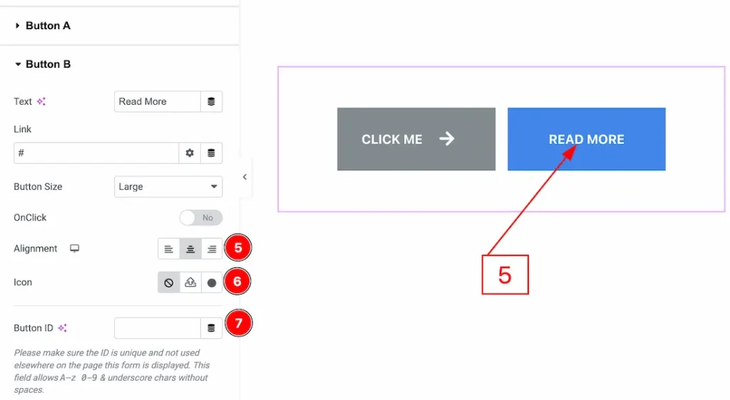
5. Alignment: You can set the button text position to left, center or right with this option.
6. Icon: You can add an icon to the button with this option.
7. Button ID: You can add a button ID to the button with this option.
Work with The Style Tab
Button Section
Go to Style → Button
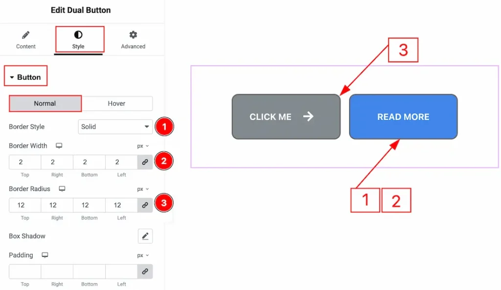
In this section, we have two more tabs. These are Normal & Hover. Let’s start with the Normal Tab first –
1. Border Style: You can add and change the border types of the button with this option.
2. Border Width: You can set the thickness of the border with this option.
3. Border Radius: You can control the roundness of the border with this option.
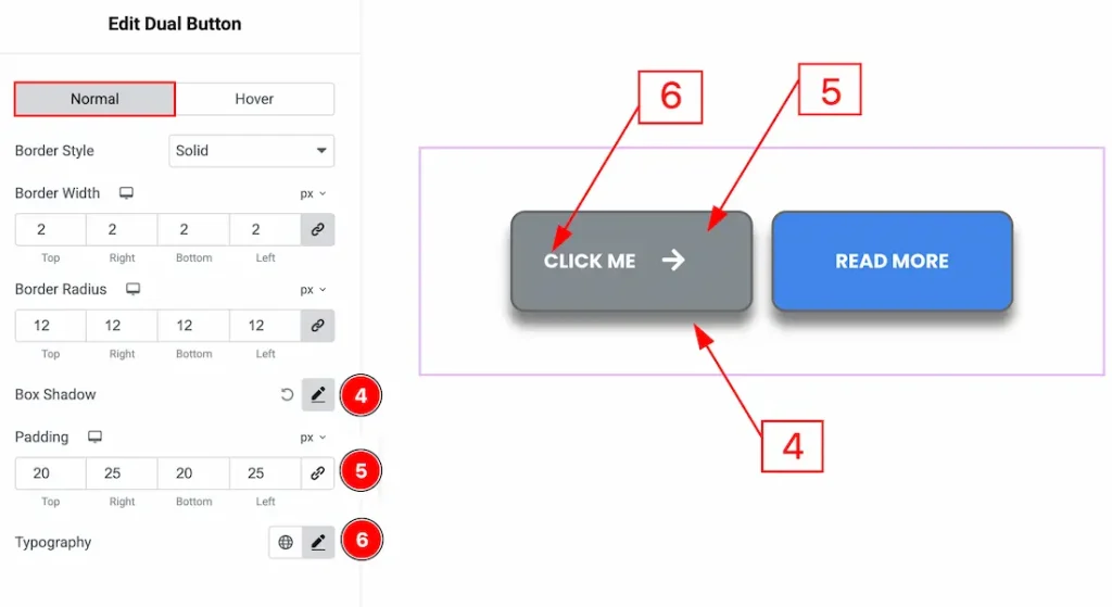
4. Box Shadow: You can add a shadow effect to the button with this option.
5. Padding: You can adjust the inner space of the button with this option.
6. Typography: Change the font family, size, weight, transform, style, decoration, line height, letter spacing, and word spacing from here.
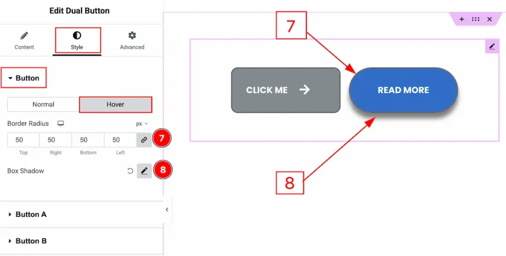
Now, let’s start describing the Hover Tab –
7. Border Radius: You can control the roundness of the border with this option.
8. Box Shadow: You can add a hover shadow effect to the button with this option.
Button A Section
Go to Style → Button A
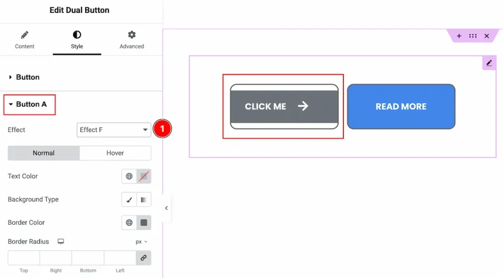
1. Effect: You can add an animation effect to Button A with this option.
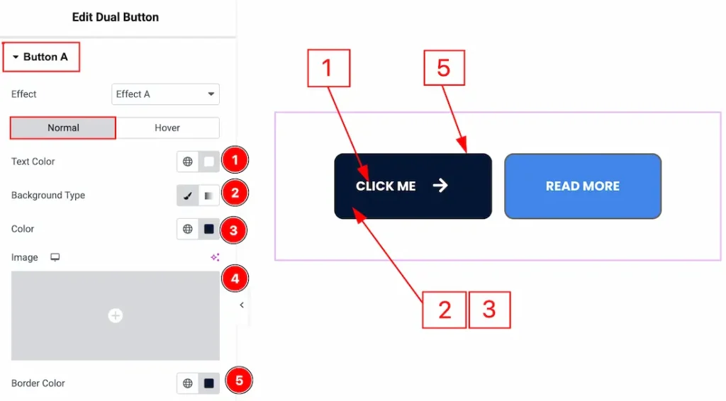
In this section, we have two more tabs. These are Normal & Hover. Let’s start with the Normal Tab first –
1. Text Color: You can make changes to the Button A text color with this option.
2. Background Type: You can change the background type to be classic or gradient with this option.
3. Color: You can change the background color with this option.
4. Image: You can change the background image with this option.
5. Border Color: You can change the border color with this option.
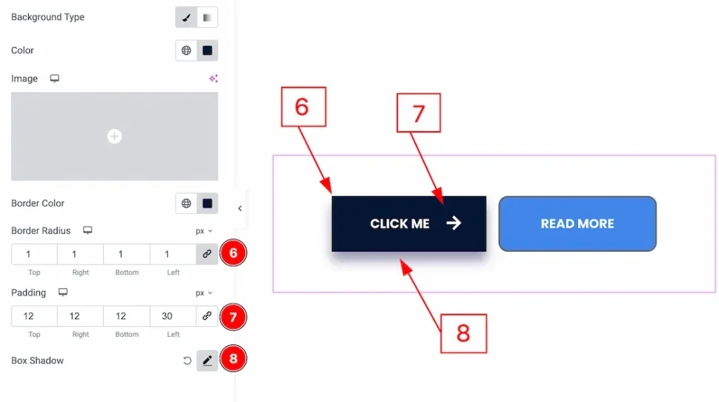
6. Border Radius: You can control the roundness of the border with this option.
7. Padding: You can adjust the inner space of the button A with this option.
8. Box Shadow: You can add a shadow effect to button A with this option.
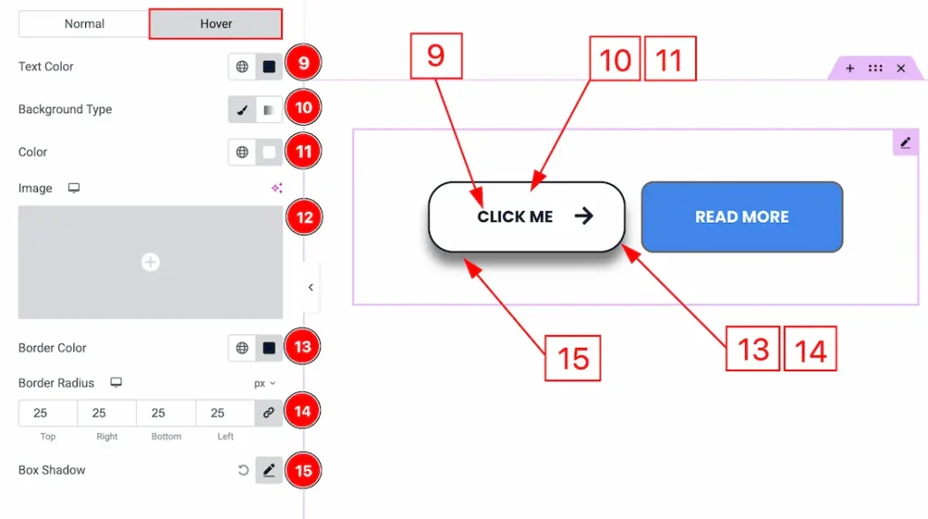
Now let’s proceed to the Hover Tab –
9. Text Color: You can change the Button A text hover color with this option.
10. Background Type: You can change the background type to be classic or gradient with this option. Here we have selected the background type as classic.
11. Color: You can change the background hover color with this option.
12. Image: You can change the background image with this option.
13. Border Color: You can change the border hover color with this option.
14. Border Radius: You can control the roundness of the border with this option.
15. Box Shadow: You can add a hover shadow effect to the button A with this option.
Button B Section
Go to Style → Button B
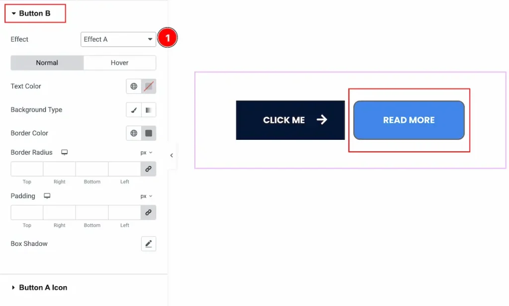
1. Effect: You can add an animation effect to Button B with this option.
In this section, we have two more tabs. These are Normal & Hover. Let’s start with the Normal Tab first –
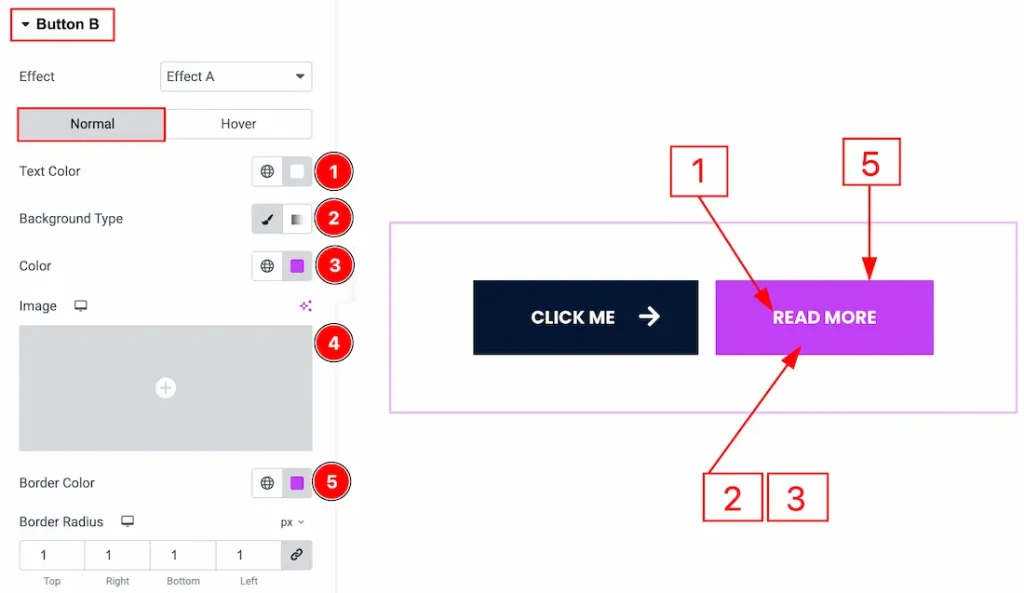
1. Text Color: You can make changes to the Button B text color with this option.
2. Background Type: You can change the background type to be classic or gradient with this option.
3. Color: You can change the background color with this option.
4. Image: You can change the background image with this option.
5. Border Color: You can change the border color with this option.
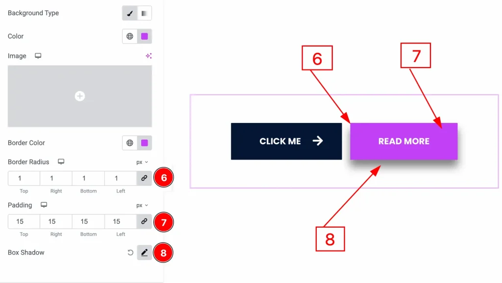
6. Border Radius: You can control the roundness of the border with this option.
7. Padding: You can adjust the inner space of the button B with this option.
8. Box Shadow: You can add a shadow effect to button B with this option.
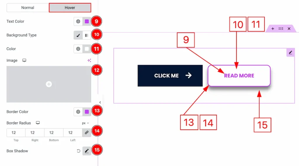
Now let’s proceed to the Hover Tab –
9. Text Color: You can change the Button B text hover color with this option.
10. Background Type: You can change the background type to be classic or gradient with this option. Here we have selected the background type as classic.
11. Color: You can change the background hover color with this option.
12. Image: You can change the background image with this option.
13. Border Color: You can change the border hover color with this option.
14. Border Radius: You can control the roundness of the border with this option.
15. Box Shadow: You can add a hover shadow effect to the button B with this option.
Button A Icon Section
Go to Style → Button A Icon
In this section, we have two more tabs. These are Normal & Hover. Let’s start with the Normal tab first –
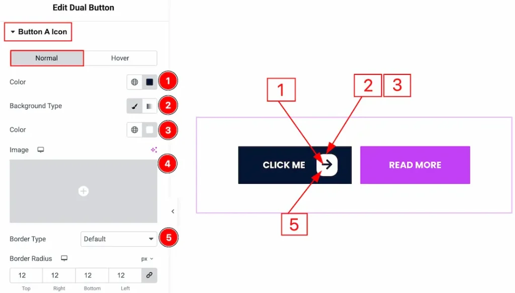
1. Color: You can make changes to the icon color with this option.
2. Background Type: You can change the background type to be classic or gradient with this option. Here, we have selected the background type as classic.
3. Color: You can change the icon background color with this option.
4. Image: You can change the background image with this option.
5. Border Type: You can add and change the border types with this option.
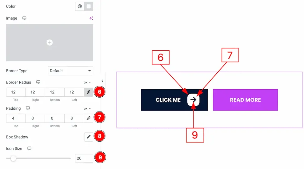
6. Border Radius: You can control the roundness of the border with this option.
7. Padding: You can adjust the inner space of the icon with this option.
8. Box Shadow: You can add a shadow effect to the icon with this option.
9. Icon Size: You can adjust the icon size with this option.
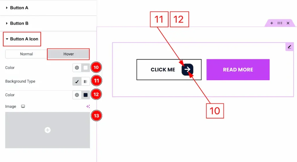
Now let’s proceed to the Hover Tab –
10. Color: You can make changes to the icon hover color with this option.
11. Background Type: You can change the background type to be classic or gradient with this option. Here, we have selected the background type as classic.
11. Color: You can change the background hover color with this option.
12. Image: You can change the background image with this option.
Middle Text Section
Go to Style → Middle Text
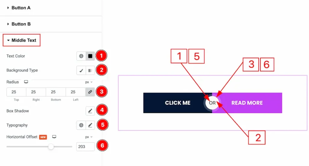
1. Text Color: You can change the text color of the middle text with this option.
2. Background Type: You can change the background type to be classic or gradient with this option.
3. Radius: You can control the roundness of the middle text border with this option.
4. Box Shadow: You can add a shadow effect to the middle text with this option.
5. Typography: Change the font family, size, weight, transform, style, decoration, line height, letter spacing, and word spacing from here.
6. Horizontal Offset: You can move the middle text horizontally with this option.
All done! You have successfully customized the Dual Button widget on your website.
Video Assist
You can also watch the video tutorial to learn more about the Dual Button. Please visit the demo page for examples.
Thanks for being with us.