The Dropbar widget from Element Pack Pro allows you to display additional content inside a hidden panel that appears when triggered by a button, link, or hover action. It helps you present menus, information, or custom content in a clean and space-saving way using Elementor. This documentation explains how to use and customize the Dropbar widget.
Enable The Dropbar Widget
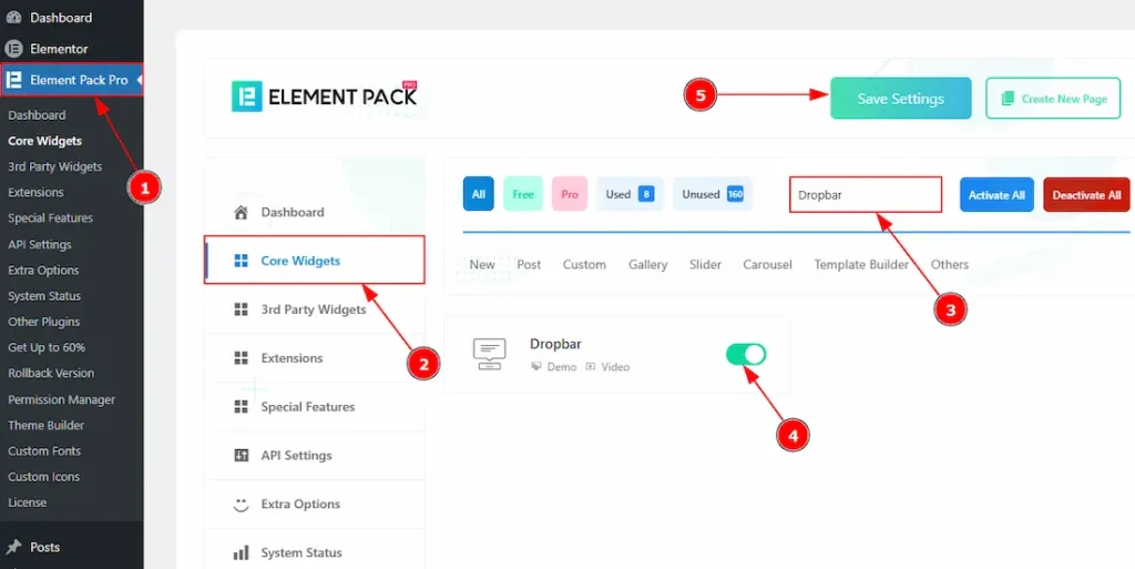
To use the Dropbar widget from Element Pack, first, you have to enable the widget.
- Go to WordPress dashboard → Element Pack Pro Plugin dashboard.
- Then, Click the Core Widgets Tab.
- Search the Dropbar Widget Name.
- Enable the Dropbar Widget.
- Hit the Save Settings Button.
Inserting The Dropbar Widget
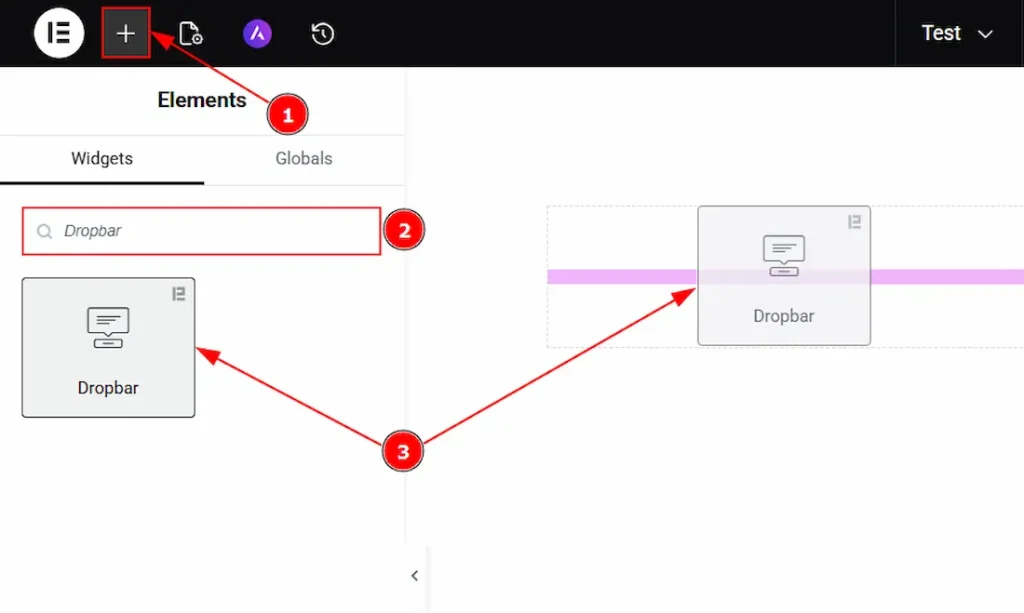
1. Go to the Elementor Editor Page and hit the “+” icon Button.
2. Search the Dropbar name.
3. Drag the widget and drop it on the editor page.
Work With The Content Tab
Dropbar Content Section
Go to Content → Dropbar Content
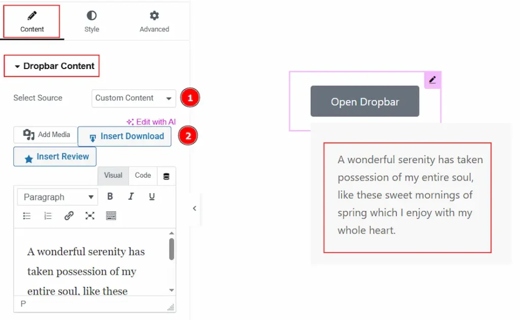
1. Select Source: You can select the source of the content with this option. The available options are Elementor Template, AE Template & Custom Content. Here, we have selected the source as Custom Content.
2. Content: You can add the content text of the dropbar here.
Button Section
Go to Content → Button
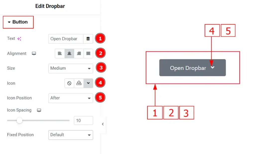
1. Text: You can make changes to the button text with this option.
2. Alignment: You can set the position of the button text to left, center, right or justified with this option.
3. Size: You can adjust the button size to extra small, small, medium, large & extra large with this option.
4. Icon: You can add an icon to the button with this option.
5. Icon Position: You can set the position of the icon before or after the button text with this option.
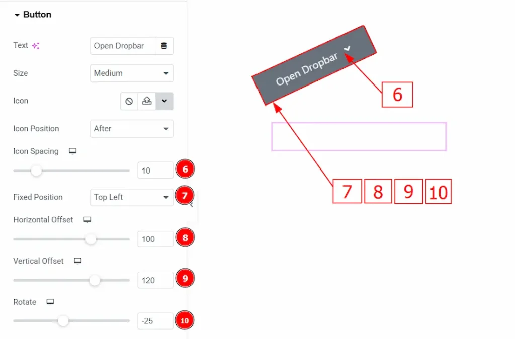
6. Icon Spacing: You can adjust the space between the text and the icon with this option.
7. Fixed Position: You can set the button position with this option. Here, we have selected the position as top left.
8. Horizontal Offset: You can move the button horizontally with this option.
9. Vertical Offset: You can move the button vertically with this option.
10. Rotate: You can rotate the button with this option.
Dropbar Options Section
Go to Content → Dropbar Options
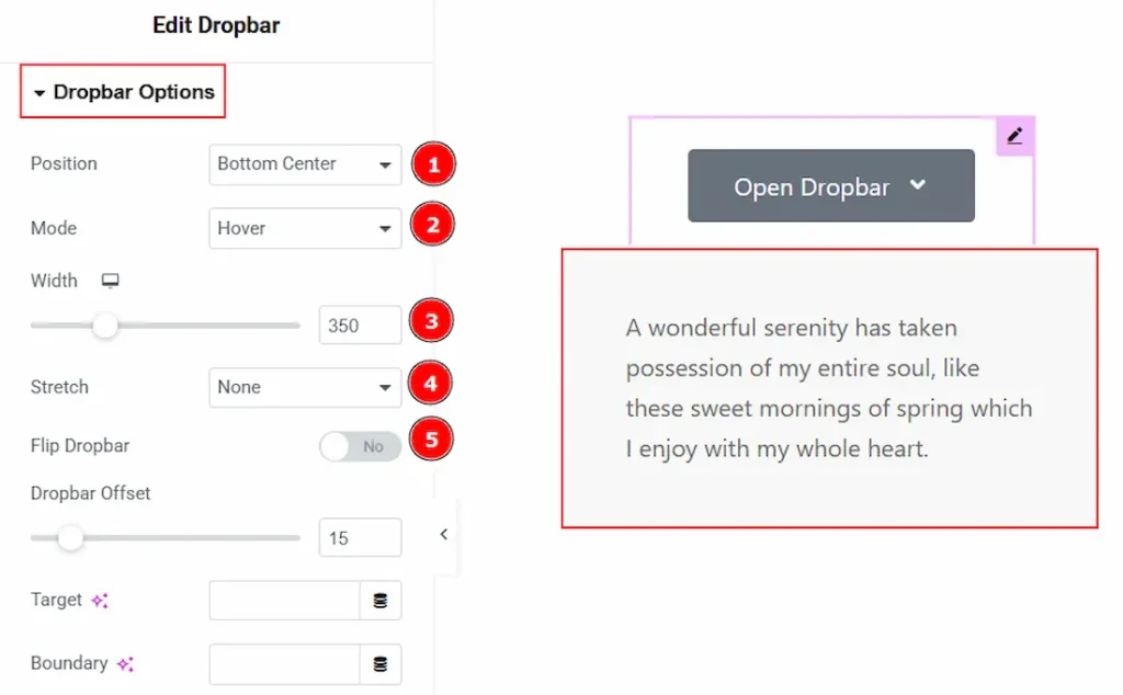
1. Position: You can set where the dropbar will appear relative to the trigger button.
2. Mode: You can choose how the dropbar opens, such as on click or when hovering over the trigger.
3. Width: You can make changes to the dropbar width with this option.
4. Stretch: You can expand the dropbar width to match the container, section, or full screen if selected with this option.
5. Flip Dropbar: You can automatically change the dropbar direction if there isn’t enough space on the selected side.
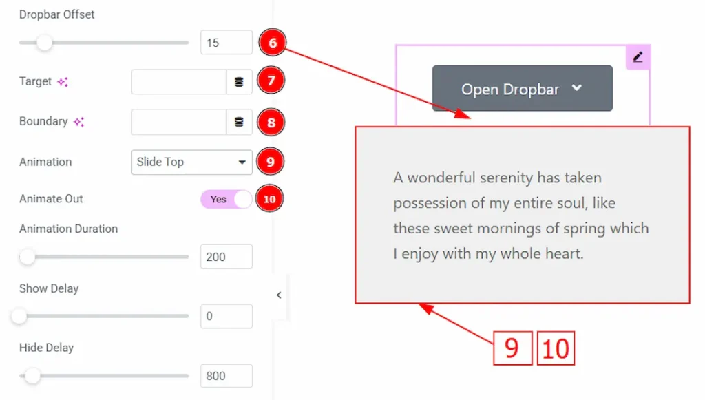
6. Dropbar Offset: You can add spacing between the trigger element and the dropbar.
7. Target: You can define which element will trigger or control the dropbar using a selector.
8. Boundary: You can limit the dropbar inside a specific container so it doesn’t overflow outside.
9. Animation: You can select the animation style used when the dropbar appears.
10. Animate Out: Enable the switcher to animate when the dropbar closes or disappears.
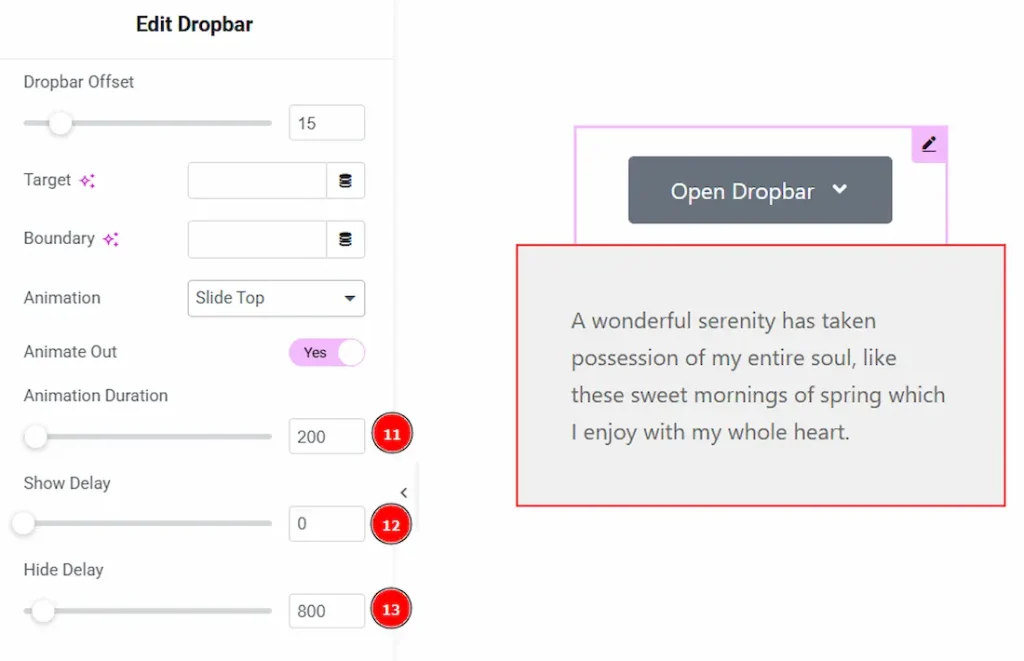
11. Animation Duration: You can set how fast or slow the animation plays (in milliseconds).
12. Show Delay: You can add a delay time before the dropbar opens after triggering.
13. Hide Delay: You can add a delay time before the dropbar closes after leaving the trigger area.
Work with The Style Tab
Button Section
Go to Style → Button
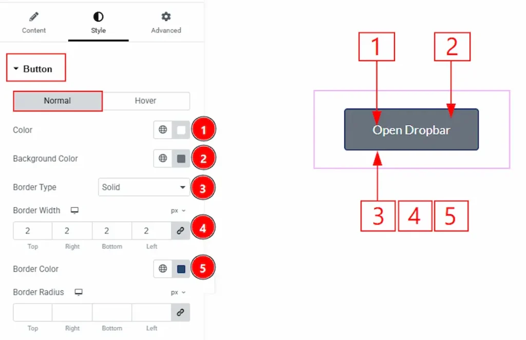
In this section, we have two more tabs. These are Normal & Hover. Let’s start customizing the Normal Tab first –
1. Color: You can change the button text color with this option.
2. Background Color: You can change the background color of the button with this option.
3. Border Type: You can add or change the border types with this option.
4. Border Width: You can set the thickness of the border with this option.
5. Border Color: You can make changes to the border color with this option.
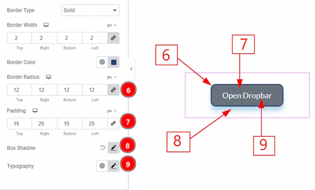
5. Border Radius: You can control the roundness of the border with this option.
6. Padding: You can adjust the inner space of the button with this option.
8. Box Shadow: You can add a shadow effect to the button with this option.
9. Typography: Change the font family, size, weight, transform, style, decoration, line height, letter spacing, and word spacing from here.
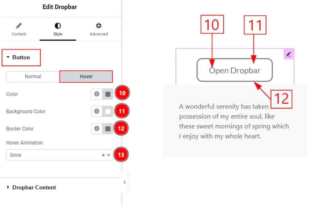
Now, let’s proceed to the Hover Tab –
10. Color: You can change the button text’s hover color with this option.
11. Background Color: You can change the button’s background hover color with this option.
12. Border Color: You can change the border hover color with this option.
13. Hover Animation: You can add an animation to the button and change the animation type with this option. Here, we have selected the animation type as Grow.
Dropbar Content Section
Go to Style → Dropbar Content
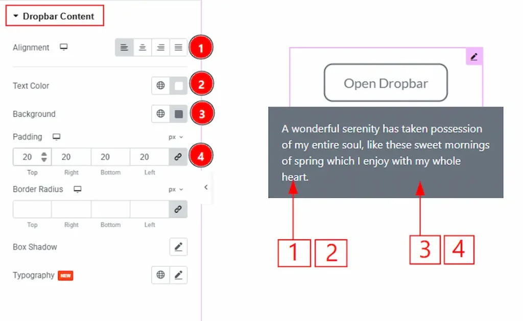
1. Alignment: You can adjust the position of the dropbar content text to left, center, right or justified with this option.
2. Text Color: You can make changes to the dropbar content text color with this option.
3. Background: You can change the dropbar content background color with this option.
4. Padding: You can adjust the inner space of the dropbar content field with this option.
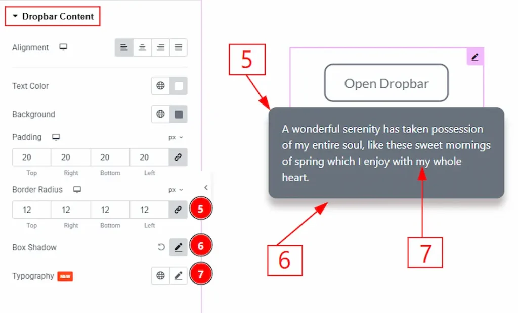
5. Border Radius: You can control the roundness of the border with this option.
6. Box Shadow: You can add a shadow effect to the dropbar content field with this option.
7. Typography: Change the font family, size, weight, transform, style, decoration, line height, letter spacing, and word spacing from here.
All done! You have successfully customized the Dropbar widget on your website.
Video Assist
You can also watch the video tutorial to learn more about the Dropbar widget. Please visit the demo page for examples.
Thanks for being with us.