
The Brand Grid widget from Element Pack Pro allows you to display brand or client logos in a clean grid layout. It’s ideal for showcasing partners or sponsors with flexible styling options. This documentation explains how to use and customize the Brand Grid widget in Elementor.
Enable The Brand Grid Widget
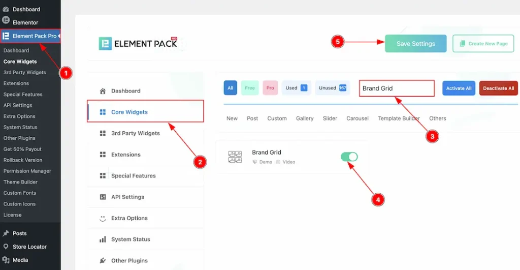
To use the Brand Grid widget from Element Pack, first, you have to enable the widget.
- Go to WordPress dashboard → Element Pack Plugin dashboard.
- Then, Click the Core Widgets Tab.
- Search the Brand Grid Widget Name.
- Enable the Brand Grid Widget.
- Hit the Save Settings Button.
Inserting The Brand Grid Widget
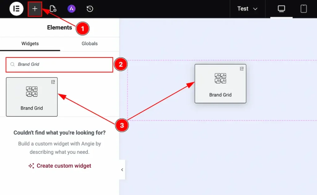
1. Go to the Elementor Editor Page and hit the “+” icon Button.
2. Search the Brand Grid name.
3. Drag the widget and drop it on the editor page.
Work With The Content Tab
Brand Items Section
Go to Content → Brand Items
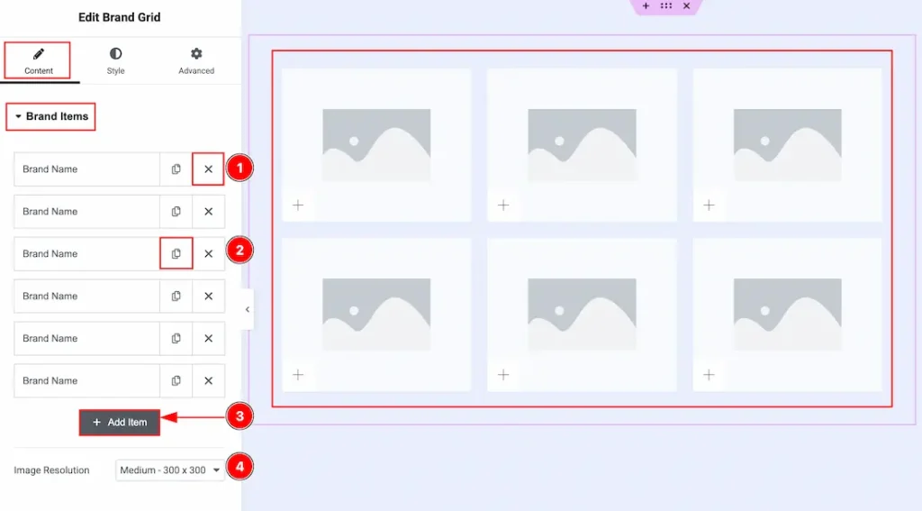
1. Close Button: You can click on the close button to close the brand items with this option.
2. Copy Button: You can click on the copy button to copy exact same item or duplicate the brand item with this option.
3. Add Item: You can click on this button to add more brand items.
4. Image Resolution: You can adjust the image resolution with this option.
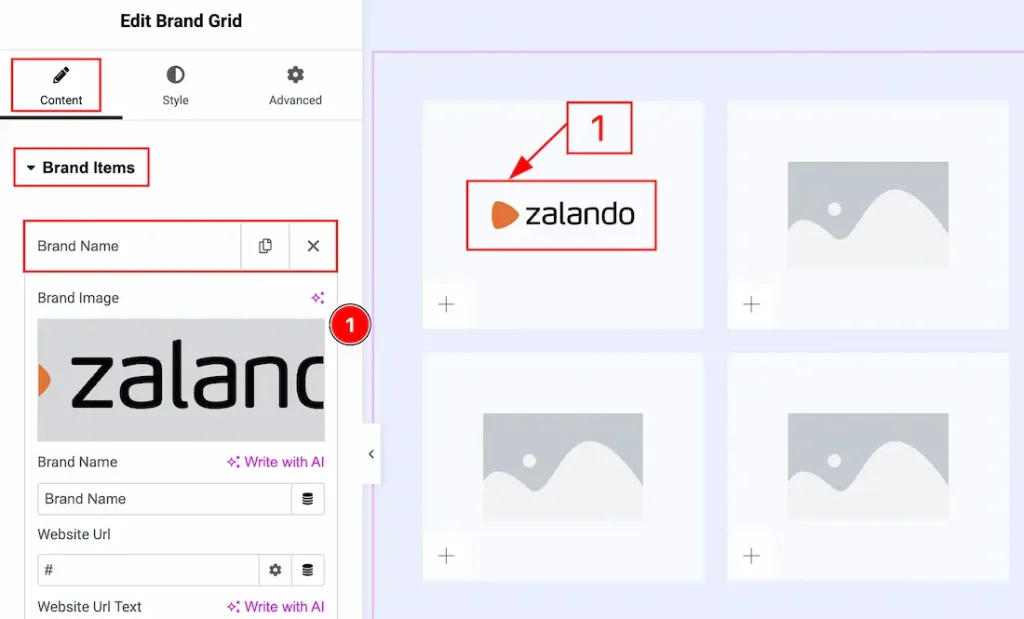
In each brand item, we have more options to customize. Let’s start describing those options –
1. Image: You can add an image with this option.
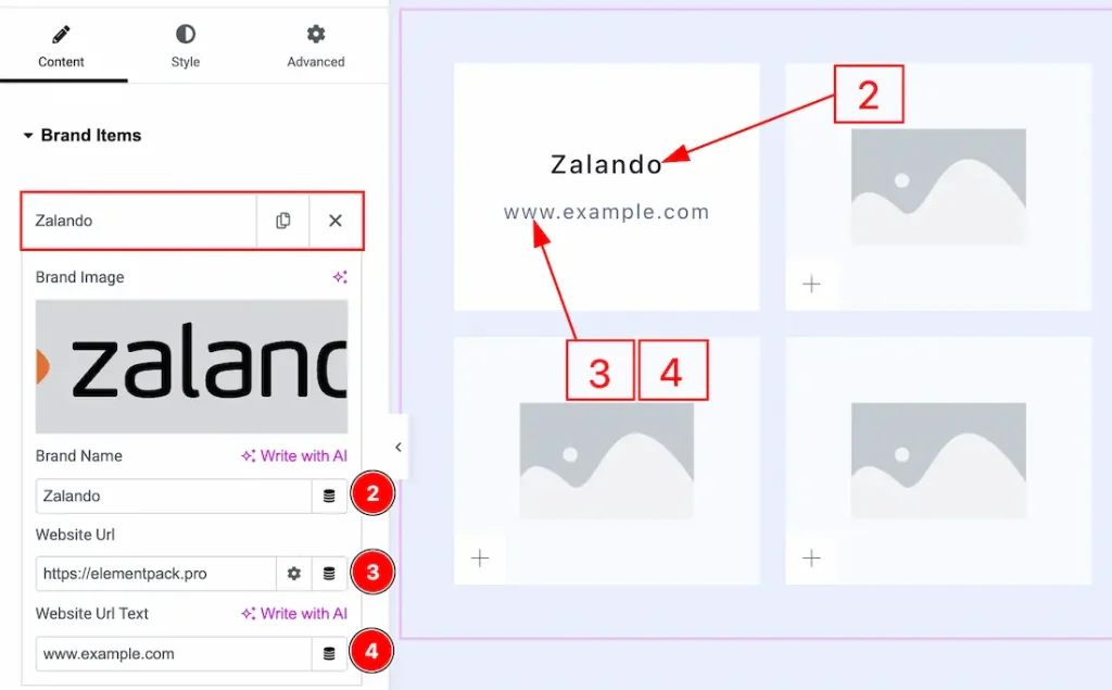
2. Brand Name: You can add or change the brand name with this option.
3. Website URL: You can add a website URL to the Website URL text with this option.
4. Website URL Text: You can add and make changes to the website URL text with this option.
Additional Settings Section
Go to Content → Additional Settings
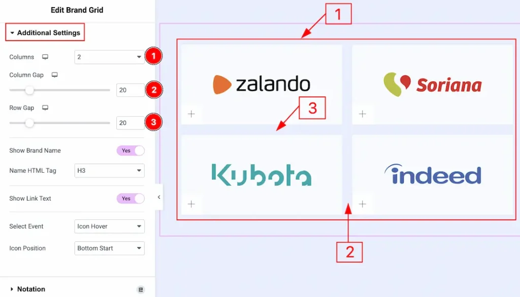
1. Column: You can adjust the column number that you want to show to your audience with this option.
2. Column Gap: You can adjust the space between the columns with this option.
3. Row Gap: You can adjust the space between the rows with this option.
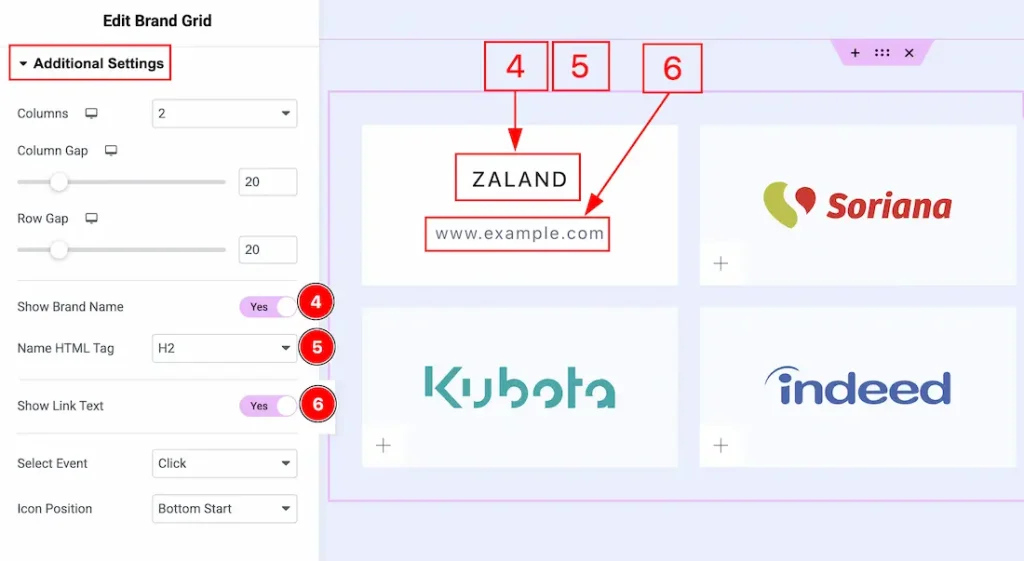
4. Show Brand Name: Enable the switcher to show the brand name to your audience.
5. Name HTML Tag: You can select the HTML tag for the brand name with this option.
6. Show Link Text: Enable the switcher to show the brand link text to your audience.
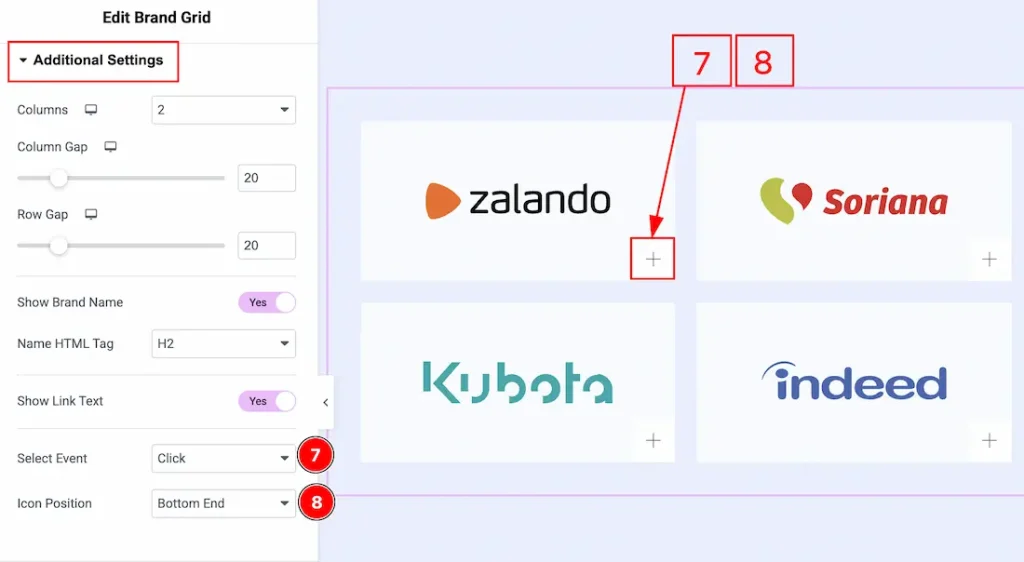
7. Select Event: You can select the event by which you want to trigger the brand items to show additional information with this option.
8. Icon Position: You can select the icon position with this option.
Work with The Style Tab
Items Section
Go to Style → Items
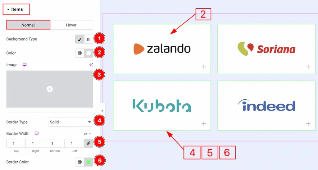
In this section, we have two more tabs. These are Normal & Hover. Let’s start with the Normal Tab first –
1. Background Type: You can choose the background type between classic or gradient with this option. Here we have selected the background type as classic.
2. Color: You can make changes to the background color with this option.
3. Image: You can change the background image with this option.
4. Border Type: You can add and change the border types with this option.
5. Border Width: You can adjust the thickness of the border with this option.
6. Border Color: You can change the border color with this option.
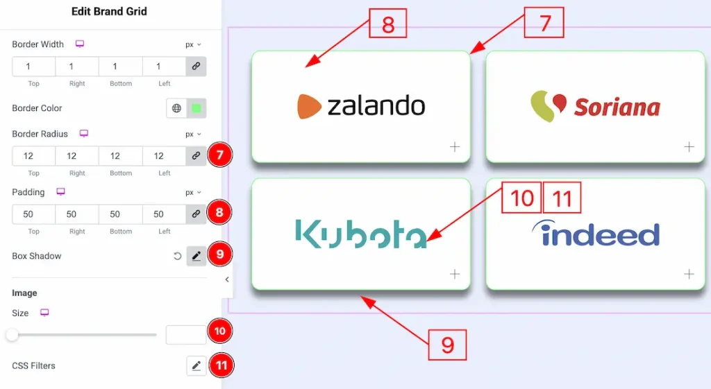
7. Border Radius: You can control the roundness of the border with this option.
8. Padding: You can adjust the inner space of the items field with this option.
9. Box Shadow: You can add a shadow effect ot the brand items with this option.
10. Image: You can make changes to the image size with this option.
11. CSS Filters: This setting lets you apply visual changes to the image. In this setting, you can modify properties like Blur, Brightness, Contrast, Saturation, and Hue.
- Blur: Softens the image, reducing sharpness.
- Brightness: Adjusts the overall lightness or darkness.
- Contrast: Modifies the difference between light and dark areas.
- Saturation: Controls the intensity of the colors.
- Hue: Shifts the overall color spectrum.
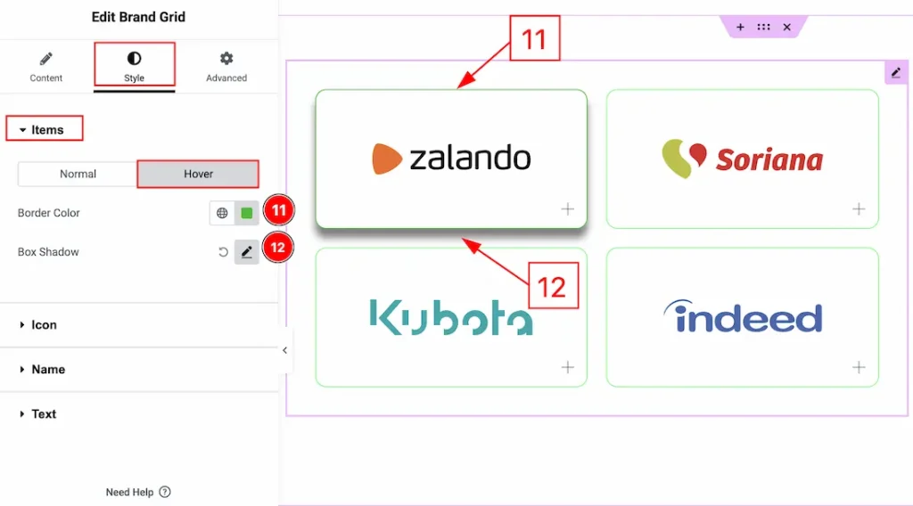
Now, let’s start describing the Hover Tab –
7. Border Color: You can change the border hover color with this option.
8. Box Shadow: You can add a hover shadow effect to the button with this option.
Icon Section
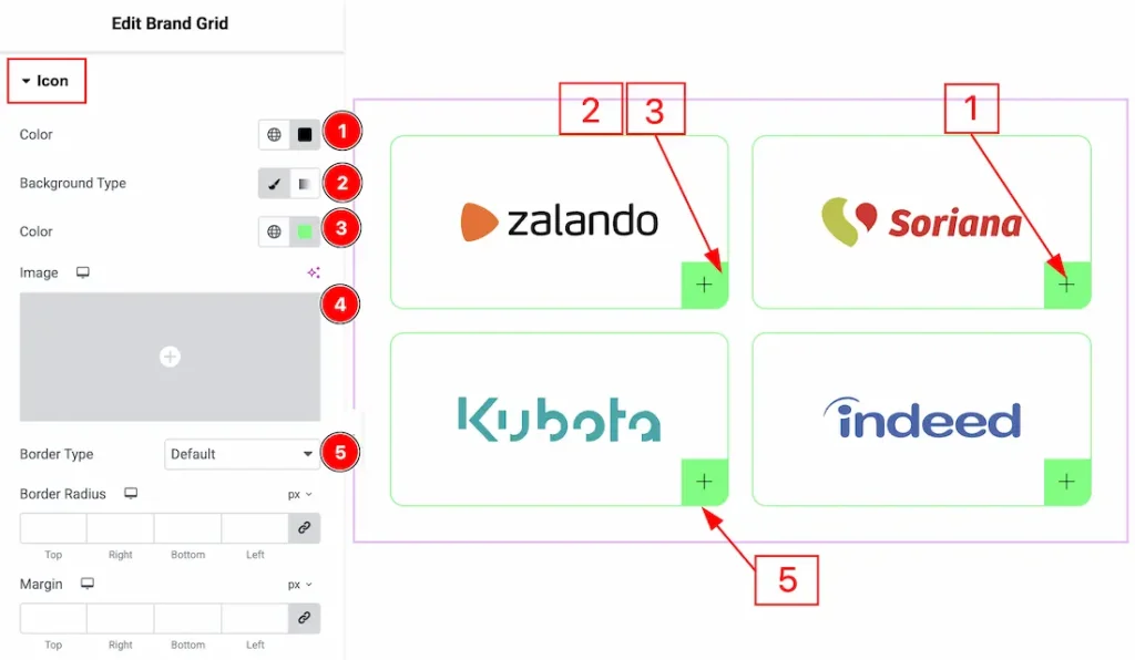
Go to Style → Icon
1. Color: You can change the icon color with this option.
2. Background Type: You can select the background type to be classic or gradient with this option.
3. Color: You can change the background color with this option.
4. Image: You can change the background image with this option.
5. Border Type: You can change the border and change its type with this option.
6. Border Radius: You can control the roundness of the border with this option.
7. Margin: You can adjust the space around the icon field with this option.
8. Size: You can adjust the size of the icon field with this option.
9. Font Size: You can make changes to the icon size with this option.
10. Box Shadow: You can add a shadow effect to the icon field with this option.
Name Section
Go to Style → Name
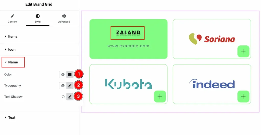
1. Color: You can change the brand name text color with this option.
2. Typography: Change the font family, size, weight, transform, style, decoration, line height, letter spacing, and word spacing from here.
3. Text Shadow: You can add a shadow effect to the brand name text with this option.
Text Section
Go to Style → Text
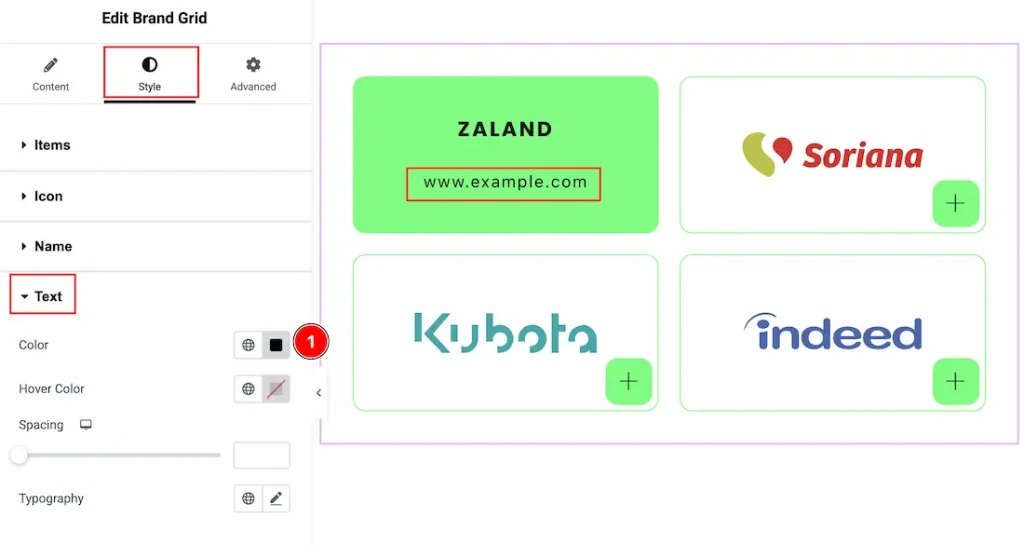
1. Color: You can make changes to the brand URL text color with this option.
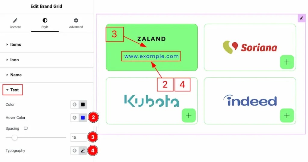
2. Hover Color: You can change the hover color of the website URL text with this option.
3. Spacing: You can adjust the space between the brand name and the brand URL text with this option.
4. Typography: Change the font family, size, weight, transform, style, decoration, line height, letter spacing, and word spacing from here.
All done! You have successfully customized the Brand Grid widget on your website.
Video Assist
You can also watch the video tutorial to learn more about the Brand Grid widget. Please visit the demo page for examples.
Thanks for being with us.